

NOTE: This is an archived version of the first incarnation of Brand New. All posts have been closed to comments. Please visit underconsideration.com/brandnew for the latest version. If you would like to see this specific post, simply delete _v1 from the URL.
![]()
At the heart (pun!) of every city or country branding effort is a zealous desire to portray the destination as world-class and home to the greatest people on earth — and, sometimes, like New York or Slovenia, there is nothing sweeter to communicate this than with a heart. Belfast, the capital city of Northern Ireland, unveiled a new identity to help promote tourism and enhance the perception of a city that has experienced its share of political, cultural and religious troubles from the 1970s to the 1990s, and has only recently experienced positive growth and perception. And what better way to grow than by opening your heart.
Designed by London-based Lloyd Northover, the new identity revolves around a heart that nicely takes the shape of a B, with the city name set at a vertical angle in a custom-made typeface called “Moment”. Even though the typeface looks plenty like House Industries’ Chalet (the 1980 style), having a proprietary typeface that partners and vendors can freely download (go get your copy now!) is probably much more feasible and economical than forcing everyone to license a retail typeface. The B/heart icon is interesting, but it seems to do little to differentiate Belfast from any number of other cities or countries whose name starts with a B that could also adopt the exact same idea, from Brussels to Brazil (trust me, it would work for Brazil. Ahem.). Nonetheless, as a way of avoiding a logo with a local landmark this succeeds well. The typeface is pretty generic and has a retro-ish feel that I don’t think helps establish Belfast as a forward-looking city. (Interesting that there is this new trend of Bauhaus-inspired typography being used to communicate “contemporary,” see Euronews).
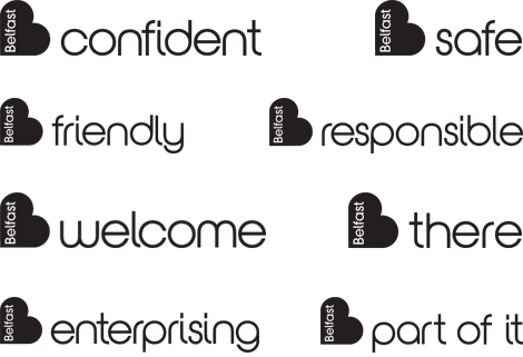
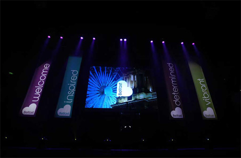
The new identity also comes with a number of tag lines, stemming from the main one, “Be Part of It,” that can be used freely in all sorts of communications from the Belfast City Council and Belfast Visitor and Convention Bureau. And it also comes in a variety of colors for versatility. The final result although not terribly exciting is lively and energetic, and as much as I am not convinced by the relevance of the heart to Belfast I can certainly appreciate that they got to it first and can own the idea of the B/heart for a city or country.


Jump to Most Recent Comment
felipe gil’s comment is:
that´s a cute deja vu
On Jul.22.2008 at 06:27 AM
Mondayne’s comment is:
I visited Belfast last year and did indeed find it a nice place to visit. The city itself has some charm, and a very interesting history.
It's a heart AND a B! CLEVER!!!
It's adequate, I suppose, and at least it's not Australian-tourism-esque brush scripts! But it's a bit dull, and that typeface is not very nice is it?
Well, I'm not feeling the love anyway.
On Jul.22.2008 at 06:50 AM
Hugo’s comment is:
Erm, shouldn't the "before" be blank and the new logo be in the "after"?
On Jul.22.2008 at 07:03 AM
Julian’s comment is:
Write something about the "Be Berlin" campaign and branding!
On Jul.22.2008 at 07:59 AM
plamen’s comment is:
It's a heart and a B! Clever!
... just like Mr. Bricolage!
![]()
Daniel Campos’s comment is:
I loved pic with a citizen. She's so pretty!HAHAHAH
On Jul.22.2008 at 08:18 AM
Armin’s comment is:
Hugo, yes, I forgot to change the logo graphic to say "new".
On Jul.22.2008 at 08:25 AM
Samantha Armacost’s comment is:
I can appreciate the versatility, but it brings to mind a better executed Burlington Coat Factory.
![]()
PP’s comment is:
Pretty cool!
On Jul.22.2008 at 09:17 AM
paul’s comment is:
its a rip off of baby boom records surely...
http://babyboom.bigcartel.com/
not that iam jealous as i work for a design company in belfast,
On Jul.22.2008 at 09:32 AM
Jeff’s comment is:
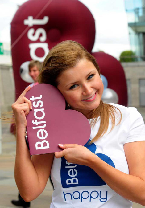
I'm not feelin' this. The taglines are uninspired & tacky and the logo is awkward. That weird blow-up thing in the woman photo looks sweet, though.
On Jul.22.2008 at 09:40 AM
lodenmuse’s comment is:
The B is cute, doesn't even need the type inside--maybe create a pillowy ELFAST to follow it. Use the 'B __' tags or just tons of B's plastered around. But it does imply that you'll get a Purple Heart if you visit Belfast. =^\
Honestly, my first thoughts of Belfast are the IRA and John DeLorean. Hmm, ok, I DO love Belfast.
On Jul.22.2008 at 10:12 AM
Chip O'Toole’s comment is:
The typography is foul, weak, and too stock.
Integrating a heart/b may not be original but is friendly and fresh and can still effectively connect with tourists and successfully promote the city.
On Jul.22.2008 at 10:18 AM
Armin’s comment is:
> The typography is foul, weak, and too stock.
Technically, it is not stock : )
On Jul.22.2008 at 10:21 AM
JD’s comment is:
I like it, but what about Rebtel ??
On Jul.22.2008 at 10:24 AM
rickyaustin’s comment is:
I reeeeaaaally dislike the typeface.
'Belfast' itself sets fine in it - but some of the subheads just look awful in this face. The tails on the 'i' and 'l' really kill it for me.
Overall - the identity isn't mindblowingly original or revolutionary, but I think it will accomplish its goal.
On Jul.22.2008 at 10:36 AM
Chris Pace’s comment is:
I don't mind the mark, even if it doesn't scream location as much as it might product line.
What really had me laughing was the tagline "There". Come to Belfast! We're... we're definitely here.
On Jul.22.2008 at 11:03 AM
Dayne Wessel’s comment is:

von K’s comment is:
Chris: I think you're supposed to read the mark as a letter b in those tagline lockups, so that'd make it "be there." Like, "ladies' night, all you can drink--be there."
I wonder why they used the Chalet-derived type. It just points my thoughts toward the 70s and 80s, which, as Armin mentioned, weren't the most tourist-friendly years for Belfast.
On Jul.22.2008 at 01:28 PM
PP’s comment is:


danny’s comment is:
Is it just me? Maybe its that weird plum color...doesn't settle right.
Amanda’s comment is:
I don't hate it, but it's not entirely original. I also don't like the typeface. I would have liked to see what they had before. while this isn't the best, it is probably a big improvement.
Also, this came to mind along with Burlington Coat Factory.
![]()
Emily Charette’s comment is:
Bellbottoms.
On Jul.22.2008 at 02:49 PM
damon’s comment is:
don't like the typeface that much, it's weak.
and I like the heart B ok, but it feels as though it belongs on some indie electro groups cover or some hipster T shirt you'd find in manhattan at some cool soho boutique.
not really for a city et all....especially one with so much history and identity.
On Jul.22.2008 at 02:56 PM
john’s comment is:
It's 1973 all over again! Woohoo!
On Jul.22.2008 at 03:40 PM
rich’s comment is:
I hate to be so negative, but there are just times when incompetence should be pointed out as such.
Not only is the mark bland, indistinct and aesthetically awkward, but just as Paul pointed out, is a DIRECT RIP OFF...

we really need to be raising the standard here for our industry fellas. especially for professional branding firms
On Jul.22.2008 at 04:20 PM
Mark’s comment is:
:)
I love it, so simple yet so elegant!
On Jul.22.2008 at 04:22 PM
sonia’s comment is:
I'ts a good idea, maybe it has been used before but it's a clever way to express what they just really want.
The only thing I don't like (in fact, I hate) is the typography...too round and it doesn't contrast with the heart.
On Jul.22.2008 at 04:30 PM
Marc Baptiste’s comment is:
A bit poor. I thought it was better when seeing "Up the Hoods" written at the side of the roads meant you knew you were arriving in Belfast
On Jul.22.2008 at 05:32 PM
Peter Whitley’s comment is:
The whole thing seems pretty B9 but I suppose that's what is expected with this type of campaign.
Derrick’s comment is:
Is it supposed to look like breasts?
On Jul.22.2008 at 06:00 PM
Cam’s comment is:
I just keep thinking there's got to be an application that spins it into a shamrock/4-leaf clover....
On Jul.22.2008 at 06:52 PM
Doolingus’s comment is:
Cute girls. Marketing genius.
On Jul.22.2008 at 07:25 PM
Pseudonym’s comment is:
Looks awfully like one of my own designs:
![]()
The examples of other similar designs - none of which I was aware of when I created mine, I might add - just go to show:
a) how rare unique - as distinct from merely original - ideas and expressions are; and,
b) how the internet so cruelly shoves this down one's throat!
Pseudonym’s comment is:
And, like a few others, I find the type choice a bit odd.
On Jul.22.2008 at 10:27 PM
LL’s comment is:
Belfast: complete arse.
On Jul.22.2008 at 10:51 PM
jRod’s comment is:
cute girl! the way she's holding that logo makes me think of it as a heart... WAIT! It IS a heart! amazing! i am utterly amazed.
On Jul.23.2008 at 09:18 AM
jenimattson’s comment is:
This would have been a great campaign for Belgium (whose country abbreviation is BE). a.k.a. "BE" safe.
On Jul.23.2008 at 04:28 PM
Matthew J’s comment is:
I'm from Northern Ireland, and I do kind of like this work. Its definitely the strongest brand Belfast has ever had, but that is not saying much because its been terrible for a long long time.
This one (whilst I agree it doesn't hold much symbolic connection with the city really) seems to be a very friendly, warm, modern, embracing kind of brand. The "B...." idea is also great for 'expandability' for the future.
Its already all over the city too, makes a change from the bland and staid council signs we're used to seeing.
On Jul.24.2008 at 11:40 AM
Frank’s comment is:
Another "logo" where the icon cannot stand on its own (without the type) because it's too similar to at least a dozen other identities.
How come agencies and clients alike have become so sloppy with the concept and execution behind a logo nowadays ? It seems like all it is about these days is "make it look nice in context of the identity program and it'll do".
Seems nobody cares anymore if a logo can stand on its own or if at least it's unique and original in a way.
On Jul.24.2008 at 03:52 PM
Dave’s comment is:
On Jul.24.2008 at 05:53 PM
Keenan Cummings’s comment is:
I haven't been following this thread, but I'm sure the type has been called-out. In short, it is just bad.
But BB Saunders out of London did a pretty nice ID for a UK Radio Station called Heart FM. Check out their site for more. The aerial view poster is pretty nice.

Jett Loe’s comment is:
Having just left Belfast after living there for four years the new branding feels appropriate. Even with the addition of new malls with Apple Stores and Starbucks, Belfast has a disctintly 70´s vibe about it. The refresh feels ´Belfasty' yet helps it move into the future.
On Jul.26.2008 at 10:08 AM
plamen’s comment is:
1. Barrow
2. Belfast
3. Blackburn
4. B?
Randy Hill’s comment is:
Gobsmackingly boring.
On Jul.29.2008 at 01:46 PM
Richard’s comment is:
http://www.dailymail.co.uk/news/article-1038596/Council-lavishes-60-000-new-logo--identical-towns.html

brett King’s comment is:
A nice idea, around the "be".. not similar but similar is this campaign
On Aug.05.2008 at 05:46 PM
Tim Whalen’s comment is:
You know, when you turn a heart on its side, it kinda looks like a "B". Clearly it's been done before (we have many examples here). I'm not saying it's right to utilize this idea, but it's really just a matter of parallel thinking. I agree, though, that we should challenge ourselves to create more original ideas (don't settle for the "obvious" answer), and, at the very least, do our research to make sure we're not stepping on others' toes.
On Aug.05.2008 at 06:45 PM
Philip Bulley’s comment is:
That is one seriously overused concept.
But then again its takes from the most overused iconic symbol.
And in my opinion, a heart is the bestest iconic symbol ever created in the world. ever. awww.
Remind anyone of Heart 106.2 London?

Mongoose’s comment is:
Okay, so there's nothing new about heart-B. I've seen it before in Lutheran Brotherhood's logo, and big Brothers/Big Sisters has a variant of it. okay. It's a cliche, but is it used well here?
I say yes. The 'Moment' typeface is, for a use like this, stylish; the 'B adjective' campaign is.. well. cliched but workable.
I give it, with no irony intended, a B. I think there could be something stronger done to accent the heart, but at it's core, it's clean, effective.
On Aug.17.2008 at 01:21 PM
Goffredo Puccetti’s comment is:
I agree with Rich.
It is awful to be so negative but this is plagiarism! Two major UK Town, a Record Company, retailers, radio stations, etc etc...
This was the headline of a poll on the UK press commenting the Barrow-Blackburn logos clash: "Are branding logos a waste of money?"
I agree that for the sake of our industry, standards must be raised. A logo for a town, IDENTICAL to AT LEAST TWO other close towns... is simply unacceptable, imho.
On Aug.29.2008 at 06:09 PM
Graeme’s comment is:
Rip-off from too many other brands. Typeface is a bit dated for me and boring. Don't like the ay 'Belfast' sits in the b heart or whatever it is.
Awful.
A total waste of money. I thought Lloyd Northover would have produced something better than this.
On Feb.15.2009 at 01:33 PM
Comments in Brand New, V1.0 have been closed.


