

NOTE: This is an archived version of the first incarnation of Brand New. All posts have been closed to comments. Please visit underconsideration.com/brandnew for the latest version. If you would like to see this specific post, simply delete _v1 from the URL.
![]()
Here is something to change the mood a little bit, because it isn’t just corporate logos, or brands for all sorts of liquids that occupy most of our time and, in fact, branding for children’s products is probably one of the biggest, influential and most underrated specialties of identity design. If you don’t have any kids — or if you have kids, but find the notion of cartoons imparting moral tales and focusing on Christianity and Biblical themes to be too much — Veggie Tales is a 15-year-old cartoon featuring vegetables with eyes and mouths, that has exploded in TV ratings, DVD sales and box office ticket sales. I have yet to see these talking veggies, since our daughter is more preoccupied with dinosaurs and Caterpillar trucks, but their presence in the market is hard to miss.
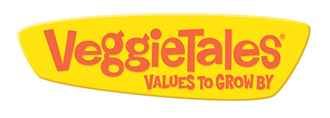
So, here is their new logo and it’s hard not to see the improvements right away, specially with the poor old letterforms that were squished to death. The new, and I believe custom (or at least customized), wordmark is a great improvement with each character modified properly to make it funky and playful, and I really appreciate that the “e”s are all different, rather than just repeating them. The holding shape is fun and, with all the image-heavy applications they do, it will help it stand out.
Just like sports logos, where there are certain visual tropes, children’s logos have their own (swingy, swirly, boppy, etc.), so it’s important to judge against context.


Jump to Most Recent Comment
Geoffrey’s comment is:
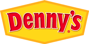
I'm not very familiar with this brand but my first reaction was that it reminded me of Denny's.
On Mar.25.2009 at 07:47 AM
Doug Bartow’s comment is:
Nice new wordmark—agree the clarifier visually completes (in a not so good way). VeggieTales do a nice job, and they're not as Bible-thumping as some of their critics might have you believe. It's mostly old testament stuff (ie: golden rule etc...) and the characters are original and funny. Given the din of Pokemon, Digimon, Bakugan, PowerPuff, Bratz, etc.. they stand out as a truly original series with a real purpose. Where else can you see a cucumber who turns into a superhero?
On Mar.25.2009 at 07:50 AM
Danielle Hartland’s comment is:
I think they've definitely taken a step in the right direction. It's much more pleasing to the eye and it will fit nicely into all of their different applications.
On Mar.25.2009 at 08:05 AM
josh’s comment is:
i like the g's!
On Mar.25.2009 at 08:16 AM
Saylor’s comment is:
"Good Morning George, HOW ARE YOU?!"
Having cousins that watched Veggie Tales (all the time), I'm quite familiar with the brand. What's behind the brand is great, but their logo has always bothered me with letters "squished to death."
Great move, and about time!
On Mar.25.2009 at 08:35 AM
Scott’s comment is:
I actually kind of like the "squished-ness" of the old logo. Not because it's pleasing to the eye - it's not - but because it reminds me of their characters who bounce around, gyrate, change shape, etc., to move within the cartoon frame. Like pogo-sticks, if you will. The old font speaks to that movement, IMO.
Otherwise, it's an improvement. The new look is nice and clean with a crisp, unique font ... so long as Jesus approves (just kidding, lighten up people :)
PS - I could do without the tagline/slogan. I think it's unnecessary.
On Mar.25.2009 at 08:52 AM
Mokokoma Mokhonoana’s comment is:
HUGE improvement!
I agree, having the letters 'e' and 'g' look different makes the logo more interesting.
The old logo fails to standout when no background is applied to it.
On Mar.25.2009 at 08:53 AM
Erik at Logo Critiques’s comment is:
My son loves Veggie Tales (which he calls "Bob the 'mato"). I think the new mark is a vast improvement. The switch to s sans serif was needed and creates a cleaner look. I also think the new mark is much more in-your-face or bold. It's good.
On Mar.25.2009 at 09:02 AM
Teevio’s comment is:
I'm a parent of 3 young children, and have been familiar with VeggieTales and it's products since the beginning. I'd have to say that I'm very pleased with this redesign.
The new logo retains the same playfulness of the original, while the updates to the text make the logo look much more up-to-date and fresh.
I do have to say that I've never seen the old logo put up against a white background like you have it with those particular colors. At least the new logo addresses that issue.
On Mar.25.2009 at 09:05 AM
Emily Brackett’s comment is:
The letters are fitting much better now. It can still have a playful, jumping-around look without looking squished.
However, I'm not crazy about the colors. The orangey-red of the type is sort of blah -- not saturated, not light. Could use more contrast with the yellow
On Mar.25.2009 at 09:21 AM
Eighthave’s comment is:
I like this better because the letters are designed rather than just squished. I'm nit-picking perhaps, but I wish the T was a little more distinct than just capitalized. Otherwise, it's working very well.
On Mar.25.2009 at 09:36 AM
Chris Herron’s comment is:
The new logo is an excellent design. It strikes the right tone. Distinctive, asymmetrical enclosure shape, and playful, well-crafted typography. Fun stuff.
On Mar.25.2009 at 10:01 AM
Kevin Zwirble’s comment is:
I do think this is a good improvement. The off-center counters in the "a" and "e" work, as well as the googly-eyed g's. Much more playful and kid-friendly. Although, adding the tagline takes away from the breathing space within the enclosure.
The serif font is and the odd proportions are what truly bug me about the old mark. It just makes it looks un-designed.
On Mar.25.2009 at 10:21 AM
Glenn Sakamoto’s comment is:
Stronger. But makes me crave a Denny's Grand Slam breakfast – hold the meat.
On Mar.25.2009 at 10:44 AM
Jacob Spence’s comment is:
I am young enough to of actually watched quite a bit of VeggieTales in my day. I think they have done quite a nice job and have succeeded in a rather smooth transition. Kids will be able to subconsciously adapt to this new wordmark as it shares similar colors and connotations.
I do agree that the tagline cramps the balance of the logo. Maybe a thinner typeface and a alternative color would do the trick?
On Mar.25.2009 at 10:44 AM
Jay Williams’s comment is:
I definitely like the new logo, I think it keeps the same feel as the old one, while adding a bit more of a polished look. I'd really like to see it without the bevel and emboss, however.
On Mar.25.2009 at 11:04 AM
Kevin’s comment is:
I think it is an overall improvement, and agree that it is easier to read.
I will second Geoffrey's comment though that it reminded me a little too much of Denny's.
On Mar.25.2009 at 11:08 AM
Dirk’s comment is:
Anyone know who designed this?
On Mar.25.2009 at 11:49 AM
jRod’s comment is:
i have been a fan of VeggieTales for years (even applied for a job there back in '98) and this has been their logo from the beginning. it’s a little sad to see it go. the new version is well executed, though, and most likely done in-house. they are a really talented group of designers and developers and it wouldn't surprise me if that were the case.
On Mar.25.2009 at 12:31 PM
Frank’s comment is:
Good balanced wordmark.Only minor issue i see is the "T" could be a bit bigger and slightly taller.The stem widths don't seem to match the one of the "V".
But all in all a great improvement i'd say.
On Mar.25.2009 at 01:10 PM
Dawn Nicole Baldwin’s comment is:
Dirk & jRod-- Yes, it was designed in-house by John Trauscht & Ron Eddy. I used to be on staff with them in 2000 and you're right--they're insanely talented, but also very down-to-earth & humble.
Glad you guys enjoy the new look :)
On Mar.25.2009 at 01:24 PM
Jeremy’s comment is:
A big improvement. The letterforms look like they're bouncing around, like kids.
On Mar.25.2009 at 02:05 PM
Mark’s comment is:
It's an excellent improvement. The previous logo looks cold and stale in comparison to the new one. But I'm interested in why the suddenly neededed to add an enclosure to the logo?, I think it could have worked fine an be still very playful as a wordmark as well. Not a big deal just something I'm curious about.
On Mar.25.2009 at 04:28 PM
Mark’s comment is:
I made an error. neededed isn't a word. XD
It's an excellent improvement. The previous logo looks cold and stale in comparison to the new one. But I'm interested in why the suddenly needed to add an enclosure to the logo?, I think it could have worked fine an be still very playful as a wordmark as well. Not a big deal just something I'm curious about.
On Mar.25.2009 at 04:32 PM
Suzanne Elliott’s comment is:
This is stronger, similar feel yet somehow easier to look at and though I read the comment about Denny's and see the similarity...it isn't what I thought of first.
On Mar.25.2009 at 05:51 PM
chris zodrow’s comment is:
Fits the brand: funny, friendly and down to earth.
Nice typography, stands out in a sea of modernism.
On Mar.25.2009 at 06:19 PM
Amanda B’s comment is:
Such an improvement, and such a good fit for the show. Fun, childlike and buoyant. I'm so glad they got rid of the skinny little stroke around the old wordmark.
On Mar.25.2009 at 06:31 PM
Neil’s comment is:
Looking great. A definite improvement. The attention to detail in changing each of the 'e' characters and the two 'g's is a really nice touch.
On Mar.26.2009 at 04:31 AM
Elyse Holladay’s comment is:
I love VeggieTales - I remember them being around when I was babysitting kids. This logo is a much-needed improvement! I don't mind the enclosure but I think it would have been just as good or even better without it, giving the tagline a little more space.
On Mar.26.2009 at 09:51 AM
Blaise’s comment is:
Great lettering, huge improvement! I wish the colors had more contrast and saturation though.
On Mar.26.2009 at 12:15 PM
EnergonCube’s comment is:
I love VeggieTales. It's funnier than SpongeBob and has a nice moral lesson for my kids.
As for the logo, it's an improvement for sure!
On Mar.26.2009 at 03:09 PM
Mongoose’s comment is:
I rather like it overall; the boundary shape will help for the endless supply of direct-to-video DVDs and picture books that VeggieTales put out. (And for the record: The Pirates Who Don't Do Anything is such, such a catchy song by them.)
I don't like it a lot better than the old one, mind; I think the squash n' stretch of letterforms worked well in the first, and I love that old 'T'. The new one does seem to take it a bit more towards legibility with the playfullness, and the paired 'g's do work nicely. The 'T' looks small in comparison to the old version, especially with the heights of the g, i, l...
I give it a B+ for a moderate improvement on an already-good logo, and one that will work well with packaging. Just going to miss that huge 'T'!
--Mongoose, oh where is my hairbrush?
On Mar.26.2009 at 03:50 PM
Justin Hill’s comment is:
It kind of reminds me of the rebranding of the SpongeBob SquarePants, a little bit. The kind of rebranding that brightens up the logo and makes it more cheerier.
Way before (1999-2001):
![]()
Before (2001-2007):
![]()
After (2007-present):
![]()
The third logo was unveiled back in 2007.
And, yes, I'm a big fan of SpongeBob SquarePants.
On Mar.26.2009 at 08:58 PM
Bill Dawson (XK9)’s comment is:
Very nice. Logos for kids' products tend to be a bit kneejerk; but this one is really well done. Every letter has character, and they all work together as a whole; pretty conceptual when you think about it.
It's a good week for logos.
On Mar.26.2009 at 11:20 PM
John Mindiola III’s comment is:
I think it's GREAT that a respected, high-visibility site like BRAND NEW featured the VeggieTales logo update. My wife and son love VeggieTales. They do great work, and even when judged on artistic merit alone, they're top-notch.
On Mar.27.2009 at 01:59 AM
Yael K. Miller’s comment is:
I agree that the typography is a wonderful improvement. But as @Geoffrey said, the colors remind me of Denny's. I would have gone with the background of a nice blue-green color like the cucumber character and white or yellow type. And to echo @Scott, the tagline is unnecessary and in fact draws the eye away from "VeggieTales."
On Mar.27.2009 at 01:10 PM
Dylan’s comment is:
Immediately thought of Denny's.
On Mar.27.2009 at 05:11 PM
Serviceburo’s comment is:
I'm going to vote in favor of the enclosure. While I'm not usually a fan of this method, with this particular logo I think it makes a lot of sense. Consider the type of packaging that this mark is going to be placed on - DVDs. As a result, it's going to be slapped up on top of photo backgrounds pretty regularly. It will gain a degree of visibility that the previous logo wouldn't have had in these types of situations.
On Apr.06.2009 at 01:24 AM
Jessica’s comment is:
I have to agree with Geoffrey up at the top that said it looks like the Denny's sign. And I liked the old logo, I didn't think there was anything wrong with it. I do however like the nice little add on that says "VALUES TO GROW BY".
On Apr.12.2009 at 05:06 PM
ev149’s comment is:
I like the new logo, even though I never really watch it since I'm atheist and VeggieTales is about Christianity. It seems fun and playful, however it would be nice if the colors of the type were darker. I also feel that it is too similar to the Denny's logo.
Denny's Logo
VeggieTales Logo
VeggieMom’s comment is:
In response to Mark who wondered why the enclosure was needed: The enclosure is something they used years ago when they needed contrast. They also have used (off and on) a 50's style boomerang as an accent.
You can see the logo inside an enclosure in this pic of some older VHS tapes.
http://cgi.ebay.com/BIG-IDEA'S-VEGGIE-TALES-VHS-tapes-MOVIES-lot-of-4_W0QQitemZ160305790152QQcmdZViewItem
Comments in Brand New, V1.0 have been closed.


