
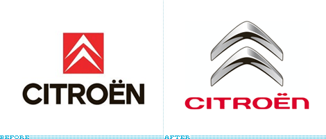
I will start this by saying that I am not a car person, I haven’t owned one in more than eight years and beyond the obvious subjects, my appreciation of cars and their makers is limited. Given the amount of e-mails I received about the redesign of French manufacturer Citroën, I am going to assume that their cars and brand mean a lot to a lot of people.
Continue reading this entry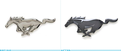
I don’t know much about cars, or what makes a good car good, and I haven’t owned one in five years, but somehow I know that Ford Mustangs kick ass. Or at least they appear to. Regardless… as Ford prepares for the launch of the 2010 edition of the Mustang they have issued a press release for the redesign of the badge. Fitting somewhere between logo design and sculpture, this new pony comes with some of the most awesome (and I strangely mean this without sarcasm) press releasing: It’s just a faster-looking steed. → We lifted the head to make the pony more proud, tipped the neck into the wind to give it a feeling of greater speed and better balance. → It’s more chiseled and more defined and looks more like a wild horse. And indeed it is! It really looks like it could do even more ass kicking than the previous version. The differences are hard to discern so I quickly put this overlay together (yellow is the new badge). I love it when companies obsess over details to make a stronger visual, reminds me a little of Matthew Carter’s redrawing of the MoMA logo. Giddy up!
Thanks to Jason who already reported it on his blog for the tip.
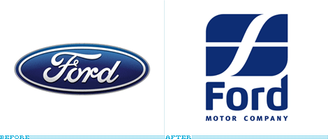
Amidst concept cars, sneak previews, and other automotive-based pyrotechnics during the New York International Auto Show this past week, Ford Motor Company quietly deployed its new logo to attendees of the show and will roll out a full unveiling later this month. For an industry where identity is everything and decades of legacy can stall any possible change, it is surprising and commendable that Ford would drive away from its script, oval logo that has been around since 1912 and sustained few visual evolutions.
Continue reading this entry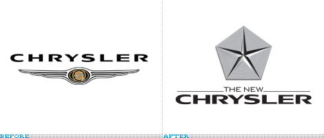
The only thing more exciting than a large merger — and the ensuing identity design — is the occasional demergeralization. It’s like a divorce on steroids times hundreds of millions of dollars. The latest case, as you may have heard, was the separation of DaimlerChrysler, formed in 1998, as Chrysler Holding LLC in the U.S. and Daimler AG as its German counterpart. — nicely down the middle, just like any good settlement. Chrysler, now blatantly dubbed “New Chrysler” (New Coke anyone?), has revived its old logo, the “Pentastar”, for the new chapter in this company’s life.
Continue reading this entry
Guest Editorial by Ryan Hembree
“Go ahead. Stare.” That is the challenge posed by the new tagline for Armor All, a product used by millions of car enthusiasts to clean, shine, and protect their dashboards, steering wheels, and tires. And by spending some time staring at this newly revised brand we can see definite improvement in its execution, as well as some potential pitfalls.
Continue reading this entry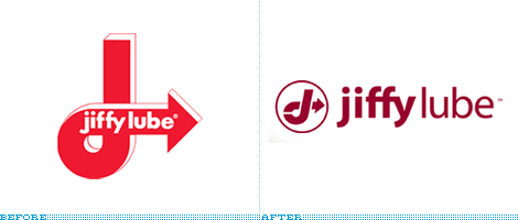
Jiffy Lube, the quick oil change company, decided it was time to update their highly recognizable mark and go horizontal. Jiffy Lube was founded in 1979 and was the first company to have a drive through service bay — signaling a new trend in the business of oil-changes.
Continue reading this entry
Unless you are a car enthusiast or are one of the few civilians that can open the hood of a car and can name any of the numerous alien parts found in that Pandora’s Box, going to a car mechanic is one of the most horrible experiences. Right up there with dentists and taxes. Since 2001 I have not owned a car, and that lack has been even more adorable after my experience in Atlanta, GA where I owned a very used, $2,000 VW Jetta that broke down every other month. I found a 5-foot, arms-like-stones mechanic that talked loud and fast and from whom I never understood what was wrong with my car, other than it required hundreds of dollars to be fixed. This mechanic, however, wore a uniform and worked for Midas. I felt somewhat assured that this was the equivalent of going to a Genius in the Apple store. And it is this sense of security and confidence — and the reason for my long-winded story — that Goodwrench has strived to instill in GM owners since the late 1970s when it launched its Goodwrench program where all dealers of Chevrolet, Buick, Pontiac, Oldsmobile, Cadillac and GMC cars had to meet a level of efficiency and knowledge to fix all the cars that would inevitably need fixing.
Continue reading this entry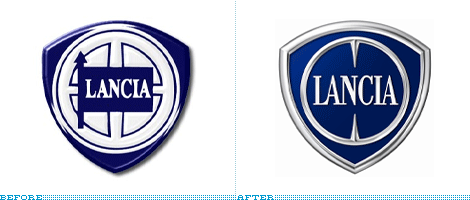
For some reason — contrary to my usual disdain for shadows and gradients — when it comes to car logos I like mine shiny and bevely. As If yanked from the hood of the car and glued to a business card. Italian automobile manufacturer, Lancia, celebrating its 100 years of car-making, has just launched a new identity designed by Italian design firm Robilanti Associati. While retaining the original and, I assume, recognizable shape, Lancia was able to add a hefty dose of attitude to the new badge, and they are not hesitant to play it up; from their web site: “… the shield has more depth, the 4 spokes have become 2 aggressive points….” Aggressive is rarely a word used to publicly describe any corporation. This new logo exudes car-ness and luxury, via a nice condensed serif (with a mean LA ligature) and is well positioned to support the new tag line, “The Evolution of 100 Years of Elegance and Attitude.” Now, that’s how I like my car logos.
Thanks to Jon Fredkove for the tip. Large image of the logo after the jump.
Continue reading this entry(Total Number of Pages in Automobile: 1)


