

![]()
While it was the LA Lakers that lost to the Boston Celtics in this year’s NBA Finals, perhaps the most devastated losers were the Minnesota Timberwolves that traded their 10-time All-Star for a handful of younger players: It was like watching your ex boyfriend or girlfriend break up with you, then seeing him or her marry the greatest catch, have kids, and live in a white picket fence house with a golden labrador retriever. So, maybe unrelated, a little facelift was in order for the Timberwolves, who unveiled a refreshed primary logo during last week’s NBA Draft. It’s a fun game of spot the differences, and there are some nice tweaks like the highlight in the wolf’s face, and the lettering is less fangy.
Continue reading this entry

White socks. Trolley dodgers. Expos. Metropolitans. Frightening, right? It’s one of the many things I love about the game of baseball. Non-threatening mascots. Bears can be scary, but a cub? That’s just cute. Oh sure, you can hate a Yankee (just ask anyone down south or from New England), but they don’t really make you quake unless you’re still living in the 1860’s or the one facing Joba Chamberlain’s 98-mph fastball. Minor League does it even better, with its vast array of gentle souls. Mud hens and Zephyrs. Express trains and Isotopes. Awesome. So I welcome our feisty but not angry wood chewers from the northwest, The Portland “Lucky” Beavers, back to the club with their updated, old-school and, most importantly, friendlier identity.
Continue reading this entry![]()
The Major League Soccer (MLS), currently in the process of expanding from 13 to 16 teams by 2010, recently announced its 14th team, the Seattle Sounders FC as an expansion team. The Seattle Sounders FC were named after a public poll that included the names Seattle Alliance, Seattle FC and Seattle Republic (you can read the rationalizations for these names here) as well as providing a “write-in” option for the fans to propose something they liked. With 14,500 registered fans, 50% of the votes were write-in options and, from those, 49% offered a variation on the name of Sounders. Now, I don’t know how many of you are familiar with the history of Seattle soccer — I certainly wasn’t — but the Sounders is a name associated with Seattle soccer since the 1970s, first with the Seattle Sounders that played in the North American Soccer League from ‘74 to ‘83, and currently as the Seattle Sounders — four-time champions! — of the United Soccer Leagues (USL) First Division since ‘94. The MLS’ Seattle Sounders will use “FC” (Football Club) to differentiate themselves from the USL Seattle Sounders… although I’m not clear if the USL Sounders are going away. At first I couldn’t understand who would call themselves the “sounders” but, I’m guessing, it’s in honor of Seattle’s Puget Sound, the body of water that’s their pride and joy.
Continue reading this entry![]()
Earlier this morning I set out to write a one-paragraph review of this logo. It’s 10:15 p.m., I’m missing the Oscars, I have nearly 20 tabs open in Safari, and I’m just now finishing to unravel the epic evolution that involved one reputable sports logo firm, a few hundred designers (and non-designers surely), a contest, and, of course, a committee. In 18 months. Ready? The story starts when South Dakota State University (SDSU) started to transition into the Division I of athletic competition in 2004, but it only starts to really unspool in October of 2005 when the athletic director noticed how bad its logo was in comparison to the other slick logos of DI schools. So they enlisted New York-based Phoenix Design Works (PDW) to tackle the challenge — but not before asking another firm to do “some preliminary designs”, whatever that means — with the goal to unveil a new design in February of 2007. From what I gather PDW started working on the logo somewhere in late 2006. In October of that year, PDW showed up to SDSU to present 30 design options, and as a response, the committee “took the representatives north of campus to watch jackrabbits running” hoping that this experience “would help them design a jackrabbit that fits SDSU better,” because, “their previous exposure to jackrabbits was online photos.” This should tell you enough about the process.
Continue reading this entry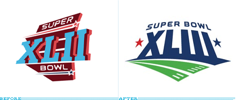
Less than 24 hours after Super Bowl XLII aired on FOX, NBC (which will air the next Super Bowl) unveiled the logo for the XLIII edition of the Super Game in Tampa Bay during a commercial break of American Gladiators, hoping to get their audience excited and their DVRs programmed 364 days in advance. There are a couple of firsts for this logo: The first, and the somewhat ridiculous, is that it’s the first logo unveiled a year in advance, which Dick Ebersol, Chairman, NBC Universal Sports and Olympics pegged as simply “an initial indication of how excited we are to broadcast the Super Bowl”; and, second, it’s the first Super Bowl logo to use green — something that I found quite amazing actually, given that for three hours straight you are looking at a couple of dozen figurines (including the zebras) battling on a giant field of green, so go figure. The logo is meant “to reflect the natural elements of Tampa Bay, including the blue and green hues of the regional waterways and landscapes” and if you are wondering what the towering numbers in perspective represent, it’s “an abstract representation of a stadium and field.” Emphasis mine: Just a stadium? Any stadium? Okay. Like any major sports event logo, this one is meant to look bigger than life and exciting beyond belief, and it does so as well as the rest. The obvious critique is that this Super Bowl could take place anywhere, as there is nothing specific to Tampa Bay — maybe there is nothing about Tampa Bay to be specific about? — to make it unique, and neither did the last one, where at least something could have been made out of the Cardinal’s shiny new stadium… Maybe we are just seeing the start of the latest trend in this category: Perspective + Dimension + Stars +/- Slab Serifs.
Thanks to Daniel Peck for the tip.
![]()
Guest Editorial by Von Glitschka
As a kid I grew up collecting baseball trading cards. I never worried about getting the entire set, I just collected the players I liked best. As far as the product was concerned it was pretty low-grade card stock, cheap full-color printing on the front with a one spot color uncoated back. The rock hard stick of chewing gum that came with each pack would often ruin the card next to it, or stain it with the white powder that coated the gum. This went on year in and year out throughout my childhood with a few new companies coming on the scene but still using the same tired methodology. In 1989 a new rookie company entered the trading card game. Its name was Upper Deck.
Continue reading this entry
Hello! I’m Jonathan Selikoff, along with Jim Palmer, Tim McCarver, Dick Vitale, Mel Allen, Dick Enberg and Dr. Joyce Brothers. Join us, for this all-important contest between the logos and uniforms of the old Tampa Bay Devil Rays and the 2008 Tampa Bay Rays.
We’ve got a heck of a competition tonight, don’t you think Dick?
Continue reading this entry![]()
These Girls Rock is the “brand platform” launched in 2005 to support the positioning and five-year plan of the Ladies Professional Golf Association (LPGA), and mid-way through that plan the LPGA has unveiled a new identity. Well, in addition to being a little chauvinistic by labeling the women of golf Girls (or is that just me?) the new identity developed by SME doesn’t necessarily Rock.
Continue reading this entry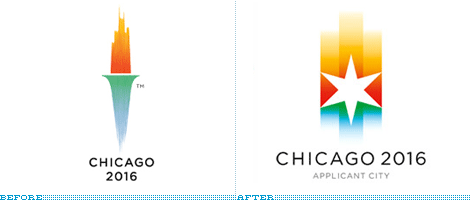
Almost a year ago, the city of Chicago unveiled its Olypmic applicant city identity and was welcomed with rare fanfare from the design community. Smart, surprising and sophisticated were all regular compliments — and these are only the ones that start with an s. Then in May of 2007, the International Olympic Committee (IOC) changed the rules of the bidding process for cities, with one clause stating that city logos “shall not contain the Olympic symbol, the Olympic motto, the Olympic flag, any other Olympic-related imagery [such as] flame, torch, medal, etc.” Chicago 2016’s skyline torch was now breaking the law.
Continue reading this entry![]()
Dear New York Yankees,
I love you. Let’s get that clear from the start. It’s unconditional. I loved you when you traded for Ken Phelps I loved you when you finished in last place in 1990. I loved you when George was banned, and still loved you when he came back. So I hope you understand that what I’m going to say is said out of deep embrace than of callous embitterment. I can’t be bitter; I’m not from Boston.
So, here’s the deal: your all-star game logo, for the final, wonderful year of Yankee Stadium, sucks.
Continue reading this entryPrevious Page | Next Page
(Total Number of Pages in Sports: 3)


