


![]()
In February of 2008, the Major League Soccer awarded the city of Philadelphia an expansion slot to become its 16th team and start play in the 2010 season. Operating since then under the snoozy name of MLS Philadelphia 2010, the team finally unveiled its new name and identity yesterday in front of Philadelphia’s historic City Hall: Philadelphia Union.
Continue reading this entry![]()
Last season’s ridiculous record of zero wins against sixteen losses for the NFL’s Detroit Lions makes its glory days of four NFL championships, the latest more than fifty years ago in 1957, a very distant past. Truth be told, the woes of its football team should be the least of the city of Detroit’s worries, but few things can bring the citizens together as an exciting sports franchise and the Lions are doing whatever they can to bring a little bit of hope to Detroit, and a new identity for the Lions may not be the salvation but at least it’s a diversion. Yesterday’s media announcement of the new logo would have been more climactic had the logo not been leaked by the NFL itself nearly a month ago when the store posted a toy 18-wheeler featuring the new logo.
Continue reading this entry![]()
Hosted by the Asian Football Confederation, Asia’s governing body of soccer, the annual AFC Champions League features the best clubs from each country competing for Asian soccer supremacy. This past December they unveiled a new identity aimed towards the new and growing generation of soccer enthusiasts.
Continue reading this entry![]()
I vividly remember the day I stopped watching baseball: It was the day I never started watching it. In part this makes me completely inappropriate to judge anything related to a team with one of the most ardent set of fans, but just as well, this objective detachment from the history of the Boston Red Sox or any nostalgia towards their iconography may be the best suited to pass graphic judgement. This week, the Red Sox unveiled new primary and alternate home and road uniforms plus a new(ish) logo. (Plenty more images and news if you search online for “New Red Sox Logo.”)
Continue reading this entry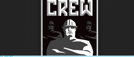
![]()
The United Football League (UFL) is a new professional league that is set to begin its first season in August of 2009 with eight teams in markets where that other professional football league isn’t and if it doesn’t get crushed by lack of ratings or attendance it will probably serve as sort of a minor league for the NFL. This week the UFL unveiled a new shiny logo. I really like the color choice, I think U.S. professional leagues get too enthralled with the red-white-and-blue combo that they forget other colors exist; I like that it’s the green field and the open skies above, although I’m sure they’ll play at night or in closed stadiums. The type is, well, whatever, it’s footballish. The ball and star icon are a little awkward, and I’ll leave it up to everyone else to say what it looks like. The overall shape is interesting — it reminds of the New Jersey Nets logo — as it avoids pure symmetry, which can sometimes make a logo hard to work with, but it also makes it stand out. I would have loved to see this without the shading and gradients and just the shadow of the ball and star, would have been pretty strong. While play begins for the UFL you can play Name Consultant and suggest team names.
Thanks to John Quijano for the tip.
![]()
Earlier this year, the city of Seattle and the Seattle SuperSonics owner Clay Bennett came to a $75 million-agreement where Bennett would be able to get out prematurely from his lease at Key Arena and take the team to Oklahoma City, while Seattle retains the SuperSonics name, rights and history so that one day it can have its team back. Introduced officially yesterday — although apparently leaking out slowly over the past few months — is the name and identity for the NBA’s “newest” team: The Oklahoma City Thunder. If the name doesn’t make you shake in your seat out of electrifying excitement neither will the logo, not even with lukewarm blurb about it: “With a nickname denoting energy and power, a classic-look logo, and the colors of an Oklahoma sunset […]”. Perhaps the most misguided, dispassionate and lackluster professional sports logo produced in recent time. There is nothing unique, memorable or thunderous about it and the cornucopia of elements thrown in there never make a cohesive whole. Quite dispiriting to see a blank-slate opportunity missed so harshly.
![]()
This coming October will be the inaugural season of a new venture from the International Ice Hockey Federation: The Champions Hockey League, that will see the best Hockey teams from Europe battle it out. The simple, yet elegant press release offers the following explanation on the logo: “The most prominent part of the trade mark has the shape of a hockey puck, where two hockey stick blades meet. In the middle of the puck, the rink’s centre ice area is shown — with the centre circle and the centre line — depicted.” If they’ve already put so many things in the logo what stopped them from throwing in a Zamboni, goals, and referee? IIHF President added “It’s simple, it gives you an immediate association to what you want to communicate and it conveys a touch of class.” You heard it here first people… gradients, bevels and glows are the new class. Sarcasm aside, the new logo feels oddly non-European and maybe a tad too American, or a tad too Second Life, there is no sense of restraint or focus, and the typography is downright clunky. Feels like being hit in the teeth with a puck.
Thanks to Andras Sudy and Ivan Philipov for the tip.
![]()
If 100 yards feels like too many or being subjected to the whims of nature is not your thing, then indoor football might just be what you need, and there is a new league waiting to fulfill your full-field-length passes: The Indoor Football League (IFL). Created from a merger of two existing leagues, United Indoor Football and (the awesomely named) Intense Football League, IFL will bring together the teams from each league for next year’s season.
Continue reading this entry![]()
The New Orleans Hornets — celebrating its 20 years in the NBA, shared with the recently nip-tucked Timberwolves — have updated the logo that has basically remained the same since 1989. It even survived the move from Charlotte to New Orleans for the 2002–2003 season. Could we be experiencing a new trend? Of designers, marketers and team owners recognizing equity where there is some? Instead of swatting away known icons for the sake of change? Anyway, there is really not much information about this logo, other than this post, so like the Timberwolves logo, it’s nice to just look at a before and after and dig on the evolution. The old hornet was rather campy with its Mickey Mouse gloves, perplexed expression and funky shows, while the new one is smirkily confident, has better kicks and lost the gloves. The drawing of the basketball is much better too. The typography remains as funky as the old one, it’s neither good nor bad, it just seems to revel in oddity and awkwardness. A nice update all around.
Continue reading this entryNext Page
(Total Number of Pages in Sports: 3)


