

NOTE: This is an archived version of the first incarnation of Brand New. All posts have been closed to comments. Please visit underconsideration.com/brandnew for the latest version. If you would like to see this specific post, simply delete _v1 from the URL.
![]()
Hudson’s Bay Co., founded in 1670 by King Charles II, is a huge Canadian retailer with over 600 retail locations all across Canada. They have four diverse outfits: The Bay is their full-line department store, Zellers is their mass-merchandise department store, Home Outfitters is the kitchen, bed and bath arm of the operations, and Field’s (sorry, no site) follows up as the deep discount offering.
Looking to the previous brand identity for Hbc, one would guess that the four color stripes twisting through the black box represented each of their outfits — though that’s where the visual connections clearly end. The creative Director for Arcade Agency (the firm hired to handle the redesign), Pablo Mozo sums it up well: “The problem with the old logo was that no one knows what HBC meant and what that represented… Was it a TV station? Was it a bank?”. NRDC Equity Partners, who bought Hbc back in 2008 and instigated the rebranding, decided to move away from the Hbc acronym and return to using the full name “Hudson’s Bay Co.” This shift back to their roots was echoed in Arcade Agency’s design which repurposed the original company coat of arms to create a modern crest that included Hbc’s four emblematic colors. As Mozo notes: “It’s definitely steeped in tradition, in terms of stripes and the crest, but made clean and modern to show that it’s still relevant today… It’s taking the heritage and updating it without reinventing it.”
This redesign is a vast improvement, providing more context and heritage than the previous, generic logo. The rendering is clean, consistent and scales well without being overly cold or lacking character. While it could be argued that the current identity has little to do with retail outfits, this is a corporate logo that will likely find itself more often beside the likes of Olympic logos (as they’re currently a national partner) than featured prominently in department stores. It was a smart move to leverage a heritage that helped build a nation rather than searching for some trendy visual gimmicks. Plus, think of all the great opportunities there are to extract the visual elements of a fox, cervidae and beavers (ok I admit, I’m exaggerating a bit)! Overall, a vast improvement that should see them through for a while.


Jump to Most Recent Comment
Adam Fuller’s comment is:
Adding the stripes of color crowds the design a bit much for my tastes. Personally I would have come up with another way to implement them, or just remove them all together.
A nice, if not somewhat generic improvement overall though.
On Mar.19.2009 at 07:01 AM
Remy Overkempe’s comment is:
Are those beavers as common charges?
I like the update. The previous logo was way too generic and plain, and while I, at first glance, still don't have a clue what the company is selling (vacations? yachts? nature thingies?), at least I get a pretty picture to help me in the right direction. And yes, the rendering is beautifully clean.
On Mar.19.2009 at 07:14 AM
Kim’s comment is:
Oh, so THAT'S what HBC stands for. I always assumed it was Home-Something-Something. A big improvement, then, for clarity if nothing else.
On Mar.19.2009 at 07:23 AM
keith’s comment is:
A very nice update. The new logo screams "heritage" yet colours keep it tactfully modern. A company that makes me proud to be Canadian!
.. even if it's owned by Americans.. grumble..
On Mar.19.2009 at 07:32 AM
Josh’s comment is:
I always enjoy crests with "animal standing on hind legs with appendages motioning toward or on crest". Really.
On Mar.19.2009 at 07:45 AM
David’s comment is:
The stripes are NOT a reference to the organizational divisions of the company. They are a reference to the colours in the famous Hudson's Bay Point Blanket, first sold by the company in the 18th century and which remains a signature product of the company:
http://en.wikipedia.org/wiki/Hudson%27s_Bay_point_blanket
On Mar.19.2009 at 07:48 AM
Michael J. Young’s comment is:
This is a real improvement. With such a rich heritage, it was a shame to simply do away with it all.
Nice use of the signature colours too. In Canada those coloured stripes are probably even more synonymous with the Bay than any logo.
On Mar.19.2009 at 07:56 AM
Lucas Human’s comment is:
I appreciate the move away from the old logo. But I feel that the stripes are a little heavy handed on the new logo. And I am not sold on the 4 small rodent looking animals in the crest. I would like to see what would happen if the 4 colors were in place of the 4 animals on the crest. Just a thought.
On Mar.19.2009 at 08:30 AM
Craig’s comment is:
And I am not sold on the 4 small rodent looking animals in the crest.
It's a beaver. As a Canadian, we love the little guys and I would think that most of us welcome the inclusion of the beaver in the crest of a company so steeped in rich Canadian heritage.
On Mar.19.2009 at 08:35 AM
Lucas Human’s comment is:
Oh, ok sorry. So there are 4 beavers? Then in such a case I think I am still not sold on the redundancy of 4 beavers in the crest. I am sure I would like the little guys too, and as for inclusion within the crest, maybe there is a different solution.
On Mar.19.2009 at 08:41 AM
Josh’s comment is:
I think the beaver is pretty iconic, especially given the history of HBC. It would be hard, at least, to miss the significance.
On Mar.19.2009 at 08:55 AM
Mat’s comment is:
I really like it and think it works quite well. The thing is (and I don't mean any offense by this) is that as non-Canadians, the redesign is hard to evaluate on more than just a design scale. The Bay is something very unique to Canada, so it's significance is likely lost on those not from here. Another point I'd like to make is that to a Canadian, the redesign and brand make perfect sense without further explaination.
On Mar.19.2009 at 09:05 AM
Erik at Logo Critiques’s comment is:
I'm not liking the color stripes of the mark. It's already complex and busy, the color pushes it over the edge.
I think the mark could benefit from some simplification. The fox on top of the crest seems unnecessary, why add another animal to the mix (already have the deer & beavers). The hill that fox is sitting on is weird too, it doesn't really fit the rest of the design. Then there are the beavers in the crest, I wish the left left ones were flipped so they all face the center.
All in all, there's a lot that bothers me about this mark.
On Mar.19.2009 at 09:05 AM
Gentleman Agitator’s comment is:
Excellent! Finally, a present day company sees the value in their own brand history and culture. They also see the value in Canadian patriotism and history. Great job! I also see how you could separate either element, the crest or the stripes and have a separate mark for different things. And the crest is REAL heraldry unlike some made up marks from the likes of Ralph Lauren or Tommy Hilflinger.
On Mar.19.2009 at 09:08 AM
Emily Brackett’s comment is:
This seems to be a thoughtful rebranding. At first glance I thought the before & after could have been mislabeled, because we've seen so much of a move towards acronyms and oversimplifying of graphics. It's a welcome change, and I think it's very appropriate based on their history.
However, as some have mentioned it could stand to be simplified. This does seem like an identity that will need to be applied in a very wide variety of formats. Like maybe a labeled stitched into a garment? That could be tricky.
On Mar.19.2009 at 09:13 AM
Smirker’s comment is:
I like it... the stripes will really help distinguish it from every other crest out there. When you see it all teeny-tiny on their corporate sites the stripes make sense.
On Mar.19.2009 at 09:37 AM
Nisio’s comment is:
Lovely job, nice balance of modernity and heritage. They'll need a landscape variant of the logo with the type positioned left and enlarged for web and other applications.
On Mar.19.2009 at 09:50 AM
Canuck’s comment is:
I second Mat's comment, you likely need to be Canadian to really evaluate this. Most major Canadian cities have large a HBC store built in the early 1900s, which is the flagship store for that city. HBC features in our history curriculum, because it had a major shaping role on our country. So, to play off the history is a wise move. Yes, the original coat of arms  is quite awkward. Yes, the stripes may not make sense to people not familiar with the Hudson's Bay Blankets. But to Canadians, intimately familiar with these details, this is a great move. Also, they did a decent job working with what was a fairly awful original coat of arms. As a semi-graphic-design-literate Canadian, I think they did a great job.
Glen Turpin’s comment is:
I don't like it. But I love it.
Right now, the front page of their Web site says, "Founded in 1670 by King Charles II, the Hudson’s Bay Company played a vital role in building Canada as a nation." That's not bluster. That's fact. How many other retailers can make that kind of claim? This isn't a design that you can evaluate from a purely visual standpoint because, as several commenters have pointed out, the design elements are steeped in historical meaning that is only apparent to Canadians.
If you're not Canadian and you don't get that, it's okay. Just recognize that there's a lot more going on here that you understand.
I don't think there's any question that this is a tremendous improvement over the previous logo.
The stripes are immediately recognizable and familiar. The colors feel more contemporary while simultaneously being closer to the historical colors on the iconic blanket. Stop and think about that a second. Canadians recognize those stripes because they've seen them for centuries on blankets and coats. That's brand equity. As a logo element it seems like a bit much when the logo stands on its own, but the integration of the logo on their web site design makes it work.
The typography is vastly improved. I don't even know what to say about the previous version.
I think the criticism of the composition of the crest expressed by some of the other commenters may be well-founded from a design perspective, but again, thinking of the logo as a key visual expression of the brand, this isn't a simple design decision. If you're going to use a 325 year old heraldic device, you can't arbitrarily pick and choose which design elements you keep. You can clean up the execution of an extraordinarily baroque composition, or you can choose not to use it at all. Hudson's Bay Company obviously wanted to re-connect with company's history through the coat of arms and this is an accomplished rendition.
Also remember that this is not a retail brand. It's the corporate logo of the parent company of several retailers, each of which has its own unique identity. This isn't going to be stitched on apparel, appear on point-of-sale displays, shopping bags, and whatnot. We'll see it on business cards, letterhead and Web sites.
Going back to where I started, if I look at it from a purely visual perspective, I don't like it much. But as a Canadian, it speaks to me very clearly and powerfully.
John Leschinski’s comment is:
Thank god. That HBC logo was such an eye sore. The crest is so iconic it's hard to imagine any other suitable solution for a company like HBC. Love the blanket stripes too.
On Mar.19.2009 at 10:09 AM
dance’s comment is:
I am not a design person but a historian, and this logo is very interesting. I feel as though a change like this has political implications, in that HBC was also very much involved with the First Nations peoples in early Canada (and I'm no expert on that history to know whether there is especially bad blood there, or the HBC was generally legit in their treatment). Wikipedia says the blanket's main purpose was to trade to First Nations for beaver pelts. I love the idea of going back to the history and building on tradition rather than jumping for trendiness---but in 2009, to be recalling the early days of 1670 in a form that really doesn't allow them to do anything other than romanticize the hunting? Hmm...
On Mar.19.2009 at 10:41 AM
drewdraws2’s comment is:
Hearing the reaction of the Canadians on here has cemented my thought that this is a great rebrand. Working with an awkward coat of arms, they've created something that will age well and be relevant for years to come. My only issue is with the stripes. Although I understand the importance of them for the brand, I would have liked to see them a little better integrated. All in all, a nice job.
Now are they going to start redesigning the individual store brands and websites? They are possibly the worst lineup of logos and websites I've seen from any major brand.
On Mar.19.2009 at 10:43 AM
D Hansen’s comment is:
Another Canuck voice here to emphasize how this 're-design' is more of a 're-turn' to the company's roots as a fur-trading/frontier-expanding bastion of Canadian history (though not the only one; don't forget those NWC pirates!). Every element of this mark has historical significance - as stated above, the four colors refer to the famous wool point blankets sold by HBC, on which four bars indicated the highest quality. You can still buy them, and they still are very much a 'Canadian' object.
Personally, I think the previous logo was a poorly executed attempt to modernize their image, effectively removing most historical or cultural references, rendering it meaningless. This redesign/return is appropriate and meaningful... though I do wonder if another solution could have been found for the bars, which are a bit obnoxious. Perhaps four vertical bars centered underneath?
On Mar.19.2009 at 10:48 AM
AJ Kandy’s comment is:
I think it's great. Maybe what it needs is just a slightly pixel-tweaked version for the web, but as a symbol, it encapsulates everything good about the Hudson's Bay Company and the relationship Canadians have with it.
On Mar.19.2009 at 11:07 AM
Kristi’s comment is:
Wow. I love this new logo. I no longer have to shove my Bay bag in my purse cause of the ugly logo.
Also thank you "canuck" for posting a photo of the crest, it is such a beautiful piece of our history and I enjoy seeing it.
Christian Palino’s comment is:
To part of Glen Turpin's comment: This isn't going to be stitched on apparel. We should note that while this will likely ring true in retail environments, our mention of this new logo appearing next to the Vancouver Olympics logo was drawn from understanding that the logo will in fact appear on all official Olympic apparel, athlete uniforms and advertising initiatives surrounding the Games.
On Mar.19.2009 at 11:34 AM
alexandra’s comment is:
Love hearing all the comments from the Canadians.
The new logo seems like a big success; they have leveraged a huge amount of national pride/identity.
On Mar.19.2009 at 11:37 AM
Cailin’s comment is:
I'm glad that they've switched back to Hudson's Bay Co. Now when I shop there I will feel like I'm trading pelts with the exciting company I learned about in 7th grade history class, and not like I'm buying a curtain rod from a modern company I actually don't like very much.
On Mar.19.2009 at 11:46 AM
Glen Turpin’s comment is:
Christian Palino:
Good point. I hadn't seen that.
Rachel’s comment is:
Very nice. At first glance I thought the logos had been accidentally reversed, since I'm not familiar with the company. It was a pleasant surprise to see that a company was actually going BACK to an old-fashioned, traditional-looking logo, rather than getting rid of an iconic image in favor of something trendy. The "before" logo looks like it should belong to some sort of home shopping channel.
I actually love the "redundancy" of the four beavers in the crest. It makes me smile to look at it, because it just seems so playful and silly (in a good way, Canadians! I'm not trying to insult your beloved beaver!), especially when used in a logo that could have been quite self-serious.
On Mar.19.2009 at 11:49 AM
David’s comment is:
The thing as a whole (the use of the coat of arms, the stripes, and the use of the full name of the company) work together to give me, as a Canadian, a good feeling. It appeals to the immensely important role this company has played in Canadian history. Yes, there are design quibbles (the stripes are perhaps too dominant, I'd prefer to see the word Company spelled out instead of abbreviated, etc). But evaluated against the people who are its principal consumers, this logo sends all of the right messages.
Their challenge will be to bring the messages of this logo to their retail stores, which occupy a much more everyday space.
On Mar.19.2009 at 12:09 PM
Luc Doucedame’s comment is:
I love the stripes ! This is a great example of how to leverage brand equity & heritage to create something completely new and fresh. Fantastic Eh?
On Mar.19.2009 at 12:31 PM
freddygirl’s comment is:
Design must work in a cultural context and to me, this is an example of design doing that brilliantly. There are no HBC retail stores in the US... all that matters is that the design works for Canadians. And it does! Most of us recognize the crest. Most of us know exactly what those four stripes represent. Most of us know HBC was built on the beaver pelt industry. So it totally makes sense. I love it and can't wait to see it in use.
On Mar.19.2009 at 01:14 PM
Mark’s comment is:
This logo seems like a step backwards, at least the previous one LOOKED like a logo, this looks way too much like a government seal.
It's not bad, it just doesn't look like a logo. It's too complex.
On Mar.19.2009 at 01:25 PM
Mark’s comment is:
Okay,okay it's a logo.
I wasn't sure though.
On Mar.19.2009 at 01:29 PM
Kim Siever’s comment is:
A couple of thoughts.
As a Canadian, I love the new logo. Specifically, I like the integration of the stripes with the white background (compared with the black of the previous logo). The logo looks like it could have been taken from the back of an HBC blanket, which were white.
Second, I find it interesting the company is going back to such a patriotic logo given they were bought out by American firm NRDC Equity Partners last year.
On Mar.19.2009 at 01:43 PM
richard winchell’s comment is:
As has been mentioned a few times here, this redesign works very well in its context, which is Canada, and only Canada.
The crest and stripes have been a part of HBC for over 300 years, so there's some serious brand equity involved here.

From a design perspective, I think this is a great streamlining of a very distinctive crest, and for me, the stripes are well-integrated.
This is a wonderful example of why knowing the context of a piece of design is important for judging it properly.
On Mar.19.2009 at 01:51 PM
kristin’s comment is:
I don't think there could be a more perfect logo for HBC. I personally love the way the stripes are integrated.
On Mar.19.2009 at 02:36 PM
Alec’s comment is:
As a Canadian and was a British Overseas citizen, the royal style symbol, logo, crown... etc are what I (we) familiar and admire to.
The "old" HBC logo is a mess even for Canadian, we have no clue what it means even inside The Bay department store, not because we never heard Hudson's Bay but that's a weak approach to simplify the full name. Like stock symbols, not much people can remember companies' full name.
A logo represents a brand (a corporate company in this case) to deliver a message to target and non-target audience. The "old" logo did nothing to achieve that. Heritage symbol with beavers, moose... and the 4 color stripes may not be attractive in 2009 if no historic stories supporting them. As people mentioned, target audience are not shoppers, so the logo must built to represent company's 300 years heritage. With the "new" logo we all knows more about this company.
Arcade Agency did a good job to transform the monogram from the detailed signage, clean and nice shaped. Straight color stripes now remind me how they shown on the blanket and stayed away from the monogram could be the best way to reproduce artworks for different kind of printing method, like stamping or embossing in monotone.
I'm sure there are more design options from Arcade, but who decided to pick this one? Guys at Hudson's Bay mostly, that's their identity.
On Mar.19.2009 at 03:09 PM
Winston Steele’s comment is:
Just an interesting observation to add to the conversation:
I took particular notice of the quote from Pablo Mozo (“The problem with the old logo was that no one knows what HBC meant and what that represented… Was it a TV station? Was it a bank?”) because a short time ago there was a barely-better HBC logo that did, in fact, answer those questions.
It was in circulation for a very short time immediately prior to the most recent 'black-box-with-wavy-stripes' iteration. It was quickly replaced - presumably - to either have the iconic stripes included or to not narrow the scope of the company to simply 'retail'.
That l'il 'handle' at the top of the black box told you exactly what HBC was ... which is, in of itself, an interesting study in iconography.

Ben Muldrow’s comment is:
I want to add a little more about the company history which really make this design very thoughtful in my mind. The four stripe are from the original point blanket system. A field of cream with red, yellow, green, and black to blue depending on the dye lot. The reason that they were called point blanket was because they were used as trading currency for beaver pelts. The signature four point blanket would have four black lines, or points, and would be traded for four beaver pelts, thus the four beavers in the logo. You can like it or dislike it compositionally, but the crest has a lot of meaning to the fundamental history of commerce the company created
On Mar.19.2009 at 04:55 PM
Nathan Derksen’s comment is:
Hear hear, as a Canadian, I totally agree that this logo is a significant improvement. "The Bay" (as pretty much everyone calls it in normal conversation) went for the longest time referring to themselves as "HBC" in their advertising, particularly with their HBC rewards card. It actually took me some time to realize what it stood for, or even that it was related to the Bay at all, even though I have shopped there many times. The "HBC" logo and designation totally destroyed any association with the store. I'm glad to see it gone.
On Mar.19.2009 at 07:24 PM
Matheus’s comment is:
This is a good update, from a nonsense-rainbow to a crest. Way to go
On Mar.20.2009 at 02:12 AM
Panasit Ch’s comment is:
Oh the new logo is so charming. Very playful for an emblem. Contain a lot of symbolism but not too busy.
I wish they make a polo shirt with this logo on it. I'll buy it in a second.
On Mar.20.2009 at 09:05 AM
Brian’s comment is:
Can't believe it took new American owners to make this much needed change. Perfect re-design of the classic crest. Kudos Arcade!
On Mar.20.2009 at 09:43 AM
damon’s comment is:
Ha, I an interview at Arcade once, it was just a one man shop that farmed everything out to freelancers back then, now they're doing national rebrands? not too shabby.
I'm surprised the job didn't go to amoebacrop, the agency responsible for most of the bay's design work / campaigns, and one of canada's best design agencies http://amoebacorp.com/
I like the redesign personally. I've always had a thing for coats of arms, and if there is any company operating in north america today that can pull one off it's the hudsons bay company. It has got to be the oldest operating company on the continent. The bars may seem awkward to people, but if you're from canada, as mentioned, they're very iconic of the store. They're a part of their brand fabrics used for at least a century.
On Mar.20.2009 at 11:53 AM
PS’s comment is:
A minor point: some of the crests depict two moose and others depict two elk.
I prefer moose!
Overall, a vast improvement over the old version, but even taking into account the historical value of an old Canadian image, the crest itself is a bit 'meh.' I appreciate that they are, as others have pointed out, trying to recapture their history rather than rewrite it. I think it's an image that will grow on me over time.
On Mar.20.2009 at 04:59 PM
Sara’s comment is:
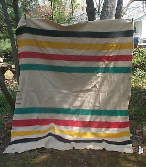
Hi. Being Canadian I feel the new logo is way better than the "before" logo. But the logo BEFORE THAT ONE was ok too. Also, the colored stripes are the most identifiable part of it for canadians, because they have a trademark blanket with those stripes on it. http://www.chezmarianne.com/textiles/tex_images/4pt_oldhb1.JPG
it
They sold these wool blankets to trappers at the beginning of Canada itself (even before?). I can see why americans my not identify with the stripes, but everyone in Canada knows someone with this blanket. I like the crest, feels more historical, as it should.
Shawna S’s comment is:
I'm glad they didn't make each of the elements a different color and eliminate the stripes. While it is a very busy logo, the crest manages to stick out. I'm not a huge fan of it as a logo - I feel they should be simpler - but it isn't offensive.
On Mar.20.2009 at 07:37 PM
lyndi parrett’s comment is:
i see a hunting department store from this.
On Mar.21.2009 at 02:09 PM
Rich’s comment is:
There's an explanation of the moose-and-elk problem on HBC's heritage site.
On Mar.22.2009 at 11:28 PM
marnie’s comment is:
This makes me positively gleeful. I think it's so well done that it doesn't even look new: at first glance I thought it was just an announcement that HBC was finally dropping the hideous corporate branding and picking up it's old logo again. Which, to some extent, it is. Let's just chalk the twisting bars of colour up to an unfortunate blip in an otherwise nice progression from 17th century.
Like most of the other Canadian commentators, I welcome the re-design.
On Mar.23.2009 at 10:07 AM
jRod’s comment is:
not being Canadian, i can't tell you the personal impact of the new brand. but from an outsiders point of view, i can't help but be reminded of late 80's early 90's clothing logos. the main reason for this is the color bars. i think the crest is wonderful and a serious step up from the previous logo, but the colors just kill it dead.
i agree with earlier commentators... find a way to integrate the colors (tastefully) or get rid of them altogether.
On Mar.24.2009 at 11:27 AM
Bruce’s comment is:
A great and much-needed update. The previous mark looks like a telecom company. The four color bands remind me of native American blanket designs. The crest could probably be further simplified, to help the overall simplicity of the design.
On Mar.24.2009 at 04:25 PM
Mongoose’s comment is:
So, being non-Canadian, even after the fine explanations in the comments I'm sure I'm still lacking some of the proper import and effect of the historical crest.
But it is a crest, and that fact comes through clearly and obviously; any company that's been around for 300+ years darn well should be using some of their historical legacy and import in their logo. I think the new one is an excellent modernization, without being the maybe-telecom, maybe-hotel group, no they're really a clothing shop? prior logo. Still, the older logo had some sleekness and charm.. but the new one is far superior.
I mean, you have a fox sitting on the Cap of Maintenance. That is an excellent historical goofiness that should not be done away with.
I give it an A-, because it still seems a smidgen busy with the stripes. But this, this is nice.
--Mongoose
On Mar.26.2009 at 02:16 PM
Michele Champagne’s comment is:
The Hudson's Bay Company: http://en.wikipedia.org/wiki/Hudson's_Bay_Company
On Mar.31.2009 at 10:40 AM
Morgan’s comment is:
It's interesting that soon after HBC is bought buy an American company (which was contraversial considering the Canadian heritage of it) that this American company now wants to return to HBC's 'heritage'. Good marketing ploy to ease tensions.
On Apr.07.2009 at 02:30 AM
Ashley’s comment is:
I love this new design.
Typographically it is strong. The only problem I see is that the period should hang so that O in CO visually aligns with the edges of the stripes.
On Apr.14.2009 at 03:25 PM
Allan Ailo’s comment is:
As a Canadian and a heraldist I am impressed with the new logo and could identify it (and with it) at first glance.
It is refreshing to see a company celebrate its heritage and history. Why should they not incorporate the coat of arms into the logo? It has been in use since 1670 as part of the company's visual identity.
The design of a coat of arms is adaptable as the graphic style is not set and it can be depicted in another form without the arms being compromised. As long as the blazon (the official written description) is accurately followed when drawing the design, there is creative latitude graphically. Therefore, coats of arms are very practical for corporate identity use as they can provide continuity without becoming outdated. Furthermore, arms can, and have been, used in many different media (carved in stone or in wood, in metal as a 3D object, etc.).
I believe that more Canadian companies can benefit with the use of a coat of arms. Since 1988, with the creation of the Canadian Heraldic Authority, corporate bodies (and individuals) in Canada have been able to petition for a grant of arms.
One point to remember is that the proper term is "coat of arms" or "arms". In this context, a "crest" is actually one part of the arms, the object at the top (in this case, the sitting fox).
On May.05.2009 at 07:28 PM
mario's pants’s comment is:
On the one hand it's really successful as a reminder of the brand's heritage while on the other, it screams "brand extension". Like a logo on a 350th anniversary sweater or hat. It certainly has enough swag littering the design to interest the Versace set so it could gain some high street cred for the brand.
I'm not convinced it's a keeper, however. As a branding element for "The Bay" (who's logo I never really liked) it works, however.
On May.06.2009 at 02:31 PM
Armitage Shanks’s comment is:
If the colors were incorporated into the beaver shield (one per quadrant) it would have made the mark cleaner and less cluttered...
On May.08.2009 at 03:31 AM
Esteban’s comment is:
These startups always have bizarre logos...
Seriously though, I like the coat of arms, but the stripes looked dated. I would take off the stripes and add a little color to the coat of arms, emphasizing the red Cross of St. George and the four brown beavers.
On May.25.2009 at 11:05 PM
Paul Grant’s comment is:
The HBC redesign from 2002 was the stronger design. It eliminated the unnecessary - over the top flourishes and such, smoothed out and bolded up the coat of arms, and did away with the attention-robbing stripes. All they needed to do was remove the circular encasement and write "Hudson's Bay" underneath. Loose the "Co."... it's very jr. brand sounding.
On Jun.02.2009 at 03:36 PM
Alyssa’s comment is:
I don't like it. The colored stripes look horrible ...and four beavers? It looks really cheap to me.
Glad I don't live in Canada so I don't have to see that horrid logo.
On Jun.03.2009 at 02:32 AM
Comments in Brand New, V1.0 have been closed.


