

NOTE: This is an archived version of the first incarnation of Brand New. All posts have been closed to comments. Please visit underconsideration.com/brandnew for the latest version. If you would like to see this specific post, simply delete _v1 from the URL.
![]()
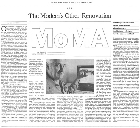
Here is a fun one for the beginning of the holiday season. Sent in by a brand tipster — have I told you all already how much I love the tips? If not, well, let me be thankful for that this Thanksgiving — this is an almost impercebtible before/after of the Comcast logo. It is not uncommon to have logos redrawn for performance and legibility issues, but I am not convinced Comcast needed this treatment. Sure, the old “t” was ghastly, but still understandable, and I think I may like the old “s” better, although it looks like a transplant from Helvetica into Avenir, approximately typeguessing, as all the characters (old and new) feel customized.

Above you can see an overlay of the old and new, with the old logo at 100% opacity and the new one at 50%, where you can tell where some of the detailing went. This exercise reminded me a little bit of Matthew Carter’s redrawing of the MoMA logo four years ago… Except, well, this one wasn’t done by Matthew Carter.
You can see a bigger view of the article here, and read the story (and discussion!) here.


Jump to Most Recent Comment
Tim Van Damme’s comment is:
This is awesome stuff! Much respect to the person who convinced everybody within the company to put time/effort/money in this re-align! The result looks more in balance!
On Nov.21.2007 at 09:08 AM
Mark’s comment is:
Wow.
hehehe.
The change is so minute it's almost unnoticeable, wow.
Never the less the change looks better, I wish I could say the same for the most of their commercials.
On Nov.21.2007 at 09:33 AM
ChrisM70’s comment is:
It's a small tweak, but I'm sure it's enough to make people forget that Comcast is spying on their customers and blocking Bit torrent files.
"Logo fixed! We're no longer Evil!"
On Nov.21.2007 at 09:50 AM
Jasper’s comment is:
The arc fits better around the c now, which is more balanced, but also has the effect of making the c look smaller, at least to me. Overall, an improvement though.
On Nov.21.2007 at 09:54 AM
BWJ’s comment is:
Bring back the old "s" and I could agree that it's much more balanced. But they swapped out one bad letter (t) for another one (s).
I would like to know what something like this costs the client, and how many hours it costs the firm.
On Nov.21.2007 at 10:03 AM
Ty’s comment is:
The original T always bugged the crap out of me, I'm glad to see it updated!
On Nov.21.2007 at 10:07 AM
Anonymous’s comment is:
This has been used for over a year now.
On Nov.21.2007 at 10:28 AM
Armin’s comment is:
Well, then, it's about time it got recognized.
On Nov.21.2007 at 10:35 AM
Andrew J Klein’s comment is:
I wonder if this was done at the request of the client or agency.
By the way, both logos appear to be at 50% opacity, neither is at 100%
On Nov.21.2007 at 11:14 AM
Darrin Crescenzi’s comment is:
Agreed, Jasper. The way the arc wraps around the C is much more considered. An update for the better, though admittedly I probably wouldn't have noticed this one in the wild. I'd like to think that is due to an aversion of all things Comcast, and not a lack of perception. But that's probably wishful thinking.
On Nov.21.2007 at 11:15 AM
Unit B’s comment is:
Wow! I guess this is where my cable rate hikes have been going. This was implemented a year ago?! Miserable company, bland, nothing redesign.
On Nov.21.2007 at 11:20 AM
Andi’s comment is:
oh, the wasted time and energy to fix a "t" and "s"! Honestly, Comcast should put that money into better customer service, more reliable internet, or at least better commercials.
On Nov.21.2007 at 12:37 PM
Dave’s comment is:
Maybe they actually made the 's' look more like a snake to represent the company's evil ways. If that's the case, great job!
On Nov.21.2007 at 01:02 PM
cee’s comment is:
"oh, the wasted time and energy to fix a "t" and "s"!"
Revising a logo is a waste of time and energy? I can appreciate Comcast refreshing their logo, even if the new "s" is worse than old one.
On Nov.21.2007 at 02:33 PM
Joe S’s comment is:
I don't want to suggest that I don't appreciate Comcast's decision to update their logo. I think it's great when a company understands the equity their logo can have. I also think that this is an improvement overall, but I have to agree that the new 's' is all wrong. It reminds me of times that classmates of mine in design school would select a typeface for a logo that didn't have an ampersand and so they'd just drop in one indiscriminately from another typeface. It's just wrong. I'm impartial to either 't' in all honesty. I think the new 't' is too generic and the old 't' is just obtuse.
On Nov.21.2007 at 03:58 PM
TheUprock!’s comment is:
Is it just me or did they change the red too? It looks different from the left sample to the right, but that could also be the result of grabbing the logo from two different sources, one of which didn't use brand standards.
On Nov.21.2007 at 04:29 PM
TheUprock!’s comment is:
Is it just me or did they change the red too? It looks different from the left sample to the right, but that could also be the result of grabbing the logo from two different sources, one of which didn't use brand standards.
On Nov.21.2007 at 04:29 PM
TheUprock!’s comment is:
Is it just me or did they change the red too? It looks different from the left sample to the right, but that could also be the result of grabbing the logo from two different sources, one of which didn't use brand standards.
On Nov.21.2007 at 04:29 PM
Dale H.’s comment is:
I actually prefer the new s/t relationship. Relatively speaking, the old s and t were more at odds with each other and the more tightly knotted, denser s blocked the flow of the word. (Not that anyone would notice if the two logos weren't side-by-side.)
The new, airer s recedes back into balance with the other letters and links more smoothly into the t-bar.
I understand the designer's thinking. I'm just not sure this redesign was worth it; it's still a nothing logo.
On Nov.22.2007 at 12:05 AM
dale harris’s comment is:
I agree with Dale H. Great name by the way.
On Nov.22.2007 at 01:26 AM
Gary Wales’s comment is:
You have to admire the effort that's gone in to shoring this logo up.
Personally, the whole marque is now balanced - the "m", "s" and "t" are so much better - there's no straining.
Nice one!
On Nov.22.2007 at 06:45 AM
damon’s comment is:
I like the M is WAY better.
the T also, bit unsure which S I prefer....the new one I suppose.
On Nov.22.2007 at 01:38 PM
willzager’s comment is:
I think Jasper was exactly right with the arc making the c look smaller. In my sight that in turn makes the o looks extra big...other than that it looks great though.
On Nov.22.2007 at 06:59 PM
Anonymous’s comment is:
Why couldn't they just ditch this logo? They're stuck in the '90s with the dreaded swoosh/arc thing.
On Nov.23.2007 at 06:26 PM
disgruntled designer’s comment is:
it looks like a bad pc default of the original version. i never noticed how small the "c" in the arc looks. now that's going to annoy the hell out of me anytime i see it.
i bet this "rebrand" cost no less than 150k.
On Nov.23.2007 at 07:02 PM
Gm’s comment is:
'No less than' $150,000 ?
Not a chance in hell.
On Nov.23.2007 at 10:28 PM
Jeff’s comment is:
I would wager we'll see the old logo for quite sometime. I doubt the company will call for an overhaul of its entire fleet of vehicles for so minute a change - a change that only experienced designers will probably note.
On Nov.26.2007 at 03:54 AM
C-Lo’s comment is:
Hooray for font substitution?
On Nov.26.2007 at 08:59 AM
EnergonCube’s comment is:
Nice. The evenness in the type's color is much improved. Comcast is still the Devil, though.
I curse thee back to Hell!
On Nov.26.2007 at 12:52 PM
cee’s comment is:
"i bet this "rebrand" cost no less than 150k."
Why are people so focused on cost? Whatever Comcast paid they understand that design has value. I wish more people understood the value of design.
On Nov.26.2007 at 03:00 PM
A’s comment is:
I agree the type is better but, really is that enough to be considered rebranding. They need to get rid of the 90's swoosh and update the whole logo. Having the red swoosh makes you unappreciate the new type choice.
On Nov.29.2007 at 05:26 PM
Mattus’s comment is:
I wonder if anyone outside the small elite of graphic designers will notice the difference or gives a shit if they knew the differerence.
I can't imagine that this change will effect the business of Comcast in any way, nor good, nor bad. Therefor it's a waste of time and money and I really doubt the mental state of anyone who seriously things that the relationship between s/t has improved or that the 'm'is so much better now.
The person who convinced the management of Comcast to approve this treatment should be promoted to VP Sales. If you can sell this, you can sell anything
Matt’s comment is:
Whether or not any one thinks that Comcast is "The Devil" I do have to admit that over all the logo looks better. (no matter how minute the change is) sometimes the smallest details will effect things in the biggest ways...
On Dec.01.2007 at 12:38 PM
Matt’s comment is:
Whether or not any one thinks that Comcast is "The Devil" I do have to admit that over all the logo looks better. (no matter how minute the change is) sometimes the smallest details will effect things in the biggest ways...
On Dec.01.2007 at 12:38 PM
Adam’s comment is:
Nothing was made of the release. The majority of the company still has no idea that the logo has changed. That is why it took all this time for anyone to notice.
The major rebrand happened back in 2004–2005 when they started with the "Comcastic" stuff.
On Dec.02.2007 at 12:38 PM
Char Alfonzo’s comment is:
Yeah, the orginal T used to bother me so much. It looked foreign when you compare it with the rest of the letters.
On Dec.04.2007 at 01:05 AM
Hugh’s comment is:
"I wish more people understood the value of design."
Uh...yeah.
People like Comcast? They took a crappy logo and spent a dumptruck full of cash to come up with...basically the same crappy logo.
That's not "understanding the value of design," it's an absolutely classic example of Design By Committee. A company widely recognized as being actively evil could have used the power of design to reinvent themselves. Instead, they used it to reinforce the idea that they...how you say? Ah yes: suck.
On Dec.04.2007 at 06:13 PM
Char Alfonzo’s comment is:
Well, I don't think they were trying to go for something totally different... The logo went to the hairstylist for a trim not for a full haircut.
On Dec.15.2007 at 04:37 PM
Wheezbuh’s comment is:
Less than a week ago, I was actually thinking, "When is Comcast going to get a logo redo? This sucks." Apparently the drastic change I was hoping for is not coming any time soon.
Interestingly, I largely disagree with most of the opinions about the revision being an improvement. I would say a few of the characters—in isolation—look more refined. But when I see the two versions side-by-side, I can't stand the new version.
To my eyes, the old version is what it is. The 's' and 't' characters don't really look like they are part of the same font. However, the general nuance is very geometric in form (a la century, avant garde, etc). The last half of the new logo looks ever-so-slightly squashed... like somebody sat on the 'a' and messed up the form. (Though I will confess, the new 'a' looks like it rests on the baseline more comfortably than the old version). I also notice that the ends of the 's' and the 'c' don't quiet work together.
On Feb.02.2008 at 04:43 PM
Anonymous’s comment is:
ummmmm actually the logos should be reversed.
the after comcast logo is the old and the before comcast logo is the new one.
i work for comcast i have the files :)
On Feb.20.2009 at 02:54 PM
Comments in Brand New, V1.0 have been closed.


