

NOTE: This is an archived version of the first incarnation of Brand New. All posts have been closed to comments. Please visit underconsideration.com/brandnew for the latest version. If you would like to see this specific post, simply delete _v1 from the URL.
![]()
Dollar General has 8,400 retail stores, $10.5 billion in annual sales and everyday low prices on everyday products. Its new identity has been designed by Interbrand Design Forum, who share with us the positioning and rationale they worked with.
Brand positioning:
We provide top brands and quality alternatives to her at the lowest prices so she can provide her family with all the essentials and treats they’ll love. We understand she wants a great quality of life, but has to manage it on a modest budget. We operate the same way, with clean, no frills stores that provide ease, convenience, and friendly service to her. Helping her save time, save money, everyday.
The identity design rationale from Interbrand:
Our identity is our signature icon. As our brand ambassador, it proudly celebrates our heritage of delivering value with the “stretched dollar” shape of the carrier and the straight-forward typography of our wordmark. Our identity is friendly, bold, simple, and energetic. Our core brand colors, yellow and black are our most sacred brand equities and have been carefully balanced to maximize the impact of our identity.
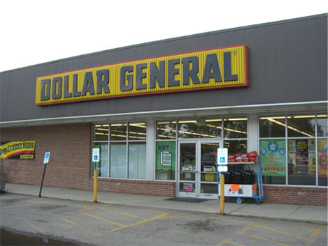
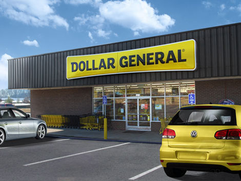
Old (above) and new (below) store exteriors.
Some of what you would expect is happening here. Updated typography to try and strip out some of the dated feeling but still retain some of the quirks. Focusing the color palette on the yellow and black, two-color scheme, rather than the previous three-color scheme. A payoff — “Save time. Save money. Every day!” — to speak to their audience about their intention to embody a convenient shopping experience with low prices. And the new visual gimmick that communicates stretching a dollar. All the pistons firing away to bring you this bright, shiny, new 1992 Mercury Sable. That’s really the first analogy that came to mind: it’s the low-cost model that was based off of another low-cost model. While it’s true that Dollar General is a generic store with convenience and low prices, there still remains no differentiator in the brand presence between them and other establishments. The red, black and yellow previous logo, with its condensed boxy letters had some equity and was easily identifiable. This new identity, while cleaned up and feeling a little less 1968 and a little more 1992, still appears like it came right off their shelves.


Jump to Most Recent Comment
john’s comment is:
Lipstick on a pig.
I dunno, what else were they gonna do? It's easy to mock with great vim and vigor, but I suppose they had an eye towards their target market, which probably wouldn't respond favorably to anything radical. I'm sure I won't remember I saw this by lunch.
On Apr.24.2009 at 08:39 AM
kristin’s comment is:
What's with all the "she" and "her" talk in the brand positioning? Eek.
On Apr.24.2009 at 08:42 AM
jen’s comment is:
well kristen, the target consumer is female.
On Apr.24.2009 at 08:46 AM
Mrs. M’s comment is:
The tagline is expected, so I doubt it's going to register on anyone's radar. That said, it's neither good nor bad. And perhaps that in itself is bad in that why'd-you-even-waste-the-time-to sense. Even a horrible tagline would be more memorable.
The pinched holding roundtangle has rudimentary cunning: pinching pennies, squishing prices, reducing costs. It adds a tiny bit of jazz, but that's about it.
The typography irritates me, though. I keep thinking this belongs in a cartoon world. It isn't offensive, the letters are nothing special, but it has an ounce of quirkiness that smacks of an animator's idea of adding flair to the backdrop.
The whole thing is sort of twee, sort of bland.
I'm curious if they'll update their ghastly interiors. It's been years since I've shopped at Dollar General (my mother swears by this place), but I recall wanting to shower each time I left one. The food aisle was particularly scary.
On Apr.24.2009 at 08:47 AM
CJ’s comment is:
I love that they think people with Volkswagen GTIs and BMWs will be shopping there!
On Apr.24.2009 at 09:18 AM
SR’s comment is:
^^I go to Dollar Store to get last-minute giftwrap / ziploc, etc...it's just smart shopping, for non-perishable items at least.
I don't think it has anything to do with the vehicle I drive. I know of countless people who are affluent, well-educated, (male or female), drive BMWs (sometimes different ones) who would stop by every now and then @ DS as well.
I agree that they do need to clean up their stores though! As for the rebranding, it's unnecessary, just not worth the effort.
On Apr.24.2009 at 09:29 AM
Josh’s comment is:
The only thing that really bothers me about it is that it still reads GENER AL. Otherwise, it's an update.
On Apr.24.2009 at 09:30 AM
Ryan’s comment is:
That was my first thought, too, CJ.
On Apr.24.2009 at 09:31 AM
Ryan Adair’s comment is:
Not too impressive. I like the way the 'R' looks, that's about it.
Look! It even makes the weather more beautiful! WOW!
On Apr.24.2009 at 09:36 AM
jRod’s comment is:
Yeah, right there with you, CJ. I drive a GTi and I hate that place.
I will admit that the logo is a vast improvement though. Only problem is that the buildings that they are married to are really ugly little things and make every neighborhood they are in look poverty-stricken.
Also, not a big fan of sentence fragment tag lines.
On Apr.24.2009 at 09:48 AM
Stuart’s comment is:
It is clear to me that many who post here are either not graphic designers or not very good ones. Not every project is going to be the next Nike rebrand. Sometimes you have to work with more down to earth clients on more down to earth projects and this is a perfect example of that. Despite the tracking issue between the R and A of GENERAL, this is a very well done rebrand. It still holds some of the equity of the original brand, with the D and the yellow background, while giving it a nice facelift and breathing new life into a brand that had fallen by the wayside. I don't shop at Dollar General stores and even after this I don't plan to make it a habit but I can recognize a good rebrand when I see it.
On Apr.24.2009 at 09:48 AM
Chris’s comment is:
This looks to be an improvement. The enclosure shape is distinctive in a subtle manner, and as Mrs. M noted above, it has positive associations for the brand.
But the typography needs refinement. It looks like the logotype is a mashup of several typefaces. In particular, the R stands out as a humanist letter amongst neo-grotesque counterparts (those R's do add more than their share of personality). In addition, the spur on the D could have been used more consistently.
But the overall effect is indeed "friendly, bold, and simple."
On Apr.24.2009 at 09:53 AM
Loyal Typo’s comment is:
great point stuart. no matter how much background info armin can provide, there will always be missing context that you can only get through client direction and knowledge of the consumer insights that tell the designer what equity a brand identity holds.
if you don't have this information, it is very easy to be critical of what may be a very effective identity.
On Apr.24.2009 at 09:56 AM
Maya’s comment is:
When I first saw Dollar General in PA, I it said to me I was going to find cheap, nearly expired stuff. I accepted that when I saw the name of the place and the type. Regardless of the logo, a dollar store is a dollar store and it has its use.
Now the stretched logo looks like I'm supposed to think about how far my dollar will go. It's an improvement, but I'm not sure it makes a difference.
On Apr.24.2009 at 10:02 AM
rwinn’s comment is:
what a disappointment - there is nothing memorable with this design. I will concede that there may have been constraints that limited the designer. What is even more disappointing is the rationalization from interbrand. "Simple, Bold, Energetic?" Simplistic, Safe, Boring!
would have expected better.
On Apr.24.2009 at 10:06 AM
Jacob’s comment is:
I understood the "stretched dollar" on the first glance. That part is very clear. As for the rest of it--nice update. Clear and evolutionary. It's just right for the store. I'm glad they didn't take the Payless Shoesource route and make some sort of stupid little medallion to plop onto the stores.
On Apr.24.2009 at 10:08 AM
Proverbial Thought’s comment is:
Looks like a a dog's squeaky toy newspaper to me. It is cleaner, but I don't like the ubiquitous shape of the new logo, and the yellow and black combo is as brutal as it was on the old logo, probably more so without the red IMO...
What bothers me most is that the logo raises it's voice to me on EVERY DAY! Seriously, do they need the added emphasis there? Makes me think about my mom yelleing at me for leaving my dirty clothes on the floor EVERY DAY!
Agree with the others, though it's an improvement, the change is totally unnecessary.
On Apr.24.2009 at 10:08 AM
thomas’s comment is:
great improvement. It's unfortunate the "LLA" in "DOLLAR" has so much space in it while "GENERAL" has almost none. I cant help but read "GENERAL" first, it almost looks larger.
On Apr.24.2009 at 10:12 AM
Andrew Klein’s comment is:
RE: Stuart’s comment : " It is clear to me that many who post here are either not graphic designers or not very good ones. Not every project is going to be the next Nike rebrand."
I was thinking the same thing, the Kerning Nazis need to settle down!
I think it's an A+ Re-brand. It's a logical step forward, clean, readable at a distance, not at all pretentious, and it doesn't have a damn "$" sign or dollar bill in it!
On Apr.24.2009 at 10:22 AM
Eli’s comment is:
I love it. I think it's dead on for the message they're trying to convey (Really Cheap. Not Disgusting). It'd do them a disservice and confuse the positioning to get an upscale identity. The use of the same colors and general shape allows this to be implemented relatively painlessly in the stores. Also, and maybe irrelevant, the Press Release quote kind of makes sense, especially against something like Packard Bell.
On Apr.24.2009 at 10:41 AM
Matt2’s comment is:
I would have kept the top serifs on the R's to better establish the connection with the old logo. And maybe experimented with contouring the letters to match the shape of the rectangle, thus emphasizing the "stretching" aspect.
It's certainly less generic looking, but otherwise I'm indifferent.
On Apr.24.2009 at 10:44 AM
Randy’s comment is:
Meh.
Doesn't do anything for me, and I dislike taglines.
And they really could have worked on the lighting for that mockup, there are two suns, I see.
On Apr.24.2009 at 10:50 AM
M.’s comment is:
You know, for what it is, it's a decent rebrand.
But that has to be the most depressing "after" in-the-field picture in the history of design.
On Apr.24.2009 at 11:13 AM
denny’s comment is:
Nice typographical change, but that "stretching the dollar" thing is so ham-fisted.
On Apr.24.2009 at 11:13 AM
buffalo one’s comment is:
in relation to Stuarts comment - "I don't shop at Dollar General stores and even after this I don't plan to make it a habit..."
How can you say it is a good re-brand if it hasn't changed your perceptions of the brand - if it doesnt change consumer behaviour, what is the point in re-branding? isn't that the very purpose?
I agree re-designs do not always need to be groundbreaking, but they at least need to serve a purpose
i agree with armin that while the re-design is nice enough, it hasnt added anything new to the brand
On Apr.24.2009 at 11:21 AM
Tim W’s comment is:
I dig it. I think the "stretched dollar" shape was a good choice. The old signage looked like it was pulled from a dumpster, while the new looks modern without looking overpriced. My only complaint with the sign is the line going down the middle... I assume that's just a quirk in the construction of the sign, but I think they could have accounted for that in the design... it's off center... it bothers me...
Aside from that, I think this was a step in the right direction. Now they just need to train their employees how to use a mop and they'll be all set!
On Apr.24.2009 at 11:24 AM
otto’s comment is:
I think the typography feels contemporary, and vaguely European, which is a nice change of pace.
Overall though, the identity leaves me feeling empty, with nothing of substance to grab onto or remember. The tagline offers nothing new.
Someone stated early on that "eye towards their target market, which probably wouldn't respond favorably to anything radical."
I think this is the wrong approach.
Designers in ivory towers, never produce compelling or relevant work.
Von K’s comment is:
Compared to the old logo, this is a huge improvement, IMO. Those heavy, condensed letters with the diagonal terminals felt like saw-teeth--like you could cut yourself.
I thought "stretching dollars" the instant I saw the new containing shape. Effective communication if I've ever seen it.
The new wordmark is much less scary and still a little quirky. That might seem like "background" to some, but really--how shouty should a wordmark be? Especially with the shape & tagline to share space with. Honestly, if the wordmark had any more going on, it'd probably be ghastly.
The tag line is friendly, overtly mom-targeted writing. It's there, and nice if you need to hear that sort of thing, but really it's elevator music. I'm glad they don't have it on the signage.
This is a budget chain. The identity should reflect that. If they had some masterpiece of design as the new logo, they'd be communicating the wrong thing. IMO, this logo is just right.
RE: GTIs and BMWs - I thought the same thing at first. On closer inspection, though, it could be Rabbits and Mazda 3s...
On Apr.24.2009 at 11:44 AM
Proverbial Thought’s comment is:
The fake autos are SUCH a distraction, I hope that image wasn't used for presentations. Sucha distraction, I can better remember that the person driving the VW is going to get a ticket for not having plates on their car than I can remember what the logo looks like, or what the tag-line is. That, except for being yelled at about EVERY DAY!
On Apr.24.2009 at 11:54 AM
Kevin Zwirble’s comment is:
I'm glad some folks spoke up and explained that what we do as designers cannot always be the flashiest, trendiest, most award-winning work. Rather, it has to be design that works for the brand, that talks to a specific consumer (in this case "her") and gets the job done.
I, for one think this is a very good update. Because that's what they've done, kept the equity of the brand while updating it, not redesigning it. They're trying to appeal to a new clientele while notr totally alienating their current one.
I think it's great that they've taken something that was designed during the time period of Little House on the Prarie and made it a little more modern. They tried to clean it up and give the folks that shop there and work there a little bit more pride in the brand.
On Apr.24.2009 at 11:55 AM
Lauren ’s comment is:
Fantasy vs. reality. Like everybody is saying, you can make a cheery PSD comp with nice cars, but the reality is that without store cleanup it's not going to be as reinvented as the comp shows. A dollar store is still a dollar store. But I applaud the persuasive art :)
New logo isn't "rustic" which is awesome. It's more modern than old-western, and a little reminiscent to me of Wally World.
I say good job with reshaping their previous logo. Wouldn't call it a resdesign.
On Apr.24.2009 at 11:59 AM
Stuart’s comment is:
RE: Buffalo One's comment:
"How can you say it is a good re-brand if it hasn't changed your perceptions of the brand - if it doesnt change consumer behaviour, what is the point in re-branding? isn't that the very purpose?"
I thought I spelled that out in my post clearly enough. While I appreciate that you seem to believe I am important enough to matter in the greater scheme of things and my patronage of this establishment will either make or break the branding redesign, alas it is not so. I can appreciate the work that went into the rebrand and see the positive direction the design took without it changing my perception of the store in general (no pun intended).
On Apr.24.2009 at 12:01 PM
Minder Singh’s comment is:
I think it's a nice update but I think they should've kept the red stroke. The most amazing thing about this post is finding out that Dollar General does $10.5 billion in sales. Is that right? That sounds astronomical.
On Apr.24.2009 at 12:12 PM
Lucas Human’s comment is:
Proverbial Thought’s comment is:
"The fake autos are SUCH a distraction, I hope that image wasn't used for presentations. Sucha distraction, I can better remember that the person driving the VW is going to get a ticket for not having plates on their car than I can remember what the logo looks like…"
Are you KIDDING ME with the cars. Get over what type of cars are in the image already.
And getting a ticket for no license plate...? Come on man.
On Apr.24.2009 at 12:12 PM
Pat Broderick’s comment is:
The new background shape is nice but the typography looks very awkward to me. They took stock Franklin Gothic and grafted weird tails on the D and R. I think custom lettering would've improved this greatly.
On Apr.24.2009 at 12:42 PM
Scott’s comment is:
Logo is pleasant enough. An improvement, for sure.
The tagline ... eegads. What's the point of the bold AND the exclamation point?
Overkill.
And did anyone else notice the "line" between R and G on the sign? That fold mark, line, whatever is not on the logo, but on the sign?
On Apr.24.2009 at 12:44 PM
Fish’s comment is:
Let me throw this one out there... I am betting, if one were to look past the "fake autos" into this solitary image that got posted. You might be able to begin to see some new signage in there! Unfortunately this is our only reference for such signage on this specific site.
But, in time, when we all begin to think outside the vacuum, we may realize that we could visit a new Dollar General store ourselves first had, and possibly experience the entirety of the brand refresh!
On Apr.24.2009 at 01:19 PM
koyo’s comment is:
Yeah, it's not brilliantness. Just a common logo. But I like the application on the market. I think that the new logo looks much better like web application (with a bit of 3D like in the picture). That give much life to the nwe brand.
A nice work, with really not much effort.
On Apr.24.2009 at 01:20 PM
Proverbial Thought’s comment is:
@Lucas Human
Excuse me? I am an impartial observer and I was EXTREMELY distracted by the bogus, phony cars. Are you saying that that is of no value? Remember, Dollar General doesn't service educated graphic designers; nor were they presenting mockups to GD PHDs. Thus, it is of EXTREME importance if fabricated elements draw away from the brand. That is, if you are able to step out of the Design bubble long enough to consider how the average consumer or board member thinks.
Case in point: how many comments have been made about that bogus rendering here? IT IS A DISTRACTION, and far more noticable so than the subtle "redesign" of the logo. The rendering would have been just fine with an empty parking lot as opposed to having a car with a sun reflecting from behind it and a shadow casting to its left WITH NO LICENSE PLATES. Make it look real or don't make it at all... That is EXTREMELY relevant to the rebranding efforts.
On Apr.24.2009 at 01:29 PM
damp pants’s comment is:
I do not understand why people that visits this site are soo negative. I do not like Dollar General and the stores are grouse but this new logo is much better than the old one by far.
And by the way to all of you that got cut up with the brands of cars in the parking lot ... money pinchers are usually the ones that have the most money, so this is not soo unusual.
A critic is not always a negative one.
Stuart’s comment is:
@Fish,
"But, in time, when we all begin to think,..."
Fixed your comment for you.
On Apr.24.2009 at 01:44 PM
Juan Marin’s comment is:
A decent facelift but certainly nothing memorable.
Compare to the rebranding that the competitors chain FAMILY DOLLAR did not too long ago, I believe this is better.
J
On Apr.24.2009 at 01:46 PM
Proverbial Thought’s comment is:
I'm just saying...
On Apr.24.2009 at 01:53 PM
Tymn’s comment is:
Stuart’s - Not every project is going to be the next Nike rebrand.
Thank you for pointing that out.
I think this rebrand is absolutely brilliant. It takes everything that I think of a Dollar General store, cleans it up and presents it new and fresh.
Tag lines are neither here nor there and are probably client driven. Type could use a little tweaking but that doesn't make it bad. The stretched dollar is brilliant and communicates the stores position perfectly, but is still subtle. They could have easily followed the trend of "lowercasing the type for a friendlier appearance" but didn't.
It's not Target it's a dollar store and they did everything right for this rebrand, great job guys!
On Apr.24.2009 at 02:06 PM
Fever76’s comment is:
It will look good until they do place a nice clearance banner, like this:

And, really? A clearance at a dollar store?!!
TFHackett’s comment is:
I just love that you titled this post Dollar Brand.
http://en.wikipedia.org/wiki/Dollar_Brand
On Apr.24.2009 at 02:26 PM
dg3’s comment is:
I like it.
On Apr.24.2009 at 02:37 PM
NicKLAUS’s comment is:
When I see yellow used as a primary colour in a logo, it says "Dollar Store" to me. So with this being said, I feel it works. As many people have stated here, what do you really expect? Its a Dollar Store. Its a place where in one aisle you can buy imported ichiban noodles made by a company you've never heard of, then go around the corner and get every Christmas decoration imaginable even though its in the middle of July. I'm never going to expect anything huge when it comes to dollar store branding. If it looked classy or impactful, people wouldn't think they could buy birthday candles or discount ball point pens. If the logo didn't look cheap, no one would expect cheap stuff, the store wouldn't make a profit therefor going against the entire reason why they would have done the rebrand in the first place.
Was that too much of a stretch to get to the punch line?
Oh well. Its a dollar store logo that looks like it should belong to a dollar store, and by golly, it does.
On Apr.24.2009 at 02:40 PM
Dale Campbell’s comment is:
Wonder if they subliminally want people to "stretch" their dollar as much as possible...
Sorry, I had to...
Keep well,
Dale
dg3’s comment is:

Tommy’s comment is:
So, i'm kinda confused by some of the comments..
a lot of you say that its hard to read because of too much space between "LLA" or GENERAL looks like GENER AL...
how would you change it? i mean, its the the letters themselves that are cause it to look like that. Would you just redesign the the uppercase L because it has too much whitespace?
i'm generally curious to hear what you'd do "differently".
On Apr.24.2009 at 02:58 PM
Kong37’s comment is:
Considering their objectives I'd say its a commendable update, although I wouldn't consider it a complete re-brand until I see a new integration store wide. Currently it serves it's external cosmetic purpose.
Similar to a face-lift: your upper chin doesn't droop anymore; but your still an a-hole.
On Apr.24.2009 at 03:18 PM
Von K’s comment is:
@ Proverbial: The police tape looks much closer to the old logo than the new.
On Apr.24.2009 at 03:25 PM
Stuart’s comment is:
@Tommy,
I would have made the R and A a ligature, connecting them at the bottom and tightening the space above more. The LLA is what it is and there's not a lot that could be done with that.
On Apr.24.2009 at 03:55 PM
Joe Sites’s comment is:
While you are at it, you should take a look at the rebranding of Dollar General's store brand food products. They gave everything a HUGE face-lift, rebranding everything as "Clover Valley" and, while not an amazing packaging set, it is a HUGE improvement over what they were using.
On Apr.24.2009 at 05:11 PM
John Mindiola III’s comment is:
Joe S, good call on the packaging. It's not bad!
On Apr.24.2009 at 06:42 PM
Mark’s comment is:
While the logo is certainly an improvement the !@*# I've been reading about what this company has been doing is unbelievable,certainly food wise. I don't think a simple logo change is going to make it all of a sudden go away.
Far from it.
On Apr.24.2009 at 07:21 PM
Anonymous’s comment is:
Granted that it's not entirely clear given the name, but why do people keep asserting it's a dollar store?
On Apr.25.2009 at 01:54 PM
alyxandr’s comment is:
Hey, at least they didn't go with Everyday!
On Apr.25.2009 at 03:32 PM
Matt Barnes’s comment is:
I've always thought it would be fascinating to rebrand a dollar store. Often our instinct as designers is to elevate the sophistication of a brand, but too much of that would be death for Dollar General.
On Apr.25.2009 at 05:50 PM
CJ’s comment is:
I was half-joking about the cars... Of course people with nice cars will shop there now and then... I stop into Big Lots once in a while with my MINI. I just thought it was a funny juxtaposition.
Overall it's a nice improvement for what it is and the kind of store it is. Personally I've always been confused as to what these stores are when I run across them before I enter... a dollar store? ...a general discount store? ...a grocery store? This new identity doesn't help that, just makes it look a little fresher.
On Apr.25.2009 at 06:20 PM
Serviceburo’s comment is:
I can't believe how short sighted some of the comments on this post are. Some of you really seem to be offended that this rebrand isn't artistic or worked far enough. Do you really think that the average lower class American really cares about the subtlety of the kerning? No, they just care that it's recognizable as the Dollar store, where they can get stuff for cheap enough to have money left over for a couple of 40's on the way home.
The more time that I spend on this blog, I'm realizing that the reason so much design I see now is terrible is due to the bourgeois gentrified lifestyles of the people making it. A closed system breeds entropy, plain and simple.
On Apr.25.2009 at 06:38 PM
NicKLAUS’s comment is:
@Serviceburo...
If people didn't speak out about how they don't like a brand or logo, then that would defeat the purpose of this blog. Even though the average lower class American won't care about the kerning, we will. So comments that may be perceived as short sighted should be either embraced if you agree or give a structured reason why you don't agree without calling it out as being short sighted.
On Apr.25.2009 at 07:55 PM
Mongoose’s comment is:
(Disclosure for disclosure's sake: My aunt works for Dollar General.)
Ahh, the good old Dollar General (Or its almost-identical competition, Family Dollar). Good places for cheap stuff and.. nothing in this rebrand really changes that. They're still going to be in small towns and lower-income areas; they're still going to have the 3 face towels for a buck deals, the staffing will be mostly comprised of the desperate or the surly. Wouldn't want it any other way, except perhaps cleaner.
And 'cleaner' is what the new logo is, and I must admit I like it. The stretchy outline beats the rectangle of red any day; it's the sort of thing that can go on store-brand packaging and merchandise at all sizes. Scales up well, scales down well.
The old font had some classy dated charm; keeping the 'D' tagged is a faint but positive echo. The Rs are nice in there, the N, not so much; it's less mass-of-black than the old font. It's a correct choice, but not one I really like so much as I agree with. Maybe it's just font-snobbery on my part, but then again, Brand New is the place for that.
I give it an B+ for a darn-lovely enclosure around an average but legible font.
--Mongoose
Replies
Christian: Well, y'know, those 1992 Mercury Sables are the ones that will still be parking outside the Dollar General more often than the VeeDubs and Beemers. Know your audience!
Scott: And did anyone else notice the "line" between R and G on the sign?
That's just because the sign is big, and goes up in two parts; Notice the old sign has the same effect, likely, they're trying to re-use old brackets and such.
On Apr.26.2009 at 12:35 PM
Roby Fitzhenry’s comment is:
It's better than it was. If it looked fancy, people wouldn't expect it to be a low-cost option and may go elsewhere.
Kudos to them on redoing Clover Valley though. It looks much nicer.
Dollar General is my source for BIC mechanical pencils within a walking distance so I will stay positive. :)
On Apr.27.2009 at 10:10 AM
craig shully’s comment is:
The thing that seems lacking in all the DOLLAR type stores is fun!
Why make the identities look so generic, so drab and uninspiring.
Add some interest and not make it look like "I hope nobody sees me going in here"
Dollar Stores have a real purpose and I think it should include a sense of "what will I find here". You got something for a buck or close to it and it feels good.
On Apr.27.2009 at 10:12 AM
Darrel’s comment is:
seems...pointless...
On Apr.27.2009 at 01:52 PM
Josh’s comment is:
The flaccid negative space on the ends where the background curves up is pretty sad. The old logo actually had better consideration of negative space, even if it was a very easy solution. Sure, it's out-of-date, but strong visual tension never goes out of style. The typeface was far more interesting, too, but, still, out-of-date
I've seen a lot of comments to the effect that lower income people don't care about good design. Sorry, but they may not notice good design, but it still has an effect on them. Good design doesn't get noticed at all, it just draws people to it. Doesn't matter their income.
On Apr.27.2009 at 05:04 PM
tez’s comment is:
We don't have dollar general in the country that I live in, however I personally think its a well executed brand. The typograpy is bold and generic assuming that all products sold are generics. The yellow dollar device is brilliant even if it isn't self evident as to what it is in the beginning. (I dare anyone to come up with something better). Frankly I think those of you who are moaning about it are the poor twats that didn't win the client pitch. I think intebrand has done a great job, and its a great step forward. for a brand that looked so dated to begin with.
BTW the GENER AL comment I think it fairly lame sure they could have pulled the kerning between the R and the A tighter even to the point where it joined however you'd get complaints that it joined. However the same could be said for the DOLL AR part too.
On Apr.28.2009 at 12:31 AM
Andrew O. Ellis’s comment is:
I want to clear up some confusion here, if I can. Dollar General and Family Dollar are not dollar stores in the sense that an "everything's a buck" type of place is. It's a discount chain, to be sure, but I think these brands pre-date that business model and the dollar in the name was meant to be evocative rather than a literal description of their price list.
THAT SAID, I think this is a decent rebranding for the target market and the company itself. My #1 problem with the existing brand is that it makes neighborhoods (including my own) look blighted.
The new version still looks cheap, but not ludicrously outdated. I'd rather live in a low-rent neighborhood than a run-down neighborhood, and I think that's a problem the new mark has solved well enough.
On Apr.28.2009 at 10:08 AM
Astro’s comment is:
wow, people getting hung up architectural renderings and the car that are in them. I have a feeling half of the people making these comments haven't set foot in a DG.
I think the logo is a nice subtle update myself.
On Apr.28.2009 at 11:04 AM
Proverbial Thought’s comment is:
Well Astro. The closest Dollar General to me is a 3 minute ride or ten minute walk. I go there often because I am cheap. The stores are sloppy, the aisles and products are poorly spaced, and the store layout is confusing. BUT the stuff is cheap. I guess in that paradigm, the logo PERFECTLY represents the store...
On Apr.28.2009 at 03:26 PM
Loyal Typo’s comment is:
somebody's cranky... and has been for about 3 days now
On Apr.28.2009 at 03:32 PM
Alex Pearson’s comment is:
Dollar General Headquarters is based about 10-15 miles outside of Nashville TN. Being a designer in Nashville I am actually a little miffed they didn't use a local creative firm. Instead they went to Dayton OH? Odd. I actually could have understood more if they went to Chicago or NYC, but Dayton? At that rate why not just keep it in Nashville?
On Apr.29.2009 at 11:58 AM
tnt’s comment is:
I was going to make a remark, but by the time I got to the bottom of the page to comment I had forgotten about what we were talking about.
On Apr.29.2009 at 11:59 AM
b.r.o.o.d.y.’s comment is:
Not an earth-shattering rebrand... But I still don't feel this redesign was a wasted opportunity. A wasted opportunity for what? It's a dollar store. There's nothing fancy about a dollar store. The design is honest, remains true to the brand, and that's good.
That said, the mock-up shots are hilarious. Yeah, I can afford an expensive, shiny, european brand-new car and yet I buy at the dollar store.
On Apr.30.2009 at 12:19 AM
Merrick’s comment is:
I'm more surprised by their revenue than anything.
On Apr.30.2009 at 12:37 PM
James R’s comment is:

Loyal Typo’s comment is:
look! a yellow-ish orange shape with black type in it...!!!!
On May.04.2009 at 09:36 AM
Loyal Typo’s comment is:
...that's not even the company's real logo anymore...!!!!!!!!
On May.04.2009 at 09:38 AM
PJ Chmiel’s comment is:
Looks like it was designed by the same "quirky" goofballs that brought us the recent logos for Long John Silvers, Pizza Hut, Red Roof Inn, Super 8, etc. These goddamn dollar stores and Walmarts are a plague on the country, but I liked the old DG logo and find this new one tasteless and awful. I know Americans keep getting stupider by the day but now major corporations seem to be targeting 8-year olds more than adults.
On May.06.2009 at 03:24 PM
Comments in Brand New, V1.0 have been closed.


