

NOTE: This is an archived version of the first incarnation of Brand New. All posts have been closed to comments. Please visit underconsideration.com/brandnew for the latest version. If you would like to see this specific post, simply delete _v1 from the URL.
![]()
Guest Editorial by John Feldhouse
King County is in Seattle, Washington. For those who are unaware of King County do not feel bad, you are not alone. I never heard of this county before (being from Atlanta) but I suddenly found myself wanting to learn more about it.
The county was originally named after William Rufus de Vane King, vice president under Franklin Pierce but was later renamed in honor of Dr. Martin Luther King, Jr. in 2005. The namesake change is part of a 20 year bi-partisan effort that began in 1986. Proponents of the renaming pointed out that William King was a slave owner in Alabama so they decided it was only right to change the namesake of the county.
The county chose Gable Design Group, a local design firm in the Seattle area to redesign the identity. A group of 28 other firms made a bid for the identity as well, the largest response King County has had for a design contract. The transition period will take roughly 5 years to change over all materials and should be complete in 2012.
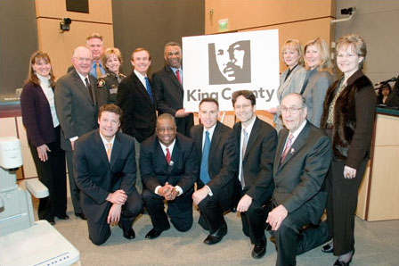
Council Members.
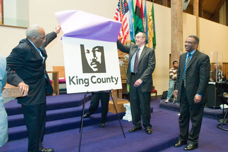
Unveiling.
The new mark clearly represents the county’s values and ethics. The mark is conceptually on point, stunning, classic and poignant. The designers at Gable Design Group took a real chance and created a bold mark that works. Tax payers will be happy to know it is a 1-color job to save costs, but this limitation is what makes the mark beautiful.
This is one mark that will have people talking about its socio-political effects for many years to come. Gable Design Group should be applauded for taking a big risk and creating a powerful and invigorating mark. As well the King County council that voted this mark into practice should also be recognized for taking a step forward. But with that being said, there is one big question to be asked.
The concern is the right to own someone else’s image. Certainly King County can’t own the likeness of one of the most influential leaders in American history. Or can they? Is this type of imagery limited to only the deceased or will designers be able to use anyone’s image? Where do we draw the line with copyright usage and appropriateness? This mark is beautiful but comes with some heavy debate.
To view the press release click here.

John Feldhouse graduated from Auburn University in 2005 and is currently working at Radiant Systems, a technology company based in Atlanta, GA.


Jump to Most Recent Comment
Paul D’s comment is:
I think the mis-use of the word "own" confuses the issue. They're simply using a representation of the man their county is already named after to symbolize it. They don't "own" the face of Dr. King, nor do they have control over how others display pictures of him. They're not even using it as a commercial trademark. I fail to see any issue at all.
On Mar.28.2007 at 10:25 AM
Splashman’s comment is:
I have no problem with the mark -- it works, and is appropriate. My only complaint is on the typography. Is there no one in that design "group" who knows anything about kerning?
It's frustrating to see so many otherwise decent logos marred by awful-to-mediocre typography. My eyes can only roll back so far in my head.
On Mar.28.2007 at 10:45 AM
Christian Palino’s comment is:
The visual issues:
As a logomark, the rendering and use of a single color will be versatile and hold up well over a range of applications.
The new typography is rather lifeless – likely also attributed to the lock-up which seems stale and doesn't work well with the square logomark. Perhaps a more asymmetrical aproach to the lock-up would have helped the typography and overall impression seem more contemporary.
It would also be useful to understand if the identity will only use a black and white palette, or if there will be other color applications. I imagine that a different color applied to the same mark would change it significantly.
. . .
However the "big question" is the most relevant here. Legal ownership aside (as that could/would be determined by a court if it came to that – which raises the question, did they get permission from The King Center?), the idea that an organization can adopt a personal life/legacy and do as they like with it seems irresponsible. We are discussing branding here and turning someone's likeness into a brand and then yielding it as you like – irrespective of that individual's consent, or at the very least the consent of his family – is simply disrespectful.
The actions of the organization will undoubtedly be linked to the guise they are using, and in the same way as using that likeness of Dr. King will bring certain ideas, principles and inferences to the organization, so will the orginization bring ideas, principles and inferences to the memory of Dr. King.
To me, this was a cheap way to try and simplify someone's life into a set of principles and then adopt them for your personal/organizational use and gain. And no less, done to one of the nation's greatest civil leaders.
On Mar.28.2007 at 11:05 AM
L.Vazquez’s comment is:
The logo doesn't strike me, but that's only because the treatment of the image has been used a few dozen times by the design 1 classes taught at the college I work at. Plus, I think it's too simple and unchallenging, but that's just my take. Positives... well... I'm forced to agree with the author on most issues.
As for likeness 'ownership' issues... I know that at one point, The Franklin Institute uses a likeness of Benjamin. Also, the Lincoln Financial Group uses a likeness of President Abe, top hat and all.
On Mar.28.2007 at 11:42 AM
Shazbat’s comment is:
Seattle is in King County, not the other way around. King County encompasses much of the progressive part of Washington State, including Seattle and environs.
The best part about this mark is that it'll piss off the rabid right-wing Republican racists who populate eastern Washington. Too bad they didn't use Coretta Scott King's image instead, because that really would have blown their feeble, Fox News-addled brains.
On its own merits, this logo is a fantastic rendering, I agree.
On Mar.28.2007 at 12:17 PM
John Muir’s comment is:
Great job.
I think the ethical issue would only arise if the logo were for a private company. So long as the county doesn't go crazy at some point in trying to enforce ownership in an inappropriate fashion, it seems just as right as any institutionalised iconography.
On Mar.28.2007 at 12:29 PM
rykodisc’s comment is:
huh.
apparently all designers are not created equal.
i see nothing in the least exciting about this mark. as mentioned the typography is ham-fisted, and the rendering reminds me of my introductory 2D class. this strikes me as an exciting and highly visible challenge but for the most part, an opportunity missed.
DesignMaven’s comment is:
Great Job Tony!!!!!
For those UNAWARE Tony Gable is a Legend in Identity Design one of a few African Americans Practicing Independently other than myself.
Tony Gable created the ICONIC and MILESTONE Identity for his Best Friend Legendary Jazz Saxophonist Kenny G. Referencing the Logotype of Kenny G's Name which was embellished in a Saxophone.
At the same time, Tony Gable Developed and Designed the Identity for the Kenny G. Foundation.
In reference to the Identity itself without getting into the Politics of usage rights of Dr. Kings Imagery which I'm sure
was approved prior to Launch and Roll Out.
The Likeliness is an Impeccable Rendering in Silhouette.
The Pictogram is as ICONIC as any I've seen:
1. Quaker, Larry the Quaker Man, Designer Saul Bass.
2. Liberty Bank, Statue of Liberty, Designer Landor.
3. Peter Max, Silhouette, Designer Peter Max.
Smith Brothers, Cough Drops, Designer Unknown.
George Washington, GW University, Designer Unknown.
L. Vazquez
Honestly, is there any other way to Symbolize the Essence of an International Figure without embellishing the Identity in a Silhouette Pictogram???!!!
DM
The Hostile Takeover of Corporate Identity
On Mar.28.2007 at 01:40 PM
j’s comment is:
DM, has anyone ever told you that your comments are difficult to read and (as a result) somewhat annoying? Because of that I usually ignore them and I realize that's unfair and I should probably mention it...
(sorry to be off topic)
Also, for the folks who complain about kerning, I'd like to see them take the mark and "fix" it, posting the results in the comments. I only ask because there have been several times a comment will remark on the terrible kerning...but it doesn't look that bad to me. I can't tell if this is ultimately a matter of personal preference/individual eye or if I just need to be exposed to more "before" and "after" kerning studies.
On Mar.28.2007 at 02:11 PM
Von Glitschka’s comment is:
Overall I think the style of the mark looks nice. Very Michael Schwab. Some have debated if you can own a persons image as a brand? Not sure, so I'll let better minds wrestle with that.
I am more curious as to what photographic source they derived their art from. That is how you pull off this style. Michael Schwab though usually takes his own reference pictures so I hope Gable didn't just Google an image and draw from it because that would be infringing upon the original photographers copyright.
I just hope they have gone about it correctly otherwise it'll be expensive to change or compensate once it's deployed.

DesignMaven’s comment is:
J
You're One in a Million.
Ole Saying One Monkey Don't STOP THE SHOW.
I've Partnered, Tutored and Mentored People from all over the World that seek my Expertise in Corporate Identity via Speak Up and Brand New.
DM
The Hostile Takeover of Corporate Identity
On Mar.28.2007 at 02:43 PM
Christian Palino’s comment is:
DM – keep the styling
Von Glitschka – it seems you've just discovered animated gifs… a little weary on the eyes
On Mar.28.2007 at 02:57 PM
j’s comment is:
DM: Hmmm. I think you misunderstood what I was saying. I didn't mean any disrespect, because I think the information you provide is valuable. It's the -delivery- of your information that frustrates me (all caps, bold, alternating capitals, strange line breaks).
Besides, I always thought that most designers are generally concerned about optimum legibility and clarity (in any type of information relay), so I thought I'd point out that your 'style' can be difficult to translate, in case no one had before.
so I hope Gable didn't just Google an image and draw from it because that would be infringing upon the original photographers copyright.
would it really? or does the whole "we changed it enough so that it's 'ours'" theory apply to this one?
On Mar.28.2007 at 04:13 PM
Paul Riehle’s comment is:
It does give me the impression of a high school identity project. A cheap looking and "expected" logo is what I see when I look at it.
On Mar.28.2007 at 04:30 PM
Von Glitschka’s comment is:
J's said: "would it really? or does the whole "we changed it enough so that it's 'ours'" theory apply to this one?"
I am sure there are designers that would use that argument but regardless it doesn't hold up legally. That isn't my opinion that is just copyright law.
A few years back an illustrator did a promotional illustration for Corel of an indian. The illustration was derived from an existing photograph and they got sued. When you looked at both the illustration was different and had detail not in the photo but it was still clearly derived from the source which was copyrighted.
So I hope they bought usage rights for the photo they derived this MLK Logo from, that is the only point I was trying to make.
On Mar.28.2007 at 04:48 PM
DesignMaven’s comment is:
Please contact me Off Line in reference to THESE Trivial Persuits.
Apologies to Arm and John for NOT IGNORING THE COMMENT.
"J"
It's the Delivery:
"It's the -delivery- of your information that frustrates me (all caps, bold, alternating capitals, strange line breaks)".
Hmmmm "J"
Sounds as if you're indecisive and unsure
of yourself.
THOUGHT YOU NEVER READ MY COMMENTARY???!!!
This is a First. Five years writing on Speak Up and now Brand New. I'm Obliged to Explain my Writing Style to someone that DOESN'T GET THE JOKE???!!!
Perhaps my Intelligence is over their HEAD.
Was anything DAvId cArSon ever Designed Readable???!!!
My writing style is DecONTRUctioNISM.
Paying Homage to a Designer I...
The Joke is on...
DM
The Hostile Takeover of Corporate Identity
On Mar.28.2007 at 04:57 PM
*Terramia*’s comment is:
Interesting...
I live really just a hop, skip, and a jump away from King County (north a bit... into British Columbia). I'm impressed...
j’s comment is:
Von: Aha. That whole 'exception' when it comes to changing something a certain percentage always seemed a little...wishy washy to me...I always wondered how it would hold up.
On Mar.28.2007 at 05:17 PM
skurk’s comment is:
just imagine it as read by William Shatner and it all makes sense!
On Mar.28.2007 at 05:36 PM
mandy’s comment is:
I had no idea King County was named after MLK Jr., even though I live in the state. But, as stated by someone above, it does seem very "unoriginal". No disrespect to MLK, but I think there might have been better ways to represent what he stood for without actually just using his face.. which in turn would have probably been much more symbolic and meaningful.
@DM: If no one can read what you're saying, I don't think the joke is on anyone. If the joke is that you're a first grader -- haha?
But more than anything else, it's just annoying to look at and I don't blame "j" for not wanting to read it or having a hard time comprehending what you're trying to say. And to get defensive because they couldn't understand what you were saying is rude. And rubbing your own ignorance in "j's" face and flaunting your "design knowledge" is just ridiculous.
On Mar.28.2007 at 05:55 PM
fatknuckle’s comment is:
"The racial makeup of the county was 75.73% White, 5.40% Black or African American, 0.92% Native American, 10.81% Asian, 0.52% Pacific Islander, 2.56% from other races, and 4.06% from two or more races. 5.48% of the population were Hispanic or Latino of any race."
Taken the 'pedia called wiki
seems kind of ironic doesn't it?
and DM keep doing what yer doing'...
On Mar.28.2007 at 06:11 PM
fatknuckle’s comment is:
Sorry for the double post but I found this on their PR...
"the county is not paying a fee to the estate of the slain civil rights leader. "
So therefore a county with no relationship to a national icon, appropriates his legacy and image, then doesn't pay for it?
Nice...
On Mar.28.2007 at 06:14 PM
DesignMaven’s comment is:
I love Denny Crane.
BOSTON LEGAL is the Best Show on Television next to SHARK, Grey's Anatomy and HU$TLE.
Vonster:
You're absolutely Correct in respect to copyrighted material.
If the work is in the Public Domain there's No Suit or Copyright Protection.
I've been having the same Argument with my Friends this weekend, Bierut, Jerry Kuyper and Bob Taylor among others.
In reference to printed material Designers, Artist and Photographers will increasingly
become Powerless in protecting their work
and if the Library of Congress Changes the Law which they are contemplating.
My conversation with Mentors was an Argument about the Legitimacy or illegitimacy of
U Tube.
In reference to Partons uploading Portions of Copyrighted Material from Film and Television on U Tube.
This is the Reason Viacom is Suing U Tube.
I certainly have NO PROBLEM with UPLOADING a Video you Directed and Produced yourself.
Which I thought was what U Tube was about.
Anyway you look at U Tube, Regarding of U Tube's Popularity. Uploading copyrighted material is infringement and punishable by law.
The Outcome of Viacom vs U Tube Lawsuit will be Monumental.
If you check the Library of Congress Website, better the Graphic Artist Guild. The lines are getting Blurred.
http://www.copyright.gov/1201/index.html#hearings
DM
The Hostile Takeover of Corporate Identity
On Mar.28.2007 at 06:23 PM
DesignMaven’s comment is:
Typo Correction:
Anyway you look at U Tube, Regardless of U Tube's Popularity. Uploading copyrighted material is infringement and punishable by law.
Fatknuckle and Christian Palino:
Thanks for the SUPRORT!!!!
DM
The Hostile Takeover of Corporate Identity
On Mar.28.2007 at 06:32 PM
pnk’s comment is:
The state this is happening in is WASHINGTON, ferchrissakes. It's obviously a state tradition to name yourself after the folks you admire there. (D'ya think George Washington's "people" had to weigh in on that?)
MLK was a good-looking guy: why not use his face? I think the pictogram rocks, and the type is strong but not perfect, just like King was. Kudos to Gable.
On Mar.28.2007 at 06:55 PM
skurk’s comment is:
bear hard to My port,
You are yet the Captain of my Heart.
launch your torpedo,
Stun Me! report to my BRIDGE.
bravely come,
no Man has come here before.
Oh Captain of my Heart.
Energize...
DesignMaven’s comment is:
Here's a Link I sent out in a mass email November 2006.
The links are Old but the information Relevent.
Read for yourself Designers, Artist, Writers are losing their Rights if not Directly Indirectly.
The Copyright Office not accommodating Creatives by not making their database searchable for Orphan Works, which covers copyrighted works.
Click on the appropriate link for pdf
The Hostile Takeover of Corporate Identity
On Mar.28.2007 at 07:06 PM
DesignMaven’s comment is:
Apologies for the Garbled Text in the former Post.
Here's a Link I sent out in a mass email November 2006.
The links are Old but the information Relevent.
Read for yourself Designers, Artist, Writers are losing their Rights if not Directly Indirectly.
The Copyright Office not accommodating Creatives by not making their database searchable for Orphan Works, which covers copyrighted works.
http://www.gag.org/activities/advocacy_materials/orphan_works_letters_2.php
Click on the appropriate link for pdf
DM
The Hostile Takeover of Corporate Identity
fatknuckle’s comment is:
"The state this is happening in is WASHINGTON, ferchrissakes. It's obviously a state tradition to name yourself after the folks you admire there. (D'ya think George Washington's "people" had to weigh in on that?)
MLK was a good-looking guy"
Wow. What if MLK had been ugly?
The whole flaw in this whole love fest is that that King County was founded in 1852, not 2005. And not after Dr. King. Sure they may espouse the "whole equality for all, respect for everyone and (we) have an absolute passion for justice." but I would venture to guess a lot of people (myself included) believe very strongly in the same thing.
Now if the King County had been some other name, and they were passionate enough to want to rename & rebrand their county in honor of Dr. King then that would be worth talking about and truly worthy of note...
On Mar.28.2007 at 10:20 PM
francisco’s comment is:
This process has going on for at least 7 years now. First as a petition to the governor to 'rename' the county to reflect a civil rights leader vs. a ex vice-president who protected slavery rights. And to change the logo from crown to a image of King's face. Also if you read the site, you'll that they did indeed get permission to use his likeness for the logo.
Google has email?
On Mar.29.2007 at 12:10 AM
Munchausen’s comment is:
No matter what kind of tricks you are trying to play on yourselves, this is not at all a distinctive, memorable, or thoughtful mark. While I most certainly agree that the silhouette is beautifully rendered - that does not make it a strong logo in the least. I doubt that it will reproduce well small, etc. etc. Yes, it is a intro 2D student's solution, with a remedial typographic treatment.
On Mar.29.2007 at 02:36 AM
Christian Palino’s comment is:
francisco : Also if you read the site, you'll that they did indeed get permission to use his likeness for the logo.
I rummaged through that site, but couldn't find any evidence to support this. Could someone point us to the place where King County got permission from The King Center?
On Mar.29.2007 at 04:28 AM
Ben’s comment is:
Might I be the first to comment who's from good ol' King County? I'm quite happy with the change. (Has nobody recognized how ugly our previous brand was?) Whether it's a great logo or not isn't something I'd like to answer, but here's my take on the other issues brought up so far:
(1) I'm entirely with J regarding kerning... it looks pretty good to me. It clearly must be either a matter of personal preference or I'm terribly uneducated. Perhaps both.
(2) Regarding the usage of MLK's likeness in the mark, my bet is that it's unlikely that there's any copyright issue. Hell, for all we know, someone could've drawn that. It'd be disappointing if Gabel just ripped something off.
(3) As far as the ethics of using MLK as an identity, it seems we must first acknowlege the widespread adoption of others' names and faces as their identities. Washington State is named after the former president (pnk), and his image appears prominantly on our state flag. High Schools all over our state (and others) are dubbed Roosevelt, Lincoln, and Kennedy. Hell, our nation's capital is named after some guy who'd probably weep at the current Administration's hording of power. My point is, though one might argue that this oversimplifies the message King sought to spread, it no doubt exhibits an attempt to honor a man we allegedly hold as a hero, and that's not something we should ignore. Still, such homage is constructive but not sufficient in working toward a more progressive state.
(3) Finally, and sorry to ramble, I'd like to ask Shazbat to be both more reasonable and more respectful in his assessment of our Washingtonians from the east. Claiming that Eastern Washington is populated by "rabid right-wing Republican racists" with "feeble... brains," is inaccurate and morally reprehensible. If you're going to criticize people who are racist, try to shake off a bit of your own prejudice, please.
Good talk, everyone.
: )
- Ben
On Mar.29.2007 at 05:11 AM
Ben’s comment is:
P.S. Sorry I spelled your name wrong, Gable.
On Mar.29.2007 at 05:12 AM
Andrew J Klein’s comment is:
I like it. Well done.
It's easy to over-design something, especially a logo, it's refreshing sometimes to see some restraint used. They where designing for the client, not for the next design show.
Being visually "expected" is sometimes appropriate. In this case, the concept is key, not the style; changing from a crown (which generally represents power and opression) to a key civil rights leader, is a very powerful and symbolic move.
It's simple, refreshing, honest. The type is no-frills, which should be expected from a government entity, I don't see where it could have been kerned much better. The "Ki" pair tends to be a bit awkward.
Again, nice work!
On Mar.29.2007 at 11:10 AM
C-lo’s comment is:
Von Glitschka's Animated GIf says it all. Quick and simple is how this logo rolls. As for using Dr. King Jr. as the picture... Yeah why not. I don't think it's an "ownership" of the face rather then the beliefs that he fought for. I can take a picture of a building, but I won't own it.
On Mar.29.2007 at 11:29 AM
Von K’s comment is:
I think the mark is nice. I don't like the lockup so much, though. The type feels too big in relation to the mark for my taste. Like someone already said, something asymmetrical would help this be more memorable, less static.
Huge improvement overall, though.
On Mar.29.2007 at 11:31 AM
rykodisc’s comment is:
let's not confuse restraint with lack of a concept here...and is anyone else seeing the irony of it being a black and white mark? doesn't speak much to equality.
the type choice just doesn't seem appropriate or well balanced in relation to the mark.
it's expected and, in the governmental design vein, feels similar to oh-so-modern close-cropped jeffersonian nickels.
too safe, too staid. it's just...there.
andrewmartin’s comment is:
A very nice mark, fo sho. Given the myriad uses of a municipality logo, though, gotta wish that the type treatment was stronger/moredistinct/betterkerned/uniqueinanyway. Because considering the gravity of Rev. Dr. King's image, I'm not sure it has a place on county-managed services like garbage trucks, snowplows, housing inspectors, and what not. All such items ought be county-branded, though, so hopefully there are more elements than The Face keeping that system together.
On Mar.29.2007 at 12:46 PM
Armin’s comment is:
Let's stick to the logo discussion.
Maven has been writing like this for many years on many blogs and despite many complaints. He is not about to change any time soon. So if his posts irk you, skip them. I realize we have many new readers and his posts come off oddly, but so is the nature of our good ol' Maven. You'll get used to them, and eventually find out how much identity history he does have to share.
On Mar.29.2007 at 01:05 PM
Von Glitschka’s comment is:
BTW, I read the original RFP they sent out for this project and their budget for the logo was $40,000. Just though everyone would like to know that. Their site states it'll cost an additional $600,000 to implement the new mark through out the state.
Francisco said: "If you read the site, you'll that they did indeed get permission to use his likeness for the logo."
Could you post the link where you say this information? I looked myself and could not find any mention anywhere on the site that says they got permission? I'd like to see the information you say was on the site myself. I know the original RFP never mentioned anything regarding permission either.
On Mar.29.2007 at 03:57 PM
fatknuckle’s comment is:
I so don't charge enough...
On Mar.29.2007 at 11:42 PM
Simon’s comment is:
I think the mark is good, but looks unfinished. We are talking about MLK here and a county named the same. It is arguable whether they could symbolized this differently and more effectively.
Folks, give some kerning example improvements.
On Mar.30.2007 at 11:25 AM
g-sppud’s comment is:
The mark is ok, but what exactly does MLK have to do with King county. I got that they share the same values, but doesn't everybody. It seems odd to just to get rid of the actual namesake - keep the name - and substitute in another namesake because they have the same name. Just wondering if there is any actual connection (other than the bromidic "sharing of values").
On Mar.30.2007 at 01:04 PM
Frank’s comment is:
"mark" ? As in "trade-mark" or "logo mark" ?
Hmm..i always thought that one key element of a good logo is that it indeed can be registered as a trademark.Actually that's one of the most important roles a good logo has to play - work as a registered TM.
Now - it's one thing to use a photo/illustrationn/etc of someone famous or someone who is "public domain" so to speak.
But just because doing so might not cause legal troubles doesn't equal you can use that same image as part of a (probably) to be trademarked logo.
In other words, how in the world does King County plan to register it's so-called "mark"? How do they plan to enforce legal action on TM infringements and most important, what would constitute as such ?
Like, if someone else creates a logo with MTK's face ? What would be the county's copyright to the face ? Why should/would they have any right to it at all?
Quite the opposite i think - what the county has here is everything *but* a "mark".
For 40k one would expect at least something trademarkable..
On Mar.30.2007 at 01:10 PM
Frank’s comment is:
Oops - i meant to say "..it's one thing to use[..] on your blog, in a news report or similar.."
in above post. :)
On Mar.30.2007 at 01:13 PM
DesignMaven’s comment is:
Frank:
Trademarks are for Manufacturers ONLY,
whom Produce and Manufacture Goods.
Think Pepsi, Apple, AT&T, IBM, CISCO etc.
Corporate Identities are not Trademarks.
Corporate Identities only Identify the Corporation and Service.
Trademarks can perform dual roles as Service Mark to identify the Corporate Service and Trademark to identity a product.
The above Corporations I mentioned perform both a Service and Manufacture Products.
There are Corporate Entities that only perform a Service. They are Registered with a Service Mark.
Which is not a Trademark in the Traditional Sense.
Since King County is an Identity (Symbol) for a County within the State of Seattle.
It more than likely will be Registered as a Service Mark to be incorporated for Government and
Municipal usage.
DM
The Hostile Takeover of Corporate Identity
On Mar.30.2007 at 01:59 PM
Michelle French’s comment is:
I have adored Tony Gable for years, since meeting him at an AIGA board retreat. He is also an accomplished jazz musician. I'm so proud that I have an autographed copy of one of his CDs. (Tony, I'm playing "Seven Hills" right now!)
However, I cringe at the problem King County may have created for themselves.
All likenesses of Dr. Martin Luther King, Jr. are controlled by the King estate. He is the ONLY public figure whose heirs totally own all rights to his image. (Generally, when one enters "public life" one loses the right to control one's image. Think paparazzi here.)
If you took a photo of him, you do not have the right to publish it without their permission. This link gives just a tiny bit of info.
Living in Atlanta, being involved politically, I have had to deal with this before.
The only works of his that can be used without the King Estate's permission are those whose copyrights he had specifically assigned to others before his death.
On Mar.30.2007 at 02:06 PM
DesignMaven’s comment is:
Correction, I was a bit over zealous.
Of the Corporations I mentioned, only
Apple, AT&T and IBM PERFORM both a
Service and Manufacture Products.
DM
The Hostile Takeover of Corporate Identity
On Mar.30.2007 at 02:17 PM
Josh B’s comment is:
Counties have logos? Huh.
Commentary about the design aside (IMO it's an ok logo)...
What unsettles me is the revisionist history going on here. Other people have commented on this, and I have to agree. It's far too convenient to find another person with the name King who happens to have a brighter legacy.
It's not like King is so specific a name that it has to be tied to anyone historic. While King County, WA may have been named after someone else before, their logo didn't reflect that. It was most likely read as completely generic to the average person, even residents of the county. Now it's unmistakely tied to someone who frankly has nothing to do with this geographical location. Brooklyn is in King County here in NY. Should they jump on the MLK train too? What if that former VP's name had been Kleinschmidt?
Furthermore, didn't George Washington own slaves? Maybe they should rename the state while they're at it.
On Mar.30.2007 at 02:20 PM
Frank’s comment is:
@DM:
Yes, although not being from the U.S. i know about trademarks and service marks and the difference.
But first of all, of course trademarks are *not* limited to manufacters *at all*.Don't know where you got that myth from.
Second, even if the county should "only" apply for a service mark, where's your point ?
It doesn't change the fact that the logo hardly works for that purpose and that i'm still eager to learn how the county would want to establish any rights.
After all, the "logo" is just a tracing of a photo of a public domain person.
On Mar.30.2007 at 03:24 PM
Daniel Green’s comment is:
Yes, counties and municipalities have logos. In some cases, they replace the "seals" that have traditionally identified governmental bodies. In other cases, however, they're used more for promotional and development purposes, whereas the seal continues to be used for official governmental identification. (Kind of like some colleges and universities.)
In my experience, many governmental bodies have departments, divisions, and commissions that often have stationery or vehicles that identify their specific sub-group. Has anyone seen this mark locked-up with divisional nomenclature? I'd be curious how it worked.
On Mar.30.2007 at 03:44 PM
DesignMaven’s comment is:
Frank
I'm not sure where your from or where you reside.
In the United States, Trademarks are only Registered to Manufacturers of Products.
On the other hand if a Business is in a Service Industry say a Hair Salon or a Health Facility the can obtain a Service Mark Registration.
It is Fact Not a Trademark. It is an Identifier or Corporate Identity.
Government and Municipalities CANNOT obtain a TRADEMARK. As noted by Daniel Green, Government's generally obtain a Seal. Most Government's obtain a Seal and many have an Identity ( Symbol).
My point, the King County Government DOES NOT have to Register the Identity Designed by Tony Gable to officially use the Identity.
Registration of any Image Shows Ownership.
King County Government only has to be Granted and Purchase Usage Rights from the King Family.
Usage Rights when purchase can last from 5, 10, 15, 20 years (Whatever) depending on what length of time Negotiated.
DM
The Hostile Takeover of Corporate Identity
On Mar.30.2007 at 04:06 PM
DesignMaven’s comment is:
Follow up:
Frank, your argument is akin to someone SAYING I'm a Vegetarian. I don't eat any Red Meat. I only eat Chicken and Fish.
We'll I'm a Lacto Ovo Vegetarian, I don't eat anything that HAS A HEART.
I don't eat anything that SWIM, CRAWL, or WALK.
Can you understand the Ridiculousness of the Former Argument???!!!
DM
The Hostile Takeover of Corporate Identity.
On Mar.30.2007 at 04:17 PM
dw’s comment is:
I am more curious as to what photographic source they derived their art from.
According to both local papers, the image is based on multiple images of King but is not based on any one image (due, obviously, to the IP issues with any one photo).
Personally, though, I always liked the crown logo. It was simple and industrial.
On Mar.30.2007 at 04:52 PM
felix’s comment is:
Excellent new identity.
Congrats to Gable Design Group for knocking out what is, in my not really so humble opinion, the best piece in their portfolio.
I'd also like to ask my town, Maplewood, NJ, if they needed any help unloading 40k on our new town identity. Ken Pettis (our black mayor) I know you're listening because you're standing over my shoulder... Ken, I'd like to encourage you and the town to stop bickering and start embracing the 13.5 of the gay populace here. Gays really are handy and (unlike Obama) clean (hey- I hear he still smokes). Ken, quit breathing on me. I don't like you that way. Ken! However, ahem, for 40k I'm sure my wife wouldn't, well... OK, Ken but just this once..

Maplewood rocks. Ken rolls.
On Mar.30.2007 at 10:51 PM
Frank’s comment is:
@DM:
From the USPTO glossary:
"trademark - protect words, names, symbols, sounds, or colors that distinguish goods and services from those manufactured or sold by others and to indicate the source of the goods."
See the word "services" here ?
And btw - you still miss my point.
Which is to say that in terms of potential legal/copyrights conflicts it makes no difference if the "mark" is going to be registered as a TM or SM because both have the same requirements.
On Mar.30.2007 at 10:54 PM
Joe Moran’s comment is:

Opportunity lost.
VR/
On Mar.31.2007 at 12:31 AM
Rett’s comment is:
Wow there are some great comments on here! Felix, I got a good laugh from your Queen County mark. And I am definitely enjoying the back and forth between DM and Frank.
From what I've read it seems to be pretty even between people that think this is a great mark and those that think it's kinda lame. What would be really interesting is to hear what 'regular' people (not us designers and type-geeks) think of it.
I often like to use the wife test. In this case without giving any context except for "here are two different logos for King County in Washington" I asked her "Which do you like better?" She said the one on the left. It wasn't immediately apparent to her that it was MLK. I bet she's not alone.
On Mar.31.2007 at 03:35 PM
fatknuckle’s comment is:
Rett-
A great thread of commentary can be found over at the Seattle PI
Linky here
DesignMaven’s comment is:
Frank:
"trademark - protect words, names, symbols, sounds, or colors that distinguish goods and services from those manufactured or sold by others and to indicate the source of the goods."
It is your interpretation of the above words and your lack of understanding of the words that are WRONG.
The Statement is talking about Manufacturers that Produce Merchandise and provide a Service by selling said merchandise within their own entities (stores) or to a license Reseller or third party.
The word Service in the USPTO Statement does not Allude to nor Imply Service as a Registered Trademark.
The terminology of Service being used by USPTO,
to supply with aid, information, or other incidental services.
---------------------------------------------------------------------------------------
Hmm..i always thought that one key element of a good logo is that it indeed can be registered as a trademark. Actually that's one of the most important roles a good logo has to play - work as a registered TM.
Frank the above statement is your Argument which makes No Sense.
Please Read with understanding your own words.
Your Words Not Mine, Your Lack Of Understanding,
Not Mine.
King County is a Government it is in Fact a Municipality. Governments CANNOT obtain a TRADEMARK!!!!!
That is my Point.
You PROVED nothing by SHOWING me Text from the
The United States Patent and Trademark Office.
Service Marks are Not Trademarks although you Register them with the Patent and Trademark Office.
The United States Patent and Trademark Office doesn't even have a Trademark because it is a Government Agency.
It has a Seal and it has an Identity (Symbol) which is Registered as a Service Mark.
Meaning,employment in any duties or work for a Person, Organization, Government.
A department of public employment, an administrative division of a Government, or the body of public servants in it: the diplomatic service.
I've been in Identity Practice for over twenty three years I've Registered Trademarks and Service Marks for my clients.
They are emphatically not the same.
My Family owns a Shooting Range. I Developed and Designed the Identity. I had the Identity Registered with the Patent and Trademark Office in D.C.
It is not a Trademark it is a Service Mark because the entity provides a service and Manufacture Nothing.
The last Identity I Registered was a Mark for a Video Store. It is a Service Mark not a Trademark.
Regardless of the Play on Words or YOUR LACK OF UNDERSTANDING.
TRADEMARKS ARE ONLY OBTAINED by Manufacturers.
Services Marks are for entities that provide a Service.
The Recording Industry is a Manufacture of Music which is why Sound is listed in the USPTO Statement you provided as well as Trade Dress which represent Corporate Color.
Your Argument is still akin to a lack of understanding.
People that eat any kind of Flesh or any living species with a Heart are in Fact Not Vegetarians whether they believe they are or not.
Which is why I gave that example in a earlier Comment.
You seem to be the type of person that sees a Gorilla and call it a Monkey. Or see a Monkey and call it an Ape.
Whales are not Fish, they're Mammals just because they live in water doesn't make them fish.
Wolves are not Dogs, just because they look like dogs and are the same size as dogs doesn't make them Dogs.
Bowties are not Neckties although you wear both on around your neck and buy them at a tie shop or department store.
The contrary seems to be your argument.
SOME KIDS GO TO SCHOOL and some kids go to school.
Can you differentiate between the meanings???!!!
If you cannot any further conversation is redundant.
DM
The Hostile Takeover of Corporate Identity
On Apr.03.2007 at 12:29 PM
rykodisc’s comment is:
hey that's all great, thanks for the diversionary semantics lesson...
none of it changes the fact that the identity in question is weak, uninspired, and uninspiring – and unfortuantely i don't see anything represented in the firms portfolio that proves it could have resulted otherwise.
laura’s comment is:
I am from atlanta. I now live in seattle.
I dont understand why it makes sense for King County to co-opt MLK. Sure, maybe rededicate the name of the county to someone you're not ashamed to be associated with (in which case, every county in GA would have to be renamed King County). But using his portrait as the logo? It feels weird to me.
In Atlanta, hell yes. In Seattle?!? He is not yours to own.
On Apr.04.2007 at 09:41 PM
Mark’s comment is:
The new logo is really all-around awful. Design-wise, it's just drab and a bit cliche. And it's bizarre for a government to choose a single person as the prominent visual for an entire county, especially when that person was a radical who lived and worked on the other side of the continent.
On Apr.04.2007 at 11:49 PM
Bobby Henderson’s comment is:
I don't mind the visual design of the new logo. At least it wasn't the typical garbage I see amateurs vomiting out of Microsoft Publisher, complete with tortured & murdered type set in Arial Black.
The theme of the design is where it fails. I don't think entire counties visually branded to one single person, no matter how great a leader that person might have been. Yes, I think it's goofy the entire state of Washington is named after one guy.
The new King County logo also reminds me of those Chris Rock jokes about the MLK Blvd. in every city seeming to run through the most dangerous part of town, "if you're on MLK, RUN!!!"
On Apr.05.2007 at 11:25 AM
thomas vasquez’s comment is:
APPARENTLY NOT FREE AT LAST, BUT BOXED IN FOREVERMORE...
i'm sorry, but this logo is already tired. admirable in its conceptual direction, but poorly executed. it just isn't open and inviting, it doesn't 'flow' or 'elevate the spirit' like so many of dr. martin luther king's speeches... instead, it kinda just sits there enclosed, boxed-in like an encyclopedia entry. a missed opportunity.
On Apr.05.2007 at 01:13 PM
Darrel’s comment is:
I'm all for this for no other reason than it's nice to see MLK's memory get upgraded from being named after streets in the shitty part of town.
To be serious, the big problem with this is that it puts all the focus on MLK--the person--and not much focus on King--the county. MLK is certainly worthy of focus, but it seems that any branding by the county should first and foremost be about the county. Because of that, I find the original logo a much more applicable design solution. The King County county fair pie eating contest or King County dump or King County sewage plant are all going to look a little odd with MLK's face plastered all over them.
On Apr.06.2007 at 05:36 PM
L.Vazquez’s comment is:
Design Maven: I know this reply is a couple of weeks late, but in reference to your question:
Honestly, is there any other way to Symbolize the Essence of an International Figure without embellishing the Identity in a Silhouette Pictogram???!!!
I think that's a tough question, and has been answered with too simplified a solution. Again, this is just my taste. I think a more challenging solution could've been used here, but I can see the value in this silhouette. It's safe and unchallenging.
I'm curious as to see what was rejected...
On Apr.10.2007 at 08:33 AM
notkms’s comment is:
I live in King County. It took me a little while to get used to it, but I really like the new logo. It's visually strong and incorporates a great figure from history. All sorts of entities have appropriated the names and likenesses of George Washington, Abraham Lincoln, etc. -- it's a sign of remembrance and respect.
On Apr.13.2007 at 04:00 AM
Sebhelyesfarku’s comment is:
How creative. Put the face there, logo is ready. Meh.
On Apr.18.2007 at 08:18 AM
Charlie Kate’s comment is:
Design merit (or lack thereof) aside, just how respectful is it to have Dr. King Jr.'s face appropriated for ALL of the county's various departments? Consider - for all the government buildings, stationery, libraries and recreational facilities, there are just as many dubious uses. What about the Department of Noxious Weed Control? Regional Wastewater Services Plan? The Solid Waste Division (including recycling bins and waste receptacles)? And can we really think that Dr. King Jr.'s family would be proud to see his likeness so prominently displayed over the "Sex Offender Search" page? I too would be curious to see how this logo has been used with divisional nomenclature, but the web site simply tosses it in above all the existing content. Gee, what an honor to this man's legacy!
On Apr.18.2007 at 10:33 PM
adam’s comment is:
designmaven, i have one issue...
you say: "Honestly, is there any other way to Symbolize the Essence of an International Figure without embellishing the Identity in a Silhouette Pictogram???!!!"
here is my issue: they were not designing a logo to symbolize the essence of an international figure, they were designing a logo for a county that actually has NOTHING to do with dr. king except the coincidence of their names.
On May.02.2007 at 03:18 PM
John’s comment is:
Well, since President Washington presumably never got farther west than, say, the Mississippi River, prescedent exists for naming a geographic region after someone who had nothing to do with it.
I would imagine that the larger issue for the socially conscious in the Pacific Northwest is that the good First President was a slave owner. I move they re-name the entire state after Dr. King. Why the hell not?
On May.04.2007 at 11:25 AM
Peter’s comment is:
This page on the King County web site both mentions a consultation with Martin Luther King III around permission/approval, and observes that the Seattle (main city within the county) and Washington (state) logos show the faces of their namesakes (so the usage of the face here is traditional rather than trite).
On May.04.2007 at 07:14 PM
Mark’s comment is:
I think the new logo is great and work well, but theres something that draws me to the previous logo it's probably the simplicity.
On Jun.16.2007 at 08:04 PM
dasgoot’s comment is:
I live in King County, just south of the Seattle area, so this identity change does have a sort of relative visual impact on me. I am a recent graduate of >Cornish's design program, and have to agree with those who've liked this to a student 2D intro project. Upon initial glance, it's just a bit... clunky.
I ride the King County Metro system on a regular basis and have begun to see the transition being implemented on some of their print work (mainly on their notices). The county logo is sported on all the buses as well (the new mark hasn't made its way to them yet. If fact, many of the buses still use type treatment prior to the old logo being compared to above).
Between the two, I rather like the old logo over the new one. Who the county is named after doesn't really significantly weigh much to me as far as the design of the county logo. Don't get me wrong, I agree that the rendering of Dr. King is nice, but I don't agree that it's successfully applied in this case.
I feel the old logo of just a Crown is appropriate and it works great on everything the county has to use it on (printed pieces, buses, plows, employee polo shirts, etc). When I hear "King" I immediately thing "crown." And that old crown wasn't bad at all, by any means. If I were to put it through the Would-You-Wear-It-On-A-Tshirt-Test, then the answer for me would be "Yes."
All the background info on the namesake of the county great, but it would be something I'd look up on a whim of curiosity or if I was writing a report on the matter.
I do feel the supporting logotype needed to change (I believe what is used now is Verdana... and Gill Sans on their Metro units). Never was a fan of how the old logo and type worked together on a number of appliances. And Although the inconsistency of usage probably attributed to that as well. As for the new typeface (Avenir?) - I'm a fan of the face, but not the treatment/usage for the logotype. It is a bit too tightly kerned to my eyes. My fingers are just itching to take an Exacto to that sucker and some some between the letters!
I would've liked to have been on the committee reviewing those other submissions that didn't make the cut.
There you go. Thanks for reading.
On Jul.01.2007 at 10:43 PM
jon ’s comment is:
Hey gang, let's take a quick trip to Adobe.com buy Photoshop and and posterize this photo of MLK. What a load of crap that only bureaucrats could buy. Not that process determines the quality of a design but this one is pure rubbish from start to finish.
Poor Seattlites and all of their well intentioned suburban residents, so torn up about the name of the county they reside in that they had to rewrite history. I suppose now Washington state is now named after George Washington Carver. After all, the first president also owned slaves. What about Seattle? Isn't that an exploitation of Chief Sealth of the Suquamish? Let's rename Seattle! Puget Sound was named after an exploitive imperialistic explorer as were the Straits of Juan de Fuca, the San Juan islands, Vancouver Island and more than half of the named places in the world!
I'm not a Republican and I'm not right wing. I'm a Liberal with a capital L. But this kind of feel-good, waste of money nonsense is what has given Liberals a bad name. Bad design just makes it worse.
On Jul.04.2007 at 11:35 AM
Mark’s comment is:
Agreed, with jons comments.
Why fix it if it ain't broken??
Really.
On Jul.05.2007 at 07:06 PM
EDWARD SCHWARZMANN’s comment is:
I believe the new logo shows the wrong king.
MLK Jr. did not have the county named after him, and it is wrong to hint that it was.
On Nov.10.2007 at 01:15 PM
XPADREX’s comment is:
The whole point is that King County was not named after MLK, Jr. It was named after William King. It was a cheerful coincidence for the latte-guzzling Washingtonians. I'm sure the local taxpayers would have preferred a reduction in income tax provided by the financial sponsorship of a different kind of King for the new identity:

Note: I am not going against MLK, Jr.'s legacy- but I think "renaming" a town is so "today". History isn't always pretty, but it's real. Revising history is one step closer to absolute disillusionment.
Bets’s comment is:
I wonder how they got permission from the greedy King trust to use his likeness. It is ridiculous what they charge to use MLK's picture except for editorial use.
On Jun.22.2009 at 04:32 PM
Comments in Brand New, V1.0 have been closed.


