NOTE: This is an archived version of the first incarnation of Brand New. All posts have been closed to comments. Please visit underconsideration.com/brandnew for the latest version. If you would like to see this specific post, simply delete _v1 from the URL.

PhotoShelter, a “provider of archiving, e-commerce solutions and sales opportunities to the world’s fastest growing community of independent photographers,” founded in 2005, recently exited its Beta stage and has entered the busy, online stock photo marketplace with the intent of bringing back more control to the photographers whom they work with.
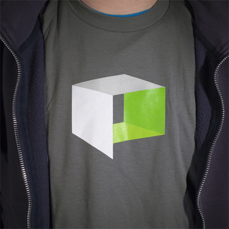
Working with Cinco Design, PhotoShelter has updated their previous logo — which had been designed by its founder and was intended to represent photos stacked to form a shelter — to a sleek, dimensional box in the form of a “p.” This new logomark helps remove some of the ambiguity from its predecessor through playing up the word “shelter” and hinting at a viewfinder or spatial representation.
Cinco Design constructed the icon with photo frame-like windows to convey protection akin to PhotoShelter’s role as an advocate for photographers’ rights, royalties, and creative freedom. The design team selected a lush green as PhotoShelter’s official color to emanate life and the freshness of the company’s products and thinking.
— From Press Release
Where this logo falls short is in its execution. Conceptually the “shelter” is a viable idea that marries well with their company’s mission, however the rendering yields a rather flimsy shape that seems less solid and/or protective. One of the visual extensions of the logo’s form is the speech bubble, which you can see employed on the PhotoShelter web site in the footer, and while it’s possible that this could become an ownable graphic device for PhotoShelter (as much as speech bubbles can be owned these days), the opportunity seems rather under-explored.

T-shirt image swiped from Cinco Design’s blog, where they have a post about working on the project.
The typography got an update as well — darker, bolder and without the potentially dated CamelCase. Where this new typography is extended into the body of the web site its seems to work well through bringing a more authoritative visual voice than they had previously. However, the trade-off in the case of the logotype is decreased legibility (a product of the all-caps setting with its tight kerning) and less personality. While the original typography was far too light in value, the mixed-case was easier to read and the typeface had more character. Overall this redesign comes to life on their web site where the bold typography and colors are designed into a more lively layout — which is likely a visual language that can be extended into other collateral, however the logo itself will have a long road to travel to communicate the identity and attributes of the company to their audience.

Jump to Most Recent Comment
fred autechaud’s comment is:
Strong, simple, coherent. I buy it.
On Apr.16.2008 at 09:59 PM
Armin’s comment is:
I like this quite a bit. For me, the connection between photography, shelter and "p" all came together nicely in the mark... Shelters, unless guarding from nuclear weaponry, don't necessarily have to be made super thick borders, so in this case I do find the delicate solution well conceived. I also like that tight Avant Garde bold, it looks old school.
I do agree that the speech bubble idea can be taken further and/or better integrated with the logo itself.
On Apr.16.2008 at 10:19 PM
Yeison Agudelo’s comment is:
the black "p" dosent convice me i do like the gray one on the shirt though i think it would look much better
On Apr.16.2008 at 10:39 PM
Yeison Agudelo’s comment is:
the black "p" dosent convice me i do like the gray one on the shirt though i think it would look much better
On Apr.16.2008 at 10:39 PM
T-Bone’s comment is:
Overall I like it and it's a huge improvement.
The logo does bug me a bit though, it seems a bit 'wonky' ('crooked' in New Zealand English). Is the perspective way off or is it just me?
On Apr.17.2008 at 12:04 AM
Jason’s comment is:
I like this! It also suggests a light box which is appropriate. It works as a favicon too. The only thing I find weakens the mark are the gradients.
On Apr.17.2008 at 01:44 AM
Anonymous’s comment is:
Strong, simple, coherent. I buy it.
Fred said it right. Right Said Fred.
=]
On Apr.17.2008 at 02:25 AM
Tephlon’s comment is:
I like it. Probably it's also going to be used as a layover on the comping images. The old logo doesn't lend itself as well for that. The "Shelter" part of the type could use a bit of kerning.
I do agree with T-bone though, the Box logo looks slightly off in perspective.
On Apr.17.2008 at 05:10 AM
Matt’s comment is:
I agree with you Christian. I didn't see the "P" when I first saw it. It looked like a misconstrued box. Quirky for the sake of. Granted once I looked closer, I realized that it was a P. Makes more sense then. But to me, it says "messed up box" more than "P lightbox/shelter."
The Photoshelter font doesn't really impress me either. I can see where they were going with it. But it seems to me, that it could have been refined more.
On Apr.17.2008 at 08:48 AM
Luke Despatie’s comment is:
I like it as well, but I agree the perspective is wonky.
Also, does anyone else find it a bit 'Xboxey'?
On Apr.17.2008 at 10:01 AM
Luke Despatie’s comment is:
I like it as well, but I agree the perspective is wonky.
Also, does anyone else find it a bit 'Xboxey'?
On Apr.17.2008 at 10:01 AM
Nate H’s comment is:
Love the mark but it seems ill placed on the far right side within the Website layout. I didn't see it at first.
On Apr.17.2008 at 11:41 AM
Rob’s comment is:
I think this mark works well and is an improvement over the old. The AG bold comes across as far more authoritative and solid. Overall, nicely done.
On Apr.17.2008 at 12:06 PM
Kyle’s comment is:
What gradients? Isn't the box made up of four distinct colors/panels?
On Apr.17.2008 at 02:03 PM
Eli’s comment is:
I think the type is excellent, if a little derivative of the Polaroid logo. The mark doesn't do it for me. It's not clear that the extended wall is supposed to be the leg of a P, and the result is that it looks a little slopped together and wobbly. Not characteristics I'd be so keen to have in a shelter.
On Apr.17.2008 at 02:26 PM
BWJ’s comment is:
Nice.
Love the mark, not as excited about the type treatment, but it works.
On Apr.17.2008 at 04:52 PM
c-lo’s comment is:
not ground breaking, but VERY strong. I like it
On Apr.17.2008 at 04:56 PM
Darrin Crescenzi’s comment is:
I think it's a rather nice P. It appears that the perspective is mathematically correct, but having the left panel extend down (admittedly a necessity to make the letterform read) results in the "wonky" optical oddity that commenters are noting. I imagine there is a fix for that, but I have a feeling that it would require slightly different renderings of the logo for each different color/size/media in which the mark appears.
For some reason that I can't put a finger on, I love the typography.
On Apr.17.2008 at 05:41 PM
Jason’s comment is:
Kyle:
You're right. I think I might be seeing an optical illusion of the lighter shade juxtaposed to the darker shade. The grey looks lighter next to the black than it does next to the green.
Good eye.
On Apr.17.2008 at 09:43 PM
Paul C’s comment is:
I wasn't aware of th "P" the box is supposed to form...I was most curious in reading this post due to the ambiguity of the longer side dropping down a bit...so in that regard the mark is slightly confusing...but as a simple visual element i think it's alright.
seen better, but i have seen worse.
(Still furious about seeing that animal planet type cluster on my tv!)
On Apr.18.2008 at 04:53 AM
Romeo’s comment is:


CJ’s comment is:
Gone from a lean-to to something a bit more substansial...I like it.
On Apr.18.2008 at 09:52 AM
Chris’s comment is:
Great update. Effortless recognition of the shelter, the P, and the photo industry reference (reminds me of Fuji's colors).
On Apr.18.2008 at 11:32 AM
Catherine’s comment is:
Took me a bit to get the "P" out of the box, but I like it regardless. It's a strong and clever mark!
On Apr.18.2008 at 11:34 AM
Phil’s comment is:
Hello. I really like it. I agree that the additional leg of the P seems quite weird, but if you think about it, you can use it as a very remarkable feature of your identity (like they do in the widget or other parts of their homepage). GREAT!
What is the font's name?

Guido Durazzo’s comment is:
Looks like a redesign of Fotolog's logo, which is very similar in concept, symbol and typeface execution.


Roberta Seldon’s comment is:
I think it's great, and a much needed improvement from the previous design.
On Apr.30.2008 at 09:20 AM
Andrew Boardman’s comment is:
Very nice logomark. It clearly reads shelter, and improbably, photography. It's too bad, though, that the PhotoShelter website does itself disservice by separating the logotype from the mark in the top navigation. It looks like they got divorced.
On Apr.30.2008 at 11:38 PM
Horace Whitley’s comment is:
aortorrhaphy bucephalus petticoatism bullpoll pantotactic paradidymal elaeocarpaceous misname
http://www.ewtn.com/library/MARY/KOLBE2.htm >Blessed Maximilian Kolbe, Priest Hero of a Death Camp
http://www.melaman2.com/tvshows/index.html

Ty’s comment is:
Very well done. In agreement with most of the posts, the symbolism is fantastic on a number of different levels. What could very easily have been a run-of-the-mill concept with mediocre execution is very well thought out.
It's nice to see someone care about their job.
On Jan.07.2009 at 03:22 PM
JtzCWcmw’s comment is:
kee8IQ
On Apr.13.2009 at 04:39 PM
Comments in Brand New, V1.0 have been closed.


