

NOTE: This is an archived version of the first incarnation of Brand New. All posts have been closed to comments. Please visit underconsideration.com/brandnew for the latest version. If you would like to see this specific post, simply delete _v1 from the URL.
![]()
From the few things I was able to read online and a couple of details our tipster shared, it sounds like Unimarc, a grocery store chain in Chile established in 1961, was in dire need of updating their identity and signal change. Whether it was all around sub-par cleanliness or dealing with the expiration dates of their products by placing new labels over the existing ones with dates further into the decaying future, Unimarc needed to clean up its act.
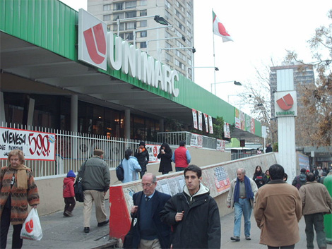
Old store exterior.
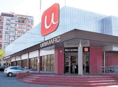
New store exterior.
Purchased in 2007 by the larger holding group SMU, Unimarc is set to add 100 new stores across Chile over the next three years to complement its existing 25 locales. The old logo and overall look was definitely frumpy and generic, although I think there was something nice and old school about the “U” icon. The new logo, designed by Santiago, Chile based Porta4, updates the icon and typography to a somewhat odd mixture of styles that on their own would probably work well but, together, something just doesn’t quite sit well.
I like the simplicity and friendliness of the “u” and I even like the rounded corners of the box it sits in. I like the “uni” treatment. And I’m indifferent to the poorly kerned Helvetica light. Mix it all together and you have a weird little disproportionate lock-up. Nonetheless, the new look is a major upgrade, and the stores look much more welcoming and even upscale. There are a few more images here and a news story in Spanish here
Thanks to Pablo Gonzalez for the tip.


Jump to Most Recent Comment
Lester’s comment is:
On screen, it doesn't look so great, but I love it on the building like that. I think it's a combination of the mark with the rich browns and brick colorings that I love so much.
I do think that a more logical evolution of the old U mark could have been made. The old logo wasn't that much worse than the new one, it just seems like they put a lot more thought into how they apply the brand to the buildings now than they used to.
On Apr.22.2009 at 06:26 AM
Lester’s comment is:
I should have included this in my first comment, but the design's got this whole space-age bachelor pad vibe going on that I really dig. Anyone know if the mark is attached directly to the grey walls behind it, or is it somewhat suspended? First glance told me it was suspended, but further examination leads me to believe it's attached directly to the wall, which isn't nearly as exciting an application.
On Apr.22.2009 at 06:32 AM
Erik at Logo Critiques’s comment is:
All I could think about when seeing this new logo was the Jack in the Box logo you featured back in Feb. I guess it was the red and the tail of the 'u'.

thedesignermike’s comment is:
the use of black in a grocery store environment immediately gives an upscale look and feel, sort of like a trendy deli, pair it with a nice clean typeface like helvetica and a clean iconic mark and it all spells upmarket, so I wouldnt be suprised if this is what they were after with this re-brand.
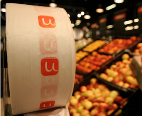
very nice. especially like the grocery bags.
i also think this new mark is quite expandable and could be adapted to work in a number of different ways quite nicely.
On Apr.22.2009 at 08:17 AM
buffalo one’s comment is:
totally agree with Erik too, immediate thought was the Jack in the Box re-brand - same typeface, same colour, same rounded-corner box
i think the treatment of the wordmark could have gotten more attention, it looks like they are very much trying to build the brand around the new "U" mark, so that is what you remember more than the name - nothing wrong with that - just think the wordmark could have gone further
On Apr.22.2009 at 08:22 AM
mellerad’s comment is:
I second Erik's notion...though I guess it wouldn't matter since these stores are in Chile
On Apr.22.2009 at 08:31 AM
Saylor’s comment is:
@Lester: "space-age bachelor pad vibe" haha, yes. I'm diggin that.
But it looks like the store front image is photoshop'd. The power lines don't even go over the big U-sign.
Anyways, it is a big improvement overall. I'd get my turkey there.
On Apr.22.2009 at 08:33 AM
awesomerobot’s comment is:
I'm glad I'm not the only one who was instantly reminded of jack-in-the-box.
Oh, and I love the "space-age bachelor pad vibe" - if there's any vibe that should become a fad again it's that one!
John Mindiola III’s comment is:
This looks cool. I wish more stores/store brands would go for the cool factor in their work. You don't have to LOOK cheap just because you have inexpensive products in your store. Cheers to good design! Less frump, more bump!
On Apr.22.2009 at 08:47 AM
Josh’s comment is:
As a person who might visit the store who doesn't live there, I find the rebrand to be much more trustworthy. It may be the same store, but it's reassuring to have a solid, clean identity.
On Apr.22.2009 at 09:08 AM
sra’s comment is:
The 'u' in the box is so fun and lighthearted, I feel a bit let down by the type beneath it.
On Apr.22.2009 at 09:42 AM
Manny’s comment is:
It's called contrast sra!
On Apr.22.2009 at 11:39 AM
angelo’s comment is:
Hi guy, i'm from Chile and i can tell you something about it...
Unimarc had, until this rebranding, one of the most long-standing logos in Chile, it was old and absolutly associated with lost of scandals and low quality service.
The other day y went into one of the store right in the moment when they where placing the new logos up-front. For day all the Unimarc buildings where nameless, so i asume there was a rebranding coming. Inside i was blowed away, the use of black all over the place, with those little red touches...it's really a higher level marketplace...
Really nice rebrand...well commented in Chile by the way.
On Apr.22.2009 at 11:43 AM
matobarros’s comment is:
I'm from Chile too, and honestly.. was a great work. No matter what happened before, this feels like a totally new grocery store.
And yes.. it's clearly based in the Jack in the box logo, but here.. nobody knows who's Jack... :)
On Apr.22.2009 at 12:27 PM
Carmine’s comment is:
Nice. Also nice that the artists seem to have been inspired by the new Jack in the Box branding. That was the first thing I thought of - and have to second Erik at Logo Critiques’s comment.
On Apr.22.2009 at 12:54 PM
jRod’s comment is:
that N is really bugging me... yes i realize that its an upside down U but its still bugging me quite a bit. and the rounded font doesn't lend itself to the half-bold / half-thin thing very well.
the mark is fine, but i agree... i reminds me a lot of Jack in the Box.
On Apr.22.2009 at 01:09 PM
Manny’s comment is:
Some of you should note, Jack in the Box is an unknown brand outside of the US, and in-fact in some US states.
I think the similarity is totally coincidental.
On Apr.22.2009 at 02:16 PM
Mark’s comment is:
nice and simple, with a bit of personality, I like.
glad they got rid of the tipping U, it frankly, looked stupid.
On Apr.22.2009 at 02:29 PM
Dale Campbell’s comment is:
I like it - as simple as it is, I feel it will be easily recognizable and in that, it will be memorable. It looks very nice on the building (large) and also on the produce/veggie bags (small) - which is the true sign of an icon's accessibility.
I don't mind the old mark - the icon in particular - but I can understand how a new logo could symbolize a fresh and new beginning. I certainly hope it stays "fresh".
Placing stickers over stickers - that's just not cool no matter how you look at it.
Keep well,
Dale
WarmOtter’s comment is:
Am I the only one that sees a big, poo-eating grin in the old logo?
Because after seeing that, the new one just doesn't quite do it for me.
On Apr.22.2009 at 04:45 PM
Kellie Schroeder’s comment is:
I agree with the posts that say it looks familiar to the Jack in the Box logo...but I believe it is completely coincidental.
I think it's a reflection of changing design trends. Maybe we're turning the tide to a warmer, friendlier, more casual corporate brand.
Anybody think this is brand design reacting to the quick, casual approach of social networking? Maybe trying to stay relevant?
On Apr.22.2009 at 05:39 PM
Glenn Sakamoto’s comment is:
I like it. Simple, contemporary, and fresh. A nice update.
On Apr.22.2009 at 06:02 PM
Paul’s comment is:
simple it is. and it definitely seems to work.
agreed re: the shift to a warmer branding approach.
a welcome one at that.
no more glass tables we're all warm rugs etc.
On Apr.22.2009 at 08:12 PM
Serviceburo’s comment is:
I think we are starting to see a new trend in branding. For most of the years that I've been paying attention rigid homage to Swiss style has been the norm, but I'm really convinced that there has been some sort of a shift towards a naturalistic almost Rand-ian feel to a lot of the work I see in the public arena. Granted, this is only true for the logomark itself, I personally feel that the type doesn't mesh that well with the mark.
If this trend really materializes, I'll be curious to see which designs people are referencing in ten years when they are accusing something of being derivative.
On Apr.22.2009 at 11:19 PM
Gustavo Cadar’s comment is:
I don't like the new logo (neither the old one). It's not strong, remarkable or even more contemporary than the old one. The way that the new logo is being used is much better, but it could be done with the old one. I think that if they put the old one logo on the new look of the stores the result wouldn't be very different.
On Apr.23.2009 at 12:09 AM
Old vs New’s comment is:
Old Wins.
On Apr.23.2009 at 02:39 AM
Chuck Spidell’s comment is:
Red is making a comeback. I'm not familiar with this brand but relieved the "u" in the mark didn't become another stupid smiley face. It's restrained, adding plenty of flavor.
On Apr.23.2009 at 02:44 AM
Kimberly McGuire’s comment is:
At least the designer for the old logo knew how to kern type.
On Apr.23.2009 at 07:32 PM
NicKLAUS’s comment is:
I can't help it, but all I see when I look at the 'u' in the box is cleavage if a female shopper was bent over picking up produce. Maybe its just me. Overall I think its a good icon though, innuendos or not. It's nice to see a simple 2D logo for a change. With a shape like the red box, I think nowadays we'd typically see designers trying to make it "interesting" by adding some sort of gloss or 3D emboss, so kudos to them for keeping it simple and flat.
On Apr.24.2009 at 08:37 PM
cundis’s comment is:
It looks like boobs to me...or possibly an ass...anyone else see it? Maybe it's just me.
On Apr.26.2009 at 05:06 AM
Mongoose’s comment is:
Yes yes red roundtangle is like Jack In The Box, moving right along to substance.
The old logo.. delightful product of its era. I like it plenty. The same can be said of the new one, and that makes it hard to judge; But I'd say it's a modernization and a slight improvement. The 'u' is nicely balanced, solid, and clean.
'UnIMARC' I'm not so sold on, though I like the below-the-rountangle presentation. Mayhap extending the geometric 'UNI' further, though I imagine that was tried and they just couldn't get that pesky R to look right.
I'm giving it a B, it's a very nice modernization over the old rather nice logo.
--Mongoose
On Apr.26.2009 at 12:57 PM
Dawn’s comment is:
As soon as I saw this I was reminded of your article on the new Jack in the Box branding. I know they're not identical but put them side by side and they could be brothers!
On Apr.27.2009 at 03:43 PM
TheSlush’s comment is:
Hmm... Unimark... that doesn't look like a Vignelli logo. ;)
On Apr.28.2009 at 02:39 PM
orangetiki’s comment is:
Funny, I first thought Herman Miller when I saw the new logo. 
Also a nice touch with the trim on the outside of the building and the large logo. The 50's are coming back and with a vengeance. I could not be happier.
On May.04.2009 at 01:30 PM
Carlos Bahamondes’s comment is:
Es fantastico el logo nuevo, Unimarc era un supermercado muy antiguo y a uno como espectador, ya lo consideraba como parte de las costumbres, con los auges de Carrefour, Lider, Totus y Jumbo, Unimarc fue quedando atrás en la persepción de la gente, sin embargo ahora con el relanzamiento de la marca, deja una imagen de renovación con el cliente.
Simple, pero efectivo, que es lo que vende.
Comments in Brand New, V1.0 have been closed.


