

NOTE: This is an archived version of the first incarnation of Brand New. All posts have been closed to comments. Please visit underconsideration.com/brandnew for the latest version. If you would like to see this specific post, simply delete _v1 from the URL.
![]()
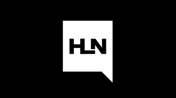
Many changes happened across the CNN network this week, most notably the replacement of the on-screen ticker at the bottom of the TV with the “flipper.” The other notable change is the redesign of the CNN Headlines News logo, which has dropped the CNN and moved away from the overarching use of lowercase sans serif and red. As far as speech bubble logos go, this is perhaps one of the nicest and most appropriate. It feels contemporary and hardcore, just like the channel itself. At first I was taken aback by the HL ligature, but it’s actually quite smart as it creates a better acronym than just HN and reminds people that “headline” is one word. You can never have enough grammar and spelling lessons in the world. This is a nice move to give Headline News its own look and feel that doesn’t rely so much on its parent identity.
Thanks to Geoffrey Sorensen for the tip.


Jump to Most Recent Comment
Rodrigo Müller’s comment is:
smart one!
On Dec.17.2008 at 07:13 AM
Ben’s comment is:
Surprising from CNN! I could swear that the bubble functions as an opening doorway too.
On Dec.17.2008 at 07:35 AM
Cool Unicorn’s comment is:
This represents a major change for CNN as they become a "brand of brands" rather a singular voice among other networks. I can see each of their shows becoming more self-sufficient and independent within the channel.
CNN has always delivered with solid design from their corporate identity, to their on-air graphics, and websites. I dig this logo and the strategy it represents. (And by the way, I'm not affiliated with CNN.)
On Dec.17.2008 at 08:07 AM
Jeff’s comment is:
It was good to give it its own identity. But I'm on the fence about the ligature!
On Dec.17.2008 at 08:13 AM
Barclay D.’s comment is:
changes look good. now only if we could change nacey grace, that would be a very big improvement.
On Dec.17.2008 at 08:21 AM
Jacob’s comment is:
I miss what Headline News used to be--half-hour news shows repeated back-to-back-to-back. Now I see talking idiots bloviating about unimportant topics for an entire half hour or hour.It's appropriate that very little content is found inside the speech bubble--like the network and its anchors, it says very little of substance.
On Dec.17.2008 at 08:48 AM
Dale Campbell’s comment is:
Yeah,
I saw an opening door before a speech bubble thing. Man I hate those (speech bubble logos).
I not very fond of piggy-backing text and images within identities, but that's just me.
Thanks,
Dale
Manolis Gerasidis’s comment is:
I couldn't "see" a speech bubble before reading the description! I "saw" an open door! It is indeed a better acronym than "HN" but i can't see how it "reminds people that "headline" is one word" actually! I think that the "merged" HL is confusing and taking things to the opposite direction.
On Dec.17.2008 at 09:00 AM
Jonathan’s comment is:
The look is much improved, but the ligature isn't working for me. It looks sloppy... We're looking at this thing at about 5%, but if you really could zero in on this thing, the lines of that L look pretty shaky. I also feel like it really separates from the N.
On Dec.17.2008 at 09:18 AM
Nate G’s comment is:
Hm a speech bubble. that's original.
if it's an open door then it will really only work when it's reversed out like above. It really needs some finesse, the whole thing feels a bit sloppy and unfinished.
On Dec.17.2008 at 09:41 AM
Manolis Gerasidis’s comment is:
I forgot to mention the problematic "L"'s width. It looks narrower than "H" and "N". I think this way it would look much better.

dmagy’s comment is:
My first reaction was not good. I too saw a door or a descending stair. Manolis Gerasidis's version is much better, giving the logo at least one vertical vector.
On Dec.17.2008 at 10:16 AM
Kevin Zwirble’s comment is:
It's simple, clean, and smart. I think those are very important traits for mastheads, headlines, etc. It doesn't take away or mess with the overall hierarchy of the on-screen graphics.
On Dec.17.2008 at 10:42 AM
George - LogoDesign.org’s comment is:
@Manolis: I agree it looks better like that, it also looks more like a speech bubble. Nice logo overall.
On Dec.17.2008 at 10:56 AM
Peter O'Connell’s comment is:
Ugh? Nice? No! Ugly? Yes.
Certainly changing from what they had was the right concept but it came out with the wrong execution. This will not help their brand nor their positioning. But it also might not hurt them as I doubt any viewers really care.
Best always,
- Peter
Jeff’s comment is:
I'm getting tired of speech bubbles. This has become the new "swoosh" that every logo used to use. I see them everywhere and they have become quirky substitutions for real design thinking.
And what is worse in this case is that the shape surrounding the HLN logo does not look like a speech bubble, it looks like an open door.
Regarding the ligature - while I realize that HLN will have tremendous market penetration and their logo will become known because of high visibility, I don't think most people would otherwise associate the logo with Headline News. The ligature is not clear when taken out of the context shown above where you have the text, "Headline News" appearing as a lock up.
It will probably be shown and advertised for a long time as a lock up before they do away with the text, as Target has been able to do.
On Dec.17.2008 at 11:08 AM
Bruce’s comment is:
I agree with those who think the "point" of the bubble should face downward. It reads more quickly as a speach bubble that way. As for using a bubble, I think that evokes a "cheap talk/gossip" flavor, rather than up-to-the-minute real news. Like the type and ligature, though.
On Dec.17.2008 at 11:28 AM
Mr Posen’s comment is:
I am tired of speech bubbles too, though I think this is a strong solution.
On Dec.17.2008 at 11:54 AM
damon’s comment is:
I hate the HL ligature.
On Dec.17.2008 at 11:58 AM
Josh’s comment is:
I liked the old one, and still prefer it.
On Dec.17.2008 at 12:05 PM
WORK’s comment is:
Love at first sight, then I noticed the odd growth... still looks good enough for me to date her.
On Dec.17.2008 at 12:39 PM
Jeff’s comment is:
Right on, Manolis – I hadn't noticed that.
On Dec.17.2008 at 12:44 PM
Draplin’s comment is:
Maybe a missed opportunity with the overlapping "L" and "N"? Hmmm.
Morgan Smail’s comment is:
simple, clever, distinct. exactly what a logo should be
On Dec.17.2008 at 01:57 PM
damon’s comment is:
headline is one word, it doesn't even make sense.
a nice HN lock up would have been better.
On Dec.17.2008 at 02:07 PM
Matt’s comment is:
i do think this is a step forward, but like many others, speech bubble didn't come to my mind first, and like bruce said, this is REAL IMPORTANT news, not crap you talk about at the watercooler with coworkers (don't mean to offend anyone)
As far as the ligature goes, i think some revisions like those already posted work a bit better.
maybe after a while of showing it on screen while the news is being played it will be more recognizable on its own...
On Dec.17.2008 at 02:15 PM
Gregory’s comment is:
Even though they are two different words, I think the lig separates the "HL" from the "N" too much. The letter "L" on its own will always have a very lopsided feel to begin with, and balancing that is a difficult task, unfortunately, I think the lig makes it more unbalanced. I see why they did it—to reiterate, "Yes, we know, 'headline' is one word," but it's just not working for me. Definitely needs some type of tie in with the lonely N out there.
On Dec.17.2008 at 02:41 PM
Lawrence Anderson’s comment is:
I just can't seem to like this one. The combined H & L just seems awkward.
On Dec.17.2008 at 02:53 PM
ChrisM70’s comment is:
I didn't see a speech bubble or an open door.
To me, it looked a little like an open laptop computer.
I think this is why the shape isn't used like a traditional speech bubble - because it can be interpreted in other ways and mean more things to more people.

T-Bone’s comment is:
also sick of speech bubbles. it's kinda hard core, but could be more hard core, with all the letters merging. kinda like Draplin's one above.
On Dec.17.2008 at 03:51 PM
Mark’s comment is:
I like it.
Nice clean and simple.
much better than their old one, which was quite dull.
Reminds me of the 1988-1992 Headline News logo.
On Dec.17.2008 at 04:12 PM
James’s comment is:
"It feels contemporary and hardcore, just like the channel itself."
What is hardcore about headline news?
On Dec.17.2008 at 04:51 PM
Joe Moran’s comment is:

Peter’s comment is:
I don't like it. The old one has more character. The speech bubble I think will looked dated pretty quickly. The lettering is too clean and 'immediate' and a little under-formal for me. And the H and L? Too design. It looks like something I would cough up in flash. And that's not good.
On Dec.17.2008 at 06:51 PM
Altaf’s comment is:
It's much more practical, it can be applied to any layout and it even scales well.
The fact that it doesn't have rounded edges sets it apart from the rest, giving it a sharp, clean and fast image. Now that's appropriate for a news channel.
Nice look.
On Dec.17.2008 at 07:43 PM
Cayla’s comment is:
The more I looked at it the more I began to like it. But the more I looked at it, I realized that it was a speech bubble and not an open door. Now I just don't know what to think.
On Dec.17.2008 at 10:03 PM
lodenmuse’s comment is:
I really loved the open doorway with light spilling forward... news leading the way forward... information illuminating your path out of the darkness...
Oh.
On Dec.17.2008 at 11:32 PM
GregT’s comment is:
I also saw the open laptop silhouette. I don't see a speech bubble at all (they're roundish or at least have curved corners, folks). Even if the speech bubble were more recognizable, I don't make a clear connection between that and "headline," which is a print term.
Also, decoupling it from CNN seems a needless loss of brand equity.
On Dec.18.2008 at 12:01 AM
Joseph Maguire’s comment is:
Track Back, Thanks for this Post Brand New:
I took a stance saying that this new brand reminds me of another media brand as commented further on my blog.
http://www.maguiredesign.com/blog/
ChrisM70’s comment is:
The one thing I find puzzling about this logo is why try to make it look like HLN? Isn't HEADLINE one word? It's not Head Line News.
So why not just HN?
Is there a rule there has to be at least 3 characters in a channel's call letters?
Just seems like they were making it needlessly difficult, because the HL combo looks funny.
On Dec.18.2008 at 01:46 AM
Brandon’s comment is:
I tuned in to CNN and heard a promo for something on the Headline News channel. They aren't calling it "Headline News" anymore. It's "H-L-N." I like the logo, but I'm not too fond of the acronymization of everything. (And it's not even easier to say—same number of syllables.)
On Dec.18.2008 at 02:01 AM
M Beard’s comment is:
You beat me to it, Brandon... not everything needs to be (or is more powerful as) an acronym. In fact, I believe in some cases, acronyms can hurt the branding value. Who calls it HLN?
I too prefer the old logo. To me, the new attempt looks cheap, bland, and lifeless... regardless of the debate surrounding speech bubbles vs. open doorways: Neither contributes to Headline News as an identity.
This looks like a new logo for the sake of a new logo. If it was supposed to have a greater purpose, it's lost on me.
On Dec.18.2008 at 09:21 AM
Bruce’s comment is:
Joe Moran: good humor!
On Dec.18.2008 at 01:25 PM
Justin’s comment is:
not a fan.
On Dec.18.2008 at 03:13 PM
Orangetiki’s comment is:
Streamline and overly clean. It seems to go with some emerging trends. I did see an open door before the speech bubble, but I don't want to re-tread on old talk. It reminds me of Euronews.nett
Although nothing alike they do seem to share that clean to a T feel that you see a lot on the web.
On Dec.18.2008 at 03:56 PM
John Mindiola III’s comment is:
I agree with the folks commenting on acronyms. This one is horribly forced, and the awkward ligature makes it seem even more forced. In a logo, tension is good, but . . . this, however, is not.
On Dec.18.2008 at 04:01 PM
Derrick’s comment is:
I'm pretty sure the speech bubble is meant to represent the opinion shows on the network.
On Dec.19.2008 at 08:41 PM
Mongoose’s comment is:
I also saw the door first: Speech bubbles generally point at the speaker, or slightly down: this sideways one takes a moment to process.
If it's going to be CNN and HLN.. an interesting take. This doesn't at all read 'CNN' to me, and now that Headline News is no longer Halfhour News, I suspect further differentiation of the two networks.
It's all right. A good, significant change, nice and legible, The 'HL' works decently.. I'm not overawed by it, but it'll fit better in small spaces (favicons and corner-floats).
I give it a B.
On Dec.20.2008 at 10:45 PM
Mark’s comment is:
Is it me or is their a slight similarity bewtween the CNN logo and the HLN one?
The way the letters connect is almost identical to how the CNN logo connects it's letters.(except for the L not connecting)
This was probably done on purpose to express that Headline news in now a seperate brand from CNN but also showing that they originated from CNN. They were originally called CNN 2 when the channel came on air. I looked it up.
http://en.wikipedia.org/wiki/Headline_News
On Dec.21.2008 at 01:43 PM
Mark Ratheram’s comment is:
Have to say I like it.
Nice clean and simple.
The old one was very dull.
On Dec.25.2008 at 11:35 PM
steve’s comment is:
the most positive thing i can say is that it will make for a good bug due to its simplicity.
as others have mentioned, the conjoined letters aren't working. that coupled with the blockiness of the H and L are making it look like pixelated type. no bueno.
On Dec.27.2008 at 10:10 PM
Cheetahboy’s comment is:
Draplin's five second solution shows why participants of this forum should refrain from quickly trying to suggest alternatives. This version is worse than the original, has not solved the ligature issue (for those who do not like it) and introduced a whole other problem with overlapping the letters. To me it now looks like H U N. Everyone should keep their critiques to written words only.
On Dec.29.2008 at 04:49 PM
Johnny S’s comment is:
Why would Headline News want to break away from identification with its parent brand? I think it might have been better to develop similar logos for for CNN brands so they are all identifiable as a family.
On Dec.31.2008 at 11:04 AM
carlosandresvega’s comment is:
i do not like it! what is this. cartoon network?
On Feb.14.2009 at 03:32 PM
Comments in Brand New, V1.0 have been closed.


