

NOTE: This is an archived version of the first incarnation of Brand New. All posts have been closed to comments. Please visit underconsideration.com/brandnew for the latest version. If you would like to see this specific post, simply delete _v1 from the URL.
![]()
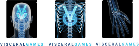
Okay, so you are all tired and bored of these corporate mergers and boring wordmarks with simpleton icons that could be done with children’s chalks, right? Fine. Let’s take it to the opposite end of the spectrum, shall we? Visceral Games is the newly minted name for EA’s Electronic Arts Redwood Shores (EARS) studio that has been responsible for gory, action-packed games like Dead Space. Its tagline — which follows the same premise as EA’s “It’s in the Game” — is the more heart-wrenching “It’s in our blood.” The identity has been designed by Venice, California based Arnson Communications in collaboration with Bill Dawson.
“Action, intensity, excellence. It isn’t just in our DNA, it’s in our blood,” said Glen Schofield, VP and GM of Visceral Games. “For the past two years, we have adopted a new culture that prizes excellence above all else. Primal action is the beating heart of the studio and now our new name reflects that.”
— Press Release
![]()
![]()
The EA logo gone visceral.
To be perfectly honest, this is isn’t my kind of logo, I rarely wake up in the morning and think “Man, what I really want to do today is an X-rayed skull for my client.” Nor do I get excited by highly textured logos or grunge-painted typography. But, to hell with that, the logo works. It’s, well, visceral. And it’s uncomfortable and I don’t want to look at it for any period longer than what I already did. This is also a logo that will live on screen and on the web, so it makes sense to have a full blown image-based logo. Even when it’s in print, which will likely be on the video game package, it will be a full-blown 4-color print anyway. Faxing or embroidering is likely the least probable uses for this logo.
If I had any formal critiques as I would with a more “normal” logo I would say the VISCERAL typography could use some looser tracking and at the same time it could be somehow more integrated with the background, as it feels like it’s just placed on top, maybe getting rid of the blue stroke would help. The skull could be smaller as it sort of eclipses everything else. And perhaps a few other details here and there, but overall the logo achieves what it needs.
Logo animation.
To add to this story, we have some early sketches of the X-Ray idea to be able to see how things evolve from initial presentation to final execution.
Some of the early sketches for the X-Ray concept.
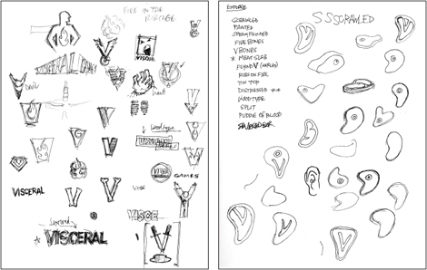
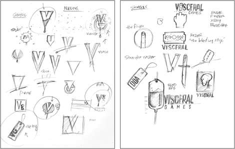
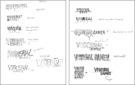
Some early early sketches of the design process.


Jump to Most Recent Comment
Woke’s comment is:
A 'neither here nor there' logo. Doesn't seem to deliver any message as far as teh brand is concerned. X-rays?
On Jun.11.2009 at 07:09 AM
d13t’s comment is:
I always think that early sketches are done afterwards.
Especially when they are so clean like these.
Like the results, though.
Tom’s comment is:
This isn't bad when you put it in context, the animation certainly brings it to life and gives it more sense and cohesion in my opinion.
However, the 'V' in the skull doesn't do anything for me. As an icon I don't think it stands on it's own and with the rest of the identity it clouds the overall message
On Jun.11.2009 at 07:31 AM
WilhelmR’s comment is:
I like the overall look. It matches the grungy videogame logo feel.
But the type just doesn't work. stroking grungy type is such a sin...
On Jun.11.2009 at 07:49 AM
Chad Kaufman’s comment is:
I love the sketch with the wordmark underneath the image (the one with the ribs being my favorite). The stroke around VISCERAL is definitely crap–creating weird tracking issues and touching tips of letters.
The Animation!! Oh man, that would get me pumped up before blowing off zombie heads and exposure to gore. It makes you realize that this logo is more of a guideline to the aesthetic that will be carried throughout the applications on screen.
On Jun.11.2009 at 08:34 AM
Andy’s comment is:
@woke
VISCERAL adj. 1. of or relating to the internal organs in the main cavities of the body. 2. relating to subjective feelings rather than intellect.
An X-ray is perfectly appropriate here, even TOO literal, some might say. And how is it not delivering the message of a brand known for aggressive, morbid and otherwise gory games. Seems like you're the only one not getting that message.
On Jun.11.2009 at 08:42 AM
emily’s comment is:
i think it is not a ground-breaking logo, but it nestles (yes.. nestles) in perfectly with the genre it represents. people who play these video games will love it.
my favorite sketch is the one with the middle finger.
On Jun.11.2009 at 08:43 AM
Dan’s comment is:
The best thing about this work is that it's clear that the designers had lots of fun with their work. And yes, it's nice to see something that is not bland or generic. Man, there are some fun ideas in those sketches!
On Jun.11.2009 at 08:51 AM
sra’s comment is:
This is pure nitpickery, but the stroke on VISCERAL is driving me nuts. Especially when compared to the cleaner, strokeless EA beneath it.
On Jun.11.2009 at 08:52 AM
derrick’s comment is:
The "visceral" version of the EA logo is better than the actual division logo. Why can't they just use that version of the EA logo on their more gory games?
On Jun.11.2009 at 08:55 AM
Colormist’s comment is:
Gamer here. I like the skull and the grungy V inside the skull is also cool. The font below the skull feels a bit like a phone-in though. It doesn't quite match the imagery of the skull. I would have gone with something a tad more pointy and violent/painful looking. Maybe more like the V in the skull.
I dunno, something just doesn't connect between the two.
On Jun.11.2009 at 09:08 AM
Chris R.’s comment is:
I'm not a gamer, but I agree with Colormist 100%.
On Jun.11.2009 at 09:17 AM
optical_allusion’s comment is:
I agree with all the other commenters about the stroke on Visceral. But mostly, I'm just reminded of Donnie Darko.
http://www.raindance.co.uk/site/picture/upload/image/resources/natasha%20top%20ten/donniedarko.jpg
On Jun.11.2009 at 09:20 AM
Maya’s comment is:
I would like to have seen the meat slab go further.
On Jun.11.2009 at 09:34 AM
Sand’s comment is:
I take it this logo won't be embroidered huh? heh.
Nice visual with the x-ray, totally appropriate for the genre and style it's aiming for. The typeface is a little uninspiring. A grunged up Courier(New) would have been nice to see.
On Jun.11.2009 at 10:15 AM
jRod’s comment is:
As a designer and a gamer, i see this type of logo imagery all the time. I agree with Colormist - the font treatment does look like an afterthought. And I would like to see a printable black and white version of it.
The VG looks really good. I think I would have placed that under the skull and not overlaid on top of some X Rays.
On Jun.11.2009 at 10:46 AM
Tre’s comment is:
Judging by the fact that these guys made a game with a href="http://http://news.filefront.com/wp-content/uploads/2008/07/ds_eapcpftfrnt-1024.jpg" target="_blank">cover like this, and their current game in development being about Dante's Inferno, it's perfect for them.
I do agree with Sand though, the typeface is pretty boring. The black "Visceral" on the bottom of the first page would've been the best way to go paired with the skull. The IV one would be my favorite of the sketches.
Scott’s comment is:
Looks terrific as a poster.
Loses something big-time as a 2" JPG ... imagine what this will look like on a box (at roughly 1") ... or a card, or in the corner/at the bottom of a Web page (at less than 1").
Hmmm, it's limited, that's for sure.
On Jun.11.2009 at 10:47 AM
Tre’s comment is:
Sorry, meant to put this: 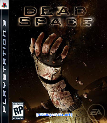
Joseph’s comment is:
There's some merit in this creative, but I don't feel like its as finished as it could have been. It just seems like the concept was executed quickly. I have to agree some of the comments earlier about the typography spelling out the whole logo seems a bit ordinary.
On Jun.11.2009 at 11:01 AM
Chris’s comment is:
You know the stroke bothered me at first as well but when I saw it in the movie reel it seemed appropriate.
On Jun.11.2009 at 11:02 AM
Ronlewhorn’s comment is:
Wow! I love seeing the sketches and in-progress pieces. Great find! I HATE the typography. I love a good grunged font, but the typeface is just boring and the Stroke is sloppy. This has the potential to be great, I just think the type should be pushed a little further. If you're going grunge, don't stop at a clipped texture over your poorly kerned typeface, Get in there and rough up the stroke and make your wordmark as realistic and powerful as your icon.
On Jun.11.2009 at 11:05 AM
Chris’s comment is:
To be pointlessly pedantic: Bones aren't viscera! Viscera are the soft messy bits, not elegant structural bits like the skeletal system. Intestines spilling out of a fresh would would be visceral; this is just "kinda goth".
On Jun.11.2009 at 11:22 AM
Sand’s comment is:
@Ronlewhorn: I totally agree, the typography could have been pushed further to work with the design style of the image.
This is what I had in mind (please excuse the poor photoshop :))

VonK’s comment is:
Concept is dead-on, though pretty literal. I agree w/ comments about the type not feeling integrated--the whole thing feels kind of hastily executed.
Would have liked to see the razor blade & bloody letters explored further.
Andrew Sabatier’s comment is:
My long standing position on logo design, dedicated logo designers and logo obsessed media demonstrates the limitations of the term 'logo' that is being used to measure the value of the Visceral Games brand identity.
At a push the Visceral Games skull and type is a logo. The 'viscerally' textured EA is more obviously a logo but both are better grasped as brand marks and brand marks on brand marks.
A brand mark can be any mark that is central to an identity, no matter how open, ephemeral or own-able. The Visceral Games brandmark (one word) is not the sanitised, hard-edged, easily scalable and robust brandmark we might expect from traditional corporate brandmarks but they can be usefully held as own-able brand marks (two words) and it is by this measure that the Visceral Games brandmark should be assessed.
The Visceral Games symbol is skeletally visceral and death is the obvious currency. Visceral might ordinarily imply blood and guts but the x-ray brand mark adequately conveys the visceral theme.
A photographic brandmark succeeds where perhaps a hard-edged graphic might appear too tame, cliched or cute. This is a brandmark with an immediately graspable hit of meaning for a brand that may not benefit from a longer term strategy to embed a different kind of brandmark with the relevant attributes.
This is a highly localised brand with a core audience in mind. This should exempt it from many of the criteria we as brand identity designers might expect from corporate brandmarks. Within this context there is no reason why EA should not be able to build specifically directed equity into the Visceral Games brand.
There is no right or wrong when it comes to assessing the value of brand marks. The criteria should be the effectiveness in defining a memorable and evocative identity. The Visceral Games identity is indeed viscerally evocative.
That gamer needs some serious dental work. Dentists be afraid and logos be gone.
A.
oscar’s comment is:
That animation is so EXTREME! I just about fell on the floor laughing.
On Jun.11.2009 at 12:55 PM
mm’s comment is:
As a Game Industry designer, I find logos like this one hard to work with. It looks fine on it's own (Except the previously mentioned typography problems) but when you start having to put it on stuff, it becomes a pain.
Overlayed on box covers
Overlayed on screen shots
Overlayed on promotional posters
Look at the Dead Space box, see how the EA logo is ghosted on top of the background image? That's a pretty typical games logo application.
Full color logos present a challenge because the colors often conflict with the mood of the image you are trying to create.
This visceral skull logo shouldn't have color problems (since it's basically monotone), but it will have complexity problems. It's detail is going to fight with any underlying detail in the image. So designers will have to only choose images that have the corner for the logo relatively clear.
Imagine the xray skull in the bottom right of the Dead Space box. Suddenly, the whole thing is way too busy. Floating arms in one style, floating skulls in another style. The image fights for attention.
They can put it in a box, (Which will probably work best, but that presents it's own composition challenges.) Or you can nix the image and just use the word mark. Too bad this one is so bleh.
The best game logos in my experience are the ones that are one color and look good inverted so they work on both light and dark backgrounds.
That all said, it wouldn't be too hard to make a one color skull with a V on it.
On Jun.11.2009 at 02:39 PM
tetra’s comment is:
to me it seems like they were trying too hard with each concept (the type, the skull, the overall grungy-ness).
as a gamer and a designer, i see (and cringe) at far too many awful logos and general design practices on packaging, etc. that follow this exact template. just because something is gory doesn't mean it needs to be portrayed -- or in this case, completely overdone -- that way.
and just because you /can/ go all out doesn't mean you should, and i disagree with people that say it works in the animation. perhaps i've just seen some really great studio logos/animations and the context in which they're usually presented.
most of what the better ones have in common is that they are a one or two colors, often times are a simple mark or custom typeface and most of all it doesn't detract from the cut-scene/intro scene or whatever is coming up next. there's nothing more annoying than having to continuously sit through or have to click-through the beginning credits as they're often a stream of never-ending logos from everyone that took part in the game that are flashing and bouncing around, each with their own serious-gaming sound effects(!).
i'm stoked your company took part in the production of this game and i totally know you want to showcase yourself, but i don't feel like having a seizure.
On Jun.11.2009 at 03:11 PM
anon’s comment is:
This is not a logo, its an image. And the font is terrible.
I agree with "mm"'s post above.
A real logo works in all applications relevant to its product.
On Jun.11.2009 at 04:06 PM
Molly Bennett’s comment is:
I actually think the close tracking on "visceral" works. Afterall, the point of these games, like with suspenseful movies, is to keep you in a heightened state of agitation and discomfort. The tight tracking on the letters definitely makes me agitated and uncomfortable, so I say mission accomplished! :)
On Jun.11.2009 at 05:46 PM
Rafal S.’s comment is:
As a gamer and designer I must say I’m not very fond of this. I would not call it good taste, or clever, or interesting... Some of those early sketches are more fun than the final solution.
The only logo in gaming industry I really like is Valve's. Simple, but with unsettling accompanying images (those valves that go to different places). This Portal wallpaper is also nice... Made for a game created by Valve. This game is full of cleverly designed images.
On Jun.11.2009 at 05:47 PM
Bill Dawson (XK9)’s comment is:
@d13t I did those thumbnails and I can assure you that the sketches were done at the start of the project. "...so clean..."? That's just how I sketch.
On Jun.11.2009 at 07:45 PM
Joe’s comment is:
Hey Bill Dawson, just saw your site, it's friggin amazing work dude!
On Jun.11.2009 at 08:04 PM
Bill Dawson (XK9)’s comment is:
@anon. I respectfully disagree with everything you said. And you smell funny. :)
@Maya, me too.

My personal favorite from Round 1.
Here are a couple other of my favorites...

The studio was formerly known as EA Redwood Shores (EARS).

Too subtle. ;)
Bill Dawson (XK9)’s comment is:
@mm There is standalone version of the type that can work for overlays, etc. I understand your critiques and yes, this is not the most versatile or compatible mark. Texture was determined to be an integral part of the identity.
I'm actually amused by the criticism of the type. The outlined type was meant to be a graphic interpretation of the glow around the x-ray image of the skull. It is not a "grunge" font. It's Bell Gothic Bold that's been made bolder. The "GAMES" font is Gotham Narrow Bold.
The type was hardly and afterthought. Some iterations cleaner and more messed up type designs using a variety of techniques to make it look worn and textured. We ultimately agreed that this one worked as the best complement to the x-ray image.
If the gamers like it, I like it.
On Jun.11.2009 at 08:45 PM
jb’s comment is:
They could have stopped at the distressed V and called it a day in my opinion. Communicates everything they needed to say.
On Jun.11.2009 at 09:06 PM
Bill Dawson (XK9)’s comment is:
@Chris Your "pointlessly pedantic" point regarding "viscera" correctly defines it as guts. But this is "visceral," which is an adjective. If you read Andy's note above, the logo attempts to evoke the second definition "relating to subjective feelings rather than intellect." That describes the virtual bone-crushing experience of a Visceral Game. The logo is about a feeling in the gut, not blood and guts.
On Jun.11.2009 at 09:18 PM
henry’s comment is:
great concept and execution. embodies the the genre well and still manage to put distinctive twist to a oft-used image.
would love to see the logo in a longer animation, perhaps in some game context where every few moments the skull flashed out on the character.
On Jun.11.2009 at 11:21 PM
baddrawingblock’s comment is:
I always kinda think of logos as the tie that you wear to meetings, and branding as the clothes that you pick to go along with the tie. Public perception is well the things that people see you doing while wearing those clothes and tie.
That said, when's the last time u saw a banker with an exciting or clever tie? Do you want your banker to be wearing an exciting or clever tie? Heaven forbid my banker to be doing anything clever or exciting
On Jun.12.2009 at 01:06 AM
mm’s comment is:
@Bill: Meat slab logo wins.
On Jun.12.2009 at 03:00 AM
Matt Barnes’s comment is:
They're certainly not that similar, but this did remind me of the logo for Volition, Inc, another game developer.
I swear, do all game developer's names begin with V? Visceral, Valve, Volition... every industry has its conventions, I suppose.
On Jun.12.2009 at 12:52 PM
Bill Dawson (XK9)’s comment is:
One more.

metalchik’s comment is:
I would say not enough research went into what
the people who PLAY these games are excited
about seeing. There's a *culture* here, and this logo
doesn't even come close to speaking to it. They should have spent a lot of time with some Cannibal Corpse album covers. 'Coulda even got some street cred with
a li'l input from the likes of Jeff Gaither or Brian Schroeder.
tetra’s comment is:
@Bill Dawson
What I don't understand is why all these previous-round concepts are so much better (ridiculously so) than the final.. too many cooks in the kitchen?
The current mark/logo/whatever makes the studio look cheap and outdated, skulls are way overdone and don't convey the horror/gore they once did -- I much prefer all of the others you have posted.
On Jun.12.2009 at 02:44 PM
John Martinko’s comment is:
Well... obviously this studio is geared toward EA's pony and puppy simulation games.
I could say that it's a rather knee-jerk, cookie cutter identity for the category, but then, most games suffer from the same, so depending on their focus, maybe not rocking the boat is the best thing for them. An unchallenging identity works for unchallenging games.
Unfortunately, it does rather nail them down to a very narrow range of genres, which can be a bit sticky these days. In comparison, Rockstar's or Valve's identity can believably stretch to different audiences.
And for anyone worrying about it's "tastlessness," here's a quote from a review of their most recent game:
"The most basic Necromorphs are humanoid monsters that attack in a frenzy. Horribly mutated undead babies also make an appearance, and they run along the walls and ceilings sprouting tentacles from their backs capable of throwing organic projectiles."
I don't think any perceived lack of taste is a problem with this mark. I mean, come on, can't you just see the sketches on a 7th grade math book cover?
On Jun.12.2009 at 08:52 PM
Bill Dawson (XK9)’s comment is:
@tetra
I respectfully disagree that the final is "ridiculously" inferior to the other ideas. I appreciate that you prefer those concepts. But as any experienced professional designer knows, not all ideas resonate with clients. As a designer it's my responsibility to discover what satisfies them and answers their needs; I can (and should) advocate for ideas that I think are good solutions, as I did in this case.
We decided that the bloody solutions were just too literal. The slab of meat had the support of one member of the team, me. The humor of that mark was not the attitude they wished to present. We all agreed that the x-ray was the right image for Visceral. In that marketplace, I believe that decision was entirely sound and ultimately correct.
...
Valve is to Nine Inch Nails as Visceral is to Megadeath. Discuss.
On Jun.13.2009 at 03:52 AM
Marc Rapp’s comment is:
Conceptually and semantically, the mark is on target. The overall movement within the mark seems to be it's greatest setback. It is not as simple as it could be, considering its namesake.
The tonality/branding video is probably what helped sell this as a concept, too. Clearly, the mark was designed with motion in-mind with a very detailed story behind the idea.
My only real complaint is; The use of the EA mark as a graphic container instead of utilizing it as EA's mark was intended. But, this technique often allows packaging design to look better without 15 unique icons on it. It offers a little quiet structure.
On Jun.13.2009 at 10:07 PM
Johnny’s comment is:
I immediately thought of Volition Inc. too...but a very good friend of mine works there, so perhaps I'm biased. ;)
![]()
Bill Dawson (XK9)’s comment is:
@Marc Rapp
Currently at EA, the customized EA is the intention. Other EA studios like Maxis and Pandemic have their own versions of the EA that is applied to their titles.
Mark’s comment is:
Hate it or love it. it still works.
It fits exactly with what they do, crude, rash and gory. I like this logo it's very unconfortable looking, it's in your face and won't go away. Well done!
Logo Bang’s comment is:
I agree with most of the comments. The concept is great. I love the opaqueness of the logo. Great job.
On Jun.19.2009 at 05:48 PM
mog’s comment is:
Ugh. Dead Space was decent but as a gamer this logo actually makes me less likely to buy a Visceral Games product. I'd feel like some stupid punk kid. Please tell me it won't be anywhere on the packaging.
It's just too much. It's more of a picture than a logo, and an unoriginal one at that (I, too, immediately thought of Volition). "You know it's bad-ass, because it has a SKULL!"
Maybe someday I'll be included in one of EA's target markets... *sigh*
On Jun.20.2009 at 03:57 AM
Comments in Brand New, V1.0 have been closed.


