

NOTE: This is an archived version of the first incarnation of Brand New. All posts have been closed to comments. Please visit underconsideration.com/brandnew for the latest version. If you would like to see this specific post, simply delete _v1 from the URL.
![]()
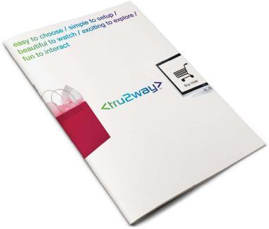
Coming this holiday season, Tru2way will be unveiled. What is Tru2way? It is an interactive experience with your television unlike anything you have had until now. It will be carried on major cable operators including Comcast, Cox, Time Warner Cable, Cablevision, and Bright House Networks.
The new identity is brilliantly done by Seigel+Gale. It communicates a fresh, progressive feeling with its rich color (even though it is a gradient it functions well) and bold typography. There is a trend in identity right now to incorporate rounded type. Whether or not it is appropriate in prior identities is debatable but it functions well here. Initially, I did not know how the majority of consumers would accept the “html code” feel of the identity. In the end though, I think it speaks technology from another point of view to those who are not involved in web design.
More on the mark:
“Tru2way is the future of interactive television,” says Alan Siegel, Chairman and CEO of Siegel+Gale. “This new, industry-standard technology will allow a whole new generation of interconnected media devices, including interactive television needing no cable box. Consumers will be able to vote, order pay-per-view, purchase products, services and music, organize their content, and access a personalized TV guide, all with a click of their remote.”
The Name: The name, tru2way, expresses the true, two-way interactivity of this cable technology — its ability to dramatically increase and deploy an array of exciting, new interactive services for cable consumers. It establishes a common software platform that enables cable companies, content developers, network programmers, consumer electronics companies, and others to extend interactivity to the television set and many other devices.
The Brand Promise: Tru2way promises to streamline how the public chooses, uses, and enjoys television. For enabled TVs, it means the television set is truly plug-and-play — no setup box, fewer wires, fewer remotes. On top of that, tru2way brings viewers simple two-way, interactive television that lets them see what they want and have more control.
The Logo: The tru2way logo is designed to help bring the brand promise to life. The arrows and name are integrated, giving it a streamlined, directional feel. The gradient color suggests fluidity. The lowercase letterforms are technical and modern. It is compact and legible. It also operates as a stand-alone trademark and technology symbol, signifying the purity of the interactive experience.
Overall, the newness of the identity should last for a long time while bringing strength to the brand. I can foresee this logo evolving into the digital media and becoming highly interactive. It’s going to be interesting to see what comes of Tru2Way in the upcoming years.


Jump to Most Recent Comment
Paul Harrison’s comment is:
For the first time, I strongly disagree with the opinions presented here. Where is the substance? What differentiates this from the glut of pseudo-futurist identities presented in the late 1990s, other than the throwaway gradient? I'd like to think that "high tech" can be communicated using something other than proto-Eurostile and faux HTML tags.
On Feb.07.2008 at 10:32 PM
Wes Pelletier’s comment is:
I agree with Paul. It's really pretty ugly and eightiesh, and the gradient looks like something done in Appleworks. I also take huge issue with the 2. It's dumb. The only thing I find halfway likable in the design is the t. The font still sucks, but if they apply the same "half-t" effect with a different (very different) font, it might work.
On Feb.07.2008 at 11:16 PM
Neven Mrgan’s comment is:
Huh.. Does Brand New do sponsored reviews now? This reads like a total cheerleader job, no offense.
"It is an interactive experience with your television unlike anything you have had until now."
A-ha. I highly doubt that the inevitable decline into obscurity this company will suffer will be "interesting to see".
Anyway, about the logo... It looks like a cover from one of those mid-90s techno CDs: "Tru2way Vol. 6: Ibiza Fever". Nothing about the gradient communicates anything; the shape doesn't lend itself to it any more than... any other shape.
The type looks tired, probably from dragging its face for years across video game boxes and cheap hosting websites. The word itself is hard to read - I keep having to scroll up to check what this thing is actually called. "Truway?" "Trutway"? "Truway2"? And what's up with thinning stroke on that "w"?
Those chevrons bug the heck out of me, but I am glad that they didn't use the double angle quote mark. I'd make some joke about how the logo doesn't know which way to go, but I think it does: it's going nowhere.
On Feb.07.2008 at 11:20 PM
Jay’s comment is:
I bet it animates just as well as that hideous Xerox rebrand...
On Feb.07.2008 at 11:33 PM
L.Vazquez’s comment is:
I happen to agree with the reviewer. Plus, it can work in one color as well. I think this identity works.
I do wish the 'y' was closer to the 'a' though. Maybe even adjust the other > mark, then, too.
On Feb.07.2008 at 11:38 PM
benp’s comment is:
Sorry but I have to disagree as well; this is an utterly forgettable logo (and brand name).
On Feb.07.2008 at 11:47 PM
Prescott Perez-Fox’s comment is:
@Paul, I think the left and right brackets are supposed to be 'arrows' that point in both directions conveying transit and communication, not a reference to HTML.
@Neven, I agree, this post reads like a commercial, or at least a press release. Somehow, I got onto a S+G mailing list, so I saw this a few weeks ago during CES.
On Feb.07.2008 at 11:51 PM
Darrin Crescenzi’s comment is:
Hard for me to judge the effectiveness of the communication with only press-release-ese to help me understand the nature of the company, but compositionally I think the mark leaves a lot to be desired. As Neven pointed out, that thin "w" stroke is just hideous, but a similar misfortune has befallen the "r" and "y." Ick. The kerning is too loose between the "u" and "2," and also between the "a" and "y."
If the 2000s are defined by the omission of vowels in brand and product naming, then the '90s trend was replacing words with numbers. And NOTHING good happened in the '90s.
For once, I suppose, I don't mind the gradient.
On Feb.08.2008 at 01:25 AM
Miles’s comment is:
I normally think that this blog is a little to harsh and often the authors seem to hate logos I think are perfectly decent... but this logo is extremely mediocre (haha is that an oxymoron?) verging on bad. The typography sucks, the gradient's terrible, the name is mega-barf... so what the heck?
On Feb.08.2008 at 01:30 AM
Christoffer ’s comment is:
Is this irony? I, as many others here, usually identify perfectly with the opinions of this blog but this post I just don't get.
On Feb.08.2008 at 02:36 AM
Lester’s comment is:
This might just be me, but any time I see the word "true" written as "tru," my brain just reads it as "false."
Tell me that's just me.
On Feb.08.2008 at 02:59 AM
Nic Eldridge’s comment is:
Lame. Lame. Lame.
On Feb.08.2008 at 04:15 AM
Joe S.’s comment is:
I think this is different enough from standard logos of today to say that it will stand out. But it's not timeless enough to be memorable. I will always maintain that gradients have no place in logos, nto because of how expensive they are, but because of how teh human eye reacts to them. They weaken the visual impact despite intentions to the contrary. Anyone who studies color in-depth could tell you this. Oviously, there are some kearning issues and stroke width issues needing to be dealt with. I don't completely dislike this, but I would bet that it could be tweaked and get much better results.
On Feb.08.2008 at 04:23 AM
Thomas Eagle’s comment is:
...I get the feeling the apocryphal "client's 14 year old son" may actually exist and have had a hand in this...
On Feb.08.2008 at 04:49 AM
Jeff Gill’s comment is:
the newness of the identity should last for a long time while bringing strength to the brand. I can foresee this logo evolving into the digital media and becoming highly interactive
Either that or it's going to remind people like me of the really high tech auto-reverse cassette player they had back in the 80s.
But I guess cassettes are cool again, at least on T-shirts.
On Feb.08.2008 at 05:46 AM
diogo’s comment is:
I agree with john. I like it because it's
one of the few logos that uses the gradient to communicate something, not just to be web2.0ish. Also because of its type choice and because it totally fits in the KISS principle.
I like it!
On Feb.08.2008 at 06:08 AM
Christopher Thompson’s comment is:
"vote, order pay-per-view, purchase products, services and music, organize their content, and access a personalized TV guide"
Sounds like my computer! Amazing. So if this logo was to relate to the actual product it would have to be really expensive and replaceable by something free. Free as in surrendering control of the design and using any old text people choose: People will recognize the tag when they see it.
That feels pretty open.
kristoff’s comment is:
I agree with the majority of the commenters. The mark is far from fresh and progressive and certainly does not appear 'brilliantly done'.
I enjoy reading your critical but usually spot-on reviews. However, this is absurd.
On Feb.08.2008 at 07:53 AM
Armin’s comment is:
> Huh.. Does Brand New do sponsored reviews now?
Hey, someone has to pay for my diamond-ringed Cuban cigars.
Re: The logo
Like John I actually like this. The one thing that you have to realize is that this logo will have to be an endorser of a technology that will appear in a bunch of places that have their own branding, like the number of cable providers mentioned in the post, as well as any other web enterprises that jump on board. So the logo has to play the role of something like the DVD logo, or even the Closed Caption logo. It can't be too overwhelming in its own right, and it must immediately signify something. In this case I immediately get that it stands for something that has to do with the internet, and if I see it on my TV it must mean that it's bridging something, so the gradient makes sense as well (although I doubt the gradient will make it to TV much).
The typography is techie, because this is a techie technology that will, in theory, be delivered at a mass consumer level, so the common denominator approach works well here. The typography leaves details to be desired for, but as a general philosophy it's correct. Plus, if you are a fan of Terminator, like me, this is simply awesome.
On Feb.08.2008 at 07:55 AM
Jeff’s comment is:
This logo is perfect for its purpose. I agree with John in that I could see this brand lasting quite some time -- especially if the technology delivers what it boasts. The colors are well chosen, adding a sense of comfort to skeptical consumers. Not the route I would have taken, but very effective.
On Feb.08.2008 at 08:37 AM
Samantha Armacost’s comment is:
Does Sony have a stake in this new technology? It is evocative of a squished PlayStation2 logo. Which could turn in their favor and help with the bridging the interactive concept to the logo, but it still feels off to me.
On Feb.08.2008 at 08:46 AM
Juggling man’s comment is:
2 words
silver foil
On Feb.08.2008 at 09:09 AM
Ty’s comment is:
I think that if this logo's specified purpose is to be noticeable, yet mesh with other brands, like the DVD logo, that it should be more flexible. The logo is very horizontal, and will be harder to fit into package design than most other icons like the DVD, CD and Closed Caption icons. Those are all more balanced as squares.
I can see where John and Armin are coming from, but I still think this misses the mark.
On Feb.08.2008 at 09:14 AM
en_dash’s comment is:
Fairly sure this is one of the new WordArts in in Office 2008.
On Feb.08.2008 at 09:18 AM
iffy’s comment is:
Design aside... the name sounds so religious that it is hard to get over.
On Feb.08.2008 at 09:20 AM
Dave Klonke’s comment is:
I'm having trouble with the name more than anything. How is it pronounced? True 2-way or true2way. Based on the review I'd say it supposed to be "true...2-way." If so, the logo should help people say it correctly since it's not yet a household name.
On Feb.08.2008 at 09:32 AM
Stacy Rausch’s comment is:
I have to agree with Dave on this one. I wasn't sure how to pronounce it until I read halfway through the review. I keep wanting to run it all together, without the pause so it does read "true...2-way".
On the logo itself... forgetable in my opinion.
JBIII’s comment is:

I think that they are on to something here. The tracking could be tightened in my opinion and the TM placement is awkward.
On Feb.08.2008 at 10:57 AM
JBIII’s comment is:

Jody’s comment is:
This is why the creative director shouldn't show the client their 'alternate' logo comps that the intern whipped-up without a thorough evaluation. Doh!
On Feb.08.2008 at 11:02 AM
John McCollum’s comment is:
Aside from the typography, the naming, the colors and the gradient, I think it's a fabulous identity.
On Feb.08.2008 at 11:03 AM
BWJ’s comment is:
The new identity is brilliantly done
Ha. It's not terrible, but brilliant is reaching.
On Feb.08.2008 at 11:07 AM
John’s comment is:
Like Armin said, this is going to be cross-platform on many different carriers. In order to keep continuity, it has to be quick and memorable. There is no other design on cable like this and it will stand out for sure. Again, it is difficult to judge until we see it in the environment, but my initial gut tells me it's something good. Give S+G some credit that they tested this mark in its environment.
Regarding the naming, it is supposed to read "True Two Way". As in, it's a true, two way experience with your television. Sometimes things like Pollack's and Picasso's aren't accepted at first, but do become what everyone desires. Perhaps this is what's happening here. Or not. We'll see in November.
On Feb.08.2008 at 11:21 AM
rynot’s comment is:
if this is what passes for 'brilliant' our profession, and identity design specifically, are in worse shape than i had previously feared.
the name, the way it's spelled like an i-would-die-4-you prince-ism, the type style and the half-raindow gradient collectively give a gay/bi bar vibe circa '98. it just feels lazy in every creative regard.
Rachel’s comment is:
Instant flashback to the old Knight Ridder logo. That link has the logo in black, but when I worked for KR about five years ago, the sign outside the office had the logo with the exact same gradient as the tru2way logo. Hmm. Of course, I always loved the KR logo, the tru2way one just reeks of classlessness. I can see where they were going with it, but it just doesn't fit together. Most of all I just HATE that icky "futuristic" typeface. Shudder.
On Feb.08.2008 at 12:42 PM
Darrin Crescenzi’s comment is:
I completely agree with Ty; If this identity is going to be used in a capacity similar to the DVD or CC logos, as Armin has pointed out, then it is even more misguided than originally feared. Its horizontal composition will make it extremely difficult to work with, and likely illegible considering the fixed-width (what, maybe a half-inch?) that most of those logos are forced to deal with.
I suppose they could solve this with a condensed version, like or something, but that's a terrible way to launch a new brand. I think this one needs some more end-usage thought put into it.
On Feb.08.2008 at 12:48 PM
Darrin Crescenzi’s comment is:
Ha ha, oops. Apparently the blog thought my "condensed" example was an HTML tag. I was suggesting they could reduce the name to t2w, in the brackets, to reduce its overt horizontal-ness, but again that wouldn't be the best way to launch a new brand...
On Feb.08.2008 at 12:51 PM
stock_illustration’s comment is:
I could maybe digest parts of the review as valid, but this logo doesn't measure up to "brilliantly done" no matter how I look at it.
On Feb.08.2008 at 01:13 PM
patrick’s comment is:
It just feels unfinished. Maybe a good direction for one concept, but lacking that "aha!" moment when concept suddenly matches design. Jody's right! It totally is an alternate comp that was never fully realized.
As far as the press release *yawn... am i missing something, or did the mumbo jumbo they spit out say absolutely nothing?wireless...connectivity...integrated...shopping. Now I can buy something on QVC with my wireless remote? Awesome!
On Feb.08.2008 at 01:25 PM
Bjorn Yeo’s comment is:
This is a horrible logo! Common.. expected and normal. Did you just post the entire press release and piled on praise?
*shakes head*
On Feb.08.2008 at 01:46 PM
Mr Posen’s comment is:
Honestly folks, this identity is mind numbingly bland.
The letter forms are ugly and poorly drawn (look closely at the 'a'), the kerning is amateurish, the gradient is stuck in the mid 90's, the arrows are default, and finally the name is hard to say.
My guess is Siegel+Gale, put one junior designer and a PM on this, and gave them a week to prepare concepts.
On Feb.08.2008 at 01:48 PM
Whaleroot’s comment is:
I will not get behind any company or company identity that includes a numeral representation of a word (2 / to).
I agree that it has some new, fresh elements but overall it just feels downright ugly. Like a weaker Wolff Olins attempt.
I don't disagree that it might work, however.
On Feb.08.2008 at 02:03 PM
Ragdoll’s comment is:
I like the contrast of the letterforms. Left angle bracket with the t and r pointing in the opposite direction. Right angle bracket with the y and a pointing in the opposite direction. Then the 2 in the middle, which snakes around and connects the two sides together.
Pretty neat!
On Feb.08.2008 at 02:39 PM
Willis’s comment is:
Close up shop! Brilliance has been located in the logo for Tru2Way. btw, sweet gradient... ![]()
M.Stringer’s comment is:
Re: JBill's fix of the logo.
I think it actually looks better before, seeing one after the other like that. The kerning issues seem to only involve the "2wa y" portion of the logo, and this leads me to believe that it was a conscious decision to separate the "tru" and the "2way".
I agree with the "a" and "y" being too far apart though.
On Feb.08.2008 at 02:59 PM
Derrick’s comment is:
What's so special? It's a bunch of text with a gradient.
On Feb.08.2008 at 03:18 PM
Josh B’s comment is:
)) < > ((
Forever.
On Feb.08.2008 at 03:22 PM
vectr’s comment is:
Seriously Armin, "brilliantly done"?
And that progressive rounded font you like so much is the most overused 'techno' font from the 90's (Handel Gothic).
Not sure what would be worse... you actually liking this, or you being a paid shill.
Darrin Crescenzi’s comment is:
I don't believe it was Armin who said "brilliantly done..."
On Feb.08.2008 at 03:37 PM
Mr Posen’s comment is:
Though he did say "this is simply awesome"
Mr Posen’s comment is:
John Feldhouse said:
"Overall, the newness of the identity should last for a long time while bringing strength to the brand."
vectr’s said:
"And that progressive rounded font you like so much is the most overused 'techno' font from the 90's (Handel Gothic)."
Yes, totally agree.
Newness?
A little bit of historical perspective please!
stock_illustration’s comment is:
The review states:
"The new identity is brilliantly done by Seigel+Gale."
On Feb.08.2008 at 05:23 PM
Adam’s comment is:
Usually these reviews are spot on. But seriously. Brilliant? Wow. Shocked I even read that on here. I Hope you guys got an advanced Tru2Way to play with.
I think the Animal Planet one is "brilliant" compared to this one.
On Feb.08.2008 at 05:52 PM
Kyle Hildebrant’s comment is:
Sorry this is off topic but...
@stock_illustration:
It's odd how the name you post under happens to be one of your most marketed key phrases for the site that is linked by you.
Are you posting with the sole purpose of bettering your organic search? Clever SEO strategy.
Just curious.
On Feb.08.2008 at 10:04 PM
Armin’s comment is:
> Though he did say "this is simply awesome"
In relationship to Terminator. And to be even more specific, Terminator 2.
The big problem here was John's choice of words in "brilliantly done". This identity is far from brilliant, and much farther from brilliantly done. BUT it's appropriate. And sometimes arriving at a solution that is relevant to the service or product being offered is much harder than it seems. Just look at Animal Planet, Capital One, or Xerox. Those are all misguided decisions with the wrong strategy in place. This one at least takes one aspect of its offering (technology) and plays it for all it's worth.
> Not sure what would be worse... you actually liking this, or you being a paid shill.
Not reading who wrote the post and accusing someone of being a paid shill, I would say that's worse.
On Feb.08.2008 at 10:42 PM
damon’s comment is:
I don't like this identity much personally.
however, i would like to take the time out to point out that the posted reviews on this site are usually really on point, insightful, and fully with merit. I'd also like to point out that in true internet fashion, the haters come out of the woodwork with their pseudo-intelligible holier than thou design school gospel, but lets face it, i've clicked out a lot of your names, and seen your personal work, you're not the paul rand's whose grave rolling you often lament.
lets face it, this isn't the best logo ever, but it's also a flaky name more than anything. I think the CONCEPT of using code tags/identifiers is cool, and the type is sort of quasi-modern but in the end, it's less off target and most things are on target.
something to think about.
damon’s comment is:
doh, that should read...."and the type is sort of quasi-modern but in the end, it's less off target THAN most things are on target."
my point is, lay off the reviewers harpies, design is subjective to a point, but many of you are far from that point.
shape up.
On Feb.08.2008 at 11:11 PM
Matheus’s comment is:
tru2way logotype
On Feb.09.2008 at 01:17 AM
jonathan’s comment is:
Jeff wrote: "This logo is perfect for its purpose."
I concur with Jeff.
On Feb.09.2008 at 04:21 AM
Greg’s comment is:
I think I'll hold out for "tru3way."
Seriously, with the name, and the rainbow gradient, doesn't this product belong next the the Swedish Ticklers at your local porno shop? Finally, I can have that real two-way experience!
I will say that I like the brackets. I don't hate the font but it's not interesting. I guess in the world of the DVD/Blu-Ray/Compact Disc logos, it's apropos, but I disagree that a logo should be nothing just because it's secondary. The purpose of putting your logo on a product is to create a branding experience when the product is used, and if no one notices your logo, there's no real reason to put it on there.
You know, I wonder if the color is done that way to give the impression of that silvery-holo-reflective color that they use on logos in places like the outside of the DVR or DVD players.
On Feb.09.2008 at 08:04 AM
Jeunesse’s comment is:
"damon’s comment is:
my point is, lay off the reviewers harpies, design is subjective to a point, but many of you are far from that point."
Damon, don't preach if your going to sit on the fence.
The truth is this identity is lazy, it is just another 'flavor of the day' solution, though in this case the day was in 1998!
On Feb.09.2008 at 01:35 PM
Danny Tanner’s comment is:
This identity accomplishes
what it said out to do.
The greater than/less than
symbols speak to the name,
and the name speaks to
the service. The signature
is simple, distinctive, and will
work well where it needs to
be applied. This mark (in
terms of a b&w) should do
its job very well.
The gradient is a little too
much, given the distinctiveness
of the letterforms. Know when
to stop. I'm interested to see
how this gradient will play out
in terms of the look and feel
beyond the signature.
I don't see any reason to imply
this signature is evocative of html.
A greater than/less than symbol
is not enough to sufficiently
communicate that to most anyone
(that is unless they're judging this
identity in context of a blog forum
with html code in front of them.)
I don't love the type, but than again,
it may have been the right type
for the job.
Lesson number 243:
TYPE CAN NEVER "LOOK" FUTURISTIC
The only way for type to truly be
futuristic, is if one went into
the future and saw it. However,
then it would probably just be a
short lived trend anyway. Any time
we try to speculate what the future
looks like, we do that in terms
of our current technology.
Remember when folks thought that
type like this looked pretty futuristic?
i.e. html which is not futuristic.
Anonymous’s comment is:
Hahaha, this is ridiculous. I love how people think this forum is some sort of DESIGN INQUISITION!
"THAT RED DOESNT WORK!... BEHEAD HIM!"
Poor the man who straps himself to dull standards.
I agree with those that are saying that this logo serves it purpose.
On Feb.09.2008 at 04:41 PM
Greg Formager’s comment is:
I often disagree with the opinions on this blog and this post is no exception. Ugly typography, really ugly "" marks, and boring.
On Feb.10.2008 at 11:14 AM
Jeunesse’s comment is:
Anonymous’s comment is:
"Hahaha, this is ridiculous. I love how people think this forum is some sort of DESIGN INQUISITION! "THAT RED DOESNT WORK!... BEHEAD HIM!"
Poor the man who straps himself to dull standards."
It's a forum dude. The reviewers give their opinions, the 'Brand New' audience responds. It's fun.
What would you prefer, everyone to just agree and group hug?
Toughen up.
stock_illustration’s comment is:
@Kyle Hildebrant
It would be clever, except for the "nofollow tags" this site adds. I post because I really like this site; my tagline IS an SEO habit that dies hard, but I'm gaining nothing from it here. No intention to offend.
And I still don't like this logo.
On Feb.10.2008 at 05:24 PM
diogo oliveira’s comment is:
Like i said before, i actually think this works well, i really don't care if the type is from the 90's, it seems contemporary to me.
I also think the logo works in black and negative:

...and integrated in graphic objects:
David M’s comment is:
Gradients in logos remind me of pharmaceutical brands.
![]()
Char Alfonzo’s comment is:
Jeunesse’s comment is:
It's a forum dude. The reviewers give their opinions, the 'Brand New' audience responds. It's fun.
What would you prefer, everyone to just agree and group hug?
Toughen up.
No, I'd prefer everybody giving an explanation to their opinions other than 'hating on' other people's work. I think there could be a better way to express opinions and thoughts. More like a design forum sometimes this place feels like the girl's bathroom in high school.
On Feb.12.2008 at 10:59 AM
Darrel’s comment is:
It's not ugly nor bad, really, but it's a forgettable name, logo, and product concept and the critique reads like a press release.
I get a very 'fly-by-night ecommerce web site banner' vibe from this for some reason.
That and for something trying to boast 'simplicity' the name is a mouthful, hard to read with the mix of letters and numbers, and includes superfluous HTML brackets (oh THAT is hip) and color gradients.
On Feb.12.2008 at 12:32 PM
Darrel’s comment is:
In regards to the comments that are critiquing the critiques...I think the 'harshness' of reviews in comments on sites like this are directly correlated to the 'poofiness' of the press release announcing it.
At least that's typically my reaction.
Had the review been "this is a logo for a yet-another-attempt at an interactive TV product" the reaction would often be "OK, I guess that works."
But when the post attempts to make the mark more than it really is, it should be expected that the comments would react accordingly.
Ultimately, this is a logo for vapor ware. So, there's going to be some product skepticism rubbing off on the logo. That and no one really has much love for the Cable industry. So, this logo has a LOT of work to do... ;o)
On Feb.12.2008 at 12:39 PM
xinsight’s comment is:
Am I the only one who reads this name as "throwaway"?
On Feb.12.2008 at 11:57 PM
chris’s comment is:
Would be cool as an ambigram. More fitting in my opinion.
On Feb.14.2008 at 06:23 PM
Peter McRae’s comment is:
It seems very possible that this logo will seem better in context. My first reaction was to not like it. Armin's comments about the context did make sense though. I think I'll withhold judgement until I see applications of the mark.
As the man said - context is decisive.
On Feb.15.2008 at 11:38 PM
John L. Hoh, Jr.’s comment is:
At first the "brackets" didn't say "HTML" to me (even though I am accomplished in HTML). It worked with the text as a directional for what the product is about.
On Feb.18.2008 at 10:53 AM
Darrel’s comment is:
John:
I assume that was perhaps the intent, but it comes off as 'html tags' for no other reason that hundreds of logos created since 1998 have used the same thing to mean 'internet'.
On Feb.19.2008 at 12:43 PM
Comments in Brand New, V1.0 have been closed.


