

NOTE: This is an archived version of the first incarnation of Brand New. All posts have been closed to comments. Please visit underconsideration.com/brandnew for the latest version. If you would like to see this specific post, simply delete _v1 from the URL.
![]()
After not having been to Italy in all of my young life, in 2006 I found myself there twice: First in May when we spent some leisurely time in Rome and then Tuscany and again in September when we went to Venice as guests of the über friendly folks at Università Iuav di Venezia’s for their Teachme3: Comunicare l’oggetto conference. We were there to talk about blogs and the vibrancy, immediacy and connectivity they bring to our (and every other) industry. And these three attributes are strong at play this week. Two of the major Italian design blogs — designerblog and SocialDesignZine — are wildly hosting the discontent of the Italian design community (click on the em-dashed links) immediately after Premier Romano Prodi and Culture Minister Francesco Rutelli unveiled the new logo this past Wednesday.
![]()
There might be some elements lost in translation here, but I’ll try to explain as best as I can what I’ve learned about this new identity for Italy.
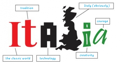
1. It was designed by Landor Italy.
2. Apparently, they were the winners of a contest with over 60 entries.
3. The identity will be mostly used in its two-letter configuration of it. (A smart move considering that their top-level domain is .it).
4. Said configuration enables the presence of red, white and green, the colors of the Italian flag. Although as pointed out in designerblog, the flag reads inversely: green first, white and then red.
5. The green shape is meant to convey “movement, flexibility and imagination”. Another meaning behind the green shape is to “strengthen the image of a country rich in natural beauty”.
6. The black (Bodoni?) i is meant to stand for “traditional” and “classic”.
7. Point 7 here was not necessarily part of the briefing but, yes, the logo uses at least 4 different fonts, none of which should be used together in a six-letter word.
And I’m sure there is a lot more where that came from. Now, as I mentioned, I was in Italy for a total of nearly 18 days last year and I bring this up not because I want to brag about my limited world travels but because I feel I can express the disconnect between what I saw in those trips and what is presented in this identity. In theory, as a tourist, I’m one of the key target audiences for this identity and if someone had pulled me into a focus group for this one, they would have gotten their $75.00 worth. Italy is a country rich with layers of textures, sights, flavors and smells, none of which feel, look, taste or smell like this new identity; Italy does not feel like a Karim Rashid salt shaker. Italy does not feel like incorrect and childish letters that change between upper and lower case for no apparent reason. Italy does not look like a jalapeño pepper. Italy is not a cold sans serif. Italy is everything that this logo is not. Including sense of humor. Antonio Moro swiftly parodies the new logo (I took the liberty of translating his captions):
Alora…If it’s not good enough for Italian designers, it’s not good enough for me.


Jump to Most Recent Comment
Danny Tanner’s comment is:
The whole logo seems pretty slick, too slick, and too generic. I don't imagine italy looking or feeling like a generic tech or computer company. (that is what the primary use identity communicates to me)
The green squiggly mass (that is supposed to be a letter t) should not be green. Having a weird green shape like that as part of a destination brand communicates to most some sort of landmass, and that is clearly not the shape of italy.
The type could at least be the same weight if it has to be four different fonts. Please, raise your hand if your tired of people using the idea of different fonts in a wordmark communicating the traditional, classic, etc. These are design ideas that most people, especially the target audiences don't understand or think about. Plus, it feels... a little sloppy.
On Feb.22.2007 at 11:58 PM
MCF’s comment is:
Love your literal translation... I'm sure the Italian's won't mind the UK as their letter 'L' either, they're not too proud a bunch. ;o)
On Feb.23.2007 at 02:37 AM
Sønxenn’s comment is:
A shape in a logo that stands for a country reminds me right away with the shape of the country itself.
But: this shape aint the italian boot. its just a nonsense green flubber shaped like a beer stain formed into a t-near-shape
that logo is interesting to talk about, but not worth a penny. thanks for reporting :)
On Feb.23.2007 at 03:04 AM
La Niña GRaphics’s comment is:
I´d rather prefer Antonio Moro`s one!!
seriously, that logo doesnt feel like italy, it doesnt taste mediterranean, it doesnt look like the better option.
I dont want to know how much it cost.
Christian Palino’s comment is:
To me, this is a failure. I agree, the use of diverse typefaces does not serve the creative intention it was after, and indeed it is a tired approach. Obviously, the green mass of a "t" not only hurts legibility in this case, but reflects nothing of the cultural value of italy, nor does it reference accurately the geography of the country. They did manag to get the prerequisite Bodoni-esque typeface in there – big surprise… But wait, where's the Futura? This poor solution is an unfortunate echo of a lot of the work the Landor office out here has been putting out of late.
On Feb.23.2007 at 06:03 AM
garethjax’s comment is:
Look like a mirror image of the state of Florida to me.
We are probably going to be (sometime in the future) annected as the 51th state of the U.S.A.
fatknuckle’s comment is:
A putting green. The new tagline "Italy, The New Scotland." There is simply too much to sift through. Multiple typefaces, design hooks (love that Flubber ref. Søn,) and color leads to an incredible sense of visual dissonance.
I think the idea is spot on, relating multiple cultural differences in a primary mark, but nowhere in the Absolutetility Inflexible No No Rules of Identilial Design handbook does it state you should use all of the devices at your disposal all at once...
On Feb.23.2007 at 09:32 AM
stock_illustration’s comment is:
Reads like a font library ad. The "t", rather than evoking Italy, reminds me of a pork chop past its sell-by date.
On Feb.23.2007 at 10:43 AM
g-sppud’s comment is:
This is absolutely awful. I get the idea, and it is an interesting one, but the execution missed at every turn. OK - I guess the "i" isn't too bad.
On Feb.23.2007 at 11:37 AM
Darrel’s comment is:
Seems to be more suited for a golf course.
But Italy is great...so, even the worst logo in the world won't stop people from visiting...
On Feb.23.2007 at 12:22 PM
en dash’s comment is:
Yes, the 't' seems to be a golf course ... are golfers enough of a fraction of travellers to warrant that?
Also, four fonts? Are the "L" and "I" indeed different? Or are you including the "t"-blob as a font?
On Feb.23.2007 at 02:22 PM
keenan’s comment is:
I think the ideas here aren't the problem, just a sloppy execution. The most vital representation of Italy is missing, and that is romance. If the logotype were a lot more balanced and finessed, instead of clumsy and chunky, I would by a meat lovers pizza and drive to Rome right now.
On Feb.23.2007 at 02:51 PM
andrewmartin’s comment is:
I'm breaking rank and coming out in favor of this logo. Because IT'S A VERY GOOD LOGO.
POINT: It doesn't feel like Italy -- rich textures; vibrant colors; rolling, terraced, vineyard-buried hillsides
COUNTERPOINT: You're right, this logo doesn't feel like cliche Italy, the one we see in "the Italian Job" and, presumably, the one that millions of tourists pay billions to visit each year. But, perhaps evidenced by the nonproliferation many gasoline or milk ads, it's not necessary to advertise what people already know they want/need. This mark could be a conscious decision to expand people's idea of what it means to visit Italy, appealing to new audiences and markets. The look of this logo is spot on for destination cities like Milan or Roma -- classic, modern, fashion-forward, a bit pazzo at times, but combined for a wonderful experience.
POINT: That green blob ain't a boot!
COUNTERPOINT: It's a boot without a toe, which again (speculatively) could be a strategic move. Northern Italy is a) home to most major Italian tourism destinations and b) more accessible (by hours or days) to tourists across Europe. Why not emphasize it? Why not, also, generate a bit of buzz by bucking the cliche notion that Italy would fit nicely around a huge shin?
POINT: Mixing fonts is old! It's childish!
COUNTERPOINT: By and large, that's true. But when executed with care and craft, it works to nice effect -- as in this identity. It goes a way towards creating a nice visual system, too: the "iT" stand-alone mark is sharp; the varying colors work to nice effect; the diversity of form makes it all very unique/ownable.
So yes, it's a good logo. And yes, everything above is (subjective) speculation.
**On a side note, it's worrisome and sad that identities -- nations' identities, at that -- are being put up for grab in "design competitions." Don't be lazy, clients; search out the top firms and have them pitch. Paid.
On Feb.23.2007 at 03:04 PM
felix’s comment is:
![]()
David E.’s comment is:
Im not sure what this logo is being used for. Is it the official logo of Italy? If so, why does a country need a logo in the first place?
On Feb.23.2007 at 08:04 PM
Andrew’s comment is:
I believe the green blob represents the jawbone of an ass.
On Feb.23.2007 at 08:37 PM
Andrew’s comment is:
Why does a country need a logo?
Is David E. lost?
Is this a branding website?
Christian Palino’s comment is:
POINT: It doesn't feel like Italy -- rich textures; vibrant colors; rolling, terraced, vineyard-buried hillsides
COUNTERPOINT: You're right, this logo doesn't feel like cliche Italy, the one we see in "the Italian Job" and, presumably, the one that millions of tourists pay billions to visit each year. But, perhaps evidenced by the nonproliferation many gasoline or milk ads, it's not necessary to advertise what people already know they want/need. This mark could be a conscious decision to expand people's idea of what it means to visit Italy, appealing to new audiences and markets. The look of this logo is spot on for destination cities like Milan or Roma -- classic, modern, fashion-forward, a bit pazzo at times, but combined for a wonderful experience.
I don't buy this rationale at all. This IS going after the italian cliches, for better or worse.
Using the "national" colors
Using a "boot" shape
Utilizing Bodoni and Futura-like typefaces
(anyone who's been in Italy for a while will attest to the overuse of this last one).
And this brand is absolutely SPOT OFF for promoting cities like Milano, Roma, Torino. If we are promoting what great, modern cities have to offer (as those three examples do) then the usage of typography that is very tired here in Italia heads off in the opposite direction.
POINT: That green blob ain't a boot!
COUNTERPOINT: It's a boot without a toe, which again (speculatively) could be a strategic move. Northern Italy is a) home to most major Italian tourism destinations and b) more accessible (by hours or days) to tourists across Europe. Why not emphasize it? Why not, also, generate a bit of buzz by bucking the cliche notion that Italy would fit nicely around a huge shin?
This is not an accurate shape to reference the boot – no matter how hard we try.
Northern Italy is NOT "home to most major Italian tourism destinations". In regards to the tourism statistics here in Italy, Toscana, Lazio, Emilio Romagna and Umbria make up a huge percentage of the tourism destinations for foreigners (and italians!) every year. Not to mention Sardegna, Sicilia, Campania, etc…
And in regards to your rationale above, this "t" shape is not a lack of emphasis on parts other than northern, in Italy – it actually removes some (Sicilia, Sardegna, Calabria) Piemonte and Liguria (in the north) included!
POINT: Mixing fonts is old! It's childish!
COUNTERPOINT: By and large, that's true. But when executed with care and craft, it works to nice effect -- as in this identity. It goes a way towards creating a nice visual system, too: the "iT" stand-alone mark is sharp; the varying colors work to nice effect; the diversity of form makes it all very unique/ownable.
The mixing of fonts here is not creating a "nice visual system", its hurting any sense of consistency that the use of a unified typeface might be able to add to this broken mark.
**On a side note, it's worrisome and sad that identities -- nations' identities, at that -- are being put up for grab in "design competitions." Don't be lazy, clients; search out the top firms and have them pitch. Paid.
This I could't agree with more andrewmartin. Unfortunately we are seeing more and more of this in our field, throughout the world. And I can say from experience, that out here in Italy it is becoming extremely common.
However, in this case, I wouldn't be surprised if the competition is used more because there are financial/tax incentives for the type of business that this brand belongs to if they have a competition rather than paying for bids.
On Feb.24.2007 at 05:59 AM
Armin’s comment is:
> But when executed with care and craft, it works to nice effect -- as in this identity.
Andrew, beauty may be in the eye of the beholder, but unfortunately there is no care and craft to be beholded in the execution of this identity. The weights of each letter are different, one "i" has a dot, the other doesn't. No care. No craft.
> Also, four fonts? Are the "L" and "I" indeed different? Or are you including the "t"-blob as a font?
Endash, yes, I guess. It's closer to a "t" than anything else. But I agree, it's not a font per se.
> Im not sure what this logo is being used for. Is it the official logo of Italy? If so, why does a country need a logo in the first place?
Most countries create identities to support tourism campaigns; to present a unified visual statement when you step into the airport; to act as official endorsers of maps, brochures, information kiosks handed to tourists or even on taxis and public transportation; sometimes they are the effort of the government, sometimes they are spearheaded by a tourism board. And every now and then there will be an "official" logo (a seal, a wordmark, etc.) plus a "marketing" logo that is meant to be more emotive and lure you to any given destination.
On Feb.24.2007 at 09:22 AM
Old Jacques’s comment is:
A few answers and comments: the contest winner was reportedly paid between €80K and €100K (I don't think it is clear whether the €100K prize included or excluded VAT 20%).
The logo is to be used for tourism and its promotion on Italy's brand spanking new national tourism site, much like the (successful?, or at least easily recognizeable) logo for Spain ![]() on their touristy site: .
on their touristy site: .
With the difference that the Spanish site comes up automagically in relatively understandable English, while the Italian portal, after a series of long, slow, delayed, useless splash screens (partially removed in the past day or so) requires a choice of languages to arrive at a typically Italian "inglese maccaronico" (macaroni English) littered with imaginary words and frequent spelling and syntax errors.
The site itself reportedly cost upwards of 45ML€ (so the logo seems almost a bargain), between infrastructure and contents, many of the latter of which have already been demonstrated to be horribly outdated (ex. by one testimony of a local resident, many of the movie theatres listed as active in Genova seem to have been either converted to red-light houses, or closed, or in some cases both first one and then the other, even more than ten+ years ago). Thought it has been theoretically 3 years in the making, it seems like most of the real work has happened in the past 8-14 months, with the majority in the past 3-6 under unrealistic deadlines.
In any case the public outcry has been somewhat drowned by the local political crisis, but a series of bloggers are trying to keep up the protest.
On Feb.24.2007 at 10:45 AM
nic’s comment is:
Horrendous,
On the other hand, It does wonders at synthesizing all negative stereotypes about Italy, (even those coming from within Italy).
Racist/separatists from the Liga Nord (the north) would surely say of this design gem:, "assolutamente meridionale"- that'd be: totally southern...
andrewmartin’s comment is:
You're right, Armin, "care and craft" may have been giving this logo too much credit. And since many of my assumptions are disputed, and some discredited (thanks, Christian, for the Italian perspective), the logo seems lacking some strategic merits, as well. All that said, though, it's not a bad mark -- with some x-height and line-weight correction, it could be quite sharp. And yes, I stand by the flubber T.
On Feb.24.2007 at 11:35 PM
socialdesignzine’s comment is:
http://sdz.aiap.it/notizie/7311
Press release
The presentation to the public of the new logo for Italy’s tourism promotion "It” has provoked great disappointment and deep dissatisfaction within the entire national community of visual communication professionals.
The Italian graphic association (Aiap) endorsed the general discontent by promoting a petition addressed to the Office of the President of the Council of Ministers. The petition has collected in a few hours, and is still collecting, the signatures of hundreds of companies, designers, architects, artists - the expression of a relevant share of the world of communication.
It is not only the formal result that is blamed but the procedure that has lead to this result, through a competition which did not satisfy minimum standards: selection of the participants based on their turnover, lack of anonymity, inadequacy of the jury, insufficient time to prepare the offer.
While expressing their feeling that the "It" project is not adapted to the quality of the Italian graphical standards, Aiap, SocialDesignZine, Progetto Grafico, Ministero della Grafica, ask the Office of the President of the Council of Ministers, through the petition "Not IT my name", to rethink the entire initiative.
On Feb.25.2007 at 05:25 PM
pk’s comment is:
what a joke. i'm actually surprised there's a creator's name attached to it. don't we have a alan smithee for the design disciplines?
On Feb.26.2007 at 01:52 AM
Mary’s comment is:
Granted, I do not think that a boot-shaped green patch in the middle of this logo would be the solution, but why would you want to associate a random, green blog with a country that is known for it's uniquely shaped land mass?
I would def. like to see the other submissions and more importantly, I would like to know who is in charge of choosing a logo and what their qualifications are - maybe that is at the root of these sorts of problems.
On Feb.26.2007 at 09:28 AM
marco’s comment is:
i'm an italian designer and i'm sorry.
this the REAL and EXACT condition of italian Culture (sic, everyone can remember our history...), there are no more consideration in research, money for universities, no respects for professionists in our country, cliché worldwide known as "italian style" doesn't exist in all Italy. There are no more italian fashion designers, all "creatives" comes from other country, country that normally spent some time for young designers, for research, and, finally institutions+clients have some respect for designers and professionist.
David E.’s comment is:
Most countries create identities to support tourism campaigns; to present a unified visual statement when you step into the airport; to act as official endorsers of maps, brochures, information kiosks handed to tourists or even on taxis and public transportation; sometimes they are the effort of the government, sometimes they are spearheaded by a tourism board. And every now and then there will be an "official" logo (a seal, a wordmark, etc.) plus a "marketing" logo that is meant to be more emotive and lure you to any given destination.
OK, so in this case what is it – the official logo of Italy from now on? – something that's part of an advertising campaign that will last a month or two? I suppose what I'm getting at is that in discussing identities, the context of a logo is very important. I can't imagine this site is intended to do nothing other than discuss the formal considerations of logos.
Is David E. lost?
Uh, no. Are you?
On Feb.26.2007 at 01:10 PM
David E.’s comment is:
As for the logo itself, it does seem very "Italian Design" – in a dated, '80s, Memphis kind of way.
On Feb.26.2007 at 01:19 PM
David E.’s comment is:
As for the logo itself, it does feel very "Italian Design" in a dated, '80s, Memphis kind of way. Maybe it was approved for that reason.
On Feb.26.2007 at 01:32 PM
Tony’s comment is:
I think David E is right, and Armin's clarification helps too. The visual identity of the nation-brand, traditionally, is its flag. It seems to me that Italy's, Spain's, and Argentina's excellent "logo" are better understood as campaign logos. They designate tourism and economic development campaigns, and as such they come and go.
On Feb.26.2007 at 01:37 PM
Ben’s comment is:
Whether it was designed as a mark for the entire country or just for a few tourist maps is entirely irrelevant. The logo is bad, and is successful at little more than stirring up the design community.
For me, the most salient example of a good tourism identity is that of the Bahamas:

David E.’s comment is:
Whether it was designed as a mark for the entire country or just for a few tourist maps is entirely irrelevant.
I don't see how the context of something can ever be irrelevant to a discussion of it. At the very least, it would make the discussion more interesting – unless, as I said before, you think that identity design is about the form of the logo and nothing else. Post-modern ecleticism, for example, is considered to have been a legitimate design movement, and one that is closely linked with Italy (at least to some Americans). If this logo is referencing that (as I already suggested might be the case), and especially if it were part of a campaign that included other elements that were integrated with the logo, it could have quite a bit more merit. I'm not defending the logo as much as I am my suggestion to include context in the discussion.
David E.’s comment is:
Im really screwing in posting today...the first sentence of my last post was the quote, the rest were my comments.
On Feb.26.2007 at 03:16 PM
David E.’s comment is:
screwing "up", I meant. Maybe I am lost. :)
On Feb.26.2007 at 03:17 PM
Von Glitschka’s comment is:
Weeeee!

Antek’s comment is:
Here you have a thing of similar origin: hatred logo of Poland.

Authors suggested the meaning as "youth, movement and changes".
Below the second version by Stanislaw Tym, polish satirician, jocking from free-mason philosophy:

"P - the saber stands for our history (fore-wall of Christianity); O - merry baloon ('universal symbol'); L - polish quality (90' is 90' also in Poland); S - Wisla rivier with three main cities;
K is a table and A is a chair to sit down and write which letter means what.
C-lo’s comment is:
No.
To sum up Everything about this logo: "No."
The only way they could have made this worse is if the "T" golf course looking thing was brown.
I'm still going to visit though
On Feb.27.2007 at 03:00 PM
Daniel-son’s comment is:
Am I missing the joke in Antonio Moro's parody. Why an outline of Great Britain? (Not the UK, as that would include Northern Ireland, see). Can someone explain?
Anyway....
You guys should all know better... A logo does not maketh the brand.
It's what happens around it that matters, and that remains to be seen. As a part of that 'brand' (and it's to promote it to tourists remember), it works ok for me at a glance. Not a very 'Landor' solution, and yes, a bit '80s American-designed identity' too, sadly.
It's beyond the 'glance' that it falls apart. The type is criminally amateurish (the 'alia' bit). Scaling without weighting...? You should have asked some decently educated design students about that fundamental mistake. It's not really a very cohesive logo either... a bit weak on its own, which, given my point about a brand being a many-headed beast, isn't so bad. However, I also know that in tourism marketing, the logo appears on a huge number of thrid-party ads and collateral. Shame.
On Feb.27.2007 at 05:27 PM
Leanne Johnson’s comment is:
to me, it just looks messy and amateur. The 'IT' mark on its own...bad, but bearable in context on buildings etc (can't remember where I saw it though). The 'ITALIA' mark...horrible. The sudden change in typeface is unnecessary and I think it looks awkward.
Also, Italy is so classy, so historical, so beautiful - it has SO much potential...and they haven't used ANY of those ideas.
On Feb.28.2007 at 10:19 AM
jack’s comment is:
i like the idea of using "it" predominately, but that shape...i just am not seeing it. and the rest of the typography...those "a"s make me want to cry. is the circular part not the same weight as the rest of the letters, or is that just a trick of the eye? either way, it looks awful.
The green shape is meant to convey "movement, flexibility and imagination". Another meaning behind the green shape is to "strengthen the image of a country rich in natural beauty".
what the hell were they smoking when they came up with -that- bull?
On Feb.28.2007 at 01:35 PM
Greg Scraper’s comment is:
"We know that the image of a country must have something which is instantly recognizable, a graphic symbol which delivers a message. This is why we felt it was necessary to come up with a logo." – Premier Romano Prodi
Hmm... using a logo as a graphic symbol to deliver a message... it's so crazy is just might work!
Unfortunately, they apparently let monkeys into the contest and even gave them some sort of advantage, I dunno, like maybe fingerpaints and a bad typewriter. But you know what they say about monkeys and typewriters... unfortunately, this is about as far from Shakespeare as you can get. I'm not sure what they say about monkeys and fingerpaints. Maybe Monet?
On Mar.01.2007 at 09:58 AM
Kula bácsi’s comment is:
That "green shape" looks like a turd after a spinach dinner.
On Mar.06.2007 at 08:18 AM
Lisa’s comment is:
I feel quite embarrassed with myself but all I can see when I look at that t shape is an upside down dildo... something like Tom Dixon's Bone design.
On Mar.06.2007 at 12:29 PM
Elisabetta Bruno’s comment is:
Andrewmartin, while right now I don't feel like admitting it, I am Italian and that isn't a good logo.
Get out of here.
On Mar.18.2007 at 04:11 PM
Exigent’s comment is:
CRAP!
Sorry Italian friends... but this is artistic garbage.
On Mar.27.2007 at 04:37 PM
klingklang’s comment is:
hi guys, i'm from italy.
please, type "merda" (shit) in google and wait... :)
Brenda’s comment is:
It doesn't matter. It's going to go onto tourism brochures and place marketing websites. We might see it on the tail of an airplane.
Logos are completely inadequate ways of communicating the complexity of place.
It's a shame that so much money is spent on them.
Goffredo Puccetti’s comment is:
As an Italian designer, I am delighted to inform you that the whole italia.it portal project has been stopped as it was nothing more than a huge waste of tax payers money.
That horrible logo -shame on Landor Italia!!! - will never ever be seen again.
See:
http://italianscandal.wordpress.com/
http://martin.sarsini.it/2008/01/italiait-58-million-euros-for-a-blank-page/
The whole project, starting from how the bid was set up, is now under investigation. Now let's hope we will see some people in jail.
ElKid’s comment is:
How lame can you get
On Feb.12.2008 at 05:49 AM
Janan’s comment is:
In response to keenan's comment:
Since when is a meat lovers pizza truly Italian? Maybe this is the problem, the underlying philosophy of this logo seems to be coming from the view of un-educated, Little Caesar's eating outsiders, as opposed to how Italy views itself: They are a proud, passionate people who love and respect their country and its history. This logo in no way reflects the elegance, sophistication and rich historical textures of Italy.
On Feb.19.2008 at 11:24 AM
Randy Hill’s comment is:
Horrible. Horrible. Horrible!
It looks as if it needs a good dose of Viagra.
jgzfquxoh pznxdctj’s comment is:
sapjulk qvcbypois wlmn ouscvz sinmlu kujcyd wmfks
On Oct.24.2008 at 03:32 PM
Comments in Brand New, V1.0 have been closed.


