

NOTE: This is an archived version of the first incarnation of Brand New. All posts have been closed to comments. Please visit underconsideration.com/brandnew for the latest version. If you would like to see this specific post, simply delete _v1 from the URL.
![]()
I don’t travel much to the West Coast, so my only face-to-face experience with the fast food chain of Jack in the Box is limited to one tasty burger back in the late 1990s and I remember it was quite satisfying. Despite it being a limited staple on the far-left coast and Texas, Jack in the Box seems to have a very strong brand presence throughout the U.S. with their regularly entertaining TV ads and big-headed Jack. Without much fanfare — nor an update to their web site and much less a press release — Jack in the Box has been slowly updating their restaurants in San Diego, where they are headquartered.
As far back as October of last year I received the first tip of Jack in the Box changing from Roberto Comparan in San Diego, alerting us to the new look, and since then people (thanks everyone!) have been sending in links — specifically to this story from December — and photos from Flickr documenting the change. By now plenty of Jack in the Boxes feature the new logo and a couple of days ago Duffy & Partners posted this item on their blog, confirming that a) they designed the identity and b) the new restaurants weren’t just Beta-testing a possible change.
The old logo had all the fixings of a classic American fast food chain logo: red and quirky typography. Plus years of equity. The new logo is a very contemporary departure from the original, which is par for what’s been happening to fast food logos, and the new, custom script is quite attractive and dynamic. And, pending a press release, I’m pretty sure the tail of the “k” is meant to be a smile. The old flat square has been replaced with a box seen from the front with a marked perspective on which the lettering wraps, and in the actual signage, the corner of the box sticks out, which is a nice detail. The biggest letdown is the “in the box” typography having a needlessly techie feel. Separating “Jack” from “in the box” appears to be a move to colloquially position the chain as just Jack, which I doubt will work, since Jack in the Box rolls nicely off the tongue — however, they do have one of the most awesome NASDAQ tickers, JACK, when they switched on December 15 from The New York Stock Exchange.
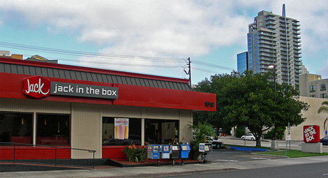
Photo: Flickr user So Cal Metro
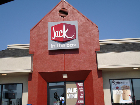
Photo: Flickr user dlassotta
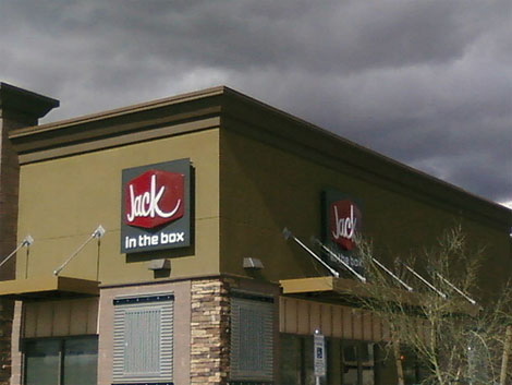
Photo: Flickr user buzaw0nk
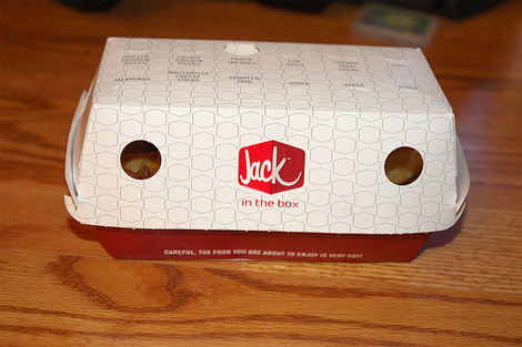
Photo: Flickr user becausemaybe
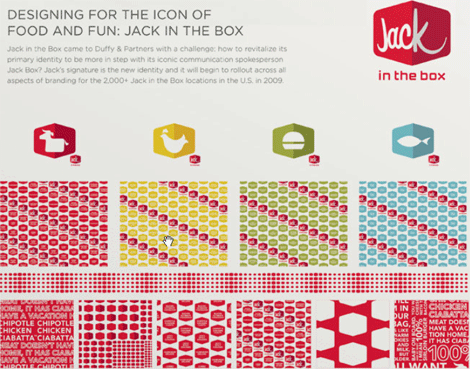
Image from Duffy & Partners’ newsletter.
Update: Thanks to Nate Voss for pointing out the materials on D&P’s newsletter, the image has been added.


Jump to Most Recent Comment
Joe’s comment is:
cheese
On Feb.25.2009 at 10:17 AM
Serviceburo’s comment is:
Living down the street from one, I'm glad to see the new logo. The "ox" in box always looked to me like they were going for some sort of subliminal Jesus message. Now if they'd just have some vegan food . . .
On Feb.25.2009 at 10:29 AM
Steve’s comment is:
Not liking it. it kind of reminds me of a computer or electronics-like logo.
I remember a few years ago (2004 or 2006) when Jack in the Box decided to test out a new name, "JBX," in a few markets. It obviously didn't work out since the name never changed.
On Feb.25.2009 at 10:30 AM
rickyaustin’s comment is:
I love nearly everything Duffy & Partners does, but I dunno, this doesn't feel right.
It's a nice mark, good everything, I just don't think it feels like Jack In The Box.
The way the type is set, it reads JACK!!! (oh, p.s., he's In The Box too).
Couldn't a simple update of the original mark have been enough with an accompanying identity to create enough change? Reminds me of the DQ rebranding in that a kitschy-American-fastfood mark just needed cleaned up, and the slate was wiped clean. This is far nicer than the DQ rebranding, but I feel they did too much.
I still love D&P.
On Feb.25.2009 at 10:30 AM
John Lascurettes’s comment is:
It's not the first time they changed the logo. The Jack In The Box logo used to have a clown head on it. In the eighties they "wasted the clown" and went upscale to where they been.
When they brought Jack back in the nineties as the corporate suit-wearing giant clown head, it was actually another brand realignment. A brilliant one if you ask me. It offered more personality and memorability than the tilted red box and the annoying staccato violin music they played in commercials.
During the Super Bowl commercials, they threw Jack under a bus (literally) and I said out loud at my party, "uh-oh, they're wasting the clown again. We're going to see a new brand." I guess here it is. By the way, that's a lovely silhouette of a perfect breast in the counter of the K.
On Feb.25.2009 at 10:34 AM
Mike’s comment is:
Maybe the motive's more utilitarian. I can see Jack much better from a distance now.
On Feb.25.2009 at 10:36 AM
Harris’s comment is:
The colors, font, design are pleasing, and look much more upscale, but it bugs me that the text is so unbalanced and doesn't look like it's actually on the box. Or is the text in the box? The "k" feels so strong and the "J" is so weak.
On Feb.25.2009 at 10:37 AM
Nate Voss’s comment is:
Actually, Duffy announced this work in their last newsletter — and it goes quite beyond just a logo refresh. Lacking a direct url (flash-based site), head over to Duffy.com and click the menu at the top left, scroll on down to newsletters and use the funky-fresh navigation there to flip the page over and you'll see a little bit more of the scope of the visual language of the project. I find it to be quite nice.
Joe and I spent a few minutes covering the ins and outs of this project on a show called Design Matters about two weeks ago. It's a good show, you should check it out.
On Feb.25.2009 at 10:37 AM
Mathew Ballard’s comment is:
I like the font in the new one. But, I like the old logo better overall.
On Feb.25.2009 at 10:38 AM
Harris’s comment is:
Their website is still in the 90s. Can a moderator remove the bold from all of these comments?
On Feb.25.2009 at 10:39 AM
Andrew Klein’s comment is:

jRod’s comment is:
i don't understand why they couldn't incorporate "in the box" in the box, using a good, non-techie complimentary font. other than that, its a solid upgrade that uses colors and not gradients to create a 3 dimensional look, and i have always been a big fan of that. i was in Seattle over the weekend (first visit) and saw several of the new Chevron logos, and they really pull it off well.
More of this please. and curly fries.
On Feb.25.2009 at 10:47 AM
Plamen’s comment is:
The "k" looks like a rhyno :-)
On Feb.25.2009 at 10:48 AM
Nick Irwin’s comment is:
nooooo
On Feb.25.2009 at 10:51 AM
Anonymous’s comment is:
rweastr
On Feb.25.2009 at 10:53 AM
Armin’s comment is:
Nate thanks for the tip on the newsletter. I have little patience for Flash-sites so I don't poke around much. A screen grab of the newsletter has been added to the end of the post.
On Feb.25.2009 at 10:55 AM
Jon Sandruck’s comment is:
I moved West about 5 years ago and encountered my first JITB. It has always bothered me that the phrase "in the box" was in the box. Being one that enjoys visual word puzzles, I've always felt it reads "Jack In The Box in the box."
On Feb.25.2009 at 11:00 AM
Adam’s comment is:
First of all, I am a huge fan of the JITB tacos! They are an unhealthy addiction for me. That being said I am not a fan of this redesign. It screams of Chipotle to me, especially the building with the green paint and the industrial awnings.
The techie type used on "in the box" looks like a tacky design that would be found on a rave flyer. Juxtaposed with the strange perspective of the word "jack" over the cube shape...the type just seems off.
One great thing that the current branding has going for it is the cheesy appeal of the Jack character. I don't know if the commercials will work as well with the new swanky branding.
Overall, I just don't think it conveys the spirit of JITB very well. They became popular as one of the first fast food companies to have a great value menu. They are known for tasty value, and this new design doesn't seem to reflect their position in the market.
But my opinion and the branding might not matter to the drunk college student looking for a late night taco fix...and I will still buy their tacos as well. Yum!
On Feb.25.2009 at 11:00 AM
Keith’s comment is:
The old logo is a classic -- albeit a bit dated now. The new logo is nothing short of a mess in my opinion. It looks undesigned. I think a subtle refresh could have been more effective.
On Feb.25.2009 at 11:02 AM
Ricky Irvine’s comment is:
Looks like Best Buy's newest competition.
On Feb.25.2009 at 11:07 AM
Jeff’s comment is:
Everything's gotta smile! Except for the designs on the D&P newsletter, this is pretty boring.
And look at that "coffee drinks" poster in pic2 ... McDonald's?
On Feb.25.2009 at 11:07 AM
Morning Toast’s comment is:
Man...what's with all these places F'ing up their good logos lately? It's snowballing...
Despite the JitB being a little "dated," it was very strong, simple. Now it's just kind of weak. Yeah, it looks good and slick, but just not as impactful as the original. Not a good move if you ask me.
Pretty soon, whoever *keeps* their old logo will be the one that is unique.
On Feb.25.2009 at 11:11 AM
Robb Irrgang’s comment is:
Looks like an MTV type logo. Jack in the box with Carson Daly?
On Feb.25.2009 at 11:15 AM
Erik’s comment is:
I love the look of the red box with the the word Jack. It's friendly, modern and inviting. however, I think the text treatment for "in the box" is really the wrong choice.
On Feb.25.2009 at 11:25 AM
jrmm’s comment is:
I remember when I went to San Diego last september that I saw a JITB location with that new logo, I thought they already changed the logo... but I saw billboards with the old logo on the road... so probably it was a testing...
Like John... that's probably the reason why JITB made the whole campaign of Jack Box being hit by a bus and being in a coma: www.hangintherejack.com
On Feb.25.2009 at 11:30 AM
Bart O'Dell’s comment is:
I actually quite love the new design. It is a refreshing change to the fast food realm. I also found quite a few more pics on the Duffy site.
http://www.duffypov.com/detail.aspx?article_id=2118
On Feb.25.2009 at 11:31 AM
Joel Beukelman’s comment is:
I personally like the new band. The just opened a new location with the new identity less than a mile from my house. I think it is a fresh approach to a dated look. I think there old look retained some "niche" value, but I'm a big advocate for change. However, I can't stand the "in the box." Way too techie.
On Feb.25.2009 at 11:37 AM
Brook’s comment is:
I don't know how widespread it was, but the first attempt at re-branding Jack in the Box from its original 50s/60s image that I know of was in the mid-80s, when they renamed the Puget Sound area restaurants "Monterey Jacks" and ran ads with Ray Charles singing (to the tune of "Hit the Road Jack")"Monterey Jacks, you're gonna come back for more, for more, for more..." It was dreadful for all involved.
The "Jack is Back" campaign began with the name rollback. Considering that there's a teaser ad on TV now with Jack in a coma, clearly something's coming.
On Feb.25.2009 at 11:42 AM
lucid’s comment is:
just say no to smiles!
On Feb.25.2009 at 11:50 AM
Xav’s comment is:
Weird choice to have the "in the box" bit on a grey background on restaurants. Grey and food don't go together at all, I'd have gone for a dark green personally...
On Feb.25.2009 at 11:51 AM
Mongoose’s comment is:
I'm kind of liking it. And really in the mood for one of their horrible tacos.
A lot is maintained here, though subtly: The red box notion (even turned three-dimensional), the connections between letters in 'Jack'. It doesn't to me seem more 'upscale', but decidedly more modern.. built to match the Chipotles and Red Robins that surround the mall, moreso than to be off the I-35 exit ramp.
What I don't like about it: The 'In The Box', downplayed and in the font from all my trance ambient CDs from 1996. (I'm not proud. But I'll bet you had some yourself.) And the 3Dism in the logo works on signage better than in print; flowing better as 'Jack' than as 'Jac|k'. Even 'in the box' looks better in the white.
Overall, a B+ ; It's crisp signage, moderate print, and I think everyone will still keep saying 'in the box' and not just 'Jack'.
--Mongoose
On Feb.25.2009 at 11:52 AM
Zach’s comment is:
I really don't like a lot of these "new" logo changes that are circulating. This is another example of the wrong design applied to a company with an established identity. Alienating your costumer base doesn't improve sales.
PEPSI, BEST BUY, WAL-MART please stop being absolutely retarded.
I like the little food group icons, but that's all.
On Feb.25.2009 at 11:54 AM
meg’s comment is:
I'd give it an A-/B+ overall, but I must say, I love the fact that "in the box" is out of the box. Love it.
On Feb.25.2009 at 11:55 AM
fakar’s comment is:
nice progression
On Feb.25.2009 at 11:57 AM
Dave Bastian’s comment is:
Now reads even more like JACK (as in: nothing) in the box, which is more apropos for a seller of boxes rather than burgers.
Also, does nothing to make me forget they killed 4 kids via E. coli in 1993.
On Feb.25.2009 at 11:59 AM
Kevin Zwirble’s comment is:
I really like the work Duffy did for this. The icon families and the the packaging looks very sleek and much more modern than the '80's looking logo they had.
Although I'm not sure it fits. To be honest it looks like a trendy-posh-new york restaurant or an upscale coffee bar. I don't maybe I've seen this too many times in the CommArts Design Annual.
On Feb.25.2009 at 12:00 PM
Anonymous’s comment is:
Does this logo smack of Carl's Jr to anyone?
On Feb.25.2009 at 12:06 PM
Jeffro’s comment is:
I think the "in the box" text is trying to be box-ish. Not techie.
On Feb.25.2009 at 12:10 PM
damon’s comment is:
it feels lopsided to me, and not in a good asymmetrical way.
overall it's better than the old one for sure, but I'm not in love with it to be honest.
it's better though
On Feb.25.2009 at 12:10 PM
claes’s comment is:
I quite like it. I have no sentimental history connected to the old logo, so to me it just seemes clunky and outdated. The new mark is really nice by comparison, though the "in the box" typeface could've been something a little less tech-y and more welcoming.
On Feb.25.2009 at 12:24 PM
Abe’s comment is:
It's actually a welcome change. I have Jacks all over my hood and their look tends to feel dingy and so dated. This is quite refreshing. As I drove past the one by my house for the first time since the change it immediately stood out to me and the 3D signage only helps to make it much more visible.
So this new look along with their hilarious ads could go a long way for them.
I'm an In & Out guy so I rarely eat burgers anywhere else but the new design makes it a bit more appealing to me.
On Feb.25.2009 at 12:29 PM
Adam’s comment is:
::addition to my previous post::
...I just noticed the damn smile...when are designers going to stop doing this!!!!?
On Feb.25.2009 at 12:30 PM
felix sockwell’s comment is:
smiles everyone! the plane!
i like it. the patterns are a nice touch too. the only flaw is a lack of vision in regards to how this functions in 3 dimensions. perhaps the fabrication cost was too great.
On Feb.25.2009 at 12:30 PM
pamela’s comment is:
Yeah, I'm seeing lopsided too.
Alright, It's a step up from the last, but the "in the box" is most definitly feeling unconnected.
Also, if I think of this in an actual 3d kind of way, if someone were to build a real live 3d cube based on this design, the "JAC" would be on one side, and the "K" would be on the other.
You know what, this could almost grow on me. I really like the JACK typeface. Again, not sold on the 'in the box.' Maybe it a step to illiminate the 'in the box' and to simply go with JACK? who knows.
Anyway, I'll give this a B-. ^_^ and maybe an extra 1/2 point for not bringing back the clown.
On Feb.25.2009 at 12:35 PM
Dale Campbell’s comment is:
I think its okay - but just okay.
The font choice is what doesn't appeal to me the most. Jack in the box was never really upscale or modern looking, nor were or are it's customers...
It's a fast-food place.
I think the more I look at it, the less I like it, actually. Which is weird, because I too normally love all that Duffy puts out.
It is asymmetrical and the font is far to futuristic or something.
Thanks,
Dale
Jon’s comment is:
Jack ON the box!!
On Feb.25.2009 at 12:45 PM
Andy’s comment is:
I love everything here except for the logo. I like the script Jack very much, but I would have explored other means of incorporating 'in the box' well, into the box, or at least with a less 90s typeface.
On Feb.25.2009 at 12:46 PM
Matt Warburton’s comment is:
While I agree with Armin’s comments about the fonts (what the hell was the designer who picked that techie sans serif font thinking?!?! At least its not another 'badly drawn sans", just a badly chosen one), I like the applications, especially the food icons and the patterns which have a bit of a comfort food/retro feel to them. And the fake 3D effect isn’t as obvious in the signage and icons, which is a good thing as I find the box perspective a bit contrived.
Love the script though.
At least they didn't shorten it to an acronym ala KFC...
On Feb.25.2009 at 12:48 PM
doogs’s comment is:
Command-Z! Command-Z!
On Feb.25.2009 at 12:51 PM
Bendy’s comment is:
I like it... but it seems totally inappropriate for Jack in the Box. I mean, if it were a new Pita & smoothie chain in SoCal, I would like it... but it's freaking fast food.
Like the logo, but it's terrible for Jack in the Box - the previous logo was fun and matched the company's approach. This feels too pretentious for JITB to me.
It's hard, because it's a good execution... it's just very perpendicular to the Jack in the Box we know now. Maybe it's just the Compaq typeface they chose for 'in the box' that I'm reacting to...
On Feb.25.2009 at 12:52 PM
vectorbug’s comment is:
The tail of the K looks like a side boob!
On Feb.25.2009 at 12:56 PM
Kerry’s comment is:
I'm not sure about this one. I think the design is good, but the personality doesn't seem to match the quirky style they have now.
I wonder if this ties into their current TV campaign where Jack gets hit by the bus? Are they "reviving" the brand in conjunction with Jack?
On Feb.25.2009 at 12:56 PM
vitorino’s comment is:
i have to agree with some - my first reaction was computer/electronics...just not a foodie feel to it
On Feb.25.2009 at 01:04 PM
Javier’s comment is:
OK, I love Duffy & Partners, but this does feel too out of the box.
I agree that the old logo looked a bit clunky but it looks American. I don't know why designers now brake their heads into finding the latest and greatest font trends. I love what underware did with that boom of script fonts but it's hard to top them and it has been overdone.
The "in the box" techie font looks too close to what Chipotle uses as their secondary font. The scripty font looks close to the Chipotle font too.
I do like their meat, chicken and fish icons and secondary colors though but i'd say the old logo has more of shelf life than the new one. I give it 5 years.
Stop trying to fit new fonts just for the heck of it. Instead relate it to it's culture, it's history, it's market. If it fit's the purpose then great.
Just an example. I came across this book about American Hardcore Music called Radio Silence. The book uses DIN as the main typeface. While I don't have a problem with DIN, it does not say American nor Hardcore Music. Yeah it looks clean and modern, but that has nothing to do with hardcore.
Where is America in this brand?
On Feb.25.2009 at 01:11 PM
DM’s comment is:
I have some concerns about the disjointed name, so...as long as they're ok being known simply as "Jack" and then tag'ed as "in the box" think their fine. If they want to retain their "Jack in the Box" name they might have some issues. There will be much bickering about this I'm sure.
I especially love the food boxes - the way they work to ID the contents, and the retro theme of the brand extended to the form.
Totally dig the associated product patterns that extend the brand.
But the signage misses the mark. It's a retro themed brand with modern accents, but executed in 1992 stripmall-esk materials. Where's the neon? Wheres the lightbulbs? The quilted aluminum? And why would you need to put the folded box, and the "in the box" tag inside a warm gray box...? It would sit so much better floating on the red background...
Also think the ox/cow icon is not yet finished... it's not quite part of the family yet.
Overall, a B+
On Feb.25.2009 at 01:11 PM
Adam’s comment is:
I can't help but wonder if the disconnect with "in the box" isn't on purpose, if the company made it clear they wanted the option of dropping it in the future. There is certainly enough room on the right of the box to make it Jack's as well if they wanted.
On Feb.25.2009 at 01:14 PM
Hernan Valencia’s comment is:
If they're going for a story arc revolving around #2 in their 'jack gets hit by bus' campaign, it could work as a nice exit strategy if their design is unpopular. Which i'm assuming from the comments that it's not a good fit. We'll just have to see
On Feb.25.2009 at 01:16 PM
Jacob’s comment is:
The "Jack" reminds me of a mix between the Jack Johnson (singer) logo and Jack FM logo.
Hey, maybe you'll hear Jack Johnson playing on Jack FM on the radio at Jack in the Box...
The old logo was better. It says "Hamburgers".
Glenn Sakamoto’s comment is:
I love Duffy Design, but I think missed the burger boat on this one. It has none of the kitsch and fun of the original. Has anyone on the design team eaten here?
Quite frankly, it looks like a logo for a video game.
On Feb.25.2009 at 01:25 PM
coda’s comment is:
Their restaurants look like DIY stores. As for the logo, not much of a fan. In some instances it feels right, mostly not though.
On Feb.25.2009 at 01:31 PM
Tyler’s comment is:
It feels like they should have tried to maintain keeping "in the box" in the box too. I do not enjoy the shaded "k", that just feels silly...
On Feb.25.2009 at 01:41 PM
Cam’s comment is:
Looks better when executed than in the side by side, but I'm still not a fan of this one. Strays too far from the old mark. Definitely looks classier than the food poisoning cess pit of the past. Then again maybe it's a good idea to stray from the previous mark and its unique brand equity
On Feb.25.2009 at 01:44 PM
BJN’s comment is:
I think Armin's analysis nails the pros and cons. I think the look is "electronics retailer".
I don't think I'll be saying "I'm heading out to Jack" without irony.
On Feb.25.2009 at 02:38 PM
Randy’s comment is:
Got nothing to say here, saw the new logos last year when I was in San Diego for Comic Con. Love it, but the "techie" look is annoying. Oh well, it's better than Blimpie.
On Feb.25.2009 at 02:44 PM
anonymous’s comment is:
These new logos are godawful.
The original logo wasn't much to speak of, but these new logos make it seem like a generic new diner that's aiming for a techie crowd that likes salads.
This new design reminds me of Circuit City, and not in a good way.
On Feb.25.2009 at 03:05 PM
Don’s comment is:
I'm going to have to be honest here (and a bit vulgar)... with the new logo, I see the word "Jack" as a verb, and "in the box" as where you should be doing it. Seeing the real-life pictures, I keep reading it as "JACK... in the box."
On Feb.25.2009 at 03:14 PM
Bruce’s comment is:
I like the script "Jack" and the shape of the box, but the typeface for "in the box" is already dated, and due to it's "techie" feel, doesn't seem appropriate anyway (unless JITB is planning on opening locations in software companies nationwide). I didn't realize JITB was viewed as a western U.S. restaurant. JITB was on Long Island when I was growing up there in the '60s and '70s, and I've seen them in other east coast states.
On Feb.25.2009 at 03:22 PM
DG3’s comment is:
Ya know, I kinda like it.
They've had that other logo for 25 years, so maybe it will help them stand out more.
On Feb.25.2009 at 03:29 PM
Miguel’s comment is:
I like it, but one thing I find odd is that in the horizontal version of the logo the tag line is "jack in the box", whereas in the vertical version it's just "in the box".
So the horizontal version reads as "Jack jack in the box".
Rodrok’s comment is:
I like it.
I've never eat there before, because their old logo looks cheesy, and low quiality like...
Now I will consider it as an option to go eat...
I'll give them a chance just because the logo makes them look more serious about what they are cooking...
On Feb.25.2009 at 03:41 PM
Whaleroot’s comment is:
They have the shittiest tacos ever. But they're soooo good.
On Feb.25.2009 at 03:46 PM
MikeTheVike’s comment is:
They should change the name to "Jack in the Crack", that's what everyone I know calls it.
On Feb.25.2009 at 03:51 PM
rynot’s comment is:
the visual disconnect of jack being ON the box is a bit vexing. not digging it at this point. the support visuals seem nicely done so i'm going to reserve full judgement.
On Feb.25.2009 at 03:59 PM
gary b’s comment is:
love the 'Jack' type.
but it looks like a prehistoric mastodon trapped in 'the future' (aka the rest of the logo).
On Feb.25.2009 at 04:04 PM
jacqueline c.’s comment is:
I like hidden elements but the hidden "smile" is just ridic. We can't all be Amazon.com.
On Feb.25.2009 at 04:05 PM
ArtChemist’s comment is:
Wack! Why the double "Jack Jack" in the horizontal signage?
On Feb.25.2009 at 04:10 PM
Covarr’s comment is:
This is a wonderful logo, but it is entirely unsuited for Jack in the Box.
On Feb.25.2009 at 04:12 PM
Jordan Dobson’s comment is:
Oh noes! I'll no longer be able to call it Jack in the B-Jesus fish... bummer.
On Feb.25.2009 at 04:16 PM
@dean’s comment is:
terrible.
the layout adds unnecessary 'visual punctuation' to the company name.
former logo, while tired nevertheless mandated an integral pronunciation of the name, now it is "jack, in the box".
anonymous’s comment is:
Rodrok’s comment is:
I'll give them a chance just because the logo makes them look more serious about what they are cooking...
Congratulations!
You are the stupidest person to have ever posted on this blog!
Kim Siever’s comment is:
Apparently, I'm not the only one who sees a breast on the right hand side of the box. I guess the are going after the teen and 20-something male crowd?
On Feb.25.2009 at 05:06 PM
David’s comment is:
The type feels too techy compared to the retro script (which is kinda nice). The last time I had their food was 15 years ago and it was so disgusting I never went there again. I liked their Jack mascot and like the commercials but never have desired to eat there again.
On Feb.25.2009 at 05:08 PM
Nisio’s comment is:
Oh christ, another smile...
I usually like to give a rational on why I like or dislike a design, with this I just couldn't be bothered.
It's just not suitable, fit for purpose or nice.
On Feb.25.2009 at 05:19 PM
TheMaster’s comment is:
I grew up on Jack in the Box. What a shame they are losing that quirky old logo. I thought it was fun, even if it was outdated and forgetable.
What people don't know about the OLD logo is that the owners of the franchise are super-religious (much like the owners of In N'Out, for all you West Coast burger lovers). Like In n' Out, JITB subliminally snuck their viewpoints into the designs.
See the Jesus fish where the O and the X come together?
Look on the bottom of the old cups, see the scripture number?
Thought you should all know that.
I have no comments about the new design. It's as bad as Pentagram's Ruby Tuesday, and man, that is bad. Pentagram can't get it right lately.
Duffy, meh.
On Feb.25.2009 at 05:29 PM
Michael’s comment is:
I don't like it that much. The smile is kind of sweet but the "k" is still something else from the "Jac" part. I guess the 2 different tones of red help alleviate that a bit. But the "in the box" just seems like an afterthought, like they forgot about it and just stuck it there underneath, centered. It doesn't feel like part of the whole name.
On Feb.25.2009 at 06:24 PM
ADCS’s comment is:
The K is half of Jack's head.
Look for it, you'll eventually see it.
Pretty clever, actually.
On Feb.25.2009 at 07:22 PM
Emily Charette’s comment is:
Liking it! The packaging and fun script logo is nostalgic, the icons are really nice. And, great color. However, it seems there MUST be a better way to incorporate "in the box" ... the signage is just not selling it. I kinda liked the old identity, too. Burger joints should be fun, both identities do the job.
On Feb.25.2009 at 07:49 PM
Scott Hattis’s comment is:
Non-italicized Virgin America, anyone? Just horrible for a fast food chain...
On Feb.25.2009 at 08:01 PM
Anonymous’s comment is:
I grew up in San Diego on Jack in the Box, and in college, my buddies and I would frequently refer to Jack in the Box as "Jack." As in, "It's 2am, let's go to Jack since it's the only thing open." Or "Man, I had too many tacos from Jack and now I feel sick."
Not sure if it was just us, but I'm sure we weren't the only ones.
Also, in response to Steve's comment (Comment #3 way up top), "JBX" was actually the name of a more upscale, fast-casual concept Jack in the Box was trying out back when all the fast food companies were trying to get into fast-casual. The full name was actually "JBX Grill." They launched a few test "JBX" locations in a few test markets, but he concept didn't catch on, so they were reworked into traditional Jack in the Box locations.
Not commenting on the design because I'm no designer, but I'm kind of sad to see the old Jack logo go. And I agree with the poster above who said Jack's tacos are so gross but so good. Where else can you get a taco with a slice of American cheese inserted inside fully intact?
On Feb.25.2009 at 08:10 PM
Hugh G Rection’s comment is:
Robot Tampon Logo
On Feb.25.2009 at 08:22 PM
Anonymous’s comment is:
Back in high school, we called it Jack in The Crack.
It's usually where all of their cheap, greasy food ended up.
On Feb.25.2009 at 09:20 PM
Koko’s comment is:
That is... I'm not sure what to say. Maybe it's just because I'm so used to seeing the only logo & such, but I really don't like this. For some reason my first thought when I see the logo is that it must be a donut place. I hope that's not what they were going for?
On Feb.25.2009 at 09:35 PM
Mark’s comment is:
gaaaaaaaaaaaaaaaaaah!!!!!
*jaw drops*
ummm you SURE this isn't a joke???
it looks BAAAAAAAAAAAAAAAAD!!!!!!!
GAG!
On Feb.25.2009 at 10:01 PM
rich’s comment is:
brand fail.
I can't emphasize what a huge oversight and blunder it was to have completely ignored the brand equity Jack In The Box has built up over the past couple decades.
The entire brand revolves around "Jack" himself (see TV commercials) and the new identity solution makes absolutely no effort to consolidate this. A shallow stint of research should have pointed any branding expert to a much more distinct of a visual solution... for example (below image)
![]()
ya I suppose the new logo is kinda cute, but the truth is that it now looks more like a mom'n pop burger joint than the global franchise brand it really is. Either Duffy & Parnters used this oppurtunity to put their own personal stamp on an allready established brand or they simply don't know any better.
This is infact, THE difference between good branding and "cute design"
On Feb.25.2009 at 11:20 PM
rich’s comment is:
commercial still

John Mindiola III’s comment is:
I really want to love this. Duffy is in my backyard in Minneapolis, and they do awesome work. This logo seems a little forced to me. The OWNED the red, rounded rectangle, tilted. Why give that up for a two-tone hexagon? Er, ahem, I mean box.
On Feb.26.2009 at 12:44 AM
Colin’s comment is:
Just get rid of "in the box" (or find a more appropriate typeface) and I love it. I wonder if "in the box" will be spoken in a robotic voice in the commercials now...
On Feb.26.2009 at 12:52 AM
Sharon’s comment is:
this is HORRIBLE!
i was happy to see the brand get more creative and fun throughout the years...but this is a big miss.
On Feb.26.2009 at 01:57 AM
Wilfred’s comment is:
So what others are saying, Jack was hit by a bus and he's at a hospital (so the story goes). I bet he'll have a new face job to coincide with the new identity.
On Feb.26.2009 at 02:08 AM
Tom’s comment is:
TheMaster, must you complain about Pentagram on every post you make? I'm willing to bet you applied there and didn't get a call back.
Get a life!
On Feb.26.2009 at 02:25 AM
Von Glitschka’s comment is:

Nobody in design bats a thousand.
On Feb.26.2009 at 02:58 AM
E Stuart’s comment is:
I don't have time to read all the comments, so I apologize if I'm repeating something that's already been said, but I see "Jack" in the the tail of the K, in addition to a smile. I'm seeing the circle of Jack's head in the tail of the K, and Jack's hat in the top.
On Feb.26.2009 at 05:19 AM
Alex’s comment is:
Oh wow. This is unneeded imo. I don't like the new subtext at all. It seems like some electronic company wordmark. The box, I actually like. It's kind of cool. Also, did anyone else notice this..."in the box" is not in the box :| .
On Feb.26.2009 at 08:07 AM
Sprecken’s comment is:
@alex
The "in the box" is not in the box because "Jack" is in the box; ergo "Jack in the box" and not "Jack in the box" in the box.
Alex’s comment is:
You lost me there. I was just pointing out it was a funny thing I noticed. That "in the box" was actually outside of the box. Which I guess is outside of the box thinking. So in a way, it's innovative.
On Feb.26.2009 at 09:02 AM
koyo’s comment is:
Well Applicated.
On Feb.26.2009 at 09:27 AM
Mary’s comment is:
seems to work better in print than as a sign...
On Feb.26.2009 at 09:55 AM
Andre Felipe’s comment is:
House Inbdustries would have done it smarter.
On Feb.26.2009 at 09:57 AM
Loyal Typo’s comment is:
eeeehhhhhhh.....?

inspiration is good.
Fish’s comment is:
Loyal Typo attempts to educate us on design inspiration, yet ceases to educate us on typing simple HTML code. Thus his name is "Typo" so we understand.
On Feb.26.2009 at 10:08 AM
David Sanchez’s comment is:
The new device is right on, very nice and simple. Efficient identity system and applications. Just because literal does´t mean is dumb.
Cheers.
On Feb.26.2009 at 10:12 AM
Josh’s comment is:
Aside from criticisms, I really enjoy this.
On Feb.26.2009 at 11:05 AM
Cyrius’s comment is:
What's the Jack Johnson cover got to do with this?! Seriously? Wow, they have the same name! And, it's a a script face! You're a genius!
Also, I think this logo missed-badly. Nice patterns, etc. but the mark is too tech meets Vegas. What happens in Jack in the Box stays in Jack in the Box. Until you hit the head...
On Feb.26.2009 at 11:25 AM
Kevin Kabat’s comment is:
Wait, it's Jack in the BOX? I always thought the old logo said Jack in the BOY - hence my reticence to go anywhere near one of these places.
On Feb.26.2009 at 11:38 AM
TheMaster’s comment is:
@Tom
Sorry, Tom. It's just easier to compare bad design to other bad designs. Pentagram is an easy target and i'm a sucker for sitting ducks.
I wonder if the menu will change. You know, I used to get a burger AND a rice bowl there!!! The menu was all over the board, i loved it!
A 3-D solution seems like a cop-out to me.
On Feb.26.2009 at 12:14 PM
TheMaster’s comment is:
BTW, That Jack Johnson cover (even though it is totally unconnected) is so much better!!!!
haha, Duffy, you get a D-
On Feb.26.2009 at 12:20 PM
No’s comment is:
I have to agree with the other folks who are surprised to see the chain give up their rounded, tilted rectangle.
A type update makes sense, but to loose that box...
The new branding makes me think I'm going to walk into a Starbucks version of "Boston Market," not a quirky fast-food burger joint.
I have to agree with TheMaster on this one. It's very, very reminiscent of the "blanding" that Pentagram did to Ruby Tuesday.
JITB (and Ruby Tuesday) should be capitalizing on quirk and kitsch, instead of allowing an over rated ad agency to suck the life out of their brand and replace it with faux-modern blandness.
I weep for my round-headed spokesfriend, and I weep for the death of kitsch.
Char’s comment is:
1) It looks like a website logo
2) Acknowledging the box vernacular and ignoring "Jack" is a huge mistake.
3) The way how the logo extends throughout the system looks like anything but a fast food restaurant
4) the "IN THE BOX" type is just so... cold.
5) I LOVE "JACK IN THE BOX"! Why did you guys do that?!
::cries::
On Feb.26.2009 at 07:48 PM
TheMaster’s comment is:
Ruby Tuesday. Popeye's. And now Jack in the Box.
A single tear trickles down my face,
as I reminisce about monster Tacos,
egg-rolls and Oreo shakes.
Mark’s comment is:
I think they should eliminate the "In The Box" and let the visual speak for itself, so it's litterally Jack in the box.
the "in the box" part is VERY WEAK.
On Feb.26.2009 at 08:14 PM
Mark’s comment is:
I think they should eliminate the "In The Box" and let the visual speak for itself, so it's literally Jack in the box.
the "in the box" part is VERY WEAK.
the box signs however look strangely, cool.
On Feb.26.2009 at 08:16 PM
Metaforico’s comment is:
I don't like the new logo for Jack in the box. Looks so weird in a way that looks so retro. I like the way it was, simple and easy to recognize
On Feb.26.2009 at 11:39 PM
Jason A. Tselentis’s comment is:
Is nothing holy? What a travesty! Next on the event horizon: McDonald's does away with the golden arches, Kmart goes with a littler K, and Apple changes logo from Apple to Macintosh. Sheesh.
On Feb.27.2009 at 07:01 AM
Masood Ahmed’s comment is:
My first thought was it looked too much like Ogilvy's Brand Integration Group logo...
![]()
Tim’s comment is:
I completely agree with the comment likening the signage to Virgin America...that's the first thing I saw when I looked at the red with the "future awesome" font for "in the box."
Unrelatedly, why is the tagline in the first photo "Jack in the box?" So, when side by side with the box logo, it now reads "Jack jack in the box."
Bleh, this new logo (and the new look of the stores) is completely un-fun. Make me think of getting a burger in a Pier 1.
On Feb.27.2009 at 09:33 AM
Jop’s comment is:
i like the old one better... the new one looks outdated already...
On Feb.27.2009 at 09:42 AM
lyndi’s comment is:
i LOVE this new packaging, logo, colors, etc... very refreshing and actually makes me want to eat there! not the cheesy 80s colors of before.
On Feb.27.2009 at 11:37 AM
Dragon Blogger’s comment is:
I like the look of the new logo, but think the old one had tradition, there was nothing wrong with it. The recognition loss alone can hurt them if they roll this out to fast.
I never had Jack in the box before moving to AZ and they do make some good hamburgers, taco's and chicken sandwiches.
On Feb.27.2009 at 03:40 PM
Nasser Djawas’s comment is:
well, its not brilliant but at least its an UPgrade.
Patrick Sheldon’s comment is:
Kind of techie. Feels like Jack in the Xbox.
On Feb.27.2009 at 10:26 PM
Frank’s comment is:
Yeah, a nice script font.But that's about it.I really don't get the balancing - so the "Jac" is on one side of the box and the "k" is on the other ?!
Looks weird and must be looking even more weird on the real 3d signage.And why is it the box has rounded corners but not in the center where "c" and "k" meet - how is that box supposed to look in real life ? And the techie trance font for "in the box" makes it look like they're an upscale sushi bar.
Strange.
On Feb.28.2009 at 10:36 AM
XK9’s comment is:
I like Loyal's reference to the Jack Johnson cover. Anyone else noticing a bit of a trend toward hand script and brushwork for logos. To that I say a hearty "bravo!" Hey look! A human designed this! Jacks Johnson and ITB have produced nice expressive hand done logo work. For a bad example, see the overwrought Lifetime logo.
As much as I like the Jack on the cube, I think the "In the box" feels like an afterthought. Unless they're planning on changing the name to just "Jack" or "Jack's," this makes little sense. The newsletter illustrates the signage problems, "Jack Jack" (Hello Pixar?).
Couldn't they have worked out a solution where the Jack script left room for "in the Box" stacked above the "k" stoke, on the right panel? Then it's one complete logo, as opposed to a Jack symbol and an in the box line of tyoe.
On Mar.01.2009 at 05:51 PM
d4kc’s comment is:
love the food icons ... would have liked to see them incorpoate the icons and the logo into the physical food containers - at least the box containers (using a wrap-around logo/icon where the corner in the logo is the corner of the food container)!!
On Mar.01.2009 at 06:03 PM
kirk’s comment is:
does this mean Jack dies of his injuries sustained in the accident?
On Mar.01.2009 at 06:43 PM
moeed’s comment is:
they should just rename the restaurant to Jack's and get rid of "in the box" which is set in a hideous, completely inappropriate typeface.
Dont like this.
On Mar.01.2009 at 11:00 PM
Panasit’s comment is:
I scrolled down the thread without reading the article and I thought the identity looks great. It was very bold, very attractive. It's definitely better than the old one. It sophisticated yet has a lot of energy.
Some of the comments are hating it and I don't understand why. Then I read the post and realized it was for a fast food restaurant.
I honestly couldn't tell. I thought the store sell something electronic.
On Mar.02.2009 at 10:45 AM
Loren’s comment is:
why did they change
Jack and the Be-Jesus Fish?
Lone’s comment is:
Feels like a corporate too much finger and pie situation, like Pepsi. The techie 'in the box' type doesnt keep up with the 'Jack' half, even so far as to be tacked on.
Almost too much of a turnover form the original.
Carolyn’s comment is:
You know it's funny to see how most of the negative comments remind me of really immature client comments. It's always the same people too.
This place is ridiculous and reminds me of the saying, If a tree falls down in the woods and no one is around to hear it - does it make a sound?
Pointless, useless and pathetic. I'm out of here.
J.B. Chaykowsky’s comment is:
I like it. This is a complete redesign I can get behind.
I like the fact they can place the various food symbols within the box. The box itself is different enough to distinguish it without looking generic.
I think "Jack" might be on the way out... or have himself completely re-imagined... especially since he is currently in a coma or something on the commercials.
I also like how this design elements and patterns remind me of Googie architecture that was especially prevalent in Southern California - the birth place of Jack In the Box.
This isn't the only overhaul happening either. Everyone is redesigning everything. I got some photos of the new Kraft Cheese packaging on my site. I thought it was pretty successful
On Mar.03.2009 at 12:39 AM
wayne granzin’s comment is:
seems very under-crafted. it does kind of have a 1960's fast food vibe, which is fun... but i never have understood why a timeless mark suddenly decides to TRY to be fashionable...
On Mar.03.2009 at 01:04 AM
Josh’s comment is:
Gosh....I just don't know what to think. Being a fan of Duffy and a relocated Minnesotan to the west coast and now eaten my share of Jack In The Box, i'm just not to sure of the execution.
I'm very pro the "Jack" and its retro application. Though this faux 3D thing just doesn't seem very solid like Duffy's past work (though they have changed over the years).
Though the placement of "in the box" at the bottom just kind of throws it off for me. This is the one time I'd like to see a mark with some Rand-ian solidarity. Either some of us are just giving up or were just seeing who can sell the biggest load. And you'll always see them here on Brand New - weekly.
Now I don't feel so bad for making cliched brand identities on occasion.
On Mar.03.2009 at 02:38 AM
dMullins’s comment is:
I am really, really surprised that they didn't do anything at all involving their clown guy.
That seems like the most ownable piece of their brand, no?
As usual, it would help to know what their strategy was/is.
On Mar.03.2009 at 09:01 AM
dMullins’s comment is:
I am really, really surprised that they didn't do anything at all involving their clown guy.
That seems like the most ownable piece of their brand, no?
As usual, it would help to know what their strategy was/is.
On Mar.03.2009 at 09:03 AM
Russel Hempel’s comment is:
We just call it "the JIB" and the food isnt going to change, so I'll still eat there.
On Mar.03.2009 at 11:33 PM
tomas’s comment is:
The new logo is a fine logo on its own.
Not GREAT, but fine.
But it's not appropriate for Jack in the Box, which already HAS its own look. No need to change it.
On Mar.05.2009 at 02:41 PM
Jeff’s comment is:
Disappointing. I love Jack In The Box, and while their old brand scheme was a bit dated, at least it was the product of some thought and practical testing. This looks like a 'C' grade design school project.
So is the box rounded or not?
Why is "Jack" wrapped around the side like that?
Why don't the other food icons (the chicken, the burger, etc.) wrap around in the same manner?
What's with the 90's shareware tech font? It clearly doesn't work.
Why even disconnect "Jack" from "In The Box"?
Sigh... Whatever they paid for this, it was too much. To me, the fact that they hung onto the old logo for so long was a testament to their integrity, which I think they (until now) have communicated quite well in other ways. I guess that's done and over with, as the new one makes them look like an electronics store.
Hopefully they leave the food alone.
James Womack’s comment is:
I will always like JITB regardless of their branding because they've always been out of the box thinkers and a proud product of San Diego. I've witnessed all of their local test runs and it's been fun to watch. As I post this, I see they're still using the previous logo on television. Jack in the Half!
On Mar.06.2009 at 11:57 PM
belle’s comment is:
i've seen the new commercial. They went for a funny approach, rather than anything revealing.
I guess they're building up to it?
By the way, YES totally best buy techie-ish.
I say, meh.
juan’s comment is:
i think someone else might've mentioned it, but this new design totally screams "fast casual," which is not jack in the box at all. i love jack in the box for what it is -- a cheap, great, often scuzzy place to eat that will never let you down when you have the drunchies. this is its role. this is where it should stay. i'm sad to see the old logo go.
On Mar.08.2009 at 03:46 AM
Mark’s comment is:
at least it's not Phil in The Box ;)
On Mar.08.2009 at 10:59 PM
Anonymous’s comment is:
Looks Gay... Why Do Companies Change Logos After Years Of Using One... Then Older People WHo Don't Know The New One Get Confused And End Up At The McDonalds Down The Street... I hate This Change...
On Mar.09.2009 at 11:39 AM
Josh’s comment is:
What? Are you kidding me?
It looks great, don't get me wrong. But it's a ffn fast food chain. Are they going the Ruby Tuesday's route?
I don't understand why they had to do this honestly. I prefer their old logo - if they did want a rebrand, why do it this way? It looks more like a software company than a fast food joint.
On Mar.09.2009 at 06:05 PM
Mark’s comment is:
"Jack" looks fine.
It's the "in the box" part that looks off, could'nt they use a less boxy font, so it would FIT BETTER?
On Mar.09.2009 at 07:41 PM
Will’s comment is:
Hmm. The actual signage looks like they're trying to rip off Chipotle while still remaining a burger joint. Course I'll still eat there every few months while maintaining my moratorium on MCD and BK, but hey. At least they're moving away from Arial Bold.
On Mar.09.2009 at 11:11 PM
Sriram Venkitachalam’s comment is:
Love at first sight with the new logo.
On Mar.10.2009 at 12:28 AM
Anna’s comment is:
I'm majoring in graphic designing and the font is very unbalanced..The font for "in the box" looks like an advertisement for a new video game.
On Mar.10.2009 at 04:27 PM
Sriram Venkitachalam’s comment is:
Now that I've had time to reason why I liked the new font at first sight,
I think the older logo is a bit laid back. It's on a box that's lying on a table (a bit passive). I'm sure many love that too. But the new logo to me comes across as very energetic and happy. The corner gives it depth.
On Mar.10.2009 at 05:57 PM
Sriram Venkitachalam’s comment is:
I also love the font because it is not web 2.0 while the older logo's font syle is so over used these days. (sorry for spreading my comments over 3 slots)
On Mar.10.2009 at 06:01 PM
Michael Locke’s comment is:
Don't like the new logo/brand at all. Love the old one. Just emotionally tied to it. Best deep fried $0.99 tacos in the country. You get two (2) for that price I might add.
On Mar.10.2009 at 07:14 PM
jack’s comment is:
love the original logo...
the new logo looks like some local fast food restaurant... the original one is much better.
name / logo recognition is already with the original logo.. no reason to change it.
On Mar.10.2009 at 07:22 PM
Artman’s comment is:
Very disappointing. Another change for change sake. 'Looks very feminine. Just an example of more time and revenue wasted on trendy looking trash. I feel this move hurts their image and identity. I still like the food though.
On Mar.11.2009 at 10:34 AM
Bill Fisher’s comment is:
I don't care much for it. Looks like a local coffee/sandwich shop and I suspect that it will soon be gone. I just hope they don't mess with the current TV ad concepts. The commercials actually get me into a JITB once a week. I am entertained, the food is good and I want to keep things going.
On Mar.11.2009 at 11:53 AM
Kristen’s comment is:
Am I the only one who see's Jack's head on the right side of the cube, in the angle (nose) and curve (bottom of head) of the K?
That small detail is what makes this logo for me. Otherwise it would look weirdly unbalanced and totally disconnected from Jack the character.
On Mar.11.2009 at 01:39 PM
Mary’s comment is:
I love it! At 47, I remember the cloww, I remember him being dumped and the other changes. This is more of a retro look, which is appropriate since they've been around so long. Why is everyone so critical? If you like the food, eat it. If you are saying the new sign will make you avoid JITB, then you didn't like it in the 1st place. AND, as for the sexual innuenedos. Funny, I am usually the first to see those, but do not feel the new design makes me think of "jackin it". That is stupidity and those people are just using the new sign as a ocassion to state old "jokes". If you are going to make fun of anything, make fun of that stupid King character from Burger King.
On Mar.11.2009 at 08:21 PM
Maria’s comment is:
My husband and I agree, We hate it. We do not have Jack in the box here in Michigan anymore. When we travel to Texas, we look so forward to seeing our beacon in the night. Why change a GREAT thing. I can not express my love for Jack. Did you ask your loyal customer first before making this mistake. Sorry, I hate it.
On Mar.11.2009 at 09:24 PM
Ron S’s comment is:
Who cares what the SIGN looks like? C'mon, gimme a break -- it's the FOOD. I like the new Teriyaki Bowl, especially the Chicken! Good (NOT great) new Denver Breakfast Bowl - the peppers SHOULD BE cooked WITH the eggs, not "dumped" on top, but it's better than just sandwiches. And the HashBrown Sticks are crispy. When's the LAST TIME you had "golden brown" Fries at the arches or king's place? They're white & limp & Gross. Good for Jbox. BTW, I liked "JBX", so did the Kids. At least they adopted SOME of the JBX FOOD concepts...A good start beyond burgers! Also, why CHEESE on EVERYTHING? Ya gotta PAY for it EVEN IF you DON'T WANT it? Hey, Marketing...need those bucks THAT bad? Too much Fat'n'Salt w/all the added cheese. Yeah, I LOVE cheese, but enough is enough. Again, who cares about the SIGN? Bring back Monterey Jack's. I now CHOOSE you over McD/BK w/all the above. Good Job!
On Mar.12.2009 at 03:04 AM
buster’s comment is:
hmm.. went from charming puffy 70's fast food fun to stuffy 50's fast food and cell phone retail.
On Mar.12.2009 at 07:02 PM
Jason’s comment is:
Kristen’s comment is:
"Am I the only one who see's Jack's head on the right side of the cube, in the angle (nose) and curve (bottom of head) of the K?"
------------------
You're wrong, actually.
The angle formed by the upper arm of the "K" is Jack's triangular hat, not his nose.
Chris’s comment is:
Wow, that coffee poster in pic 2 is so mcdonalds. What a cc, sad.
I don't like the look. I'm a distant fan of Jack (ps., he's in the box.) We don't have in Chicago, but I hit them when I see them.
I can only say that since mcdonalds started remodeling their store to have a "higher-class" look/feel (laugh at that a bit), Jack decided they needed to go "high-end" also. I still don't like. Makes me feel like I will get charged a premium for a burger. And if it's not expensive then I'm getting served cheap food.
{referring to high-end mcdonalds because most of them in chicago are very nice. Plasma tvs, wi-fi, etc. They opened a feng shui designed store in california i believe. It increase store traffic sales by 40%. Perhaps Jack would like some of that action.}
On Mar.14.2009 at 12:32 AM
.miss sunshine.’s comment is:
im not from US, not even living there...But i know the brand and the Franchise, so whatever. Also well...i didnt read all the comments, just a few randomly.
But for me, the first impression, was "nice"....like looking pretty, but that's it.
But in a critical eye, is like no scence! OMG the "in the box" text just pissed me off! WHY!? why that cyberfont!? Its necessary?! jack in the box is already in the box...But...ok, ok...why is no balance? Why is the "K" in just one side?! And also think as someone else says that looks better for a website or to computer shows than in printing :S kinda make me feel lost.
ChrisL’s comment is:
Seems like they were going for a friendly 50's era retro-futurist theme. (Jack in the Box has always seemed a bit dated compared to other chains, and thats part of its charm, like Whataburger. It makes sense for them to try a theme like this.) I like the idea, I like the Jack box (especially the 50's hand brushed font look), "in the box" i'm iffy on. they probably went through a few iterations of it, and settled on a compromise between techie and legibility; unfortunately, that tends to scream contemporary typface, clashing with the retro appeal.
Someone complained about the faux 3D. I actually think it works here. There's no photoshop airbrushing to shiny it up, its made up of nice flat colors and shapes. There's no horrible shadow drop behind the lettering. Its faux 3D actually done right, and i applaud that.
Overall, I like it, but then I don't really have any emotional attachment to the old logo (which tends to be the case when people dislike a new logo that isn't outright terrible).
On Mar.16.2009 at 10:52 AM
J-Man’s comment is:
I dont know if anyone has mentioned this already (i didnt ready through EVERY post) but I feel the side of the box having just the k on it actually seems to make the shape of Jack's head with the pointy hat in the upper left. Right? Right?
On Mar.20.2009 at 09:45 PM
Jonoh Morgan’s comment is:
Nice change. Finally thinking outside of the box. Logo looks clean and gives the rest. character, which it had been lacking with the old rounded font style. Lots you can do with this logo, now you're cookin jack
On Mar.20.2009 at 10:30 PM
Kristof’s comment is:
I like it. It works - but I'd personally recommend dropping the "in the box" for a couple reasons.
First, I agree w/ an above comment that it looks like an after thought. And secondly, and more important, although the full name "Jack In The Box" does "roll off the tongue, it's not how people refer to the 'restaurant' -- they call it "Jacks".
As with how customers referred to Kentucky Fried Chicken as KFC, the company realized that, in the end, it's their customer base that eventually defines them.
@John Lascurettes - I didn't see the silhouette. And now that you've pointed it out, I can't not see it. Too bad it wasn't a positive image like the arrow in FedEx.
On Mar.27.2009 at 10:15 AM
Johnny Socko’s comment is:
I agree with what two of the above commenters said, and I'm surprised nobody else picked up on this:
The first time I saw the logo -- and once I got over the shock -- my initial gut reaction was "Googie". It's clear that the design is alluding to the Googie diner culture and design language pioneered in Southern California in the 1950's. So I see this logo as being the opposite of modern. In this way at least, the logo is a smashing success compared to the "Denny's Diner" rebranding.
And strike two for me on finding the hidden image. First I missed the FedEx arrow, and now I missed the clown in the new JITB logo.
Thanks to whoever confirmed that the "ox" in the 80's JITB logo was intended to be a Jesus fish. I've been wondering about that since the previous logo was introduced.
On Mar.27.2009 at 06:04 PM
Anonymous’s comment is:
I thought it was funny you said the older logo had a "classic" look to it, and then went on to say the new one is "contemporary".
The new logo has a very "classic" sign painted style to it while the older logo is a VERY dated 80's look that was in dire need of an overhall. There was nothing classic about it and nothing too special. Bringing the clown head back (via CEO Jack) was a great move and the new logo just completes it.
I'm VERY happy about this, though I also admit the "in the box" is probably on its way out. A lot of people just call it JACK anyway. I don't, but anyway, no biggie.
EXCELLENT LOGO
On Mar.30.2009 at 07:11 PM
xeos|creative’s comment is:
I don't understand the laughing over the 'in the box' being out of the box. The name is Jack in the Box -- and that's just it, Jack is in the box.
The logo would be effective even without the In The Box text.
On Mar.31.2009 at 09:20 PM
Jason’s comment is:
I like the new look. It's pleasing to the eye, and has that nostalgic 60's look to it.
Let's hope they don't blow up Jack like last time. And I've never heard anyone call "Jack in the Box", Jacks. But maybe I'm not cool enough.
On Apr.02.2009 at 05:48 PM
Qudans’s comment is:
Are you guys serious? For someone who isn't from the US, the original logo is far better. Though like the new identity system.
On Apr.02.2009 at 08:44 PM
Vins’s comment is:
A couple of years ago we created a corporate identity for a Fros International. A Holland-based importgroup of clothing ans shoes.
It really looks alike. Check http://www.fros.nl/ .
Consumer Zealot’s comment is:
Still looks like Jack Off in the Box to me.
On Apr.12.2009 at 05:38 PM
brandgal’s comment is:
I think they did an amazing job. The old logo lacked personality, which in my opinion, is a key element for making a connection to the audience. I say bravo, good job. It was time. Suddenly it's relevant again. Love the custom typography...and the simplcity. My only pause is the secondary typography. There's a little disconnect. Other than that...BRAVO!!!! Love it all.
On Apr.14.2009 at 06:40 PM
Rob’s comment is:
The old logo looked like a children's plastic toy company logo but it now has more charactor and has been blissfully modernized. Thank goodness and great job.
On Apr.15.2009 at 05:16 PM
Jamie Sheehan’s comment is:
I can't believe they are giving up on their OX ligature. That was the only personality in the old logo and something they should have fought to keep. Not sure what to make of the 'in the box' out of the box...
On Apr.20.2009 at 02:42 PM
Mark’s comment is:
I'm getting to like this one, it's growing on me.
On Apr.20.2009 at 02:47 PM
ana medina’s comment is:
i love 2 eat at jack in the box it makes me say jumm bo
On Apr.24.2009 at 05:19 PM
maria maciel’s comment is:
hey iam a chola comiendo mi amburgesa that is verry pimp just like my hommies in tj by the way hi jack in the box i love ur food
On Apr.24.2009 at 05:24 PM
maria maciel’s comment is:
hey iam a chola comiendo mi amburgesa that is verry pimp just like my hommies in tj by the way hi jack in the box i love ur food
On Apr.24.2009 at 05:25 PM
natalie lopez ’s comment is:
well I just want to say that i love to go to jack in the box i love ur prices al right the adios aka verry presiosa la chola mas fresa
On Apr.24.2009 at 05:32 PM
MILKROW’s comment is:
No matter how many times I see any of their logos, I don't see a food brand...maybe frozen treats, but not a fast food burger chain. Clowns are ok, but am I the only one that things this looks like a toy brand? This new logo looks like the rollout of their game title offshoot...
On Apr.24.2009 at 09:55 PM
ABI ARRIZOLA’s comment is:
i had my 15 in november and i wish jack was there to give us burgers
On Apr.28.2009 at 04:18 PM
TX DESIGN’s comment is:
Thats a fly logo. Im in TX & they've slowly been rolling this out, primarily instore. I have yet to see any actual signage but im sure that its coming up soon. The ones in San Antone have all undergone a major facelift, but no new signage. Keep up the good work JIB.
On May.21.2009 at 03:33 PM
Max’s comment is:
The new logo is doomed to become dated, oh, yesterday. The techno font suggests that JITB only caters to kids who play video games. The old one, while not perfect, is a lot more timeless.
My two cents.
On Jun.01.2009 at 01:40 PM
Comments in Brand New, V1.0 have been closed.


