

NOTE: This is an archived version of the first incarnation of Brand New. All posts have been closed to comments. Please visit underconsideration.com/brandnew for the latest version. If you would like to see this specific post, simply delete _v1 from the URL.
![]()
A little over five months ago Kraft Foods introduced its new corporate logo with an accompanying press release that stated: “[The new logo] signals to employees, consumers and investors what the new Kraft Foods is all about.” This past week Kraft Foods modified its logo already. So, as a consumer, what this logo change signals to me about Kraft Foods is a company that can not make sound decisions to begin with and, once made, can not live with them. Which is a little harsh, but if we are to believe what we read in press releases, then let’s keep corporations accounted for their spin.
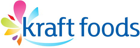

New and old logos in big.
The biggest problem of course is not what the press release said but what the change says about the logo and its elements: They are inconsequential. It doesn’t matter if the icon faces one way or another. It doesn’t matter if the shapes are in one order or the other. It doesn’t matter if the colors are solid or gradient. It doesn’t matter if the type is bold or light. It doesn’t matter if the smile is angled one way or another. These are all expendable visual cues that don’t require commitment or investment. There is no stake from the company in the logo. Of course, it doesn’t help at all that the new logo is no better at all than the old one, it’s simply rearranging the deck chairs on this logo Titanic.
Thanks to Make Seriously for the tip.


Jump to Most Recent Comment
Warren’s comment is:
I hated it then and I hate it now. It always looked like someone had stubled upon the Unilever U and tried to twist it into Kraft.
On Jul.07.2009 at 07:39 AM
WayneP’s comment is:
While I would agree that it is shameless to have to rearrange the chairs on the deck for the new logo, I do think its execution is far better. The rearrangement places the focus on the word 'Kraft' in a more natural way without having to use bold type. The colours are softer, the graphics are fuller and more playful, resulting in a more pleasing look... over the previous edition. Either way, the final effect is still too busy for my liking, and gives Kraft nothing to smile about. In the end, the design looks more like a personal hygiene company, than a food company.
On Jul.07.2009 at 07:41 AM
Jamie’s comment is:
I wonder if they rearranged it so that "Kraft" could be used by itself as a logo with the smile image, as needed?
On Jul.07.2009 at 08:09 AM
John McCollum’s comment is:
I'm glad the butterfly is no longer menstruating, but this still looks like an identity for a company that makes douches, not food products.
On Jul.07.2009 at 08:13 AM
Dwight’s comment is:
I never noticed the Kraft logo before. It's a generic mark that doesn't really say anything. It's not memorable; it doesn't build on brand strengths.
Blah!
On Jul.07.2009 at 08:33 AM
soully’s comment is:
Agreed, no better or worse really. Looks like someone senior looked back at an old email with logo variations and changed their mind. That said the Make today delicious tagline looks like it uses a nicer typeface.
On Jul.07.2009 at 08:37 AM
soully’s comment is:
...and looking back at the original logo Kraft started with, it's still leaps and bounds better than either of these newer ones
On Jul.07.2009 at 08:38 AM
Mike’s comment is:
![]()
I like this better mostly because its my childhood what I mentally think kraft looks like and it goes along with the old kodak logo these old logs had nothing wrong with them they reached iconic status like the CBS eye.
On Jul.07.2009 at 08:46 AM
Ryan Gonzalez’s comment is:
Still not very good.
Why couldn't they keep using the classic logo?
On Jul.07.2009 at 08:57 AM
Jose Nieto’s comment is:
I agree with your general take on this, Armin, but on the details I'm with WayneP: the new version is certainly an improvement -- in fact, it's pretty dramatic.
Of course, one need only look at the original mark (thanks Mike) to understand how much brand equity Kraft has tossed aside.
On Jul.07.2009 at 08:58 AM
C.Swift’s comment is:
Oh please just K.I.S.S. - I looks as if its decorated for mardi- gras.
How about just a word mark for a real change.
On Jul.07.2009 at 09:01 AM
Scott’s comment is:
I thought last time the Kraft update was posted it was a Kraft internal logo and the classic logo was going to stay on the food products. Am I misremembering this? Is this still the case with the new rearranged logo as well?
On Jul.07.2009 at 09:12 AM
mckenzi’s comment is:
http://www.underconsideration.com/brandnew/archives/cheerier_cheer.php
reminds me of the cheer laundry detergent redesign.
On Jul.07.2009 at 09:26 AM
Armin’s comment is:
For clarification: This is only the corporate mark for Kraft Foods. The consumer mark, posted by Mike, remains as the consumer mark.
On Jul.07.2009 at 09:36 AM
Peter O'Connell’s comment is:
Armin
I disagree, I think when comparing the two logos side by side, there is a difference for the better with the new icon. There is an improvement. And this new and fairly recent logo will NOT change a consumer's opinion of the brand. Taste and price will.
Best always,
- Peter
Nick’s comment is:
I totally agree with Mike here... these corporations somehow think that changing there look and feel is all of a sudden going to change things for them... Most of the time rebranding "iconic" brands are just not the solution to the companies underlying problems and quite simply they end up failing.
I still struggle with the UPS rebranding. :(
On Jul.07.2009 at 09:45 AM
Stephanie’s comment is:
I really wished I knew what was the reason for this change yet again. What was the point of rearranging the elements? Was there a deadline and the final logo was picked without full approval?
The logo still looks rather awkward to me, especially with the new lighter blue and gradients. It would be interesting to see the thought process behind these tweaks that was done in such a short amount of time.
On Jul.07.2009 at 10:17 AM
Dale Campbell’s comment is:
so THIS is what "perfume on a pig" means...
now I get it.
Jason Laughlin’s comment is:
I find it interesting that a company like Kraft feels the need to abandon their public facing mark in the first place in regards to corporate. When put side by side the public mark is just as universal as the new corporate mark (either of them). I would also think that the current public mark would inspire more unity and loyalty from those at corporate given that it has an actual history. GE certainly didn't change their mark, even after they started making everything from MRIs to TV shows.
Everything about this shows weakness and lack of discipline for both the brand and the company.
On Jul.07.2009 at 10:29 AM
Adam’s comment is:
I just don't see this working out...especially on their packaging. I wouldn't be surprised if they just went back to the classic mark in a few months.
On Jul.07.2009 at 10:31 AM
Deg’s comment is:
I do like the newer logo better than the older one. It's an improvement, but both are still lacking.
On Jul.07.2009 at 10:32 AM
Glenn’s comment is:
Whatever happened to iconography? Meaningless shapes and arbitrary placement. The one benefit of the new logo is the shift in the hierarchy away from the "smile" and delicious to focus back on Kraft Foods.If they were going to change the new logo the least they could have done was bring back some of the equity they had in their original logo.
On Jul.07.2009 at 10:35 AM
Luke S’s comment is:
While I think the new logo is a slight improvement over the 5 month old one in terms of layout, the colors are all wrong. One thing the older logo had was the use of their iconic reflex blue and red. All the pastel gradients scream 'Tropical' and 'Caribbean'. Is KRAFT relocating to Miami? It would certainly appear that way judging by this logo.
I swear I've seen similar logos on a range or products from a cup of yogurt to my wife's sanitary products.
I hope they keep the old Kraft logo on their food products. It's one of those logos that has that weird ability to make me instantly hungry for Mac 'N Cheese and BBQ Sauce (not together).
On Jul.07.2009 at 10:42 AM
jRod’s comment is:
Dear Kraft -
Please go back to the original logo. That's how we all know you, and despite your attempts to modernize, we will always remember the one that was around when we were kids reaching into the fridge to grab a "Kraft Single" to snack on while watching ThunderCats. You have something that most companies simply don't... an icon of American culture that you use(d) for a logo. You are throwing away a lot more than you realize, despite what the marketing people are telling you. Buck the trend and stick with what you know. Better yet, stick with what WE know.
Sincerely,
The Kid in Me
On Jul.07.2009 at 11:05 AM
Luke S’s comment is:
LOOOOLLLZ @ jRod
Now I really want some Mac 'n Cheese mixed with Kraft Original BBQ sauce and some Kraft Singles melted on top. Mmmmm, lunch time.
Violet’s comment is:
I second what jRod said... ^^^^^
On Jul.07.2009 at 11:18 AM
Trent Walton’s comment is:
I agree with C.Swift... the first thing I thought of was mardi-gras.
With some recent brands scaling back on the BS and returning to some version of their simple marks, Kraft would have done well to follow suit.
On Jul.07.2009 at 11:25 AM
Grant Hutchinson’s comment is:
If nothing else, the elimination of italicized Tekton in the tagline is enough to get its head above water again … but it’s still sinking.
On Jul.07.2009 at 11:33 AM
Nope’s comment is:
>>So, as a consumer, what this logo change signals to me about Kraft Foods is a company that can not make sound decisions to begin with and, once made, can not live with them
What this signals to me is that Kraft is a company
which is able to assess mistakes made and correct them.
Kudos on correcting everything good design would
dictate should have been corrected. Well done, Kraft.
Tymn’s comment is:
Meet the new logo, same as the old logo.
For their corporate mark, this design seems more like it's targeted to consumers, it's just all wrong.
Armin’s comment is:
> What this signals to me
Well that's the perfect example of the proverbial glass half: For me it's empty, for you it's full.
On Jul.07.2009 at 11:47 AM
Jose Nieto’s comment is:
For clarification: This is only the corporate mark for Kraft Foods. The consumer mark, posted by Mike, remains as the consumer mark.
This is an important detail to keep in mind -- the point of this logo is to create some distance between Kraft as a consumer brand and Kraft Foods as a corporate entity. I'm not sure about the wisdom of such a move, particularly when the consumer brand is so iconic in the culture, but at least there's a strategy behind the change. (No need to worry jRod, your childhood memories are safe, at least for now.)
To be fair, this is what got replaced by the new logo(s) above:

Soda & Candy’s comment is:
Thanks to Jose Nieto for posting the previous *corporate* Kraft Foods logo.
I second what a lot of people have said, both the 5 month old logo and the newer one remind me of sanitary products.
As childish as the previous one is, I think it communicates the idea of foodstuffs better and at least makes me think of the most iconic Kraft food, the Single cheese slice. (or as we Australians call it, plastic cheese)
On Jul.07.2009 at 11:57 AM
Armin’s comment is:
Jose, that's actually something else. Some sort of recipe site with its own URL. The corporate site is this http://www.kraftfoodscompany.com/ and I'm pretty sure they did use the old iconic Kraft logo as their logo.
On Jul.07.2009 at 11:58 AM
Henry’s comment is:
Seems to me that they were a bit inspired by the Amazon logo. Don't you think?
On Jul.07.2009 at 12:02 PM
Jose Nieto’s comment is:
I stand corrected. Another quick search on the Wayback Machine produced this at their corporate logo (as of January 2008, anyway):

jRod’s comment is:
they've released the new version of the new version.
jayparry’s comment is:
The gradient allows the mardi gras to go behind kraft. The smile art has been vastly improved. The tekton font has been removed. These are all great refinements.
Im sure those of us who have worked in corporate can understand what happened. The first logo was done by someone's cousin and they approved it for use. Then a new marketing exec came in that had a little more design sense and commissioned it to be changed but was told it couldn't stray to far from what was just done.
On Jul.07.2009 at 12:27 PM
Rodrigo Müller’s comment is:
@jayparry's I wouldn't call someone that puts gradients on a logo a person with design sense.
On Jul.07.2009 at 01:08 PM
Chris Johnson’s comment is:
This exercise is a good example of an executive making changes that serve no real purpose except to make the executive seem valuable and worth his salary.
When you only sell one product, food, differentiating the "corporate" mark from the consumer mark is sort of useless. In fact, what this logo implies is that the corporate leadership has set itself apart, insulating and distancing itself from the core operations. If a company's main goal is to sell high quality products to consumers, every aspect of the operation should re-enforce a connection to and engagement with those consumers. This logo represents ivory tower thinking and that makes me worried about Kraft's focus.
We're using these comments to criticize the design when we really should be, in my opinion, criticizing the fact that a separate corporate logo exists at all. On the other hand, this exercise in strategic foolishness kept designers working and I'm in favor of that.
On Jul.07.2009 at 01:47 PM
Soda & Candy’s comment is:
Oh well ignore my earlier comment then, as far as the comparison of the logos!
Also, Chris Johnson - Amen! I'd totally work for Kraft, I bet they're still raking it in even in these dark days.
On Jul.07.2009 at 02:05 PM
Mark’s comment is:
Damn, I can't decide which ones worse, the one with the cockeyed red smile and a color splash, or the one with a left straight smile and a color splash. They both look equally bad. The only good thing I can see in the new logo is that the smile is straight. The should have dropped the smile altogether.
On Jul.07.2009 at 02:15 PM
Kim’s comment is:
The blue wedge popping out of the k bothers the hell out of me and I can't figure out why. It just looks so awkward...
On Jul.07.2009 at 02:45 PM
Andrew_EMPAC’s comment is:
Dear Kraft,
The only good change here is that they decided not to use TEKTON for the tag line "Make Today Delicious" However, the addition of the gradient and what seems to be even more rainbow clown vomit around an already poor font choice for a word mark make this cheesier than velveeta. Just use the old logo! You've been around so long you don't need to reinvent yourself into something that looks like it belongs on a Carvel birthday cake.
On Jul.07.2009 at 03:05 PM
ZariaZ’s comment is:
I'd change the typographic style of the letters 'd' and 's' like the letters 'f' and 't'.
Personally I still don't like the messy fireworks.
Jason Fox’s comment is:
I'm glad they added "Foods" so I'll stop confusing my mac 'n' cheese with brown paper.
And good luck reproducing those gradients.
On Jul.07.2009 at 04:17 PM
Nathan’s comment is:
It's a slight inprovement they got rid of that Comic Sans-esque font (make today delicious).
On Jul.07.2009 at 04:48 PM
dbrenton’s comment is:
I think this new logo is an improvement over what they had. It's more condensed. I think the improvements took it from being a really good student project to being a much better professional design.
With all due respect...you people are way too harsh on everything.
btw, I agree with Nathan. I'm glad to see the Comic Sans-esque font gone.
On Jul.07.2009 at 04:53 PM
Jennifer’s comment is:
I'd have to concur with your assessment. Still underwhelming.
On Jul.07.2009 at 05:11 PM
Charlotte’s comment is:
Is it just me or is this a rip off of the Bahamas branding?
On Jul.07.2009 at 06:13 PM
Charlotte’s comment is:
Is it just me or is this a rip off of the Bahamas branding?
On Jul.07.2009 at 06:14 PM
Ash’s comment is:
I think Jamie was definitely onto something when he suggested that the change is so that the "Kraft" can now be used independent of the "foods", but retain the device logo.
On Jul.07.2009 at 06:27 PM
Sean S’s comment is:
From what I read recently, there seems to have been a flap over the
old new logo being too similar to the yoplait logo:

Anonymous’s comment is:
looks like a diet food brand now
On Jul.07.2009 at 07:57 PM
Loren Shumaker-Chupp’s comment is:
Wow. Is this a bite at designers who said that the original logo could not get much worse? In my opinion, this makes a disgraceful logo far worse...
There is no longer the chance of a standalone logo within the logo type.
The gradients are awkwardly placed to look as if they go behind the non-gradient type.
I didn't like FS Lola to begin with. I'm not a fan of bridges on K's, and the teardrop is pointing right at it. At least they dropped Tekton.
Does anyone else see a face in "Kraft" where the blue shapes are a smile and tear drop, and the other shapes are being thrown at the face?
On Jul.08.2009 at 01:08 AM
Sand’s comment is:
LOL@menstruating butterfly (John McCollum)
I honestly feel like this logo (and the previous iteration) is inappropriate for a corporate mark (vs. consumer) I'd expect something more conservative, 1-2 color, no gradient, maybe just a wordmark.
If you want to be taken seriously in the corporate landscape, wouldn't you want a serious mark that represented you?
On Jul.08.2009 at 09:35 AM
Alistair Morton’s comment is:
they tried for 2.0 and only got 0.2
On Jul.08.2009 at 11:32 AM
Mindzai’s comment is:
I think i prefer the old one better.
Oh well. If I had to choose I like the newer one better. It makes more sense and the gradients are a big effin pain in the ass when it comes to print. I'm willing to bet that this is the reason why there was a change. None of that PR message BS.
Anonymous’s comment is:
I like it.
On Jul.08.2009 at 06:19 PM
Manuel’s comment is:
Today I stumbled upon a Yoplait truck, saw their logo and immediately thought "That must be why they changed the logo." (now I know someone has already mentioned this in a comment above, and here's a link on it too.)
Kraft must have managed to keep it hush because this Yoplait logo is not used in the US.
On Jul.09.2009 at 02:38 PM
wonkawut’s comment is:
Looks too much like a feminine hygiene product logo. It doesn't say mmm food, it says umm tampon?
On Jul.09.2009 at 02:55 PM
Bendy’s comment is:
Well, it's evolved from an ejaculation to an explosion... neither of which make me want to gobble down synthetic cheese or douse my salad with ranch dressing.
Anonymous’s comment is:
Gawd help us…it's like a flailing fish…someone shoot it and put it out of it's (or our) misery!
On Jul.09.2009 at 08:43 PM
daniel’s comment is:
I hate this new logo! Why they spend so much money on something that brings nothing?
On Jul.10.2009 at 10:24 AM
3ring’s comment is:
Here's another vote for the old-school logo (which I'm glad still appears on food). The new ones seem scattered, with too many random flounces and (agreeing with Glen) too little meaning.
And thanks, the concept of a menstruating butterfly is now seared into my visual memories :)
On Jul.10.2009 at 12:03 PM
Kaylee’s comment is:
That can't be it?!?! Talk about boring. Reminds me of a washed-out version of the NBC logo. Ack!
On Jul.10.2009 at 02:02 PM
Jason’s comment is:
Yeah, the logo is not so good....I will say though, that I have had the privilege of viewing the brand style guide for this, and the logo looks much nicer with solid colors, and the collateral pieces are so nice and are great at integrating the various shapes and colors.
On Jul.10.2009 at 05:05 PM
Daniel Blank’s comment is:
This change is simply a rearrangement of the existing elements which were meaningless in the first place. The primary color abstract shape model is so generic at this point that it just makes the companies that chose the direction all look alike. Sure it's easy to weave a story around abstract shapes but how credible is it really?
On Jul.12.2009 at 12:06 PM
Nate’s comment is:
This is a perfect lesson in "who really makes the design decisions."
Most likely it's someone who couldn't even coordinate their shoes, socks, and tie to their overpriced pinstriped suit.
On Jul.12.2009 at 01:47 PM
Mongoose’s comment is:
It's an improvement, but I agree with Armin's point: So much of this is arbitrary fixes to an arbitrary logo.
They're fixes to improve it, mind. The font massacre of the first is cleaned up somewhat. The smile looks more smiley in its current place, the flowerburst is better behind the 'k'. It's an improvement.
But Armin's point is valid: It shows how it's a reshuffling of elements that aren't cohesive. Kraft has such a strong logo in the red stretchagon with the bold 'KRAFT' inside. Distancing that solid, trustworthy, well-known logo from the company seems like a poor decision; and the two logos here don't add anything.
See also: AB InBev.
--Mongoose
On Jul.12.2009 at 03:19 PM
mm’s comment is:
I say kudos to whoever was tasked with rearranging the elements. This arrangement is a much better than the previous one.
On Jul.12.2009 at 08:21 PM
Glenn Sakamoto’s comment is:
Same awful logo. Same awful food. When we all wake up from buying this junk this planet will and its inhabitants will be much better off.
On Jul.13.2009 at 10:45 AM
Anonymous’s comment is:
ARGH,
Gradient and a swoosh....
could it get any worse?
On Jul.13.2009 at 12:52 PM
Comments in Brand New, V1.0 have been closed.


