

NOTE: This is an archived version of the first incarnation of Brand New. All posts have been closed to comments. Please visit underconsideration.com/brandnew for the latest version. If you would like to see this specific post, simply delete _v1 from the URL.
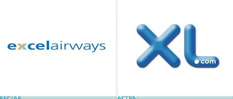
Does XL mean Excel? Up, up and away? Beating expectations? Getting ahead? To be superior? To surpass? Or does it just mean extra-large?
Recently, Excel Airways rebranded themselves as XL with the help of London-based Brandinstinct. Although there are several blue airlines out there, Jetblue being the most obvious, I think the XL planes still look fresh and vibrant. Owning color isn’t just about using it, it’s how you use it. Overall I think they did a good job with the design although I’m not crazy about the .com in the mark. As far as Excel vs. XL, Excel had already used XL in certain situations so going completely to the two-letter version was probably an easy decision. Also, owning a two-letter name is great if you can do it. Think GM, GE, HP, BP and VW. All very recognizable.
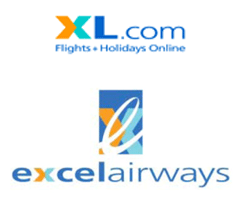
Two previous uses of a two-letter XL
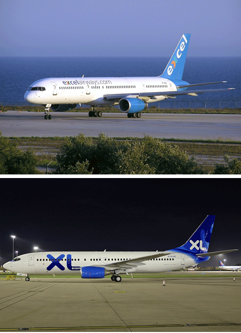
Before and after photos from jetphotos.net
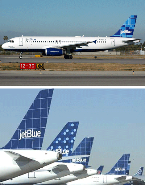
Jet Blue uses blue a bit differently
The secondary graphics do seem like they could have used a bit of refinement. They seem to be referencing travel routes and I like the thought but some of the curves and transitions are poorly executed.
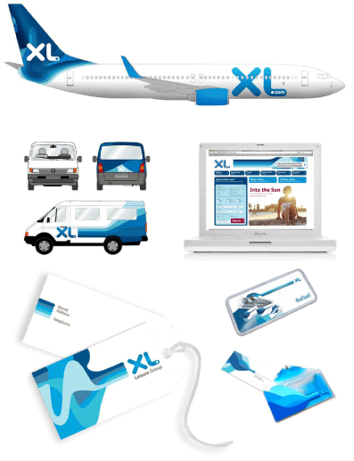
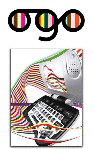
The graphics remind me a bit of the ogo graphics, which I love.


Jump to Most Recent Comment
felix’s comment is:
As much as i hate the candied, photoshop bubble XL, i have to say this is LOADS better than their previous mark.
As far as the OGO (no credit for Ogilvy's BIG?) association, that's a stretch. the ogo stuff was at least grounded in a certain aesthetic, this XL stuff is dunkin' donuts meets aol hip hop clothing. after viewing the website, you're left with the irksome feeling that this identity isn't finished. the curves are poorly exectuted and don't flow with the ease and fluidity associated with air travel. No surprise, really. Take a look at the firm (Brandstink) and you'll quickly understand they have no earthly idea what they're doing.
On Dec.20.2006 at 10:07 AM
stock_illustration’s comment is:
Beautiful use of logo on the planes, trucks and collateral. Very eye catching and memorable. I really like this.
On Dec.20.2006 at 10:12 AM
andrewmartin’s comment is:
The entire package -- identity, collateral, and website especially -- looks like a series of comps. Maybe the agency ran out of money and just quit working on it? That still wouldn't explain the year-2000-esque 3d-wet-bubble-glow logo effect...
On Dec.20.2006 at 10:23 AM
David Weinberger’s comment is:
Oh, didn't know that BIG did the ogo stuff. I like it. Didn't you happen to work there when BIG was started? Did you work on ogo?
On Dec.20.2006 at 10:29 AM
Paul Riehle’s comment is:
Looks great on the planes and other collateral. It seems that they aren't adopting the photoshop bevel version, which is good.
On Dec.20.2006 at 10:44 AM
Von K’s comment is:
The XL itself seems like a rough concept rather than a finished mark. I think it looks nice on the planes and collateral, but that "shiny" one is x-eedingly nasty. I can't tell what I dislike more, the stupid "highlights," or the disgusting shade of blue.
Changing to 2 letters is a good idea, but they could've used the letterforms in a cool way to represent the industry, travel, or some-such. That way they'd have something more idiosynchratic and ownable.
On Dec.20.2006 at 10:48 AM
Peter Marquardt’s comment is:
I like it, nice and juicy. Stands out very well on the planes, as has been mentioned
On Dec.20.2006 at 11:03 AM
Alex’s comment is:
Adobe seriously need to remove the bevel tool from all of their applications. Anyone fancy joining me in a petition?
On Dec.20.2006 at 11:55 AM
JonSel’s comment is:
As far as booking travel, sure I'd use XL.com. Cheap fares are great. Would I fly a plane marked as XL.COM. Hell to the no. I wouldn't fly Travelocity Airlines either (if it existed). ".COM" can mean good things regarding the use of technology in a company's business, but it should only be part of the official company name when their business is entirely online. When I think of an airline, I want to know there are guys on the ground with a lot of years looking into plane engines and guys in the cockpit with thousands of hours of experience. I don't want to think of software outsourcing to another country.
On Dec.20.2006 at 11:56 AM
Jeff Stevens’s comment is:
I actually prefer the earlier version. Excel says to me they are looking to be the best. XL says they are cutting corners wherever they can.
On Dec.20.2006 at 12:02 PM
5000!’s comment is:
I'll second JonSel. The inclusion of ".com" in the names of companies whose primary business is offline drives me batty. Would've rather seen "XL" solo.
I don't love the logo, but I do like the applications. Seems to be a general consensus on that.
On Dec.20.2006 at 01:14 PM
Chris Johanesen’s comment is:
Am I the only one thinking that putting a giant X on the side of your plane seems a little odd in this "post-9/11 world," as the kids like to call it?
And rounded fonts? And the website? Why don't they just called themselves Web 2.0 airlines? Doesn't instill confidence for me. Just makes me think they could go out of business at any moment. Like while we're in midair.
On Dec.20.2006 at 01:29 PM
Mark’s comment is:
Is it me or has the complete meaning of the company changed?
They went from being Excel Airlines which I would would associate with excelling at something as in "we're doing our best for you" to XL which I can't help but think it's Extra Large as in "we're a very BIG company"
with those "X"s on the plane I can't help but think "X marks the spot" (as in a target)
That paint job on the plane doesn't really inspire confidence in me. :P
On Dec.20.2006 at 02:17 PM
Splashman’s comment is:
Excel vs. XL is a toughie. The "XL" on the aircraft is certainly eye-catching, and it's an easily-remembered company name & URL, but to me it has a "cheap" (in the negative sense) connotation that does not instill confidence. But that's not important for an airline, right?
One more vote for ditching the ".com". Barfola. Ditto for the weird curvy mess, the beveled logo and the website in general. I can't help but laugh at the fact that on the website, the curvy mess is mostly covered by the "special offer" box in the upper-right -- eliminating almost any possibility that the average Joe would correctly interpret the curvy mess. Gotta love it. Most likely the special-offer box wasn't in the original design, and added by an unthinking suit at XL, so I won't necessarily blame the web designer for it. But that doesn't excuse the rest of the page: conflicting styles & shadows, a kajillion shades of blue, rampant misalignments . . . and a backlit aircraft photo so the spiffy new livery is less prominent.
*heavy sigh*
On Dec.20.2006 at 02:18 PM
Paul Irish’s comment is:
this just popped up: http://blog.pentagram.com/archives/2006/12/new_work_saks_fifth_avenue_1.php
On Dec.20.2006 at 02:28 PM
Matt’s comment is:
I love the new logo and graphics as used on the planes. Really, really nice. I absolutely hate the candy gradients on the "after" example and on XL's website. A flat appearance, or just a straight gradient would be way better, in my opinion!
On Dec.20.2006 at 02:37 PM
fatknuckle’s comment is:
I wonder if Snoop will be the captain...
The problem is that this mark does not convey trust, or reliability, rather young (which associates to inexperience and recklessness) which is not what you want people to think about with air travel.
I think jetBlue did a wonderful job with their identity and brand, making it modern and fresh but still conveying that trust, reliability and upmarket quality.
Also this is way to close for my tast to XM satellite's brand. I applaud the departure from Excel (which was too software for me) but I think their treatment is simply trying too hard to appear young and completely misses the runway.
On Dec.20.2006 at 02:37 PM
Mark.S.’s comment is:
Like—are we there yet—Captain-dude?
I agree with fatknuckle. It doesn't exactly inspire confidence.
The applications/collateral far out-weigh that hideous PS filter excuse for a logo(type).
Cameo once said:
It's like candy,
You sure are sweet,
You're taking my appetite-but it's all right,
You're so dandy,
It's like candy…
DBD+A’s comment is:
Uhmm... No. Thank you, no.
Whatdafukizdis?
On Dec.21.2006 at 05:04 PM
Armin’s comment is:
Better – and more considerate – comments than the above are cordially encouraged, and expected.
Thank you.
On Dec.21.2006 at 05:33 PM
DBD+A’s comment is:
Whachootalkinbout, Armin? Considerate to whom? Is (intended) humor not allowed in this forum?
On Dec.21.2006 at 06:27 PM
Armin’s comment is:
I guess I just may be losing my sense of humor towards the end of the year.
On Dec.21.2006 at 10:13 PM
Kabari’s comment is:
Whoever mentioned that the logo doesn't convey trust is absolutely correct. The logo looks good on teh business cards, but that plane looks like the Soul Plane, and I don't trust it one bit.
On Dec.22.2006 at 02:34 AM
Von Glitschka’s comment is:
When the XL appears as a flat color I think it looks nice. The Photoshop layer effect version looks cheap and amatuerish though.
If more and more companies are going to adopt the whole candy coated and glassy feel with their marks they better hire designers who know how to 'Illustrate' such visual flair.
Overall branding looks nice but the execution on the faux 3D mark is poorly done.
On Dec.23.2006 at 07:35 PM
Diane Witman’s comment is:
XL = Xtra Large
What on earth?!? I don't quite understand the abbreviation of the excel name. I would feel much more comforted by excelling than XL'ing. Is this a move due to the IM'ing going on in the world where everyone is tired of typing and feel a desperate need to abbreviate everything???
I dislike the .com inside of the L, it looks lousy and amateurish. "Hey guys, what if we promote the website by putting .com somewhere on the logo? No, I got it, how about we put it in the logo!" AHHH!!! That's a nightmare. I prefer the previous logo, I love the combination of the yellow and the blue. The new graphics are nice but the new ID kills it for me.
Does the X in XL mean "X marks the spot?" I just don't get it.
On Dec.27.2006 at 11:16 AM
Darrel’s comment is:
Virgin needs to rebrand as XXL and kick their ass!
What would have really tied the rebranding together would have been to actually play off of the XL...larger seats...more leg room...THAT would have gotten some attention.
And jetphotos.net? Wow. There's a web site for everything!
On Dec.28.2006 at 05:13 PM
Joe Moran’s comment is:
Booooring.
Too baaaad. Baaaaah!
Is that some grass over there? I'm chomping...
Baaaaah!
And the lamb lied down...
On Dec.28.2006 at 11:04 PM
Mark’s comment is:
The 3D version of the "X" reminds me of jacks
these things:
http://en.wikipedia.org/wiki/Jacks
Mark’s comment is:
Tht font in "XL" I've seen before, it's been on those tic-tac-toe boards on playgrounds for years.
http://images.google.com/images?q=tic+tac+toe+panel&ndsp=20&svnum=10&hl=en&lr=&c2coff=1&safe=off&client=firefox-a&channel=s&rls=org.mozilla:en-US:official&start=60&sa=N
On Jan.03.2007 at 02:47 PM
Mark’s comment is:
That font in "XL" I've seen before, it's been on those tic-tac-toe boards on playgrounds for years.
On Jan.03.2007 at 02:48 PM
Moriarty’s comment is:
Looks bloody awful as the full logo; bevel and emboss with the the ".com" dropped awkwardly in the "L". But it looks loads better when it's flat and white out of bue or the pattern.
Not amazing but still an improvement on the previous 80's special.
On Jan.06.2007 at 08:51 PM
Richard Brown’s comment is:
Doesn't change anything. Excel XL are still the same airline that lacks a customer-centric fibre in its corporate body. Take a look at http://www.exhellairways.co.uk
On Jan.18.2007 at 05:21 AM
Anonymous’s comment is:
XL.com is the name of the company, it is not XL.com on the side of the planes just XL and for the company as an entirity you can't put comments on here saying that they don't know what they are doing considering you don't work for them and can't tell from a civie point of view. Branding opinions are completely freehold however you cannot put the company itself down for its branding
On Mar.30.2008 at 12:39 PM
Web design’s comment is:
Great article, but I think XL airways are closed due the economic crisis...
On Jan.28.2009 at 01:44 PM
pu’s comment is:
the gradient version kicks the crap out of the beveled version for sure.
On Feb.13.2009 at 01:17 AM
Comments in Brand New, V1.0 have been closed.


