

NOTE: This is an archived version of the first incarnation of Brand New. All posts have been closed to comments. Please visit underconsideration.com/brandnew for the latest version. If you would like to see this specific post, simply delete _v1 from the URL.
![]()
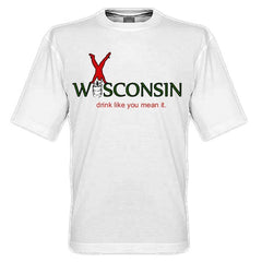
I debated quite a bit about posting this logo, because it’s like dangling a bloody bundle of fish in front of a great white shark — a great white shark that can hit “post.” Nonetheless, it’s a story that has made the news quite a bit and I think it’s worth giving it a formal run here on Brand New. Last Monday, Wisconsin Governor Jim Doyle unveiled the new logo and slogan for the Wisconsin Department of Tourism to help attract visitors to the state as well as helping it portray a positive image. Like most state or city logos, the Wisconsin logo has ignited plenty of criticism, and even though I am absolutely no fan of the logo I thought I could debunk a couple of its publicly mocked misgivings.
![]()
The most common complaint is its cost, at $50,000 of tax payers’ money. The basic response is “$50,000 for that?” No, people, it’s not. $50,000 covers more than just coming up with a slogan, a typeface and an icon. But that has always been the problem of reporting costs when announcing a logo, people just assume the designers pocketed all the money. I can’t verify that the designers — in this case, Wisconsin-based Red Brown Klé — didn’t pocket all the money but I am pretty positive this was not a $50,000-fee identity job.
The other main complaint was the slogan, “Live like you mean it,” which has been used by other products, campaigns and, as has been quoted in articles, even by motivational speakers and authors. Gasp, the horror: “motivational speakers and authors” have used a common phrase before Wisconsin! What a travesty. Again, people criticizing this logo need to get a grip, the problem with the tag line isn’t that it has been used before but simply that it’s generic without any specificity to Wisconsin. But so is “I Love New York”, you can love any darn state, so why does “I Love New York” only work for New York? It’s about building that message in people’s heads and if Wisconsin wants to embed the thought of living life as if you meant it, so be it, give it a chance.
Then there is the matter of the logo itself: a man (a boy?) doing a cartwheel over one of the strangest typefaces I’ve ever seen. Some people are offended that it was a male doing the cartwheel, ostensibly emasculating the entire Wisconsin female population. Others are offended that it’s a clown representing the state, and that the logo will only work when promoting a circus coming to town. There are many formal problems with the logo, starting with the typeface, and then the colors, but the concept isn’t as bad as it was executed. There is a free-wheeling, fun, liberating implication made by someone doing a cartwheel that does match the slogan and you can’t blame the designers for trying to capture that, it was just unfortunately not well translated into a visual.
The logo is far from perfect, and I would be the first one in line to suggest changes, but I am constantly more appalled by the behavior of people in the media who suggest that they could have done it better, or that a contest paying $500 to the winner would have been better. And the problem isn’t the resulting design, but that the process of designing an identity is completely misunderstood and the media will be the first to exploit that. Anyway, just a side rant using this logo as a delivery. Go at it, I guess.


Jump to Most Recent Comment
Adam Fuller’s comment is:
I kind of like the "Wisconsin" typeface, but that's as far as it goes. The color scheme makes my eyes hurt, and the upside-down man seems kind of cheesy, like perhaps it was designed about 10 or 12 years ago. Definitely doesn't do the job of peaking my curiosity about Wisconsin.
Wisconsin, as a word is a prime candidate to be turned into a metal band logo...think about it!
On Mar.20.2009 at 07:01 AM
Matt Moore’s comment is:
It's pretty telling that since a WI-based firm did this identity work (and they should be experts on the state and what it has to offer) that if you travel there, you'll get a pretty bland experience. So maybe the identity is a great success!
On Mar.20.2009 at 07:22 AM
stache’s comment is:
It has nothing to remember it by or make me want to visit.
I look at the previous post (Hudson Bay logo) and think, Ok, hunting...heritage, why not
I'm sure there is something iconic about Wisconsin (cheese?) that could have been introduced to give this mark some meaning.
Here in Texas, our logo/slogan may be cheesy, but I think the idea of country western, cattle, rough and tumble meets classy-scripty-font works for us.
![]()
stache’s comment is:
...and yes, I realize Hudson Bay is a retailer and not a state.
Just saying that logo would be better for state tourism than this thing.
Erik at Logo Critiques’s comment is:
I can't get past the terrible typeface for Wisconsin.
As someone that travels to WI at least once a summer for lake time, this logo doesn't really speak to me about what WI is all about.
On Mar.20.2009 at 08:00 AM
Sham Ramachandran’s comment is:
Hey, to be really frank, I like the Wisconsin typeface except for the stroke on the "W". And as far as the baseline goes, like Armin said, It's a gradual process of building it over the years. I'm sure when Nike came up with "Just do it", there would've been enough nay sayers. But fortunately media was not that rampant during those days and Nike was never the place they lived in.
So what I would say is, people please give it time to grow up and stand on it's own.
ps: Armin, I see that you just stopped short of giving your feed back on what can be bettered on the logo. I would like to know that. Yeah, they could've bettered the colors.
Dale Campbell’s comment is:
Trying not to be TOO much like the aforementioned "shark", I have to say - when looking for a design company that you're going to entrust with say, oh I don't know, the branding of an entire state, don't you think that when you are reviewing that company's website, it should be indicative of the quality they provide?
I couldn't stand 5 seconds on that Red Brown Klé site. Completely annoying and not user friendly.
That being said, the logo made COMPLETE sense to me after looking at that website.
I've never been to Wisconsin, but I can pretty much imagine that it, like every other state, has it's things which make it 100% unique - from cultural things to landmarks, etc.
Why a cartwheel was chosen to represent a state is beyond me. I mean, they should have just saved themselves the creative thinking time and put "the cartwheel state" under the state name.
I think that there are many other creative possibilities - most which were probably never even explored - that could have better represented the great state of Wisconsin.
It's a shame. One more state in this nation with a turd for an identity.
On Mar.20.2009 at 08:27 AM
Matthew’s comment is:
Um... emasculating the entire population of Wisconsin's women?
One would hope they're pretty emasculated already...
jarrod’s comment is:
@Matt
Perhaps you were joking-if not, that's a pretty ignorant comment. Having grown up in Wisconsin, yet lived around the world (Boston, Munich, Holland, etc), I can say that Wisconsin is a pretty great place to live or visit.
What's telling to me-as a graphic design professional-is that the design firm's work/website looks very limited, and not altogether sophisticated. Based on that, the logo is not too surprising.
But its quality is certainly not representative of Wisconsin.
On Mar.20.2009 at 09:00 AM
Anonymous’s comment is:
Wisconsin: Learn to do handstands because there's nothing better to do.
On Mar.20.2009 at 09:09 AM
JJ’s comment is:
Ha - Armin. This is the funniest thing I've read all week:
"I debated quite a bit about posting this logo, because it's like dangling a bloody bundle of fish in front of a great white shark — a great white shark that can hit "post."
Funny.
On Mar.20.2009 at 09:21 AM
Christopher’s comment is:
I grew up in Wisconsin's southern neighbor, Illinois, and spent most of my summers -- and a good portion of my winters -- at lakes in the Southern part of the state. (I was, in the local terminology, a F.I.B. -- f*%king Illinois bastard.)
It's a beautiful state, rolling and green with beautiful hardwood forests in the north. One of my absolute favorite states. Throughout my childhood the slogan was "Escape to Wisconsin" which I always loved -- the implication that we in the other 49 states -- but particularly Chicagoland where the commercials and bumper stickers and billboards were ubiquitous -- were trapped. Trapped in a rat race of our own making, slaves to our systems. But Wisconsin?! Oh lo, Wisconsin! Now there was the road to freedom! Our own underground railroad!
"Live like you mean it" is so aggressive. So standards based. So Starbucks in one hand, baby in the other. In other words, Wisconsin has just succumbed to the same rat race as the rest of us. It's no longer an escape. But another hurdle to cross in order to prove to the world that you've made it.
How very unfortunate.
On Mar.20.2009 at 09:34 AM
Gabrielle’s comment is:
okay okay— to us "city folk" WI is a far off land—FAR FAR AWAY—and honestly, being as though I love to travel would have LOVED to see this state create a mark for itself. It bothers me from a design/traveler standpoint to see this fail for many reasons. 1. because I'm American, I want ALL the states to be represented well and 2. Because who wants to go see a state with a crappy logo!?
Tourism, although not like the food/hospitality, is still an industry, and should be treated as one. Geeze!
—get rid of the guy—I KNOW there is more to WI than a fun guy doing handstands..and honestly the art director/whoever let this past the concepting table needs to go to a typography seminar...out of 190,234,678 fonts in the world you let your client see this one? Alright, leave it for now—but can we PLEASE see a rebrand in the next year at least? (pretty please)
Randy’s comment is:
You really hit the nail on the head with your comments. I find the logo confusing, and that it doesn't really make me interested in Wisconsin. To be honest, I like the older logo better, it has more homely feel to it, this logo is attempting to be a hybrid of a living community logo, and a day care center.
...something I wonder here is why didn't this firm try to make any connections to the diversity of Wisconsin? They're famous for cheese, right?
Why not create a logo that reflects the state?
I, for one, would like to see their designs that lead up to this.
On Mar.20.2009 at 09:43 AM
Josh’s comment is:
Frankly, the design work doesn't bother me so much as the concept. I get this feeling that it was a very client-driven process. Aside from the "W", Wisconsin actually is pretty nice, and the slogan is set really well. It looks classy, and the colors give it a kind of rugged feeling. To me they recall a flannel, and frankly Wisconsin isn't known for it's sprawling metropolises.
That said, I'd drop the cartwheel. I get that it's free-spirited, but it seems that there is probably a way to express that which will appeal more to the demographic.
As for the fee. Perhaps we should get national media to talk to actual designers instead of those CrowdSpring folks. It would be worth trying to educate the masses before the mob throws out the misunderstood king in favor of the tyrant...
On Mar.20.2009 at 09:59 AM
CJ’s comment is:
I would have liked the logo more if they had a set of figure icons to represent Wisconsin... sort of like what New York is doing right now. The logo seems very limiting and not truely depict the state (not that you can ever completely do that).
I agree that "live like you mean it" is too aggressive, and doesn't seem to focus on people OUTSIDE of Wisconsin... more of a directive to the people already here, but that might just be me.
Also, I am "city folk", and I live in Wisconsin.
On Mar.20.2009 at 09:59 AM
dlacasa’s comment is:
I'm sorry, but could be possible that the man is doing like it is an "x" instead of sc like it was spelled Wixconsin? I can see some extra possibilities on using that figure as an icon of the state.
Maybe is because I'm from Spain and I have never visited Wisconsin, but I kind of like the logo. Anyway, is sometimes more easy to see things with a little more perspective than if you are involved. I really don't like my state logo, but it seems to work...
On Mar.20.2009 at 10:16 AM
Christine’s comment is:
As an art director and WI native, I blogged">http://creativecooler.blogspot.com/2009/03/wisconsin-bombs-rebranding.html="_blank">blogged about this logo when it came out Monday and one of my biggest frustrations is what @Randy is suggesting above. The logo does nothing to suggest or promote the things that are unique to the state—and there are many. Similarly, it doesn't represent the design work capable of coming out of the state either. Milwaukee has a vibrant ad and design community, which I don't believe Red Brown Kle has been a participating member of.
Regarding your comments on the price tag, $50K is a nice budget for a logo design. Remember this is Wisconsin, not New York. There shouldn't be any printing costs etc. so the majority of that money would go to agency time and development of the project. My problem with the price tag, is not the money itself, but what they got for it. It has the look of a $5K job.
I'm not a big fan of the slogan or cartwheel idea, but it could work well, if done correctly and thought through. If you're trying to illustrate 'Live Like You Mean It' with a cartwheeling figure, the logo and figure should have vibrancy and movement. This logo doesn't—it's just flat static. I thought the cartwheeler was doing a handstand until I read otherwise.
With a $50K budget, these simple and obvious design issues should have been addressed.
I'm also curious to know what other ideas and designs were offered before this one was settled on.
On Mar.20.2009 at 10:17 AM
Jon’s comment is:
I'm always curious with these things to see the work that ended up languishing on the pasteboard.
Clients make, uh, interesting decisions and sometimes there's no amount of exposition that can dissuade them from their course.
On Mar.20.2009 at 10:23 AM
Maya’s comment is:
At first i kept trying to "see" something in the word Wisconsin that gave me anything about the state.
Is that a flag in the 'W'? Are the N's mimicking rollercoasters? Why is the word pinched in the middle?
I can't come up with anything.
On Mar.20.2009 at 10:27 AM
TheMaster’s comment is:
It's just weird. Really weird.
I don't like the type, the slogan, or the dude doing the handstand. It's all just so corny...and it actually makes me never, ever, ever want to go to Wisconson.
I think it should have been a guy doing a backflip into a big wedge of swiss cheese, off of the lip of a can of Old Milwaukee. Then at least you would have a few relevant icons from the state...but that's just me...

tom’s comment is:
Man, the logo is beautiful... compared to its designer's web site...
On Mar.20.2009 at 11:00 AM
Kevin’s comment is:
I have an issue with the blogger's comment about the tagline - that it's perceived the problem is in that the line has been used.
That's not the issue.
The issue is, it says nothing about the state. It has no equity whatsoever. It doesn't elicit an emotion or speak to a truism of the state. The fact that it can be used for a rum, motivational speakers, authors and energy bars is just the support to that point. That should've been an internal discussion with the inept agency and misguided committee who approved this.
If you're going to debate what people are complaining about, get it right first. Know your facts and develop a reasonable argument - not one that was handed to you by a radio personality.
On Mar.20.2009 at 11:12 AM
Katey’s comment is:
Tom- I hadn't looked at it till you mentioned it. It is horrifying. I can't believe they actually used the default type face in Adobe Flash.
On Mar.20.2009 at 11:17 AM
colormist’s comment is:
lol@Armin
Well, I keep staring at the font. Each and every single damned letter of Wisconsin. I keep thinking I'm going to discover a new surprise in the lettering. I'm not sure if that's good or bad. I'm not even sure what the font is supposed to represent. I think we can all agree that the upside down man was a bad idea and remains a bad idea.
"More Than Just Cheese" would have piqued my interest more than this tagline.
I still keep staring at that font. Is there something hidden between the letters that I'm not seeing. It's driving me nuts. Probably not a good result of the typeface.
I do like the color combo. Seems very Wisconsinish.
On Mar.20.2009 at 11:19 AM
colormist’s comment is:
To clarify: Wisconsinish as in pine trees and flannel--mainly flannel.
On Mar.20.2009 at 11:20 AM
Neal’s comment is:
I agree that the state logo's unsuccessful identity can be predicted in the wearisome flash site of the design firm responsible. For important and influential public projects, a professional design consultant should really be called upon to help select the proper designer/agency.
On Mar.20.2009 at 11:32 AM
daniel’s comment is:
that's an awful website. took me a few tries before i could actually see their works.
and did someone bother to spellheck the copy at all? "here me now"? really?
On Mar.20.2009 at 11:33 AM
Bill Dawson (XK9)’s comment is:
Mmmm. Chum. Very Chummy.
On Mar.20.2009 at 11:34 AM
craig shully’s comment is:
There are a large number of very qualified design / branding firms in Wisconsin. It would be interesting to know if ANY of these firms were contacted with regard to submitting credentials and proposals or if this project was just a political favor.
Based on the results and the collective mockery of the design and slogan, I cannot think it was anything but an assignment dealt out to a connection, using taxpayer dollars.
On Mar.20.2009 at 11:37 AM
Bill Dawson (XK9)’s comment is:
Armin, might you do a post comparing this to other state campaigns? I (love) New York. Virginia is for Lovers. The Spirit of Massachusetts. This is a very interesting niche for identity study. It falls outside other corporate identity criteria. It seems the primary goal with these campaigns is to give the state a catchphrase that makes it memorable.
It reminds me very much of the silhouette altered I(heart)NY campaign you presented last year. If this were delivered without the overly caffeinated handstand fellow, it may have been better received by this group. Neither the logotype nor slogan "suck". As part of a well conceived print campaign this might be very successful.
On Mar.20.2009 at 11:45 AM
Bill Dawson (XK9)’s comment is:
BTW, can a female population be "emasculated"?
On Mar.20.2009 at 11:48 AM
sra’s comment is:
@Matthew Emasculate means to castrate, or to weaken. It can apply to both men and women.
As weird as the typeface is, it's kind of growing on me. I feel like if they had've focused more there, the end result would've been a lot better.
The dude is just terrible though. Completely dated and out of place here.
On Mar.20.2009 at 11:53 AM
TheMaster’s comment is:
Live like you mean it. What a sham...
http://www.620wtmj.com/shows/johnjagler/41304572.html
On Mar.20.2009 at 12:26 PM
Austin’s comment is:
I don't really have anything to say about that logo, but Oregon has a nice thing going. I don't know where it came from (maybe Powell's Bookstore?) or who made it, but this sticker is on just about every car in Oregon right now. It is simple, and represents our state pretty well, I'd say.

Aaron’s comment is:
To me this logo has some visual oddities that give it an uncomfortable, wonky quality. The word Wisconsin seems to twist and lean to the right side. I think this is due to two factors.
One, the front stem on the last N in the word Wisconsin does not fully meet the diagonal stroke. This creates a strange backwards number 1 in the space between the letterforms since it is placed next to a sans-serif I. This pointed negative space leads your eye into the S-like diagonal stroke of the N, which intensifies the sense of sliding down and to the right. It also makes the front stem of the N appear to tilt in a clockwise direction. This tilting, twisting quality makes the logo lean to the right. Not good sicne it is clearly intended to be a "centered" logo. It almost makes me dizzy to look at.
The second thing is the flaring of the word Wisconsin. A very slight flaring of the ends of the words creates a three dimensional effect which is messing with my head. As I read the word from left to right, I get an uneasy feeling that something is not right with the type. Maybe this is because the flaring effect is so subtle.
I realize that this is a mark that will be seen at larger sizes and not read in the traditional sense, but it is still jarring to me. I could probably go on about the stylistic touches in the W, but you get the point and ultimately, I don't feel that it gives the same jarring visual effect.
The "tag line" is uninvolved and not well integrated with the Wisconsin mark. It seems to have just been tacked on at the end without a great deal of thought.
The guy doing a cartwheel at the top (I guess he is living like he means it - LOL) is fine I guess, but kind of cheesy. I don't think that a little cheesy fun for a family oriented travel message is inappropriate. If I were doing the project I would not include this as a key element of the overall logo, but would save it for specific applications, say on a t-shirt or poster advertising a particular event. And for all we know, it will end up being used in this way.
As for the color scheme, I'm not getting "live like you mean it" from those colors. They are very muted and conservative, rather than fun and exuberant. I know that people are not the same everywhere and that fun and exuberant in Wisconsin will probably look different than say an art-deco aqua/hot pink logo from Miami that says "live like you mean it". Bottom line: these colors don't pop or have enough "oomph".
This whole logo needs more attention to detail and specificity of message.
On Mar.20.2009 at 01:09 PM
BJN’s comment is:
That's not a cartwheel, it's a somewhat awkward handstand. A more dynamic illustration depicting a cartwheel would be conceptually better, but I'm sorry Wisconsinites, but I don't think of whimsical cartwheeling people when I think of Wisconsin.
The typeface is WPA era arts & crafts. Okay if the theme had a nostalgic bent, but the style has no connection to the slogan.
Where are the cows? Don't tell me that Wisconsin is too hip to acknowledge the cows. Where's the whimsy of the cheesehead hat?
On Mar.20.2009 at 01:09 PM
rynot’s comment is:

JP’s comment is:
A few variations on this theme going around:
Drink Like You Mean It keg stand version. You can buy the shirts here.
The Oregon logo is great, but I'm pretty sure it's unofficial. Seems like it just kinda started showing up a few years back.
On Mar.20.2009 at 01:20 PM
Dan’s comment is:
I agree with everyone's comments about the logo... BUT, when it comes to tourism, it's all about the execution of the overall identity and messaging. I mean, take another Midwestern state, like Michigan. Their logo is utterly uninspiring (although decently typeset):

Yet, their execution has been AMAZING. As a Chicagoan, I've seen their campaign evolve from touting the beautiful colors in the forests in the fall, to pitching snowmobiling and bed-and-breakfasts in the winter, and now we're starting to move into spring-centric billboards and radio/TV spots. Check out some of the spots if you don't believe me.
The point is, while I do believe that it's OK to judge the logo on it it's merits, it's not fair to judge the Wisconsin Department of Tourism in its entirety until we see the ads and collateral.
On Mar.20.2009 at 01:24 PM
Maya’s comment is:
Thought I would save people time:
The studio's work is listed under "Divine Intervention" not Rigamarole or whatever the other parts are called.
On Mar.20.2009 at 01:36 PM
Digitalshep’s comment is:
Yup, the designers site IS worse than the logo. That's amazing!
On Mar.20.2009 at 01:40 PM
SeeingI’s comment is:
You institute a no-snark rule the very week that "Syfy: Imagine Greater" and "Wisconsin: Live Like You Mean It" debut? Boy, you really know how to test your readers' self-control!
My problem with the logo is that I don't feel like I know anything more about Wisconsin than I did before. I don't get a feeling for the state, what makes it unique, or why I'd want to go there. I am not saying the logo should be all cheese and ... um, whatever else is in Wisconsin. I am not going to pretend I could do better. But as a consumer, I am unsure what's being sold to me, other than a generalized feel-good-ness and a vague feeling that if I'm not in Wisconsin, then I'm not really living. That's subtly negative, not positive.
I agree with Dan above, that we haven't seen how the logo / slogan are implemented. They could take on a wholly new character in conjunction with the right ad imagery.
OK just a tiny bit of snark please? My snark takes the form of a rhetorical question. How exactly does one emasculate a female, let alone an entire population of them?
On Mar.20.2009 at 01:42 PM
Mark’s comment is:
oh my....
so this is all they could come up with?
um, well that is different...
I don't like the cartwheeling person, it makes it look like a parody logo.
I like the type face though. Could of worked better as a wordmark.
On Mar.20.2009 at 02:31 PM
Mark’s comment is:
This logo could of been executed better, the tag line doesn't bother me, nor does the typeface. It's the cartwheeling person. I think the logo could live without it.
I mean how is thew cartwheeling person going to represent what you'll experience if you visit Wisconsin? How does that relate to the experience at all? Obviously it supposed to make you happy but how? How is this going to draw more tourists to Wisconsin? What's so special about it? What makes it stand out? See? This are the types of questions a logo is supposed to at least partly answer. I don't see the cartwheeling person as answering them in a clear manner.
You do realize this logo is representative of the entire state to tourists. So far I don't see them taking themselves seriously, that can be a problem.
That's my problem with the cartwheeling person. It doesn't hint at the experience of visiting Wisconsin,and it doesn't take itself seriously when it comes to tourism.
On Mar.20.2009 at 02:49 PM
Frog’s comment is:
I think it's fun! Behind all the bad points is a cheery logo. It's fun and fresh, and makes me smile :) Whether it's suitable is a different matter, the concept could be taken forward and used on a child themed logo. It's very random, but I like random.
On Mar.20.2009 at 02:57 PM
Dave’s comment is:
Oh my God... Has anyone even seen the Designer's site?? It's absolutely horrendus... NO disrespect, but the Flash intros and the colors... Wow... I was just clicking away at the close button.
On Mar.20.2009 at 03:24 PM
ScottS’s comment is:
I'm an art director/freelancer and Milwaukee resident, and frankly this logo was not a surprise whatsoever. A decent logo design would have been the shocker! This state has many many faults, and this atrocity is just yet another example (have you ever seen our license plate design?!). It has always frustrated me that with the wealth of creativity in this state (Planet Propaganda in Madison, and MIAD, McDill Design, Platypus Design and a ton of others in Milwaukee) this state always seem to choose the most awful designs. This yet another.
I can't really find anything positive to say about this logo (sorry Armin!)--the typeface is simply bizarre, the "cartwheel" is more a handstand (either way, what on earth does this say about our state?!), the colors don't do anything to help create the excitement that the guy is theoretically demonstrating, and the tagline (clearly not original or meaningful) is weak and forgettable).
I agree with most of the previous commentators, this is a painfully embarrassing way to advertise our state. I don't see how it could possibly encourage/entice people to come visit. What it seems to be doing is creating controversy and ridicule for a state that already has plenty of both!
This state has a LOT to offer, but this new logo does nothing whatsoever to capitalize on any of those things.
On Mar.20.2009 at 03:33 PM
Calvin Buchanan’s comment is:
Why didn't one of the great, well respected firms from Wisconsin get a shot a designing this mark?
On Mar.20.2009 at 03:52 PM
adam’s comment is:
i do not think the point of a destination logo is to tell you everything there is to know and experience about the state in a two second glance, that would be really hard to do. the logo is meant to accompany and identify collateral and messages from the Office of Tourism. said materials are what tell you about the state.
this logo feels very OshKosh B'Gosh, which is fitting, right?
and glad im not the only one who notice the spelling error on the designer's flash intro. it went by really quickly and i thought i just misread it.
On Mar.20.2009 at 03:56 PM
Mark’s comment is:
adam I apologize, I was wrong about what the logo is supposed to do.
On Mar.20.2009 at 04:32 PM
Vik Design’s comment is:
What's apparent to me, is that the proper resources aren't available or visible enough, for someone who needs a brand campaign to make an educated decision when choosing a design firm. The fact that there was ample budget available and these are the results they got, leads me to believe that better Wisconsin firms weren't considered. Until there's an obvious resource for business owners to turn to, that allows them to make a qualitative informed decision for professional grade graphic design services, we run the risk of more and more folks turning to $500 crowdsourcing sites, because those are quickly becoming the most visible solution. We need venues like Behance, Coroflot and the AIGA to become the recognized go-to resources to find talented, experienced designers and to simplify the introduction process so people can walk through the front door and say hello.
On Mar.20.2009 at 04:33 PM
CarlyM’s comment is:
I think the shoelaces are my least favorite part of this whole thing. Details like that make the cartwheel-man look just like clip art that was slapped on the type, instead of a graphic that was thoughtfully constructed to scale large or small.
Why a cartwheel-guy? Maybe they were trying to attract more gymnasts to the state?
On Mar.20.2009 at 04:49 PM
Matias’s comment is:
I'm kind of sick of people complaining about how much a logo costed and how the designers pocketed the money. Even designers say that kind of things! Maybe it's what they'd do if they had to make a brand with a huge budget.
Yes, a logo worth $50,000. Even a crappy one, like this. Thanks for remarking that. And death to logo contests!
adam’s comment is:
mark, i wasnt trying to "call you out" or insist you were wrong, i was just stating my view, like you did. and im not saying that a logo should be totally generic and random and say nothing about the destination, either. (my statement may have come across a bit "black and white")
i work for a local Convention & Visitors Bureau, and we frequently partner with the state tourism board. we also are in touch with competing destinations and their advertising and collateral. if you look at what is out there, there are some destination logos that do a much better job of portraying the state than this particular wisoconsin one does.
i do concede that the tagline is frequently what really hits home the message of the states logo and their uniqueness. the visuals arent always that unique, but then again, neither are most of the tags.
unless you are one of those clients that keeps telling the designer to "make the logo bigger" and front and center, then the logo is just a branding mark that needs to be easily legible and doesnt require too much thinking or is too abstract.
On Mar.20.2009 at 05:24 PM
Boris Kostov’s comment is:
I just want to comment about the fee issue. Even though I understand a taxpayers perspective on spending that much for something that seems so insignificant, in this economic climate, I am a firm believer that you get what you pay for.
Even though the agency responsible for the brand might have missed the mark a bit, it is ridiculous to say that a $500 contest would yield better results (even though in this case it may have been true, I'm sure there are a lot of hungry design students that would be more than happy to take a stab at it).
This whole trend of cheap logos is disheartening to me as a designer. Clients are starting to expect more for less and ultimately all design work suffers from this.
I think that as designers we need to educate our clients and in this case the public (taxpayer) on the real value of design.
On Mar.20.2009 at 05:50 PM
Matt’s comment is:
By looking at the design shop's website, it's no wonder they produced such an odd logo.
A main problem I can't get past is the typeface, why does it seem squished in the middle? What is the meaning of that? And the Ws & Ns??@#$?#@!$????
Another problem I see is the reviewing process prior to presenting work to a client. We all know not to show something to the client you can't live with, because you know the one you hate the most is the one the client will pick, 100%. Who was editing logos before showing them to the client? the Creative Director/Art Director/Someone with a design degree/some experience designing logos or anything that looks proper? 4 god's sake, this sucks (sorry, I had too).
I don't think any amount of money/positive advertising can save this one, but time can only tell. shoot, pepsi not looking so bad anymore...
On Mar.20.2009 at 06:02 PM
Matt’s comment is:
And about the 50G, more power to them, raise the bar of logo prices all around
On Mar.20.2009 at 06:04 PM
Ryan Adair’s comment is:
Every state logo that I have seen is better than this. Even my home state, Nevada. Hey Armin, I think this would be a really good study. State tourism...it's really interesting the thinking (or lack thereof) that goes behind branding a place...

Ryan Adair’s comment is:
sorry about the image size...
On Mar.20.2009 at 07:20 PM
Matt’s comment is:
i apologize in advance, but they are now calling prostitutes adventurous terrain in nevada, wide open? at least it is unique to nevada and funny, so thumbs up for that.
On Mar.20.2009 at 07:30 PM
Paul Lloyd Johnson’s comment is:
I think this is how places should go about branding themselves:
http://www.torontounlimited.ca/video.htm
On Mar.20.2009 at 08:21 PM
LL’s comment is:
@ Paul LJ: Toronto was always gonna be a tough one. That video felt like the five seconds before you get to see the photos... but the photos never came. (And not a single 'aboot'.)
I like Toronto. Hell, I was living there a year ago. But it defies branding, and so they fall back on this kind of shotgun approach to describe it. Really the best they could hope for is to just run with it and own the word,'multicultural', and hammer it home.
On Mar.20.2009 at 10:59 PM
Scott’s comment is:
I love it! (No not the logo)
I saw the story about this bad boy and knew it was perfect for this site ... hence the email to Armin.
Being a public relations professor/pro I was intrigued by the controversy ... and the general low quality of tourism brands. This one being a royal turd.
A couple of great ones were mentioned earlier. N.C. has "the state of minds" to promote its core of technology/higher education ... though there's little push behind a universal campaign.
Wisconsin is "trying" here ... they're trying to be out there, trying to be clever. And, who knows, how this campaign will ultimately turn out? Bottom line, though, the logo is not pleasing to the eye. At all.
On Mar.20.2009 at 11:36 PM
Justen’s comment is:
I would really like to see the concepts and pitch, many times government design work is by committee, and they kill anything creative! As far as the typeface, I don't think it's all that bad, remove the serif like flag in the W and tweak the size of the last couple letters and it is definitely unique. I have nothing to say about Mr. Cartwheel?
On Mar.21.2009 at 01:38 AM
fakar’s comment is:
Armin, Looks like we are back to the same old hurt, cruelty and group slam session that you were looking to avoid.
I thought we all agreed to be more constructive, for christ sake give the designer and their website a break already! It only takes 1 or 2 slams to make the point hit home... What do we have so far... 50?
Sure it's not the best, but I have seen worse. Did anyone bother to consider that the concept was developed by a politician and that the designer just followed poor instructio, right or wrong, that's my bet.
On Mar.21.2009 at 03:08 AM
Alec’s comment is:
The designer(s) did a very good job to differentiate each letter's ratio, size, and perspective at "WISCONSIN". You could see letter "I" at both sides are made to be different too.
Sorry for joking.
On Mar.21.2009 at 03:16 AM
dkm’s comment is:
This is sad. There's nothing that imbues the rolling hills and farm scenery from all thru WI, nothing about the unique nightlife on State St. in Madison, nothing about the beer industry, or the Packers, or the center of international studies that is the Univ of WI/Madison, or WI's proud food production industry, WI's lakes, and even (duh!) its dairy industry. I got all of that from my infrequent visits to Madison and I'm not even from there. Sh*t! Couldn't their travel bureau do that? Marketing travel is about creating the desire of the exotic (no matter how domestic that "exotic" is) and the need to visit to satisfy that desire. FAIL.
On Mar.21.2009 at 04:14 AM
Josh’s comment is:
I can understand people being pissed that $50,000 of taxpayers' money was spent on a brand - but they realize that there is more to it than just that.
I kind of like the typeface. But I totally don't understand the cartwheeling figure. I mean, I don't really understand what they are trying to say. I agree with some of the others, that they should have gone with something more iconic. And the slogan could be better. I like to say it could be "Live life like it's meant to be lived." or something.
Honestly, I also don't see why the media has to make a big deal out of it. But of course, that's what you can expect out of them. That's ALL you can expect out of them - and it's sad.
On Mar.21.2009 at 08:08 AM
Eric’s comment is:
From Wisconsin and am definitely more troubled by how generic it is and how poorly it was executed.
What I think the 'outrage' represents is a transition in consumer awareness of branding. I know from going into meetings presenting designs that everyone has an opinion whether it's helpful or not. But I think the conversation in this instance has been a more 'aware' conversation.
It might be too much to expect the general public to understand what goes into the process of creating a brand. But I think they are becoming Savvy enough to know WHY this is a poor outcome regardless of how much was paid.
On Mar.21.2009 at 08:53 AM
altoption’s comment is:
The tag line is responsible for a huge part of the problem. In these economic times, people who can afford a vacation are looking for a unique, inexpensive diversion that allows them to forget about their troubles back home. And Wisconsin seems perfectly positioned to go after that market. "Live like you mean it" fails not only because it's generic, but because it stresses you out.
On Mar.21.2009 at 09:42 AM
Jonathan’s comment is:
PROS
- another candidate for worst of 2009
CONS
- one of the strangest typefaces I've ever seen
- tagline feels disconnected and cheesy (pun intended)
- color scheme feels almost southwestern
- cartwheeling man. Seriously?
Justin Hill’s comment is:
I know of a better slogan:
Wisconsin: Milk more out of life.
On Mar.21.2009 at 01:46 PM
bobco’s comment is:
I was a bit unimpressed and underwhelmed when I first looked at the logo, but I think it could work. To me, the man looks like he's walking on his hands (people doing handstands usually put their feet together straight up, and the body looks a little awkward for being in the middle of a cartwheel).
I like the color choice. But that's also because I'm in my 20's and love to do outdoor stuff. For everyone else, I can see that it's unappealing, due to the earth-tone color scheme and lack of "Wisconsin personality". I'm not saying they need to have a big hunk of cheese just to please everyone, but text that's squished at the middle with weird W's and N's (what typeface is this?) doesn't really cut it.
On Mar.21.2009 at 01:48 PM
lyndi parrett’s comment is:
pretty sad looking logo, and more depressing because i spent half my life in wisconsin and this logo does NOTHING for actually how beautiful it is there. it is the cheese state and everyone knows that, that is their real estate that they should of capitalized on.
On Mar.21.2009 at 02:00 PM
Frank’s comment is:
Strange letterspacing and a strange font.Looks like the wordmark is falling apart towards the end (NSIN) while at the beginning(WISCO) the letters are much more narrowed.
The red guy really looks like downloaded from a early 90's vector clipart archive.I wouldn't use such clipart for a $20 job, let alone a $50,000 one.
But the biggest offense for me is the slogan."Live like you mean it" might work for Barcadi but it sounds like it's suggesting that right now i'm actually not living like i mean it.Uh? Who is the state of Wisconsin to judge about how i live my life? Why do they think so far i haven't been living my life like i mean it?
I think it really can come across negative, to me it definately does.
On Mar.21.2009 at 03:30 PM
Carmine’s comment is:
I agree that the logo misses the mark. The font is, to say the least, awkward. The color scheme is trying too hard to be different. BUT, the spirit the logo conveys and its intended message are terrific. Not back to square one, but back to the - err - drawing board.
On Mar.21.2009 at 04:28 PM
Nate’s comment is:
I would agree with Armin that the intention of the logo isn't too off-base, but the real problems lie in the execution of the design. As a Wisconsinite, my main disappointment is that the logo seems to miss what Wisconsin is all about.
By chance, I got to talking with a person the other night who happened to be on the tourism board. Seems this branding effort was done in the way you might've thought--design by committee. Focus groups were gathered in the state and surrounding metro areas and the consensus was that Wisconsin was loved for it's natural resources and "quirky and friendly characters." With that in mind, I can kind of see how cartwheel dude was born.
Nevertheless, I think it's Wisconsin's rustic charm that's totally lost in this identity. Having grown up in New Mexico for the first half of my life, I feel I can still look at Wisconsin as an outsider. And while I wouldn't disagree that Wisconsin has "quirky and friendly characters," I don't know if I'd think of them in a cartwheelin,' let's rock out with our c*ck out kind of way. Not sober at least.
On Mar.21.2009 at 06:55 PM
Mike’s comment is:
The $500 contest idea is a tongue-in-cheek reference to the Milwaukee Brewers. If you are not familiar with the story, the iconic ball-and-glove Brewers logo was designed as part of a $500 contest by a Marquette undergrad, and became one of the most recognizable and heralded sports logos ever. So, it's not a slam at graphic designers, it's a half-joking reference to a formula that has worked well before.
That said, I agree with you wholeheartedly.
On Mar.21.2009 at 10:34 PM
chris’s comment is:
@Matt Moore, way off base.
The only redeeming factor of this logo is that it spawned a pretty good parody; the keg stand guy.
On Mar.21.2009 at 10:39 PM
Armin’s comment is:
> Armin, Looks like we are back to the same old hurt, cruelty and group slam session that you were looking to avoid.
I've been out of the office most of the week and didn't have a chance to clean. Some of the minor comments have been cleaned. Comments about the designer's web site being worse than the logo, well, can't argue with reality.
On Mar.22.2009 at 08:11 AM
Quadrafonzie’s comment is:
I've spent a good 15 minutes on the Red Brown Kle site, and am now convinced it is one of the finest pieces of satire I've ever seen. It's like they've taken the worst excesses of pre 2.0 web design and turned it up to 11.
I mean, the contact us page has it's own Flash intro! They have to have a page with the definitions of the words they're using as site navigation! The bios... well... I don't know what to say about the bios.
Crazy. Brilliant.
On Mar.22.2009 at 01:20 PM
Quadrafonzie’s comment is:
The pop-up window! The clip art! I can't get enough of this thing!
On Mar.22.2009 at 01:23 PM
Devin’s comment is:
As designers we often look at the beauty of the logo being the factor as to whether or not its good. I personally think its more important that a logo is remembered. And this logo I will remember. I know what you're thinking, "but if you have an ugly logo, what does that communicate about your brand." That's valid, but we're talking about a state tourism dept. If it can be read and remembered, that's all you need. Live like you mean it!
On Mar.22.2009 at 06:52 PM
Gabriel’s comment is:
Remember that Client play an important role in doing a logo, do not blame always the designers, because with a difficult or just non creatives- recceptives clients sometimes the results catn be expected to be any good.
cheers
On Mar.22.2009 at 09:16 PM
Shauna ’s comment is:
First of all if they're going to have a cartwheel they could have had it at a different point, where the boy is on one hand.
The font is strange and bad but the color make my eyes want to rip themselves out of the sockets that green is hideous.
The slogan is too aggressive, for somewhere that feels the need to have a cartwheel as a major part of their logo.
Being Canadian maybe I just don't know Wisconsin well enough but that logo just lets me know that one place is out of the running for my next vacation location. This logo looks like it could be used for almost any of the southern states.
Kyle’s comment is:
Unfortunately it's no joke. The state is pursuing a trademark. Major mistakes like this are why most people have a negative perception of brand development and marketing.
On Mar.22.2009 at 10:53 PM
Plumb’s comment is:
Think about this... The idea probably came from here...
WTF (literally)
http://www.witourismfederation.org/
On Mar.22.2009 at 11:20 PM
Hannah’s comment is:
I may have found the origin of our little cartwheel boy. Air-Jordans logo... flipped.
http://www.air-jordans.com/content/frame.html
On Mar.23.2009 at 08:48 AM
Matt’s comment is:
I actually like the logo. i dont know why everyone is acting like this is anything like the London 2012 logo which is TERRIBLE.
What is terrible is the website of the agency who made this logo.
Its
God
Awful.
john’s comment is:
the font is do-able; and if the upside-down guy was airbrushed out of the picture - it might work just how it is...
otherwise... i say; new colour scheme.
On Mar.23.2009 at 12:30 PM
Matt’s comment is:
it is a bit pony isn't it... it say's absolutely nothing about Wisconsin, it's indulges in clip art monstrosity and the type looks like it came from a 1980's Letraset catalogue... I can't find anything I like about it... and 'live like you mean it'? Is Wisconsin a gym?
On Mar.23.2009 at 12:53 PM
jRod’s comment is:
wow, it just looks so unthoughtful. so many mistakes. its looks like someone found a weird font, used the Arc tool in Ai on it and then slammed some wonderful clip art on top of it.
i wonder what Red Brown's first iteration looked like before the "committee" got ahold of it...
On Mar.23.2009 at 12:56 PM
Mark’s comment is:
I'm guessing the original was just a wordmark, and the client said "um how is that going to communicate the feeling? add someone doing something, how about a cartwheeling person?" then the client threatened to fire the designer if he did not do that.
Hence this is what we got. This is all conjecture though, I wish the could have shown the ones that weren't used.
On Mar.23.2009 at 04:07 PM
brands that work’s comment is:
Well there's a greater issue involved here beyond the lack of care put into the state tourism mark and that's the lack of openness in awarding these projects. The state uses contractors based on certain criteria to assist business' that claim they need help to level the playing field. Whether it be gender or ethnic reasons, but is this the best way to handle contracts in today's marketplace?
It would be great to compete on skill alone in our society, but many feel they're not getting the chance to prove themselves fairly. I like the fact of our government helps business' grow, but the state needs to free itself from this practice as it is in itself a form of segregation. We need the best work and we need it to come from a system that allows it. What could that system be? I'm sure there are many opinions on this subject and I'd love to hear them as I may be too near sighted and not seeing the solution in the distance.
As for the logo. The proceeding shows that our government knows what's best for us, never question that and learn to love it.
On Mar.23.2009 at 07:04 PM
David B.’s comment is:
The "Ns" won't stop fighting with each other! Back and forth they make my eyeballs go. And, just when I think I can settle on something (anything), the "W" kicks in screaming for attention! Then, of course I have to check the "Ns" again to see if what I originally thought was indeed true. Then, BAM it starts all over again...
Also agree with shoelaces comment above--didn't notice at first, but that illo is oddly detailed!
On Mar.23.2009 at 07:55 PM
Joseph Maguire’s comment is:
Seriously the tagline was ripped from some bacardi ad in the past. Sad to say. The logo is a bit too illustrative. but its not the end of the world.
On Mar.24.2009 at 12:11 AM
luis’s comment is:
I'm not that fond of this logo at all, i think there is just too much going on, you have the type that kind of bows/distorts (a big pet peeve, reminds me of freshman year in college.), then you have the little embelishments on the typeface itself, then cartwheelin' man, then different type treatment for the slogan below. Its just got too many things going on and they arent working well together.
Rather than cartwheelin man i think it would have been more fitting and refreshing to take advantage of the open air and 'green-ness' of wisconsin. The color palette feels muddy and boring, definately not lively and free. I dont mind the typeface itself, as it does have a bit of personality, but i would have 1) not skewed it and 2) would have tweaked the 'N' in wisco'n' to just be a regular looking n without the embelishment. It kind of kills the personality of it to see the little cut on the n repeatedly.
On Mar.24.2009 at 09:52 AM
Jonas’s comment is:
I feel this logo has strong potential.
Rachel’s comment is:
My main issue is with the puke green color (at least, that's how it appears on my monitor). To me it screams "pollution" rather than the "clear blue skies, rivers, lakes and farmland" one would think Wisconsin would want to be associated with.
And now I have that "smile like you mean it" song stuck in my head. Thanks, Wisconsin!
On Mar.24.2009 at 12:19 PM
Kirk’s comment is:
could be worse. i have to see douchebags rocking this on thier cars 24-7
Jenn’s comment is:
Born and raised in Wisconsin... and I still live here. Red is the only thing I see somewhat "Wisconsin" like. Other than that, I've got nothing.
Maybe the drunk college kids downtown attempting handstands?
On Mar.24.2009 at 12:42 PM
Jared Lunde’s comment is:
Being a logo designer from MADISON, WI I can't tell you how sickening this is. I literally live 2 blocks from where these decisions are made. Sigh.... If only.
On Mar.24.2009 at 04:54 PM
morse’s comment is:
-Some designers from Wisconsin:
Frank Lloyd Wright=Wisconsin
Raymond Loewy=Wisconsin
-Some industry icons:
Harley Davidson
Oshkosh Truck
Neenah Paper
Appleton Paper
SC Johnson Wx
-Notable industries:
Farming
Paper
Beer
-----
Wisconsin has unique geography, heavily sculpted by glaciers.
Summer and winter recreation is very water centric, with many lakes and rivers dotting the countryside.
-----
The potential for this identity is pretty huge, unfortunately It is visually bland, maybe this is indicative of the client or committee that chose this option.
Trish’s comment is:
certainly this is not a great logo from a design perspective, but it is not a horrible logo either. I would say it is so so. what I would like to see are survey results. I'm sure WI will be doing tourism surveys... most states do. One of the questions on there should be whether the average joe tourist likes the logo. cause I'll be they do. I'll bet they like it a lot. so it may get a D in the design category, but it may get a solid B in the 'but does it work?' category. in the long run 'if it works' trumps design every time.
If anyone has worked for local government, they'll know jobs go to relatives with companies. I'm sure that is how the design company got the job. or maybe they golf with someone on the committee.
Matthew’s comment is:
Um... emasculating the entire population of Wisconsin's women?
One would hope they're pretty emasculated already...
On Mar.20.2009 at 08:52 AM
for the record Matthew here is right. That is a terrible word choice. emasculate means to castrate or make effeminate. in other words to make a man more like a woman. to make a woman more like a man, you should have used the word butch.
On Mar.24.2009 at 05:20 PM
EGray’s comment is:
Just a quick look at the design firms website makes me wonder how they won the bid for this job. The projects they currently have listed on their site are mediocre and their website is very strangely oriented. All that being said, I do like the typeface if you take off the little flourish on the "W". The cartwheel guy looks like clipart.
I dont think you can blame the slogan on them though, thankfully
Yves Peters’s comment is:
To answer bobco's question -- the typeface is Rian Hughes' Sparrowhawk. Some characters were customised, and quite poorly I must say.
BTW Whenever you need a typeface identified, contact the Typophile Type Identification Board or submit a Font research request to FontShop's Research Team. Easy, and fast. ;)
On Mar.25.2009 at 06:46 AM
Adam’s comment is:
nevada:wide open.
now that is an awesome tagline.
Jeffrey Hamilton Smith’s comment is:
Hi Armin,
all points very well made. Though it has long been my belief that if the media, designers, and general public weren't encouraged to issue critique, effective design would cease to exist in all genres, all together. Design exists (or should exist ) for we, the people. If there's a disconnect, then the creators owe the media and public a great deal of gratitude for caring enough to espouse their views and concerns. In this case, for the state of Wisconsin. A state which I doubt anyone in the U.S. holds any personal grudge against. If fact, most likely the opposite. Wisconsin is much like that stunningly attractive, wholesome blonde 4th cousin who grew up on a farm, talks a little funny and though you've only met them once at a family reunion, you can't get them out of your mind.
And the mass response tallied against the firm responsible is much like witnessing your neighbor's kid dressed up funny; wherein, being empathetic to the child's mental health, suggest to his/her parents that in order to thwart huge amounts of money thrown at therapists following puberty, that they might want to reconsider what they're making their kid wear to school. In effect this not only affects the individual made to wear such mal-aesthetic, but it also affects the dynamic of the neighborhood, tribe or village as a whole. In this instance, it affects Wisconsin's appeal globally.
I think we can all agree that the logo is not on par with what one would define as best solution. But let's not forget that the firm responsible is not a brand strategy firm; it's a small ad agency, and I'll bet one which is located in Wisconsin. Fair enough. What I suspect happened is that the RFP dictated how much funding was left over for the design aspects of the campaign, which is typical practice in ad agencies. Many of whom farm out campaign tidbits to smaller, better skilled free-lancers. I don't know if this was the case, I'm just saying.
I think many variables can add or distract from any meaningful outcome. And I do believe that money and internal bias play an important part of a brand's success, and certainly did in this instance. In this case, while the strategy did not meet with the design expectations, nor the slogan development seemingly, there is only so much one can do when dealing with client bias, restricted budget, and committee decisions made by government employees with no design experience, nor design sense.
On the other hand, I can't help but feel while the firm may have presented aspects of a brilliant brand strategy for their client, the design side was a second thought, perhaps when the money started to run out. And here's my point: you can have the most incredibly well-thought out strategy ever conceived, but if the design is lacking in anyway, that strategy becomes unbelievable and ultimately worthless. Humans only connect through what senses Mother Nature has given us, the most important of which is sight.
On Mar.25.2009 at 03:54 PM
e|v|l’s comment is:
Originally from Minnesota I can say that this doesn't do Wisconsin justice. That being said I think it could definitely have turned out much worse.
I don't know how it will be used in the marketing materials but if the cartwheel man is replaced with other silhouette people "living like they mean it" it would make more sense or at least be more bearable.
On Mar.25.2009 at 04:31 PM
Kawika Holbrook’s comment is:
FWIW, the Brewers' web site states:
One of the most recognizable logos in sports, the Milwaukee Brewers yellow and blue mitt logo was introduced in Winter 1977 and adorned Brewers caps for the 16 greatest seasons in club history. The logo was selected among more than 2,000 entries from both professional and amateur designers in an open contest in October and November 1977. Tom Meindel, an Art History student at the University of Wisconsin-Eau Claire, designed the logo and earned the $2,000 first prize. The logo combines the lower case letters "m" and "b", the club's initials, to form a baseball glove.
On Mar.25.2009 at 05:01 PM
Kawika Holbrook’s comment is:
Another FWIW, the Heart in Oregon graphic was deigned by Chris Bucci, who tells the story on his website of how he came up with the idea that now seems to be on everyone's cars in my former state.
On Mar.25.2009 at 05:27 PM
adam’s comment is:
i agree with evl above . . . hopefully the application of the logotype is more dynamic in its usage on collateral, signage and the web and such -- it might be enough to give this staggering wildebeast some life.
i actually kinda like the idea of the same logotype being used but with silhoettes of different people doing different things. it could have some fun applications on the web or with motion graphics treatments.
maybe if there were ten different versions of silhoettes on the type, then i could see this as a sticker on the backs of all those cheeseheads trucks (makes it more personal that way, then they could pick one that is more "them")
oh, and i can say "cheeseheads" because im a "fib" from way back.
On Mar.26.2009 at 01:30 PM
whitewhale’s comment is:
All this negative feed back. I agree that the logo is less than appealing, but I don't know how many of you have ever worked with government officials before? It's tough pooh. They are stiff. I mean frozen hot dog stiff. Dead corps stiff. Okay okay I think you catch my drift. The majority are boring and have a no sense of design. So that why I have sympathy for how this logo turned out. Poor guy. He must be bald by now.
On Mar.26.2009 at 05:35 PM
karen’s comment is:
It's easy to hate Wisconsin . . . its a strange place. (I live in Wisconsin.)
I'm pretty sure that type has been used before to advertise Wisconsin, I remember it on a thrift store tee shirt I used to have.
I think Wisconsin is a hard sell. Sticking to cows/beer/calatrava/forests seems trite, yet everyone wants to identify with the woods and cabins. I think it is difficult to view this logo objectively. It doesn't do much to counter Wisco's bad reputation. The cartwheel might be an attempt to seem more liberal. Its probably what the governor thought people in Portland might do.
When I think Wisconsin, I think rockabilly and supper clubs and tattoos. And of course, beer and forests.
Try again!
On Mar.26.2009 at 09:58 PM
Dr. Matt Dingo’s comment is:
Why not use the logo at the top of WI state license plates? It speaks to what the state really is (a farm, a boat, a sunset, a lake, some birds, grass etc.). It's not a gorgeous piece of typography, mind you, but a change in font combined with the current illustration would make the perfect logo!

leetspeaker’s comment is:
I see this as an example of poor design efficiency.
The wordmark, device and strapline have to work together to pull off the idea. The strapline has to work hard to give the device relevance. In doing so, the device becomes a weak, almost juvenile punchline. In isolation, these two components are a cliche. Together, they are an epic fail.
Josh’s comment is:
Born, raised and live in Green Bay.
Don't you know that we do cartwheels all the time. It's how we get around. Completely relevant.
I wish there would be some better representation of WI. We are so much more than beer and cheese.... and cartwheels.
On Mar.27.2009 at 04:12 PM
Mark’s comment is:
has anyone drawn any attention to this yet?
some rather interesting similarities there...
On Mar.30.2009 at 01:25 AM
Matt’s comment is:
Being a design student who grew up Madison, WI I am so embarrassed by this. Like previously stated, there are many studios in the state that produce extremely high quality work (planetpropaganda.com for example) it's a shame that the Tourism board didn't capitalize on Wisconsin's creative resources.
That aside, the wordmark is not too atrocious. It's obvious that the whole word was stretched in Illustrator, because the two 'I's should match and they don't. The letters should have been individually constructed. The 'N's are nice and unique; they remind me of trees or rivers, two things that are abundant in Wisconsin.
We all know how boring and generic the tagline is. What was wrong with "Escape to Wisconsin"? That phrase spoke to the natural beauty of the state, and expressed a sense of serenity to many of the tourists who come from the expressway-riddled suburbs of Chicago. Why was the refocus on absolutely nothing? It now clearly states "In Wisconsin We Are Alive!" I can't blame people for not being interested.
The cartwheel is simply one of the worst symbols I have ever seen in terms of both concept and execution. I can't even begin. It's worse than the laughable foam cheese hats. Just another thing to be made fun of for.
So please everybody, don't let the poor decisions of our government speak for the whole state. Look at how impressive the University's wordmark and symbol is. http://wiseli.engr.wisc.edu/graphics/uw_logo_bw.gif
arlen’s comment is:
Calvin, about why more prestigious local firms weren't chosen: I talked to some local firms on this subject when the brew-up over the gov responsibility website came along and the answer was fairly consistent: the govt makes for a troublesome client and they didn't want the headache.
Morse: You missed a designer -- Brooks Stevens. How he must be turing over in his grave over this logo.
On Mar.31.2009 at 11:24 AM
Marie Lee’s comment is:
Govenor Doyle,
I hope you read this.
Stop the presses.
Do NOT invest another penny in this logo.
Ask Red & Brown for 2 or 3 more logo designs to choose from.
If thay resist then cancel the project and hire an experienced logo designer who will give you an original logo design. And minimum of three to choose from.
And better yet hire a Sr. Graphic Designer who is employed by the state or retired and an expert in logo design. You will be pleased.
Anonymous’s comment is:
i hate it dont you
On Apr.02.2009 at 01:13 PM
Martino’s comment is:
Funny how the guy spells X (say it out loud: k-s),
while the letters he holds on to say SC (s-k).
I guess Red & Brown didn't see that either.
When you design a logo, always check it with as many people as possible. And always try to imagine that people will see something else in your logo.
While this pronunciation issue isn't bad per se, or even at all, it's just something people might notice.
On Apr.07.2009 at 05:28 AM
Comments in Brand New, V1.0 have been closed.


