

NOTE: This is an archived version of the first incarnation of Brand New. All posts have been closed to comments. Please visit underconsideration.com/brandnew for the latest version. If you would like to see this specific post, simply delete _v1 from the URL.
![]()
What better way to shake off a stint at minimal security prison and the failure of a show that was worse than its Trump-led counterpart than with a new identity? Yes, there are better ways. Truth is, and snarkiness aside, Martha Stewart’s empire seems like it never missed a beat, and this new identity is so in tune with the “Martha Look” that its evolution is as seamless and easy-looking as making squirrel-shaped centerpieces out of cloth napkins.
The new identity was designed by long-time MS collaborator Stephen Doyle of Doyle Partners in New York, who has been working with them since 1997. In good MS fashion, the identity is deceptively simple and elegant and anyone that has ever tried to set type in a circle can appreciate the improbability of pulling such a feat with the qualities mentioned above. An aspect I find interesting in this change is the segue into opposites: From an authoritative and demanding sans serif to a soft and sophisticated “quasi serif”, and from a hard-edged rectangle to a friendlier circle. All the while, turning an otherwise lackluster light teal/aqua color into a digestible color. The new logo — described by Doyle as a “welcoming wreath” — is set to “soon grace most of [Martha Stewart Living Omnimedia] properties”… Grace. Exactly.
PS. I particularly like and prefer the identity as applied in the spines of the image below, without the enclosing circles.
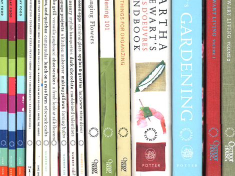
Image Source: Doyle Partners.
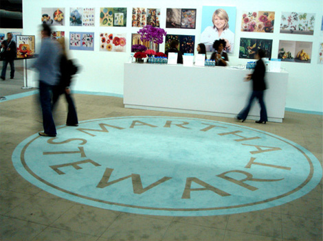
Image Source: Doyle Partners.


Jump to Most Recent Comment
Kosal Sen’s comment is:
Where'd that mermaid woman in the middle go?
On Jan.10.2007 at 09:40 AM
Mark’s comment is:
Woah, that is a radical change and it does feel more inviting.
On Jan.10.2007 at 09:41 AM
felix’s comment is:
Thanks for posting this, Arm. Another perfectly encapsulated redentity®. I hate Martha Stewart, but I rather appreciate her taste for design and it's oozing out nicely here (via Stephen Doyle's well compressed but cheeks).
Being somewhat of a logo freak I immediately went searching for my Pentagram Compendium (only to fing I don't have one anymore). There is an idenity in there thats near identical, but thats just my natural knee jerk pesimism. This is better.
It tosses a lifesaver® into Martha's dingy old cell and separates her from past mistakes. Its timeless. Its classy. Its all a lie. And its perfect.
Well done Doyle Partners. Those bastards recently took our foosball brass too. Which only means they'll don another wreath come next November's WGDFC 4. Game on, my friends. Game on.
On Jan.10.2007 at 09:53 AM
JP’s comment is:
Yes it is a large departure from the past logo but is it really the right direction? There is very little balance here and it feels like it just wants to roll off the table. I think the all caps a re too large for the circle and the letters feel cramped and from a distance completely unreadable. This reminds me of logotypes in the early 90's when Freehand introduced the ability to wrap letters to a circle object. I like to find positives in a critique and well...just can't here.
JP
On Jan.10.2007 at 10:09 AM
Doug’s comment is:
I didn't find the former Martha Stewart logo effective, nor do I see any massive improvement in the new one. The spacing between her first name and surname is creating a jumble of words - 'smart', 'art,' 'wart,' etc. and the overall shape doesn't clearly communicate anything about her brand.
When reduced on the magazine spines, the type proves even less function without the containing circle. Martha Stewart's brand has been positioned around conservative, suburban style. This identity doesn't say that.
On Jan.10.2007 at 11:11 AM
Joosse’s comment is:
Anyone else think this could've been designed by Peter Behrens 100 years ago? If Martha Stewart were one ruthless Geschäftsfrau, this would be a fitting centennial logo.
Looking at it from this distance, I still love that old lime green, but maybe it overstayed its welcome by a couple of years.
On Jan.10.2007 at 11:27 AM
C-lo’s comment is:
The perfect circle a'la Martha Stewart logo.
Oh look the new Martha Stewart logo.
Doyle says it's a wreath of welcomeness.
Wreaths are round like life preservers, felix said.
Life preserves are on boats.
Wait, I get seasick real easy.
I think i'm gonna hurl...
BARF.
Oh look the new Martha Stewart logo.
I've seen the local plumbers with better logos. Does anyone say NO to the chairpeople in design meetings anymore?
On Jan.10.2007 at 12:22 PM
//maria’s comment is:
perfect for the empire she has built!
It exudes power without looking expensive;
more like well established and ever present.
jenn.suz.hoy’s comment is:
I definitely appreciate the change in typeface here, but I'm not so sure about the circle. I agree with JP's comment about how it looks like they just found out how to make words wrap around a shape again.
Though, I also find it fitting, since where this logo lacks annoys me in exactly the same ways Martha does.
On Jan.10.2007 at 01:49 PM
Gabe Ruane’s comment is:
This is clearly not going to blow any of us away creatively, but both the old and the new logo did/will do a good job representing a massive array of products, magazines, books, etc. The brand is too diverse to warrant a specific/bold visual personality.
I agree that the type-only version is far more appealing, and the kerning-on-a-curve is about as well executed as you could hope for.
On Jan.10.2007 at 01:54 PM
John Hoare’s comment is:
I think it's a complete mess. To my eyes, it's virtually unreadable. You can't tell at a glance where one word ends and another begins.
On Jan.10.2007 at 02:27 PM
Shahla’s comment is:
Ring around a rosie, a pocket full of posies…
At least they stayed away from red! (earliest symptom, the round, red rash of the Black Plague)
On Jan.10.2007 at 02:43 PM
Drew Pickard’s comment is:
I particularly like that if you look at it just right - it looks like it reads "Smartha"
:)
Circle type is hard.
This reads less like a logo, and more like a stamp or seal of approval or authenticity.
Her previous mark reads more like "THIS IS MARTHA STEWART, OR ELSE" A little bossy, more like a statement of indisputable fact.
Maybe more like her alleged off-camera personality, but not as inviting as the new.
There's room in the circle for you, now.
On Jan.10.2007 at 02:55 PM
Mark’s comment is:
Is this logo also going to appear on the magazines also?
On Jan.10.2007 at 04:43 PM
k’s comment is:
does no one else see a button here? upon first (and second, and third) glance, i saw a giant levi's-esque button staring back at me. at first i thought, oh, yeah... martha stewart... domestic... buttons... i see what's going on here. then i realized that i was dead wrong.
never-the-less, i agree with drew, in that it seems to be more of a stamp of approval than a logo...
On Jan.10.2007 at 05:01 PM
David’s comment is:
I saw this 2 nights ago at a Macy's home store that was selling some of her furniture. There was some p-o-p signs on the furniture with the logo with the word Signature in the middle of the circle. I took it to be the logo for just her "Martha Stewart Signature" line of furniture. Didn't know they had changed the mother brand.
Like the typeface, but yeah, type in circles only works on jean buttons.
On Jan.10.2007 at 06:30 PM
eric strohl’s comment is:
I'm not so sure on this one. while I agree it was time to refresh this mark, this just isnt jiving fo rme.
The type selection is less elegant than before, although it is more unique. Maybe its just going to take some getting used to. There has been some elegant branding done in recent years for "personalities" similar to Martha who have ventured into the realm of endorsed products (Nigella and Mario Batali come to mind as lovely examples)
Martha's past branding was less about logo, and far more about color, mood and packaging. This new look is very much a "mark" and thusly limits its versatility some. I would expect an entirely new, perhaps subtle, approach to the packaging.
In the end, I trust the nice folks over at Doyle because of their amazing work in the past and that they continue to do. I am eager to see how they encorporate it into such a huge system.
On Jan.10.2007 at 06:55 PM
Mark’s comment is:
The previous logo was boring commonplace and forgettable this new jumps of the shelve's.
There was nothing special about the previous mark.
Seriously, why does a logo have to look boring (dull) all the time,whats wrong with looking unique?
I see the wreath and the name and quite frankly it's clever.
On Jan.10.2007 at 07:17 PM
diane witman’s comment is:
Her site has already been branded with the new id:
MarthaStewart.com
I thought something might be going on since the re-design of her website a few months ago, they attributed it to adding space for advertisers. Apparently they had more up their sleeves than we all knew.
I like the new id, especially on the book spines. It doesn't work as well on the magazine spines, but who's looking at them anyway(except for me).
On Jan.10.2007 at 08:06 PM
neal shaffer’s comment is:
I thought this looked a little rough at first, until i distanced my eyes. If you look at it that way -- which is likely the way most people will, considering they won't be looking at it on a design website, with the designer's eye -- then you can clearly see that it looks like a sun. Notice the progression of M-T-T-W when you step back...in fact, it might even suggest a tilted compass. Direction and light. Makes sense.
Also, I'm struck by the fact that the word "Art" jumps off the top left. Then again, the word "War" also weighs down the bottom right.
ns
On Jan.10.2007 at 11:53 PM
Von Glitschka’s comment is:
Design psycho-babble aside this logo is pretentious at best. So maybe it is a good fit for Smartha Tewart.
And based on the article that was linked from 'Logo Lounge' I still can't believe it took Doyle Partners two months to produce this end result?
On Jan.11.2007 at 02:27 AM
kabari’s comment is:
I think it would be much better of a logo if it had a bat or a chain in it, I mean..she just got out of the joint and all, this is no time to get soft.
Joking aside...it looks really nice on the side of books and magazines. Everywhere else it looks corny.
On Jan.11.2007 at 02:53 AM
felix’s comment is:
Von,
I don't know how type in a circle is pretentious; perhaps Smartha doesn't own a place in your heart? This two month time span is acually fast- tracked if you've ever dealt with a branding monster like this (approvals. luncheons. second-guessing. focus groups. second-guessing) you know what I'm talking about. Its madness.
This is a big deal in the realm of CI/ branding. I've havent seen anything recent like it. Its a total throwback but quite brilliant. Anyone that lives in this area and reads the NY Times (Op Ed) knows Doyle is a master of typography and metaphor. He rarely misses. The fact that there are so many knee jerk novice poo pooers on this thread is equally inspiring.
On Jan.11.2007 at 09:56 AM
Design Maven’s comment is:
TEXAS BAD ASS:
This is what I found in my Pentagram Identity Compendium (wink).
This is only Distributed to Genuine Disciples and Acolytes of Pentagram.
Notice who has a Copy.

Don't go asking Arm for a Replacement Copy.
I just Pinged BIG BRO to take Inventory of said Stock. (LOL)
DM
andrewmartin’s comment is:
"This reads less like a logo, and more like a stamp or seal of approval or authenticity..."
Um, guys, remember what logos do? They are stamps or seals of corporate approval and authenticity. This mark is a very-well-crafted design solution.
On Jan.11.2007 at 10:08 AM
fatknuckle’s comment is:
Seems that Omni has been picking through Saks' trash again...
That transitional face becomes even more difficult to decipher in the round, and does in no way indicate inviting and welcoming. So I hear what you are saying Von.
I also have to agree with the "wreath" analogy as it pertains to the enclosed version. Wreaths have irregular outside edges and a visible center. While it applies when the enclosing circle is absent, it certainly looks more like the button previously mentioned when its there.
I think it speaks volumes when a master brandmark has to be changed in its fundamental visual structure to support its various applications. What ever happened to the one concise mark that would work without having to significantly alter it's appearance each and every time to get it to work? (and yes that circle is an important part of it's lock up) Saks has done it, now martha, Im seeing a pattern forming here....
On Jan.11.2007 at 01:18 PM
Ed’s comment is:
brings a whole new meaning to the term "circle jerk" :-P
On Jan.11.2007 at 01:34 PM
Nathan Philpot’s comment is:
I too see a button, but on the website I don't see it. I see a wreath. I like it. You make sacrafices when you set type on a circle. I look at more like an image, and the image communicates all the subtle things people have mentioned.
On Jan.11.2007 at 01:43 PM
Von Glitschka’s comment is:
Yes, I think the logo is pretentious. I am holding to it's classic definition of course.
pre·ten·tious: making usually unjustified or excessive claims (as of value or standing), unwarranted, or exaggerated importance, worth, or stature.
If you want to hug this graphic and back pat the designer that is fine. We all however have the opportunity to voice our opinion on this blog. I'll take your word that Doyle rarely misses but on this mark it's hardly brilliant. (Maybe a good topic for the podcast Felix?)
I know discussing stuff like this on a forum doesn't always lead to good communication. People can read into what you say any tense or mood they want to.
On Jan.11.2007 at 01:50 PM
fatknuckle’s comment is:
Looking at it a bit further, one of the things that bothers me is the vertical strokes on letter-forms. They seem to be a bit random in orientation which probably is caused by simply placing the font on a circle without adjusting the letter-forms themselves to compensate for the curve and its orientation to the center and radiating axis' (axii?). Some of the characters do this (H, & T) but the others seem to be off a bit (especially the A and the W.) I'm not advocating strict mathematical presentation but they definitely need a bit of fine tuning.
![]()
One of the many reasons circular type is takes a lot of tweaking to look right.
On Jan.11.2007 at 02:01 PM
felix’s comment is:
If you want to... pat the designer... fine. We all (can)... voice our opinion. —Von
Not asking anyone to can it on my account. I find the areas this lives in (ie: book spine) and see the direction as a not so subtle ownership grab. Smart! NO ONE at a company the size of Martha Stewart would have the balls to regress in this fashion.
Perhap Armin should have shown this:

You have to admit; theres a tastiness to it. I'm sold.
On Jan.11.2007 at 03:21 PM
Jason L.’s comment is:
I'm a much bigger fan of the type only version. And when seen in repitition, as in the shot Felix provided and in the spines, it works really well. I appreciate the breakdown of some of the idiosyncrasies in the mark, but overall I can get past them assuming that compromises have to be made when setting type in a circle. The mark certainly seems to benefit from its application, which considering the umpteen zillion applications the Martha brand has, I would rate this a pretty good succcess.
On Jan.11.2007 at 03:40 PM
fatknuckle’s comment is:
Jason-
I think in this application it's a matter of details rather than compromise. Look at the Pentagram example provided by Maven. Thats how it should be done.
Also since it seems to be the text only application is far better in most applications (at least the ones presented here,) why is it then that the main wordmark has that circular enclosure around it? Why not simply make the mark that version instead and call it a day?
On Jan.11.2007 at 04:17 PM
Keivn M. Scarbrough’s comment is:
Every time I flip past Martha's show on TV, she's making a holiday / seasonal wreath. In that sense, the logo is oddly appropriate.
On Jan.11.2007 at 09:58 PM
Tony Spaeth’s comment is:
The big difference is strategic, isn't it? A bit of distancing. The old mark was nothing but Martha. "Here I am. This is my name. In your face." In the new mark she recedes. "Here is my brand. With a little effort you can still find me."
On Jan.12.2007 at 10:44 AM
DesignMaven’s comment is:
Vonster:
Although, you Defended your Comment.
Felix wasn't talking about you Per se.
Almost certain his comment was meant for others
that Blaspheme without a Proven Track Record or unforeseen accomplishment.
We know you have an Award Winning Proven Track Record.
Honestly, I get the SAME FEELING. Glad Felix Spoke Out. It needed to be Said.
If I may Piggyback on what Felix said being from D.C. and not The Design MECCA New York.
Stephen Doyle, is one of the Best most Respected, Astute and Passionate Designers Practicing Today Worldwide. Bare None!!! Second to None!!!
Fatnuckles:
Great Analogy and Letterspacing Lesson!!!
As Vonster would affectionately say "You can Drive a Truck through the "A" and "R" in Stewart.
Seriously, I think the Type was OPTICALLY KERNED. In Normal Kerning or Tight Kerning the type is Mathematical to Correspond with each letter placement.
In OPTICAL KERNING, type can be manipulated to phonetically enunciate the word or create the illusion of depth and space for a perfect fit.
In this respect you witness unevenness of letterspacing.
DM
On Jan.12.2007 at 11:18 AM
Von Glitschka’s comment is:
See what I mean I read into the tense and mood of Felix post. DOH!
I'll go on record and say I enjoy Felix feisty nature.
I don't think someone has to have an award winning track record to comment on a design though. I know many who never bother to enter any award shows but none the less do incredible work.
But once again I maybe reading into what you just posted? Either way no worries.
I really do enjoy this blog and taking in all the view points, it' changed my opinion on several logos posted so far.
On Jan.12.2007 at 12:04 PM
DesignMaven’s comment is:
Vonster:
We're on the same page in reference to your assessment. Winning Awards should not be a Criteria for Discussing Identity and Design.
Ultimately, Intelligence, Insight and Experience into what goes into Creating Identities should be a Major Factor.
Shooting from the Shoulder with informed Analytical Opinion is always Respected on
Speak Up, Brand New and other Design weblogs.
Opposed to Shooting from the Hip and Fanning ones Pistol without removing the Gun from the Holster and taking Aim with informed Analysis.
It's the Gunslinger Mentality that give Identity Discussions a Bad Name with Insiders and Practitioners on Blogs.
This is what Insiders (Leading Practitioners) tell Me about Discussing Identity on Blogs:
" We don't know the Business issues, name issues, proposed identity evolution which should all be addressed before commentors confirm what Designers and/or Identity Consultancies presented is just bad or completely insane".
Since none of us reviewed the Brief nor Interviewed the Designer, Consultancy or Client.
We can only Measure the work against Design Objectives Originality, Memorability, Uniqueness, etc.
Design Objectives are Rarely Addressed when discussing Identity on Blogs.
DM
On Jan.12.2007 at 01:54 PM
Jason L.’s comment is:
Fatknuckle-
To answer your latter question, I have no flippin'idea whay they aren't using only the typographic version of the logo. I can only assume that they are smarter than me. But my meager mind is only willing to assume so much.
Also the only real detail issue I have is essentially the large space that separates the two words. Both the vaunted Pentagram mark and the MS mark suffer issues with the A's and the R's, so i'm going tto assume that that's a given. I would love to see the versions done to arrive at this. Perhaps this is as good as it gets. And even with all this ramblilng having been said, I still think the mark is successful.
Woot!
On Jan.12.2007 at 02:20 PM
Stephen Doyle’s comment is:
Armin:
Where did you get that horrible quote? Not here!
And where's you get those pics? (and the 'facts"?)
Stephen "Long-time MS Collaborator" Doyle
On Jan.12.2007 at 02:52 PM
fatknuckle’s comment is:
I fail to believe that this is as good as it gets and I too think its successful for all of the reasons presented here (both strategic as Mr. Spaeth says and presentation wise as others)
One caveat though, the wordmark without the device is far more successful.
Maven -- I disagree that comments without the brief or without insider explanation are inherently bad or insane, I think that critical analysis on execution / presentation doesn't require it. We can all tell whether something has been executed well or not.
Analysis of intent, strategy or objective, though, is a vastly different case and I would tend to agree with you and the "leading practitioners." in that regard.
But whatever level of information we truly get (and here it seems to be quite sufficient to form an opinion on those matters as well) and if you have been around the block more than a few times, you can readily infer this information without necessarily having the brief in hand.
On Jan.12.2007 at 02:58 PM
Mark’s comment is:
One thing I've noticed about the logo:
When the logo is on the circle background it looks like it's in a spinning motion but when it's text only to my eye it looks stable and steady, plus the 'wreath' design shows through more.
It's just something I've noticed I'm not sure if that helps or hinders the effectiveness of the mark.
On Jan.12.2007 at 03:15 PM
felix’s comment is:
Oh snap.
Time to come clean, Arm before you get hammered (sorry). Let's hear about those facts! Now!
On Jan.12.2007 at 03:45 PM
Monostereo’s comment is:
Ouch! Seems a bit too 'old biddy' to me. Especially the website. I know she's the queen of crafts, but I think that the modernism of the old logo appealed to a younger audience. This seems catered to an older audience. Are spinsters the new teal?
I
On Jan.12.2007 at 04:01 PM
DesignMaven’s comment is:
Fatnuckle:
I believe we're on the same page, yet you're missing the Point.
I can CULL a Gazillion Post where nothing MORE is said, other than I like it or "I don't like it. I think it Stinks, This is terrible or it's bad Design".
Re-read my Post again, again, and again until you get the understanding. We vehemently Do Not Know the Corporate Objectives.
All we can talk about are the Design Objectives.
Does the Identity meet these Design Criteria Paramount to Successful Identity Design.
1. Originality
2. Memorability
3. Usability
4. Livability
5. Propriety
6. Uniqueness
7. Visual Impact
8. Imaginative
As you stated, Fatnuckles, "I think that critical analysis on execution / presentation doesn't require it. We can all tell whether something has been executed well or not".
I disagaree, because unless you're the Creative Director or Designer working on said Project you have No Idea of the Personal Vision and Initiative the Designer. Or Consultancies Philosophy which Govern their Creative Process and Personal Taste.
We can Judge only Aesthetics. How something looks to us. Ultimately, the Client has the last word, it's their money they're spending.
Not everyone has the same Acumen, Ideology, Personal Taste and Level of Understanding of Identity.
I can emphatically tell you Craft and Execution have NOTHING TO DO WITH DESIGN OBJECTIVES nor the Success of an Identity.
Yes, something Well Crated and Properly Executed are Goals we Strive as Designers based on Personal Taste.
Identities are Driven by Marketing and Communication. That's what make them work and successful. Identities e.g. Logos, Logotypes, Symbols, and Marks are meaningless in and of themselves.
Because, there are a lot of UGLY, POORLY Designed Identities that do a Great Job because they are Properly Managed,
Let us not Forget, PAUL RAND saw a Flaw in his Bow Design for UPS. Mr. Rand went to Management at the time to ask if he could fix the bow for NO FEE. Management told him No!!!!! They didn't see anything wrong with it.
Long Story, The Bow on UPS has been Fixed by being Permanently Removed and the Mark Forever Destroyed.
Most important, mindless attributes are often given without any thought in Reference to Design Objectives and the Criteria Professionals incorporate to Develop and Design Identity.
If you don't know what the Objectives are you cannot expound on them.
That's why I continually write them and Passionately ask Designers to say something more Concrete and Substantiated other than I like it or I don't like. This is a FUCKED UP Identity Solution without providing Rationale.
If you read my Good Friend and Mentor Roger van den Bergh's Analysis and Commentary of enterprise car rental. At the end of his dissertation he iterated he liked the Identity.
Before Mr van den Bergh stated he liked the Identity he gave a Clear and Concise Analysis and Commentary why he liked the Identity based on Enterprise Business Issues, Naming Issues via Company History, Target Market, Core Audience as well, Analysis of other Noted Alphaglyph Identities, Alitalia, Olin, and Bridgestone as Examples.
His Analysis and Commentary was Substantiated with informed Intelligent Analysis.
Not Mindless Comments. If I may Quote James Brown.
TALKING LOUD and SAYING NOTHING.
In reference to Maestro's Comment.
"This is my name. In your face." In the new mark she recedes. "Here is my brand. With a little effort you can still find me."
Maestro, is also addressing Design Objective(s). I wonder, how many Designers writing on this site know which Design Design Objectives he's addressing???
DM
On Jan.12.2007 at 04:16 PM
stock_illustration’s comment is:
DM, you are far ahead of me in identity theory, but I can't help thinking that Fatknuckles is right...without knowing the unknowable, i.e. the Corporate Objectives, no one can critique any identity on this site unless they're privy to that information. That's not realistic. All we can do is critique the execution, the final product, based on our experience and the company's percieved objectives. This logo looks unfinished. Will it work? Absolutely. With otherwise impeccable marketing sense, the Martha Stewart empire will burn it into our psyche. But debating the proper management of a poor logo isn't why we come here, IMO. I confess I come here to see new corporate identity deconstructed by the best in the business.
On Jan.12.2007 at 09:07 PM
fatknuckle’s comment is:
Maven-
I wholeheartedly agree with you on the "like it or dislike it" commentary offering up nothing.
Again, I simply was commenting on physical execution of the mark which my experience allows me to comment on in a "concise and intelligent manner."
Yes that kerning is off. Yes the vertical strokes are off on some of the characters. Simple statements about the execution of the mark. Nothing more nothing less.
That comment is based on my professional experience, education and yes, to certain extent, but not entirely personal/professional aesthetics.
Does simple execution matter in the larger view of design objectives? According to your statements it doesn't. But then again maybe on some level it does or at the very least should.
On Jan.12.2007 at 09:21 PM
diane witman’s comment is:
The big difference is strategic, isn't it? A bit of distancing. The old mark was nothing but Martha. "Here I am. This is my name. In your face." In the new mark she recedes. "Here is my brand. With a little effort you can still find me."
I think distancing is correct. During her indictment Martha Stewart stepped down as CEO of the company but remains on the board and of course the star of the television show(s) and a radio show with Sirius Satellite Radio.
Since being released from house arrest she has been on a slow and steady incline of working her reputation back to credibility street. Being called a "liar" and bouncing back must be incredibly difficult. However, I'm not sure why they chose to change the company image now. It's been well over a year since her ankle cuff was removed and now it seems the Martha Stewart company is looking to start with a cleaner-looking slate.
On Jan.13.2007 at 08:21 AM
DesignMaven’s comment is:
Fatnuckles:
Again, we're on the same page.
I wasn't questioning your Acumen or Capability.
Rather expounding everybody doesn't have the same Problem Solving Capability and Level of Taste.
Execution is a Craft or Production Control Problem.
Most Principals of Design and ID Consultancies are not Responsible for their Production.
Albeit their name being on the Design.
Not making excuses for anyone.
Certainly, not telling you anything you don't already know. Generally that responsibility is Delegated to a Production Manager who should've corrected the problem or created the illusion the problem didn't exist.
I'll go as far to say, there are IMPERFECTIONS
in every Design, including Masters and World Masters. Regardless of their Statue and Reputation.
Realistically there's No Perfect Design.
Perfection is an Ideal WE ALL STRIVE to Accomplish in Design and Craft.
The Unwritten Rule there are Acceptable Allowances for certain IMPERFECTIONS in Identity and Design. The Identity shown at .11 inches on the letterhead or spine of a book and .05 or .08 within the inside page of the book or magazine the imperfection is not noticeable.
Generally, Identities are not shown at sizes larger than .11 inches. Except for Packaging, Billboard, Storage Tank, Promotion etc.
In this instance, A tighter Designed letterform is needed to compensate for imperfection.
I'm sure Mr. Doyle has included a Secondary Identity Design in his Identity Standards or Guidelines Reproduction Sheet.
Herb Lubalin was such a Perfectionist with Typography if it wasn't correct he got an Xacto Knife and spliced letterforms until they fit.
Today we're too Short on Time, Multi-tasking and Dependent on Technology to Solve all our Problems.
Technology is not the End All Be All when it comes to Design. You still need to have a Discerning Eye and a Passion for Design.
Computer Generated Design isn't PERFECT.
I've always Operated on the Premise Designers need to be somewhat Illusionist. Not the Smoke and Mirrors, Dog and Pony Show aspect of Design, referencing Charlatan Practice.
Designers should be capable of successfully hiding their mistakes. At least make their mistakes work for them.
In the Old days working by hand. White Paint and/or an Xacto knife were the Cure All for Mistakes.
You're to Young to know about The Good Ole Days.
DM
On Jan.13.2007 at 12:09 PM
diane witman’s comment is:
DM- I enjoy your posts. :)
I wish it were the ol' days, even though they were before my time of practicing design. Hands on was on the outs and computers were in when I was in college. I really feel the profession is lacking that certain something. I love being able to work with computers but as the days go on I have been teaching myself calligraphy, my interest in letterpress has been growing and most of all I miss sketching 100 thumbnails (which was mandatory in college). Since I have gone back to these practices my designs and attitude have improved greatly at work. Herb Lubalin is a great influence of mine and I can only hope to see more work and techniques like his resurface in the industry.
Again, thank your for some interesting posts.
On Jan.13.2007 at 03:21 PM
JonSel’s comment is:
It's been well over a year since her ankle cuff was removed
Hmm, I hadn't even thought that the logo could be a representation of the ankle cuff. Doyle you trickster!
On Jan.13.2007 at 04:12 PM
DesignMaven’s comment is:
Diane:
Thanks for the Vote of Confidence.
Anything you want to know about Lubalin Ping Steve Heller.
I trust you have Lubalin's Book which was Published in the 1980s shortly after his Death.
Art Director, Graphic Designer, Typographer.
Lubalin was the Greatest. Bass, Lubalin, Dorfsman were the Brat Pack of the Design Industry and Lifetime Friends. All were Born in New York.
Uncle Milty and Ivan Chermayeff would occasionally accompany their Brat Pack Compadre's.
I'll send you a scan of a Treasured Graphis Magazine article on Herb Lubalin from my Archive.
If I were ever afraid of any aspect of typography and hand lettering, believe me it was Calligraphy.
I still own my Speedball Lettering Pens. Occassionally take them out in sheer Awe how far we've come as Designer(s).
In the Future we'll be talking into Computer Microphones Instructing it how to Design and what colors to incorporate.
Hopefully, I'll be Retired.
DM
DesignMaven’s comment is:
Diane:
I meant Rat Pack not Brat Pack.
The Reference made to SINATRA, MARTIN, DAVIS,
BISHOP, and LAWFORD. Who were Genuine Friends and
Hung Out with one another.
The Brat Pack was Johnny Depp, Emilo Estevez,
Rob Lowe, Kevin Bacon, others.
Cited for Buddy Movies opposed to actually hanging out with one another.
DM
On Jan.13.2007 at 08:12 PM
fatknuckle’s comment is:
Maven --
Plaka & K+E and my old WN No. 7 Sable. I still love getting my hands dirty. I think that's why I relate so closely with the craft/execution aspects of our work.
Or maybe its because I had a bitch of a professor that made us render registration marks by hand...
But don't get me wrong, I would definitely be the first in line for that "Marvelous Maven Design-o-mator"...
:P
On Jan.14.2007 at 01:11 AM
DesignMaven’s comment is:
Fatnuckles:
Great point.
I continue to work by hand as much as I can in Developing and Designing Identity.
Have all my Red Sable Brushes, Ink, Gouache, Ruling Pens, Rapidograph Pens, T Squares, Triangles, French Curves, Press Type, Zipatone, Illustration Board etc.
I was discussing Martha Stewart Identity with one of my Mentors Offline.
We surmised the problem with letterspacing wouldn't happen with Hot Type, e.g. Mergenthaler, Varityper, Alphatype.
Cold Type, PhotoTypositor, Compugraphic Machines.
Reason, the Designer was able to position each letter visually and thus retain complete control over kerning.
It's evident with the computer some aspects of typesetting is not on the same level as Hot Type and Cold Type Machines.
Correction.
My brother informed me I mistakenly left JERRY LEWIS out of the RAT PACK.
APOLOGIES.
I was a bit over zealous giving those measurements. I meant, 0.5-0.8, 0.11 inches respectivelly.
DM
On Jan.14.2007 at 01:31 PM
felix’s comment is:
Folks, Design Maven is officially out of retirement.
Tanned, rested and ready for 08.
Back to my Helen Reddy The Forgotten Years CD
On Jan.14.2007 at 08:21 PM
Blake’s comment is:
I don't really like it. Not that it's in any way a terrible brand...it works on many levels, so in that respect I suppose it's a winner. Yet the reasoning behind the change...but then again, the fact that Martha's empire hasn't skipped a beat while she was in prison tells you something about us.
On Jan.15.2007 at 09:19 AM
Mark’s comment is:
One question: Does anyone know the reason behind the redesign?
Someone mentioned Martha stepping down as CEO, okay thats one reason.
lets see the other six reasons.
company has changed it's name here? nope.
symbol has become controversial here? nope
symbol has become obsolete of meaning or content here? once again. nope!
symbol has become dated or old fashioned here? nope in fact it was pretty current!
symbol has caused techinical problems here? nope I doesn't see any problems with the previous symbol,black or white or otherwise.
legal requirement to change the logo here? I'm not so sure.
So far the company's previous logo meets one of the objectives for change the rest of them it did not have any problems with.
Now unfortunately,(logo critiques aside)I see problems for the new one, how long is it before rounded text seems dated? or before confusion between when to use the circle background or not inevitably happens? or when it starts losing it's meaning? like when do people don't notice "the wreath" anymore?
It's not that it's a horrible brand, I'm just bringing up some considerable questions!
Joe Moran’s comment is:
Found this in the LA Times arts section. Martha Stewart concept homes.
VR/
On Jan.15.2007 at 08:08 PM
Sebhelyesfarku’s comment is:
Much ado about nothing. This new logo is a shite.
On Jan.16.2007 at 05:36 AM
Scott Stowell’s comment is:
Beautiful. I love it.
On Jan.16.2007 at 11:29 AM
fatknuckle’s comment is:
I would venture to say that the primary reason for this change would be because their previous identity has pretty become the standard for that market segment and it has become unduly crowded since its original inception. Also, as Joe pointed out, they are trying to expand their market offerings beyond their core magazine, tv properties which the previous mark has become such a part of.
I would think this expansion into new markets and differentiation in the currently crowded marketplace is the primary driver for the change rather than the negative association with the MS name. If that was the primary consideration they would have done it a long time ago.
Personally I think her association with K-Mart did far more damage to the brand than her jail sentence. Although it probably made her boatloads of cash.
On Jan.16.2007 at 12:49 PM
diane witman’s comment is:
DM-
Thanks, as young as I am, I even know who the Rat Pack was. Franky, Sammy, and the rest of the gang.
I would really appreciate that article and no, I don't have his book. But I can say it won't be long before I do have it. Thanks for the suggestion!
On Jan.16.2007 at 03:17 PM
Mark ’s comment is:
Personally I think her association with K-Mart did far more damage to the brand than her jail sentence.
Agreed, during the time Martha partnered with K-mart ,Kmart still represented the very meaning of "cheap" and that probably resulted in the image of mass produced,middle classed,suburban image.
Another big mistake was expanding into other fields so fast such as the Apprentice spinoff,furtniture,another tv show etc.
However pairing this time with Macy's may help keep the company stable,good smart move to step down as CEO also her image was tainted after the scandal.
On Jan.16.2007 at 05:35 PM
Joe Moran’s comment is:
Mark,
I have to disagree with your last comment.
K-mart + Martha = something better than WalMart, but less expensive than Target-Mart. A middle ground, so to speak.
Interesting?
VR/
On Jan.16.2007 at 09:16 PM
Greg Scraper’s comment is:
"Hmm... I have this type... what should I do with it?"
"Aw, fuck it, just put it in a circle."
What the hell does the circle mean? Maybe it's me, but does this seem forced to anyone else? The type choice is nice but the relationships of the letters to each other are mangled by this circle. I don't agree that the logo is somehow made better by repitition and nice color choices (any more so than any other logo, at least).
I feel the box in the previous logo is a better solution than this. There's so much space in the previous iteration, and so little in the new. I do like the optima-esque type, but optima is essentially a serif face without serifs. It maintains all those relationships, and to break them like that is unfortunate.
On Jan.18.2007 at 12:22 PM
Jacob’s comment is:
I like the old one better (and I don't care for the old one).
On Jan.18.2007 at 12:43 PM
Mary’s comment is:
I want to be wowed by this logo, but I'm just NOT. The circular shape of her name is just sort of jumbled looking. My eye goes directly to the odd space where there "A" of Martha meets the "T" of Stewart. I like the cheery blue color, but I think this new logo is a lateral move at best. It is all just a matter of apples and oranges (or in this case, circles and rectangles).
On Jan.24.2007 at 12:12 PM
Jeope’s comment is:
I made something much like this myself ... the first time I ever opened up Freehand in college and asked the instructor how to put type in a circle. I shoulda trademarked it.
On Jan.30.2007 at 01:03 PM
felix’s comment is:
still waitint for armin to answer mr Doyle's question.
Armin, where'd you get the quote?
On Feb.05.2007 at 11:02 AM
Armin’s comment is:
I didn't answer because the answers are somewhat evident if one follows the links in my original post. I also don't know what quote he is referring to: "welcoming wreath" or "soon grace most of [Martha Stewart Living Omnimedia] properties". The latter is from this link, which was rehashed in a prettier page that I linked to in the main post. The former is from Doyle's web site, same place where I got the pics.
On Feb.05.2007 at 11:14 AM
felix’s comment is:
"quasi serif"...described by Doyle as "welcoming wreath... soon grace most of [Martha Stewart Living Omnimedia] properties"…
"Grace. Exactly." — Armin
Hmm. Perhaps it was the snarky tone? From Doyle, it sounded as though you perhaps went from heresay. Chalk it up to the "who cares, it's a blog" osphere.
On Feb.05.2007 at 12:09 PM
David E.’s comment is:
I always thought the old logo was far too generic and corporate for Martha Stewart as a brand – it felt uncomfortable. This is much better. And yes, the type/lettering is expertly executed.
On Feb.15.2007 at 02:27 PM
Tony Goff’s comment is:
Mmm not a massive fan really I quite liked the spacing on the old logo, the old logo is also a bit easier to read. Still its not the worst redesign ever to grace these pages...
On Apr.04.2007 at 12:09 PM
Exigent’s comment is:
DM - Your comments are always insightful, but the tangents in which you fly off into are often quite boresome and long winded. We all know that you see yourself as the Queen of this here forum, if not the world of design, but namedropping and proving dominance isn't always the key to winning favor.
That being said-
The original logo was anything but memorable, original or creative. I would suspect that Martha must have stumbled onto this realization and wanted a logo that shows a more youthful and creative logo that shows her all encompassing empire without a feeling of stark dominance.
I believe that a circle shows just that. There are no hard edges, nor are there any signatures or pompous typography which currently dominates the designer markets.
There is an inviting softness to this new badge and I think it fits how Martha would wish to be viewed.
On Apr.04.2007 at 12:48 PM
Ned’s comment is:
Smart..Hat... wha...-?
Smartha Teward?
What's that say?
On Apr.05.2007 at 02:54 PM
DesignMaven’s comment is:
Exigent
"We all know that you see yourself as the Queen of this here forum, if not the world of design, but namedropping and proving dominance isn't always the key to winning favor".
First and Foremost, I'm a Straight Heterosexual Male.
The proper address would be King, or Prince.
Perhaps, Prima Donna is more befitting and Goodwill Ambassador is more Accurate.
I resent the implication.
It isn't Name Dropping if YOU or (others) don't know the History or Accomplishment of certain individuals.
It's not dominance if you or others don't know what you're talking about and I correct you when your wrong.
For the Record, I am an Authority in Corporate Identity and Visual Communication with 35 years of Practical Practice.
Certainly as an Corporate Identity Expert, Professional Partner, Facilitator and Educator many seek my Renowned Expertise. Many Leading Professionals seek my Expertise because it is an aspect of their Education and Experience which is Gray Matter.
Would you consider A History of Graphic Design by Phillip Meggs Name Dropping???!!!
C'mon lets not get Self Indulgent with YOUR Ignorance and Insecurities.
In Reference to Winning Favor.
Self Made Man. I seek nothing, or
No One.
Yet, I am Highly Sought After!!!
FYI, I've turned down Eight (8) Major Interviews in the last two years including an Interview with my Best Bud, Armin Vit for Speak Up Podcast. At the same time, requesting Mr. Vit commit to an Interview with my DesignFather a Historically Significant Designer.
Does that make me a Shameless Socialite in your Warped Narrow Mind and Tunnel Vision???!!!
Or does that make me a Conscious Human Being (an endangered species) whom readily put other people before himself.
I'm certain YOU would've LEAPED at the OPPORTUNITY to WHORE MONGER and Self Aggrandize!!!!!
DM
The Hostile Takeover of Corporate Identity
On Apr.06.2007 at 02:40 PM
Exigent’s comment is:
My My. Settle down princess.
I concede. You are the fairest in the land!
On Apr.09.2007 at 09:12 AM
L E’s comment is:
Is it Gill Sans? Love that font. Simple, functional, non-pretentious as are her products.
Type in a circle? So what. I find myself recognizing, at a glance, the teal/aqua dot on a product and know it belongs to Martha Stewart and am more apt to pick it up to see what she is into now.
The colour? Teal/aqua, signature Martha.
Done before? Vintage - signature Martha.
So what.
On Jan.06.2008 at 10:17 AM
Comments in Brand New, V1.0 have been closed.


