

NOTE: This is an archived version of the first incarnation of Brand New. All posts have been closed to comments. Please visit underconsideration.com/brandnew for the latest version. If you would like to see this specific post, simply delete _v1 from the URL.
![]()
Available in the U.S., Latin America and Europe, HTV (Hispanic Television) is a music channel broadcasting the best Latin and Hispanic music videos. Launched in 1995, it was acquired in 2007, along with other channels, by Turner Broadcasting System Latin America. This past April, it launched a new identity designed by Turner’s own Latin in-house design group based in Argentina, InJaus. (In Spanish, that spelling would be pronounced as “in-house”.)
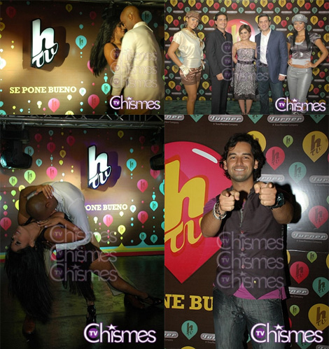
Launch party that shows some of some bubbling HTV logos and some hot people. Image source.
Before writing this post I wasn’t aware of HTV and, if you had asked me what their previous logo was for, I would have never guessed it was for a Latin music channel. I’m not sure I would be able to pinpoint what this new logo was for either, but the visual cues are much more evident: It’s more bubbly, more pop, more fluid… it just feels like it belongs to the channel much more. The letterforms are actually quite interesting, if just a little unrefined. And the holding shape, while trendy and overused, works pretty decently in this logo and also as a bubbling application. In one of the news items I was reading about it, it tried to explain that the new identity was about “generating heat,” so depending on your idea of visualizing heat generation this might be right on the spot.
Unfortunately the HTV web site requires that you use Internet Explorer so, because this is not 1999 and Microsoft abandoned the OS X ship years ago, there is probably some information or visual application that I may be failing to provide. But I believe you get the gist.
Thanks to Diego G. Díaz Giammarino for the tip.


Jump to Most Recent Comment
the designer mike’s comment is:
I think this new identity is great. While it isn't ground breaking, it fits perfectly with the type of product it is serving and aligns with the visual language we expect from it.
I really like the construction of the logo with the top of the 'T' hooking into the bottom of the 'H' and the tail of the 'H' fluidly forming into the 'V'. All subtly done and all feed into the fluid feeling of the identity which is continued with the lava lamp like supporting graphics. It's hot alright.
I think theres also room for extending this brand in the future. It gets stronger the more I look at it. Well done.
On May.18.2009 at 08:37 AM
Dale Campbell’s comment is:
Awesome.
Simple, recognizable and versatile.
I think it's a great execution.
Muy Bien : )
Saylor’s comment is:
I really like the execution in the patterned background/ display.
On May.18.2009 at 09:26 AM
koyo’s comment is:
Nice and simple design from my Country, Argentina. Not a fan, but good work.
On May.18.2009 at 09:53 AM
Alex Pierce’s comment is:
I really find the shape and letterforms pleasing to the eye. I don't really see this as generating heat, but I do think it is definitely a more appropriate identity solution.
On May.18.2009 at 09:56 AM
koyo’s comment is:
Buen Trabajo
On May.18.2009 at 09:57 AM
KK’s comment is:
I like the new design. The shape is kind of like a bubble, but also evokes a guitar pick, which seems appropriate for a music channel.
On May.18.2009 at 10:24 AM
mujiri’s comment is:
the logo works decently well on its own. although it grabs me more as a visual elements in the accompanying picture.
the wordmark is actually interesting enough to stand on its own as shown on the top left pic
On May.18.2009 at 10:29 AM
jRod’s comment is:
its definitely easy to tell what their target audience is, as they hit the nail on the head. its well designed and the wrapper is appropriate. its a big step up from the previous version, yet its still identifiable with it. nicely done.
On May.18.2009 at 10:32 AM
Glenn Sakamoto’s comment is:
A nice variation of a heart. A unique shape that is both friendly and familiar (a guitar pick?). Well done.
On May.18.2009 at 11:00 AM
V as in Victor’s comment is:
I like that the new logo builds on the style of the old one, but refreshes it for the target market. I like it.
On May.18.2009 at 11:06 AM
Nate’s comment is:
I'll be in the minority, but I prefer the old version. The color and the faux metal styling (I think that's what it is) didn't work, but the letter forms were far stronger.
In the new mark I can't help but notice that the spacing between the pink box and the h/tv is different at every edge. Look how close the T is to the lower left side, reminds me of a balloon about to burst.
On May.18.2009 at 11:46 AM
Kevin Zwirble’s comment is:
I agree with Armin about the old logo not really emphasizing music. It looks more like a car logo or something. The new one does have more of a music-feel to it, the shape being a play button, or some other type of element.
On May.18.2009 at 12:43 PM
lucid’s comment is:
overwhelmingly feminine
On May.18.2009 at 01:20 PM
Jarrod’s comment is:
Is the target audience 13 yr old girls?
jRod’s comment is:
Guitar pick... its a guitar pick. I just figured that out. There's your musical tie-in...
On May.18.2009 at 03:26 PM
Alex C.’s comment is:
It's bubbly and obnoxious—so it works for them!
On May.18.2009 at 03:34 PM
Ryan Adair’s comment is:
I am definitely not a fan of this sort of stuff, but it seems to work. It's poppy and looks like something that would go after the MTV, VH1 crowd, so they accomplished their task.
The step and repeat is good, but cluttered.
On May.18.2009 at 06:51 PM
William’s comment is:
Under usual circumstances, I'd say a few words about the strategic appropriateness of this solution, blah blah blah...but I can't seem to get past the brunette in the lower left corner shot. *gulp*
On May.19.2009 at 12:28 AM
Benigno’s comment is:
I really like the rebrand.
We go from a sort of stained-metallic construction feel, to a happy-bubble-pop feeling.
And I’m glad to see something more up-to-date and “universally” pop into a Latin product than the typical “Soy Latino” screaming kind of style.
As far as the website, they have an interesting colorful-palette. But I think they went too bright on the design, I was expecting to see a similar treatment like the background they use in the pictures or that color palette.
They also use some sort of graphic elements like deflated balloons floating around the logo and other applications that diminish the brand and the logo itself.
Kimberly’s comment is:
i like both, and for the new one, i'm not sure pink was the right color choice with the type that is going on. It makes me think of Valentine's day.
On May.21.2009 at 07:26 PM
Neil’s comment is:
A nice rebrand, but I would be just as happy with the before/after reversed. They're both nice.
On May.24.2009 at 04:32 PM
Julio F’s comment is:
Less cheesy and more warmth. The fire is not necessary. A guitar pick, a kinda heart shape, whatever...
I think it works better as their fly than the older version taking into account that HTV goes with MTV, Q (another latin music channel), Much Music and VH1 in the grid.
Char’s comment is:
Excelente!
It's happy and it conveys music and latin flavor. It's very very Miami as well.
I like this.
Jack’s comment is:
I like the new version a lot. Like Char said, it feels very Miami. The old logo's faux metal finish (I think) makes me think of a rusty pickup truck.
On Jun.09.2009 at 08:20 PM
Comments in Brand New, V1.0 have been closed.


