

NOTE: This is an archived version of the first incarnation of Brand New. All posts have been closed to comments. Please visit underconsideration.com/brandnew for the latest version. If you would like to see this specific post, simply delete _v1 from the URL.
![]()
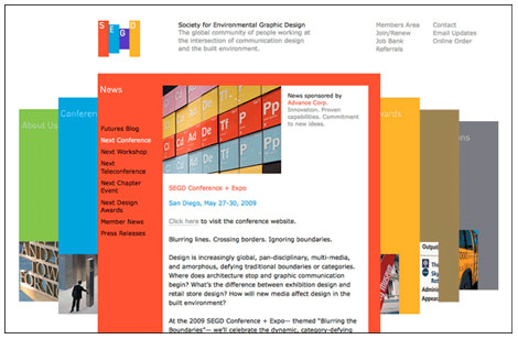
The Society for Environmental Graphic Design (SEGD) is “the global community for people who work at the intersection of communication design and the built environment.” Their new identity and website has been designed by Pentagram partner Michael Gericke and his team. Pentagram has a post about the project up on their blog where they describe the mark as consisting of “four brightly colored panels that can be interpreted as three-dimensional forms, printed graphics or interactive menus. On the site these panels act as visual springboards for the website content, providing sections for news, conferences, awards, publications and learning.”
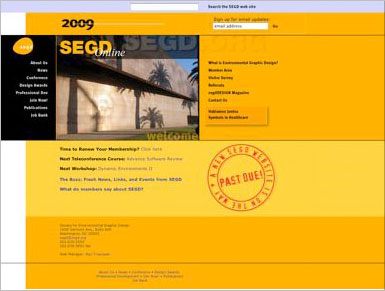
Old SEGD web site.
The previous identity, designed by Douglas Morris of Poulin + Morris, was a relatively memorable combination of indefinable shape, bright color and a surprisingly effective lowercase acronym with wide kerning. For those familiar with seeing this logo in use in the past, in collateral and online, I don’t feel it ever really found its top gear. Perhaps it was because it was a bit too quirky to apply or perhaps that there have been droves of subsequent logos that employ similar egg-like shapes with typography over them to find a distinct voice.
![]()
The new identity seems to have all the right moves with a simple set of structured elements that can be scaled and rearranged to fit various contexts, a well defined and usable color palette, elements that are easily reproduced in diverse color environments and a good conceptual underpinning — but somehow they don’t come together in the execution. The S, E and G panels start to imply space through their scaling and composition, however the D panel abruptly stops this impression by matching the same scale and vertical positioning of the first panel in the sequence. This symmetry and alignment of the S and D panels caps off both ends of the mark, boxing in any energy or rhythm that may have been started by the shifting color planes. The result turns out to be the opposite, a flat mark that loses a lot of the possible “three-dimensional forms” implications.
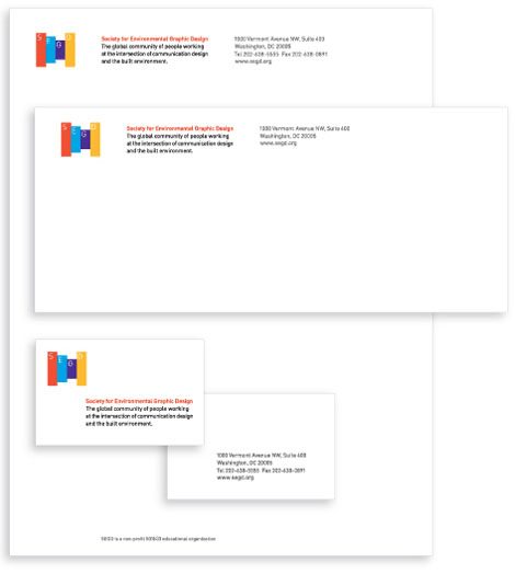
The stationary program and the newsletter are elegant presentations that show the sophisticated restraint one expects from Pentagram — however the website is not as successful. While the use of the colored panels as “visual springboards” is well intended, it too falls short in the execution. Opening and closing the colored panels, which serve as content containers and primary navigation, causes constant reordering and obscures the labels of the panels to the right of the open section — adding up to a clunky navigation experience. In addition, the composition of the main navigation panels when using the secondary navigation (Contact, Email Updates, Online Order, etc.) feels under-considered.
It’s hard to focus in on a critical assessment of this new brand in the context of Pentagram’s exceptional ability to make it look good — nothing comes out of that office looking bad — however this identity falls short of its potential. Maybe given more time and further applications will expand it.
Thanks to Josh Berta for first tip.


Jump to Most Recent Comment
thedesignermike’s comment is:
I really like this re-brand.
I disagree, I think the 'D' gives the logo a nice sense of depth, that is less obvious than if the 'D' were small and looking like the logo was dissapearing into the horizon
It gives it a sense as though you could walk through the logo which works for a company involved in environment design.
I do agree the website feels under-done and the movement of the panels defies the logic of depth the logo is trying to create. Rather than the panels growing over the top of the previous when clicked, it would work alot better if the viewer was felt to move through the panels in the same way as the logo.
The logo is an improvement on the previous logo as it feels more appropriate and its refined simplicity makes it more memorable.
On Apr.16.2009 at 08:11 AM
Bill Dawson (XK9)’s comment is:
There was something more inherently organic about the previous logo. I think the rigidity of the new symbol, while evoking perspective, seems a bit too austere for SEGD. As "Environmental" is integral to the name and focus of the organization, this mechanically precise re-invention seems a bit off the mark.
On Apr.16.2009 at 08:36 AM
Proverbial Thought’s comment is:
Am I the only one who thinks that designers sometimes just throw something together and add meaning to it later? Honestly, this looks like the work of someone who had no ideas so they drew a few boxes in Illy and dropped an acronym in them before the deadline for the project hit.
Just my opinion for what it's worth.
On Apr.16.2009 at 09:11 AM
Caryn’s comment is:
I really like the stationery. It speaks beautifully. I'm not sure how I feel about the logo, although I do consider it an improvement on the old egg one. This new one seems to speak a bit more to what it is about. Overall, I think it works fairly well and I'm interested to see how it develops.
Also, please spell "stationery" correctly.
On Apr.16.2009 at 09:16 AM
schwa’s comment is:
love the mark. love how it rolls out into the website. for a society of environmental graphic designers, the work is far from "stationary." ;-)
On Apr.16.2009 at 09:16 AM
jarrod’s comment is:
@proverbial thought
are you looking for some nice gradients and swooshes that make it look like it took more time?
a longer, more convoluted explanation?
it's smart, simple, flexible and ownable - everything a good identity should be.
On Apr.16.2009 at 09:56 AM
jRod’s comment is:
not everything... one thing that is really bugging me about this is the purple box that the G lies in. i know it’s just tricking the eye, but it looks bigger than the other bars. if they were to lengthen it a little, it would even out a lot better than it currently does.
On Apr.16.2009 at 10:06 AM
Victor’s comment is:
I don't think we've seen enough application to determine how effective the complete identity system works. It has some potential, but right now it definitely falls short of any complexity or intelligence that we've come to expect from Pentagram. It really doesn't matter what the logo looks like on the stationery...it would still maintain restraint. It looks like they played it way too safe and it doesn't have any character. The website functions just fine, but it seems lacking...nothing memorable about it.
On Apr.16.2009 at 10:08 AM
Neil’s comment is:
It's strange. I would have been much happier with the before/after images reversed.
On Apr.16.2009 at 10:08 AM
M.’s comment is:
I like the guitar-pick one better! Neither one seems timeless, though.
On Apr.16.2009 at 10:32 AM
M.’s comment is:
Also, after visiting the site - the new logo works very well as an animated "loading" spinner glyph.
On Apr.16.2009 at 10:34 AM
v’s comment is:
I think it is hideous.
On Apr.16.2009 at 10:36 AM
Chad Kaufman’s comment is:
I agree that the bars are not arranged in a way that displays a more dynamic energy — the way in which the previous SEGD logo's shape did. It is a little to symmetrical and consistent in its steps down from S, E, to G. It seems as though the difficulty of applying previous logo's shape, which may have made it hard with its odd shape, has been totally lost in the new logo. While making the S and D bar the same height creates a contained rectangular shape, it feels as though it was built that way because it would be more user friendly — and not because it would communicate better.
On Apr.16.2009 at 10:51 AM
Jordi’s comment is:
Too generic, could be used for any other client, just change the name. Old was more human, maybe needed a bit typography work. Towers of Hanoi anyone?

Matthew Smith’s comment is:
RE: jarrod, Proverbial Thought
Honestly, I think it looks completely generic. There are few techniques which contribute to this more than truncating a company's name by using its initials. The bars provide no context and not even a clue as to what SEGD does. The identity in this case fails in its mission to identify.
On Apr.16.2009 at 11:02 AM
felix sockwell’s comment is:
it has been said Pentagram "flattens things out" (—Bob Gill?). This may or may not be true but I think they do a stellar job on the big picture. And this qualifies as a nice "big picture".
On Apr.16.2009 at 11:03 AM
Wes’s comment is:
DIN? Really?
On Apr.16.2009 at 11:05 AM
Glenn Sakamoto’s comment is:
The implied distance between the rectangular boxes really works. The website application is especially clever.
A well thought out solution.
On Apr.16.2009 at 11:22 AM
Proverbial Thought’s comment is:
@jarrod - Excuse me? Seriously, how much "conceptual design" do you think went into this? 4 rectangles, 4 colors, 4 sans-serif fonts. Why would you assume that I am looking for swooshes and gradients; that is rather presumptuous. As if to say that if one doesn't like a design it AUTOMATICALLY isn't busy enough. That's ridiculous.
Hows about a question for you. How long would it take you to reproduce this logo? Hence my assessment that this logo has no meaning and looks like it was done in a few minutes. Plus, it looks like a kid's toy xylophone.
On Apr.16.2009 at 11:35 AM
Proverbial Thought’s comment is:
Also, everything might work a little better if the fonts were ALSO depicting space and distance. But they didn't even take the TIME to do that.
On Apr.16.2009 at 11:42 AM
Lauren ’s comment is:
I must be missing a huge piece of information on this organization and why this new identity is effective.
I'm not familiar with SEGD, so I'll keep my opinion to myself, suffice to say that some explaining would have to occur for me to believe the new identity system represents them properly. I'm unclear on the "environmental" aspect.
On Apr.16.2009 at 12:12 PM
Kyle’s comment is:
I'll throw my two cents into this just to back you up, Proverbial Thought.
I completely agree with you that this identity seems completely meaningless to me and I can say from experience that you're right, often graphic designers will draw up an image and then assign significance to it later.
I'll also say that Jarrod's comment is completely off-base. Just because this logo is extremely simple doesn't mean Thought would prefer busyness. I, personally, love minimalist design and detest the "busy" look of modern, mass-marketed logos. But there is nothing about this mark that appeals to me. It goes beyond simple and ends up at basic, even banal.
I feel like a group devoted to graphic design should have a pretty damn good logo, not just a couple boxes with a made-up identity to go with it. You can disagree with that if you want, but don't try to paint people that have differing views as ignorant or less intellectual or whatever. You can't be "right" about graphic design, you can only interpret what you see. And for what it's worth, I agree with Thought: I don't see much of anything here to interpret.
On Apr.16.2009 at 12:12 PM
Nik Pawlak’s comment is:
 I think something like this would have added a bit more dimension.
Nathan McKinney’s comment is:
I agree with Nik... I always opt for simplification, but sterilization is another thing altogether. The new logo's attempt at depth actually just looks flat. I like the idea, but the mark doesn't have the character that the first did.
A neat idea, but it was far too simplified.
On Apr.16.2009 at 12:43 PM
Mongoose’s comment is:
I rather prefer the egg design, though the lower-case letters though do zilch for me. Even with that pretty 'g' and the nice kerning, it seems just.. not quite there.
The new logo, though.. again, letterform choices that baffle me, and the 'G' has the only personality. Nik Pawlak's treatment shows how bigger line weights would add a great deal to the flatness of the logo. I think in both cases, there's just not enough letter for my tastes.
There's not much here to like, because there's not much here. The shape and the letterforms are bland, the colors fair but underutilized. For that, a D+.
--Mongoose
On Apr.16.2009 at 12:58 PM
Grant Baker’s comment is:
No offense to anyone, but I like the identity. I'm not seeing the problems others are. I think that it was well thought through, not just thrown together. Yes, looking at it now, you could probably reproduce the look of it in 5 min., but if you were starting from scratch, I think that plenty of decisions had to be made. I'm sure something like Nik Pawlek's idea came through, but I actually like what they did come up with. It implies depth through size and color. The "D" box is colored yellow which makes it fade back just a bit keeping with the idea of panels. I especially think it is effective in smaller sizes.
On Apr.16.2009 at 01:01 PM
Eric’s comment is:
I get the idea, it’s obvious enough.
It is an improvement on the egg, which was confusing.
The Good:
The stationary is lovely
The Bad:
I can’t shake the feeling that the logo seems a little undercooked, or to put it another way, it could have been pushed a lot further.
For me the weakest part it the treatment of the type, it is not substantial enough within the boxes.
I also think the scaling boxes are a bit pedestrian, and rely too heavily on the color to get it over the line.
The Ugly:
The website....well let's face it, Pentagram don’t do web well. Clunky and unresolved.
tom’s comment is:
(thumbs down, 'cos of the font)
On Apr.16.2009 at 01:48 PM
Andy’s comment is:
I looked at the logo and the logo failed to tell me all about the SEGD after one glance. It didn't say 'environmental' to me.
WHO CARES! That's not the logo's job; that's the website's and the literature's job. Do you REALLY want another 'green' logo with a leaf or a tree in it? I'll take this any day, with a different typeface, of course :-).
On Apr.16.2009 at 03:15 PM
jarrod’s comment is:
@Proverbial Thought
how long would it take me to reproduce? in Illustrator? maybe less than 60 seconds.
how long would it take me to do all the work/research/concepting/client meetings that i'm sure Pentagram did? at least as long as it took them.
you say i'm presumptuous about the swooshes and gradients, then continue to argue that it's "only" rectangles and colors and a sans-serif type, as if that's a debasement and not a compliment.
and why does someone always say, "this logo doesn't tell me what the company does?" does the IBM logo? apple? nike? logos and marks need not literally communicate what a company does. seriously.
On Apr.16.2009 at 03:19 PM
jarrod’s comment is:
By the way:
*If someone from Pentagram wants to weigh in and confirm this only took 5 minutes, I will be happy to stand corrected.
*In my first post, "everything an identity should be" should be "all things an identity should be" as in, it should be all those things, but that's not necessarily a complete list.
On Apr.16.2009 at 03:22 PM
Anonymous’s comment is:
To clarify, SEGD is a group that represents environmental graphic designers, which is to say people who design for environments (museums, tradeshows, hosspitals, universities) not THE environment, and do things like wayfinding and interpritive design.
That stated, we (SEGD members) were given this logo with the statement (from the designer) that it is MEANT TO CONVEY the idea of graphics and 3D panels and to impart a perception of space and depth. I agree that logos do not have to state what a company does (Apple certainly does not sell fruit, but it is an iconic logo nonetheless) but when the stated goal of a logo is to impart understanding about the group it represents, and the logo does not do that for everyone who sees it, I think that merits a fail.
By the way, this logo and website have been a topic of ongoing and sometimes heated conversation on the SEGD message board, so it is very interesting to see what non-SEGD members think.
On Apr.16.2009 at 03:55 PM
Tony’s comment is:
I am "anonymous," but only accidentally in the last comment. I am not shy, I simply got trigger happy with the "post" button...
On Apr.16.2009 at 03:58 PM
Rafal S.’s comment is:
Does everyone here believe that the amount of work someone put into this mark is relevant? Ultimately this identity has to represent SEGD, not Pentagram and all their efforts... It does not matter wether they designed it in 5 minutes or not.
I could spend a year making a sculpture but I would not come close to anything Picasso could do in 15 minutes.
On a side note, I don’t believe it represents space particularly well. It’s more like two-dimensional stacking. I suggest guys and ladies at Pentagram reread some Rudolf Arnheim.
On Apr.16.2009 at 04:01 PM
Calvin Buchanan’s comment is:
I really like this logo. The first thing I saw was four panels. I understood that the size of the panels were different because they are sitting on different planes. I thought that was genius.
There are hundreds of ways that depth could have been represented so appear more realistic, but you don't always have to make things so literal.
The website also helps in reinforcing the idea behind logo and I am sure that the other materials will continue to do the same. Great work.
On Apr.16.2009 at 04:20 PM
Eric’s comment is:
"I thought that was genius."
Really? Genius?
It's actually quite a conventional way the show depth of field.
On Apr.16.2009 at 04:55 PM
Design’s comment is:
Wow.
Another Pentagram whitewash. *yawn*
So so bad. I'm sorry. Bad.
On Apr.16.2009 at 05:06 PM
Scott S’s comment is:
Everyone's comments are interesting. I am a member (such as that is) of this professional society, at least for the present. Tony is correct that there has been much discussion on this subject. I doubt it took 5 minutes to design this logo or what alternatives were studied and presented. We have no information on the design brief, how the selection was made, and even what goals were trying to be achieved by doing away with the almost universally unloved "guitar pick".
And, from a usability perspective, the website is not very usable. I wonder what criteria they used to make their decisions. The overlords of this project did not even bother to query the "membership" as to what might be useful to it's "members" for the website.
Perhaps the most interesting thing about all of your comments is that it probably represents the organization pretty well at the moment, and by that I mean not necessarily well.
Love this block and the comments. Always educational. But ditto on several remarks: it's "stationery".
On Apr.16.2009 at 06:25 PM
Takach’s comment is:
I think that this identity had a lot of good ideas, but yes it did fall short. Some people have complained that the arrangement of the shapes don't imply enough dimensionality, I would actually disagree, I saw it as a reference to signage (maybe thats because I read SEGD though?) the real issue is the color, not the form. The values are too harmonious to imply the space the designer wanted. This mark needed more than just a hue shift, and changing the saturation would really open that space up.
But the biggest issue is really the type. Someone complained about using DIN, well DIN was created for signage so it's a solid choice, but the placement is just kind of "meh,"as in there isn't much there, just sort of plopped in the left corner. And by the way if these panels were in 3d wouldn't the type change scale? Oh well, I'm sure that's far to impractical...
On Apr.16.2009 at 09:16 PM
Rocco Piscatello’s comment is:
When it comes to displaying a built environment or architecture, visual communication soon reaches it's limits. There is no substitute for experiencing architecture, for the impression of space, structure, and function. But it's a different thing all together when communication concentrates on conveying the tasks, ideas, and attitudes involved.
On Apr.16.2009 at 10:32 PM
sharon’s comment is:
I agree with a number of the comments - it's really great.
The mark is a classic idea driven design that's sure to be timeless. Admirably, it doesn't rely on any predicable dimensional cliches, drop shadows, or typographic somersaults. Simple, graphic and very confident in execution, it's transforming a sleepy but viable group into a design aware organization that seems to cross many disciplines and dimensions.
The website is stunning, clear and engaging. They've made a lot of content easily accessible - and successfully connected it to a bigger identity.
Well done!
On Apr.16.2009 at 11:14 PM
Tim Gengler’s comment is:
The colors and the web site implementation -- and, I'm guessing, further implementation as well -- are enjoyable and fresh to the point where it's a success.
Nevertheless, I have to join the "unfinished" bandwagon... perhaps just going with a thicker font would've done the trick?
I'm tempted to suggest vertically centered Gotham Bold, but that's probably considered overplayed at this point.
The thing about Pentagram is, regardless of the logo, their execution of the brand makes it work.
On Apr.17.2009 at 12:07 AM
Ricky Salsberry’s comment is:
DIN is a highly legible typeface and is used often in the SEGD world. It makes sense.
On Apr.17.2009 at 03:06 AM
Rocco Piscatello’s comment is:
One does not always have to use a bold typeface to stand out or make a point.
In my mind, this was Pentagram's problem to solve. Design a mark that communicates the following; 1- Built Environment ( the vertical bars ), 2- Architectural Signage ( the refined use of Din ), 3- Communication Design ( the 4 colors ).
Not an easy problem, that I believe Pentagram solved well.
I am sure SEGD is very proud of this new identity.
On Apr.17.2009 at 08:26 AM
Jackie’s comment is:
I wish I had done this. 2 and 3 dimensions, even on-screen menus, all conveyed in a simple & memorable logo with meaning. Very nice job for the segd.
On Apr.17.2009 at 09:08 AM
John Doley’s comment is:
Modernist project gone bad.
Seems like even Pentagram goes somewhat wrong sometimes.
Nik Pawlak's is 10 times better.
Congrats!
obse.’s comment is:
I didn't like it at first glance, I didn't like it after reading Pentragram did it, I don't like it now that I see it again after reading all the comments, and after visiting the website I can say that I hate it.
Anyone studying Graphic Design who has DIN as a preset 'cause "it always works well" and a basic notion of Flash animation could have come up with that s**t.
I can't believe it. It's like if expertise reaches a point where it went all the way round to go back to amateurism.
On Apr.17.2009 at 09:47 AM
J.B. Chaykowsky’s comment is:
I am all for minimalism and reducing information to a clear and concise message... however I really get the feeling more could of been done. The tone of the message is what disappoints me the most.
As a member of SEGD, I was hoping for something a bit more academic and serious. Maybe I am disappointed in the website more than anything because it lacks of an education resource (see the aiga website)... it looks very "fun" but I want people to take my discipline more seriously and educate them about what we do.
I love Pentagram. I check their website often, I follow them on Twitter - I think they get a lot of negativity from some designers because of their success. I for one wish more "high profile" designers did work for small clients... but something is nagging me about this. It just falls short with me asking one nagging question:
If a design student created this... how would we view it?
On Apr.17.2009 at 09:59 AM
Simon Bremen’s comment is:
That SEGD web site is a train wreck!
Why does nearly every site designed by Pentagram look and function like brochureware?
It's 2009! sigh.
TFHackett’s comment is:
Zack’s comment is:
Penta bashing can be fun. - but this is a very good solution and great design (the website, symbol and identity). I really like it.
On Apr.17.2009 at 02:06 PM
Steve’s comment is:
My first impression when I saw the new identity was not great. I might have expected better from a firm with Pentagram's reputation, as I perceive it. But what can one expect when service or product is provided for FREE(?!).
HEEELLO!! Not much, usually, or at least not as much if one were "paying" for something (think design competition for 'free' logo in school). Normally you don't get/expect one's best effort when you get it for FREE.
On Apr.17.2009 at 02:57 PM
Daniel Bertalotto’s comment is:
This is fantastic solution. It's a functional mark that is significant to the organization and much less ambiguous than the original. It adds form, depth, perspective and function as both a visual and as a basis to a communication platform. Just look at how it translates to the web site.
Design doesn't have to be genius, just right.
On Apr.17.2009 at 04:11 PM
Kim’s comment is:
The time it took to create the logo, or how easy it is to reproduce does not define how good it is. The important question is this: Is this logo succesful? Paula Scher created the citibank logo in 5 minutes- sketched on a napkin in the first client meeting.
On Apr.17.2009 at 05:48 PM
Scott’s comment is:
The previous logo was a yellow mid century looking coffee table. How did that represent designers working in 'the built environment'?
This new identity is smart, well designed... and simply (and beautifully) conveys what these people do.
On Apr.17.2009 at 07:21 PM
Serviceburo’s comment is:
This re-brand is one of those things where I'm forced to give it the thumbs up despite the fact that I don't like it nor do I like the majority of work that I see come from Pentagram.
Let's stop and look at this from a functional/academic point of view (which is important since much of the work SEGD members produce is used in functional and educational environments. The concept lends itself to a number of iterations from web to print to installation-style usage. It does exactly what it is supposed to do. This is a good example of a designer/team that knew when to stop. Working this design any farther would have diluted the ideas and functions. Adding any "swooshes" or gradients would have taken away, not added to the effect.
The majority of the posts that I have seen in this thread expressing dislike for the design are simply personal opinions. Sure, I respect your right to have a contrary opinion to mine, but just spouting off some snark does nothing to further the debate or honest analysis of this work. I mean seriously, I would have to imagine that a large number of people who post on this blog have experience in academic situations, so why are so few able to proffer any sort of coherent argument for their point of view? My crazy old Dutch design professor would have drop kicked someone out of class for some of the comments that get made on this site.
On Apr.17.2009 at 09:59 PM
Wes’s comment is:
@ Ricky Salsberry: "DIN is a highly legible typeface and is used often in the SEGD world. It makes sense."
I think most of us would agree with this statement, and the proliferation of DIN in professionally designed materials is evidence enough. It's become something of a cop-out. In the rare instance that an identity such as this is created for an audience almost exclusively comprised of designers, I see it as an opportunity to try something more ambitious, or at the very least, an obligation to create something a bit more refined.
Perhaps obse. put it more succinctly:
"Anyone studying Graphic Design who has DIN as a preset 'cause "it always works well" ... could have come up with that s**t."
There are plenty of instances of DIN used successfully—environmental graphics and wayfinding signage systems among them—it is just my humble and typically Pentagram-lauding opinion that this is not one of them.
I think the four color bars are effective in creating a subtle sense of depth and a memorable mark for an industry that can surely appreciate these qualities, but the proportions of this particular cut of DIN do not harmonize with the proportions of the bars, and the mark suffers as a result. I think a slightly more bold, condensed typeface with rounder strokes to contrast the architectural geometry of the bars would really make this identity sing.
That, or a typeface with a little more anonymity so sophomoric designers like myself don't run around snubbing it.
On Apr.18.2009 at 03:02 PM
Jason Laughlin’s comment is:
Can someone enlighten me as to why the website is so bad in theory. It seems to do everything it needs to. I had no issues navigating it, it had more info on it than most websites for these kinds of organizations, but I am far from a web designer.
On the whole the identity feels lighter, has a better color palette and seems to work on all the levels it needs to. The concept of the time it took to do is irrelevant. Asking if it could be more refined is a different question, though somewhat fruitless as you have to figure this wasn't the only execution of the 4 bars they tried. it seems to me to be quite nice, and rather successful.
And for those who tend to like to snark Pentagram: if you can't beat 'em join 'em.
On Apr.20.2009 at 12:56 PM
Mark’s comment is:
Well it does look different my mind keeps thinking "Sega".
Could it have been done differently yes,perhaps better? absolutely.
On Apr.20.2009 at 02:15 PM
Chris Kinsman’s comment is:
I don't like this new design at all. It looks like a "Signage for Dummies" logo. The 4 panels immediately remind me of tradeshow banners which is a very narrow part of signage. In addition, the fonts are all the same size and have no depth of field. Personally, if you want to keep this look, then go with Nik Pawlak’s design. LOL!
On Apr.20.2009 at 02:39 PM
Derrick Schultz’s comment is:
Laving the logo aside for a moment (god knows anyone can find something to gripe about in any logo), I'm particularly interested in the redesign of the website and how I see it as a serious detriment to their brand. Anyone who visited their previous one can attest to how terrible and outdated it was (hard to find navigation, terrible redirects and a difficult to navigate awards archive). The redesign is a step in the right direction, but theres some very weird missteps on its way there, particularly in its usefulness across platforms.
SEGD has been the leader in design accessibility requirements. Mostly due to their need to educate their members on constantly changing ADA standards, I think they've really made serious attempts to broaden design standards in a democratic society. And their site looks to achieve the same. and yet! Turn off javascript, you cant use any part of the site. Less than a year ago I had to look up the room # for a SEGD event on my blackberry. Despite a terrible site, I got what I needed. Not now. The Access Keys, so nicely set up, don't seem to work on my setup. A lot of good web design studios now how to do accessibility right. I think Pentagram could have done this better by teaming up with one of those studios for the system while Pentagram kept control of the communication design.
It just seems like they got so stuck on using AJAX and other fancy technologies that they forgot what has been a core component of their "brand"—a serious misstep in communication of who the SEGD is. I can't tell you how many of their conferences and discussions stress not overusing technology at the hindrance of the user. oops!
On Apr.20.2009 at 03:50 PM
Captain Obvious’s comment is:
Made by Pentagram so it MUST be good.
On Apr.21.2009 at 09:54 AM
Roby Fitzhenry’s comment is:
The only reason I can talk crap is because of my extreme jealousy for Pentagram.
TFHackett’s:
Your comment wins. Hands down.
chris’s comment is:
Pentagram should hire Nik. Nice execution man.
I like the idea that P is going for, but the execution is, well, just mundane. DIN is being used on so many things now, it is like Germany invaded American design, twenty years later.
Nik Pawlik: Pentagram Partner. Sounds good.
Cheers,
c
Otto B.’s comment is:
Same idea, but done better:
On May.01.2009 at 03:17 PM
Anonymous’s comment is:
I think the logo is OK:
The Good:
The four blocks work very well in my opinion for conveying a cityscape. I think the depth is established because the S & D blocks are the same height, so the E and G blocks appear to be sitting in planes behind them. This is furthered by the color on the G block, which is the darkest and therefore recedes the most, to my eye. In this regard, I think the new logo is more effective than Nik's, which appears to have clashing perspectives and therefore looks a little too chaotic for an environmental design company.
The Bad:
The highly-saturated, primary colors plus the varying sizes do invoke a children's xylophone. Even without the xylophonesque shape, though, the colors would still seem rather childish to me. Also like everyone else, I think the logo needs heavier letters.
Ethan’s comment is:
Taking anonymous' comment above, which I agree with, I decided to design my own version of the logo, shown below. I used a much more mature, monochromatic color scheme (which is maybe a bit too stiff--lmk). I tried to maintain the perspective (though some of the shapes are a little different) and the use of color in adding depth. Also, I used used helvetica bold condensed instead of DIN because the parallel terminals on the s, the tail on the g, and the overall added rectangularity seemed to jive better w/ the buildings-like background.
I did the design in about ten minutes, so it's far from perfect, but give me your thoughts anyway.

jenny’s comment is:
I worked at Pentagram in my early days...Though I appreciate the simplicity and minimalism approach, this falls short of a finished mark. The idea is good but it looks underdeveloped. I also think the colors are weak, generic and unownable.
On May.03.2009 at 11:00 PM
Rob’s comment is:
I guess the logo visually "represents" environmental graphic design more than the previous logo (the bars are like display panels) - I would say that is an improvement. However, I don't think anyone mentioned the similarity of SEGD's old logo to another guitar chip logo that is better executed - the pharma firm glaxosmithkline. I found it odd that a design organization's logo was not as well executed as some pharma giant - and what I would be really curious to know is which place had the logo first as they even have a similar orange color!
On May.05.2009 at 11:02 AM
Aen’s comment is:
Reminds me of a site I designed in early last year.
http://sietefilms.com/
Haha!
On Jul.06.2009 at 09:30 AM
Comments in Brand New, V1.0 have been closed.


