

NOTE: This is an archived version of the first incarnation of Brand New. All posts have been closed to comments. Please visit underconsideration.com/brandnew for the latest version. If you would like to see this specific post, simply delete _v1 from the URL.
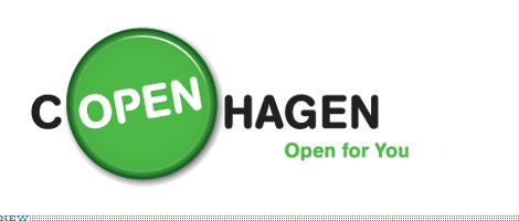
Copenhagen’s clever new campaign has a huge range. Open Copenhagen is designed to transcend and reinforce promotional efforts for tourism, business, events, investments, and more. Previously, each rogue group boosted their similar programs independently without any coordinated brand to tie it all together. OPEN COPENHAGEN arrives at a time when the city’s northern european neighbor cities have launched similarly rhetorical proposals to would-be visitors — I AMSTERDAM deploys a similar wordplay.
I love Copenhagen. The city has been labeled one of the most livable, green, tolerant, trade-friendly, design-friendly, business-friendly and pretty places in the world. One third of the population bikes to work. Those who don’t can be found on the spotless metro where all passengers seem to have rolled out of a cryonic spa on their way to a super-secret club to sip Carlsberg with other blindingly blond models, rockstars, and royal friends of the welfare state. The capital city of nearly 2 million is composed of delicately packed mansions, apartments and commercial buildings which are mostly human-scale and in impeccable condition. Apart from the occasional Lutheran spire or round tower, there is a striking absence of high rise and brutal modern boxes, and the city is hosting a renaissance of great architecture. The only tangible drawback is that it gets really effing cold and dark in the winter.
Jacob Saxild, the Brand Director for OPEN shared his rationale for the brand:
“I think our brand is strong compared to most other destination brands because it is a) value based and b) flexible — thereby useful in many contexts.”
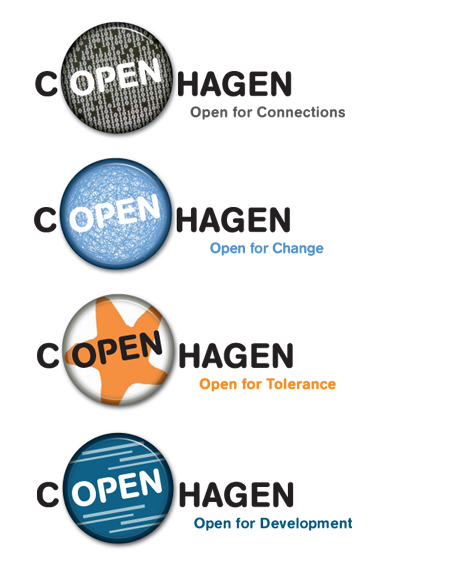
The concept and logo was designed by the Danish advertising firm, PeopleGroup, who won the assignment after 30 (mostly Danish) firms showed interest. Surprisingly, three of the five selected firms pitched variations of the OPEN concept, but PeopleGroup’s design was selected for its ease of use as a campaign.
[Hint: make real buttons, hand them out, take real pictures of real Copenhagenites wearing them! button-makers are really cheap]
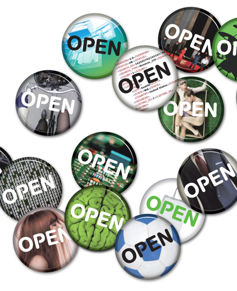
One can imagine that the campaign will evolve over time, but in some of the preliminary brand applications the non-sequitur imagery varies wildly from being cliché to painfully inaccessible (the brain, html, horizontal lines). However, even faux buttons work as a populist icon; they signify a personal, discrete mode of expression, protest, or endorsement. Presumably, the intention was for these buttons take on a life of their own as virtual spokespeople in their own right. Even if buttons and rounded type become unfashionable someday, this campaign will continue to resonate for the city.
BONUS: You may enjoy translating this Danish Brand Book.
The title of this post owes an apology to “Hamlet”, Act 1 scene 4.
Thanks to Thomas Christensen for the tip.


Jump to Most Recent Comment
Nisio’s comment is:
Lovely work. I especially like the badge shorthand, the potential for customisation and the simplicity is a great solution. I do wish they had photographed the badge to get real-world lighting, but considering badges look quite plasticy in real life, it's a minor quibble.
Nice.
On May.21.2009 at 07:26 AM
Erik at Logo Critiques’s comment is:
Looks to be a very flexible brand which is nice when dealing with something big like a city. The possibilities a virtually limitless. I agree with Nisio though on the plasticy rendering of the button. The version with a white background are especially bothersome ("open for tolerance", being one example). The shading feels dark and dirty around the outer edge when no color is present.
On May.21.2009 at 08:40 AM
Chad Kaufman’s comment is:
What a great and simple concept. It would be nice to see more applications and the real-life applications with real buttons. The choice of type is unintimidating and welcoming–it works well in the button to suggest a neon "OPEN" sign without being too straightforward:

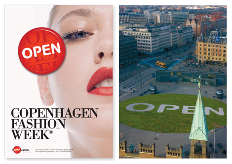
I think the Fashion Week poster is a great example of the flexibility of the identity, in this case used in a more provocative ad, transforming the identity to meet any need.
Get these buttons on the streets!
On May.21.2009 at 08:42 AM
Mark.’s comment is:
Very nice, and it goes to show that most campaigns could be strengthened by allowing some variable or element of customization. The bevel is a touch strong, but with dark colors, it's hard to tell.
Is this specifically an English-language campaign? I know everybody in Scandinavia speaks English better than I do here in Boston - if it's designed to be used for purely for tourism and business reasons, that makes sense. If there are any civic-pride connotations, perhaps there should be a Danish version of the campaign as well.
On May.21.2009 at 08:49 AM
Joe M.’s comment is:
Is this specifically an English-language campaign?
While the brand manual is primarily in English, it seems as though they've designed this program to use English as the common currency.
On May.21.2009 at 08:57 AM
koyo’s comment is:
Lovely buttons.
On May.21.2009 at 09:15 AM
Scott Messner’s comment is:
I also really like this. As the examples show, this branding allows for almost endless possibilities. I agree with Erik's comment on the white buttons. I say well done if that's the biggest flaw of this campaign.
On May.21.2009 at 09:23 AM
Andrew Sabatier’s comment is:
Copenhagen has propelled itself to the forefront of place brand thinking by going open-source.
This is a very contemporary and 'future-proof' idea that looks sustainable in a crowd-sourced and crowd-funded sense. A nested set of identities (the people) make up an interdependent meta-identity (the place) defined in an open invitation to the rest of the world.
It might be argued that the concept is a contrivance; that open has been read into Copenhagen but I'd prefer to think that the concept is as innate as the execution and creative pitch response suggests.
The brandline seems to over-egg the idea. The open button in the brandmark as well as the open-led brandline erodes the single idea. I'd prefer to see 'open' more subtly and indirectly manifested in the other brand identity elements. To this end the open buttons is a genius mass marketing device – a low cost and high value experience is delivered distinctively. Bravo.
As a highly brand-literate citizen of Copenhagen I'd be proud of this very savvy marketing approach. By open-soucing content to define Copenhagen this city deserves to thrive.
A.
Matt’s comment is:
Sadly, it's pitch perfect for its market.
On May.21.2009 at 09:36 AM
john’s comment is:
This is a very contemporary and 'future-proof' idea that looks sustainable in a crowd-sourced and crowd-funded sense.
*whew!*
For a moment there, I thought it was going to be looking to see, and not looking to look. Crowd-sourced and crowd-funded suggests a relatable paradigm that enables the functionality of the meta source strategic initiative. As always, Mr Sabatier saves the day!
On May.21.2009 at 09:39 AM
Nisio’s comment is:
No, it's pleasant to look at, is a clever approach and didn't adopt a lowest common denominator solution.
Feel free to troll elsewhere Matt
On May.21.2009 at 09:46 AM
obse.’s comment is:
I still don't know where Copenhagen is.
On May.21.2009 at 10:18 AM
Joseph’s comment is:
It's brilliant but the way you showcased it on the cover does an improper justice to the mark. The mark is "Open"
On May.21.2009 at 10:22 AM
Joseph’s comment is:
I think the lock up that they used to describe it being literally c"open"hagen probably should have been better left to an ad campaign, and the mark should have been less literal or something because the way they used the symbol is smart.
On May.21.2009 at 10:23 AM
Beth’s comment is:
I actually did not realize Copenhagen was a PLACE until I read this article (was thinking at first it was the brand of tobacco chew, and did not see how this new identity -- green? sexy? tolerant? -- would promote/work for the brand... even the circle/button around "OPEN" reminded me of the tins the Copenhagen tobacco comes in...).
As a tourist/travel logo, it still does not quite work for me. It does nothing to convey a destination in my mind... unless that destination is a convention center (not a city).
I'm left feeling a little shallow and confused.
On May.21.2009 at 11:10 AM
James Re’s comment is:
HAHA I think i like the name of this post better than the logo! hehe
On May.21.2009 at 11:10 AM
henry’s comment is:
Great execution in terms of the wordplay. The concept and ideas gel with the Copenhagen's image and provides ample room for expansion.
Hope to see more execution of the branding in other stuff:)
On May.21.2009 at 11:11 AM
orangetiki’s comment is:
Not bad. Now on a simple green back, it looks as bland as three year old oatmeal. I was flashing back to the last time I went to Staples. The added backgrounds with the tie in catch phrase "Open for" whatever really hits it home. I was pleasantly surprised.
On May.21.2009 at 01:55 PM
Design’s comment is:
Wow that's dumb.
On May.21.2009 at 02:23 PM
NicKLAUS’s comment is:
I've always been a fan of logos that change colour pallets to fit into its environment. The way it alters its appearance based on where its being used makes it very easy going and laid back which I can assume Copenhagen is just that. The message behind this logo comes across as "come here, its as easy as pushing a button"; a who doesn't like pushing buttons from time to time.
On May.21.2009 at 02:32 PM
Cope2’s comment is:
Nice concept. Too bad it's quite shitty executed. :(
On May.21.2009 at 03:47 PM
damon’s comment is:
I like the idea a lot, but I really don't love the helvetica rounded or whatever they're using there.
it's really bland and entry level. I wouldn't say it's bad design, I just think it's a bit plain where it could have been a BIT more refined.
all in all I like it a lot more than most of the city branding projects I've seen in the past year.
On May.21.2009 at 04:44 PM
Tim Gengler’s comment is:
The application within that Fashion Week ad is pretty nice, but the rest seem like a cute idea executed with only average skill.
I think they could have done a lot by "closing" things a little bit and setting up a color scheme.
Right now it just feels generic, as though they came up with the idea, put in a bunch of stock photos to see how it might look, then skipped the final step and just called the project done.
On May.21.2009 at 04:47 PM
Rodrigo Müller’s comment is:
not so sure about the renderings for the buttons, but I love the idea!
On May.21.2009 at 08:21 PM
Glenn Sakamoto’s comment is:
Love the concept. It's nice to see that witty thinking in design is still being considered.
On May.21.2009 at 11:32 PM
MPMG’s comment is:
Great solution, super flexible something rare when I'm sure this has been through so many committees as governments usually do. Most of the time all the fun is usually extracted by the time it gets to market.
Goob Job
On May.22.2009 at 04:08 AM
Felix S.’s comment is:
Need some work in terms of design execution. Looks a little bit too raw or premature... But again, like others have said, it is a good concept to start with.
On May.22.2009 at 04:11 AM
Fasten’s comment is:
COPENHAGEN wordplay works perfect for me, perfectly fitted for what it's used for, but i don't like any of the rest: type, button's design etc...
However, I wish to visit copenhagen soon, interesting city.
On May.22.2009 at 05:26 AM
nils’s comment is:
Is this specifically an English-language campaign? [...] If there are any civic-pride connotations, perhaps there should be a Danish version of the campaign as well.
It certainly looks like it. It only works in the English name of Copenhagen. You don't get this wordplay if you use the Danish name København.
Danish word for open is åben, øben doesn't have any meaning.
Taylor’s comment is:
I'm a fan. It's slightly reminiscent of Atlanta's "Every Day is an Opening Day" campaign that went bust a few weeks ago. However, let's hope this has better luck. Perhaps it will be as successful as Amsterdam's I AMsterdam campaign?
On May.24.2009 at 05:24 PM
Jem’s comment is:
Wow, a web 2.0 button, haven't seen one of those before.
This is so forced and awkward, it makes my eyes water.
On May.25.2009 at 03:57 PM
Matt’s comment is:
Love the concept. Dislike the execution. Not creative as it could be. Mediocre. Great work involved, though.
On May.25.2009 at 04:44 PM
David Z’s comment is:
Atlanta (my hometown) had a similar campaign a couple years ago that flopped miserably.

Donpa’s comment is:
Pretty funny theme condsidering that Denmarks foreign policies is quite the oposite of open... A campaign like this is doomed to fail when the culture and politics of the sender can't connect with the message.
The romantic view given in this article isn't one that resembles with my own considering I've been living in the neighbor town Malmö for almost 20 years.
On May.27.2009 at 07:13 AM
Brian’s comment is:
First thought was "i amsterdam."
Second thought was crappy knock-off.
To be fair, the concept of "open" is fantastic—but do we really need a freakin green button to convey that. In the case of "i amsterdam," it's the simplicity that's brilliant and inviting. These guys could have easily ripped off that concept and called it a day. It's extra-disappointing since there are so many fantastic designers living over there.
On Jun.20.2009 at 04:33 PM
Alexander Klar’s comment is:
Nice concept – the button could be a bit more abstracted in my opinion. The general idea reminds me of that of the London Development Agency:

Comments in Brand New, V1.0 have been closed.


