

NOTE: This is an archived version of the first incarnation of Brand New. All posts have been closed to comments. Please visit underconsideration.com/brandnew for the latest version. If you would like to see this specific post, simply delete _v1 from the URL.
![]()
It’s hard to believe that fourteen years have already passed since Chicago-based Pitchfork launched — launching along with it, hundreds of careers of independent musicians in this span. Like other successful and fledgling online ventures that started as whims of young folks who saw a hole in the internet market years ago, Pitchfork has matured and grown up to be serious business and its new logo, introduced this week, reflects this evolution. While both old and new logos are perfectly respectable and ad hoc, the new one is definitely more “corporate”, now with the arrowed pitchfork as its own icon that, with its audience, is as recognizable as the nike swoosh. The typography is also more normal, going from a heavy slab serif to a more conventional Clarendonesque typeface. Nonetheless, the logo retains the equity of the original and, like any other product, it’s the content that matters, and Pitchfork continues to deliver in that regard. That blue graffiti top-left corner of the old web site will surely be missed though.
Thanks to Steve Spillman for first tip.


Jump to Most Recent Comment
Chuck Spidell’s comment is:
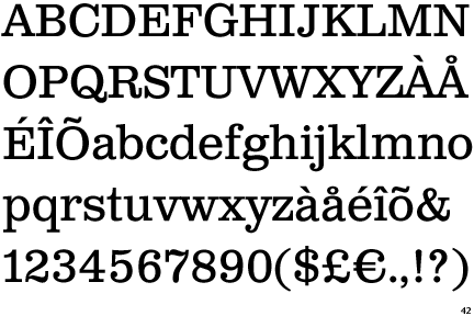
Huzzah for slab serifs! If anyone can guess the font, I'll buy them a ticket to a MBV show ... maybe.
On Mar.12.2009 at 07:42 AM
Doug B’s comment is:
"Welcome to Ruby Tuesdays...would you like to start off with a beverage, or go directly to the salad bar?"
I really prefer the old mark (and the old site as well.) The new site does offer a lot of space for banner advertising, however.
If it ain't broke...
On Mar.12.2009 at 07:59 AM
Jeff’s comment is:
I don't miss that graffiti or really anything about the old Pitchfork. The new site is soooooo much more usable. Things are organized ... finally. And hurray for cleaning up and going "serious." Seeing that indie is mainstream, this change makes sense.
But those Apple ads they had for the launch were really really annoying. (Also seen on Good.is) Anyone else catch those?
On Mar.12.2009 at 08:02 AM
Erik’s comment is:
The new mark is definitely more corporate feeling. It does a nice job of retaining the recognizable elements of the old mark tough. Honestly, I like them both. I also thought Ruby Tuesday :)
On Mar.12.2009 at 08:14 AM
Philip’s comment is:
Drats! I got here thinking 'Sweet! I am a hipster and a Brand New tipster'. Damn you Steven Spillman.
I do think this is movement in the right direction. Pitchfork has had some pretty crummy identity/branding in the past. It's nice to see them grow in popularity and take on this sharp new image. I'm still getting used to the functionality of the website, which can be annoying, but it certainly looks a lot better and less cluttered.
On Mar.12.2009 at 08:16 AM
Joe’s comment is:
@ Chuck.
Looks like Clarendon to me.
On Mar.12.2009 at 08:19 AM
Jeff’s comment is:
Wait the Apple ads are still there. What the hell?
On Mar.12.2009 at 08:24 AM
John McCollum’s comment is:
The site is cleaner, I guess, but the whole identity seems dressed up, but dumbed down.
At least the old identity had a hint of the aggressiveness you'd expect with a name that, I'm assuming, is meant to evoke more Hades than Helena (although I've been to Montana, and the two share more than a few similarities).
The logo/wordmark itself is really weak. Just lazy. It's as if someone said, "We don't want to change anything but the typeface" without understanding the implications for the brand.
I certainly think that Pitchfork needed a new identity, but they missed out on some real opportunities for funk, for spunk, for punk. I now know nothing about the brand, its story or its aspirations.
On Mar.12.2009 at 08:31 AM
Erik’s comment is:
@jeff those apple ads are pretty cool. I didn't find them annoying.
On Mar.12.2009 at 08:31 AM
Armin’s comment is:
> Damn you Steven Spillman.
Philip, if it's any consolation, you were a close second, by 27 minutes to be exact.
> Looks like Clarendon to me.
It's close, but it isn't. The top serif of the "i" is slightly sloped, where Clarendon's isn't. Someone could run it by What The Font.
On Mar.12.2009 at 09:01 AM
Steve Spillman’s comment is:
@Philip
Sorry. I really just happened upon it late night while they were switching it over. We can still be friends.
I don't miss the graffiti either - the new site looks a tad too "professional" to be representing what it is, but it's far more usable. And I think the new logo is gorgeous.
On Mar.12.2009 at 09:06 AM
Blake’s comment is:
I don't have any problems with the new identity. My only question is... is it really needed? Shouldn't an identity take on its own qualities based on how a company evolves? Or should it really evolve with a company? I consider the Rolling Stone magazine title artwork its identity, yet has it changed dramatically in 20+ years? It just seems holding onto Pitchfork's identity would make as much sense.
On Mar.12.2009 at 09:10 AM
Dale Campbell’s comment is:
I think the new logo is perfect for the new look and feel that they have established.
The new website IS pretty smooth, in my opinion but I do have to agree that it may be a little TOO corporate for what it actually represents - especially with a huge header allocated specifically for advertising. Pitchfork to me, anyways was always my safe haven away from the Jonas Brothers-4 stars-granting Rolling Stone.
On Mar.12.2009 at 09:18 AM
mattling’s comment is:
What the font says it's bodoni egyptian bold and I'm pretty sure it's not Clarendon, or at least the regular form of Clarendon doesn't have that little round bud on the lower case R.
On Mar.12.2009 at 09:26 AM
Matthew Lettini’s comment is:
meh, I kinda enjoy the old logo a tiny bit more. It has more feeling and unique-ness to it. The new is just plain font with logo next to it...overdone and corporate (as others say). I would have kept the layout of the last logo, but used a new slab font, darkened the gray, and had a few pixels smaller 3d.
And as for the website, its usability has greatly increased, but its personality has diminished. Feels corporate and stale...maybe they just need to have the spray-paint/watercolor background again and have some feelings.
On Mar.12.2009 at 09:34 AM
Chris’s comment is:
Bookman is a pretty font.
On Mar.12.2009 at 09:34 AM
Chris’s comment is:
Bookman is a pretty font.
On Mar.12.2009 at 09:35 AM
Joe’s comment is:
I think it is called Clarendon Text
http://www.identifont.com/samples/canada-type/ClarendonText.gif
On Mar.12.2009 at 09:43 AM
House of Thuan’s comment is:
The new mark is not an improvement—just a different execution of the same *idea*. Personally, I felt there was enough equity in the original mark that I actually miss it.
Upon looking at the new, cleaner, leaner Web site, I can see where the new mark might be a better fit, but ultimately it's just unnecessary.
I'll compare this effort to a brand like MTV who has been able to keep their original mark (for over 20 years), but has been able to adjust it's application of the mark to various media and still keep it appropriate, relevant and fresh.
Pitchfork should have saved its money and kept the original mark but adjusted how they use it for the new Web site.
Mark redesign grade: C
Site redesign grade: A
Doug Bartow’s comment is:
What the font says it's bodoni egyptian bold
What the font is a useful tool (sometimes). Not in this case, however.
It's certainly not bodoni egyptian bold (nor Bookman)
It appears to be a slight variation on Clarendon. Yes, there are some minor tweaks in the terminals, and the serifs are less bracketed, etc...
But it is drawn in the style of Clarendon, nonetheless.
Armin >> Pitchfork has matured and grown up to be serious business and its new logo, introduced this week, reflects this evolution
I don't think 'maturing' and 'growing up' are necessarily the same thing here. This site is about alternative music. A serious business, yes, but I feel the new mark has lost some of the edginess that alternative music needs to project...the new identity seems like "your father's Pitchfork."
When I read (NSFW) album reviews like this, I feel the new mark at the top of the page looks particularly too conservative/out of place.
my .02
On Mar.12.2009 at 10:00 AM
David Sanchez’s comment is:
Excellent evolution even better with the separation of the wordmark and graphic device.
Same idea? Ask your self, why would you throughout brand equity?
KUDOS.
On Mar.12.2009 at 10:01 AM
Rodrok’s comment is:
I guess they are shooting for an approach of "it's about the content". The logo approach for me its going back... I guess they got tired of the perspective shade... Now looks more like its directed to an older audience... before looks they are shooting for a young audience...
On Mar.12.2009 at 10:10 AM
Jacob’s comment is:
I looked at their layout, and noticed that there seems to be an emerging trend among indie media towards a dull, Times-style layout.
Don't like it.
On Mar.12.2009 at 10:14 AM
Pat Broderick’s comment is:
I think it's an improvement. The heavy Illustrator outline on the old logo always looked unfinished to me -- I want to sand down the point on the t and flatten out the baseline so the drop shadow under the t, c and o don't stick out down below. The new one keeps the basic elements of the old mark (three arrows in a circle, slab serif) so it still looks like Pitchfork, just simpler.
On Mar.12.2009 at 10:16 AM
al’s comment is:
bleh... it's a boring logo. it's too stiff and unfriendly looking.
On Mar.12.2009 at 10:19 AM
Ben Peck’s comment is:
Its sharper and the brand can be extended more easily now. Very beneficial.
On Mar.12.2009 at 10:22 AM
Dave’s comment is:
I have to be honest, when I first looked at both logos, I liked the old one better. But when I saw the new site, and saw the logo in context to how it would mostly be seen, I like the new one better.
While the old site had more pizzaz, I think the new one looks much better...not only from a usability standpoint, but it looks extremely professional.
On Mar.12.2009 at 10:34 AM
Matt’s comment is:
@ Chuck Spidell
Maybe the font is Excelsior Roman kerned tight with a stroke? And what is MBV? (I have a feeling i'm about to feel like a retard, nothing new...)
I think the update looks clean and smart, but I respond to the old logo more because of the boldness and contrast it contains. Cuz of the boldness and contrast, i think the look fits better with the company name. It is much stronger of a mark, but maybe they wanted to seem more approachable, maybe not the right word for this company, but the new feels more corporate and with a little less personality...
On Mar.12.2009 at 10:43 AM
Adam’s comment is:
This is a great update imho. In the old logo, the pitchfork arrows look awkward above the logotype. The new placement feels much more appropriate. I think the new type is more reflective of their growth into a more serious business. Well done Pitchfork.
I can't wait until the festival!
On Mar.12.2009 at 10:48 AM
Josh’s comment is:
I think the update does a nice job of preventing the logo from getting stuck in a style period. Everyone and their brother have been using dimensional blocky type for a couple of years now, so it's probably best to change it up a bit to keep it from getting stuck in the trend and left in the past.
I really dig the favicon, and the website is much cleaner. Honestly though, the space in the header and the huge white-space with the Apple ad make it feel a bit... generic? It doesn't really stand out from, say, a blog. It's a lot like Technorati, but subbing the green for red. I'd trade functionality for visual any day though...
On Mar.12.2009 at 10:50 AM
Mike’s comment is:

I think the type choice is appropriate and works well, but their symbol (the prongs of a pitchfork inside of a circle) always reminded me of the "antifascist circle".

Originally designed by Sergei Stepanowitsch for The Iron Front, and intended to be used as a "cover" for Nazi swastikas. I'm not sure whether this was coincidental or an intentional play on the symbol, but it's really interesting that they chose to present it inverse to the original.

Additionally, this mark is used by the band Strike Anywhere, again presenting the arrows in a different direction.
On Mar.12.2009 at 11:06 AM
Rudy’s comment is:
There are more marks, including a Pitchfork.tv alt and nice alternate 3 fork icon that looks more like an actual pitchfork at their agency's site: http://www.tangibleworldwide.com/#/work/gallery
On Mar.12.2009 at 11:15 AM
Colby’s comment is:
It looks so much more modern now than it did with the dated super-shadow on the previous logo. With that hint of red in it, its kept clean.
Job well done!
On Mar.12.2009 at 11:23 AM
b.r.o.o.d.y.’s comment is:
The new site is a lot cleaner, it meshes really well with the big Apple ad now (not sure that's such a great thing... The whole brand seems to have been retooled around that ad :P).
It's a step forward in spite of the fact that I think they really watered down the brand. It looks more "pro" and corporate but it also looks like any other site now really.
The old logo's font will be sorely missed! I'm a fan of bold slab serifs. The logo may have looked trendy and dated (much like the old site), but that could have been fixed without sacrificing the kickass font.
All in all, the update may be boring but it's flat-out better. It will grow on people as they get used to it and probably remain vigent over a long time. Seeing this radical change and the response it will generate is certainly going to be very interesting.
On Mar.12.2009 at 11:27 AM
emily’s comment is:
i, too, saw ruby tuesday in the new font.
new pitchfork site reminds me a lot of last.fm.
as far as the nuisance apple banner ad.. "the funnest iPod ever" really irks me.
On Mar.12.2009 at 11:58 AM
Fakar’s comment is:
If I do not like it am I allowed to speak?
On Mar.12.2009 at 11:58 AM
Anonymous’s comment is:
Frankly I prefer the older version over the new version... and I am not in love with that, I think that the older typeface was a better selection if you require a slab serif... All they needed to do was drop the shadow effect. I also like the bolder stroke around the icon on the old version and feel like they could have done more with that... just my two cents...
On Mar.12.2009 at 12:02 PM
bjorn’s comment is:
Anyone visited the new site and got an iPod ad messing with the menu bar above? Brilliant!
On Mar.12.2009 at 12:18 PM
Philip Dhingra’s comment is:
Most likely timed to coincide with SXSW.
On Mar.12.2009 at 12:56 PM
TheMaster’s comment is:
I agree with the majority on this one. Throw it into the "whatever" pile along with Tropicana. I don't understand why these ventures are even taken on. It's not a change, just a tweek...and it doesn't even help, it's all moot.
I'm not upset, i'm just disappointed...
On Mar.12.2009 at 12:57 PM
Darrin Crescenzi’s comment is:
To me, Pitchfork is all about personality — personality of the musicians, personality of the reviewers, personality in the news and event coverage.
This rebrand is sterile, corporate, bland. Well-executed, sure, and highly functional. But terribly inappropriate for what the website stands for. I don't like it one bit.
Indie rock has an aesthetic, and this most certainly isn't it. If I'm at the Doug Fir and see a concert poster cleanly typeset in Helvetica, perhaps I'll eat my words.
On Mar.12.2009 at 01:14 PM
Chuck Spidell’s comment is:
@Adam. My Bloody Valentine (MBV), a very noisy-ear-piercing band that you'll love. I'd like one of those iPod thingies.
On Mar.12.2009 at 01:30 PM
Mark’s comment is:
nice update.
The typeface is an improvement more professional than the previous one.
On Mar.12.2009 at 02:09 PM
alexandra’s comment is:
My first thought was "I miss the old logo!" but after clicking around the (new/better) site, I think it is actually a better fit.
There are so many ads inevitably creating a lot of visual clutter (except for the ipod ad on the landing page) that I'm happy to have the marque (and content) give my eye some space to rest.
Plus, this gives them the opportunity to roll out the "retro" merch with the old logo...
On Mar.12.2009 at 02:36 PM
Morgan Smail’s comment is:
very nice. Perfect example of updating a decent logo to an even sturdier one (w/ quite a handsome typeface I might add) without loosing any of the previous equity... great job
the new website looks great and even stronger/cleaner as well. makes the site content seem more reliable. ironically enough, I love the new iPod touch banner. very clever.
i've seen that type of site interruption with banner advertisements before that worked quite well... mostly on the MySpace home page
On Mar.12.2009 at 02:41 PM
everton’s comment is:
7.3
On Mar.12.2009 at 03:15 PM
Amanda B’s comment is:
I like the new logo a lot, by retaining the three arrow logomark it remains recognizable, but it is a lot less heavy.
The site is going in the right direction by cleaning up and increasing it's functionability, but like a lot of people here are saying it seems too corporate for the type of content they include. I talked to a friend of mine who isn't a designer but reads pitchfork a lot and he described it as "sterile."
On Mar.12.2009 at 03:17 PM
Phil Machalski’s comment is:
I've spent more time reading the comments on this site than Chris Eichenseer & I spent making the original logo. It's a nice update, and suits the new aesthetic.
On Mar.12.2009 at 04:16 PM
Adam’s comment is:
The new design of the site almost makes me think they are merging with Last.fm. The combination of a more generic logo and the similar feeling to a website in the same online music category, overall it feels very bland.
I agree with the notion that trying to make something super clean and designer feeling may miss the mark. http://boomkat.com recently did a similar more webgeneric feeling redesign however even the small touch of a varied color palette helped it feel a little less bland.
But then even the music pitchfork covers feels more mainstream and generic these days so maybe the site is keeping up with it's audience.
On Mar.12.2009 at 05:06 PM
Greg’s comment is:
Man I already miss the old website:(
On Mar.12.2009 at 05:25 PM
Evelyn’s comment is:
They removed all their brand equity and distilled it to a very boring, VERY expected blog-esque, devoid of personality site... which would be fine if they were going for the news portal aesthetic.
I'm all for minimal design when done well, but this doesn't cut it. The IA is really crummy and the decision to "update" the logo seems like an obvious change because the designer has no experience with branding... it's too bad.
You know something's wrong when the banner at the top of the page is the highlight of the site experience.
On Mar.12.2009 at 05:31 PM
Zach’s comment is:
I think they spent a month on the site design and the other eight months on integrating that ipod ad.
Also, Welcome to Wordpressfork!
On Mar.12.2009 at 07:52 PM
ISMISM’s comment is:
The site seems to be working a lot better now.
The first week it very rarely took me to the place i wanted to go, after lots of wasted time waiting it would come up with a server error. So it was hard to say wether it was an improvement.
But now, as a daily user of the site, i think it is heaps better, i dont find i have so many crazy blinking banners all screaming for my attention. I can find what i want and at the pace i want. The site seem to invite exploration alot more.
The addition of the lulu player etc. is great.
A nice refresh.
altoption’s comment is:
No personality whatsoever. Makes no sense for who they are and what their name is.
On Mar.12.2009 at 09:06 PM
jesse Woodward’s comment is:
At first glance I think it's ok. I've yet to dig deeper.
I'm not keen on the giant ad dead centre of my screen though. Working on an older generation Mac here, and the ad bogged down my machine pretty hard. Not so happy about that.
On Mar.12.2009 at 10:18 PM
Paul Cooley’s comment is:
Cheers to everton for sneaking in that "one-two punch" 7.3 review.
I like the logo and general feel of the site, but considering I am a daily visitor, it will take some time to get used too. I have to say I feel like there is to much information on the main page. I think the last site was strengthened by their simple homepage, but also, some things were hard to "find" on the old one.
I'm sure it will grow on me and overall it is a solid update in my opinion.
7.3 indeed.
On Mar.12.2009 at 10:30 PM
Nik Daum’s comment is:
I like their decision to lose the extrusion and lighten up the weight of everything.
On Mar.12.2009 at 11:29 PM
Indiedude’s comment is:
Goodbye Pitchfork, you are now mainstream and boring as f**k. Good luck with that new site of yours. Like Punky Brewster, I don't even know you anymore.
On Mar.13.2009 at 06:25 AM
TheMaster’s comment is:
what's going on with this blog? first the censorship threat, and now less entries. Hmmm....
On Mar.13.2009 at 10:39 AM
Chris’s comment is:
somebody probably said this already but i dont want to read 59 posts. the font is ARCHER.
On Mar.13.2009 at 11:22 AM
Armin’s comment is:
Chris, it ain't (at all), sorry.
On Mar.13.2009 at 11:35 AM
Josh’s comment is:
The font is Clarendon Text Pro modified.
On Mar.13.2009 at 01:46 PM
Paul Cooley’s comment is:
Man, Armin got his "dad voice" on for that correction.
Oh and pitchfork never claimed to be or not be mainstream, I think they pretty sat right in the middle...and their new logo doesn't exactly scream "mainstream" like so many seem to think.
On Mar.13.2009 at 02:14 PM
Matt L.’s comment is:
Not a huge fan of the new site, although its nice that they finally have a functioning search function.
I miss Stylus. The quality of their writing was heads and shoulders above P4k
On Mar.13.2009 at 04:31 PM
jason’s comment is:
In a word: Yuck.
While I agree with Armin that it's nice to have the pitchfork logo pulled away from the text, I'm NOT happy with the overall site design change.
Pitchfork used to look kicky and hip, but the new look feels like they just used TEMPLATE #013 in some Dreamweaver-like website generator.
Offensively inoffensive.
On Mar.13.2009 at 04:36 PM
John McCollum’s comment is:
Not even close to Archer. But that might have been a better choice.
On Mar.14.2009 at 08:44 PM
moeed’s comment is:
big improvement.
On Mar.15.2009 at 03:58 PM
Mongoose’s comment is:
Mmm, I'm quite torn. Agreed that both are pretty darn good logos; The former to me speaks 'magazine' and the latter speaks 'store'.
That thickness of the slab serif and outline and outline with a freakin' drop shadow! is something really nice. The new one does seem tamer, but I do like letting the logo stand on its own as well. They've still got a bit of solidity going on with those serifs, but it's much more open, airy.. and yeah, corporate.
So it gets a C. Some people might think this is a low grade, but regulars on Brand New know I give my letter grades based on the rebrand's relative improvement. I'm not grading the logo itself but the old versus new, and both are quite good in my opinion.
--Mongoose
On Mar.15.2009 at 10:18 PM
Josh’s comment is:
I'm never on time for the punchy comments. But yes, kind of Ruby Tuesdays. It does seem a bit refined for their artistic leanings. Without doing any work to support my point, they may have need a little more awesome futuristic punch like a Klavika (but who know how that would work.) for example.
I have been saying to myself and would have to others that the old site was completely unusable at times. So I'm glad they got to rectifying that, but I do think they lost a bit of character on the way in the redesign. It would seem easy enough to add some splashes using headers or bg elements, but in some sense I don't think that there is any typical or binding aesthetic to indie rock or its online temple.
Though artists really set the tone for their record covers, the gamut of music Pitchfork covers is vast-ish. Perhaps its too easy of an argument, but maybe they got out of the way of the great covers and photos to give them more presence. Could be a cop out but above all is readable and searchable. I'm sure negotiating the old database and integrating with the new site was what took 8 months of the time.
On Mar.16.2009 at 03:59 PM
c$’s comment is:
The redesigned mark doesn't strike me as odd as much as the new site does.
For years, I have used the Pitchfork site for album reviews and news. The new album reviews structure is a huge disappointment for me. It now forces me to interact with the interface just to see what the daily albums being review are.
Overall, the site feels "unfinished." Like a wireframe come-to-life.
On Mar.27.2009 at 10:16 AM
Rafal S.’s comment is:
After a couple of weeks with a new site, I must say it is a huge improvement. I do not now anything about the ads that appear there, as I am using AdBlock Plus with Firefox right now... So I do not have to worry about advertising cluttering my screen.
The new site allows me to navigate its content more fluently and easily... I also like integrating Pitchfork TV into the main site, with common layout and everything.
The new site is, quite simply, much better.
I can understand why some could find it a bit too corporate, bland, mainstream or such things.
But, honestly, is it really important? I know this site is about branding, I know that without all this corporate image thing we would not have much work as designers... But the site is better. It serves its purpose better. I don't care about the colder, more restrained image, as long as it helps me find the music I can enjoy.
And I like the new logo as much as I liked the old one.
And yes, I miss the blue graffiti thing in the corner. A bit.
On Apr.04.2009 at 04:26 PM
Mark S.’s comment is:
Not impressed. By thinning the font and keeping it serify just waters it down too much. More mature? Maybe. But like a teenager with a moustache. It's an over inflated attempt at maturity that comes off as posturing rather than real growth.
I could like the simplicity and direction, but think the fonts a flop.
On Apr.29.2009 at 05:33 PM
Comments in Brand New, V1.0 have been closed.


