NOTE: This is an archived version of the first incarnation of Brand New. All posts have been closed to comments. Please visit underconsideration.com/brandnew for the latest version. If you would like to see this specific post, simply delete _v1 from the URL.

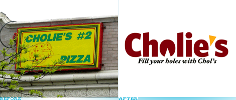
It is quite likely that you’ve never heard of Cholie’s. I hadn’t. It’s not a national pizza franchise. Nor regional. It’s not a famous local joint that people travel to. It’s not even its hometown’s most famous pie. Cholie’s is a small chain in Chicago, with three locations, aptly named Cholie’s, Cholie’s #2 and Cholie’s #3. Its logo is not even a logo per se, it’s whatever the sign painter can muster using the name, and a pizza with a slice coming off. So why in the world would we be reviewing it?

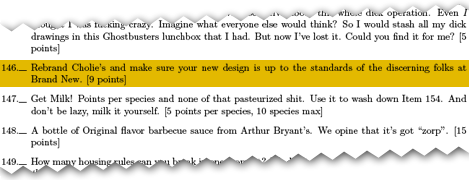
Item 146 in the 2008 University of Chicago Scavenger Hunt list.
Since 1987, the University of Chicago, nestled in the beautiful South side neighborhood of Hyde Park in Chicago, has hosted what has become the world’s biggest scavenger hunt, The University of Chicago Scavenger Hunt (or Scav Hunt), a nearly four-day marathon of scavenger shenanigans, requiring the completion of hundreds of items — and one of this year’s items, worth 9 points, is to “Rebrand Cholie’s and make sure your new design is up to the standards of the discerning folks at Brand New.” Of nine competing teams, we’ve heard from the Armydillos — the Snell-Hitchcock house team, a six-time winner, whose mascot is an armadillo, hence the name — who submitted their redesign of Cholie’s #2, located near the university, for review and final judging by the Scav Hunt committee, today at noon central standard time.
The logo was designed, in less than four days, by Luke Joyner, a University of Chicago alum now residing in Paris and a former Summer resident at Hoefler & Frere-Jones — which explains the sophisticated type choices in the logo, Whitney Black Condensed for the name, and Hoefler Text Bold Italic for the tagline. “For the re-design itself,” explain the Armydillos, “we wanted to combine the existing Cholie’s concept with something Scav Hunt-friendly, which usually turns out to be some type of witty joke. This year’s Scav Hunt judges tend to appreciate things that are slightly more crass, so we decided to accommodate their interests (and our own) with this wonderful logo.” And crass it is, specially considering that no one knows what college students are wont to do with a slice of pizza, as exemplified by the new tagline, “Fill your holes with Chol’s.” The optimist in me wants to think they are referring to the mouth cavity, but with the disclaimer that the judges are crass, I wouldn’t want to be initiated by anyone at the University of Chicago.
The logo itself also indicates that something’s awry, with the slice of pizza taken off from the bottom, as opposed to an upper side, like the existing logo. Unlike other logo reviews, exceptions have to be made, and new standards applied, so I will say that the tag line complements the new logo rather poignantly. There is also the nice gesture of using the slice of pizza as the apostrophe, although I’m not sure why the slice turned from red to yellow. The typography is an interesting choice, maybe even unintended. The noncircular “o” used to make the pizza is, of course, not round, perhaps signaling that Cholie’s is not about perfection, but about finding joy in the unexpected and singular results of each pizza baked by the establishment. And the top angled edges of the typography are a clear homage to one of Chicago’s most iconic skyscrapers, the Smurfit-Stone building on North Michigan Avenue.
Considering the timeline of this logo, the audience, the context and the result, I would deem it up to the standards of this discerning logo critic.

Jump to Most Recent Comment
bkpr’s comment is:
I think the choice to have the slice removed from below instead of above would possibly prevent the'o' looking like a 'u' or 'v'. Also, the slice turned yellow could be to either give the logo a splash of colour, or to represent the colour of cheese (red represents tomato sauce/base), or even both of these reasons.
On May.11.2008 at 11:09 AM
Marc’s comment is:
Not bad at all. There are tons of one-off pizza places (and restaurants in general) with horrible mashed-together-anything-goes-designed-in-word-clip-art logos around here. probably everywhere.
Even tiny family run businesses can benefit from something a little more professional.
Anyway good job. I hope they get the points :)
On May.11.2008 at 12:02 PM
Jeff’s comment is:
At first glance, it reminded me of bertucci's; very similar "brick-oven" maroon color, and even a similar triangular apostrophe.
On May.11.2008 at 12:09 PM
Just Sayin'’s comment is:
The Smurfit-Stone Building is at 150 NORTH Michigan Ave, not SOUTH.
On May.11.2008 at 01:42 PM
Aaron’s comment is:
I've been reading this blog off and on for a month or so now, and I have to admit I am a little surprised to see Scav, Cholie's and Luke Joyner all appear in the same post. Small world.
Gotta say the 'clear homage' to the Smurfit-Stone building is a little bit of a stretch.
On May.11.2008 at 01:46 PM
Luke Joyner’s comment is:
Wow... wasn't expecting this to actually show up here, and now I'm a little embarrassed, given that I had so little time to churn this out. But thanks so much for the post!
I have to admit I wasn't even thinking of the Smurfit-Stone (aka "Vagina") building when I designed this but it fits the crass tagline well. And yes, the crassness is to cater to the judges' discerning, umm... tastes.
As for the other comments, the orangey yellow apostrophe is indeed for color... the logo didn't stand out enough with it in the same dark maroon as the text. And the color is meant to be cheesy... perhaps suggesting that the apostrophe can fill the hole in the 'o'. The noncircular 'o' was also intentional, for reasons along the lines suggested.
Anyhow, this is now way too long a post... so no more. But thanks again!
On May.11.2008 at 02:02 PM
Jonathan Hoefler’s comment is:
Go Luke!
On May.11.2008 at 02:38 PM
dg3’s comment is:
I like it.
On May.11.2008 at 08:51 PM
Armin’s comment is:
> The Smurfit-Stone Building is at 150 NORTH Michigan Ave, not SOUTH.
Snap. As an ex Chicago resident for more than three years, that was a big booboo. Fixed.
> Gotta say the 'clear homage' to the Smurfit-Stone building is a little bit of a stretch.
Yeah, it's a stretch. I was going for sarcasm.
On May.11.2008 at 08:52 PM
Evan Rowe’s comment is:
I find this charming in that it marries a degree of typographic sensibility with typical college student whimsy. It's a notch (or three) above the majority of local pizza chains, for sure, but it remains accessible thanks to its playfulness. Sure, the pizza for the "o" and the slice for the apostrophe are a tad obvious, but nobody said it had to be sophisticated.
On another note...do any of the other gaming-inclined designers out there feel that this new logo would be right at home as a fictional restaurant chain in the Grand Theft Auto series?
On May.11.2008 at 09:41 PM
Aaron’s comment is:
> Yeah, it's a stretch. I was going for sarcasm.
Hey, with corporate logo 'explanations' they way they are these days, you can never be too sure ;)
On May.11.2008 at 10:29 PM
chicago’s comment is:
Never heard of Cholie's but i'll give it a try.
On May.12.2008 at 12:12 AM
Armin’s comment is:
This just in: The Armydillos pummeled the competition and took first place in this year's Scav Hunt. Plus, the Chicago Tribune reports.
On May.12.2008 at 12:35 PM
Mr Posen’s comment is:
"Fill your Holes", plural. ????
So this is how you roll in Chicago!
On May.12.2008 at 01:04 PM
Nabz’s comment is:
I just want to thank Armin publicly for making this happen. Also, all of these comments are brilliant. Luke's design was excellent, the judge loved it, and he had no idea anyone would actually involve Brand New in judging the design change. Now Cholie's actually has someone wanting to go try them out...Should I take the design over to their place and see if they want a change? Luke...royalties??
On May.12.2008 at 08:33 PM
Paul’s comment is:
Haha. Nice one.
The system works!
On May.13.2008 at 05:17 AM
Stuart’s comment is:
"Fill your holes with Chol's"?!?!?!?! Is that REALLY the image you want to project to the public? I understand where they were going with this but it's soooooo easy to misinterpret.
On May.13.2008 at 10:41 AM
adam’s comment is:
i think that is the point, stuart.
On May.13.2008 at 06:07 PM
Michael’s comment is:
Remindful of a Chinesse restaurant that you would find in low-rent strip mall.
Pedestrian at best.
On May.14.2008 at 11:44 PM
mongoose’s comment is:
Not bad at all. If you simply changed it to "Fill your hole" singular, you'd have the proper level of near-to-campus irreverance.
It's simple, but for a small-chain pizza place, it works. The red/yellow color scheme does work nicely for Pizza, and heck, if they want to keep the #2 #3 going, that'd work well in the yellow tagged on to the right.
To the Armydillos: I politely suggest that you go to Cholie's and offer them the new logo, for low or nil cost. Maybe minus the tagline. ;) Let them know about the scavenger hunt aspect of it.. at least it'll be fun for them to hear, and if they do like the logo.. instant resume builder.
On May.18.2008 at 04:05 AM
Comments in Brand New, V1.0 have been closed.


