NOTE: This is an archived version of the first incarnation of Brand New. All posts have been closed to comments. Please visit underconsideration.com/brandnew for the latest version. If you would like to see this specific post, simply delete _v1 from the URL.
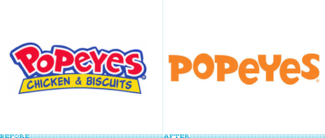
I don’t know whether this is a positive or negative, but I have never eaten at Popeyes, the fast food chain serving fried chicken that seems to occupy a similar cult status to White Castle. Popeyes was served at Beyoncé and Jay Z’s wedding, it is the butt of the joke in films like Rush Hour and Little Nicky (okay, that may not be saying much but…), it finds its way to all sorts of lyrics, and people are always willing to admit it as a guilty pleasure. From what I gather, the spicy, Cajun-style, fried chicken there is delectable. I’ll find out one day, maybe. As kooky as the following to this fast food emporium is, its former logo was equally amusing (in that kitschy, fast food sort of way) and the colorful red-blue-and-yellow sign on the facade always stood out. With a new identity designed by Pentagram’s DJ Stout, Popeyes is positioning itself to be slightly more upscale (relatively speaking) while retaining its quirkiness.
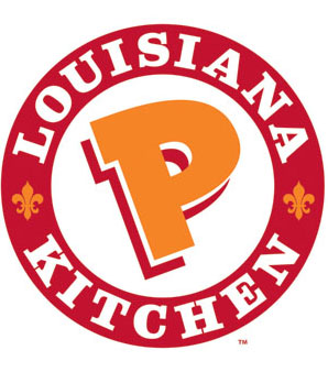
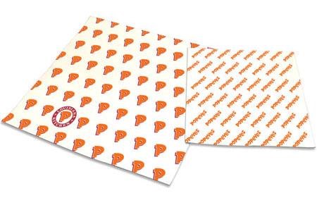
Unlike the old identity, the new one features three elements — the Popeyes wordmark, the crest above, and an isolated “Dancing P” from the crest — that work together to create a more dynamic range of pieces (see below) instead of just emblazoning the logo on everything from cups to napkins. So, in all fairness, it’s hard to compare the two logos in the opening image, as the old one is clearly more “fun” against the new wordmark that looks static by comparison, but comes alive in applications. It’s a nice move to maintain the basic shapes of the letters from the old logo, except for the “Y,” and redraw them to appear straight as, aside from the spicy chicken, it’s the only element to tie in the old Popeyes with the new.
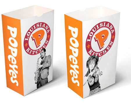
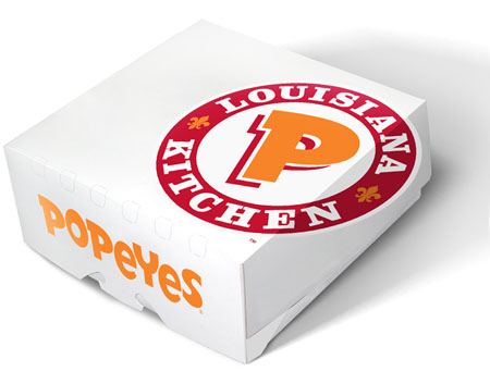
The boldest move in this identity is changing the colors, and I’m not positive it was necessary; boldening the Easter yellow was necessary though. The move to orange and red is pretty but sacrificing the blue is a little radical and could have probably been used as an accent color. Another new element is the use of black and white photographs of jazz musicians — which relate to Popeyes’ Louisiana roots — which I wonder how long it will last, it looks more like a temporary promotion than an element upon which to build a new identity. The images look completely out of place: Fast food fried chicken and good music is not an association I am willing to make any time soon. Despite these two apprehensions, I do like the new feel and it’s definitely a step in the right direction for this chain. The true test will be if Popeyes is served when Beyoncé and Jay Z renew their vows.

Jump to Most Recent Comment
Hughes’s comment is:
vows.
On Jul.28.2008 at 06:59 AM
Mondayne’s comment is:
I'm a big Popeye's fan, visiting every time I'm in the States (rarely) and am loving the chicken. And I actually liked the old identity. This new one seems good too I guess.
I do like the B+W photo's with the stamp effect, but it all could've been a bit 'louder'! It's kinda subtle or empty (in it's own way). If you're a big, loud deep-fried chicken place don't be ashamed!
On Jul.28.2008 at 07:33 AM
Mondayne’s comment is:
Hang on, why drop "Chicken & Biscuits"?
I love places telling me what they serve! Kentucky Fried Chicken (good name)/ KFC (what?), International House of Pancakes (nice one!)/ IHOP (who?), etc.
Bring on McDonalds: Burgers & Fries (& Salads for those who want to think they're eating healthy)
On Jul.28.2008 at 07:37 AM
Daniel Campos’s comment is:
I love fried chicken!!!!hahaha
On Jul.28.2008 at 08:03 AM
Remy Overkempe’s comment is:
Nice, better, but it still looks too childish to me. Loving the Easter yellow, though it makes me think about eggs instead of chicken, so don't know about that. I do like the stamp—at least that looks professional enough.
On Jul.28.2008 at 08:04 AM
Daniel Campos’s comment is:
By the way, the new logo was cool!
On Jul.28.2008 at 08:05 AM
Jeff’s comment is:
Well, for what it's worth, they've immediately added class to their image–those bags are respectable for a fast-food joint. The color scheme & crest typography remind me of Burger King's design–I wonder if BK's campaign had anything to do with Popeyes feeling the need to upgrade.
I would love to see the Before packaging to contrast the designs.
I just noticed that they don't spell their name with an apostrophe. That's weird to me.
On Jul.28.2008 at 08:15 AM
thehappyhuskie’s comment is:
Hmmm I am a little on the fence on this one, I like it, but I don't know about the long-term staying power of this one (not that the old one had that).
That said I do love Popeyes and I do like the new branding. (Is the girl on the bag wearing a Ramones shirt?)
Oh and for Jeff...I always thought the name of the place was a play on Pop Eyes for the spicy chicken, thus really not being possessive, but according to ye olde Wikipedia,
"[Founder Al]Copeland would claim facetiously that he was "too poor" to afford an apostrophe."
Huh...so there you go. We all learned something today.
On Jul.28.2008 at 09:02 AM
Holli’s comment is:
Has anyone else noticed the stamp going through the saxophone player's head?
On Jul.28.2008 at 09:11 AM
Bart O'Dell’s comment is:
For what it's worth the crest seems out of place to me. The "Dancing P Icon" and the word-mark are nice updates as well as the new color scheme. Overall not bad, if one can get past the crest.
On Jul.28.2008 at 09:19 AM
felix sockwell’s comment is:
for what it is this is quite nice. but you'll never catch me within 20 feet of the place (high cholesterol)
On Jul.28.2008 at 09:29 AM
erica’s comment is:
what a bad photoshop job on that box...
On Jul.28.2008 at 09:50 AM
ScottS’s comment is:
The pairing of the comic-like type for "Popeyes" and the more traditional slab serif "Louisiana Kitchen" just doesn't look right to me: the former is bouncy and high-spirited while the latter seems more business-like and serious. I would rather have seen all the type work together with the images to create a more unifying theme. I'm not sure the fleur-de-lis as bullets in the seal make much sense (in this context) either. It's like it's an informal fast food joint that wants to be a serious sit-down restaturant/tourism destination.
As for the supporting B/W images: I don't mind them, even if I'm not sold on their relationship to fried chicken and biscuits. However, I think they might be more effective had they been blown up more. As they are now, they appear more like an afterthought.
On Jul.28.2008 at 09:58 AM
Armin’s comment is:
Erica, good call, I was wondering how long it would take before someone called it. It's not so much that it's a bad Photoshop job, it's a bad prototyping job. It can be done in Illustrator. That logo needed to be sliced, and the portion that's on the side of the box needed to be skewed.
On Jul.28.2008 at 10:00 AM
Swifty’s comment is:
So - is the crest on the box supposed to create an optical illusion when looked at from that one angle? Or is it just a really bad composite?
On Jul.28.2008 at 10:03 AM
Anonymous’s comment is:
A friend of mine from California saw the old sign and thought it said "Pope Yes".
On Jul.28.2008 at 10:23 AM
Peter Whitley’s comment is:
I'm not eating at "Louisiana P kitchen."

downtownblue’s comment is:
Um. I love Popeyes and it is a guilty pleasure. But they're known equally for their chicken and buttery goodness that is known as their biscuits... That was the best part of their name!
At least there is transparency in the fact that there is a ton of butter in everything and the nice golden color of the logo reflects the artery clogging goodness well (even if I don't like the wordmark).
On Jul.28.2008 at 11:09 AM
JonSel’s comment is:
This update makes it feel more like a restaurant a la Chili's or Friday's and less fast food. Did they say anything about upgrading the facilities as well? Could be a move in that direction.
On Jul.28.2008 at 11:12 AM
damon’s comment is:
I like the bags with the logo knocked out of orange, and I also like the use of the BW images. The louisiana kitchen mark kinda stinks a bit...
but overall, I like it better.
On Jul.28.2008 at 11:21 AM
Nick’s comment is:
I am starving right now so anything looks good!
but it is an improvement for sure
On Jul.28.2008 at 11:56 AM
LimitedTimeOffer’s comment is:
Popeyes Louisiana Kitchen is actually a separate concept from Popeyes Chicken and Biscuits (also developed by AFC). They are not turning all their QSR locations into Louisiana Kitchens, this is just an addtional concept to target a slightly more upscale demographic.
That said the original concept has also moved away from the garish yellow/blue affair to this:


Jose Nieto’s comment is:
As someone who has tremendous respect for DJ Stout's editorial work, I find this revision fairly underwhelming -- even a bit lazy. I appreciate the attempt to maintain brand equity, but once you take the cartoonish lettering and set it on a standard baseline, the mechanical sameness of the two 'P's and 'e's becomes glaringly obvious. Couldn't the client afford to draw alternates of the repeated letters?
More troubling is the introduction of the heavy slab serif, which, after high-profile rebrandings at BK and KFC, feels very familiar in this category (as does the orange/red combination).
The whole thing feels driven by a self-defeating "me, too" strategy.
On Jul.28.2008 at 01:50 PM
Mingshi’s comment is:
Adding to what ScottS said... Why align and tilt back all the alphabets? The type looks much better in its jumpy form. If they want seriousness, they need to find a type that suits. Now's it's like telling naughty children to sit still - not funny..!
The B&W portraits of musicians reminds me of McD's global star campaign... I guess it's a fastfood braning trend to make it more about the people and less about the food?
On Jul.28.2008 at 02:12 PM
Zman’s comment is:
i love their fries!
On Jul.28.2008 at 03:17 PM
mister_eaves’s comment is:
Apparently, Clarendon is the only typeface Mr. Stout is capable of using when redesigning restaurant identities. Ruby Tuesday, anybody?
On Jul.28.2008 at 04:26 PM
Darrin Crescenzi’s comment is:
Slab-serifs set on arcs make me feel dirty.
On Jul.28.2008 at 05:36 PM
Brian Benthin’s comment is:
Did they change their name to "Pope Yes"?
That's all I can see here.

Wünderwoman’s comment is:
Nice work!
By themselves, no element really makes me go "wow"...but combined, the brand really freshens up and repositions Popeyes as a cut above cheap fast fuel available only in low income areas.
Clean up the slabs on the "K" and the "H" though. The counterspace is making it hard to breathe in there. *gasp*
:)
On Jul.28.2008 at 05:44 PM
dg3’s comment is:
My very first reaction was "Bleh". But looking at the logo in their packaging, I think I like it better.
On Jul.28.2008 at 08:37 PM
killorn’s comment is:
I wish the fleur de lis had a more custom treatment, they look really cliparty.
On Jul.28.2008 at 09:04 PM
Amanda’s comment is:
I really enjoy the implementation on the packaging and I like how one P is circled to create a completely different mark. However, I feel the logo on its own is missing something.
On Jul.28.2008 at 10:34 PM
John Mindiola III’s comment is:
this is weak. i know we all desperately miss the cingular jack, but honestly, not everything looks good in pumpkin orange against a white background. i understand the desire to go away from the alarming primary color scheme, but this a sloppy and uninspired mashup of burger king typography, mcdonald's halftone people, and wendy's newfound wussiness. i mean c'mon, they could have found a way to rebrand their silliness into coolness, without having to go faux-upscale. yuck.
On Jul.28.2008 at 11:34 PM
ash’s comment is:
tell me you're kidding about never eating at popeye's
On Jul.29.2008 at 01:19 AM
Yidel’s comment is:
I like more the old logo, seems to me that the new one no longer is seen as showy as first. I am of the city of Mexico and Popeyes is not one of the most concurred chains of fast food that exist in the city. I don´t now if this new change is reflected in more clients for the business.
On Jul.29.2008 at 02:04 AM
Armin’s comment is:
Ash, sorry to disappoint. Never.
On Jul.29.2008 at 05:48 AM
koyo’s comment is:
Nice. Very well applicated.
On Jul.29.2008 at 12:38 PM
Randy Hill’s comment is:
I too admire Stout's work. But this...I just don't dig it. Although I hated the original coloring, this is a flipping fried chicken joint, not filet mignon. Uncocking the letters just made it boring. The color is boring.
Louisiana is none of those descriptions.

Robee’s comment is:
There is an awful lot of good critique in the comments above, but they miss the mark, too.
Seems to me that it is not whether the client could afford to have an alternate "P" and "e" drawn so the first "P" and "e" are different from the second ones. Or that the slab serifs set in the crest are blocky and don't follow the "ring around the P." Or that the "fleur de lis" look rather clip-arty (and they do!). These are all things that attention, professionalism and pride in craft should take care of.
What is important is the standard this sets for those who look to industry leaders such as Pentagram, for inspiration and permission.
This seems lazy, has none of the finesse generally associated with Pentagram work and smacks of simply "feeding the bulldog" called the partnership.
Shame. Shame. Oh the shame of it.
On Jul.29.2008 at 11:57 PM
Sean’s comment is:
I wonder what the Pope thinks
Vote - Pope Yes or Pope No
Maybe?
S
On Jul.30.2008 at 12:53 AM
Anonymous’s comment is:
Red and yellow are supposed to be 'hunger promoting colors' but they're so overdone in fast food.
Plus its starting to look like a McDonalds marketing ripoff: removing the blue and adding the black and white stamp (McDonalds has the same style stamp of people on their bags, cups, etc even though they aren't jazz musicians in particular)
On Jul.31.2008 at 04:12 PM
g-sppud’s comment is:
At least the old logo had some character. This can best be described as "meh".
If you need to feel hip and fresh when you are eating fried chicken...
Well, I guess I don't even know how to finish that.

capt_caveman’s comment is:
They have since changed the box prototype on the Pentagram site to look more like what it would in real life.
On Aug.01.2008 at 04:17 PM
Cody’s comment is:
Feels a little generic... doesn't really match up with their flavorful offerings in my mind. Also looks too much like the stuff Arby's used to do. Even if the idea is too appear more upscale (what?), it's too plain.
Oh well. Good chicken, anyway.
On Aug.06.2008 at 04:15 PM
ritchie ned hansel’s comment is:
i love popeye's, one of my favorite place to eat (but have a bad graphic in its interior), i think the logo is to dramatically evolving and its kinda loosing his personality, but their new brand application is nicer.
On Aug.10.2008 at 07:55 AM
Pale Face’s comment is:
What we have to remember while looking at a before and after is that the final product always ends with where the client wants their identity to go. That goes with any design. Yes, as the designer, you point them in the right direction in all ways you can, but ultimately its the client's final decision.
Don't ultimately kill the designer over a final product. This identity, although may not be your favorite, is crafted and executed wonderfully. The application of the identity to all the collateral is fun and out-shines most fast food places.
There are always circumstances that the public never hears about while creating an identity. You dont know the provisions given, or the direction envisioned. Dont put it all on Stout.
Just some thoughts.
On Aug.12.2008 at 12:53 PM
Jillian’s comment is:
Is it me or does this new logo resemble the Hooters logo??
On Aug.12.2008 at 07:56 PM
David Blanchet’s comment is:
Not to belittle the designers work, but after Al Copelands death this seems like not only is the restaurant falling apart but now too the branding, this is underwhelming to say the least and the old branding worked far better IMHO, even the switch from the old to the current white and red is like wah? Not to rehash what many here have said but this looks more like a rebranding for the sake of rather than any real need. This isn't going to get any more people in the door, if anything its going to turn some people away...
On Aug.13.2008 at 01:15 AM
Roby Fitzhenry’s comment is:
I'm a Texan who's been born and raised on country food. In my opinion, this new look feels more sophisticate and a bit more "down home" than the overly-excited identity they previously used. Kudos on a job well done. It actually makes me want some fried chicken .. hehe
On Aug.16.2008 at 05:50 PM
Roby Fitzhenry’s comment is:
Wait .. no wonder I love it!! My man DJ Stout did it! He's such a badass it's rediculous!
On Aug.16.2008 at 05:51 PM
reidh’s comment is:
the first logo used to look like it said Pope Yes. I was sorry to see it go.
On Feb.11.2009 at 02:43 AM
Comments in Brand New, V1.0 have been closed.


