

NOTE: This is an archived version of the first incarnation of Brand New. All posts have been closed to comments. Please visit underconsideration.com/brandnew for the latest version. If you would like to see this specific post, simply delete _v1 from the URL.
![]()
Let me preface by noting that I’m not Canadian. I have never lived in Canada. I’ve never seen a commercial with a pair of talking beavers named Frank and Gordon hocking telecommunications products and services. Nor have I seen a lot of the previous Bell Canada logos out there in my daily world. And the first instances of the new logo I saw were images of their teaser campaign with its ample negative space and stark typographic compositions — just the right kind of light-handed touch to peak the curiosity of the graphic designer in me.
The former iteration of the Bell Canada logo was somewhat dated with its fat italic type and planetary-like rings swooshing around a stylized profile — belonging to its era of creation as much as one of its predecessors belonged to theirs. This identity worked relatively well in one-color, animated environments (such as in the end of the semi-aquatic rodent commercials), where the swooshes could work their dynamic magic. But time has caught up with the cosmic logo, the apparently polarizing dam building critters and BCE’s exclusive contract with Cossette Communication Group.
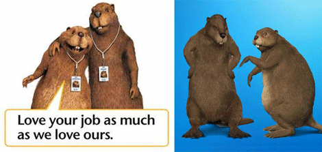
Frank and Gordon in action.
A few excerpts from the BCE press release:
“The new Bell brand underlines that we are moving forward as a company and as a service provider, with new services, a new strategy and a new goal,” said George Cope, President and Chief Executive Officer of BCE and Bell Canada. “It’s a straightforward and customer-focused brand that directly supports the Bell team’s goal: To be recognized by customers as Canada’s leading communications company.”
The new brand platform was conceived by Zulu Alpha Kilo, a new agency founded by Zak Mroueh, the renowned Canadian creative genius behind award-winning brand and advertising campaigns for companies such as Mini, Nike and Pfizer.
The Dream Team composed to execute the new brand platform across Bell’s product and service portfolio consists of Zulu Alpha Kilo; the Toronto office of Leo Burnett, one of the world’s largest and most respected advertising agencies; Ig2, a top Montreal agency responsible for the French-language platform and Cossette Communication Group, a long-time Bell marketing partner.
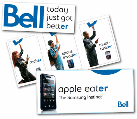
To tie the advertising even more closely to the concept of “better” and underline the range of product and benefits Bell offers, the English campaign also makes liberal use of words ending in “er” — faster, easier, music lover, gamer, worker, talker, texter, multitasker — which was also the basis of the company’s recent advertising teaser campaign.
Bell is Canada’s largest communications company, providing consumers with solutions to all their communications needs, including telephone services, wireless communications, high-speed Internet, digital television and voice over IP. Bell also offers integrated information and communications technology (ICT) services to businesses and governments, and is the Virtual Chief Information Officer (VCIO) to small and medium businesses (SMBs).
Normally, if you asked me, I’d tell you that I’m not a fan of overly tight kerning (nor do I advise the sheep stealing antics of letter spacing black letter) and I’ll admit that the old man in me was ready to condemn this wordmark from the get-go, however upon further looking I realized that in this rare case the kerning seems to work. There is something onomatopoetic about it — I can hear a bell ringing when I look at the mark. It’s likely the round “e” which seems to have struck the sides of the letters on both sides. Or perhaps the fact that the strokes and counters are asymmetrical and create a rhythm not found in many current wordmarks trying to implement more consistent stroking and structure across their letterforms. Whatever it is, it doesn’t seem to hurt the legibility and aides in the logo’s memorability. And the idea that “life happens on Bell’s networks” and thus so should the advertising — while a bit cliché — creates a visual strategy that has a lot of promise.

Bell teaser campaign images by Flickr user asianz.
As for the teaser campaign, while it potentially engaged the audience through its cryptic nature, and employs an enviably amount of expensive white space, I’m not sure there was enough meat there for most people to give it more than a glance or a passing comment. Though perhaps it’s a breath of fresh air after years of damp beavers.
You can read about some Bell history here and have a look at a Bell Canada endorsed eye dressing kit.


Jump to Most Recent Comment
Remy Overkempe’s comment is:
I like it. The colour is lovely, so much better than the old colour. The advertising letterface, sleek and round, really fits well with the logo, I think.
The teaser campaign—maybe a little bit too subtle?
On Aug.12.2008 at 07:10 AM
Nick Irwin’s comment is:
the advertising is nice the logo is kinda blah...if you put that "e" on a curve I feel as though it would look exactly like the dell logo (very similar color)
sad to see they dont have beavers on their staff anymore (not afraid to go there)
On Aug.12.2008 at 08:00 AM
Amanda’s comment is:
Honestly, I feel it's amazingly boring. ::yawn::
On Aug.12.2008 at 08:03 AM
Mondayne’s comment is:
Does it remind anyone else of either Dell? Or Intel?
On Aug.12.2008 at 08:15 AM
Mondayne’s comment is:
Oops, it reminds Nick Irwin of Dell at least..
On Aug.12.2008 at 08:16 AM
Andrew’s comment is:
I have to agree with Amanda. ::Yawn::
As a Canadian in Toronto, and wondering "what's this all about now...?" after 2 or 3 weeks of the teaser campaign in OOH, (transit mostly-- for me anyway) it's just such a let down...
Other than a few organizational name changes (Sympatico to Bell Internet and ExpressVu to Bell Satellite, etc) have they actually started 'living their promise'? Are they 'Better today'? Nope.
Oh well...
On Aug.12.2008 at 09:38 AM
Brent’s comment is:
Reminds me of a campaign for regional telco Cincinnati Bell. It started in late 2005-06 and ran until 2007, focusing on the use of "Better". In fact, they're still using a form of it for their niche products and services.
On Aug.12.2008 at 09:57 AM
Richard’s comment is:
Well, I am extremely annoyed by the commercials, but hey, that's not new (those damn beavers were even more annoying, so at least there's a bit of an improvement). I will give them credit for one thing, though: the website. It's much cleaner now. They used to have a bunch of yelow-gold boders everywhere, with grey gradients, and it wasn't pretty to look at. Now, it's all white with that rather calm blue. Makes their website slightly less painful to use.
On Aug.12.2008 at 10:01 AM
David Sanchez’s comment is:
Interesting casimir effect on the "ll", nice brand refreshment, maybe a transitory rebranding. Looking forward to see what Zak Mroueh has in mind, although the "er" usage was a bit of something already done.
On Aug.12.2008 at 10:56 AM
John’s comment is:
I must be old because that new logo just looks silly to me. I wasn't crazy about the old one but I prefer it to the new.
On Aug.12.2008 at 11:00 AM
darrel’s comment is:
I look at it and see poor little 'e' getting bullied by big 'B' and the 'l' twins.
Does Canada have telecom monopolies like the US? I'm always perplexed with the marketing budgets of companies like Qwest. Why bother when you're the monopoly?
On Aug.12.2008 at 11:12 AM
Daniel Campos’s comment is:
"Apple eater"
hahahahahahahahahahaha
damon’s comment is:
sorry, this campaign sucks from an advertising perspective. ER? what a total let down.
it should have used the BE, and ended up spelling bell. Be smarter, be faster, be creative etc etc. that teaser at least makes sense.
while I like the white space and restrained design of it all, I think it's pretty dry, and advertising genius is pretty generous to say the least, albeit from their own press release.
the logo itself is whatever, I feel like the last L is too far out in the wind, and is disconnected from the rest of the tight kerning.
people in toronto are not overly impressed thus far. The beavers were stupid and childish, but at least they were an idea, and had personality. this says nothing to anybody.
er.
On Aug.12.2008 at 11:31 AM
damon’s comment is:
P.S: I'm glad I left Leo Burnett before I was subjected to having to deal with this from the inside.
meh
damon’s comment is:
P.S.S: I'm glad to see the "turning heads" icon go though.
On Aug.12.2008 at 11:34 AM
Jon Whipple’s comment is:
@darrel: Canada has quasi-monopolies where there is heavy regulation so you can't just start a telecom, but there is also enough competition that there are presently 3 major players: Rogers, Telus, and Bell, and other regional telecoms, some owned by the Provinces as Crown Corporations (state companies): MTS Allstream, SaskTel, Shaw, and others.
I have to say after years of animals from Clearnet (bought by Telus), Telus, and Bell I am relieved that bell has shifted gears. Even if I don't get "er" and don't care if guys in speedos sell me phones.
I think the new direction is great even if the "er" campaign is dumb and I am ambivalent about the e loving it then hating it in equal measure. The tight kerning has already grown on me and I like it.
On Aug.12.2008 at 11:35 AM
Jonathan Peterson’s comment is:
Dude, you got 5-year old Dell logo!
On Aug.12.2008 at 11:42 AM
Kim Siever’s comment is:
BO-ring.
It's bad enough it sounds like "Dell". Now it looks like Dell.
Will my mobile service change? No.
On Aug.12.2008 at 11:44 AM
Kim Siever’s comment is:
Jon,
Since when did Shaw become a crown corporation?
On Aug.12.2008 at 11:47 AM
Lisa’s comment is:
I don't get the "er" tie-in to Bell. I truly don't. And I'm a designer -- seeing those er billboards, I thought it was a mistake or that the billboard painter had accidentally left a square of the old design that was up, since it had hardly anything in it. er, us, everyone.
At least those frickin' beavers are gone... I hope? They're on the cusp of both realistic and cartoony, and therefore super creepy. They're just gross and I never liked those commercials. They made me vaguely angry when they came on.
Having gotten all of the negative feedback out of the way, the old Bell logo was confusing and out of date, this is a huge improvement, as is getting rid of the "Sympatico" and "ExpressVu" names. Much clearer, now. I like it. When I was younger, I thought the old logo was a stylized pen above the wordmark, because it was always shown so small. It wasn't until I saw it larger one day and noticed the face. Oh! I said.
On Aug.12.2008 at 12:00 PM
jon Whipple’s comment is:
@KimSiever: Bad sentence structure made it a crown corporation. Clarifying there are other telecoms in Canada than Bell, Telus and Rogers. Some are crown corporations (I think) and others are not. Other telecoms are: MTS Allstream, SaskTel, Shaw...
Thanks, Jon
On Aug.12.2008 at 12:03 PM
Amy’s comment is:
The commercials Bell is airing on CBC during the olympics are pretty slick. Not sure about the 'er' thing, but I don't mind this.
I still hold no love fod bell, though.
On Aug.12.2008 at 12:03 PM
JeanC’s comment is:
@ jon Whipple
I think there is only SaskTel as a crown corporation in Canada.
On Aug.12.2008 at 12:39 PM
Armin’s comment is:
For those yawning at the logo... A simple wordmark is sometimes one of the best options for an immense company, specially when there was a previous icon that had a lot of baggage -- what do you replace it with if you take it away? A unicorn? A bouquet of flowers? And in this case, being a telecommunication company how do you represent that in an icon? Any of the obvious ideas lead to swooshes or pixels or some sort of line in motion. A simple wordmark has the possibility of adapting to an identity and an advertising campaign that imbue the logo with meaning, and the logo also acts as a seal of approval and certifies excellence.
A simple sans serif expresses a lot of confidence and, again, is a near blank slate that can be the vehicle for a hundred different messages. The tight kerning makes this ownable and unique. It may not be the prettiest thing to look at, but it is a small enough quirk that will distinguish Bell from other sans serif logos.
Having said that, I really like the new logo. It's hard to come up with something so simple that right out of the gate it becomes instantly recognizable. Just look at the logo in that Apple Eater image, it makes for an excellent bug.
As far as the "er" thing... I too don't get it and don't see the connection, but will admit that it looks nice in its execution. Why folks are hanging from the B as if it were a subway car is beyond me, but for a company that used beavers, I guess this is a "conservative" approach.
Overall, a great change that will last for decades.
On Aug.12.2008 at 12:45 PM
kristin’s comment is:
So THAT'S what those "ers" were. I saw a group of them driving by me on the side of a bus and I was just confused. I honestly thought someone may be graffitiied the bus.
Like others noted above, my first reaction was "It looks like the Dell logo."
I think the change is an improvement over the old one--and oh dear lord am I happy to hear that they're going to ditch those dumb beavers (I hated those stupid commercials--but I don't find the new logo as interesting as it could be.
I saw it in a TV commerical last night and thought, "huh." And that was about it. Not very wow-worthy.
Brandon’s comment is:
Isn't "er" British for "uh"? That's what I think when I see those blankish posters at the end of the article. They don't even mention whom the ad is for. I don't see how someone seeing those posters for the first time, having no knowledge of the new campaign, could possibly make the connection from "er" to Bell. There isn't even an "er" in "Bell!"
At first, I didn't like the spacing between the letters, but now I see a nice symmetry in the overall shape of the word that seems to me to resemble the curved underside of a bell.
On Aug.12.2008 at 01:50 PM
Yab’s comment is:
As a graphic designer, I love the new logo !!
On Aug.12.2008 at 01:53 PM
koyo’s comment is:
It's common. But it's nice.
On Aug.12.2008 at 02:02 PM
Davekos’s comment is:
errr...
inspi(red), desi(red), hampe(red), ti(red),...
Why does red make more sense to me than er?
I'm really curious about zak's strategy. Sometimes i want to know from first person what on earth they think about.
But i have to admit the new logo works well in the campaign. Soon people will recognize bell easily. that means a good brand building.
I found the small aperture of e a bit odd.
On Aug.12.2008 at 02:03 PM
Paul Lloyd Johnson’s comment is:
I love it!
On Aug.12.2008 at 02:07 PM
eighthave’s comment is:
Hm, reminds me some of the fedex logo in a way, and those who don't like this logo, you'll see it every time from now on, but the negative space in the lower part of the e looks like a profile of a sleek, modern...toilet.
It gets a nonchalant shrug from me. Better than what it was, but nothing terribly distinctive.
On Aug.12.2008 at 02:51 PM
cee’s comment is:
I love wordmarks. Two thumbs up.
On Aug.12.2008 at 03:08 PM
Morgan Smail’s comment is:
The identity alone for this company feels pretty uninspiring, so that only contributes to the lack of creditability an obnoxiously presumptuous ad for Samsung's iPhone rip-off gives the brand...
"apple eat-er"???... the fact is, the closest tagline for a product like that to use without insulting the intelligence of the viewer is "apple bit-er".
...feign brands are a dying breed
On Aug.12.2008 at 03:38 PM
Kevin’s comment is:
I have a BIT of insider information, as I work for a division of Cossette in Montreal. That being said, I'm certainly not speaking for them.
With 4 agencies involved, there were a lot of politcs involved, and even I'm not sure where credit lies for what aspects of the project. I was working on the branding and website over a year and a half ago when I first joined Cossette and was finishing executions on various interactive platforms last week. So a huge project for a huge company. I think that complexity should be kept in mind when judging this rebrand.
The executions of the launch campaign were completely different in Quebec (and keep in mind, Quebec should be seen as a parallel market, and not a secondary one). Rather than the "er", a series of negative statements where presented that on launch were turned around by the inclusion of a bell product. eg. STUCK IN TRAFFIC FOR HOURS --- WITH UNLIMITED TV RECORDING OF YOUR FAVOURITE PROGRAMS (excuse the bad translation). Tagline "La vie est Bell" (ugh).
I don't get the "er" thing. IMHO, it would have been more effective to just highlight complete words, better, faster, easier, etc. The mnemonics of it would still get across, and it wouldn't feel so awkward.
Anyways, I could ramble on for quite a bit... about how much of a challenge it is to work for such a large company, under such circumstances etc. but perhaps that's self-evident. Given the context, there are certainly a lot of things I'm questioning (even or especially having worked on it a bit), but the execution is certainly not as bad as it could have been!
On Aug.12.2008 at 04:46 PM
Bora Nikolic’s comment is:
The new logo is a perfect fit for the aging giant. Be sure to take a look at all of the campaign assets (both video, print and installations) before bashing.
On Aug.12.2008 at 04:47 PM
Kevin’s comment is:
And thank god the beavers are dead. You have no idea how hard they were to work with! :P
On Aug.12.2008 at 04:49 PM
Joe Szczepaniak’s comment is:
Call me an idiot, but I think in the Spirit of Canada it shouldn't be "er", but rather "ay".....
Im sorry, i just found myself pronouncing the "er" and then it occurred to me that Canadians don't say "er" like Americans do when they're at a loss for words.
On Aug.12.2008 at 05:36 PM
Simon M’s comment is:
I am all for wordmarks, I think little icons as part of a logo can often complicate things, but there really isn't much to this wordmark. The kerning is weak and the proportions of the letters are awkward.
The advertising campaign and launch is clean and effective. Both print and television ads have been visually effective, not stimulating or innovative, but nothing offensive (unlike past attempts). I just can't get over the boring static logo.
Shouldn't one strive to be more 'est than 'er? Mind you better to sell yourself short than fail to deliver.
On Aug.12.2008 at 05:57 PM
Matheus’s comment is:
This band has no life at all.
Fail.
On Aug.12.2008 at 07:51 PM
Mark’s comment is:
woah.
what a change.
I like.
I love the subtle hints you get from the logo, for example is it me or does the line of the "e" and the bottom half of the "B" allude to the shape of a bell? :D
and I just understood the advertising campaign the people depicted are pulling something similar to a rope/handle to ring bell.
simply brilliant, puts AT&T's campaign to shame.
On Aug.12.2008 at 08:09 PM
T-Bone’s comment is:
logo's ok, but 'er'? i thought i'd click to what that means by reading people's comments, but now i'm even more confused.
they chose 2 letters unrelated to anything and made all the ads feature words with those letters? eh? Damon nailed it by suggesting the use of 'Be'. That makes sense.
On Aug.12.2008 at 08:35 PM
Jerry Kuyper’s comment is:
For me, "er" is right up there with "um" as a way to fill dead air.
In reading the press release they are mixing two types of "er" words.
better, faster, easier
and
music lover, gamer, worker, talker, texter, multitasker.
The first group opens the door for a competitor to be:
best, fastest, easiest
although I guess "est" has its own baggage.
On Aug.12.2008 at 08:58 PM
Jerry Kuyper’s comment is:
@Armin, I don't know whether I'm yawning or grimacing, I suspect both. I do disagree with your premise.
"what do you replace it with if you take it away? A unicorn? A bouquet of flowers? And in this case, being a telecommunication company how do you represent that in an icon? Any of the obvious ideas lead to swooshes or pixels or some sort of line in motion"
AT&T, Sprint, 360 Communications, BT and Orange all faced the same challenge with more distinct and memorable results.
I have no problem with logotypes or wordmarks. The only difference between Mobil, Dell or Visa and this Bell logo is those wordmarks have a concept and/or a clear visual distinction.
The Bell logo has a belly in the B and an overbite in the e.
On Aug.12.2008 at 09:15 PM
M’s comment is:
I really am glad that companies take the time to realize how important their identity is and how they need to update it from time to time....
.....
....
....
......
but, its not that great when you update your identity so you look like everyone else. This logo reminds me of thousands of others. At least the old one gave a little bit of identity to the logo.
Ivan’s comment is:
all those "er"s...no one sees the resemblance in Motorola's RAZR, ROKR and so on? plus the logo is boring, boring, boring.
On Aug.13.2008 at 04:24 AM
illusio’s comment is:
Where's Canada in the logo? Agreed, this is a sleep er.
On Aug.13.2008 at 04:31 AM
Woke’s comment is:
I don't mind the logo - it might work in the long run provided the company delivers.
But the ad campaign sucks.They shouldn't be doing teaser campaigns just for the sake of it.
The white space reference reminded me of the 'Hutch Hi Campaign' in India.
http://www.thehindubusinessline.com/catalyst/2002/07/18/stories/2002071800100300.htm
Diane’s comment is:
I can't possibly be the only one sad to see Frank and Gordon retire. In my opinion, the more beavers in Canadian advertising, the better (ESPECIALLY if voiced by Norm Macdonald).
On Aug.13.2008 at 08:41 AM
Chris’s comment is:
Count me among the "er" haters. It means nothing, and feels like a last-minute desperation pitch approved by an equally desperate client.
Worst yet is the subway signage "Meet Here". Middle of the word, not even consistent with the rest of the campaign. Yuk.
On Aug.13.2008 at 10:23 AM
Jazzsun’s comment is:
The logo is better than the fat italics, however the campaign looks like a dumbed down version of GE's advertising.
On Aug.13.2008 at 12:07 PM
Patrick’s comment is:

Hapless Canadian Consumer’s comment is:
Stupider, Slower... more incompetent, more irritating, more closely aligned to a 19th Century telegraph company with a steam-powered beaureacracy. Linemen with butt-cracks, useless and unhelpful telephone support people....
We already know who Bell are... the teaser is of no consequence.
On Aug.13.2008 at 03:01 PM
ben’s comment is:
I like it, but i dont think the "er" is very practical.
if i was out making fun of stuff with my buddies, this would almost be too easy. stupid"er" dumb"er" - you know. i like the design, but i really dont think it's very idiot/teen/male friendly
Stephanie’s comment is:
I rode the bus for weeks wondering what "ER" stood for before I saw a TV ad at a friend's place and for the first half of the commercial, I did think it was a Dell ad!
Logo design isn't my speciality but that sounds like a failure to me.
On Aug.13.2008 at 11:45 PM
UFR’s comment is:
Diane,
I'm sad to see them go as well. I found the ads quite charming (though I understand the limited shelf life of anything animated or puppeted, I tired of Erin Esurance long ago) something this company and current campaign lack.
Then again, charm doesn't really jive with a Telecom, does it?
While I agree that the old logo was dated, this word mark does nothing at all for me. At least the Dell logo has something distinctive in the twisted e. This? Weak.
And er? Really? Where's the er in Bell? Whomever said they should have focused on Be is right on. er is disconnected from the base concept of Bell, requiring an intellectual pivot on the part of a passive audience. Be, on the other hand, is part of Bell and has a much more instinctual connection.
But it is what it is, and I'll miss Frank and Gordon. Good luck, boys, and try not to get eaten out there.
On Aug.14.2008 at 12:33 AM
Matthew Aubie’s comment is:
The ADCC (advertising & design council of canada) with Bell Canada, held a nation-wide student competition. The brief was to redesign the Bell brand using your preferred genre (logo design, advertising, radio/tv spot, etc.)...
I took part in it and spent a lot of time tearing apart the old brand, building a new brand, and studying telecommunication logos in general. One thing I am sure about now, is for companies like Bell (or telus, or at&t, etc.), the logo is one of the least important pieces of the brand when it comes to the consumer level. The logo is an identity mark, and nothing more.
Bell will now be known as Bell because people will spot the immense white space with that blue. The typeface they're using for the "bettER" "fastER" words is how people will see Bell.
Once this initial brand launch is over and done with, nobody will care about the logo - only the imagery and mood of the brand.
I don't think the logo is pretty, but it will do its job.
On Aug.14.2008 at 07:52 AM
Paddy C’s comment is:
I find it a little odd that a communications provider like Bell would choose such a static logo. These companies are no longer about phone service but TV, Video, Streaming content, etc. I.E. everything visual and in motion. And here you have a wordmark that is very static and impossible to put in motion effectively.
I also think the the typeface they're using is "overly designed" and will grow tired quickly.
It would be nice if a companies in this space would focus branding on the consumer, on quality, on choice, and price instead of trying to ram a "lifestyle" concept down our throats. My lifestyle is not my cellphone, not my TV, not my ISP. These are just tools to deliver the content I want.
Maybe I'm getting old.
On Aug.14.2008 at 12:57 PM
Joachim’s comment is:
So I was driving yesterday and came across a billboard with the new Bell identity. That overbite 'e' looks awful from a distance. Having it kerned that tightly really backfired. I honestly don't see a hidden bell anywhere that a couple have said. While I appreciate the simplicity, the name "Bell" has a lot of potential where the wordmark could be distinctive by incorporating a subtle element, but this end result is just dull.
As for the marketing campaign, the "er" communicates nothing but confusion, and the point isn't strong enough. The only thing I really like are the colours and the typeface used in the collateral.
On Aug.14.2008 at 02:02 PM
PJ Chmiel’s comment is:
Terrible, one of the worst new logos in an era of incredibly bad logo redesigns. Ugly as sin and as engaging as a conversation with a slab of concrete.
On Aug.14.2008 at 04:40 PM
fem’s comment is:
Yay, thanks for posting this!
From a consumer's standpoint, this launch has been nothing but irritating. I see the logo and immediately think of Dell. Way to represent one of the most identifiably "Canadian" companies out there.
And I had no idea those "er" things were remotely related until I saw this post! Toronto especially has fallen victim to these sorts of campaigns a little too often recently for anyone to give more than a split second's thought about them.
It's hard to explain to a non-Canadian, but this is a 100+ year old company that almost all Canadians are involved with at some point in their lives. Of course since no one under the age of 30 has a landline anymore they're freaking out. No amount of viral crap is going to make this brand interesting, I'm sorry.
On Aug.14.2008 at 04:56 PM
phillip j. fry’s comment is:
this has got to be the lamest ad campaign yet that I've ever seen. first you have the abstract ads posted everywhere on the subway system which an "intellectual" few can decipher. then you have to wait for the olympics coverage to find out what that mystery is all about, only to disappoint that it's just the new look of bell. to spend heavily on posted billboards that nobody understands, then with a follow-up on television to tell you what the latter is all about, apparently, only wastes the ever shorter attention span of the masses. from my personal experience of this new campaign, first i got pissed off more than intrigued the longer i see those "er" billboards all over the TTC. then when I figured it out from watching the olympics that it's just bell (ho hum), i realized that this new ad campaign sucks big time even more than the two dingdong beavers. and it took creative teams to come up with this campaign? what a joke for bell canada!
On Aug.15.2008 at 01:17 AM
Michael’s comment is:
I live in Canada - and Alberta at that.
I've seen a few of the er posters - and from someone in a graphic design standpoint - it made me curious but not enough to want to figure out what the hell it was. I thought it was the ad guy being lazy and not finishing putting the ad on the sign.
Bell is actually a terrible phone company and I'm canceling and going Virgin.
On Aug.15.2008 at 01:28 AM
lily’s comment is:
this new lamer ad campaign, their previous lame one, and the strings of poor unsatisfactory service has, in my personal opinion, erased from our ever short attention span minds of the fact that Bell was the first one that pioneered the telephone and telecommunications in Canada and of the world more than 100 years ago. sad.
On Aug.15.2008 at 01:31 AM
Roby Fitzhenry’s comment is:
So boring. The brand lacks uniqueness and the "er" doesn't tie in to the name at allll. The old mark could have been modernized in order to keep the existing visual brand equity. The new wordmark doesn't tell me anything and the type is nowhere near unique.
On Aug.16.2008 at 05:33 PM
Brian’s comment is:
Wow! 40 million doesn't get you much anymore these days eh? Now i see why all the pay phones went up to 50 cents a call a couple of years ago. Had to pay for this excuse of a logo somehow.
Is there a reason that Zulu Alpha Whatever doesn't have a gallery of work to view on their website? or maybe thats just the COOLer thing to do...
On Aug.18.2008 at 05:13 PM
plun9’s comment is:

Mark’s comment is:
excellent spoof I don't get the "er" thing either, first thing that came to my mind with "er" was "er...um" :S
On Aug.23.2008 at 12:24 PM
Robak’s comment is:
Boring conservative blue and bold sans just screams to me: soulless megacorp.
I don't see this helping their brand which I beleive has suffered from growing frustration of it's extorted customer base about the huge buraucracy and weak customer service as well as some annoying nibbles by a growing market of competitors.
(It may seem contradictory to speak of growing competition and extortion but the fact remains that the markets here amount to local monopolies since instead of the companies competing fo rthe same localities they effectively divey up the territories for exclusive servicing.)
On Sep.08.2008 at 10:32 AM
Craig’s comment is:
I made it bett...er by switching to rog...er s
Seeya Bell
On Jan.01.2009 at 03:42 PM
Bobby Simmins’s comment is:
Well, Bell sucks they make stupid sucky ads like apple eater mking fun of the iphone and saying more minuets than rogers or telus they rogers i love becuase they do not make fun of any compateter and are just great service like who would want to have an email @sympatico.ca but i love having a rogers email
On Jan.17.2009 at 10:18 AM
Comments in Brand New, V1.0 have been closed.


