

NOTE: This is an archived version of the first incarnation of Brand New. All posts have been closed to comments. Please visit underconsideration.com/brandnew for the latest version. If you would like to see this specific post, simply delete _v1 from the URL.
![]()
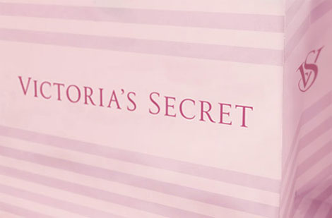
Let’s boil this down to simple facts to get started. Victoria’s Secret = Sexy. Trajan = Not Sexy. I assume I do not need to delve into the sexyness of Victoria’s Secret and as far as Trajan’s lack of sexiness, well, it’s really not its fault but its overuse suffered throughout the years. The problem with using Trajan as the logo for Victoria’s Secret is that it is no different than, say, Will Smith’s I am Legend or a hundred other movie posters. Mucca Design has evolved the logo of Victoria’s Secret to something that’s more unique and well crafted, taking the basic letterforms of Trajan and finessing them ever so slightly. And amazing how looser tracking adds elegance to small caps.
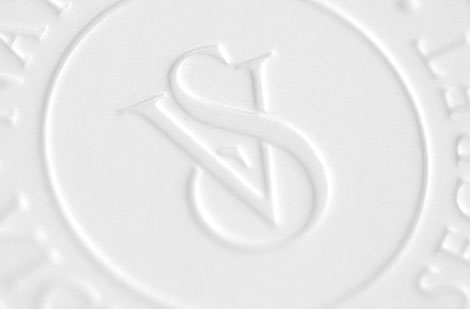
Mucca also created a monogram to introduce into the visual palette of Victoria’s Secret. I want to like it, but there is something wedding-like about it that doesn’t quite fit with the elegance of the new wordmark. It may be the white pieces that get knocked off as the letters intersect. Nonetheless, this is all an excellent evolution of a logo that has some major airtime in the visual landscape so it’s nice to know that it won’t just be a generic, out-of-the-box wordmark but a sexy little thing.
And, sure, you are welcome to comment with “Consumers will never notice.”
![]()
Update: From a little birdie on the subject of Trajan vs. Not Trajan. The font is called Victoria and it’s been part of Victoria’s Secret for a while. It is indeed a modified version of Trajan where they only modified the initial caps of VS, the apostrophe, and thinned some parts of the letters. So, it’s not Trajan but, well, it still is Trajan.
Thanks to Tony Nguyen for the tip.


Jump to Most Recent Comment
stefano picco’s comment is:
Great I like it :)
Signet looks a little bit like Yves saint Laurent
On Jun.22.2009 at 07:42 AM
Plamen’s comment is:
Sure,
Consumers will never notice.
On Jun.22.2009 at 08:06 AM
Elisabeth’s comment is:
The monogram reminds me of an old logo from that Kirstie Alley show, "Veronica's Closet":
http://dipity.s3.amazonaws.com/uploads/events/95c5d5794e178b4218a30930ae61c089.jpg
Very 90's.
On Jun.22.2009 at 08:13 AM
Dennis Van Staalduinen’s comment is:
Consumers may not notice, but that will be Victoria's Secr... oh never mind.
Thoughtful analysis as always. Spot on.
You're completely right about the new signet looking wedding-ish (which may or may not be sexy depending on how you feel about commitment), and the previous comment far too close to Yves saint Laurent. My biggest issue with it is that because of the orientation of the "S" above the "V" both vertically and spacially, it scans as "SV" rather than "VS".
On Jun.22.2009 at 08:36 AM
Rodrok’s comment is:
Definitely this won't be noticed by consumers, slow transition for the logo. Hopefully this brings back some respect to the brand I feel like it was loosing respect.
On Jun.22.2009 at 08:44 AM
Ryan Gonzalez’s comment is:
It's a nice little refinement that fixes it up little bit, makes it more loose, etc.
Not a huge update, though the signet is a nice little touch even though it doesn't quite fit the overall look. I agree with Dennis' comment about how it can be confused with an "SV" rather than "VS" due to the overlap of the "S" above the "V".
Good little overview of the tweak, by the way.
And yes — consumer's won't ever notice it.
On Jun.22.2009 at 08:53 AM
Chad Kaufman’s comment is:
I think it is a great evolution and I think the monogram is a great element to introduce, but to certain applications only. I do not like the application of the monogram to the side of the shopping bag, but I do think it is very appropriate for other products like bottles (which is what the above pic looks to be on) and will lend itself nicely to be embroidered on bras and other VS lingerie that does not have a lot of real estate to apply branding.
And Armin, if it looks wedding-like is that not almost every girls dream? This feeling may be very appropriate.
On Jun.22.2009 at 09:12 AM
Nora Brown’s comment is:
The sexiest element in the new mark is the apostrophe; compared to the old one, it's quite luscious!
On Jun.22.2009 at 09:12 AM
Santorini’s comment is:
I like the monogram and I wouldn't mind if the logo were set in all-caps Trajan. What lacks sexyness is the use of small-caps, even with this nice looser tracking.
On Jun.22.2009 at 09:21 AM
Andrew M’s comment is:
I give credit to Mucca Design for being able to sell a client on a design option that the majority of their audience won't notice. Designer's on the other hand should see the subtle improvements although we're probaly not the target market. Over the long term these details should add to the uniqueness of the logotype and distance it from all of the other Trajan users as mentioned above.
The monogram in the photo looks like it's in a debossed watermark like circle which is more elegant and historical looking than the monogram floating on its own. Either way this will definately be on a line of t-shirts.
On Jun.22.2009 at 09:25 AM
Josh’s comment is:
It's way more even now. Comparing it to the old one is like looking at two puddles, one that's undisturbed and another with a rock thrown in. The spacing of the original had ripples of too tight or too loose in it, and the new one has a nice, even flow. A great example of an update that improves on what existed without substantially changing it.
On Jun.22.2009 at 09:31 AM
Kosal Sen’s comment is:
Mucca Design has evolved the logo of Victoria’s Secret to something that’s more unique and well crafted, taking the basic letterforms of Trajan and finessing them ever so slightly.
I hope this doesn't mislead people to think Mucca customized Trajan to create the new logo. The original Victoria's Secret logo (the before) was already an elegantly modified Trajan. Mucca had more to do with finessing the logo's spacing, scale, and redrawing the apostrophe.
On Jun.22.2009 at 09:34 AM
Jeremy Heilpern’s comment is:
Overall the subtle treatments applied make for a more elegant word-mark, so two thumbs up to the Mucca team. And I do have to say I'm a very big fan of the monogram they've introduce. To me, the monogram feels more in line with the brand than the word-mark does, providing a very elegant, even sexy typographic experience.
Very well done, indeed.
On Jun.22.2009 at 09:37 AM
Kent Lew’s comment is:
This whole "distancing from Trajan" rationalization would make a whole lot more sense if the original was actually set in Trajan. That's certainly not the case in the Before shown above.
"Consumers will never notice." Designers may not either.
On Jun.22.2009 at 09:40 AM
Armin’s comment is:
> I hope this doesn't mislead people to think Mucca customized Trajan to create the new logo. The original Victoria's Secret logo (the before) was already an elegantly modified Trajan.
Kosal... Not quite. The before image is Trajan, completely out of the box, without any modifications. I already closed my file, but I had overlaid Trajan over the logo to make sure, and it's an exact match, letter by letter. The only thing they did was kern the apostrophe and that's it.
So, yeah, Mucca did customize the before Trajan logo.
On Jun.22.2009 at 09:48 AM
Giacomo Cesana’s comment is:
Sorry Armin, but the old one is not "Trajan out of the box": the "R" is different from any "R" in my Trajan Pro opentype font.
On Jun.22.2009 at 09:53 AM
Armin’s comment is:
Kosal, sorry, I did jump the gun. You are right, it's slightly modified. Green is Trajan, Pink is VS logo, then overlaid.

Mostly it's the "R"s and "E"s.
Kent, it might not be Trajan proper... Let's call it Trayjun if you will.
On Jun.22.2009 at 09:56 AM
fabrika’s comment is:
Nice update. Signet reminds of Louis Vuitton and YSL.
On Jun.22.2009 at 10:09 AM
Carlo’s comment is:
Hopefully Mucca can help them with the rest of their brand. Going to the VS website you'd think it was a completely different company; for a second I thought I was on the Land's End website swimwear section.
On Jun.22.2009 at 10:17 AM
Andrew Klein’s comment is:
The consumers will notice! Well, at least my fiance will notice when I tell her. :)
Of course, it's not always about the consumers noticing - it's about solidifying a system of branding and packaging. If these subtle changes help the system make more sense to the designers of the plethora of applications it has to work on, I say it's worth it.
On Jun.22.2009 at 10:26 AM
Scott J’s comment is:
I find it interesting that a brand is willing to tweak their mark as delicately as has been done here. It's kind of refreshing, really, and it seems to have lead to a stronger identity system. I applaud their application of restraint.
On Jun.22.2009 at 10:42 AM
Impossibly Stupid’s comment is:
"And amazing how looser tracking adds elegance to small caps."
I once again must disagree with the crowd (Hey, Armin, you should do an experiment some time and post the opposite of what you think just to see who still agree's with you just because you posted the opinion! :-). The increased distance of the letters is colder to me, whereas the original feels more intimate. Maybe that's intentional, to go hand-in-hand with the "wedding-like" monogram.
I'll agree that it's hardly noticeable when taken in isolation. Victoria's Secret is an odd brand in that it really doesn't need much help, because the product sells itself. They could have switched to Comic Sans it probably wouldn't be noticed.
On Jun.22.2009 at 10:43 AM
Sand’s comment is:
@Nora Brown - I agree, the new apostrophe is dead sexy. It's all in the curves.
I like the monogram as well. I think it helps position the brand as "intimate fashion" and not just "underwear"
On Jun.22.2009 at 11:15 AM
Paul Irish’s comment is:
Just to add an extra goodie to the conversation..
Trajan is the movie font (goodie bag)
jRod’s comment is:
im looking forward to seeing that monogram on panties someday. actually i might just be looking forward to seeing the panties.
the monogram is still good though!
On Jun.22.2009 at 11:28 AM
Eric’s comment is:
Consumers will never notice? I can't see the difference after you've pointed it out (No, I'm not a typographer).
On Jun.22.2009 at 11:31 AM
mp’s comment is:
Victoria's Secret have a logotype? I have never noticed. ;)
Andy’s comment is:
The 'C' is a dead giveaway that this is not Trajan, or at least not 'out of the box' Trajan. Almost all the letters are at least slightly different. The Cs, Rs and Es are the most different, and all the letters are slightly taller than the 'out of the box' Trajan letters.
On Jun.22.2009 at 12:14 PM
Mark’s comment is:
It looks okay, it looks like they've spaced the letters farther, however the only thing that bothers me that it looks less feminine. Oh well.
On Jun.22.2009 at 12:25 PM
Mike’s comment is:
The change is discreet...just like underwear. It works.
On Jun.22.2009 at 12:34 PM
Mark’s comment is:
I meant the new black color is less feminine but luckily it looks like they kept the purple/pink color on the bags.
On Jun.22.2009 at 12:34 PM
Nathaniel Salzman’s comment is:
Consumers won't notice and that's a very, very good thing. "Clever" or strange typefaces are mostly the playground of amateur or at best inexperienced designers. Brand building and especially the kind of subtle positioning that VS is trying for has to be executed on the subtlety of details like this. This is a great example of one piece of a holistic visual branding approach adding to the whole, and that will, in time, pay off for the brand.
On Jun.22.2009 at 12:41 PM
Darrin Crescenzi’s comment is:
The problem with using Trajan as the logo for Victoria’s Secret is that it is no different than, say, Will Smith’s I am Legend or a hundred other movie posters.
Why I don't think any designer would disagree that using Trajan for an identity is fraught with peril, I'm not sure this is the best explanation as to why.
The curves of Twombly's most ubiquitous of creations being so permanently seared into my brain through over-saturation, I had never actually realized that the Victoria's Secret wordmark was set in Trajan. The wider "E," curved leg of the "R" and completely redrawn "C" go a long way towards removing it from being readily identified as such.
All that said, Mucca did a beautiful job adjusting the letterspacing and redrawing the apostrophe. Success is found in the tiniest of details.
On Jun.22.2009 at 12:45 PM
John Mindiola III’s comment is:
I agree with the cat who stated that the looser tracking makes the mark seem colder, not more intimate. However, maybe this is what VS wanted? They often are nearing the line between sexy & sophisticated and legal-pornography. Maybe the wedding-like marks will help them (appear) to be focused on intimates fashions, and not just sex.
On Jun.22.2009 at 12:56 PM
David’s comment is:
Maybe it's just me, but the way the V and S interact in monogram evokes the image of a lot of other things especially considering what VS sells.
To me it looks a lot like a pregnant woman in a one piece bathing suit, though maybe the S is hair and the V is a face, then again, the softly curving and S could be gently supporting (perhaps pushing-up) the V. Not to mention the mark is pretty callipygous all around.
On Jun.22.2009 at 01:16 PM
Bendy’s comment is:
I love the new C...
Great to see attention to detail for such a... well, loose brand. I would have expected them to throw out the mark and go with a slab-gothic typeface to catch up with the likes of Juicy.
I think the seal mark is beautifully executed but I actually think it's too classy for Victoria's Secret. Anyone else?
On Jun.22.2009 at 02:07 PM
trobs’s comment is:
To: Dennis Van Staalduinen’s
Thanks for that, I couldn't help but laugh at the beginning.
On Jun.22.2009 at 03:25 PM
Kate ’s comment is:
So the real question is...how much did this small modification, that customers will never notice, cost them?
Sometimes makes me wonder.
On Jun.22.2009 at 04:11 PM
Joseph’s comment is:
Here's the new mission statement:
"Sure we'll try that on for you, we understand your girlfriend is the same size."
Marshal’s comment is:
Really nice update. Barely noticeable, but I appreciate it. The signet, however, does bring YSL to mind. I'm not a fan of the S in it, I think the extra swirly twirly crap kind of cheapens it.
On Jun.22.2009 at 04:42 PM
Christopher’s comment is:
@ Elisabeth.
The monogram reminds me of an old logo from that Kirstie Alley show, "Veronica's Closet"
I still cannot believe these types off the wall comparisons that appear on this blog. Not to mention 99% of the time they are so different from what they are being compared to, I think I should smoke some crack and then compare them again. Other than two letters being overlaid there are no similarities. Veronica's Closest monogram uses Vivaldi and makes no attempt to fit the letters together in any kind of elegant way, which with Vivaldi might be and impossible task. But I am sure someone will post something to prove me wrong!
Unless the comparison shows an exact rip-off by identity being reviewed then I see little value in these types of posts.
On Jun.22.2009 at 05:37 PM
Proverbial Thought’s comment is:
Works. Something about the apostrophe seems out of place to me, but otherwise it works. I agree, consumers will never notice.
On Jun.22.2009 at 05:41 PM
Jess’s comment is:
That has to be the most boring redesign ever. I am with Kate- how much did they spend on something that will go completely unnoticed? I am all for a subtle change- but a redesign it is not.
The mark should be monogrammed on a towel. It looks like SV not VS, so at a glance, I would never associate it with Victoria's Secret. And it seems far to 'frilly' for their over-the-top sexy appeal.
On Jun.22.2009 at 05:43 PM
Armin’s comment is:
Just posted an update:
**
From a little birdie on the subject of Trajan vs. Not Trajan. The font is called Victoria and it's been part of Victoria's Secret for a while. It is indeed a modified version of Trajan where they only modified the initial caps of VS, the apostrophe, and thinned some parts of the letters. So, it's not Trajan but, well, it still is Trajan.
**
I don't mind being wrong... But I know Trajan when I see it. And the before logo, nose job and botox aside, is Trajan.
On Jun.22.2009 at 07:04 PM
justanotheranon’s comment is:
I don't see why bother. The second one feels like it takes all day to read. I like the first one better. And yes, the monogram absolutely looks like "SV". F A I L ' S
On Jun.22.2009 at 09:02 PM
henry’s comment is:
well for me, the word that springs to mind now is more 'sensual' than 'sexy' . maybe because of the cleaner and more balanced tweak, the text has become softer.
but overall definitely a nice tweak to th existing version.
On Jun.22.2009 at 11:40 PM
Adam’s comment is:
victoria's secret has a logo? im very familiar with their products but i cant say ive ever paid any attention to the logo... i guess ive just never seen it apart from the product
On Jun.23.2009 at 01:30 AM
Cyber Fox’s comment is:
Oh, Come On People!
I fail to see what's new in this 'new branding' of a brand ladies' underwear
It's the same font and they changed the color ro black, you call that "new branding"? I call that laziness!
On Jun.23.2009 at 02:20 AM
Amanda’s comment is:
I love these extra nit picky identity updates...
I think the update was a nice move. I certainly agree that that extra tracking adds to the elegance of the letter forms-the space in between allows the eye to roll off the curves slowly... Sensual is the right word here, I think- in that there is little bit more flow to everything now.
The monogram reminds me a little of Louise Fili's work for Tiffany (Though not quite as nice).
On Jun.23.2009 at 03:33 AM
Loren Shumaker’s comment is:
Is it wrong of me to have such a strong distaste for small caps? This usage is definitely much better than some uses, but the idea in general just reminds me of those bad ones. Something about two x-heights drives me out of my mind. Maybe that's just my OCD designer side though.
On Jun.23.2009 at 03:50 AM
Warren’s comment is:
Victoria Secrets logo is almost anti-branding. It's so pedestrian in it's execution, trying hard to be austere, above anything remotely vulgar.
The new word mark is nicer, I think, but mainly due to the changes in height. The kerning change is 'meh'- a little superflous. and the new Mono-gram is nicer when embossed.
I much prefer Agent Provocateurs
execution of this kind of branding. Much sexier
Nate’s comment is:
Armin,
I think you just exposed Victoria and her secret. Trajan thief.
On Jun.23.2009 at 11:38 AM
ivan’s comment is:
Wouldn't hurt to actually try on a different typeface:
http://www.fontshop.com/fontcase/alternatives/trajan/
On Jun.23.2009 at 05:14 PM
Michael Kozakewich’s comment is:
It's amazing what a change from all caps to small caps can do.
I don't know if it's the apostrophe, but it seems bumpy to me, for some reason.
On Jun.23.2009 at 09:13 PM
Joseph Maguire’s comment is:
It's quality work, but I wonder how it will effect their storefront mark, if the letters are smaller than V than their height of the sign will be the limit in some places. so the letters will be smaller in signage. Now I guess that is not such a big thing, but.. the looseness of Victoria seems a little loose around 'tor' overall the VS mark works wonderfully it looks very victorian. If you know much about these two letter marks they were predominantly made for weddings and for personal use 18-19th and the beginning of the 20th century which is really cool because its something that's coming back in design. And in this case it makes for a great favicon. If there was one thing I'd have like to have seen though is some of their re branding campaign panels and how they suggest to use some of this new creative and how it affects the imagery use. Pop it up if you find a link. Great work Mucca.
On Jun.25.2009 at 09:25 AM
Dano’s comment is:
Yes, Trajan IS the movie font. It's so over-used! Found an amusing video about it on youtube.
Trajan is the movie font video on YouTube
On Jun.25.2009 at 12:28 PM
Mongoose’s comment is:
Subtle, and better, agreed pretty well on the mark with what Armin said. The height on the V and S, the more spaced letters, the better apostrophe. Among the subtler redesigns for the year, and consumers will probably *not* notice, but we did and that makes me happy. The old logo was good, and this is stronger.
So, giving it a now-small-caps 'A'.
On Jun.26.2009 at 03:25 PM
adcs’s comment is:
Makes perfect sense in the context of the market. Victoria's Secret has always been about marketing highly sexualized products in an environment classy enough to where even the most austere woman won't feel uncomfortable. The very weddingesque monogram also makes a lot of sense considering the demographics - the echo boom Millennials are hitting the 21-29 range, when many women have the intention of getting married. This helps to break away from the very college-oriented look of their big push for their PINK line - that demographic bump is starting to finish out their college years, and will likely look for something more "mature" and pertinent to their current interests. Weddings are certainly among them.
On Jun.26.2009 at 06:59 PM
Shauna’s comment is:
I like the change to black. It looks more like just a langire shop rather than only slutty underwear that isn't meant to stay on long and will not be comfortable. It makes it look more approachable to get some nice underwear for all day and feel sexy.
The signet looks nice too.
Comments in Brand New, V1.0 have been closed.


