

NOTE: This is an archived version of the first incarnation of Brand New. All posts have been closed to comments. Please visit underconsideration.com/brandnew for the latest version. If you would like to see this specific post, simply delete _v1 from the URL.
![]()
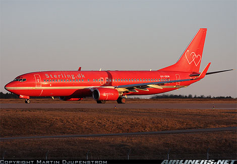
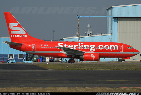
Sterling Airlines, a European low-fare carrier based in Copenhagen, Denmark was formed in 2005 with the merger of Sterling European Airlines A/S (SEA) and Maersk Air A/S and it recently updated its identity — I’m not sure if the old identity was only three years old or if it was carried over from SEA, an airline that has been in business since 1962 and I assume had more brand equity than Maersk Air. (As a side note, do check out a barf bag with an old SEA logo). The old identity was not particularly good: With its Valentine’s Day theme and mini airplane blowing smokehearts out of its behind, feels too cute for its own good. But the new one is plain (get it? plain = plane?) disastrous: It uses the tail of an airplane as part of its logo, something that seems awfully redundant; the shiny “S” appears to have some odd dimension that makes it look like a double wedge; and, by itself, the “S” is rather unpleasant looking. Unfortunately, there aren’t too many saving graces to this logo, other than, perhaps, it’s ultra confident new slogan, “We would fly with us”, which I do like. Below you can see old and new versions of the livery… including the even more unfortunate execution of the backwards-slanted “S” to fit the other side of the tail. !teewS.
Thanks to James Campbell for the tip.


Jump to Most Recent Comment
Ty’s comment is:
While I am partial to the older logo, both liveries are atrocious. Experiment with some white space...
On Mar.31.2008 at 10:26 AM
FJ’s comment is:
The new metal S is indeed surprisingly backwards — quite literally — once painted on a livery. It does, however, convey solidity and robustness which I guess is an asset in the free-flowing, fun-loving, ephemeral business of low-cost airlines. In that, it may not be beautiful, but I would look with interest at its progress in terms of mind share and brand perception.
As for the previous logo… Way too cute for its own good indeed, although reminiscent of the old Southwest "We give you LUV" theme and maybe appropriate to local trends for some reason — which, in itself, would be interested to know.
I do not mind the color liveries. Eurowhite is getting very common these days for cost reasons so a bit of color on the runways is a nice thing to see. Of course, faux silver on blood red may be a smidge too much…
On Mar.31.2008 at 10:36 AM
Alfonso’s comment is:
I wish it was blood red. That red is borderline neon orange. The previous identity was weak, at best, but this new one certainly isn't much of an improvement.
On Mar.31.2008 at 10:49 AM
Klaman’s comment is:
aside from the awful "tail section" being incorporated into the identity, the ridiculous silver S and the word sterling had me thinking sterling silver. Either way, the look is already dated in my mind. Like FJ stated, it is indeed nice to see some color on the runways though.
As to the old identity... no comment. :\
On Mar.31.2008 at 10:52 AM
Klaman’s comment is:
i should note that i do understand sterling means money in britain and that its a cheap airline. but i meant they should not have wanted it to read the way i do as a jewelry sterling :)
On Mar.31.2008 at 10:54 AM
KaskCreativity’s comment is:
Well, it seems they wanted to cash in on the look of the plane... "Oh yeah, it's the red plane." But... why not just use an iconic red plane? The new logo had me thinking just the tail part was red... and then I see a photo of a whole red plane. So that actually threw me a little. I think a simple red plane and the word sterling would have been a little more powerful, if equally obvious.
On Mar.31.2008 at 11:05 AM
Rufud’s comment is:
Looks like a giant silver dog turd.
On Mar.31.2008 at 11:35 AM
lodenmuse’s comment is:
The new slogan sounds a little desperate to me. It's about as convincing as:
"...I'm not just a client, I'm the president."
or
"I liked the company so much, I bought it!"
On Mar.31.2008 at 11:41 AM
ol’s comment is:
Wow, both are a total disaster.
Actually, I think I prefer the new one better, at least it looks like an air company logo. The old one would make me think of a dating website or something. It might not look as awful as the new one, but it doesn't even serve it's purpouse to begin with.
On Mar.31.2008 at 12:53 PM
ol’s comment is:
Wow, both are a total disaster.
Actually, I think I prefer the new one better, at least it looks like an air company logo. The old one would make me think of a dating website or something. It might not look as awful as the new one, but it doesn't even serve it's purpouse to begin with.
On Mar.31.2008 at 12:54 PM
john’s comment is:
I actually kind of like using the airplane tail shape for the logo... it says "airline" clearly and cleverly.
The rest is awful.
On Mar.31.2008 at 03:55 PM
Chip O'Toole’s comment is:
The tail shape IS a great idea. But combining a 3 dimensional element (the S) on a 2 dimensional plane creates unwanted visual tension.
They'd be better off staying completely 2D with a large S breaking the edges of the tail.
![]()
smr’s comment is:
I can't wait until this gradient trend passes. Not that I mind it when it's used well, but it just seems like they said... "Hey, gradients are a trend again, let's use one."
On Mar.31.2008 at 05:44 PM
Jung’s comment is:
Absolutely horrifying.
On Mar.31.2008 at 05:59 PM
Darrin Crescenzi’s comment is:
I'm too busy laughing about the tagline to even give this my straight-faced two cents.
On Mar.31.2008 at 08:31 PM
DG3’s comment is:
Neither of them were well thought out. If they had to change it, maybe they could have simply modified what they already had.
Jan A’s comment is:
It is just God … horrible - that S is beyond help, it looks like some thing a dog left behind itself.
On Apr.01.2008 at 03:37 AM
Von Glitschka’s comment is:

Thinker’s comment is:
man this is soooo bad...
On Apr.01.2008 at 05:25 AM
ML’s comment is:
I can just agree with the stated comments. It is horrible.
On Apr.01.2008 at 08:52 AM
Reactor Factory’s comment is:
Wow, amazing. NOT.
The "S" isn't too terrible, until you try to flip it backward. Man I can't wait for the 3-d craze to be over. Packaging design is starting to go back to clean simple flat graphics. The new Triscuit box is a good example, if you can find it at your local grocer.
On Apr.01.2008 at 10:03 AM
LimitedTimeOffer’s comment is:
@Von Glitschka
You sir, are a king among men.
Also I concur, this is design is freakishly awful.
On Apr.01.2008 at 11:24 AM
Kaz’s comment is:
Well, it is quite ugly and poorly done. As for the S, maybe it looks so heavy and chunky because they wanted us to think of the "sterling silver". Everything seems wrong anyway, and the backward S is even worse...
On Apr.01.2008 at 11:50 AM
Mark’s comment is:
I'm sorry but I like it, theres something different about it that makes it stick out to me.
If they were looking for something that didn't look like every other airline out there,well good for them.
On Apr.01.2008 at 12:11 PM
Sas’s comment is:
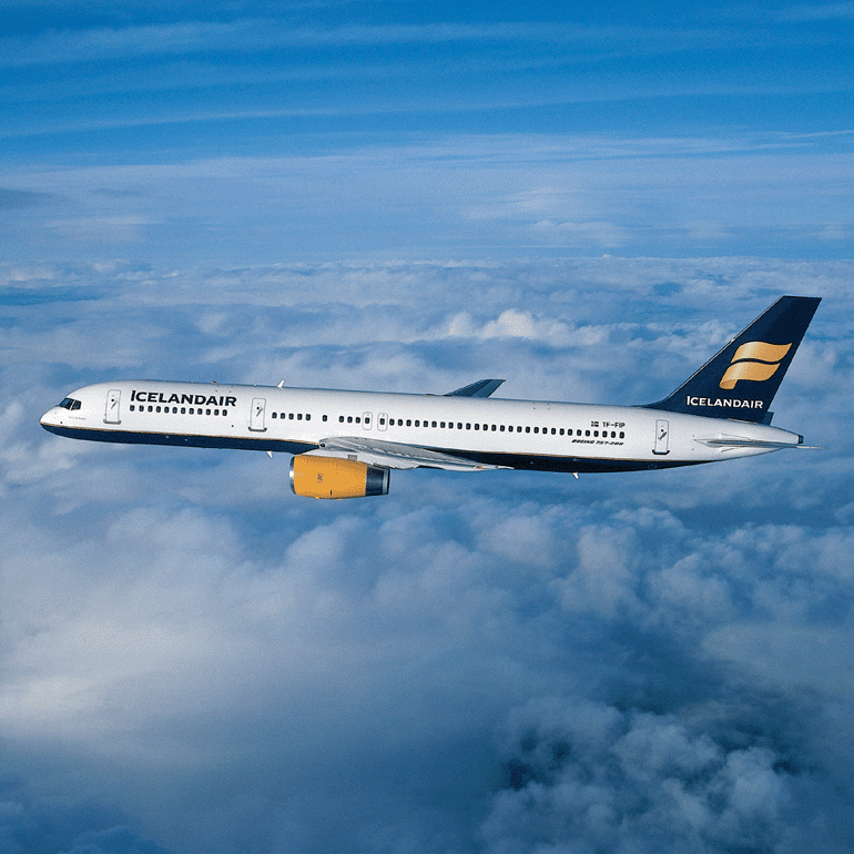
Well I think its awful but using the tail reminded me of how Icelandair does it. Theirs is a much more beautiful design and execution which has stood the test of time..
Sas’s comment is:
I apologise profusely for the insanely large images I inserted here! How embarrassing...
On Apr.01.2008 at 09:54 PM
Audrée Lapierre’s comment is:
HAHAHA at the tweaked S, omg thats so trashy
On Apr.03.2008 at 11:03 AM
Anders’s comment is:
I do agree that the new one is horrible. They constantly change logos, so it probably won't be long before the new one is dumped.
It is, however, based on the identity that they used in the 80's and probably most of the 90's, which can be seen on a model from a game here:

Mark’s comment is:
I like that paint scheme better,I mean the one from the 80's and 90's, plus the S doesn't look so clunky on that version.
On Apr.03.2008 at 12:33 PM
ML’s comment is:
I just saw their commercial on tv over here in Sweden. It was better than the logo.
On Apr.08.2008 at 02:37 PM
Yeison Agudelo’s comment is:
ugh horrendous
the old one was so childish
and this one is just nor modern at all
for an airline i dont like it at all
Aose ’s comment is:
The TV ad is better than the new logo, the new logo is better than the old one but that is no excuse. A big strong S is OK what with so many airlines going bust at the moment. Same with using CAPS rather than all the soft characters that are so fashionable at the mo. The worst thing for me is the slogan. Might work in the US but it's just too arrogant for Scandinavia.
Also won't the big S look worse on the flipside of the tail?
On May.01.2008 at 03:07 PM
ollie’s comment is:
Hi i was just wondering if you couls email me the plane liveries, as a file?
On Dec.09.2008 at 10:46 AM
Comments in Brand New, V1.0 have been closed.


