

NOTE: This is an archived version of the first incarnation of Brand New. All posts have been closed to comments. Please visit underconsideration.com/brandnew for the latest version. If you would like to see this specific post, simply delete _v1 from the URL.
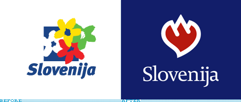
Recently, Slovenia, like many countries and other destinations, decided to undetake a rebranding. Unfortunately, also like many, they decided to make it a competition. Although Fundacija Brumen, the local design organization, protested, Slovenia went forward with separate competitions for the new logo and the new tagline.

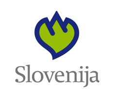
The logo, designed by a Slovenian design firm called Luks Studio, is supposed to be Mount Triglav (the tallest mountain in Slovenia), a linden leaf (a symbol of Slovenian culture) and a heart. To me, it just looks like a flaming heart. Unless your name is Malcolm Grear, it’s usually hard to combine more than two symbols into one cohesive and readable unit. This was not a successful attempt, especially since this a logo aimed at tourists who may not be aware of two of the three references. What I also find remarkable is that the new logo is far less friendly than the old. The icon and even the type seem too formal compared to the hand-drawn flowers breaking out of the square.

The new tagline, created by an Agency called Nuit, is “I Feel Slovenia”, with the word “Love” in Bold. I don’t think there is a graphic standard as I have seen it twice in two different typefaces, but I think it is interesting that it can not live without design meaning it doesn’t work verbally. I really like this tagline and between the logo trying to incorporate a heart and the the tagline trying the same, the tagline is much more successful. Great work.

Here is an alternate color version presented by Luks
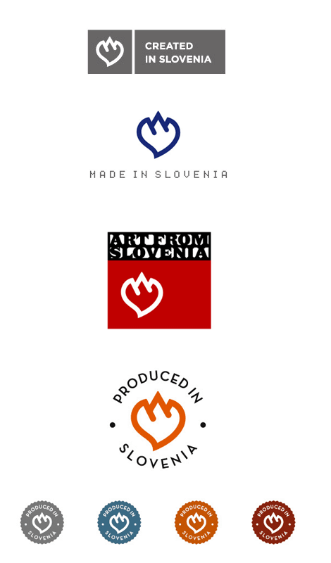
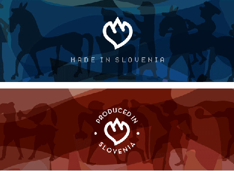
Here are a few usage options presented by Luks for products and services created, made, produced or from Slovenia.
Here is an alternate sketch presented by Luks
In the end, I really like the tagline and I love the energy with which Luks approached the design.


Jump to Most Recent Comment
Andrew Sutherland’s comment is:
My first reaction: The new logo is a great improvement. I immediately recognized both the heart and the mountains, and that's as far as I read into them. I find it to be effective, simple, and inviting. The typography also seems much improved to me. It's also unique enough to be recognizable at a glance.
That, and the old logo feels kinda like an 80's airline logo. Perhaps you know what I mean :).
So I have to disagree with you. I think they nailed this new design.
On Nov.21.2006 at 01:41 AM
Tim Van Damme’s comment is:
If it was supposed to be a flaming heart, the designer did a bad job. But don't forget that people visiting this site most of the time have a trained eye for such things. People visiting Slovenia may wonder "What's cooking?"
Let me please say I really love this site, one of my RSS-fav's! Keep 'm coming!!
- Tim
On Nov.21.2006 at 03:13 AM
sendai’s comment is:
I'm curious, the text in Slovenian, "Slovenijo čutim" does that have the same meaning as the English tag-line?
On Nov.21.2006 at 03:47 AM
Jordi’s comment is:
:( I have a t-shirt with the old logo!
On Nov.21.2006 at 04:35 AM
vuk’s comment is:
Slovenijo čutim does translate literaly as 'I feel Slovenia' but the bold part means I feel her.
Of course it is practically impossible to think up a direct and well functioning translation of a pun {like Might/Night = Macht/Nacht} so usually the whole concept of the pun is translated {this is the reason why for instance it took Italo Calvino to translate Quenneau to Italian and Danilo Kiš translated it to Serbo-Croat}.
There was lots of controversy in our country about the logo and sign, with way too much daily politics and bruised egos. The branding campaign itself still has to kick off and in terms of reactions I only saw a satirical piece combining the new slogan with the xenophobic episode involving our right wing government and a gipsy family... not really relevant in this forum.
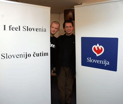
One more detail: the smiling guy wearing the cap with the slogan is chief of government. Name is Janez Janša.
Armin’s comment is:
I actually VERY much like the new logo. But just like some people are attracted to shiny objects I am deeply attracted to chunky logos. And this one is exceptionally chunky and well executed. I knew right away it was a mountain (or a mountain range) and a heart – flames don't yield these kind of shapes. The linden leaf is icing on the cake. And I also like the contrasting slimmer and elegant typography. This logo depicts a passionate and strong country. I can imagine this logo in a huge banner greeting you at the airport. It gets an A+ from me.
The tagline on the other hand, doesn't do it for me. In english it sounds slightly smarmy… "feel Slovenia". BUT, I very much enjoy the play with the words and seems like a solution that was so evident that it would be foolish to not use it.
Vuk, thanks for the extra information.
On Nov.21.2006 at 08:34 AM
paul’s comment is:
I guess what feels missing is a deep and comprehensive application of the new design across all possible communication platforms. The common thread throughout is the mountain/heart mark, but it seems to be just dropped into most of the other executions, (like dropping the mark in a white box, then a blue box, etc.). It does not feel integrated into the various executions. See the Bahamas logo by Duffy for a good example of how this can be done well.
And yes, the disconnect between the new logo and the new tagline feels like a problem.
On Nov.21.2006 at 09:41 AM
Jose Nieto’s comment is:
I'm with Armin on this one: I responded readily to the design, and the typography seems like a great improvement. The use of the contemporary serif gives it a nice European feel – both respecting tradition and looking to the future. I saw the heart and the mountains immediately, but I think the point of a mark is ultimately to be memorable, not readily decipherable, and this one succeeds well in that regard.
On Nov.21.2006 at 10:21 AM
Kosal Sen’s comment is:
I can't help but feel that the new logo is giving me the finger.
On Nov.21.2006 at 10:55 AM
Loren’s comment is:
I think the new logo is way too corporate-looking. The mark itself is also, frankly, not beautiful. The mark on it's own is ugly. It looks like a bear's paw, with a hideously thick outline.
The type is definitely an improvement though.
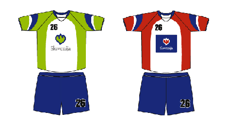
The red and white jersey with a blue box plopped in the middle?? terrible.
I'm sorry I'm being so harsh, but to me it looks like a sophomore's design project. I can't believe it won.
On Nov.21.2006 at 12:33 PM
Andrew’s comment is:
To me it looks like Slovenia shows a finger to everybody and welcomes to feel it at the same time. But it could be just me :)
On Nov.21.2006 at 02:03 PM
Jason L’s comment is:
I'm all for chunky, but not for clunky. And the mark reads a litttle heavy to me, but I don't hate it. I do wish the leaf were a bit more evident. The typography is a definite improvement. Some of the examples of application are less than inspiring, but some are very nice, in particular the lensed illustrations.
The tagline is on the money. Like Armin says, the solution is so right there you can't not go in that direction. All in all a pretty solid end product. I wonder how it reads to the international audience, and what they're expectations are?
On Nov.21.2006 at 02:19 PM
stock_illustration’s comment is:
I think it's worlds better than the flowers, but I too am a sucker for chunky logos. Love the new typography as well. The only problem I have with it is there is something about the shape that isn't quite right to my eye, but I can't figure out what is bothering me. It appears to need to be slightly skewed to the left to me. Maybe my glasses need cleaning...
On Nov.21.2006 at 02:26 PM
Ravenone’s comment is:
My first impression was that the logo was giving me the finger, followed by "oh look...it's a heart giving me the finger..." I 'got' the image after it was explained, but wonder how many people will imidiately understand what the image is about? -I'm not sure. I might be reading it all wrong because of my US background and lack of experience with European culture.
On Nov.21.2006 at 02:48 PM
Von Glitschka’s comment is:
I like the fact when I first looked at it the mark intrigued me. I was able to deduce it's meaning but it created a good curiousity. In context of the total branding it works really well. Nicely done.
On Nov.21.2006 at 03:23 PM
Loren’s comment is:
I think it's accurate to say that it's not a combination of 3 symbols, but rather only 2 -- the mountains and the leaf.
On Nov.21.2006 at 04:34 PM
[tom]’s comment is:
I like the type, but the logo itself bothers me.
I'm with Loren. It looks like a bear claw. It gives me this feeling like they want me to think that having a bear swinging his paw at you is actually a good thing...
On Nov.21.2006 at 04:36 PM
maria’s comment is:
I like it, simple and compeling!
It is about the love for the geographic nature of the country. NICE!
David’s comment is:
The type is a great improvement on the old logo.
the mark is interesting, the combination of the mountain and heart is a good one, but the final product looks bad, its bland, to corporate and the top part looks pasted on.
the slogan isnt doing anything for me, I find it kinda tacky actualy.
Doug F’s comment is:
I love it as well and think it's particularly versatile as shown in the various applications. I wouldn't have known that Slovenia is a mountainous country but the logo hints at it quite nicely.
On Nov.22.2006 at 11:16 AM
fatknuckle’s comment is:
I thing the typography is quite delicious. Its refreshing to see a European identity not set in the modern sans.
I do however have a problem in the execution of the symbol. While a good start, the mark lacks the humanist touch of the serifed typeface. A lttle to heavy in several of the applications shown, looks great small (like the produced in...tags) but anything over the size of a quarter I think would make it awkward. With the addition of some variations in the stroke width, especially in the terminals of the mountains, it could be quite the stunner.
The heart giving me the finger reminds me a bit too much of past girlfriends...
On Nov.22.2006 at 01:02 PM
Darrel’s comment is:
I agree that it's trying to do a tad too much. But, that said, as a mark unto itself, it's unique, even if not readily identifiable in any literal sense. (BTW, is there anything WRONG with it looking like a flaming heart?)
It *does* have a bit of a 'giving us the finger' feel to it, though.
On Nov.22.2006 at 01:26 PM
Oscar Bjarna’s comment is:
The heart itself looks ok when it's small.
Not so fond of it when it's big. Looks a bit chunky.
The idea behind the mark is good but maybe could be better executed, you don't get the idea unless you know about it.
The type itself looks ok to me. Maybe a bit fine with a chunky mark like that. Maybe smaller/lighter heart or stronger type would be better..
But maybe that's just me. :)
Samo Acko’s comment is:
I would like to add, that this proposal won also because it was the only one, that reached the minimum criteria.
The prize for the winning proposal would amount to aproximately 3000 euro for the logo and the same for the slogan - which included copyright transfers.
In the jury of ten there was only one (!) relatively unknown graphic designer. Six members (the majority) were polititians.
The competition was boycottet by most of the well known deisgners and students of design because of the unprofessional way it was held (it was badly written, the jury was mostly nonprofessionals, it would not nearly reach ICOGRADA standards; the diction for the symbol was "logotype" which is not what the result was ...)
Besides the mentioned Fundacija Brumen, the competition was also criticized by the local Art Directors Club.
It is also worth noting, that the brief mentioned a clause, where all the proposals, of which the identity is in any way revealed before the conclusion of the competition, would be expelled. The above picture of the chief of government was taken before the conclusion of the competition. The author of the slogan was known to the chief of the public relations and media office of the government, who was also a member of the jury. That suggests a set up.
I am a stundent of visual communications in Ljubljana, Slovenia. Me and my fellow students are appaled by the unprofessional way the competition was handled. As we are going to be affected in the future by the standards that a national design competition sets (or at least the example it gives) we ask you to write a letter of support to the Brumen Fundation, which represents graphic designers in criticizing the way the competition was held.
Brumen Fundation: info[at]brumen[dot]org
or
my e-mail: samo[dot]acko[at]siol[dot]net
Thank you!
On Nov.23.2006 at 02:00 PM
Pawel Jonca’s comment is:
Is this a new slovenian gaz company on the market? :)
The only thing I see here is the flame and.... it's red :/
Rob’s comment is:
I think the new logo really works. It comes across as bold and strong, and I got the mountain/heart without a thought of any flames.
The tagline, on the other hand, seems just a bit too forced. Yeah, it was an obvious solution but the handling of the type seems awkward. It seems to force the solution rather than letting it just happen.
On Nov.25.2006 at 01:23 PM
Ben’s comment is:
I think the typeface is a nice choice (like said before, a nice departure from the ubiquitous modern sans), but I think there should be more variation in weight of the stroke on the logo itself to match the higher line contrast of the serif face.
That might also make the content of the logo more evident, bringing out the fact that it's a leaf and a mountain. Regardless, it's a tough job to represent an entire nation with a little mark. Even though I'm not very partial to it, it's a marked improvement from the 80s-esque flowery logo.
The slogan? I dunno. I bounce back and forth between thinking it's cute and thinking it's too too cute. And it reminds me a little too much of 'I AMsterdam'.
On Nov.25.2006 at 05:11 PM
Ryan’s comment is:
Although the new logo and type treatment are not bad by any means, I think the designers approached this project in the wrong way. The end result looks like the mindset was that Slovenia was a corporate brand of some sort, and that the purpose of a new brand was to "sell" people on the idea of Slovenia. All they really succeeded in doing, though, was making Slovenia look like a corporation and not an enjoyable tourist destination.
The prior logo was enjoyable and communicated something everybody loves: flowers and springtime. Looking at the old logo, I can see myself frolicking in a meadow of flowers and enjoying the mild weather.
With the new logo, I get the feeling that I'm buying mountain spring water...but really expensive mountain spring water (not that cheap Sparkletts stuff). I don't see an enjoyable destination in the new logo, and I don't picture myself doing anything but looking at some mountains.
Oh yeah, and where the hell did the leaf go? If you're going to tell people there's a leaf in there, make it obvious. A simple outline of a leaf-like shape doesn't work in this situation. They'd be better off telling people there are only two symbols: a heart and mountains. At least people wouldn't see the poor leaf execution.
On Nov.26.2006 at 06:37 PM
Ryan’s comment is:
I'd also like to note that I see a Spork in that shape. If only Slovenia and KFC could get together and make some mashed potatoes.
On Nov.26.2006 at 06:38 PM
iblameyourmother’s comment is:
The I Feel Love message works well, though it wouldn't work so well for Scunthorpe or the Arsenal FC ground (sorry, couldn't resist).
On Nov.27.2006 at 11:26 AM
Vuk’s comment is:
Well, here's the caricature I mentioned earlier, depicting racist mob chasing gypsies (something to do with our current government's pre-election tricks exploding in their face).

It was published at the weekly Mladina and is currently featured at the cover of their site.
felix sockwell’s comment is:
What Slove got to do, got to do with it?
too bulky. too rigid. no too lovely.
On Nov.28.2006 at 02:44 PM
Ed’s comment is:
I really enjoy this logo...
On Nov.29.2006 at 04:20 PM
Mark’s comment is:
Makes Slovenija look like a brand rather than a country.
kind of awkward looking and why did the choose red (a color that known for it's intensity) as the main color for the symbol?
granted, the previous logo wasn't all that great, but you can't possibly sell the tourist expreience of a destination on a simple small logo and a catchphrase that doesn't hint on anything what the country is like.
You've got two elements in this logo the symbol and the slogan.
First let's review the logo which is made of three parts: a mountain,a heart,and a leaf....okay, so you put them together and it forms a nice looking logo. Great,so what does that tell about Sloveinja ?
nothing, so what differenciates Sloveinja from any other country that has mountains, leaves, and something to do with hearts?
It's supposed to be Mt. Trigalv with a linden leaf and a heart, right?
Well all I can see (without being explained what it's 'supposed' to be)is some pointy object (the mountain) surrounded by a curvy shape (supposedly the fig leaf) um, okay so does that make the country more appealing to me? make it a possible vacation destination? eh,no.
How about the slogan? "I feel slovenija"
Okay,so how the heck it that going make people go there? What the heck does that say about Slovenija? How does that make Slovenija more appealing? "WHAT THE HECK IS SLOVEINJA"? is probably a question a lot of people will ask.
frankly, this snazzy logo and clever catchphraise doesn't make Slovenija look any more appealing to me than before.
When you're dealing with tourist attractions you've got to SELL the best experience of what you're destination can offer them while hinting about the best attributes of your state/city/country.
It's got to 'click' in peoples minds what the destination all about.
Heres a few good examples of this:
The famous I (heart) New York campaign, why does it work? because the simple typographical font of the letters makes you think of a city,which city NY stands for? New York, which then you picture immediately it's attractions such as Broadway,Time Square,The Empire state building and etc.
Only Vegas campaign, why does it work? it's lettering is associated with vintage flashy neon signage, the name "Vegas" in it's self is associated with gambling, but being in that 50's era script further evokes flooding familar images of The Strip with it's gaudy bright over-the-top lit signs which in turn is what it's implying Las Vegas-the gambling capital of the world!
But how about when were dealing with a whole Country? while tougher it's simple to pull off once it's done right.
Discover Ireland campaign in this one they use a stylized three leaf clover which in turn is associated with the Irish,which in turn is associated with Ireland which immediately evokes images of the green Irish landscape etc.
the same thing with the Austraila campaign, in which they use a stylized Kanagaroo infront of a desretlike sun, kangaroos obviously being associated with Austraila immediately evokes desert landscapes of Austrailia and it's landmarks such as Sydney etc.
So basically what I'm saying here is that you have to a least show what your country is all about!
Now seing this Sloveinja identity I notice it's certainly mountainous and has linden leaves...but nothing clicks all I can think of is some place with snowcapped mountains and......nothing else except something to do with linden leaves and love(I guess?)
At least the previous identity showed somewhat of a clearer picture flowers up close usually associated with high mountainous areas,snow capped mountains large vistas on high elevated areas, some country similar in landscape to Germany etc.
But thats how far I get.
This new logo doesn't 'tell' me much about the country.
vuk’s comment is:
This just in:
Slovenian govt has just decided to NOT support the new logo for country promotion and so there will be one more competition.
Thought you'd find this interesting.
Armin’s comment is:
How more awesome can it get than solving a contest with another contest? Thanks for the update Vuk.
On Feb.07.2007 at 04:54 PM
rp’s comment is:
It seems the new design is getting controversial critiques, but I think it's still a great improvement over the previous logo.
The old one is uber-boring... colour-painted flowers and bold italic type, yawn. The usual "tourist office stuff, I don't even bother looking at it".
To me, the new one is catchy and inspires immediate simpathy for a trip in the country
On Apr.26.2007 at 01:59 PM
Comments in Brand New, V1.0 have been closed.


