

NOTE: This is an archived version of the first incarnation of Brand New. All posts have been closed to comments. Please visit underconsideration.com/brandnew for the latest version. If you would like to see this specific post, simply delete _v1 from the URL.
![]()
Here is one that almost passed under the radar and is not as fresh as our usual offerings. Back in very late September, Florida-based Spirit Airlines unveiled a new logo and livery that would replace the current identity that was merely five years old — one that, in use, happened to look pretty darn nice for a low fare airline [see the prior livery design after the jump]. The new identity “celebrates the colors of the Caribbean and Latin America regions” and reflects the main routes of the airline, which flies half of its flights (and growing) to destinations in those sunny regions. Besides the new 70s-styled, italicized Helvetica wordmark, Spirit has also introduced a “stylized” S [seen on the new livery after the jump] that further emphasizes their Caribbeanness, with each color getting a clever name and association: Caliente Red, Low Fares; Palm Tree Green, On-time and Reliable; Sunshine Yellow, Clean New Planes; Ocean Blue, Friendly Staff. So there you have it. The previous identity was purposedly more business like and the planes (from the outside, at least) looked like you were getting more for your money, while the new ones feel like they would not exceed your expectations. At all. The new identity feels like a step back and like it would belong better in the 80s. But, hey, you would be going to the Caribbean, right? Who cares what decade it looks like you are flying in.
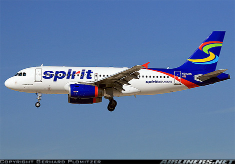
Livery before and after.
Thanks to Dave Klonke for the tip.


Jump to Most Recent Comment
Mr. Todd’s comment is:
I thought the new logo was an improvement, not good, but an improvement, before I saw the application on the plane.
definitely a step back in terms of overall identity.
On Dec.17.2007 at 10:43 PM
K. West’s comment is:
I like the stacked tiles. I'm a square-man, man.
On Dec.17.2007 at 11:02 PM
joel’s comment is:
The new logo is forgettable, but a minor improvement. However the brand continuity is totally shot, and a definite step backwards. =(
Looks like the plane was a 20 minute job or something.
John Mindiola III’s comment is:
it's hard to pull off happy and friendly and still make it look like it deserves to be taken seriously. apparently, it was hard for these folks, too.
On Dec.18.2007 at 01:24 AM
Christian Palino’s comment is:
The previous plane with the old livery was definitely on a cigarette run for the Death Star.
On Dec.18.2007 at 05:29 AM
Moriarty’s comment is:
The new logo itself is better (but way short of nice), but the application of the old logo to the livery made it look really nice, where as the new logo looks nothing short of horrid on the side of a plane.
But, at least it looks low cost now…
On Dec.18.2007 at 06:58 AM
Nubloo’s comment is:
I agree with Mr. Todd. The new identity is a bit too generic and could fit a gas station as well as a chewing gum.
On Dec.18.2007 at 08:30 AM
Ty’s comment is:
The old logo looks like it has so much potential for something better. I'm disappointed that it was completely abandoned and not improved upon.
On Dec.18.2007 at 09:27 AM
craig shully’s comment is:
The design adaptation to the plane is disjointed.
If you are going to funk up the plane graphics - go all the way like Pucci did for Braniff did in the 60's
On Dec.18.2007 at 09:53 AM
Anonymous’s comment is:
The colors are way to primary to be Caribbean influenced. Teals, light oranges, blues, terra cotta sunrise colors, hell, even purples would add a more festive Caribbean flair.
The typography is weak for both, but I agree that tile graphical element was much more compelling. This identity is blasé especial with such a competitive brandscape as airlines are concerned.
Better luck next time. Any note on who did the work?
On Dec.18.2007 at 10:00 AM
Jung’s comment is:
One might remember because it is so ugly.
And that thing on the tail must be from clip art.
Joseph Szala’s comment is:
The colors are way to primary to be Caribbean influenced. Teals, light oranges, blues, terra cotta sunrise colors, hell, even purples would add a more festive Caribbean flair.
The typography is weak for both, but I agree that tile graphical element was much more compelling. This identity is blasé especial with such a competitive brandscape as airlines are concerned.
Better luck next time. Any note on who did the work?
On Dec.18.2007 at 10:08 AM
JasonP ’s comment is:
Spirit needs to hire a new design firm. Granted the airline is low budget but I'm sure they could have ponied up a few more dollars for a decent designer.
On Dec.18.2007 at 10:33 AM
wallybear’s comment is:
Take Joseph Szala's improved Caribbean influenced color scheme, apply it to the old aircraft livery, modify the old logo a bit, finished. And it would have been good.
On Dec.18.2007 at 11:36 AM
C-Lo’s comment is:
Ugh take it away. Bring back the squares. We don't need an actual Austin Powers jet flying around. The main logo is completely misguided, and seems to me of someone taking a "shot in the dark" for a logo. Abysmal letters with "corporate blue" colors trying to be "tropical and fun". I'd take another airline company even if they were more expensive this logo is so bad. I'd take a train first. Is the branch and the terminal of the R supposed to match the clip art on the tail, or was it a lucky match? So many things wrong with this
On Dec.18.2007 at 11:50 AM
Willis’s comment is:
The new identity looks like a brand of toothpaste, and it's application to the plane makes it look like the tube. Perfect.
On Dec.18.2007 at 11:51 AM
Seth’s comment is:
The S on the tail looks an awful lot like Google Desktop. Although I wonder how many other applications of the 4-color super swoosh are out there...
On Dec.18.2007 at 12:22 PM
Ryan’s comment is:
Good lord that's a bad application.
On Dec.18.2007 at 12:36 PM
Andy’s comment is:
Don't care for the new livery either, but the old made me think the plane was made of Lego. I hope they snapped the tail on tight!
On Dec.18.2007 at 12:46 PM
Andrew J Klein’s comment is:
Was the plane painting company having a sale on swooshes?
The color choice does not make me think of tropical or Caribbean
Logo is uninspired but could have been saved by an interesting application
On Dec.18.2007 at 04:04 PM
BWJ’s comment is:
Reminds me of Sears...especially after they bought Kmart and added the red swoosh.
![]()
Les Ismore’s comment is:
That sucks.
On Dec.18.2007 at 04:38 PM
Darrin Crescenzi’s comment is:
Boy, those are both dreadful! This is just a comparison between two vastly different types of bad. How can that first identity have been designed five years ago? It was fifteen years old the second it was unveiled!
Agreed that those new colors are completely wrong for their intended communication. This is the kind of thing that happens when neither brand nor designer actually understands what the company stands for, but proceeds with a redesign anyway...
Despite my love and respect for the typeface and its historical importance, are there letterforms with LESS "spirit" in existence? Just plain inappropriate.
On Dec.18.2007 at 11:23 PM
hezz’s comment is:
The old design says dull, business and waiting for rusty bits. The new one atleast has colour and looks fresher. While I think the old design is okay, it just didn't communicate correctly. It's a small improvement even if it is a bit cheap.
On Dec.19.2007 at 06:25 AM
Jamie’s comment is:
I've actually flown on Spirit Air and before I did I heard all sorts of horror stories about lost luggage, planes leaving people, etc etc, and although the old logo feels more business-like, I still felt a little safer than if the new logo was on the plane. And another thing, I'm latin, and the new execution speaks nothing of latin culture whatsoever.
On Dec.19.2007 at 09:40 AM
Carmen’s comment is:
Does it look cheap or unsafe? Do you want people to take you serious or not. Remember impressions count, isn't that what our business it about, after all.
On Dec.19.2007 at 09:40 AM
puckeroo’s comment is:
The old scheme of the gradient-effect blocks do give the livery an upscale look
- either that, or some stealth ability!
It looks like the old typeface is just "Myriad" stretched about 150% in illustrator. Not very spirited.
Could the "primary-ness" of the colors on the new plane be due to some oversaturation of the image? Or is the whole thing a result of the designer's addiction to SPREE candy?
On Dec.19.2007 at 12:09 PM
Darrin Crescenzi’s comment is:
Ha ha ha, "stealth ability." That would be an interesting marketing campaign: "You'll get there, but nobody will ever know..."
On Dec.19.2007 at 01:39 PM
David Sanchez’s comment is:
I think is ghetto. There you have it I wrote it, thus again Ghetto. They killed the brand equity they had with the previous squared signage system. They should thought on evolving the previous progressively, not such an abrupt change. GHETTO.
On Dec.19.2007 at 02:50 PM
TheUprock!’s comment is:
The old logo was nothing amazing, but it sure does look a lot better on the plane than the new one.
On Dec.19.2007 at 03:13 PM
David Sanchez’s comment is:
Nothing Amazing?, that’s a bold statement mate!, I am sure you will have the same notion about the little Caroline Davidson’s Nike Swoosh around 1971. Spend millions in branding campaigns… and anything will be memorable. Anyway Spirit Airlines flushed down the toiled five years of equity.
On Dec.19.2007 at 04:05 PM
Wookiepants’s comment is:
Wow, lots of haters. Some interesting comments, like:
"Spirit needs to hire a new design firm. Granted the airline is low budget but I'm sure they could have ponied up a few more dollars for a decent designer."
That's pretty much the standard response around here if you don't like a design. Obviously you must be new. I'm sure if you knew the how many entities (CEO's, Boards, Committees, etc.) are involved in rebranding/logo applications, you would be staggered. It's always easy to design from the armchair without a design brief (also a standard argument, to be sure). Anyway, the point is you can't always just single out the Design Firm for a good rib kicking.
I see a design without a single gradient or 3D effect. I say not bad.
"...I still felt a little safer than if the new logo was on the plane."
Are you serious? I have to tell you, I fly on Southwest Airlines all the time and their paint scheme is pretty damn ugly. Yet I feel perfectly safe, they're cheap and on time.
"And another thing, I'm latin, and the new execution speaks nothing of latin culture whatsoever."
What? They don't use Helvetica or Red, Green, Yellow and Blue colors in latin culture? It looks like they fly into several major cites across the U.S. plus the Caribbean and Central/South America. That's a lot of cultural ground to cover. It's inoffensive at worst.
As for the old logo... well, I'll just borrow some standard vernacular:
"It looks like it took them about 15 minutes to design that"
: )
On Dec.19.2007 at 08:18 PM
disgruntled designer’s comment is:
the old version was much better in application than as a logo. the new application looks like a bad 80s throwback. r/g/b/y... risky!
On Dec.19.2007 at 09:07 PM
Roby Fitzhenry’s comment is:
The look went from somewhat militant to somewhat hideous. Should I dare ask what they paid? Perhaps they bartered for trips to the Caribbean ...
On Dec.21.2007 at 02:31 PM
Roby Fitzhenry’s comment is:
The look went from somewhat militant to somewhat hideous. Should I dare ask what they paid? Perhaps they bartered for trips to the Caribbean ...
On Dec.21.2007 at 02:31 PM
Roy’s comment is:
The old logo on the plane is awful. I'll be in the minority and say the new logo is a big improvement over the former.
On Dec.22.2007 at 08:52 PM
wookiepants’s comment is:
Jet geeks seem to like it:
Airliners.net
Mark’s comment is:
why?
the previous design was ingenious, especially on the tail.
maybe it's to save cost and have less painting on the aircraft.
On Dec.24.2007 at 12:28 AM
Greg Formager’s comment is:
I could care less.
On Dec.26.2007 at 09:53 PM
Gentleman Agitator’s comment is:
The problem for Spirit is begins with the name. The spirit of what? It's hard to make a logo around a word like spirit without it modifying something.
On Jan.03.2008 at 05:02 PM
Char Alfonzo’s comment is:
Design isn't consistent throughout the entire identity. I saw the logo and said "ok"... I saw the plane and said "huh?".
On Jan.09.2008 at 01:58 PM
Andrew’s comment is:
My first thought looking at the new logo was "it looks like it says Spiiit."
Spit? Yuck.
On Jan.17.2008 at 12:30 PM
cdub’s comment is:
the new one blows donkeys on numerous levels
On Jan.18.2008 at 01:41 PM
Andrew’s comment is:
I have a complete adoration for beautiful airplane graphics (sigh). Both of these, as you all mentioned are ponyloaf. If anyone knows more info about who designs for airplane graphics, or a gallery, etc, let me know! A couple much, much, better ones:


Comments in Brand New, V1.0 have been closed.


