

NOTE: This is an archived version of the first incarnation of Brand New. All posts have been closed to comments. Please visit underconsideration.com/brandnew for the latest version. If you would like to see this specific post, simply delete _v1 from the URL.
![]()
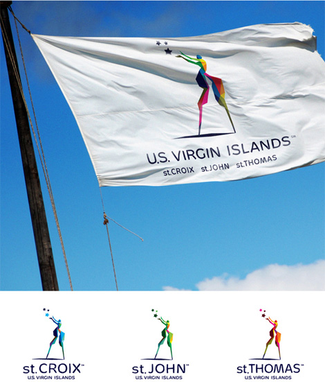
No matter where you are right now — specially on a Monday — the thought of being in a Caribbean island surely does not sound like the worst alternative to reading about logos on a blog. But if, like the rest of us, you are stuck in front of your monitor the least we can do is show you some design related to Caribbean islands. Earlier this year the Department of Tourism of the U.S. Virgin Islands launched a new identity, designed by J. Walter Thompson, with a Mocko Jumbie, a traditional stilt dancer, as its main icon.
“We decided it was time to adapt to the changing marketplace and develop a new logo and branding that truly represents the U.S. Virgin Islands and symbolizes the unscripted vacation experience that comes with having three very distinct islands and a variety of unique experiences to choose from,” explains Commissioner of Tourism, Beverly Nicholson-Doty. “The Mocko Jumbie character symbolizes the vibrancy of our people and our culture, while the stars represent the enchanting and individual spirits of St. Croix, St. Thomas and St. John.”
— Press Release [PDF]
![]()
Detail of icon and logo in one-color application.
This is one of the best destination logos I have seen in a while. The exotic, vibrant and varied nature of the U.S. Virgin Islands is very well captured in the colorfully fragmented icon, which has a lovely graphic tension with the small upper body and giant lower body. The three stars representing the main three islands (St. Croix, St. John, and St. Thomas) add a certain magic flair to the logo without, I think, being too corny.

Detail of typography from PDF.
In terms of the typography, I’m really not sure what’s going on, the press release PDF shows a very distorted treatment which is not quite as evident as the logo on the web site, but it may just be the size difference. If it’s indeed intended to be so scribbly, I think it could have been a little less of an Adobe Illustrator Distort filter. Nonetheless, I have to admit it looks good when reduced.
So if you can’t fly to the U.S. Virgin Islands any time soon maybe just get yourself a pair of stilts to go with your business casual attire.
Update: Thanks to first-commenter John for pointing out that the work is also represented at Iconologic. The image from their web site is shown above. The press release I quoted originally states “Following a series of focus groups and months of rigorous market research by Atlanta-based advertising agency, J. Walter Thompson […]” so I assumed wrong that JWT did the logo as well.
Thanks to Felix Sockwell for the tip.


Jump to Most Recent Comment
john’s comment is:
J. Walter Thompson? They might want to check with Iconologic in Atlanta: www.iconologic.com. "The Jumbie"
On Jun.29.2009 at 08:02 AM
Armin’s comment is:
Thanks for pointing that out John. I have amended the post.
On Jun.29.2009 at 08:18 AM
d_rek’s comment is:
While it's certainly a very interesting an appealing identity I don't really think it expresses all that well the true culture of the USVI.
If you've ever spent an extended period of time on any of these islands you'd know what I mean.
On Jun.29.2009 at 08:23 AM
d_rek’s comment is:
but then again... i suppose people aren't all that interested in the 'true' culture of the USVI
On Jun.29.2009 at 08:26 AM
EnergonCube’s comment is:
The mark is interesting enough, but there's something about the typeface that is unsettling to me. I get a whiff of Comic Sans and I don't like it.
On Jun.29.2009 at 08:28 AM
josh’s comment is:
i don't think it works well as a two tone..the character anyway
On Jun.29.2009 at 08:30 AM
Gonzalo’s comment is:
I really like the logo, but the typography… WTF?! And, to me, it’s worse at small size than at a larger one.
On Jun.29.2009 at 08:32 AM
Ryan Gonzalez’s comment is:
Great logo — it's a unique and intriguing figure with a decent but bad looking type-treatment when used in large sizes.
Wish they would have used a decidedly more conventional typeface for it, but whatever.
Overall, it's very good; representative of the area it stands for, executed crisply, and not overdone.
Great idea, magnificent execution (albeit the typeface).
On Jun.29.2009 at 08:42 AM
Andrew Sabatier’s comment is:
Surprising, original, authentic and evocative. These are descriptions I look to tag onto great brand identities.
Although in the realm of non-container and static old school brandmarks this is a stunning piece of work.
Sure, stars are overdone and cliched otherwise. In this context the magic is palpable, re-imagined and credible. That stiltwalker is outlandishly represented in a gorgeous and relevant rendering that looks like a contemporary impression of a traditional activity.
This is a vision of an experience I'd love to realise beyond the branding. And, a destination brand that deserves success. I give this fresh and iconic brandmark a ten out of ten.
A.
Swifty’s comment is:
I love the color scheme and the color variants for the individual islands. I will even admit to liking the hand-tooled appearance of the text, although I will agree that it perhaps could have been pushed a little farther toward an even more hand-tooled appearance.
I'm not sure I like the "Mocko Jumbie" character. At least not at large sizes. It seems to work better when a bit smaller in relation to the text.
On Jun.29.2009 at 08:45 AM
Jonathan’s comment is:
Liking the originality... hating the negative space in Jumbie's legs.
On Jun.29.2009 at 09:27 AM
Doug Bartow’s comment is:
Cross-promo capable:

Ryan Adair’s comment is:
It's just strange enough for me to begin to like it.
All these tourism brands start looking the same to me...ever since the Bahamas launched that bubbly multi-colored identity a few years ago...every Tropical tourism location that goes through a rebranding process seems to do their own version of that exact same idea.

jRod’s comment is:
i like the way the star that represents the island is highlighted in the 3 different versions. very subtle but still noticeable...
On Jun.29.2009 at 10:02 AM
Tony’s comment is:
'Specially' is not a word. 'Especially', however, is.
On Jun.29.2009 at 10:10 AM
Sand’s comment is:
HADOKEN! ... j/k
I love it. The colors are beautiful, the typography reflects the (fractured) uneven finish of the logo and it's totally appropriate for it's industry/target market.
I wonder about the lowercase "st." but I suppose it emphasizes the name of the island better than if it were "St."
Tourism logos should *look* like tourism logos. No need to re-invent the style if it conveys the right message (imho)
On Jun.29.2009 at 10:22 AM
Anonymous’s comment is:
I kind of like the hand-made type. It's laid back, like you'd expect of the Caribbean, and I think it's quite classy. While I also like the shape of the marque, I think using a mocko jumbie, is a bit generic and cheesy. what you'd expect out of cirque du soleil. the mock jumbie also makes it feel immediately dated. mid-90's that is.
On Jun.29.2009 at 10:26 AM
got1right’s comment is:
Beautiful. Elegant, whimsical, warm and inviting.
Everything a tourism campaign should be. Typography is perfect-- completely embodies a sense of leaving the strict lines and times of life off the islands. WELL DONE!
Gonzalo’s comment is:
@Tony: both are adverbs, but with a slightly different meaning. In this case, though, both are correct. If you want to stay on the safe side, always use especially.
On Jun.29.2009 at 11:02 AM
Gyula Németh’s comment is:
d-rek: Ive never been in the USVI.. how is its culture? what do you miss in this identity?
By the way I LIKE IT as it is...(ok the negative space between the legs could be nicer).
On Jun.29.2009 at 11:02 AM
John Leschinski’s comment is:
I dunno, I think it's plain creepy.
On Jun.29.2009 at 11:04 AM
John McCollum’s comment is:
First of all, "specially" IS a word.
Second, I really love this identity -- including the typography. It is quirky, memorable and evocative.
It actually makes me want to visit these places. I love that the designers used a person in the logo instead of the all-too-common sunrise/beach motif.
In fact, this may be one of my favorites of 2009.
I might quibble with the wordspacing (Virgin and Islands appear a smidge too far apart), but even that idiosyncrasy seems to work for me.
A.
On Jun.29.2009 at 11:28 AM
Glenn Sakamoto’s comment is:
That figure is scary. NIce colors, though.
On Jun.29.2009 at 11:32 AM
tinpot Dictator’s comment is:
First reaction, I think it's very memorable, appealing and exciting. Some folks may not get it, but then they're not the likely demographic.
I agree with Ryan's post that there is an underlying similarity to a number of these tourism icons, but I don't think this one toe's the line to any great degree. It's better than the American tourism icon... oh wait, where is that one?
TD
On Jun.29.2009 at 11:33 AM
Joe’s comment is:
I agree with those commenting that the figure is a bit scary. Without knowing that he is a stilt-walker, I thought the man resembled a Guillermo Del Toro monster.
Now that I know what he is though,I quite like it.
On Jun.29.2009 at 11:41 AM
Ryan K’s comment is:
Having worked with Iconologic they can do some pretty great stuff, they can also get a little carried away if you don't give them good direction. I think this is a bit of both, it has some good and some 'not as good as it could be'.
The part that bothers me the most is the shadow. I know it's part of the story, found on Iconologic's website, but I think it could have been done better.
It's also quite funny how similar other island/tropical and other tourism logos are. I think it's slightly different from the competition, but not enough. I think logos should fit their market but still stand out, no pun intended. If you put this logo next to all the other logos Ryan Adair posted, I think it blends in a little too well.
Some nice creative thought, but missed the mark a bit.
On Jun.29.2009 at 11:45 AM
Carlo’s comment is:
I don't like the ground/shadow element - seems too crude for such a whimsical/fantastical icon.
On Jun.29.2009 at 11:51 AM
Ty Halasz’s comment is:
The first thing I thought of, like @Doug, was the Bahamas logo. But really, that's only because of the extensive use of color by both identities. While I have long fancied the Bahamas brand, I think this icon is superior, due to the local Moko Jumbie connection. The juggling animation is greatness.
The typography is suited for the application, but I wish they would have made it a custom font. It appears from the web site that the only usage will be in the wordmark.
On Jun.29.2009 at 12:07 PM
Proverbial Thought’s comment is:
THe mark looks like it could be a mark for Silverlight. Overall though i think it is intriguing and works well. I lover the color combination and thedifferent applications.
On Jun.29.2009 at 12:11 PM
Robert’s comment is:
The typography looks like it was live-traced. Haha.
On Jun.29.2009 at 12:17 PM
MP’s comment is:
Stylistically it is dated, somewhere in the early 90's.
![]()
ScottyM’s comment is:
The visit Raleigh logo was better.
Very nice. Font is a little goofy. Icon is terrific.
On Jun.29.2009 at 12:42 PM
Hibryd’s comment is:
Ryan - thanks for posting those logos! Fascinating stuff!
On Jun.29.2009 at 01:05 PM
Amanda B’s comment is:
I love the icon! It has movement through the lines, it doesn't feel static, and the multi colour look is great. In shape and proportion it's a little bit surreal, which fits well with the story behind the logo. The type doesn't bother me too much, I like it best when used for the individual islands.
On Jun.29.2009 at 01:21 PM
fsaputra’s comment is:
Not impressed by the choice of font on the logotype... The tracking is a bit awkward.
But I do agree with others that it has a nice icon as recognizable and memorable symbol.
On Jun.29.2009 at 01:40 PM
Chris R.’s comment is:
Designer: "I wanted the typography to look faceted, like the logo."
Client: "I want the same font as the Bahamas."
Meet half-way and everybody wins!
Overall, I think the type works well enough. I could see it working well with body copy for brochures and the like.
On Jun.29.2009 at 01:53 PM
Steve Rose’s comment is:
I think the Mocko Jumbie should face the other direction. In the first form presented above, the whole thing feels pulled apart.
The typography is fine with me. I think it has a nautical feel.
On Jun.29.2009 at 02:47 PM
Jd’s comment is:
I like the idea, but without explaining that its a mocko jumbie, I would have no idea what the heck the tall colorful magician is. To me it doesn't capture the essence or the same type magic that's captured with the Bahamas identity.
I love the icon itself, I'm just not sure its the correct icon. The star's feel cliche and a bit forced. And yes as everyone has mentioned, the type is not happening. that "v" feels like it just wants to wilt over.
On Jun.29.2009 at 03:02 PM
Wünderwoman’s comment is:
ummmmm....yuck
On Jun.29.2009 at 03:34 PM
orangetiki’s comment is:
I can dig the Mocko Jumbie. It is nice to actually learn something. If you don't know what it is supposed to be then yeah you might just sit and wonder what the heck, but once I read the description it made perfect sense. It's also good to see a little culture tie in. It gives the art a little less of a tourist feel.
I SERIOUSLY thing the lettering is a mistake. There is NO WAY they purposely made that lettering that bad. Someone left the compression on SUPER HIGH or someone got real cheap and ran some lettering through auto trace. That is exactly what the letters look like, auto traced because someone didn't have a font.
On Jun.29.2009 at 03:52 PM
Andy’s comment is:
It's too obvious to be a mistake, though it could actually have been done through live trace (you'll notice no two letters are alike).
On Jun.29.2009 at 04:18 PM
Mark’s comment is:
Very unique and artistic, I like it!
What a creative twist on a travel logo, puts NYC's new logo to shame.
Very exciting and vibrant, well done!
On Jun.29.2009 at 04:59 PM
Calvin Buchanan’s comment is:
I love how the figure is rendered like a fractal model. I love the color combinations in all four logos. I get an idea of what the type is trying to do, but it just doesn't seem to be fully resolved. Or it might be and it is just not being reproduced well. I am a fan of this mark.
On Jun.29.2009 at 05:57 PM
John McCollum’s comment is:
Quoth MP: "Stylistically it is dated, somewhere in the early 90's."
Looks nothing like the BT logo. Nothing.
On Jun.29.2009 at 06:02 PM
Paul’s comment is:
likes
On Jun.29.2009 at 07:24 PM
Tim Gengler’s comment is:
The icon makes me think of Pan's Labyrinth and the font makes me think of an Alfred Hitchcock film, so the combination gives off a feeling that something strange and mysterious will happen if I visit the islands.
Design-wise, I really like it and am intrigued, but it doesn't entice me to go on a fun-filled trip the way several other countries' identities do.
On Jun.29.2009 at 07:45 PM
CN’s comment is:
Chuck Norris once went to The Virgin Islands. They are now known as 'The Islands'.
On Jun.29.2009 at 09:00 PM
Michael Evans’s comment is:
Annual festivals are major events that celebrate the history and culture of the VIs. The Mocko Jumbie is a major icon in those celebrations and is a fitting symbol. It's image and colors embodies a spirit of tradition and nostalgia you would have to experience to fully understand.
Overall I like the image but not sure about the type... although I understand what the designer is trying to achieve.
Jason’s comment is:
Woo hoo!! I will be in St. Thomas in less than five days!!
On Jun.30.2009 at 04:52 PM
Anonymous’s comment is:
Faceted shapes were big in 2008.
Link">Link">http://www.logolounge.com/logotrends/default.asp?Archive=True&ArticleID=607">Link
Shauna’s comment is:
I don't really like it, especially on the flag it looks horrible. All the colors look too busy and bad, I like the versions with one color for the individual islands or the silhouette version.
The stars look pretty out of place, I see how they represent the three islands and it would look even worse if they had nothing there the the stars how they are looks weird.
Also the small "st." in the island names looks horrible to me since they're the only thing that is small and all the other type is big letters it looks out of place. When not on the flag the font looks nice enough.
On Jul.07.2009 at 03:13 AM
Andrew Sabatier’s comment is:
Imagine if we measured the value of things in terms of nice and horrible, good and bad, and whether we personally liked something or not @Shauna.
A subjective nightmare would ensue and the prevailing opinions would probably come from those who shouted loudest and longest.
A.
Danielle Wilcox’s comment is:
The story of this character really brings this logo to life... I love the elements of the stilts and the three stars and the meaning behind them. This identity is a step above the rest. Nice.
On Jul.12.2009 at 08:52 PM
Comments in Brand New, V1.0 have been closed.


