

NOTE: This is an archived version of the first incarnation of Brand New. All posts have been closed to comments. Please visit underconsideration.com/brandnew for the latest version. If you would like to see this specific post, simply delete _v1 from the URL.
![]()
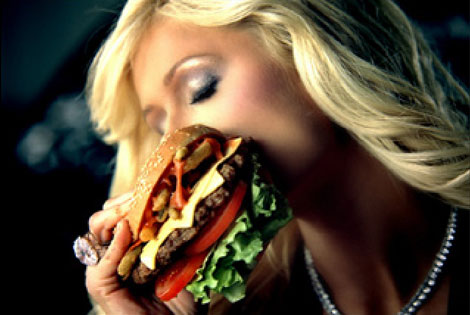
I have never eaten at Hardee’s or Carl’s Jr, mostly because I rarely eat at fast food burger places but partly because if you asked me to name five Quick Service Restaurants (QSR for short) focusing on burgers I would have a hard time getting past McDonald’s, Burger King and Wendy’s. In fact, it wasn’t until today, while googling around, that I finally made the connection that the faux hot commercial with Paris Hilton soaping up a Bentley was for Carl’s Jr. And for Hardee’s. Apparently my brand neurons never made a full synapse between these two places and Paris. Or that Hardee’s was the crazies that were pushing the 1420-calorie burger earlier this century. Perhaps the reason is that I’m not their target audience: Young, hungry guys. I guess I am the three things: Relatively young, sometimes hungry and genderly a guy. But when put together, I prefer to disassociate from my brethren. And, hopefully, this too explains why I can’t bear the sight of these new logos and much less comprehend how “research showed that the new logos were seen as classier, more unique, more appealing and more attractive overall.”
Let me first say, that the two new logos are appropriate. They fit the market, and they blend into the current state of fast food chain identity design: Extra bubbly with a side of newness. But let’s not try to associate them with classiness nor uniqueness. In terms of design execution, a closer look at the logos reveals a lack of both attributes. (Copperplate anyone?).
The new twin identities were designed by California-based Zeist Design to bring to a close the restaurant association that began in 1997 when CKE Restaurants, the parent company of Carl’s Jr., acquired Hardee’s and started merging both restaurants. In some cases a Carl’s Jr. overtook an existing Hardee’s and, overall, Carl’s Jr.’s “Happy Star” ketchuped its way into the Hardee’s identity. The new, synchronized identity will have to be integrated into — as of January of 2006 — 1,049 Carl’s Jr. restaurants and 1,993 Hardee’s. That should feed plenty of young, hungry guys.


Jump to Most Recent Comment
Mark’s comment is:
um....no thank you,a bit too much was added to this logo.
You have a bevel,a thickened outline of the letters,another shade added to the letters (chrome effect I think it's called), a star made of three colors not to mention which also has a bevel effect (added in for good mesure I suppose)all in one logo!
I know the era of simple print logos is dead, but this is just overkill!
Where's the focal point? what the heck is supposed to catch my attention first? the star? the red outline? the script lettering?
Not to mention you can barely read the byline in yellow underneith.
How many time is it going to take for people to realise that yellow text on red background hinders readability?
Even advertising agencies advise against it, because those two colors make text difficult to read.
On Jan.20.2007 at 01:21 PM

Devon Shaw’s comment is:
Simple print logos aren't quite dead, if done *right*. Even on an average day, tasteful minimalism will dwarf this overproduced trash.
I can't bear to look at these new logos. It looks like a ten year old was let loose with the blending options in Photoshop. 1996 called, they want their cheap fliers back.
On Jan.20.2007 at 01:46 PM
tde’s comment is:
An absolute homerun.
The old logos bore the taint of excess readability. You could almost hear the IBM selectric balls crashing the courier into the platen. Simply too accessible.
Now the logo is sufficiently stylized to both blur the identity of the formerly distinct brands and hinder casual recognition of the letters, thus subordinating both "word" brands to the golden star shared by both. Note that in the old logos even the signature stars were different sizes and orientations.
These new logos take a step in the right direction away from type heavy brands that purport to have any discernable meaning and move toward the ideal sublimation of cumbersome words to unique symbols.
On Jan.20.2007 at 03:08 PM
Maria’s comment is:
I would say the type helps to generate and idea of a place warmer, and more inviting, less "men only".
Class? maybe if you expect luxe with the fast food... I see: maybe your kids would like it, if you can ignore that they will get fat.
I love the smiling star! Cute and hamburgers, NICE!
On Jan.20.2007 at 04:26 PM
Ed’s comment is:
i think the logos are perfectly fitting (as stated) to an industry that neither necessitates good design or markets towards those who appreciate it. let's face it, fast food chains aren't "designerly" in any sense of the word. Therefore, fast, easy, tastey, and cheap all win out. besides, anyone who eats 1500 calories in one item of "food" isn't really all that into "tasteful minimalism" anyways.
On Jan.20.2007 at 08:20 PM
Kevin M. Scarbrough’s comment is:
For the sake of hierarchy, shouldn't the red be quite a bit darker?
Why they didn't use Illustrator's gradient mesh to render a clean, consistent, highly controllable bevel?
On Jan.21.2007 at 01:13 AM
Splashman’s comment is:
I certainly won't defend these logos, but since virtually ALL fast-food chains I've seen put their emphasis on grabbing eyeballs no matter what the aesthetic cost, I wouldn't draw any untoward conclusions about Hardees/Carls. Rag on that industry all you want, but it's kinda pointless to single out one company. It's like whining about the odor of brand X urinal cakes. Brand Y ain't gonna a whole lot better.
On Jan.21.2007 at 06:35 AM
Kevin M. Scarbrough’s comment is:
An interesting experiment for anyone in a market that Publix operates.
Food packaging, much like fast food branding, tends to be large, loud, in your face, and trying desperately to grab any and every eyeball possible.
When you stand at the end of the isle, everything just blurs together with one typical exception: the Publix brand of whatever. Consistent use of clean, white space. Makes a HUGE visual difference, and from casual observation, in purchasing decision as well.
On Jan.21.2007 at 11:35 AM
Gene Cowan’s comment is:
Hmm. Can't wait to see how badly registered this multi-ink logo will end up printed on cheap paper cups and french fry containers.
On Jan.21.2007 at 01:58 PM
Mark’s comment is:
not that great on the containers and cups
http://www.zeistdesign.com/zeist.html
Seriously, McDonalds and Burger King only have like 3 elements at most in their logos, this logo has like 4 or 5!
and still they don't fix the problem with the *disappearing* byline underneith.
one thing to note in the final version the 'star' substitutes the apostrophes in both logos.
On Jan.21.2007 at 03:33 PM
Devin’s comment is:
as stated above, anyone making a 1410 calorie hamburger isn't interested in minimalism in any way. Kind of funny that they feel the need to make a new logo - they are the only ones catering to their market (in terms of large fast food chains).
On Jan.21.2007 at 04:26 PM
eric strohl’s comment is:
So, I grew up with Hardees in the south as a kid, in the pre- carl's junior days so the logo I really remember is this one.

Any other logo just seems wrong. As for which is worse....
Joe’s comment is:
These new logos look more like "fancy" supermarket shelf-brands of meat patties rather than fast-food destinations.
Either way, the new logo looks a lot like a rubber "steak" dog toy.
Maybe that's intentional.

Mark.S.’s comment is:
Two All Bevel Patties…
I actually don't mind the use of script, replacing Stan and Kaden's American Typewriter as choice of typeface. It's just those damn, superfluous effects. Does it fulfil some (literal) need to make the logo shiny and new, or reinforce the idea of juicy burgers?
Lose the bevels!
tde: excess readability, excellent!
On Jan.21.2007 at 11:35 PM
Daniel Green’s comment is:
It's like their burgers: excessive, with no appreciable increase in taste.
On Jan.22.2007 at 08:52 AM
DC1974’s comment is:
I have to say that this new logo is all part of a bigger brand push. And almost can't be viewed separately. I've lived in both California and the South and am a big fan of CKE restaurants -- just to let you know -- the food is that much better (no one does a chicken sandwich that tastes as fresh or chickeny as they do).
So the new brand is more like a diner -- which is what this logo strives for -- it's almost retro. And the new stores are less like fast food joints and more like Starbucks -- they are homey, a small, with nice tables and just a feeling of more upscale -- like a Panera or something, but with burgers.
Even the presentation of the food is both retro and upscale -- burgers are wrapped in butcher paper and served in a basket if you dine-in.
All and all it's a great push for the brand and the store -- to distance themselves from the Wendy's (ugh decor, bad brand) to the widely individualized Burger Kings and McDonald's.
It's the very essence of brand management -- now, if they would just build some stores in more urbanized areas on the East Coast (right now, I would have to drive 20 miles to get to one) like they have on the West Coast -- all would be fine.
On Jan.22.2007 at 10:09 AM
Nick Z.’s comment is:
It's perfect.
The execution is flawless. I more gradient the better. I wouldn't have done anything different.
Slap it on the back of a red satin baseball jacket and a trucker hat and call it a day. I'm off to the bar!
On Jan.22.2007 at 11:24 AM
Josh B’s comment is:
I have to say I pretty much hate this rebranding. All the terrible layered beveling/embossing aside, the design is just so... expected. The script type, while not terrible, has no particular character, and its legibility is seriously compromised when it's on that red shape - it just feels so confined. And that's not a good association when your company's main point of differentiation is bigger food.
The previous brand was so much better (albeit with Carls Jr. having better type) and appropriate, with far greater potential - think big bold supergraphics.
I haven't eaten in many Hardees, but if you want a big, good (fast food) burger its a good place to go. Their ads were funny, and well targeted (maybe they still are). And my recollections of their restaurants was that the design of the experience, just like the logo, was one of simplicity that differentiated itself with an effective use of clean, abundant white space.
They had a better product, a sassier attitude, and better design, but now their image feels so ordinary and expected. The product and attitude may be the same as before, but the new design certainly doesn't communicate that to me.
On Jan.22.2007 at 11:53 AM
andrewmartin’s comment is:
Uncredibly bad. If you're going for homogeneous, go all the way. I understand their brand goals of classier, more-diner-esque, but you've got to execute with craftsmanship -- which is what these IDs sorely lack.
On Jan.22.2007 at 12:16 PM
Von K’s comment is:
Nasty bevels and general over-the-topness aside, what's the point in having two logos that share nearly identical forms? The only difference are the names and those have been redered more superfluous than ever before by the new logo(s).
If you're going unleash something like this, at least only do it once.
On Jan.22.2007 at 03:00 PM
fatknuckle’s comment is:
"Over the past several years, we have committed ourselves to making Carl's Jr. and Hardee's the ultimate destinations for premium quality, sit-down restaurant style hamburgers in a fast-food venue..."
Funny that. One thing I have noticed lately is that it costs me about just as much to go to a quick food restaurant as it does to go to a regular local sit down joint.
I think they broke one of the cardinal rules of market positioning though and that is you can't change someones opinion. I understand they are going all "upscale" with their brand but in reality they are a fast-food place, appealing to super manly carnivores (and I say that tongue firmly in cheek) and the result is a cartoon smiley star and casual script type?
I would say that "goin' upscale" premise is flawed pretty much entirely from the outset. They are what they are.
And I totally agree with you Von, either lose the Carl's Jr. Name or the Hardees name and roll it into one new brand, but I think that regionalism probably plays a part insofar they aren't usually located in the same market.
So that probably wasn't a major concern.
Now if I can just get these places to stop advertising to my kids. But thats an entirely different post :)
On Jan.22.2007 at 03:35 PM
Libby’s comment is:
yeah, i tend to shy away from over-the-top gradients, just in general...
adding to fatknuckle's comment about the markets not overlapping, I would add that the decision to match the logos probably isn't so much to save design time, but to link the two brands to consumers.
imagine a traveler looking for somewhere to eat. they know they like hardees, but have never been to a carl's jr...with the matching brands, there's a good chance that they'll associate carls jr with hardees and choose to eat there over other fastfood restaurants.
a sounds like a decent strategy, even if the logo isn't as dignified as most of us would like.
On Jan.22.2007 at 04:51 PM
ed’s comment is:
on that note, what's dignified about a 1410 calorie burger?
On Jan.22.2007 at 10:43 PM
Libby’s comment is:
only the ketchup stain.
On Jan.22.2007 at 11:46 PM
Leanne Johnson’s comment is:
There's a definite difference in identity style between UK and US restaurants and I could tell immediately that Hardee's and Carl's Jr are both American - that's a separate discussion though.
Anyway, the new logos look too childish for my liking...they look like a toy brand to me...but then I suppose they also want to attract kids as they're easily swayed into eating fast food. The logos (new and old) do not say 'food' in any way. But, they do say 'over the top, plasticky and fake' which is a decent description of fast food! (lol)
On Jan.23.2007 at 05:05 AM
Nick Z.’s comment is:
It's fast food.
It's perfect.
On Jan.23.2007 at 10:29 AM
Von K’s comment is:
Do these two places have different menus?
If they do, IMO, they are different brands. In that case the logos should relate to each other, but not be identical.
If they don't have different menus, who cares about regional footprint? The logos look the same anyway, so just pick one freakin' name and half the insanity!
Re: manly carnivores, smiley stars and scripts--I agree, very strange. It's almost like they were fed a meaty pile of well-crafted bullshit.
On Jan.23.2007 at 10:52 AM
Von Glitschka’s comment is:
The new marks are just OK. Overall however the readability has taken a big hit compared to the old mark when the faux glassy effect is applied. It cuts into the new graphic shapes too much and causes a lot of visual tension. It's almost as if it was a secondary thought and they didn't originally plan on doing that. This effect is suppose to enhance a graphic but in this case it just degrades it.
Larger agencies need to get a clue. They simply cannot pull off the whole glassy effect with any level of precision or craftsmanship. It looks horrible. The new mark looks like is a production artists wet dream using layer effects in Photoshop which simply cannot achieve the authenticity they were after. It takes a lot more then a pull-down menu to create that type of design aesthetic. This is most evident in the close up image where you see the layer effects in all their noobish glory.
On Jan.23.2007 at 09:09 PM
Mary’s comment is:
I swear, I don't aways want to be negative, but this revamped identity makes me think of a po-dunk AA baseball team logo. The first think I thought about was the Alabama team the Biscuits. http://www.biscuitsbaseball.com/
On Jan.24.2007 at 12:19 PM
Joe Moran’s comment is:
New Carl's/Hardee's commercial (with improved logo): Smoke gets in your fries.
VR/
p.s. This came up before with DC1974. Why two names? Seems silly to me.
On Jan.24.2007 at 07:52 PM
C-lo’s comment is:
It's fitting however even with all the beveling and shadow that a kid in tech college learning photoshop would put on a logo (or as Von K said). But Gene's got a great point. All your gonna see is a cmyk blur (before your greasy fingers get on it). Not a lot of thought went into how the logo would be implemented. Just volume, volume, volume.
On Jan.30.2007 at 10:02 AM
Jeff Stevens’s comment is:
You know, there to seem to be several variations of this logo in use by Hardee's. I've seen this one, and an even worse design that bulks up the red outline to a blob with some ill-defined lumps. There's also a variation that drops the bevels and shadows, and I greatly prefer that version.
On Jan.30.2007 at 10:25 AM
Seth Aldridge’s comment is:
I grew up in South Carolina where Hardee's was always around...but they were always a poor man's McDonald's...case and point, McDonald's is in my spell check and Hardee's was not.
I think the logo is a bit overkill. I think it could have been better executed. I'm not a fan of the drop shadow in the logo...it makes it look like it was done in Photoshop...and poorly.
On Feb.04.2007 at 01:04 PM
David E.’s comment is:
Where does one even begin?
Starting with the "before" logos... The Carl's Jr. logo is great. The logotype is balanced, the letterforms work with the icon, the icon is happy and friendly, the colors work – everthing is integrated. This is what identity design is about. It has absolutely NOTHING to do with whether or not "hungry young guys appreciate minimal modernism", or whatever.
The Hardee's version was obviously a poor attempt at aproximating the look of the Carl's Jr. logo.
As for the new logo...Even if it didn't have the obviously hideous Photoshop effects, this would still be bad on every level. The charm of the icon is obliterated by the heavy red outline. The "charbroiled burgers" type is amaturish. But most importantly, the coca cola/nostalgia/baseball penant look communicates nothing. It's generic, meaningless crap – compared to the old logo, which was not only skillfully rendered but communicated a unique personality.
On Feb.15.2007 at 01:49 PM
jomega’s comment is:
Looks too much like the Coca-Cola logo if you ask me.
On Oct.25.2007 at 09:28 PM
Brian’s comment is:
Baseball team anyone?
If the brand is built on americana, glitz, and excess - then it does a decent job of realizing this feeling. Seriously though, how many filters can you use in a logo?
Personally I am not a fan, but I feel like it probably works for the demographic.
On Feb.07.2008 at 01:10 PM
Anonymous’s comment is:
Dont be afraiid to say it, These logos suck! Another demonstration of these horrible photoshop logos. These new age designers where more is better. Its just the opposite u fools.
Hey Tommy i just bought Photoshop we can be designers now. Yeah!!!Lets design.
Bunch of no talented jackasses dumbing down real desingers abilities who are getting lost. People out there see this crap and think its good and then copy it.
On Feb.08.2008 at 07:13 PM
Annette’s comment is:
Ugh, these logos are disgusting. The orange Hardee's logo from back in the 80s was better than this.
http://photos1.blogger.com/blogger/3682/1265/1600/hardees_logo_old.0.jpg
On Apr.17.2008 at 07:27 PM
Anonymous’s comment is:
wow
On Oct.07.2008 at 08:55 PM
Anonymous’s comment is:
deww
On Feb.19.2009 at 10:12 PM
Comments in Brand New, V1.0 have been closed.


