

NOTE: This is an archived version of the first incarnation of Brand New. All posts have been closed to comments. Please visit underconsideration.com/brandnew for the latest version. If you would like to see this specific post, simply delete _v1 from the URL.
![]()
The new logo, the seventh since the company’s inception, was designed internally by Enterprise, with assistance from Monigle Associates of Denver. “Our existing mark has excellent consumer awareness, but at the same time we know we need to reflect changing times and tastes,” said Steve Smith, Enterprise’s vice president of marketing communications. “This evolution of our logo respects the strong equity and heritage of the Enterprise brand, while at the same time giving it a cleaner, bolder, more contemporary look. The ‘Enterprise’ name is also 20 percent larger in this new treatment, providing greater visibility and consumer recognition. That’s especially important as we continue to open branches in more visible locations.”

A clear distinction between the old and new is the disappearance of Rent-a-car, which was removed in order to integrate the names of its car sales, fleet management and commercial truck divisions. Also to be noted, is the integration of the “e” into the actual name instead of treating it as an icon of sorts. I am not sure if the slight change in color is an issue with the reproduction in the PDF or an actual adjustment, but the type does seem to have gained weight and character if not great personality (or the treatment from the best “plastics” guys out there). As a minor detail the ® seems to have moved inside the logo, instead of hanging out on the left.

All in all it does feel bolder, more iconic than the previous rendition. But, it also feels a bit more generic (something they wanted in order to incorporate the different businesses). And I no longer feel like driving forever… as the road comes to an abrupt end in the lowercase e.
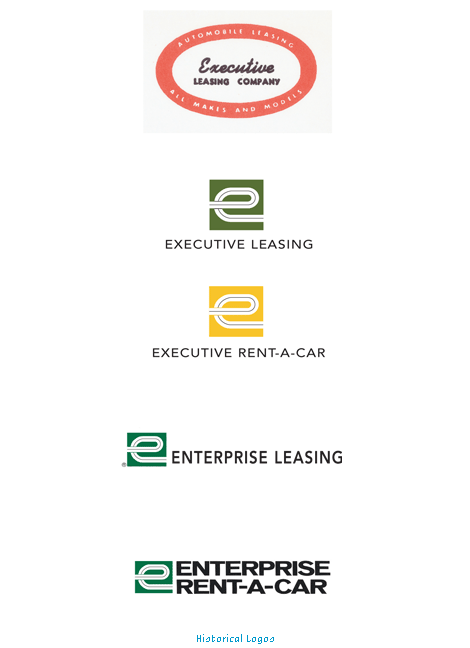
For a bit of a historical context, in case you are interested, here are the previous five renditions, starting with the original 1957 Executive Leasing Company:
The company said the new logo’s incorporation into areas such as signage and vehicle paint schemes will be phased in over the next three years, appearing first at locations undergoing renovation. Hopefully the website isn’t that far behind.
Official press release [PDF]


Jump to Most Recent Comment
Chris Dixon’s comment is:
I agree – all in all it does feel better, which is pertty unusual these days. My only concerns are the horizontally scaled type (I would suggest something like Trade Gothic Extended) and the letter ‘n’ butting right up to the green panel. I realise the object here is to integrate the logo ‘e’ into the word ‘nterprise’. Without recreating the artwork and attempting to resolve these issues, I would assume that these issues were addressed.
On Dec.18.2006 at 06:21 PM
Mark’s comment is:
Well it looks okay, I guess.
I don't like how the "e" shrank so much though.
Well at least they took a chance by making the "e" symbol also the first letter of the name.
THANK GOD, it's not another swoosh with flashy gradient effects!
On Dec.18.2006 at 06:38 PM
Robert Spangler’s comment is:
It's alright.
The only thing that really bothers me is that "nterprise" stands out so much more than the "e."
I read it nterprise then had to re-read it to see that it was enterprise, if that makes sense.
On Dec.18.2006 at 06:46 PM
Kevin McCauley’s comment is:
I really like how it works with the soft black/grey as opposed to the black on the older logo. Side by side, the new one looks like a brand while the old one looks like just a label. (that made sense in my head!)
I believe that is Trade Gothic Extended, Chris, but I think it has been tweaked a little and horizontally scaled further. I don't like the dot, or rather, oval, on top of the i (in the unaltered typeface, it's usually a rectangle/square). It's weird that it's so much wider than the rest of the letter.
On Dec.18.2006 at 07:00 PM
Andrew’s comment is:
I like it. except for a few small things that they seem to have done for legibility:
-that N is going to bother me for a while.
-and the "e" looks like it's too far to the right in the square.
Paul Lloyd’s comment is:
Is it just me, or do the second and third logos you show from the past, actually look more contemporary and iconic? I guess they also look a little more up market and may not fit with Enterprise's target market anymore, but they do seem far cleaner and simpler in design. I'd go as far to say that every interation of their logo has been for the worse, and in that statement I also include this latest effort.
The 'e' now lacks any character, and the rest of the logo looks bland also. I agree with other comments, in that the 'nterprise' is actually more pronounced than the starting e.
Not a fan.
On Dec.18.2006 at 08:02 PM
David’s comment is:
It's not Trade Gothic. I think it's closer to Univers
On Dec.18.2006 at 08:02 PM
felix’s comment is:
the e is a little horsey and the boxed e should be centered for stability but other than that looks like a thoughtful redo.
On Dec.18.2006 at 08:26 PM
Casey’s comment is:
Is it just me, or is the practice of backing type directly up against a color block a really old school look? While the old E certainly looked a little dated, I don't think there is anything wrong with that. Where's our history? The new one ends so abruptly and looks like they picked a font and split it as opposed to created it from scratch like the original. I vote against it. Lesson for other companies - if you have a solid brand identity to begin with, leave it alone.
On Dec.18.2006 at 09:04 PM
Sam Sherwood’s comment is:
The one thing that bugs me is the loss of the road image. It's as if the in-house designer didn't understand that the original 'e' was a road that could actually exist.
A little more time in editing, and this would've been a perfect adjustment.
On Dec.18.2006 at 09:29 PM
fatknuckle’s comment is:
Ouch. Hope they bought that CDW for a zillion bucks, because that thing is a wreck.
I applaud them for trying but the separate glyph in the last rendition made much more sense.
'Now you are looking at the funky e, inside a green box which is flush against a black box with the "nterprise." They need to go one way or another. Not both.
Having a decorative alphaglyph paired with the remainder of its word is separation enough, but adding that green field behind it visually reinforces that separation, because white on black is far more powerful than white on green. The size of the "e" also takes on a diminutive position, when the first letter should at least be the same size and weight or larger, such as caps. You would never see a corporate name (or anything for that matter) written in such a manner, its reverse capitalization, i tell ya.
For example:
eNTERPRISE
ummm, I dont think so.
But at the very least they killed the immediate association with rent-a-wreck and rent-a-center. So thumbs up for that.
On Dec.18.2006 at 10:39 PM
Von Glitschka’s comment is:
That 'e' looks very clunky. As if they cut it out of amberlith by hand back in the day. The radius on the vertexes looks lame and the inner line looks as if it's weight varies ever so subtly as it goes along.
The lack of precision that comes from doing it inhouse.
On Dec.18.2006 at 11:23 PM
fatknuckle’s comment is:
Kind of looks like a spoon the more I look at it...
Von, I don't think in-house work holds the patent on lack of precision...
On Dec.19.2006 at 12:36 AM
Todd’s comment is:
nteresting how the name changed over the years.
I like the new update on the logo! still uses the same recognizable elements yet updates it at the same type.
Armin’s comment is:
I have to say that I'm quite surprised to hear the positive reviews for this logo. God bless but, man, this is a failing execution on most, if not all, levels.
1. As Felix pointed out, the "e" should be centered in the square. This would deny the connection to "nterprise" but that's not a bad thing...
2. Because using a drop cap as a logo is not a good thing.
3. The original "e" worked much better as a trigger for both "road" and "e", now it's simply an "e" with an inline reminiscent of a road. It went from a mark with multiple meanings to a flat, literal mark.
4. The original "e" with the looping, infinite road gave the sense of more possibilities, longer roads, whereas this one is limited and ends abruptly. This is the complete opposite of what the mission is.
5. The 20% they gained for "enterprise" they lost for the "e", as it is at least 20% smaller. Not the best tradeoff in my opinion.
6. The typography looks very cheap. At least someone took care of making the curves somewhat even from the previously scaled version but it still looks wrong. A little Titling Gothic Extended action would have been nice.
The idea of the redesign was good, the execution was way below average. Nonetheless... Enterprise is usually our first choice in rentals, they are quick, unpretentious and generally friendly.
On Dec.19.2006 at 09:07 AM
Ben’s comment is:
If you forget about all the past identities of Enterprise that bryony (very helpfully) includes, and instead simply focus on the new mark as though it were created for a start-up, I think it's a pretty disastrous logo.
It's ugly. It's unbalanced, the 'e' doesn't make any sense, the colors take all of the emphasis off the initial letter (which seems off-center anyway), and the horizontally scaled type commits a very basic faux pas. It looks amateur. Heck, I'm an amateur and it looks more awkward and dissonant than something I'd design.
On Dec.19.2006 at 09:44 AM
Chas’s comment is:
Agree with Armin and Ben. OK idea, awful execution. I know that in-house designers don't hold a monopoly on 'lack of precision', but you'd think an external identity firm would have at least gotten the font to look nice.
On Dec.19.2006 at 09:59 AM
andrewmartin’s comment is:
Undo!
Take us back to the iconic, well-crafed, unscaled-type-having world of the first EXECUTIVE LEASING identity (#2 in the bunch).
Another little nuance that hurts the more you look at it -- why round the loop in the new E just a little bit? When the logo is small, it looks sharp; when the logo is big, it's an awkward curve. Pick one, then do it right.
Kind of gives me a sinking feeling to know that they're going to spend three years and untold dollars implimenting this lame duck -- should've siphoned some of that money into development.
On Dec.19.2006 at 10:02 AM
Mark’s comment is:
Would this mean a change in the advertising also?
Is the iconic "driving wrapped up car" day's numbered?

felix’s comment is:
you have to admit its better than the old one in its lock up form- simply becuase they lost "rent a car" and the clunky white space it rests in. less is more. I don't know what face the original is set in.. a stretched furura or maybe interstate? but its definately not refined as is... the wts of the r and pr match but only unot themselves. the kerning is also too tight and the road 'e' isn't the same as the last 'e' in teh wordmark. OK, I guess there are quite a few issues left unresolved...
On Dec.19.2006 at 10:22 AM
Ryan’s comment is:
I applaud the attempt to update the logo, since the previous version was rather timid. However, the update is quite possibly even worse in execution.
I'm surprised they're proud that they did it in-house. Judging by every experience I've ever had with Enterprise, they tend to hire uneducated 18 year-olds who'd much rather smoke some pot behind the building than help a customer with a car rental. I bet Steve at my local Enterprise designed this one; it looks like it fits with him. Hey Steve, if you're reading: smoke em if you got em!
On Dec.19.2006 at 11:21 AM
Paul Riehle’s comment is:
I think there is a huge disconnect between the e and the nterprise. Its very distracting to me. It's a nice try but it failed in execution I believe. There is a lack of sensitive within the entire logo.
On Dec.19.2006 at 11:58 AM
Mark’s comment is:
The 'e' being so much far off to the right and not being continuous looks likes it's moving while 'nterprise' looks static an obvious disconnect.
Why could'nt they at least salvage some of the continuity the previous 'e' had?
What's the reason for enlongating the length of the straight area of the 'e'?
Did they completely forget the meaning of the previous design? It was supposed to be a continous road, not just an 'e'.
On Dec.19.2006 at 12:27 PM
Casey’s comment is:
As someone who works at Enterprise (while being a graphic design student during the day), I have to look at this... "thing" every day. We've been getting it on more and more documentation. It is a disaster from the old logo. I am glad I am not alone in thinking this. I think I would have much rather had a "swooshy" Web 2.0-ish logo than this disaster. Give me back my old ERAC logo!
On Dec.19.2006 at 12:31 PM
Casey’s comment is:
Forgot to mention... I'd rather look at their "improved" logo that they used on the website than the new thing they're parading around now.

[tom]’s comment is:
I really don't like it. I can't think of anything I do like. The container created with the green and black boxes feels off to me.
It's been said already, but this mark is just generally lacking good detail...
On Dec.19.2006 at 12:40 PM
Mark’s comment is:
oh well, maybe where the 'e' ends the 'road' goes into a 'tunnel' who knows.
the 'e' feels kind of squished though.
if thats still supposed to be a road it looks really hazardous. The curves look really abrupt and not as smooth as before.
Okay, thats enough I'm getting too picky.
On Dec.19.2006 at 01:03 PM
5000!’s comment is:
It's interesting that they were focused on gaining size or weight in the name, but gave away so much weight in the leading "e." I'd be interested to know what that thought process was.
And I totally have to take exception to the idea that the "lack of precision" comes from doing it in house. Enterprise's art department may not be up to the task, but there are plenty of in house creative staffs with the chops to handle an identity design and plenty of design studios that produce equally shoddy work.
On Dec.19.2006 at 01:08 PM
Mark’s comment is:
I hate how the 'e' looks like it's hanging off the left side of the square like a flag pole.
The old one had a smooth direction of eye travel, from the left of the 'e' your eye follows the 'road' up and around through the nice smooth loop. Then your eye leads off and travels to the "rent-a-car" while taking notice of the name "Enterprise" above.
In the new one going from the left of the 'e' on the green back ground. Your eye gets a good head start with the straight lines but then you have to navigate through the hard-edged loop which curves abruptly. However then it has a nice continous cicular loop....which then ends aburptly. So then your eye stumbles across the rest of the name 'nterprise' which is NOT over a green background and instead is over black.The rest of the time you struggle to put the completely different 'e' with the normal plain looking 'nterprise'. Great seperately but look haphazard put together.
It might have been better if the background was all one color.
On Dec.19.2006 at 01:38 PM
Mark’s comment is:
That tiny looking 'e' is going to be a mess to identify from far away on the new signage.
I have a feeling the new signage is going to have to be larger for better readability.
On Dec.19.2006 at 01:43 PM
drewdraws2’s comment is:
I think this is a tragic rebranding. A quick look through the history shows that someone spent some time making the original "road/e" equally balanced and meaningful, and now they've managed to ruin both its balance and its meaning in one shot. The letterform touching the green block is also very unsettling, causing the whole thing to read more like "nterprise" than "Enterprise", and don't get me started on vertical scaling of fonts. All of the awkwardness of the dot over the "i" and the uneven roundness of the "e" could have been avoided by simply taking the time to either use a more extended font, or to work the letterforms properly.
They should have just dumped "rent-a-car" and left it alone.
On Dec.19.2006 at 04:15 PM
fatknuckle’s comment is:
Will they be changing those little stickers you see on the bumpers as well? The previous mark fit the square and was easily identifiable as a standalone. Now with its rounded shape and diminutive size relative to the green "squangle" I don't suspect its going to hold up.
Create a decorative wordmark, or a decorative symbol, or a symbol paired with a corresponding wordmark, but try to combine all into one element (and by that I mean where they are dependent on each other for their meaning and visual characteristics) it's just plain innefective, doesn't work and downright disatrous.
On Dec.19.2006 at 05:12 PM
Mark’s comment is:
I guess their main reasoning was that the logo was "outdated" in that it wasn't made in the current times/recently.
Pardon me, but I think thats a weak excuse for changing a logo (at least UPS's reason for theirs was because the profound addition of new services was plausable).
You can't just say "aw look that logos really OLD looking" and then justify changing it on that sole basis.
Fedex DID NOT rebrand solely on the reason of their logo being outdated, it had to do with how efficent the "Federal Express" name would last in a time where people were refering it as to FedEx and it's logo was reflecting a small company where as it's company was now worldwide. It had nothing to do with the age of the logo and everything to do with what the image the old logo PORTRAYED the company as.
Basing the logos effectiveness ONLY by it's age, undermines how recognizable a brand already is, and wastes a huge amount of resources based on keeping a 'trendy' image.
If 'outdated logos' was considered a legitimate reason to change a logo on a whim,the whole market would be a mess.
Many people will probably be surprised that many current logos of many companies are indeed pretty old.
Imagine if Ford decided to completely rebrand it's logo because of it's 'age', or IBM (make in the 80s) or PBS (the logos at least 20 years old) or CBS (made back in the 50's) or NBC (the current peacock is from 1986) or RCA (at least 1970's).
Sure let's go ahead and get rid of ALL the old logos, yeah let's retire the current GE symbol because it 'doesn't reflect our times' let's trash the McDonalds arches because they came from 1970s,sure we'll get rid of ALL the old logos.
No more Arm & Hammer logo (nah, that ones WAYY to old!) let's strip Coca-Cola of it's script lettering! (1800s) sure! Pepsi can retire it's blue and white globe (1970s) AND BY ALL MEANS let's remove the 'red O' from Mobil (1960s)!
Next we can retire the Olympic Rings (1930s) completely revamp the NFL logo (it's 'old') and BY of COURSE we can replace the Sony logo with another swoosh!!!! :P
oh and most of all don't forget to replace ABC's logo (too 1960s) and let's trend-ize Warner Brothers! (from the 1940s)
and you know whats going to happen once companies replace their iconic logos? the consumers won't give a s**** about them.
In fact consumers could care less that their company has a new 'spiffy' logo THEY CARE ABOUT THE SERVICE!!!!
This is not meant as an insult to anyone in the graphics design field, indeed logos will be updated but basing the reasoning for changing a logo because it's simply 'old' is not good enough.
Especially when the new logo is not as meaningful as the previous one.
If companies base how successfull they are only by how they look and not how well they perform in doing business than that is leading up to a failure.
On Dec.19.2006 at 06:25 PM
Feldhouse’s comment is:
Personally, I still see a road. It's legacy is still there and that's damn good brand equity considering they chopped off half of the road. I think imagination still comes into play with identity design. Look at Westinghouse, it isn't a literal crown but it implies a crown. I still think the road exists.
Mark:
I don't know if you're a designer or not, however, I suggest you check out www.identityworks.com and look around a bit. Mr. Spaeth has compiled quite a good bit of identity material that might be of use to you.
On there, he has a list of "Seven Reasons for a Corporate Logo/Symbol Change" which includes the following:
1. Company has changed its name - for whatever reason - so the design has to change too.
2. The existing symbol has for some reason become controversial.
3. The existing design has grown obsolete in meaning or content.
4. The design itself has grown obsolete, appearing dated, old-fashioned.
5. Perhaps the existing symbol created technical problems, for example being too delicate to reproduce well.
6. Rarely - there is a legal requirement to change the symbol.
7. Many symbol changes take place because management wishes to signal a change in corporate direction, culture, or marketing strategy.
I would say for this mark, Enterprise maybe has 3 if not 4 of the items on the list. I understand your frusration with just "changing a logo because it looks old" but the reality is it happens. It happens more frequently than you may be aware of.
And yes, everyone cares about service, but when the service is equal, excellent design can change perception.
On Dec.19.2006 at 10:16 PM
Vernon’s comment is:
The "e" looks like it's changed into a flat tire. Like others the "nterprise" is a lot more obvious. I do have to say that the "n" butting up against the green is going to drive me crazy for a little while when I see it. I would say it's the worst one out of the lineup.
On Dec.20.2006 at 09:23 AM
stock_illustration’s comment is:
Another example of how a little bit of work on the old logo along with some fresh typography could have resulted in a much better solution than this train wreck (or should I say rental car wreck). There is nothing wrong with the basic design of the old "e" that some careful updating couldn't fix. This new "e" says nothing, is poorly constructed and doesn't work doing double duty as the mark and the first letter of the name. Weak.
On Dec.20.2006 at 10:02 AM
Mark’s comment is:
Can some please explain WHY did they think it was a terrific idea to shrink the 'e' so much?
you could hardly tell it's an 'e' because the font is so frick'n wide and the edges of the 'e' look so close together at a smaller size.
Shrinking the first lettter of the company name is NOT a good decision, now probably people will be wondering 'what the heck is that?' and they're going to be have told that it's supposed to be an 'e'
of course the odd decision to brighten up the shade of green doesn't help in deciphering the letter.
At least the previous logo with it's large size LOOKED like an 'e' more!
On Dec.20.2006 at 02:31 PM
Splashman’s comment is:
My thoughts have already been expressed by others. In short: Ugh.
On Dec.20.2006 at 02:53 PM
DBD+A’s comment is:
No sir, I don't like it. Well, I like the black box copy, but I really think that they should have kept the old "E." Especially after looking at their historical marks in different colors. The never-ending E definitely implied DRIVING more than new one, too... Why fix it if it aint broke?
Oh, well.
On Dec.21.2006 at 05:00 PM
DesignMaven’s comment is:
Mark:
Here's the Seven Reasons for Corporate Identity Change John was Referencing.
http://www.identityworks.com/issues/Seven_Reasons.pdf
The newer incarnation has been upgraded to Twelve Reasons for Corporate Identity Change.
Nevertheless, the Seven Reasons for Identity Change continue to be Relevant.
Very doubtful, if Monigle had much to do with this Identity other than Brand Measurement, Brand Assessment, Brand Evaluation, Brand Strategy, Brand Research.
Often times, in this situation Identity Consultants / Designers don't Execute.
They just make Recommendations.
John, I provided the link because I'm thinking you know longer had the link and re-wrote the seven reasons from your pdf.
Critique of Identity, Fresh new look with apparent minor errors. No More Noticeable than the Redesign "K" Kmart Identity of a few years ago.
These mistakes are INVISIBLE to the General Public.
I'll kind of Miss THE WINDING ROAD "e".
Nevertheless, Enterprise Remain the only Identity I can think of with an OUTLINE Identifyer.
That in itself Speak Volumes of the Equity in the "e".
DM
On Dec.22.2006 at 08:16 AM
drewdraws2’s comment is:
DesignMaven - If the outline identifier speaks volumes of the equity in the "e", then why would they trash it as they have? I mean, let's be honest here, the new "e" is crap, and more resembles the "Betty Crocker" spoon than a winding road.
This is an example of a crap logo redesigned by a crap designer just for the sake of modernization.
Maybe the designer used to work at Quark.
On Dec.28.2006 at 07:53 PM
Mark ’s comment is:
Ahem, Enterprise is NOT the only company with an outline indentifier
You also have CNN,Procter & Gamble Productions,and other companies I can't remember the names of right now using the same outline design Enterprise uses for it's symbol.
On Dec.29.2006 at 01:25 AM
jenn.suz.hoy’s comment is:
My only thought on the new mark is that the reference of the "e" as a piece of road is all but lost. With the sharper edges, and dead-end you no longer get the quick impression of a road from the "e" mark.
It may just be personal opinion, but I always associated that part of the logo as the visual identifier of what it is the company does. Not that I think people will all of a sudden be confused to what Enterprise does.
It just seems like, in their effort to become more streamlined and "modern" they lose a bit of themselves in the process.
On Dec.29.2006 at 08:25 AM
Mark’s comment is:
I can't help it, but it reminds me of this logo:
http://www.generalmills.com/corporate/brands/brand.aspx?catID=49
seriously it looks like a spoon :P
On Dec.30.2006 at 03:45 PM
drewdraws2’s comment is:
Um, yeah Mark, that's why I said that three comments ago :-)
You are right about there being other "outline" logos however.
On Dec.31.2006 at 05:23 PM
DesignMaven’s comment is:
GUYS:
Did I say it was the ONLY Identity with an Outline???!!!
NOO0ooo!!!
I think I made it CLEAR, "Enterprise is the only Identity I can think of with an Outline Identifier".
(Inconclusive)
Meaning, at that moment, and time when I was writing.
Good Catch with CNN, Proctor & Gamble, Sears others.
I've done my Job, I've Forced you to THINK!!!!!
Regardless of the Redesign. Whether you LIKE it or NOT.
Those Comments I Like or Don't Like are NOT Amenable to the SUCCESS of any Identity.
Neither are they Favorable or Meaningful Attributes to the Success of an Identity.
Yet, Designers continue to discuss Identity injecting Personal Feeling.
The SUCCESS of any Identity is Governed by whether or not the Designer(s) met Corporate Objectives (The Brief) and Design Objectives.
Since we Don't know the Corporate Objectives.
We can Intelligently Discuss the Design Objectives, which are:
1. Originality
2. Memorability
3. Usability
4. Livability
5. Propriety,
6. Uniqueness
7. Visual Impact
8. Imaginative
drewdraw2
If you Read the link to the pdf I provided. Seven Reasons for a Corporate Identity Change.
Therein is your Answer why Management Change the Enterprise Identity.
I didn't say is was Great. At the same time, it does meet the Criteria of several Design Objectives.
Much was iterated about the off center of the Newly Designed "e".
Here's my personal observation.
My feeling why the "e" wasn't centered in the revitalization.
The Designers were trying to keep the continuity of the "e" to match the word spacing of the text "nterprise". At the same time keeping the equity of the Continuous or Winding Road.
In the Original, the Winding Road "e" was Staged as the Identifier. An Independent Stand Alone Alphaglyph, adjacent to the Signature or Logotype. The Black Box enclosing the Signature. The Staging allowed ample space from the Edge of the Box to the Enterprise "E".
The Staging is different in the newer Identity because the "e" is serving as Identifier and Signature.
The lowercase "n" in "nterprise" is flush with the Rectangle containing the "e".
DM
On Jan.02.2007 at 04:30 PM
tom b’s comment is:
Since Enterprise is not only in Rent-a-car but also Car Sales, Fleet Sales and Truck Rental they needed to simplify the name. But by combining the "e" into the name, they've violated one of their own graphic standards that has been in place for years. I also think they've run into a dead end with the road ending in the logo. That square "e" was a tremendous icon symbolizing both the company and the road. I do agree though that once the logo has been around for awhile, no one will ever notice the difference or recall the good old days of the square "e". Now if they could just rebrand their advertising and get rid of "Moose" at his class reunion and the "Let's go, girls" TV spots.
On Jan.03.2007 at 09:14 AM
Mark’s comment is:
I've said it once and I'll say it again.....
Unless you are extremely talented and can pull it off without making it look awkward, making the first letter of a company name lowercase is NOT a good idea!
What happened to sensible design? Did it get thrown out for "following the latest popular design trends"?
Sheesh I see this lowercase letter rage all over the place! UPS,TBS,Mabe,Intel,Vivedi,Macy's and the worst offender British Petroleum (I'm aware of their current 'name' BTW) are just a few examples.
What the heck happened to grammar? What the heck happened to the rule "First letter of a name of a place,person,or thing is ALWAYS capitalized"
Do people in graphic design throw this sensible rule out just to be 'different'? and what if being 'different' ends up looking like a mistake?
Imagine if everyone abolished caps in order to be 'different' imagine how udderbly stupid their writings would look.
The first letter of the name is capitalized for a reason it is meant to differentiate a NAME from a WORD, in other words it gives it more IMPORTANCE.
theres a huge difference in meaning between the word "enterprise" and the name "Enterprise".
In fact I would have prefered it if they had a capital E wordmark if they were going to use the wordmark as the first letter also.
Names look so much better when they are capitalized correctly as opposed to all this all-lowercase nonsense.
In abbriviations of names,most of the time,I can understand the uses for lowercase,BUT when you are displaying the name in full lowercasing the first letter starts to look a bit ametuer.(and a bit pathetic I might add)
designmaven’s comment is:
Mark:
All Great Points!!!
I know somebody, that know somebody, that know somebody who doesn't know Felixxx (wink) that work at Monigle.
Actually one of my Mentors is Friends with Kurt Monigle.
I'll see if Kurt can talk about the "enterprise" Redesign.
Not promising anything.
Most Identity Consultancies have a No Blogging Policy due to the Confidentiality of Identity, even after Launch and Roll Out.
Perhaps the Corporate Entities that are Redesigning their Identities with lowercase letters are paying Homage to the bauhaus.
Let us not forget, it was SIR HERBERT BAYER that was the Ultimate Purveyor of lowercase writing, applied to print, advertising and identity.
its a european thing. the principles nevertheless are valid today, as well, universal.
dm
On Jan.03.2007 at 02:52 PM
Tony Spaeth’s comment is:
Mark,
I agree, a proper name should always be capitalized (initial cap, of course). But a wordmark should not be confused with a name; I believe a logo should always be treated as a visual identifier and not as merely verbal. In fact, lower-casing the first letter is an effective way to say "this is our logo."
In the Enterprise case (Nterprise?), I suggest the problem is not that the e is lower-cased, it is that it still reads more as a symbol than as a letterform integral to the wordmark. A wordmark can have a dramatically embellished initial letter, like Alitalia's A, but it must first read as a letterform integral to the wordmark. You can sometimes get away with using a more creative letterform, constituting a symbol, in the middle of a wordmark (example Nortel) but not at the beginning or end.
Mark and DM, thanks for referencing "Seven reasons for a logo change" but you're right, DM, it's now up to 13 driving purposes (not 12):
Two structural drivers -
. Merger or acquisition
. Spinout
Six strategic drivers -
. Change direction
. Broaden scope/scale/visibility
. Narrow the scope
. Change internal culture
. Change expressed personality
. Change perceived composition
Five functional drivers:
. Name weakness
. Name confusion
. Design weakness
. Advertising breakthrough
. Legal requirement
And there are 22 communication-goal choices associated with these 13 reasons for rebranding.
For more detail, see www.CorporateBrandMatrix.com
Roger van den Bergh’s comment is:
While not a ground breaking new design, the new signature is an improvement of the previously (in around 1995) restyled logotype by then Lippincott & Margulies.
Enterprise Car Rental is a privately held company; based in Kansas, it is family-owned and managed with a conservative twist.
On the long term this strategy has paid off:
The car-rental business is a cyclical one, with huge oscillations in revenue (not unlike commercial aviation); Enterprise is a healthy entity, ready for the newly announced assault by Herz to also move into the leisure-car-rental business.
Service at Enterprise is quite personal and extremely consistent, no matter at what airport or city you rent the car. (among Herz, I am a regular customer at Enterprise).
Rates are far below the majors like Herz and Avis, even lower when booked via Orbitz.
There are two reasons why the new visual brand appearance did not need a RADICAL visual change:
–––– No change in management or ownership.
–––– No change in company character.
Therefore, I believe, the only objective was to enhance the visual impact by streamlining the outdoor signage system.
Using what I call the "Alitalia model" (the initial capital "A" used on the vertical fin of the aircraft), is quite appropriate in this case, particularly when the corporate identity has large exposure to the public (see also: the "O" of Olin, and "B" of Bridgestone, to name a few).

Separating the initial "e" from the brand name, created a powerful icon amidst Enterprises' competitors:
Because of the simple, bright green square, where the white "e" radiates from, this initial letter will certainly almost jump out of the sign cabinet.
I like it.
Happy 2007!
Roger van den Bergh
Onoma, LLC
Identity and media design
27 East 21st Street, 10th floor
New York, NY 10010, USA
212 253 6570
www.onomadesign.com
On Jan.08.2007 at 11:35 AM
Jerry Kuyper’s comment is:
I agree with Roger with one further observation. Building on Tony's comment, I think it is critical that the "e" as the first letter be a strong beginning. See Alitalia from the late 60s. This initial letter/symbol approach has probably failed more often than it has succeeded, but remains a viable approach.
When viewed on Brand New and the Enterprise site, the "e" is weaker in impact even though it is larger. I would have looked at making the "e" even larger and/or bolder and/or "nterprise" lighter.
Some combinations of these minor adjustments would have made it more effective.
On Jan.08.2007 at 03:32 PM
Mark’s comment is:
Has anyone else see their new commercials yet? I have and the logo fits well with their image.
They keep the traditions from the past ads but do it with the new logo.
I like it, it feels like the same old familiar Enterprise but at the same time it looks young and brand new.
Imagine the new AT&T except a campaign thats 100% better than that.
It's like they're saying "remember us? we're still around but this time we've improved a whole lot more" and for once it doesn't sound like they're selling me a bunch of false BS.
No it's not the same commercials with the logo pasted on in fact they're brand new ads that carry over the traditions of the previous ads (the theme music,the customer characters,a new version of the wrapped up car etc.)
Talking about the new AT&T they've bought Bellsouth and their retiring the Cingular name (say goodbye the brilliant Jack logo)
Frankly AT&T should've died out a long time ago since they're dumping a highly successful wireless campaign for their poorly rendered globe.
What a waste to simply flush Cingular down the drain.
On Jan.09.2007 at 05:44 PM
_’s comment is:
i can't believe people would actually say this looks good. stretched type? i wouldn't even allow that in type 1. no accounting for taste i guess.
On Jan.16.2007 at 12:26 PM
Amun’s comment is:
The "e" is overshadowed by the heavy contrast "nterprise", and the way the "n" is right up against the color block is very awkward. I still have to say, I like it better than the former, but still seems like they need to work out some not so minor details...
On Jan.29.2007 at 01:15 AM
P’s comment is:
i feel so depressed after hearing the marketing moron talk about the new design. polishing turd indeed.
On Sep.29.2007 at 02:22 AM
pu’s comment is:
the new e is disgusting. what were they thinking. The old e was a lot more balanced and bolder, and would have gone better with the new nterprise.
On Feb.13.2009 at 01:20 AM
Mark’s comment is:
Um last comment...
HUH???
I'm totally confused.. what's with spelling "you" as yhu?
WTF?
AND WHAT THE !@#& does this has to do with the logo?
On Jun.23.2009 at 03:16 PM
Jd’s comment is:
Bring back the executive leasing logo, they feel far more contemporary.
They completely lost the concept of the endless road, which is a shame, quite a bit unreached potential for a great mark. I really don't like how the n is tight against the greenbox, they needed to spend more time intergrating the two elements. That horizontally scaled font is just ugly, i'm not buying that marketing jargon about it being 20% bigger...make the logo bigger, we've all heard that one!
On Jun.23.2009 at 10:14 PM
Comments in Brand New, V1.0 have been closed.


