

NOTE: This is an archived version of the first incarnation of Brand New. All posts have been closed to comments. Please visit underconsideration.com/brandnew for the latest version. If you would like to see this specific post, simply delete _v1 from the URL.
![]()
The elephant—a symbol of the Republican Party dating back to Thomas Nast’s cartoon in Harper’s Weekly in 1874—has long been thought to be both “strong and dignified.” While these words have not always described the Grand Old Party itself, they do well apply to the old and familiar elephant symbol, with its simple red and blue graphic forms and three patriotic stars. The new Republican National Convention logo has pushed the immobile elephant in a less cute direction, now looking something like Babar’s evil and dumb cousin who ate wild mushrooms; it’s breaking free of the circus ring in order to bludgeon the crowd. Simplicity has been cast aside with the new agressive stripes, flailing limbs, a curly trunk, and pointy tusks. A terrifyingly patriotic and angry eye stares at the indoctrinated far right, and threatens the majority of the United States (also the world) with a circus of policies we can’t even imagine. Just like the party it symbolizes—the symbol is both unwieldy and frightening—”strong and dignified” no more.
![]()
This is what the terror looks like up close, right before you get crushed.
(note: this was written by a hippie, pinky, east-coast, big-government liberal)


Jump to Most Recent Comment
Ryan’s comment is:
You know, it's no wonder the Republicans have an elephant as their symbol. Elephants take huuuuuge dumps.
/immaturity
On Oct.05.2007 at 11:40 AM
BWJ’s comment is:
It's hard to take your critiques of this design seriously, when I can't see through your overwhelming political bias.
While I think the logo is dry, boring and expected...I don't see any political party, truly embracing design. Obama's attempt was nice, but the last thing we needed was another reflective, gradient infused logo.
But seriously, you didn't even post the old logo for comparison. Leave the political angst to the political blogs...I hear enough of it elsewhere.
On Oct.05.2007 at 11:44 AM
felix’s comment is:
I would hardly call this unwieldy or frightening.
this is frightening as hell.
On Oct.05.2007 at 11:46 AM
T. S. Lang’s comment is:
I'd like to think that this was all part of an elloborate plan of a left-winged designer that went undercover as a republican to create a logo that would cast the party in bad light. So in my mind, Super-Leftist-Designer saves the day!
On Oct.05.2007 at 11:53 AM
felix’s comment is:
It's hard to take your critiques of this design seriously, when I can't see through your overwhelming political bias
Agreed. I'm actually surprised Armin let this fly. Heres the simple homework he should've googled:

continue...
On Oct.05.2007 at 11:53 AM
david gouch’s comment is:
What is the point of this?
No good design critique can come of this because you've created a hostile atmosphere. You've made part of this audience feel unwelcome so that you can make easy jokes about the other side.
Immature.
On Oct.05.2007 at 11:57 AM
Todd W.’s comment is:
I agree with BWJ's comments. The design criticism here is nonexistent. Where's the original logo for comparison? The attempt to add dynamicism by putting the elephant in a rearing position seems like a step in the right direction, but it's completely countered by the circular ring and dull type selection.
On the political front, your overly broad generalizations demonizing a party you disagree with is exactly the sort of discourse we don't need if we're going to get this country back on track. Consider the same sort of right-wing demonizing of all Democrats as commie pinko liberals. Is that the model of thinking you want to follow?
On Oct.05.2007 at 11:58 AM
Joe Marianek’s comment is:
Part of the problem of these convention logos is that they dont stick around as long as traditional logos (or even candidate ones.) That's why we didn't do a history on it. It's just a trendy flash in the pan of Elephants that define the Republican party.
On Oct.05.2007 at 12:01 PM
BWJ’s comment is:
By that rationalization, you didn't need to show last years Allstar logo, when this years New York Allstar Game logo was reviewed...but you did.
On Oct.05.2007 at 12:06 PM
Joe Marianek’s comment is:
David,
Actually, the logo has created a hostile atmosphere...
On Oct.05.2007 at 12:07 PM
Chris’s comment is:
I agree, this is immature.
On Oct.05.2007 at 12:16 PM
Von Glitschka’s comment is:
This is merely a rant with images.
What purpose does the lossy blow up of the web graphic serve? It's not revealing anything I can't see in the smaller image.
The post lacks any coherent design rationale or subjective critique that would allow viewers to discuss the mark as it relates to the historical incarnations of it. (See Felix post)
Too bad, could have been a fun thread.
On Oct.05.2007 at 12:19 PM
Chris’s comment is:
Here is the DNC logo.
http://www.demconvention.com/a/2007/09/download_the_ne.html
On Oct.05.2007 at 12:19 PM
JonSel’s comment is:
Oh boy...
Nice shill there Felix. ;-)
…
I think this logo could have been reviewed with far less political subtext. Vote Dem often, Joe? There's just no way to take your comments seriously because you're clearly not inclined to like it. I'm a hard-core dem myself, but I can at least see past that to look objectively at this logo.
If you want to discuss the graphic merits of it, I think an aggressive elephant is quite effective marketing to other Republicans. It's an election year; what better reason do you need to fire up the base? The striped blanket (or whatever that is) don't fit that well, but it's not that poorly drawn. Overall, yeah, kind of boring, but still better executed than the previous convention logos that Felix has shown.
On Oct.05.2007 at 12:19 PM
Vavoom’s comment is:
The logo is disgusting. I don't care who's party it is for.
It's just stinks.
The graphic is bad and the typography worse (Helvetica in Caps as such has no flavor whatsoever, unlike any political party in the world).
2008 will be crushed by that elephant any time now... It so unbalanced it bothers me.
On Oct.05.2007 at 12:31 PM
Katie ’s comment is:
Hey, what about freedom of speech?
I think it would be naive to look about this logo without considering the party it represents and the state of the current government. We don't live in a pretty bubble full of logos, colors, and fonts (but wouldn't that be nice?) - there's a war going on and our government is a mess. How can we ignore that?
On Oct.05.2007 at 12:50 PM
Folksy’s comment is:
Would somebody please say something about the placement of 2008?
I mean, it's an elephant p*nis!
On Oct.05.2007 at 01:17 PM
Andrew’s comment is:
The elephant definitely looks crazed- But I'm not ready to read as much into it as you do. As a design, it's surely awful, but I'm sort of relieved every time any political group reveals its *visual* incompetence.
After all, the most dynamically-branded parties in history - those who really 'embraced design'- were probably the Nazis or Stalin's Communists.
So you know, consider that.
On Oct.05.2007 at 01:29 PM
Ty’s comment is:
As far as the logo is concerned, it may not be the best but it's still way better than their previous attempts (see Felix's post), and in light of its Democratic counterpart (see Chris's post).
As far as the post itself is concerned, let's remember that this site is a forum for well-informed and intelligent opinions on design. This particular post made little effort to fulfill either of those things.
On Oct.05.2007 at 01:41 PM
felix’s comment is:
![]()
Nice shill. —Jonsel
Thanks man. But if its free does that count as a shill? Why so shrill? Those of you (like Jonsel) in central NJ come watch me and Edel Rodriguez get shilly for mother (earth) tomorrow in the park.
On Oct.05.2007 at 01:41 PM
C-Lo’s comment is:
The elephant may looked " crazed" But the logo as a while looks so flat and dull. It doesn't look designed as more "Put Together" real quick for some small thing, and someone said Let's Use It. Put this wording with a motivated elephant they said, and this what they came up with, all in 10 minutes or less.
And yes the 2008 does need to be moved. Serves me right when I mentioned the 2012 logo being lisa simpson doin da nasty I got " thanks c-lo that's all I see now " Again, serves me right.
On Oct.05.2007 at 01:42 PM
JonSel’s comment is:
My bad, Felix. I saw the $10.00 but missed that was for S&H. Go get 'em!
On Oct.05.2007 at 01:47 PM
Lisa’s comment is:
It's a bad logo, and the elephant is scary. Remember in Dumbo when the elephant goes apeshit? Yeah. That.
But you Americans... you really need to get more than two political parties. The one-or-the-other division you all go through when it comes to politics doesn't seem to help the unification of your country. Red and blue, it makes you fight your fellow countryman.
Not that other countries don't get all riled up about politics, but with 5+ to choose from, with new parties being created and old parties disappearing, we (Canadians) have flexibility and more options. And we don't have to decide which of only two parties we'll support until we die.
On Oct.05.2007 at 01:47 PM
Christian Palino’s comment is:
Joe, I agree that this is sounding a bit rant-like. While I'm as liberally inclined as John Edwards, perhaps we could leave out the preferred party antics and have a go at the design. I think you have some valid insight in regards to the elephant image seeming oddly evil in its rendering – perhaps you could share some context for the mark and analysis in this respect. Or perhaps a look at the development of this brand and where they came from visually for comparison.
On Oct.05.2007 at 01:56 PM
Armin’s comment is:
Sigh... I had a long comment drafted and forgot to hit post before closing the window. Here goes again.
> Agreed. I'm actually surprised Armin let this fly.
The way I have always approached Brand New, and the way I encourage everyone to do so as well, is by assessing identities and brand throughs my personal experiences, biases, and understanding of any given company. That I am a designer is the reason I can muse about colors, size, and kerning, but foremost I critique based on who I am, what I do and what I care about. Whether I poke late-night TV shoppers (QVC) or global enterprises like Adobe (Photoshop), the sentiments are invariably personal. And when politics come into play, specially in the U.S., people are bound to be offended, simply because this issue is so damn polarizing. This logo does not exist independent of its background, and without acknowleding it, we are simply talking about vector points. Joe chose an approach and disclaimed his inclinations – I can vouch for his hippinness and non-meat eating ways – and you can take them or leave them, but you can't demand that personal views be left out of the equation. So, I allow it, and support it.
> By that rationalization, you didn't need to show last years Allstar logo, when this years New York Allstar Game logo was reviewed...but you did.
Correct, this is an inconsistency on our part. My inclination is towards not showing the "previous year" (as I did with the NBA all star logo), as these type of logos are usually created to meet a specific time and place, as opposed to being evolutions. We'll sort it out and I don't think this detail should distract you from talking about the logo.
Which speaking of... It is completely wrong and inappropriate. The idea, I am guessing, was to convey a certain agility and friendliness, yet in its execution it comes off as clumsy and child-like. Plus, why would anyone ever draw an eye in the shape of a star is beyond me. The elephant is either on X, or has just been clobbered by a falling trapeze artist.
On Oct.05.2007 at 01:56 PM
L.Vazquez’s comment is:
Lisa:
We actually do have more than two parties. The problem, I believe, starts with so many people not caring about politics in this country.
Anyway...
Just like the party it symbolizes—the symbol is both unwieldy and frightening
So... think this was the logo's objective? If so, well done, then.
On Oct.05.2007 at 02:03 PM
Ian Smith’s comment is:
Well at least my favorite candidate is running as a republican :) (Ron Paul). I'm not a fan of either political party (conservative republicans or liberal democrats), both are so blatantly preoccupied with destroying the other...
But as far as the logo goes, you're totally right. I saw this and thought gee, I wonder what they're trying to say. Certainly they don't mean do depict a rabid beast with tusks bludgeoning or impaling the vast array of republican supporters.?
On Oct.05.2007 at 02:14 PM
Drew Pickard’s comment is:
All I can say is that the meaning and symbolism that is evoked in me by that logo is frightening.
Do they WANT to come across as a crazed, starry-eyed feral stampeding behemoth???
Is that on purpose???
zedzedeye’s comment is:
I haven't seen a leg stance like that elephants since red-rover red-rover.
On Oct.05.2007 at 02:37 PM
Joachim’s comment is:
Do they WANT to come across as a crazed, starry-eyed feral stampeding behemoth???
Is that on purpose???
Well, I am kind of curious to know how much influence the war in Iraq and the obsession with terrorism has to do with this logo design.
On Oct.05.2007 at 02:56 PM
Ty’s comment is:
I really don't think the elephant imagery is as bad as a few of us are making it out to be. For years, the Republican elephant has been very stationary and nondescript, so I see that they are likely aiming to infuse some sort of life into the elephant.
Is it perfect? No. But does it evoke feelings of a stampeding and fierce elephant to the average American? No again.
And remember, this logo will be seen mostly on-site by a bunch of Repubs and some reporters, so I would not be too worried about the ferocity of the elephant in the logo.
On Oct.05.2007 at 03:01 PM
Aaron’s comment is:
I'm curious if a redesign of a jackass would be this hostilely greeted.
Political leanings aside, I'm not a fan of the logo on it's own merits. And I disagree with the idea that you can't critique something outside of your own politics and ideologies.
On Oct.05.2007 at 03:31 PM
felix’s comment is:
This logo does not exist independent of its background, and without... it, we are simply talking about vector points.
talk about generalisations. whew. Armin, you're stinkin' it up, son. C'mon! "independant of its background"? Huh? I had to do that research. Took me 3 minutes. To say all we're good for is vector points is incredibly demeaning. We could speak to a number of things of cultural signifigance ((historical incarnations, its psychological and cultural context) without going into a rant that allows for zero exchange. You, of all people, know how to engage people in a dialogue. This "crit" is not only immature its makes you look like a lazy editor. You're not, so lets be honest about this.
Joe chose an approach and disclaimed his inclinations. So, I allow it, and support it.
Its certainly was an approach. So OK, in hinesight, did it work? Did you engage people the way you had hoped? Or is this "unwieldy and frightening" experiement over?
On Oct.05.2007 at 03:40 PM
Splashman’s comment is:
The logo is predictably lame. Joe's commentary is insufferably lame, as it drips with political bias. Armin: learn from this, or you'll lose more readers than just me. Of all the re-brandings in the world, Brand New chose to focus on one that was guaranteed to provoke juvenile arguments, and chose to allow a juvenile political hack to review it. That's two strikes. There are a million other sites to visit when one wants that sort of thing. I don't want it here. Comprendez?
On Oct.05.2007 at 04:04 PM
drew kora’s comment is:
Politics aside, what an aweful logo. looks like something some tiny small town political office would make in Iowa or Nebraska. And yeah, that elephant is crazy looking...more deranged than powerful.
The thing about Elephants, when they get freaked out and defensive they get crazy, there's no controlling them. It's never a controlled anger, they are just on or off. So why use a big buckin elephant as your logo?
On Oct.05.2007 at 04:16 PM
Folksy’s comment is:
Here's what a calm, good elephant logo looks like.
Thank you Mr. Milton Glaser.
Tyler’s comment is:
Wow. Is it me? Or are people taking this post way too seriously? Everybody just needs to calm down, it's Friday. Let's get a beer.
On Oct.05.2007 at 05:10 PM
stock_illustration’s comment is:
That this site's bench is far deeper than just the management has never been more evident. The level of professionalism shown by people engaging what I consider to be a juvenile rant is very telling.
On Oct.05.2007 at 05:10 PM
Danny Tanner’s comment is:
I believe this is one of the best posts on Brand New ever. Given the amount of sincere debate it has caused and questions it has raised about previous posts.
I must admit, I almost peed my pants.
On Oct.05.2007 at 05:18 PM
BJN’s comment is:
Lousy logo. The star in the elephant's eye is remarkably similar to the X'd out eye of a dead critter. Looks to me like another logo designed by committee. Gotta have a star, gotta have stripes. I wonder how blue came to be the dominant color?
On Oct.05.2007 at 05:34 PM
Ty’s comment is:
BJN has a good point. What happened to the red motif? It seems to me that the RNC would want to embrace their de facto red brand, not run counter to it with blue.
On Oct.05.2007 at 05:51 PM
Ty’s comment is:
BJN has a good point. What happened to the whole red motif? It would seem that the RNC would want to reinforce the red since it is already its de facto brand, not go blue.
On Oct.05.2007 at 05:54 PM
Thomas’s comment is:
Minneapolis? Check. Elephant's wide stance? Check. Maybe they could hold the convention in a toilet!
On Oct.05.2007 at 07:13 PM
Bill Tyrrell’s comment is:
Both the GOP and Democratic convention logos have three stripes placed inside them.
Is adidas sponsoring both conventions?
On Oct.05.2007 at 08:26 PM
doug’s comment is:
Vavoom:
The graphic is bad and the typography worse (Helvetica in Caps as such has no flavor whatsoever, unlike any political party in the world).
FWIW, Vavoom, the type isn't Helvetica, it's Univers 55. Doesn't impact the discussion too much. I'm just saying.
I don't get the three stripes concept, but then again, I dont get the three stripes concept on the DNC logo either. Hmm.
Ditto BWJ: any objective criticism of the work went out the door after the first few paragraphs. That should certainly help us to be viewed as professionals. High five!
On Oct.05.2007 at 09:32 PM
Paul D’s comment is:
Perhaps "rampant" is just the wrong pose for an elephant in logos. It doesn't have quite the same effect as a stallion or a lion.
On Oct.05.2007 at 10:13 PM
Kai Salmela’s comment is:
First of all, I think people are taking this snappy, satirical post too seriously. It’s not meant to be an objective critique with carefully calculated arguments. I actually admire Joe’s willingness to present his opinions (or biases if you’d like) so transparently, and it amazes me how much contempt it has brought out in people who (A) disagrees with his opinion, (B) generally share his political point of view but are ashamed to reveal their own biases in the arena of objective discourse and instead let them seep out in much more subtle ways, or (C) for some reason have no opinion on the matter and would rather critique a political logo from an apolitical formalist perspective. I’m of the opinion that design is meant to communicate, and should thus be understood within larger contexts (political, economic, social, historical). Sure we could analyze the formal qualities of these logos as a progression of stylistic changes. We can ridicule it’s poor craftsmanship and feel content knowing that we could have done a better kerning job or achieved a more harmonious balance of positive and negative space. These things aren’t insignificant, but is that seriously what we should be focused on? What is this logo saying? The elephant is on it hind legs and looks poised to stomp someone. It doesn’t look like an elephant that is going to compromise anytime soon. Of course this is just a piece of graphic design, but it reflects the values, opinions, and policies of the organization it represents. And these values unfortunately have very serious consequences for millions of people around the world. And it is not a matter of good kerning. It’s a matter of health care, education, employment, and in some cases even life or death. So even if Joe’s sarcasm may have rubbed people the wrong way, it’s certainly understandable.
On Oct.06.2007 at 12:34 AM
Danny Tanner’s comment is:
Hear hear!
On Oct.06.2007 at 12:57 AM
Splashman’s comment is:
Gawd almighty.
On Oct.06.2007 at 01:17 AM
Jeremy H’s comment is:
As a long-time reader, and once-in-a-blue-moon commenter, I was rather annoyed by the political propaganda that was ever to apparent in the "critique".
Armin, I understand your rationalization while under the gun of an upset audience, however I do disagree with it. The fact of the matter is design reviews need not be muddied with personal bias. Yes, you can say it's about personal thinking, however I would gander to say that referring to a political movements doings as "dumps" the party as frightening to the country and to the world, as well as a "circus" are a little out of line. These characterizations stemmed far out of the reach of personal bias, and well into the realm of political propaganda and personal vendetta.
I could care less about your political affiliations, I just ask that you discuss them in an applicable forum. Thanks guys for letting us down.
On Oct.06.2007 at 02:07 AM
Gregory Suarez’s comment is:
Yo, what up with the comments? It's a CRAPPY logo. It's getting all the hate it deserves, and it really doesn't matter what political party it represents. It's even sadder that a RISD graduate created it. Pathetic.
On Oct.06.2007 at 03:46 AM
Danny Tanner’s comment is:
Jeremy:
Nothing personal, but design and life (political, religious views; hobbies; family background; childhood; etc) inform each other. You can't, and shouldn't sterilize your personal views when entering/writing for a forum such as this. From the tone of your comment, it would seem you expressed very real personal feelings. That means everyone else can too.
Lets face it, what was written in this editorial wasn't profane, there aren't even any "naughty words."
I have to ask, have you ever harbored political/religious views or had interests which influenced clients you chose to work for? Have those interests/views influenced independently/self-initiated projects?
If we ignore personal views and plunge into design only considering visual formalism, we do ourselves a disservice. By this approach, a designer doesn't care who they work for, what messages they communicate, or who they persuade to do what. Walking down this dangerous road creates the prostitute designer, the designer who will advance anyone's message, promote any cause regardless of the consequences. Honestly, if you ignore your views/feelings, you must not care about the consequences.
Now, I'm not saying we all need to go out and hug trees, or that we should be starving artists. What I am saying is that a designer's view will and should always influence how and what they create, discuss, & critique.
On Oct.06.2007 at 04:26 AM
Sfumato6’s comment is:
This is all a retro thing.
My disinterest in these political party logos has always been due to their complete lack of allegory or message. Elephant or donkey, they always contain no more visual nutrition than 2D cut-outs for the TV News to slick up and animate.
I don't doubt to longtime party members, the visual of a rearing pachyderm will strike a chord in the context of recent years. But remove it from that context and it is no more than a disposable, vector-traced silhouette of a goofy looking mammal - no hint to its history, no insight into people it represents.
Thanks for reading.
-Sfumato6
Fuzzyman’s comment is:
I think the post was actually quite insightful. Whatever you think of the politics, it points out the danger of unintended messages in a logo. Remove the text and you still look at it and say, "Whoah -- crazed rampaging elephant."
Maybe it would have been in their interests to show proposed logo designs to some liberals (like me) and see if it creates an unintended opening for humor.
On Oct.06.2007 at 06:58 AM
Armin’s comment is:
> talk about generalisations. whew. Armin, you're stinkin' it up, son. C'mon! "independant of its background"? Huh? I had to do that research. Took me 3 minutes. To say all we're good for is vector points is incredibly demeaning.
Felix I think you misread my comment. By "independent of its background" I was trying to say – and perhaps I should have used "context" instead – that this logo is not just a logo of an elephant, it's a logo that represents a moment in time for a specific group of people with certain political and ideological inclinations; if we don't acknowledge those things we are simply talking about – and here is where the second part comes in – the aesthetics of an elephant drawing made in Illustrator. I wasn't saying that pushing bezier curves is all we do – heck, I love pushing them as much as you do – or that we are window dressers. The point was that a logo is not just a GIF placed on every post here, but it's something that exists because of its background.
Re: The political commentary on this post
This too shall pass.
On Oct.06.2007 at 07:27 AM
CJ’s comment is:
Hmmm... so many comments I can think of to go with this...

Christian Palino’s comment is:
it's a logo that represents a moment in time for a specific group of people with certain political and ideological inclinations
Armin's point (from what I can gather), that this logo represents brand attributes, culture, personality, etc. of the organization it pertains to, is relevant.
However, stating that the logo's organization is unwieldy and frightening is baiting a political debate – which, while we all have our positions and choose how much influence those positions have in our life, is probably just going to end up as typical blog-style political arguments that degrade to the level of insult and injury.
Perhaps we could uncover the organization's stated attributes, culture, personality, etc. and discuss this logo in relation to them – rather than in relation to our opinion of them.
Summary and Call to Action (of the Organization, found within a PDF from the GOP site):
For 150 years, our Party has found its purpose in its principles. We confront big
challenges instead of passing them on to future generations. We move forward with
needed reforms to make the government work better for citizens. We fight important
battles and champion freedom because by expanding liberty, we make our nation more
secure.
This is the choice the American people face – moving forward or looking back,
reforming government or settling for the status quo, producing results or playing politics.
As Republicans, we know who we are and what we believe. As the Party of the open
door, while steadfast in our commitment to our ideals, we respect and accept that
members of our Party can have deeply held and sometimes differing views. This diversity
is a source of strength, not a sign of weakness, and so we welcome into our ranks all who
may hold differing positions. We commit to resolve our differences with civility, trust,
and mutual respect, and to affirm the common goals and beliefs that unite us.
As the Party of Lincoln, we stand for freedom.
We stand for the freedom of families and individuals to have good schools, good
health care, and affordable housing and services.
We stand for the freedom that comes with a good paying job in a growing
economy.
We stand for the freedom and dignity of every human life, in every stage of life.
We know that freedom is not America’s gift to the world; freedom is the
Almighty’s gift to every man, woman, and child in the world. And we stand for a hopeful
tomorrow that will come from total and complete victory in the War on Terror.
These are values worthy of a great nation. And they are values worth fighting for.
That is exactly what President George W. Bush continues to do. He is protecting us from
danger by being prepared, strong, and steadfast. Vigilance is never easy. But it is always
essential, now more than ever.
George W. Bush has done the hard work and made the hard choices required of an
American President in challenging times. Because of his leadership, we are strong.
Because of his vision, we will be even stronger. That is the pledge of this platform ... and
the promise of this convention.
Some history on the elephant symbol (from the GOP site GOP website):
The symbol of the Republican Party is the elephant. During the mid term elections way back in 1874, Democrats tried to scare voters into thinking President Grant would seek to run for an unprecedented third term. Thomas Nast, a cartoonist for Harper's Weekly, depicted a Democratic jackass trying to scare a Republican elephant - and both symbols stuck. For a long time Republicans have been known as the "G.O.P." And party faithfuls thought it meant the "Grand Old Party." But apparently the original meaning (in 1875) was "gallant old party." And when automobiles were invented it also came to mean, "get out and push." That's still a pretty good slogan for Republicans who depend every campaign year on the hard work of hundreds of thousands of volunteers to get out and vote and push people to support the causes of the Republican Party. —GOP.com
danny’s comment is:
hell, at least they are being upfront about it now.
On Oct.06.2007 at 10:03 AM
Ty’s comment is:
Danny,
You are correct, there is an inevitable amalgamation of someone's personal bias in regards to many things ranging from design to politics. The problem with this commentary is that it, for all intents and purposes, fails to discuss the political bias's application to the design, or even any design at all. If his opinions were mixed with the better informed writings about identities that we have come to love about this site, then there would be no problem. The absence of it creates the issue.
On Oct.06.2007 at 10:37 AM
Mark ’s comment is:
I couldn't help but think of this.
[url=http://img255.imageshack.us/my.php?image=badelephantbl7.png][img=http://img255.imageshack.us/img255/2269/badelephantbl7.th.png][/url]
Seriously this design, is bad, a star for the eye? and the way how the stripes cut into the poor animal, look like it's screaming in pain!
Mark’s comment is:
I couldn't help but think of this.
http://img263.imageshack.us/my.php?image=badelephantul9.png
Seriously this design, is bad, a star for the eye? and the way how the stripes cut into the poor animal, look like it's screaming in pain!
Danny Tanner’s comment is:
Ty:
While this editorial was brief, I believe it discussed more about design and history than merely focusing on personal political views.
History:
The elephant—a symbol of the Republican Party dating back to Thomas Nast’s cartoon in Harper's Weekly in 1874—has long been thought to be both “strong and dignified.” While these words have not always described the Grand Old Party itself, they do well apply to the old and familiar elephant symbol, with its simple red and blue graphic forms and three patriotic stars.
Here we had history, and it could be argued the statement "while these words have not always described the Grand Old Party itself" is bias, but honestly, the party hasn't always been strong, it has had its weak moments, and especially given many recent scandals, hasn't always appeared dignified.
Design Criticism:
The new Republican National Convention logo has pushed the immobile elephant in a less cute direction, now looking something like Babar's evil and dumb cousin who ate wild mushrooms; it's breaking free of the circus ring in order to bludgeon the crowd. Simplicity has been cast aside with the new aggressive stripes, flailing limbs, a curly trunk, and pointy tusks.
Here we had some critique, the elephant looks wild and out of control, dangerous as though it might stomp on something. Its walking on it's hind legs like and elephant does in a circus, or has reared up in effort to charge/stomp. The elephant as a form is far too complex, with stripes jutting in from the side, a strangely curled trunk, and multiple slender tusks.
The type in this seal is far secondary to the symbol healed within, and given the brevity of this editorial, understand why it was not touched on.
Political?
The following three sentences are more politicly oriented, but not exclusive to politics. One of the following conclusions is The symbol is both unwieldy and frightening, and given the nature of the design commentary, makes sense.
Conclusion:
I think a good part of criticism is not just assessing formal elements (how could I make this a better?), but also the tone/feeling of a mark and how that effectively communicates a message. This message, whatever it it may be, will also be in context, the context of this event (further informing the meaning of the logo & event), and this event exists in the context of our world.
Su’s comment is:
Armin: [...]as these type of logos are usually created to meet a specific time and place, as opposed to being evolutions.
Actually, I'd say this timeliness is an argument for the exact opposite.
You should be showing several previous logos specifically for the purpose of showing change over time. ("Evolution" implies a direct progression from the preceding that I don't think is necessarily accurate).
I'm sure observations could be made regarding how aggro the elephant is here versus older versions, for one thing.
On Oct.06.2007 at 02:03 PM
Kai’s comment is:
Compared to the GOP's previous convention logos, this one actually isn't too bad. The man who designed it has quite an impressive resume including a senior design position at Chermayeff & Geismar and a creative direction position at Landor. Clearly, it isn't ground breaking graphic design, but would that honestly be appropriate? I'd say this logo is rather effective in representing the state of the republican party, regardless of one's political leanings. This beast is not going to lay down and die, for better or worse.
On Oct.06.2007 at 02:17 PM
Folksy’s comment is:
"...George W. Bush has done the hard work and made the hard choices required of an
American President in challenging times. Because of his leadership, we are strong.
Because of his vision, we will be even stronger. That is the pledge of this platform ... and
the promise of this convention.
These are not hard facts.
Christian,
Your extraction from the GOP website is not necessarily grounds for a design brief--even if it were, the designers of the logo are not bound by any flavor of professionalism to follow orders and package this vision.
The logo stands to visualize agression and therby reinforce the political divide in the United States by holding communicative values which are in effect, exclusive and unpopulist; two traits which limit votes.
Considering, expressing, debating and creating with a client and audience's best interests in mind is inextricably professional. It is our duty as a citizens and designers to question our own point-of-view, and react accordingly. We cannot parse the content from the package in this forum.
Shame on the creators of this mark for steering the perception of the Republican party with a narrow, aloof, and heavy handed execution of the logo. A little room for interpretation in the logo would have been welcome.
Here's how non-designers are reacting.
On Oct.06.2007 at 02:50 PM
Christian Palino’s comment is:
These are not hard facts.
Brand attributes and design criteria rarely are…
Folksy, to clarify, my excerpts from the GOP site are not intended as a design brief, just some self-defining fodder from the horses (er, elephant's) mouth. I included them as an example of how the GOP sees itself. Indeed normally how the organization/client sees itself is in essence what is inevitably distilled into some kind of request/brief/parameters for the design of their logo.
On Oct.06.2007 at 03:16 PM
Jak’s comment is:
immature. feel free to bring in politics as it applies to the brand, the discussion, but this post goes too far into attack mode. If you want to have political discussions in this format, by provoking half of your audience, then change the blog goals and purpose.
A more mature and academic critique of the logo would have been more appropriate and truer to what most of us have come to expect from Brand New. The political REALITIES could of been brought in without too much bias in hand. I am sure comments from both sides would of surfaced to take care of the trench warfare that is "political debate" these days.
I am not here to defend any political party. I am here to discuss and learn from others discussing the art of the brand.
Can we steer the ship back on course please?
On Oct.06.2007 at 03:28 PM
Splashman’s comment is:
Armin, that's an absolutely pathetic attempt at rationalization of a pathetic post, and it makes the argument for avoiding politically-charged subjects: too many people's brains shut down when politics are involved. But hey, I needed an excuse to trim my feedlist anyway.
On Oct.06.2007 at 03:35 PM
Armin’s comment is:
Splashman, for having taken us off your feed and having already lost you as a reader, you sure are, well, here.
: )
(Please note emoticon, please)
On Oct.06.2007 at 09:07 PM
Jobriga’s comment is:
It was nice following this blog while it offered useful design critiques. Bizarre that you would create such a polarizing post after breaking the company out on your own; I imagine lots of casual readers will leave after this.
As Splashman said, one less site on my feedlist.
On Oct.07.2007 at 12:54 AM
John’s comment is:
As a Republican who voted for Dubya twice, supports the Iraq mission and desperately hopes the Bush tax cuts will be made permanent, I can say beyond a shadow of a doubt that this logo blows.
I can also say that the reflexive left wing surrender monkey attitude that infests so much design commentary makes me nauseous. Give it a freakin' rest.
On Oct.07.2007 at 04:47 PM
Tor Løvskogén’s comment is:
Just like the party...
Did you review this before letting this fly, Armin? As posted above - it's just too biased. I'm hoping for more content by you, further post from Joe will from now of, be ignored by my eyes.
On Oct.07.2007 at 05:19 PM
Maria’s comment is:
the logo reflects the parties values: disproportionate use of power in crazy rampages against any visible (made up) "enemy".
On Oct.07.2007 at 06:30 PM
Danny Tanner’s comment is:
UnderConsideration describers itself as:
A growing network and enterprise dedicated to the progress of the graphic design profession and its practitioners, students and enthusiasts. At times intangible, its purpose is to question, push, analyze and agitate graphic design and those involved in the profession.
Please, let's not condemn this post or Armin.
This is a place where people express bold opinions. UnderConsideration is open about this. I've read comments both insulting and exalting everything from design work to individuals. It seems a purpose of this forum is to push the line, to say things the way you feel they should be said. There is no disclaimer requiring all content to adhere to specific scholarly stylings, nor does any section of UnderConsideration that I know of claim to be strictly nonpartisan.
I don't come to this forum to read watered-down, sanitized, politically-correct dribble. I come here to read opinions. I don't always expect to agree with what I read, but I do expect that what I read to be uncensored and honest in the eyes of the writer.
Let's try to keep it that way.
On Oct.07.2007 at 10:20 PM
Kai’s comment is:
Here here!
On Oct.07.2007 at 11:44 PM
Joe Marianek’s comment is:
Designers have historically used their profession and profile to involve in personal politics...it shoudn't stop on any level, even if that means skipping a White House breakfast.
This is not a perfect logo, and we may not agree with the purpose or messenger...but it deserves our critique as designers and citizens.
Unlike a symbol for a sports team or new car, the RNC 2008 logo does not promise a more exciting and extreme experience of politics or revolutionize the perceptions of the organization (party). It uses known inconography in a sort of new, almost memorable way. Most likely, it was designed and heavily art directed by the client to act as a timely-but-quiet signifier for this event, much like the AIGA Next Conference logo (a limp mobius strip) does for designers. In that sense, the intent of the RNC client was predictably to create a unifying symbol for the party—something that would strengthen and embolden Republicans—and maybe even advertise their wares to the rest of the world. The logo is vessel for the perceptions of the party by its members and non-members alike.
One would think that the aim of the GOP was not to sign its party with a symbol of aggression...but maybe it was. It's worth deconstructing through these vantage points.
1.
The logo is cute.
At a first glance, you don't miss the elephant, stripes, year, and quiet little message. The elephant is well articulated and believable (it's drawn beautifully). It shares a clever formal and proportional similarity to anthropomorphic characters like Dumbo and Babar. The silhouette abstraction only removes unnecessary, irreproducible features such as wrinkles and hair. This archetypical elephant is successful by channeling that reassuring familiarity.
2.
The logo is cute + patriotic.
The clarity of the drawing allows one to take a leap in logic and allow additions to the fantasy. The subtle-but-bold stripes are believable as a towel or cape draped on its back, and the eyes are starry, but passionate (as oft happens in Toon-Town when a character feels something, their eyes become symbols: hearts, dollar signs, stars etc). Judging from the star-eye, this elephant is either smiling or roaring...but it's unclear which. Anyone can identify with a harmless little, patriotic elephant regardless of its political symbolic qualities. Rendering the "strong and dignified" elephant in a cute way leaves it more accessible and likeable to party newcomers.
3.
The logo is cute + patriotic + authoritative.
The seal lends authority to the cute-ness.
The encapsulating circles and Univers therein balance the "cute" inside. That is, it makes this cute thing into a powerful and official thing. The typeface is timeless, serious, and thankfully unnoticeable. We see the elephant and year first. Presumably, this symbol could be extended in the future...just change out the location and year...unlike prior RNC logos which integrated a rendering of the location. It will look good embroidered on a golf bag, silkscreened on a carribeaner, or watermarked on a big piece of direct mail. The lack of goofy gradients and presence of calm colors shows a degree of maturity and (conservative-ness.) If the question is blue percentage versus red, the lack of red is a good thing; blue is a conservative counterpoint, and could be seen as a gesture to the blue states.
4.
The logo is cute + patriotic + authoritative + dynamic.
This type of elephant is clearly active, alive, and moving; it is a refreshing departure from the static and unwavering GOP logo, which is burned in our minds. It is not a caged and lethargic abstraction with flies buzzing around it. It's clean, zippy, and reactive. The question is, what is it reacting to? Why is it standing up and opening its mouth? What is it about to do?
5.
The logo is cute + patriotic + authoritative + dynamic + provocative.
Elephants doing anything besides drinking water, eating peanuts or entertaining in a circus will likely seem, well, dangerous. The fact that we are expected to identify with this anthropomorphic elephant in mid-motion puts us right in the ring with it...talking? debating? boxing? praying? getting crushed? The elephant is either in a defensive or aggressive pose...pick one. Either way, unsettled and uncertain.
The decision to have the elephant face to the right may be because it mirrors the position in the GOP logo. Or the GOP is "the right." Or it could have just looked good and mean. The left-to-right stance of a human or animal in a logo almost always appears more aggressive than passive—don't ask me why, any illustrator here can give a better explanation, or maybe Scott McCloud. But, it has something to do with reading left to right.
Remove the provocative elements and you'd have a less alarming logo. The aggression would be corrected by reversing the position (facing left), though I imagine some would think it would appear too defensive in that position. That said, there must be an altogether more universally satisfying solution: strong and dignified but also peaceful and reassuring.
All can agree that Dennis Kucinich will be president before there is one logo that all designers can agree on, but this logo communicates an undeniably negative trait that we should not overlook: unfocused aggression—surely not a desirable communicative end, no matter what your political point of view.
On Oct.07.2007 at 11:44 PM
JonSel’s comment is:
See Joe? That wasn't so hard. Thanks for the more thoughtful deconstruction.
On Oct.08.2007 at 12:38 AM
exigent’s comment is:
Joe, first off, I found your original post to be ammusing and comical. I do not belong to a certain party, nor will I ever. I feel that having 2 parties the way that there are causes more damage than good for the overall well-being of the US citizens at large. Predetermined mind sets never help anyone.
So what I am trying to say is that if this was the donkey, I would have laughed as well. Screw the party political BS... none of it is worth it's weight in dung.
The logo is crap no matter if you have a political view or not. It should have been talked about due to not only it's importance, but due to it's being a fugly design. Next time don't let the candidates design the logo.
On Oct.08.2007 at 11:00 AM
darrel’s comment is:
That elephant looks SO GAY. And what? LIBERAL BLUE! Oh man. Rush Limbaugh and Papa Bear must be rolling over in their graves!
What? Oh, they're still alive? Damn.
On Oct.08.2007 at 01:09 PM
Kyle Hildebrant’s comment is:
It's hard to take your critiques of this design seriously, when I can't see through your overwhelming political bias.
Agreed.
AND, thank you for the follow-up clarification.
On Oct.08.2007 at 01:42 PM
darrel’s comment is:
"It's hard to take your critiques of this design seriously, when I can't see through your overwhelming political bias."
It's interesting that this is an issue.
a) it's a blog. Run by Armin, he can be biased anyway he wants to.
b) we're human, we're all biased.
c) it's politics, politics are biased.
d) what's the big deal? We can't have some fun at the expense of politicians?
e) there also seems to always be talk of 'ethical designers' and not taking on jobs they personally don't agree with.
I think it's fine to critique whatever with bias. Armin isn't 'hiding' his biases here.
Yes, we could could treat logo critiques like a forensics lab, but that takes all the fun, and, IMHO, context out of it.
But, whatever. BLOG ON!
On Oct.08.2007 at 03:02 PM
JonSel’s comment is:
Darrel, all that is fine and good, but when it comes down to it, he wasn't critiquing the logo, he was critiquing the Republican Party.
On Oct.08.2007 at 03:14 PM
agrayspace’s comment is:
as far as I'm concerned the republican party needs a little critique. if a bad logo is impetus for someone to say something they feel is important, then its their duty to do so.
On Oct.08.2007 at 03:55 PM
Joe Marianek’s comment is:
Mr Selikoff,
I am not critiquing the Republican party; instead I have made an attempt to expose my political biases in the hopes of enabling others in the forum to express their own...in relation to the logo.
--
We all have feelings about ipods, butter, banks, and soft drinks, but this is a far more emotionally charged arena. Point-of-view and political persuasion cannot and should not be whited out and sanitized just because we're on a touchy, personal topic. We're not at the dinner table.
Shouldn't we examine the ambitions of the designers who made the logo? Can we ask if this was created for money, exposure, political action/subversion or just the desire to craft a beautiful symbol? Any mix of could be considered perfectly "professional" by the AIGA page on the topic.
Is he/she an ambivalent and neutral facilitator of form or a passionate advocate for the client? Does the mark show point-of-view?
Can anyone provide some hard, professional rules about what we designers and branding experts should or should not say, think, and do about content?
Is it professional to close our eyes, shut our mouths, and cash the big bloody check?
Joe
On Oct.08.2007 at 03:55 PM
Fran’s comment is:
I didn't know they had elephants in the USA. I don't care much for politics. I care less for this logo. It's weak.
At first glance, all I see is... CIRCUS.
Chris's link to the DNC logo doesn't offer any reprieve either. Obviously graphic integrity is not a priority in politics.
And independent South African.
On Oct.08.2007 at 04:27 PM
darrel’s comment is:
"Darrel, all that is fine and good, but when it comes down to it, he wasn't critiquing the logo, he was critiquing the Republican Party."
The logo is bland and really not worthy of a critique. The politics, however... ;o)
On Oct.08.2007 at 04:33 PM
creativebits’s comment is:
Another review of the republican convention logo on creativebits.
On Oct.08.2007 at 05:09 PM
John’s comment is:
I am not critiquing the Republican party
Could've fooled me.
I have made an attempt to expose my political biases in the hopes of enabling others in the forum to express their own...in relation to the logo.
What the hell does that mean? You wish to encourage others to express their political opinions, but only so far as they relate to this logo? What kind of double talk foolishness is that?
Shouldn't we examine the ambitions of the designers who made the logo?
To what end? For what purpose? To stand in judgement as to the purity of their intentions?
Is he/she an ambivalent and neutral facilitator of form or a passionate advocate for the client? Does the mark show point-of-view?
The only point of view it should express is that of the client. Period. You know that, so don't be so disingenuous.
Is it professional to close our eyes, shut our mouths, and cash the big bloody check?
Oh, please. You act as though someone is holding a gun to your head, forcing you to work for "unclean" clients. That is an utterly sophomoric argument to make.
If you wish to wax philosophic, fine. If you wish to gaze deeply into the purposeful navel of graphic design, fine. You certainly have the right to say what you wish in whatever form or forum you wish to. But you do not have the right to not be challenged.
Please do not overestimate your audience's willingness to put up with bloated self-righteousness. By your argument, it should be perfectly acceptable for this blog to run a critique of a Planned Parenthood logo which attacks PP for being an abortion factory and a blight upon humanity. While I might think it appropriate because it addresses a social issue about which I care deeply, that doesn't mean it's appropriate for a forum in which the audience expectation is for something other than political grandstanding.
If the stated purpose of this forum was "design critique and leftist activism," that would be one thing. If the leftist commentary was balanced one for one with righty commentary, that might be another. But to assume that we're all interested in snarky witticisms aimed at denegrating one particular side of the political aisle is to assume far too much. Please, for the love of Saul Bass, give it a rest.
On Oct.08.2007 at 06:47 PM
Chris P. Bacon’s comment is:
I'm just a lowly design student but even I can tell this is a bad critique. I completely agree with what was said but there really isn't much real critiquing going on. I love this site and generally find the critiques to be very insightful and educational but this wouldn't fly in any of my class critiques. I don't feel as if I have learned anything about design from this post except that graphic designers are very whiny.
On Oct.08.2007 at 06:59 PM
John’s comment is:
Okay. I have tried to read as many as the comments as possible and some people have tried to say there is more historical content than opinion abotu the Republican party....
Just read the title. From the get go... you know whats about to happen.
I read the title. I saw the image... and I knew that this was going to happen. I quit reading Design Observer over a year ago because I couldn't deal with their political BS. Are we not business professionals? Would you EVER say this in front of a new client? Its not like you had a thought provoking question that could spark actual conversation?
You could of actually started a piece on WHY POLITICIANS DO NOT TRY TO FURTHER DESIGN?? You ever sit down and think about that? Could it be by having some slick design you come off looking like a product and fake? Or maybe compare logos of the candidates? Or had a 1 on 1 of the democratic convention republican convention?
This could of went so many great ways.... but instead you start your first post after leaving Pentagram by alienating some of your viewers...
Great job... You have 1 less set of eyes looking at your advertising.
On Oct.08.2007 at 07:12 PM
Hmmm’s comment is:
Looks like Elephant road kill.
Don't piss in the pool!’s comment is:
darrel wrote:
"it's a blog. Run by Armin, he can be biased anyway he wants to."
Sure, but this blog would be so much better if Armin was more objective. I kinda feel it sucks when Armin passes judgment before the real debate begins, it often taints the arguments.
On Oct.08.2007 at 07:35 PM
Folksy’s comment is:
Dear John,
Too fucking bad if you're crying; go home.
Cheers to UnderConsideration, Armin Vit and the First Amendment.
On Oct.08.2007 at 10:41 PM
Nathan’s comment is:
"To UnderConsideration, Armin Vit and the First Amendment"
Sounds like a conservative to me.
; )
Kyle Hildebrant’s comment is:
EVERYONE:
A lot has been said in reference to "Armin" posting this. Go back, look at the credit. It wasn't Armin.
Just a point of clarification.
On Oct.09.2007 at 02:09 AM
Jeff’s comment is:
Is it professional to close our eyes, shut our mouths, and cash the big bloody check?
You get big bloody checks? Man, I knew I was still undercharging! ;)
On Oct.09.2007 at 02:30 AM
Darrel’s comment is:
John, it's a blog. You don't have to read it.
If you care about the critique more than anything, how about critiquing the logo? Most of your comments have just been political baiting.
NOTHING WRONG WITH THAT, but dude, do you see the irony? (oh, wait, you're a republican. ;o)
On Oct.09.2007 at 09:39 AM
Darrel’s comment is:
^ (said toungue in cheek!)
On Oct.09.2007 at 09:41 AM
John’s comment is:
I should point out that there are two different Johns posting in this thread. I assume, Darrel, that your comment is directed at me, this John.
Yes, I know it's a blog. Yes, I'm aware I am not required to consume any media of which I do not approve. My critique of this particular logo was concise: it blows. I am not baiting; I am trying to make a point about editorial content and audience expectations. Simple as that.
On Oct.09.2007 at 12:04 PM
disgruntled designer’s comment is:
If you don't like it then you can go somewhere else, there are tons of blogs. Everyone is allowed to have their personal political views so don't be angry that the poster just merely represents 60 some odd percent of the population. I too would never consider stepping down from my personal opinions in my blog, it's what makes a blog.
It's also not like both parties haven't become complete laughing stocks, because they have. For some reason some people become much more defensive about things that really have nothing to do with their lives and that they can't really control. I guess after 7 years of being attacked they are a bit more sensitive. Well guess what, it isn't ending anytime soon.
Stepping off my political high-horse now, in general all political logos suck. I think it's just funny that their mark in this logo is a rabid delusional elephant getting ready to be shot dead during a stampede. Truly fitting I guess, and almost as much as a jackass.
And really doesn't the Republican party need some critiquing? How's that Craig situation going for you?
On Oct.09.2007 at 03:24 PM
Tor Løvskogén’s comment is:
I don't consider this a blog, more as a publication with focus on logotypes.
Blog is more "Blah blah, this is what I ate for dinner, and this is the party I like".
On Oct.09.2007 at 04:22 PM
Ray’s comment is:
this logo is ugly...but if i was to read into it metaphorically, i would say the elephant is in a circus ring. he has just gone ballistic and murdered a bunch of audience children. the ringmaster shot him in the head, hence the stars in his eyes.
by the way, i’m canadian and i don’t often concern myself with US politics.
On Oct.09.2007 at 05:13 PM
Kyle Hildebrant’s comment is:
A bit off subject, and I apologize, but I have never understood why people post anonymously. If you don't want to take responsibilities for your words, then keep them to yourself.
Anyway. How bout that new Film Festival logo? ;)
On Oct.09.2007 at 10:00 PM
Armin’s comment is:
> This could of went so many great ways.... but instead you start your first post after leaving Pentagram by alienating some of your viewers...
> It was nice following this blog while it offered useful design critiques. Bizarre that you would create such a polarizing post after breaking the company out on your own;
It's part of my master plan. I want to antagonize as many viewers as possible so that our readership goes down so that I lose all potential advertisers and I have no income left so that I can finally get that job baking pies at the local pizza place.
Yet another : ) necessary.
On Oct.10.2007 at 08:47 AM
Joe Marianek’s comment is:
Indeed; and I am a clandestine employee for the Pizza Place; we think Armin would make an excellent addition to the team. And now it's out.
His leadership, insight and passion for design will culminate in a really tasty (and meaningful) pie.
;)
On Oct.10.2007 at 10:57 AM
luke alexander’s comment is:
Some of the comments on this post really do go some way in helping me understand why the larger portion of the world (i.e. non Americans) looks at America with weariness.
Some comments were reactionary to the point of making depressing reading for myself. Wasn't the sense of humour apparent enough in this review to make a person take it with a pinch of salt?
Do I really want to come to an independent blog site where the author won't express a view freely?
I come to this site daily to read constructive, light hearted reviews on logos, not to read posts of people getting itchy trigger fingers over a humorous logo review.
I can't help but feel that those who were aggravated by this review should avoid seeking 'opinion' in future as it will leave them permanently heavy hearted.
On Oct.10.2007 at 11:01 AM
Christian Palino’s comment is:
I'll take two large, plain.
On Oct.10.2007 at 01:48 PM
Valerie’s comment is:
Star for an eye. BORING!
On Oct.10.2007 at 11:03 PM
darrel’s comment is:
"I can finally get that job baking pies at the local pizza place."
The world COULD use a good pizza blog!
On Oct.11.2007 at 10:40 AM
Mark’s comment is:
I wonder if the same person who made this logo also did the new Toys R Us logo ;)

exigent’s comment is:
I completely agree with Luke Alexander. If we cannot poke fun at ourselves, than what are we as a civilization?! Far too many of use along with the powers that be have become way too overprotected in terms of what we can do or say. Isn't it American to speak our minds? Maybe socialist John should find a new place to cry... or maybe Armin should water down this site and turn it into something printed in rolls and hung by toilets. Politics and religion will always cause nothing but trouble, because people don't know sit back and laugh at life.
Democrats and Republicans are ruining this country. What we NEED is an AMERICAN... not a politician. Sit down, behave and enjoy the lackluster that is American politics.
CASE IN POINT - My first freelancing design business was called "Wingnut Design". Why do I mention this? Because I can laugh at myself, like I have mentioned above. I just so happen to have ears that stick out a bit and I thought it was a clever name... so why not.
Oh, and then look at their crappy logo! HA! It's junk. The star makes the elephant look either drugged or crazy... or a little of both. There are tangents a-plenty and a busted up looking front leg due to the two front legs not sepparating as they should.
On Oct.11.2007 at 04:23 PM
Mark’s comment is:
Now that I look at it, it looks like the elephants blind and and feeling around to get where he's going.
hehehe. :)
On Oct.11.2007 at 09:22 PM
Deanna Gomes’s comment is:
The only people even analysing the logo or taking offense at it are demmy-designers!
Deanna
On Oct.15.2007 at 02:24 PM
Big D’s comment is:
I'm just glad that some adults finally showed up for the critque.
On Oct.15.2007 at 02:46 PM
Dawn’s comment is:
I have to wonder if the designer of this logo knew that the only time elephants stand on their back feet is when they are copulating. Nice job, now just put a young boy in front of it, bent over... and you have the perfect logo for todays GOP.
On Oct.15.2007 at 03:40 PM
Doug D’s comment is:
Has anyone tackled the issue of the horizontal stripes? I see them in the new DNCC logo as well. Is this some governmental directive that all political convention marks must be struck with a number of horizontal stripes?
Such an odd, odd thing.
On Oct.15.2007 at 11:42 PM
Zach’s comment is:
This post made me scream with laughter. Thanks.
On Oct.19.2007 at 11:55 PM
Joe S’s comment is:
I think it's interesting to say that design opinion is always informed by personal opinion. I really disagree with that notion. Now, this site may choose to post what it likes, and I don't think this post is too out of step with anything they've posted for a long while. I have no problem with this post. I don't agree with the bias as wholeheartedly as the writer, but I have no problem with it being posted.
I think, though, that as a designer you force yourself to look at things with form, content and context in mind. I think that if this logo had something like...a military feel to it you could suggest that it would be politically unsavvy to use such a motif. That's just using your knowledge to inform on the design. However, when a comment is formed to do something other than inform on design then it is no longer a design comment. So if this website wishes to bring in political elements, let it. But don't say that opinion has anything to do with design. I didn't spend 4 years getting a BFA in Graphic Design to just build an opinion. I did it to build expertise and knowledge. I know why kearning and tracking are good and why theyre not. I can tell you if your form is refined or if it sucks--and those things are facts, not opinions. That's because design is hardly subjective. It's not art people, otherwise we'd call it art.
On Oct.21.2007 at 09:20 AM
Dylan W’s comment is:
Yeah, keep the politics on the sideline. As a liberal-hippy-type-whatever you should know better than to be a part of a mudsling-athon. Keep it on design, its what you guys do best. If I want political commentary I will watch comedy central.
On Oct.21.2007 at 12:09 PM
seb’s comment is:
I don't like the design myself. Probably the worst thing about it (as already mentioned) is the star for an eye. I would love to here what the brief was for the logo and there reaction after getting this.
"Thats perfect... can we make the star bigger?"
ugh...
On Oct.21.2007 at 02:09 PM
LKM’s comment is:
Also, why does the tail come out of the elephant's back?
On Oct.22.2007 at 09:02 AM
paul dean’s comment is:
That's not scary. THIS is scary:
![]()
West’s comment is:
I like it. It makes me think "Damnit, I wish my party had a foaming-mad elephant!"
What's cooler than elephants anyway? Especially star-eyed space elephants ready to mount?
I don't like either of the major parties so maybe the context isn't so volatile to me.
On Oct.26.2007 at 09:16 PM
Diane Drinkwater’s comment is:
Manchester (UK) got rebranded. The logo? A capital M. Amazing. Don't ask how much it cost.
On Nov.02.2007 at 07:01 PM
cj’s comment is:
Where are the "three patriotic stars" ? Are the political viewpoints so important that we forget about design, or proofing? Maybe they are hidden. I just don't see three......
On Nov.04.2007 at 09:11 AM
Anonymous’s comment is:
dfgsl;kjvqedfgikjws
'
kai’s comment is:
way late and slightly off topic, but this is a good article:
http://www.typotheque.com/articles/how_good_is_good/
On Nov.15.2007 at 12:41 AM
David B.’s comment is:
The pose (and the crazy eye) reminds me of Dumbo's drunken hallucinations...
"Pink elephants, pink elephants, pink elephants on parade...!"
Now going through the spins, and just waiting for the inevitable hangover.
On Nov.18.2007 at 11:45 AM
frank g.’s comment is:
First, congrats to underconsideration, Armen, and Joe... It's a fine, topical post.
Second, to anyone who considers themselves a professional designer and is offended by this post or any of the commentary, you should simply be ashamed of yourself. All of these comments - be they positive, negative, or somewhere in between are absolutely relevant and necessary.
They're relevant and necessary because these are the exact types of feelings that are elicited by this logo. Taking on the challenge of developing a mark for the republican party (or democratic party for that matter) demands that the designer consider this level of feedback. This mark represents a brand for which some viewers hold extremely passionate feelings, and those feelings will manifest themselves in "critique" or responses just like the ones filling this page.
We all also know that it doesn't matter what you design or what you create, there will always - ALWAYS - be someone who can (and is quite willing) to poke holes in your design. (Someone pointed to some work by Milton Glaser in an earlier comment - and yes... even uncle Milty is definitely not bullet proof.) Your goal as a designer is to use all of the tools in your arsenal to effectively communicate the target message to the target audience while hopefully tying to minimize any holes in the delivery. That's your job. Given all of the comments and feedback on this logo - I'd assert that the designer of this piece did an excellent job of completely missing the mark (both in terms of formal design and in terms of symbolism.)
And again... If you're too immature to handle a little colorful debate about either party - do me a favor and don't vote! You're obviously too immature to handle the responsibility of choosing our leaders.
Happy designing to all my fellow professionals :)
On Feb.25.2008 at 05:15 PM
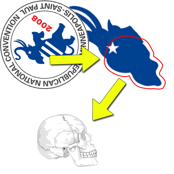
Brocke’s comment is:
Flip the logo 180. There is a skull in the ear.
Mark’s comment is:
this elephant is a great metaphor for the party, out of control and crazy minded.
On the topic of "hidden things" (*faceplant*) in a logo, tip it a bit more back and you can make out and Enron "E"
On Oct.02.2008 at 08:30 PM
Mark’s comment is:
this elephant is a great metaphor for the party, out of control and crazy minded.
On the topic of "hidden things" (*faceplant*) in a logo, tip it a bit more back and you can make out an Enron "E"
On Oct.02.2008 at 08:32 PM
Comments in Brand New, V1.0 have been closed.


