

NOTE: This is an archived version of the first incarnation of Brand New. All posts have been closed to comments. Please visit underconsideration.com/brandnew for the latest version. If you would like to see this specific post, simply delete _v1 from the URL.
Guest Editorial by Guilherme Machiavelli
In Brazil, one of the biggest competitors of coke (be it Coca-Cola or Pepsi) in the soda market is a soft drink called Guaraná Antártica, made from the local fruit, guaraná. Ten years ago, Coca-Cola, in an attempt to tackle its rival, launched Guaraná Kuat. Kuat has been marketed in various forms, beginning with the (slightly odd) strategy of declaring itself as having the same taste as Guaraná Antártica. The brand later decided to target a teenage audience, with campaigns following the “Open up your mind‚” motto.
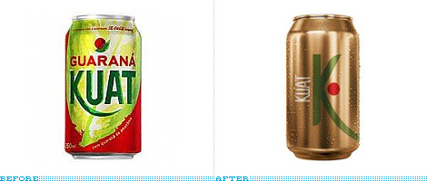
Along these efforts through the years, the logo had some iterations, but, up until now, always revolved around the same motif. In march 2008, this has changed, as Kuat unveiled a totally different approach to its identity. According to the official press release from Coca-Cola, the logo tries to break paradigms and to “search for new ways look at things‚” which looks like only a different view on the “Open up your mind” thing.
Screenshot from the Kuat web site, showing all products.
The main change seems to be the color palette. In Brazil, almost all guaranás work with orange, red and green, reflecting the colors of the fruit… Kuat, instead has put the spotlight in the drink’s color: Gold. Abandoning all the tropical wannabe feeling that the previous versions had, it tries to approach the concept in a more subtle and abstract way. Where once we had an ilustration of the fruit, there is a simple red dot; the K with an elongated swash has been even more prioritized, and typography has switched to an all caps sans serif, placed on the left side of the K. Compared to other soft drink brands, it feels rather minimalist as well. The same happens with all the packaging: The can and the plastic bottle have no bubbles, swooshes or any of the usual elements.
My feelings on the redesign are somewhat divided, though. This rebranding pleases me a lot, aesthetically speaking but, as beautiful as it might be, i can’t seem to perceive the public Kuat is trying to target. It is a refined and well made identity, but will it draw more consumers, or will it deter them, as the weird and different soda that it wants to be and that really, really stands out among its competitors?
Guilherme Machiavelli is a designer/journalist/student in Brazil who works mainly with editorial and web design, along with the eventual branding project.


Jump to Most Recent Comment
drew kora’s comment is:
wow. i dig the packaging. very cool.
On Jul.15.2008 at 07:55 AM
Remy Overkempe’s comment is:
Slick, but I'm not sure about the whole K...
On Jul.15.2008 at 08:24 AM
austine’s comment is:
It definitely looks beautiful, but I don't know how teenagers would react to it. It looks too expensive to be a soda. It makes me think of martinis, actually. Maybe that's why it appeals to me.
On Jul.15.2008 at 08:26 AM
Joel32’s comment is:
i agree with the last paragraph. i really like the design, but the gold color for the can makes me think of caffeine free coke or pepsi, which to me taste like wet cigarettes in a can. Maybe in Brazil, a gold can does not have any connection to caffeine free.
On Jul.15.2008 at 08:54 AM
Nathan’s comment is:
The rebranding is considerably different. it reminds me of "Big K" an off brand in the US. i know that if i was a kid i probably would overlook it. but then again its a different culture, so i don't how that effects the overall marketability. i would hope that they did their research, before implementing a major change.
On Jul.15.2008 at 08:56 AM
Julian’s comment is:
Pepsi is not coke.
On Jul.15.2008 at 09:12 AM
reyarts.com’s comment is:
WOW! AT LAST SOMETHING NEW...
It looks very elegant and sunny...

:)
On Jul.15.2008 at 09:34 AM
koyo’s comment is:
Nice Work. Muy Lindo.
On Jul.15.2008 at 09:41 AM
GabrielRO’s comment is:
i like the older K much better...
On Jul.15.2008 at 09:52 AM
jRod’s comment is:
I have to agree with Gabe... the other can design was much more refreshing. it looks like something good is inside. The other reminds me of hairspray cans from the 80's.
On Jul.15.2008 at 10:18 AM
R’s comment is:
While it looks good, it's not going to be enough to unseat Antarctica
On Jul.15.2008 at 10:25 AM
Kate’s comment is:
Maybe this is too American of me, but if they are aiming for teens and the new label makes it look like beer, then I think they've hit their target.
On Jul.15.2008 at 10:41 AM
Darrin Crescenzi’s comment is:
As far as soda packaging goes, I think the old design was really, really great. The typography is superb, and the color palette inviting, fresh and youthful — all without abandoning the important visual conventions that clearly communicate "soft drink." It is unique and memorable within the established visual language of its genre.
The minimalist in me wants to love this rebranding, but realistically the new can is just too radical a departure to be given consideration by a typical consumer. There's a reason soda cans look like they do…
On Jul.15.2008 at 11:50 AM
Nick’s comment is:
Que rrrico!
On Jul.15.2008 at 11:59 AM
Peter Whitley’s comment is:
I'm not buying it (in the figurative sense).
Though I don't know the market or local expectations, but to me soda pop of any flavor is about "immediate thirst-quenching goodness." This new treatment seems to suggest a long-term benefit...like the drink has medicinal properties. (The exploding green tea soft drink market often takes this approach in the U.S.)
Soft drinks are not about wellness. They're about getting your thirst obliterated NOW. This new label lacks that urgency. It's not impulsive. It's not sexy. It's got all of the charm of Old English 800 or a host of other malt liquor bottles.
Well...time will tell if "understated" works for a soft drink. I'm very skeptical.
On Jul.15.2008 at 12:06 PM
Filipe Alvarenga’s comment is:
I think this new brand design is just adopting the new Coca-Cola visual identity system– Cannes Lions 2008 Design Grand Prix. Every thing very minimalist.
I think if you watch this AD on Youtube, you'll see more about this re-brand.
On Jul.15.2008 at 12:44 PM
Anonymous’s comment is:
I don't know if Brazilian supermarkets are anything like those in the USA, but if so this simple, elegant look will stand out on crowded beverage shelves filled with swooshes and swirls.
On Jul.15.2008 at 12:45 PM
Filipe Alvarenga’s comment is:
By the way, the new motto is "A gente muda, o mundo muda" – We change, the world changes.
On Jul.15.2008 at 12:47 PM
Morgan Smail’s comment is:
great posting Guilherme.
In regards to the practical application of this design:
I think it's very easy for us designers to forget that packaging or any other form of "face" design is only half the battle. The packaging itself isn't solely responsible for the success of the drink but rather how every element of the marketing strategy works together with the design.
With that being said, i think there is a great amount of potential for marketing the new look (especially since they did such a great job differentiating it by focusing on the color of the liquid itself... very clever and quite appropriate)
On Jul.15.2008 at 01:12 PM
BenAA’s comment is:
In the US, Coke has special cans of soda shipping to celebrate the Olympic games.
The cans don the typical Coca-Cola logo on one side and on the opposite a design from a different country (like Ethiopia, for example).
I like the idea.
Bottoms up.
On Jul.15.2008 at 01:13 PM
Morgan Smail’s comment is:
in other words,
Marketing is the crux of all this. Until we start recognizing design as a "tool for marketing" we'll never begin to appreciate and/or have others appreciate the true value of our craft.
On Jul.15.2008 at 01:24 PM
Emanuela’s comment is:
Isso aí, Macki!
On Jul.15.2008 at 01:56 PM
Greg’s comment is:
Is that an outline of a guarana plant leaf on the 2L? If so it's a nice touch but, along with the rest of the redesign, maybe a bit too classy.
In my opinion Antartica still wins design and taste wise. :)
On Jul.15.2008 at 02:29 PM
Alice B’s comment is:
My first impression was that the new design is an improvement to the old one. I like simplicity and tend to like Coca-Cola's minimalist packaging. But then when I saw the other bottles I was completely turned off. The gold label and the gold color of the drink made me think of beer, or maybe even homemade liquor packaged in a plastic bottle. It doesn't look refreshing, whereas the bright splashiness of the first one does.
On Jul.15.2008 at 03:31 PM
Andre Martins’s comment is:
Kuat is a rotten brand.
Too hard too make it stand up again.
Nice packing, thou.
Glenn Sakamoto’s comment is:
Not sure if it will communicate to a mass audience. It looks more upscale (like a Sake) that might appeal to an older, more affluent audience. Perception is everything...
On Jul.15.2008 at 05:47 PM
marcia’s comment is:
it seems a beer to me...
On Jul.15.2008 at 05:49 PM
howard2112’s comment is:
I think it depends on how it's priced. It definately looks more expensive and many people will buy it over a similar priced soda for that reason alone.
On Jul.15.2008 at 06:25 PM
dg3’s comment is:
Top-notch rebrand.
On Jul.15.2008 at 08:15 PM
Miha Medvedsek’s comment is:
Looks like a can of top quality green tee from prestigious London shop. Nice design, but too elegant for Brazilian market.
On Jul.16.2008 at 04:34 AM
Marcello’s comment is:
I like a lot. Very minimalist and elegant, would play well in Japan and as an import here in the States. Not sure about Brazil, tho!
By the way...
> Julian’s comment is:
> Pepsi is not coke.
In some parts of the United States, all soda pop is referred to as "coke", whether it's Pepsi or 7UP or whatever. Perhaps the word is used in a similar way in Brazil.
On Jul.16.2008 at 02:02 PM
Jonathan Miller’s comment is:
The branding is nice, but for me its about taste, and Antartica still tastes better!
On Jul.17.2008 at 09:29 AM
Daniel Campos’s comment is:
Well, the new logo is pretty but I don't know what the teenagers will understand.
About the flavor, I'm Brazilian and a say for sure: Guanará Antartica is MUCH BETTER than Kuat!
On Jul.17.2008 at 11:36 AM
damon’s comment is:
the photography makes it look really nice. I wonder how good it looks in real life though. Sans all the back lighting and colour correction.
still pretty slick though.
the 2L needs a space next to it though, like the rest of the measurements...looks like 21
On Jul.17.2008 at 01:43 PM
JL’s comment is:
I don't mind the redesign. The identity looks good together, minus the kuat zero. It looks like the "K" has been squashed un-proportionally to the side to fit that HUGE zero in there.
I also agree with Kate's comment above, maybe this was branded to look like a beer so teens could feel like they fit in.
On Jul.17.2008 at 03:13 PM
Shane’s comment is:
I'm loving the redesign.
I lived in Brasil for almost two years. from February 2000 to December 2001. Although I prefer Antartica, it is because of taste, but Kuat comes in a strong strong second. However if you compare that Guarana the soda in general is meant to be the non alcoholic beverage in a bar. That is why it has the golden color to replicate beer. Also Antartica is one of the stronger beer companies in Brazil. So if you look at the packaging and branding of the Antartica brand guarana it resembles more of a beer feeling. So this redesign to me has more of a sophisticated beer feel to it.
So I am ALL for it. Heck if I was down in Brasil right now I might jsut switch to Kuat just for the fresh new clothes it's wearing.
I first started reading this article with fingers crossed hoping Coke was going to open up the market to the US, because I am having HUGE withdrawals from the soda, and it is difficult to find, and expensive here in the US.
On Jul.18.2008 at 04:57 PM
Corey Buckner’s comment is:
Despite the fact that the can looks like a bullet, I Love the rebrand. No science to it, I just love to look at it and thus would be apt to try it! Great job in my opinion!
On Jul.19.2008 at 12:26 AM
billybacon’s comment is:
first, some interesting facts about brazilian guarana:
guarana means in tupi (native brazilian language) 'great liana from amazon forest'.
red symbolize guarana beans and green represent amazon forest.
antarctica was launched in 1921. at that time the name was guarana champagne antactica. it's a brazilian original and the second most important soda brand in brazil; coke, obviously, is the first. ambev, the company that owns the brand, produces its owns guarana beans in a farm in the amazon region where they study the best way to raise its beans. the taste is incomparable.
kuat was launched in 1997. 'kuat' in tupi means 'moon's twin brother'. it was a released as a new option. It's the second most important guarana brand and coca-cola company owns it; the first, obviously, is antarctica. since the beginning, kuat emphasizes in its communication that their guarana beans come from the amazon region. the taste is incomparable but sweeter.
question: how could the biggest brand in the world compete with a brazilian authentic product?
answer: saying: we are not green. we are gold.
kuat's redesign campaign copy says: "...concepts are not definite. we change. the world changes. evolve."
so, you can notice that any soda design convention will not do it, right?
the use of the color gold might be questionable and controversial*. the minimalism contrasts with the brazilian vibrant mix. if we stop and reflect, by the book, this new design is doing what any new design should: change perception. it achieves that using an approach that is surprisingly unforeseen. perhaps, a pinch of strangeness goes well.
guarana soda is a brazilian authentic product. doesn't matter which brand is, we brazilians are proud of guarana the same way we are about soccer. we sell it anywhere we go.
• a golden packaging that is perceived as 'beer' is interesting culturally. every kid in brazil, while drinking guarana, loves to play they are drinking beer (you might not understand but, amazingly, that keeps them away from alcohol).
On Jul.19.2008 at 10:26 AM
Gabriela’s comment is:
I´m brazilian. The identity and packaging are great! Really nice.
However, if we want to drink a soda, we ask for a guaraná Antarctica. Kuat is Coke and there's too many people that don't want an american drink. So, Antarctica wins in taste, history, culture and idealism.
Neuehaus’s comment is:
We love it! I'll bookmark this one over at our place:
On Jul.23.2008 at 03:00 PM
Ben’s comment is:
"Nice design, but too elegant for Brazilian market."
So, let me see if I got this right... The Brazilian market can't have something like this? Do you even know something about the country, its consumers or market history?
john smith’s comment is:
From design standpoint I don't like it at all. The color reminds more of energy drink than anything else. The form "K" doesn't work for me. And, the word "kuat" vertically... it doesn't work either. It's not big enough, it has no presence. Especially if it's going to be white printed on metallic/gold material. It looks way too artificial.
But again, it's a redesign. The change is more important than the "enhancement". It looks like they are fighting for the word "guaraná". Honestly, I dig more the original design. At least it has some association with amazon. The new one says nothing...
On Jul.28.2008 at 03:56 PM
Mongoose’s comment is:
I can only approach this as an American consumer, sadly, not having the cultural impact of others. And my initial reaction between the old and the new cans is, "I'd rather drink the one that says 'Guarana' and looks juicy and fruity."
That said, I'm certain that the minimalist, re-dot-and-K, golden-accent approach does play up a lot of that beer-alternate, golden beverage aspect. I see where they're going for it, and it's not bad at all.
Incomplete, because I feel unqualified to give it a letter grade.
On Aug.17.2008 at 01:06 PM
Brian’s comment is:
In America, we say, “give me a Band Aid.” Yes, Band Aid is the most prominent, but when we’re asking that question we really don’t care if it’s that brand or some other brand. In some places here, you could say the same for “give me a coke.” At any rate, Antártica Guarana is similar. If someone says “I’d like a guaraná,” the expectation is a Antártica Guarana.
Kuat Guaraná is to Antártica Guaraná like Zune is to iPod. Which is to say, Antártica has a ridiculous market share advantage on Coke’s Kuat. By the way, it actually tastes different too. It’s sweeter—just what you’d expect from a Coke product. First of all, guaraná is a national berry-like fruit which is used in a few different products, most notably as a soft drink.
So, it’s understandable that Coke would take a huge chance and try to position their version of guaraná in a completely different light. So, they’re banking on the younger crowd who are more open to change, who are more culturally diverse in terms of the music they listen to, the blogs they read, the clothes they wear. Ok, I get that too. The one thing that in my opinion is a huge mistake is using gold as the dominant color. Gold is something usually attributed to the rich. Most youths are not rich. On an aesthetic level, the gold doesn’t really look gold. The aluminum cans look more copper (like a penny), while the actual liquid looks like beer (or urine). Antártica guaraná, by the way, has green plastic cans to make sure it doesn’t look like you’re buying a liter of piss.
Personally, I find the overall execution boring as hell. A green K and a red berry—big deal. It’s a soda damnit! Give me some energy, some waves of color, some in-your-face exploding graphics (see the Fanta review on Brand New). Don’t even get me started on how poorly-executed the Kuat Zero can—is it an ø or a 0? It’s also reminiscent of a mixed drink’s sword through the olive. Who knows.
I feel pretty strongly that both strategically and in terms of the actual work, it’s a failure.
On Aug.27.2008 at 03:53 PM
Comments in Brand New, V1.0 have been closed.


