

NOTE: This is an archived version of the first incarnation of Brand New. All posts have been closed to comments. Please visit underconsideration.com/brandnew for the latest version. If you would like to see this specific post, simply delete _v1 from the URL.
![]()
There is nothing more exciting for global conglomerates than having a “Biggest [blank] Company in the World!” catchphrase, and the latest addition to this lofty echelon of behemoths is Thomson Reuters, the biggest business media company in the world, that resulted from the purchase of Reuters by the Thomson Corporation, a deal worth billions of dollars and stock fluctuations. Yesterday, the new company unveiled its new identity, designed by Interbrand.
“The dynamic new corporate identity is a marked departure from the historical look and feel of the two companies and represents Thomson Reuters positioning as the world’s leading source of intelligent information to businesses and professionals.”
— Thomas H. Glocer, chief executive officer of Thomson Reuters
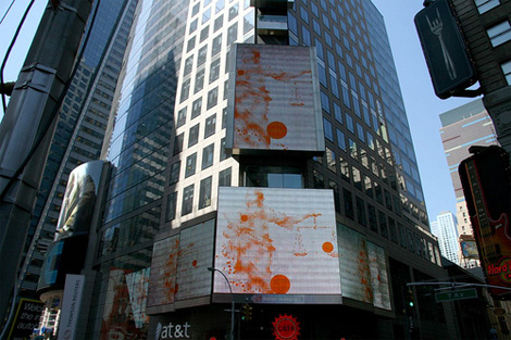
Thomson Reuters digital billboards in Times Square. Photo by Flickr user xsquare2, who has more images in this set.
The new identity overall, as it plays out on the web site and the billboards, feels indeed dynamic and interesting, and the multitude of dots are put to good use. Unfortunately, those seemingly hundreds of dots make for a rather lousy and mundane icon, better suited as an initial Adobe Illustrator sketch exercise than for a conglomerate — and their arrangement is pretty unimaginative, there is nothing expressive about them. The wordmark is a little more interesting, it feels unique, composed and contemporary — although the real star of the identity is the typeface being used on their web site that is almost similar to the one in the logo, I think they can build a lot of recognition through that typeface. Not sure if it’s off the rack, or custom-made and proprietary, suggestions and clarifications welcome.

If you visit reuters.com, you’ll see that that entity still maintains a little more brand hierarchy by using a Reuters wordmark, picked up from the new logo. A smart move to keep the name recognition of Reuters while extending the identity application. Overall, I like this new work, it is very well suited for its audience and the global business landscape. But I do hate that icon, specially when it gets rendered small, it just looks like the eye of a storm on the local TV news report.
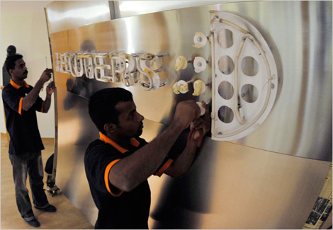
Reuters sign in Dubai gets stripped down. Photo by Jumana El Heloueh/Reuters from nytimes.com.


Jump to Most Recent Comment
Chad K’s comment is:
Love it. It looks like a shiny marble small.
On Apr.18.2008 at 12:42 PM
lodenmuse’s comment is:
A hundred shiny marbles going down the toilet.
"Call Roto-Rooter, that's the name, and away go troubles down the drain."
On Apr.18.2008 at 12:52 PM
felix sockwell’s comment is:
nice mark.
...but oh no "it looks like a storm".. nephew please. I dont think anyones complaining about Chase looking like a camera shutter anymore. everything looks like something.
this mark has clarifying type, nice movement, reduces well, is surely ownable. hey, whats not to like? if it looks like an orange hurricane maybe you should go and hide.
grade: A
On Apr.18.2008 at 01:00 PM
John’s comment is:
I like the new icon. It's an improvement over the Reuters icon, which was a riff on the old Reuters "stock ticker" wordmark. Overall, the new identity isn't as bold as the two it's replacing, but it's certainly more dynamic and offers great opportunities for ancillary graphics (such as the ones they're already using in Times Square).
On Apr.18.2008 at 01:07 PM
Glenn ’s comment is:
I feel a migraine coming on...
On Apr.18.2008 at 01:16 PM
Ampersanderson’s comment is:
Visteon

JonSel’s comment is:
reduces well
Eh...not so much to me. But I do like the visual language that seems to have been evolved from it. So a relatively good job here.
The typeface they are using looks to be Locator. The wordmark also looks like Locator with some modifications – parts of the cap 'E' from the display variant, a re-drawn S, etc.
On Apr.18.2008 at 01:23 PM
Nick’s comment is:
not bad...I do see a storm....is it prophetic about the media world...who knows....but I do agree that the typeface selection is very strong
On Apr.18.2008 at 01:41 PM
Amber’s comment is:
The type is a derivative from Process Type Foundry catalog, custom-commissioned to them for TR.
On Apr.18.2008 at 02:36 PM
KAST’s comment is:
I love that type! In times where everyone is using Gotham (myself included), it's nice to see something different. I have a renewed appreciation for the work of Process Type Foundry. Overall I think it's a very nice mark.
On Apr.18.2008 at 02:55 PM
Christian Palino’s comment is:
I'm in agreement regarding the new typographic system having the ability to build a lot of brand recognition - arguably even enough to do without the logomark. Regarding the logomark, on its own it does little to communicate the company, its goals or attributes, as it has a rather generic, unarticulate quality. The visual extensions of this mark (dots in some sort of configurtion and space), if worthy, could have been created as a visual campaign without tattooing it to the company's name, certainly a past trend. This mark may resonate with audiences, thats always hard to speculate, however from a design perspective it seems a rather underdeveloped exploration of something found in the Design Elements catalog.
On Apr.18.2008 at 03:00 PM
Eoghan R’s comment is:
Amber: wondering where you're getting that the typefase is custom commissioned. I played a small roll in this project and it's very much stock Locator with (as JonSel pointed out) minor variations in the wordmark only.
On Apr.18.2008 at 03:22 PM
Eoghan R’s comment is:
Pardon the typo above.
On Apr.18.2008 at 03:29 PM
Greg Hoy’s comment is:
We worked on the design of the website. The logo and heading typefaces on the site is Locator from Process Type Foundry.
On Apr.18.2008 at 03:40 PM
Prescott Perez-Fox’s comment is:
I'm afraid I have no love for this new logo. It's abstract corporate blah at its finest, complete with dull colours, a nebulous brand name, and a mark that harkens back to the hey-day of Magic Eye calendars.
Having never heard of Thomson, I'd say Reuters is clearly a stronger brand. Their mark was clear and colour scheme set them apart in the realm of news/media. Every time I look at these dots, I'm going to think to myself "WTF." At least they didn't add a random marble/ball/orb.
I do like the typeface, so +1 for the tidy type treatment.
And once more, where do CEOs get these fantastical words for press releases? Seriously, do they go to school for this madness: "We are witnessing the maturation of the information economy and content from Thomson Reuters will be its currency.”
On Apr.18.2008 at 03:53 PM
Jerry Seinfeld’s comment is:
Conceptually I was a fan of the previous Reuters identity & system, accessible information available 24 hrs a day. Very simple, clean, clear, but outdated and unsophisticated. I think this new mark brings a refreshing quality to the table, even more so of how it is implemented dynamically, and the simple fact that this is not another god awful dimensional globe. Although this appears as if Reuters acquired Thomson (not the other way around) which is the only real downfall I see in this design of the logo, maybe that just doesn't matter all that much.
Animation:
The dots used in various animations I saw at Times Square were interesting yet simple. A concept like this could have gotten ridiculously out of hand, but there was something organic, yet controlled about it which makes this work so well.
Environmental Graphics (Times Square):
Having offices around the world I could only imagine the kind of undertaking this was. But at the end of the day I was left very uninspired, at least by the Times Square site.
Website:
Their website does appear "intelligent", but has a few wrinkles to iron out when moving the cursor around on the screen. I'm also having trouble getting this to load properly in Safari.
Overall:
Either way a solid job based on first impressions. +1 Interbrand.
Mr Posen’s comment is:
All your profits being flushed down a sinkhole, is what I see.
I do like the secondary, billboard visuals though.
On Apr.18.2008 at 03:59 PM
fred autechaud’s comment is:
Take two B2C identities and turn them into some poor B2B emblem. At least they can go on any business sector with this.
On Apr.18.2008 at 05:40 PM
Jason’s comment is:
I like how the dots respond to mouse movement on the site. It's a nice touch!
On Apr.19.2008 at 05:43 AM
dotdotdot’s comment is:
There are some good reasons for the dot massacre:
the reuters logo history and the well executed online styleguide, which defines a wide range of media, including on air/broadcast design.
For all, who want to have a look for the last time:
http://about.reuters.com/corpid/
fullstop
*** Dave’s comment is:
Wow. I was just in NYC and Times Square last weekend, and remember noticing the (old) Reuters signs/logo. Weird to think it was just about to vanish ...
For the record, the current logo and text (as attractive as the font is) could be for anything from news to washing machines to grommets. Says and does nothing for me, unless I follow it along to the "Reuters" part of the name.
On Apr.19.2008 at 04:34 PM
marko savic’s comment is:
could be for anything from news to washing machines to grommets.
Isn't that what the news is?
I like it, but the world is being barraged by a plethora of orange dots these days. The type makes me happy.
On Apr.20.2008 at 01:50 AM
Armin’s comment is:
> reduces well
Dear nephew, please!
On Apr.20.2008 at 12:00 PM
Maestro Masters Maven & Michael’s comment is:
Hands down SIR ALAN FLETCHER (Founding Father of Pentagram)
1968 punch dot Reuters Identity for Crosby Fletcher Forbes Gill is the Rolls Royce of all the Reuter's Identities.
SIR ALAN FLETCHER's Identity 4th from top them.
http://worldsbestlogos.blogspot.com/2007/11/reuters-logo.html
Memory serving me correctly dots alone
in a word mark were never incorporated before SIR ALAN FLETCHER'S Identity.
The last two (2) incarnations of Reuter's Identities were Designed by Enterprise IG / UK 1996 and 1999
In reference to the new Identity, although not a Hallmark in Originality it does keep the spirit and equity of SIR ALAN FLETCHER's punch dot motif in symbol not the wordmark.
Dots have been used forever in Identity symbols and have become a cliché. The beauty of clichés is the ability to show an Old thing in a new way and a New thing in a old way.
In this respect, InterBrand's Reuters Identity is a success.
Golden Arm is a-b-s-o-l-u-t-e-l-y 100% correct in reference to usability. With current new printing technology this Identity will have no Readability issues and will print flawlessly in color and black and white.
You can read other analysis and commentary onMaestro Tony Spaeth's website.
http://www.identityworks.com/reviews/2008/Thomson_Reuters.htm
DM
The Hostile Takeover of Corporate Identity
On Apr.20.2008 at 03:05 PM
Darrin Crescenzi’s comment is:
Reuters has been around a lot longer than I have, and yet somehow I still thought the "punchdot" logo referenced by Maven above was the official Reuters logo… Apparently that one had some staying power.
I guess I'm glad to see at least an attempt to retain that equity in this new identity… and I agree, the type is very nice.
On Apr.20.2008 at 09:23 PM
Darrin Crescenzi’s comment is:
Apparently, my comment was so insightful that it needed to be there TWICE.
(sorry)
On Apr.20.2008 at 11:10 PM
AL’s comment is:
B(r/l)and.
Alan Fletcher's 1965 version still wins.
On Apr.21.2008 at 07:47 AM
c-lo’s comment is:
Not terribly inventive, but it is slick. I guess they had to figure out a way to merge the looks and keep a look that resembles the two older logos. And keep the logo lawyers at bay.
On Apr.22.2008 at 09:54 AM
Frank’s comment is:
It sucks.
Just another techno, mid-90's, Webbubble 1.0 logo made from dots."Space dots" logos belong in the same category of cliched logos the swoosh and the orb logos are in.
So dated, so not saying anything.
Sorry, but i refuse to see the emperor's new clothes and i'm not going for the marketing speak either.
damon’s comment is:
like the typeface, indifferent to the glyph.
anybody know what font that is?
Mr Posen’s comment is:
This is a very average and expected solution on so many levels.
The symbols is overly complex, fills in when small, is confusing, swirling dots disappearing down a hole, that says Reuters to me! Designing a symbol that is legible in the diminutive, is logo design 101, why Interbrand did not address this is... amateurish.
The logotype is the best part, but even then it is very much a 'favor of the day' style, that may date poorly.
This logo is not up to the standard expected of such a prestigious redesign, by an established branding agency like Interbrand.
Straight from the tube just doesn't cut it.
On Apr.24.2008 at 11:47 AM
Annette’s comment is:
I don't care for this logo. The typeface is nice, but overall it looks too generic. There are too many logos that have some abstract circular thing followed by a typeface. There are other shapes besides circle, you know. :P
On Apr.26.2008 at 06:05 PM
Adriano’s comment is:
The typeface used globaly on their website thomsonreuters.com it's based on Process Locator.
The type of the logo itself seems like a nice Locator/FTF Morgan Sans/Monotype Neo Tech flavored glyphs. Very nice result.
On Apr.28.2008 at 10:35 AM
Lori’s comment is:
The typeface of the word mark is based on Neo Sans. The typeface used for page titles and some headlines on the website is Locator, but will soon be changing to the newly-commissioned custom font that is based on Locator.
On Jun.06.2008 at 04:17 PM
Roy’s comment is:
It's cool & mature.
On Jul.03.2008 at 10:00 AM
Joaquin’s comment is:
I mean,

Moeed’s comment is:

Similar concept.
On Sep.11.2008 at 03:13 PM
Comments in Brand New, V1.0 have been closed.


