

NOTE: This is an archived version of the first incarnation of Brand New. All posts have been closed to comments. Please visit underconsideration.com/brandnew for the latest version. If you would like to see this specific post, simply delete _v1 from the URL.
![]()
The Port of Seattle is a major hub for international trade, transportation and travel in the northwest United States. Established in 1911, the port has quickly grown, becoming the 7th busiest US seaport in 2007. From its roots until now, the port has always thought of itself as progressive. The port envisions itself as one of the “cleanest, greenest, most energy-efficient port[s] in the nation.” Visually the port has attempted to align itself with its twentieth-century mission of being the cleanest, greenest port.
The three bars of the logo suggest air, land and sea – the three realms where the Port operates – with green running through the center. They also represent the three parts of sustainability: economic development, social responsibility, and environmental stewardship.
Yoshitani intends the logo to demonstrate to the community the Port’s commitment to sustainability, and also inspire Port employees to incorporate sustainable practices in everything they do.
— From this semi-press release
The prior mark was a little too ambiguous and didn’t clearly identify the port; and the color scheme was questionable at best. The new mark is headed in the right direction but lacks proper execution but, yes, it’s still ambiguous. The color scheme is improved but the typography is weak. The R/T ligature had potential but was not rendered with care. The “air/land/sea” mark is clever but not powerful enough to represent the three elements. Right now the mark is messy and blue — which doesn’t say clean nor green. The identity is so close to being mnemonic but isn’t there yet.


Jump to Most Recent Comment
Justin Smith’s comment is:
You know, normally I agree with every critique of new logos you make, but I'm going to have to disagree on this one. While I will give you that the typography may be a tad bit ambiguous, I would argue that the logo by itself is genius. I like the lines showing horizon, and using the colors for air, land and sea is very simple, yet incredibly effective.
I'd say it's a tremendous improvement over the previous one.
On Apr.11.2008 at 11:17 AM
soundwave’s comment is:
Seems like an unusually harsh review for what is a definite improvement.
I do agree with the ligature, but however, I am a little confused armin as to your remark regarding the mark being clever but not "powerful" enough. Its a port... i cant see how a literal translation of services, products etc would have been a better solution.
overall, its a mucho improvement!
On Apr.11.2008 at 11:29 AM
mr black’s comment is:
It's better, but it's too muddy looking. The colors don't particularly stand out, and it seems more swampy blue than green and clean. It needs brighter hues.
The font is better, but I agree that it's weak. It should maybe be bolder and more dramatic than the uninspiring humanist typography they went with.
On Apr.11.2008 at 11:39 AM
Chris’s comment is:
The first thing that came to my mind is how the new logo abstractly resembles the Seattle Seahawks' emblem and color palette.
On Apr.11.2008 at 11:42 AM
christopher’s comment is:
I really like the old logo. It is representational of the docks on the Seattle waterfront. Likewise, it has a bird/wing form that speaks of the airport system, and finally the arrows are reflective of the road system. It seems a more elegant solution than the new one.
I agree with you Armin, the typography on the new design is incredibly weak as well. The kerning alone is poorly done, especially between the o and r in port. It seems poorly balanced over all.
The old solution is a better execution IMHO.
Cheers.
On Apr.11.2008 at 11:49 AM
John’s comment is:
Chris, I completely agree. I had that in the original write up. It seems Seattle has an obsession with "green" - Starbucks (well, the old one at least), Seahawks, Etc...
And for those who think the logo isn't sloppy, check out the larger image from their site (granted, someone didn't know how to save anti-alias but still...):
![]()
christopher’s comment is:
I really like the old logo. It is representational of the docks on the Seattle waterfront. Likewise, it has a bird/wing form that speaks of the airport system, and finally the arrows are reflective of the road system. It seems a more elegant solution than the new one.
I agree with you Armin, the typography on the new design is incredibly weak as well. The kerning alone is poorly done, especially between the o and r in port. It seems poorly balanced over all.
PS- one of the other considerations is the presence of Native art, which is also reflected in the older execution.
The old solution is a better execution IMHO.
Cheers.
On Apr.11.2008 at 11:53 AM
Patrick’s comment is:
Old logo wins. No question.
On Apr.11.2008 at 12:00 PM
drew kora’s comment is:
I like the mark, not crazy about the type treatment around the mark. And I'm not into the of.
On Apr.11.2008 at 12:03 PM
doogs’s comment is:
[ It seems Seattle has an obsession with "green" - Starbucks (well, the old one at least), Seahawks, Etc... ]
The use of green and blue has generally become the default color scheme of many organizations representing the region. As you've stated, the Seahawks use this (green/2 blues), the Mariners use this, the Thunderbirds (hockey), the SoundTransit system, and the Sounders (soccer). I'm relieved the Sonics didn't fall into this color trap, even though they do use green.
As for the logo itself, I agree that the execution of the mark and typography is not the greatest. The rationale is sound be from a form standpoint, it's not visually substantial, being perhaps too "airy."
On Apr.11.2008 at 12:21 PM
Unit B’s comment is:
While the logotype could be stronger, I think the new icon is a winner. (Yes, question, P.) The blue strokes seem to form a stylized S, and the green runs through the heart of it. A vast improvement, if not a winner, it certainly ranks on the leader board.
On Apr.11.2008 at 12:22 PM
Danny Tanner’s comment is:
My initial take is the strategy was
messed up from the get go.
Who is their audience? Tourists
or people using the port for
shipping? If I was a shipper, what
do I care if the port is 'green'
or not? I just have to get stuff
shipped there, hands down. This
port doesn't seem to need a
'point of differentiation,' and if
all anyone could come up with
was 'green' then lets congratulate
them for hopping on the
bandwagon. Let's be thankful
the strategy wasn't to go with
an acronym, P.O.S. would have
been even more ridiculous.
If this port really did need to
differentiated for some reason,
and someone can tell me why,
please do.
Armin’s comment is:
> I agree with you Armin, the typography on the new design is incredibly weak as well.
I know I write a lot, but this one was written by John Feldhouse. Not me.
On Apr.11.2008 at 12:47 PM
Bendy’s comment is:
This new logo is an absolute joke... I see the dock edge/flight strip much more clearly/quickly in the original logo than I do "sea, land, air" in the new.
This is a ridiculously careless execution. It's not thoughtful, it's hackneyed and already appears out of date. It's a sad day for the port of Seattle.
Soundwave, I'd like to hear how the new logo is actually a "definite improvement"... There are too many colors, the form is very weak, it's ambiguous and is not engaging or even clever.
On Apr.11.2008 at 12:51 PM
andrew miller’s comment is:
apparently they want us to realize its the "port of seattle" not the other port that might be the "port in seattle."
On Apr.11.2008 at 01:00 PM
Prescott Perez-Fox’s comment is:
![]()
This is how I would have handled the type. I don't quite understand why it wraps to the left and bottom. Regarding the type, I totally agree with John.
However, I feel the blue-and-green scheme is a massive improvement over the previous one which feels corporate and cold, like something from Cold War-era Ukraine. It will be interesting to see this logo across more materials, because right now the webpage doesn't reflect any kind of re-design or update.
On Apr.11.2008 at 01:05 PM
Willis’s comment is:
I don't have a problem with either logo. The older one is definitely more interesting, but perhaps less suited to it's task.
Aren't Seattle-ites becoming a bit tired of the same exact 3 color shades being used for every thing? This, the Seahawks, the new MLS team that was just announced...
![]()
doogs’s comment is:
[ Aren't Seattle-ites becoming a bit tired of the same exact 3 color shades being used for every thing? This, the Seahawks, the new MLS team that was just announced... ]
Yes.
[ However, I feel the blue-and-green scheme is a massive improvement over the previous one which feels corporate and cold, like something from Cold War-era Ukraine. ]
I appreciated the one color mark. I feel the old mark totes the feel of 'port authority' a lot more than the new mark (of course, we'll see if that changes once it's settled in for a while). I felt the chevron mark works really well as a single color on shipping containers / official vehicles. I'd totally wear it on a shirt. The new one? Not so much.
Much of the reasoning seemed to be expressed in the use of the 3 colors, but I question if the translation to one color diminishes the idea of being green. I don't feel that that is something that can be designed into this kind of mark. It's more likely that the idea of being green will be associated with the Port of Seattle by how the port runs its biz.
On Apr.11.2008 at 01:34 PM
Anonymous’s comment is:
Bendy. In my humble opinion, and i am just an average graphic designer... but the branding looks stronger to me with the new logo. I live on the east coast, and therefore i speak from purely a visual appeal, and dont have the intimate understanding of the locale.
The old mark to me seems disjointed. I see several people claim the new mark doesnt reflect the port etc. The old logo looks like a mistake. With remnants of a symbol that got chopped off and merged with some type.
So i guess in my opinion, even if the green palette is worn out, it seems appropriate and lively. It makes the Port of Seattle seem alive and progressive.
just my two cents.
On Apr.11.2008 at 01:47 PM
Soundwave’s comment is:
oops... the last comment was written by me. sorry.
On Apr.11.2008 at 01:48 PM
dg3’s comment is:
Or even:

Stevie K’s comment is:
Supersonics can be added to that obsession with green, come to think of it they have an obsession with the letter S as well.
On Apr.11.2008 at 02:54 PM
Kim Siever’s comment is:
I also like how the logo seems to resemble fog or smog as well. ;-)
On Apr.11.2008 at 03:03 PM
Von Glitschka’s comment is:

Chief Seattle isn't happy. A proverbial tear if you will.
On Apr.11.2008 at 03:53 PM
CJ’s comment is:
I like it, it has a nice subdued, not scream in your face feel thats actually refreshing. Plus it plays nice with their other property:
![]()
J2B’s comment is:
That original mark is pure genius. Nothing says port authority like a row of shipping containers. The new mark seems like such fluff.
just my 2 cents :)
On Apr.11.2008 at 04:04 PM
felix sockwell’s comment is:
hah hah.. nice one Glitsch
like shooting fish in a bucket on a port in the rain.
On Apr.11.2008 at 04:26 PM
Fernando Lins’s comment is:
I like the new type better, but the logo has really muddy colors indeed. Overall it feels unbalanced though.
On Apr.11.2008 at 04:36 PM
Rachel’s comment is:
I like the old mark, but not the colors. Maroon and I just don't agree. I like the land/sea/air bit, but I don't like the type at all - too wispy. And why the italicized of? Makes no sense. Give me serifs, at least, to lend a little weight to those letters before they fly away!
On Apr.11.2008 at 04:37 PM
Adam McIsaac’s comment is:
There were three referents in the original mark: cranes, containers and the port itself -- the sharp point at upper right, accessed from the Pacific to the west, and the Puget Sound from the south. A much better idea (and more vigorous execution) than the new one, which seems tentative and ambiguous; Moreover, it worked much better small and in one color. Its replacement is an example of change, it seems, for the sake of change.
On Apr.11.2008 at 05:54 PM
Jung’s comment is:
I think the old mark and old type treatment but with the color range from the new mark will be the winner.
On Apr.11.2008 at 06:20 PM
Joe M. ’s comment is:
Do we know who did it?
On Apr.11.2008 at 07:27 PM
sam’s comment is:
Glitschka is super awesome
On Apr.11.2008 at 08:12 PM
JR’s comment is:
Change for the sake of change? Couldn't agree more.
Still, I feel like the old mark needed an update, no matter how appropriate it was/is the mark's date with both the color and typography. I'm just sad that the new mark looks like a patchwork collage of mediocre elements no one had any idea what to do with; the hackneyed typography shreds any sense of intelligence; and the of is like a bullet between the eyes.
Who thought that was a good idea? And I'm not even going to dignify those ligatures.
The mark's interesting, though. It has some dynamism and the standard eco-friendly palette and I'm sure someone put some thought into it--they just needed to think a little longer.
I just wish more consideration went into the rebrand because right now it feels shallow and looks awkward.
On Apr.11.2008 at 09:30 PM
fred autechaud’s comment is:
The new one looks like the name of a cruise ship.
I now try to post here an obvious evolution of the "container theme" of the original logo, building on the Sea and Land color+form. Hope it will display fine...

fred autechaud’s comment is:
oops...

Glenn ’s comment is:
Pros: Fresher and the colors are better.
Cons: The balance and proportions need some work.
On Apr.12.2008 at 01:23 PM
Chad K’s comment is:
It's just boring. Need we say more...
On Apr.12.2008 at 04:20 PM
mog’s comment is:
It still needs work, but it looks much friendlier than the old mark. Regarding the old mark, "Cold War-era Ukraine" is right. And who associates Seattle with that muddy maroon-plum color?
And yes, I can sort of see the shipping containers/docks/airstrips/what have you in the old logo, but to me, that seems like even more of a stretch than the "sky/land/sea" thing in the new logo, which is at least more clever.
Do I think the new logo is perfect? No. Could it use some work? Yes. Would I change the type alignment? Of course. But is it an improvement? IMHO, definitely.
On Apr.12.2008 at 06:04 PM
Mr Posen’s comment is:
The old logo looks militaristic and dull and the new logo has absolutely no unique or interesting qualities.
The real loser here is the client.
On Apr.13.2008 at 12:00 AM
Roseva’s comment is:
Both logos lack any identity at all, they are so boring, when did shipping become so unappealing? The whole idea of communications and sea adventures, which were part of the trade history and the very essence of moder civilization is totally lost. Sea ports have become so dull they are almost invisible.
On Apr.13.2008 at 10:34 PM
Chris’s comment is:
I agree with the above comments regarding the shades of blue and green. If your going for a greener approach, a nice vibrant green is always a good solution as a opposed to the murky green that was displayed with the new logo.
By using color to bring emphasis to Seattle like the examples above, helps the location of the company really pop out and helps create a more uniformed mark.
In final, time wasn't well spent on the typeface decision.
On Apr.14.2008 at 09:57 AM
Wünderwoman’s comment is:
Nice work.
On Apr.15.2008 at 12:16 AM
Mark’s comment is:
One question, why is "of" italicized?
it doesn't fit that quite well when one word is italicized and the rest isn't, not that a big of a deal.
It still works overall, it's just something I've noticed.
Von, I just noticed that the old one could be seen as an arrow (which seems more dynamic)just by tilting it a couple of degrees.
On Apr.15.2008 at 01:03 PM
Shanti @ Antishay’s comment is:
I don't like the "of." That's all, really. Being from Seattle all my life, I actually really like the new look. Most of Seattle is blue and green (and gray!) and this logo just... sits well with me. I see your point, but it really does fit here.
And if you come to Seattle, you'll find that we're a bunch of environmental activists and we are certainly super "green." ;)
On Apr.23.2008 at 04:36 AM
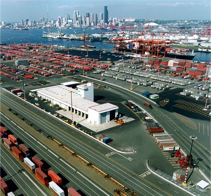
Shanti @ Antishay’s comment is:
In the last comment, I was being sarcastic about the activists, btw. Well, sort of.
I thought it would be good to give a little perspective, since everyone is going on about the ships, airplanes, etc. The Port of Seattle is for CARGO SHIPS and it's MASSIVE and mostly ORANGE. But I still like the new logo. When I think of the port, I think of this:
Nolen Strals’s comment is:
For a port that prides itself on being the "greenest" and most energy-efficient in the country, I have to wonder why they would choose a logo that requires the use of more resources to reproduce.
Maybe this is a stretch, but it seems that only having to use one color for printing and painting services would not only save money, but also energy and resources.
On May.01.2008 at 04:10 PM
Ty’s comment is:
While I enjoy the logomark, I wish that the web site were a bit more congruent with the logo. The site is generally disorganized and cluttered, clashing with the simplicity of the mark.
On Jan.07.2009 at 03:27 PM
Comments in Brand New, V1.0 have been closed.


