

NOTE: This is an archived version of the first incarnation of Brand New. All posts have been closed to comments. Please visit underconsideration.com/brandnew for the latest version. If you would like to see this specific post, simply delete _v1 from the URL.
![]()
Qantas — Queensland and Northern Territory Aerial Services for long — unveiled a new logo and identity this past Tuesday, after 23 years of using the previous identity. Designed by Hulsbosch Communications — if you have patience for Flash sites, you can see some images on their web site — an Australian firm with a proven record of designing airline identities, the new logo is a subtle but beautiful change.
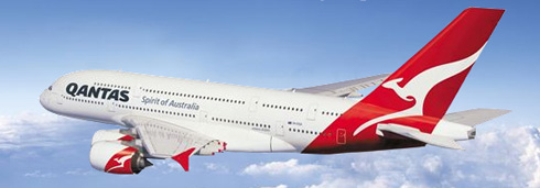
The new change was triggered because of a new tail shape on the Airbus A380 super jumbos and Boeing aircraft as well as a dated kangaroo. Executive General Manager John Borghetti states:
“This move also reflects the changing structure of our new aircraft — for example, the shape of our new kangaroo is a great fit for the tail of the A380 and other new generation aircraft. We will also be progressively rolling out the new branding across the airline in the lead up to the delivery of the first A380 in August 2008.”
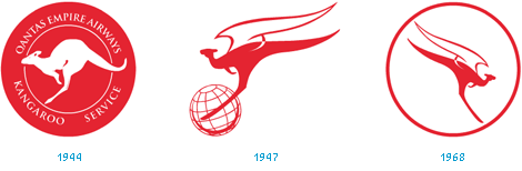
Previous logos
“The differences are subtle but distinctive, in keeping with the gradual evolution of the logo since it first appeared on one of our aircraft in 1944. Our new flying kangaroo is sleeker and more contoured than the current version — a modern take on a design that has stood the test of time,” he said.
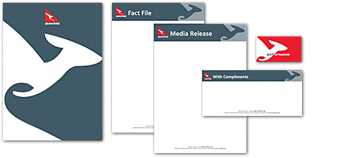
The new look is a nice refresh to one of the most recognizable logos from Australia. The richer red and improved typography is a nice change, although the new type does remind me a bit of the Burger King type. The sleeker form makes sense — more power in the legs and a larger tail. Overall the new logo is a huge improvement while retaining the brand equity from the original kangaroo.
For more information, check out the press release.
Ed. Note: Many thanks to all that e-mailed about this story, including Australians who were 12 hours ahead of us in getting the news.


Jump to Most Recent Comment
Michelle French’s comment is:
Wow! Very nice work. Also, it is nice to see some client loyalty. If you look at the Hulsbosch Communications site—Quantas was their original client 20 years ago.
On Jul.25.2007 at 10:10 AM
C-LO’s comment is:
Nice Tweak. I am getting a nice "jet" feel from the head of the kangaroo when it is on the business cards and the letterhead which really ties together the animal with the company. That alone is such a nice touch. Very tied in with speed. I like how the main logo is used EVERYWHERE, and not needing simplafied logos. It's slick
On Jul.25.2007 at 11:24 AM
Tony’s comment is:
I, honestly, only buy it because of the rendering on the plane. I thought the new logo looked a little heavy and unbalanced even though it, appreciatively, was a minor change. But on the plane, there is a gracefulness and dynamism that I like. Bravo.
On Jul.25.2007 at 11:27 AM
Bart O'Dell’s comment is:
I honestly think this is a very nice upgrade. It retains the heritgage of the image while giving it a very elegant update.
On Jul.25.2007 at 11:39 AM
Von Glitschka’s comment is:
Beautiful work.
I just heard that the airlines also signed a deal with Coke.

Guillaume’s comment is:
Very encouraging. So some people do get it.
It's one of those rare cases where the logo on itself isn't trying to be a statement of absolute beauty that only works on its own. It's humble and only really comes to live through its multiple applications, resulting in a lively brand experience. Actually, the logo becomes more of an accessory of the overall brand identity. It's the London 2012 effect, but intelligently tempered.
Also nice to see something else than either sports or failed identities around here. Way to go guys.
On Jul.25.2007 at 01:41 PM
John’s comment is:
personally, I think it'd look a lot better with some beveled lettering and big 'ol swoosh through the middle. Yeah baby!
On Jul.25.2007 at 02:34 PM
DesignMaven’s comment is:
John:
Please accept my Public Observation and Devine Intervention in the Spirit it is given, for sake of Accuracy and to Enlighten.
Apologies for not sending a Private email. I'll take this time to Enlighten everybody.
"An Australian firm with a proven record of designing airline identities".
I have not seen any other Airline Identities Developed and Designed by
Hulsbosch Communications other than the Quantas Identity on their website which is not the before Identity being shown.
You missed the Quantas Identity Developed and Designed by The Legendary KEN CATO. I'm certain that 411 was not available to you at the time of your research. Sending 411 from my Archive to Arm to Upload in my commentary.
I'm almost certain the Before Quantas Identity you're Showing was not Developed and Designed by Hulsbosch Communications.
I believe it was Designed by Ken Cato or another Auatralian Identity Consultancy.
Historically, here's how Airline Identity Design Stack Up.
Landor, has Designed more Airline Identities than any Consultancy Worldwide to date.
Ken Cato, Lendary Australian based Identity Consultancy has Designed Eight Identities for Mayor Airlines. More than any Consultancy in Australia or America except Landor, perhaps FutureBrand.
Arthur King, Identity GOD, Designer of the 1965 Eastern Airlines Identity for Lippincott & Margulies has had a HAND in Development and Design of more Airline Identities than any Individual Designer Living. He's got something like thirty (30) to his Credit.
DM
The Hostile Takeover of Corporate Identity.
On Jul.25.2007 at 02:37 PM
Feldhouse’s comment is:
DM -
Thanks for your clarification. It is always welcome. In reference to Hulsbosch Communications, please reference their navigation > Identity > Australian Airlines (9th identity).
On Jul.25.2007 at 02:55 PM
DesignMonkey’s comment is:
Heads up on another NHL rebranding - the San Jose Sharks.
On Jul.25.2007 at 03:08 PM
DesignMaven’s comment is:
John:
That's the Hulsbosch Communications Identity I was referencing. I cannot find a year for it.
I know that Ken Cato did the Identity after 1968 in Blue and Gold which are the Official Colors of Australia at the time he Designed the Identity.
I think Cato also commenced a ReDesign of Quantas.
Anyway sending my files to Arm for upload. If I send them to anyone else,
Arm get JEALOUS and REBUKE my Privileges.
He's Hoarding all my imagery for the Design Encyclopedia. ( Major Laughs)
Back to Identity Development for City Planning.
DM
The Hostile Takeover of Corporate Identity.
On Jul.25.2007 at 03:13 PM
exigent’s comment is:
This is an elegant improvement and a beautiful branding in total. I do have issue with the stand-alone icon in that it is horribly off-balance and seems to me to move backwards... not forward. And personally, the font is horrific. It looks wonky and lethargic.
With tweeking, it would be absolutely brilliant.
On Jul.25.2007 at 03:26 PM
Steve’s comment is:
Did you also notice how the leg and tail now make a bird crescent shape on the lower left side?
Great work by QUANTAS
On Jul.25.2007 at 05:46 PM
Splashman’s comment is:
Not thrilled about the font, but on the aircraft, it all works. Huge improvement to the kangaroo illustration -- simplified and iconic, less representative. A great example of the difference between an representative illustration and an icon.
Bravo to all involved. It's great to have a few success stories to read about, amid all the muck and mire.
On Jul.25.2007 at 05:49 PM
Armin’s comment is:
Images courtesy of DM.

Link to bigger view for image above.


Bill Tyrrell’s comment is:
Competing airlines Qantas and Australian Airlines both use/used the kangaroo for their symbol? Where's the love for the wombat?
But seriously, this is a sleek update for Qantas while maintaining its familiarity.
On Jul.25.2007 at 06:15 PM
Marcel’s comment is:
Elegant update.
Love it - especially on the aircraft's engine cowl
stock_illustration’s comment is:
Beautifully done. Distinctive, elegant, and works very well in all the uses shown. Plus giving a solid nod to the old brand identity. Nice job.
On Jul.25.2007 at 09:47 PM
Jerry Kuyper’s comment is:
Design Maven,
Thanks for the additional information and insight.
When I try to imagine the extent of your knowledge and files, all I can envision is the last scene in Raiders of the Lost Arc which showed a underground warehouse exteding into infinity.
On Jul.25.2007 at 09:48 PM
Kit Grose’s comment is:
I really don't like the wordmark, personally. I understand the need for revitalisation, but I think legibility is sacrificed with such an incredibly severe italic.
The Kangaroo doesn't look right at all with its new leg position, but that problem sorts itself out on the plane.
Overall, I think the identity works perfectly in situ but irks me on the page/screen.
Oh, and Australian Airlines were a QANTAS subsidiary, not a competitor. It was replaced with Jetstar in 2006.
And it's Qantas, not Quantas. It's an acronym.
brian’s comment is:
I do like the execution on the plane but I think the kangaroo reversed out on the engines takes it too far, I wish they would have just left that red. Sometimes its all about knowing when to stop.
On Jul.26.2007 at 02:09 AM
Mr. One-Hundred’s comment is:
Kit, sorry to be picky, but Australian was never a subsidiary of QANTAS. They were originally called TAA (Trans-Australia Airways) and were a domestic carrier, while QANTAS was an international carrier, so in that sense they were not competitors.
Australian “went bust” after 9/11. Virgin and later Jetstar were brought in to fill the void when airliners stpopped being flown in to buildings.
BTW, I love the refined Kangaroo – form following function, but, God, I hate that typeface.
On Jul.26.2007 at 02:13 AM
Mr. One-Hundred’s comment is:
Actually, I just checked that, and I was wrong on a couple of points. QANTAS acquired TAA in 1992 and they were merged the following year. It was Ansett that went bust after 9/11.
Sorry, I should check the facts before I open my mouth.
On Jul.26.2007 at 02:41 AM
Leanne Johnson’s comment is:
I like it! For once a major company has gone with a proper refresh of brand - nothing drastic, just a cleaner, more updated look. The kangaroo shape sits better within the triangle (and on the aircraft), the font is much more modern and implies movement, and the red is a more pleasing shade.
What was up with the 1968 identity though...the kangaroo looks like some kind of mutant bat!?
On Jul.26.2007 at 04:43 AM
Blake’s comment is:
More of a tweak of the brand. But I like it. Really seems more of a task of refinement. The type seems like a nice approach, while I didn't necessarily have a problem with the last version.
Interesting how the redesign comes from a new plane's shape. Interesting comparison between industrial design and graphical design needs in response.
On Jul.26.2007 at 07:54 AM
Anonymous’s comment is:
I couldn't help but notice the Aussiebum swirl around the hand.

Splashman’s comment is:
Uh . . . . . . . . . yeah . . . . . . . okay . . . . .
(mumbles to self: WTF?)
Su’s comment is:
Looks like it's slowly morphing into the Kanguru logo.
On Jul.26.2007 at 05:23 PM
vectr’s comment is:
Airplane livery is the holy grail of a defined format brief.
No more A4/US Letter, no more 800x600/bigger monitors, "put something on our shark-like fin!".
I understand the "re-brand by 20% at most" argument, I think they should have left the strong typography alone and helped define the Roo, not just as a decorative dynamic cola ribbon, but have it really define that wedge space.
On Jul.26.2007 at 05:48 PM
Frank’s comment is:
What i like most about this rebranding is what the Executive Manager said and how he said it; a no-nonsense explanation that sticks with the facts and brief.Nothing over the top about how "it reflects the new dynamic direction" of their company or any other BS like that.
Refreshing that is.
On Jul.26.2007 at 06:27 PM
Kevin M. Scarbrough’s comment is:
I love the new mark, I think it is very well refined. The implied movement is spot on. My only complaint is the stylization of the type, it looks like this could've been pushed a bit further to smooth out the lumpy edges.
On Jul.27.2007 at 10:22 PM
J Brian Crain’s comment is:
If I may be so bold...
![]()
I understand that the kangaroo needs to work inside a triangle when applied to the tail wing of the jets, but let the poor critter run free in other applications. I don't care for the new type -- just my personal taste -- no particular rationale.
On Jul.29.2007 at 12:38 PM
Mario Puig’s comment is:
Nicely executed Brian!
I'm not a fan of the new type either.
It's seems to be a bit much for my liking as well.
Mia’s comment is:
I love the applications shown - it makes a difference to see how it is applied, as by itself I wasn't a big fan immediately. The type doesn't do it for me, but I really like the way they've interpreted the kangaroo on the other pieces.
On Jul.30.2007 at 02:30 PM
Serge’s comment is:
Completely unnecessary and already terribly outdated changes to what was a solid and modern identity. Looks like the ‘Before’ and ‘After’ are set the wrong way round.
Airline identities (and identities in general, or “BRANDS” as everyone seems to call them now) just get progressively worse, always seemingly at the hands of moronic “communications” or “branding” companies who add pointless flicks, swooshes and bevels for no valid reason whatsoever.
On Jul.30.2007 at 05:54 PM
Michael’s comment is:
Nice 're-rendering' (I was avoiding using the term 're-hash') of an existing mark but still another typically conservative branding exercise for a well known Australian company.
On Aug.02.2007 at 03:45 AM
Jeremy’s comment is:
The proportions of the original Kangaroo are far more refined and beautiful than the tweaked version.
How sad, our Qantas logo has been web 2.0'd.
On Aug.07.2007 at 08:31 PM
David B.’s comment is:
Me likey the mark a lot. Not sure about the type, but it seems to work in context.
On Aug.13.2007 at 07:55 PM
Neven’s comment is:
The logo implementation on the livery and in print is better. The logo itself is worse.
The shape change is arbitrary, the color is weak, and the type is awful. That "N" looks like it's being donkey-punched from behind.
On Aug.14.2007 at 06:17 PM
dale harris’s comment is:
there is some wacky stuff going on with the curves in that kangaroo.. i mean the direction is great and as it is evolving i reckon it is moving in the right direction however i reckon the next iteration will be spot on.. this one seems like an 'in between' stage to me.
also, the style reminds me more of new zealand/maori style artwork than australia.. so close.. but no cigar ;)
and i must say i am not a fan of the new type - the old type was much better.
ps. how lifeless does the kangaroo in the australian airlines logo look? what were you thinking ken?
On Aug.14.2007 at 09:27 PM
Blip’s comment is:
Great tweak, looks great on the plane, but am I the only one that thinks that the stationery is awful?
On Aug.15.2007 at 10:07 AM
J’s comment is:
No,the stationary is just ugly. Centered type under a ranged left logo. At that very late 90's corporate blue band, what were they thinking?
On Aug.15.2007 at 01:40 PM
dale harris’s comment is:
i must admit i am ignoring the stationery in the hope it will go away ;)
On Aug.15.2007 at 08:46 PM
Me’s comment is:
I think the form of the original Kangaroo is superior.
They have lost the elegance and beauty, looks like a Coke logo now.
(+ The logotype looks like it will date next week)
On Aug.16.2007 at 03:22 AM
Burma787’s comment is:
Overall I feel the logo is an interesting evolution of the Airline’s DNA. Stronger, powerful, and maybe a little too big, like the A380.
The type font is confusing to me, as it doesn't have the same strength as the logo. It looks like a 'customized', tweaked, font that got away from the original design goals and customer's personality. It doesn't match the crisp lines of the logo; it's too soft and amorphic, basically it looks hand drawn, especially on the "S".
My main concern is the overall inconsistence in the element's application on the differing aircraft. The Kangaroo's clocked differently on each aircraft which diminishes the overall consistency of the fleet adaptation.
This design firm has now entered a much larger pond, so my advice to them is to dial down the brag and step up the performance.
Good luck!
S.
On Aug.22.2007 at 02:11 PM
Amun’s comment is:
I agree that the kangaroo looks better while actually represented on the tail of the plane... however by itself, the proportions seem awkward and unconsidered. Obviously it doesn't have to be realistic, but it just seems to have strange thicks+thins in strange places....
On Aug.26.2007 at 11:07 PM
Sebastian’s comment is:
They can rebrand all they want but the fact remains that they're a shitty airline. Oh and it's QANTAS, guys, no U in it.
On Aug.27.2007 at 07:48 PM
Skip’s comment is:
This is poor on a variety of levels. I can think of at least half a dozen Australian studios that would've done a better job than the incumbant in refreshing this brandmark. Guess their bosses are playing golf with the wrong people. As for the stationery... nah, too easy a target.
On Sep.24.2007 at 02:23 PM
VF’s comment is:
The proportions of that kangaroo seem a bit disproportionate to me. Hate to say it, but the original was better, I think the new one looks over worked, like the designer didn't know when to stop tweaking.
The logotype, well lets just say someone needs to learn typography, what a mess!
On Oct.09.2007 at 05:42 PM
Ac from Au’s comment is:
Stationary looks great. Logo looks better on the plane than anywhere else unfortunately.
the lettering looks soft and wimpy, not sleek and fast, what i'll assume the designer was aiming at.
Shifty airline? on what basis? Only major airline with a perfect safety record so how you can call that shifty with china airlines still flying i dont know.
On Feb.07.2008 at 08:59 AM
Anonymous’s comment is:
I absolutely love the qantas logo and the update didn't stray too far, which is a refreshing thing indeed for a design company. The text does look rather strange though as others have said. Red really stands out on the tail of qantas planes and makes them instantly recognisable with such an iconic emblem.
It's going to be interesting seeing the massive airbuses at airports the world over soon.
On Sep.11.2008 at 06:46 AM
Stewart’s comment is:
Hey Brand New
I forgot while writing the Woolworths e-mail that another massive Australian retail chain recently got a facelift, then remembered while shopping the other day. "Big W" it's a bit like an Aussie version of Wallmart. Here's a link to their branding guidelines I found: http://www.bigw.com.au/vendors/index.html
The old logo can be seen on google image search, but I can't find a high resolution copy so didn't bother adding it.
Woolworths and Big W are owned by the same corporation so maybe their logo re designs were done by the same company? TheBig W logo has that same Web 2.0 gradient feel in it's 3d version. It's more a facelift from the generic to something a bit nicer. I don't like the fact the middle arch of the W extends above the line of the two handles on either side though, works better in the 3d logo where you can't notice. What do you think?
Anyway just another heads up of another Aussie logo. (So many corporate logos over here are incredibly generic, I wonder if this will start a trend in updating amongst other retailers, I hope so!)
Thanks and keep up the fun read!
Stewart Falconer
sfalconer.com
Stewart’s comment is:
I absolutely love the qantas logo and the update didn't stray too far, which is a refreshing thing indeed for a design company. The text does look rather strange though as others have said. Red really stands out on the tail of qantas planes and makes them instantly recognisable with such an iconic emblem.
It's going to be interesting seeing the massive airbuses at airports the world over soon.
So sorry for the anonymous then copied email reply stuff up D:
On Sep.11.2008 at 06:48 AM
Comments in Brand New, V1.0 have been closed.


