

NOTE: This is an archived version of the first incarnation of Brand New. All posts have been closed to comments. Please visit underconsideration.com/brandnew for the latest version. If you would like to see this specific post, simply delete _v1 from the URL.
![]()
If you’ve never heard of the [deep breath] Microsoft Digital Advertising Solutions Creative Awards it may most likely be because — if you reside in the U.S. like yours truly — it’s a European competition, or because it’s only two years-old, or, possibly, because its six-word-long name is downright forgettable, if not obnoxious — or maybe, by default, you just stop reading anything after the word “Microsoft”. Also, the criteria for entering is somewhat limiting: Advertising that appeared only in a Microsoft-run web site like MSN or XBOX Live. The one uptick to these awards is that the first-prize winners in each category get automatically entered into the Cannes Cyber Lions competition — a big deal if there ever was one. Seeing that a coveted “Lion” award was the ultimate bait, Brand Guardians and johnson banks (who are the firm responsible for the playful identity), focused on fauna-influenced naming and arrived at “Mouse” as a better, catchier and more memorable name for these awards.

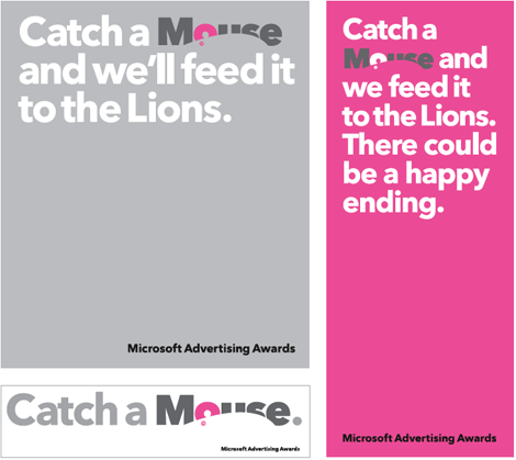
I haven’t expressed sheer effusiveness about a logo on Brand New before, but I think this warrants it: I love it. I would even call it “brilliantly executed” and stand behind it 100%. I suspect many will disagree but that’s the least of my worries. The biggest compliment I can pay this logo is that it makes me smile as the details are revealed: You read the word mouse… you see the white mouse… you see the big, pink ear… and finally you see the copyright symbol, the punch line to this sophisticated design joke. I can go on and on about this logo: From the colors, to the type selection (Avenir Next), to the overall composition: It all works. It’s embarrassing to compare this to the old non-logo, with its faux-brush stroke arrow, so I won’t even go there.
And, to boot, the identity program is equally clever and playful while emphasizing that winning a Mouse could earn you a Lion.

Can a catchy name and identity turn around an awards program? In this case I think it can. I feel that a good name, and something that people can throw around at dinner parties — “Why yes, I did win a Mouse last year, thank you for asking” — and feel proud about being associated with can do wonders for a flailing effort. So maybe in a couple of years, regardless of your country of residence, you will know about the Mouse awards.


Jump to Most Recent Comment
Rick’s comment is:
In appearance alone, the overall program reminds me of Barack Obama's program, with the swooping graphic cutting into letters.
Overall this is pretty sweet.
On Feb.14.2008 at 03:22 PM
Jesse’s comment is:
Man. I think it had been me who had that solution dawn on me, I'd be jumping out of my seat, and making karate chops and kicks in excitement.
That is one impressive piece.
On Feb.14.2008 at 03:51 PM
drew kora’s comment is:
Yeah. That's prety incredible. I'd really love to see the sketchbooks and drafts that lead up to that design.
...using the copyright for the eye....GENIUS.
On Feb.14.2008 at 03:53 PM
Joachim’s comment is:
Initially, I found the copyright symbol to be too distracting, but now that I see a mouse with the ear and the eye, it's growing on me really fast. At first, I thought it was a computer mouse with an oversized mouse wheel which was probably what annoyed me about the copyright logo. Now that I definitely see an animal mouse with the white space on tail of the 'e' representing the mouse's tail (I'm starting to get confusing here)... anyway, bravo on the creativity and execution!
On Feb.14.2008 at 03:58 PM
Samantha Armacost’s comment is:
That copyright symbol usage made me grin instantaneously. And so I have to wonder if anyone has seen other clever uses of the copyright or trademark within a logo concept.
On Feb.14.2008 at 03:59 PM
Chad K’s comment is:
Thank god for the copyright symbol. Do they need another on the end so that we know the mouse eye is copyrighted?
On Feb.14.2008 at 04:01 PM
Mr Posen’s comment is:
Overall, very strong.
My only bitch is the placement of the copyright symbol - it is a little forced and precious for my taste.
Also, the colors make it look like a 'feminine hygiene' product, especially with the name.
On Feb.14.2008 at 04:34 PM
Able Parris’s comment is:
This is a great logo, although I am confused by the ads. I don't get the lion/mouse association.
I am even more confused as I try to think of how the word "mouse" would cause Mr. Posen to think of a "feminine hygiene" product??
Joel Peterson’s comment is:
The lion/mouse association is an ancient fable, with hundreds of modern day references:
http://en.wikipedia.org/wiki/The_Lion_and_the_Mouse
Joel Peterson’s comment is:
The lion/mouse association is an ancient fable, with hundreds of modern day references:
http://en.wikipedia.org/wiki/The_Lion_and_the_Mouse
Char Alfonzo’s comment is:
Hahahaha... it made me laugh.
Clever and beautifully executed.
Love it!
nat’s comment is:
it's gorgeous! i am so in love.
On Feb.14.2008 at 05:07 PM
cee’s comment is:
I love it. Love the concept, love the type, love the color. It all works so well together.
On Feb.14.2008 at 05:13 PM
dan’s comment is:
the mouse, the ear, the eye...nobody noticed the tail?
On Feb.14.2008 at 05:21 PM
wordup’s comment is:
Looks tooo much like "Finding Nemo".
On Feb.14.2008 at 05:22 PM
Kim Siever’s comment is:
I, like Joachim, also saw a computer mouse. I think that's another thing that's cool about it.
On Feb.14.2008 at 05:28 PM
Kim Siever’s comment is:
The negative space of the "e" is an odd-looking tail, dan.
On Feb.14.2008 at 05:28 PM
dan’s comment is:
actually I was thinking of the "S" as the tail.
On Feb.14.2008 at 05:31 PM
Matheus’s comment is:
well, not bad at all
at least isnt one of that freak logos made by w.o. and similars
Amy’s comment is:
First time commenter. THIS is awesome. At first I saw a computer mouse, then I saw the actual mouse.
It's clever, really clever. It makes me wish I could be so clever sometimes :)
I would kill to see the sketches for this one.
On Feb.14.2008 at 06:08 PM
Darrin Crescenzi’s comment is:
My, this is adorable, isn't it?
At first I thought that the mouse silhouette/negative space should be drawn more like an actual mouse, but then, like other commenters, realized how the ambiguity of the form allows that nice dual-association. It's very well done!
There may have been a missed opportunity to turn the counter of the "e" into a curled-up mouse tail, but perhaps that would have been a little too cutsey for the logo's own good... I bet they had it in a sketch.
On Feb.14.2008 at 08:36 PM
Ray’s comment is:
Finally, something different. simple, cute, and smart.
On Feb.14.2008 at 10:40 PM
Sam’s comment is:
Not sure about that. I first saw a computer mouse as well.
I think closer attention to the form of the mouse and the oversized ear could have been explored.
its still very strong.
On Feb.14.2008 at 10:41 PM
cubek’s comment is:
It's nice, yes. But perhaps everybody saying how amazingly clever it is...just isn't that clever? I mean it's a mouse knocked out of a type block.
On Feb.14.2008 at 10:43 PM
Armin’s comment is:
> I mean it's a mouse knocked out of a type block.
You mean as opposed to throwing every Photoshop filter or Adobe Illustrator gradient at a logo? Yeah, I guess you are right, it's just a mouse knocked out of a type block.
On Feb.14.2008 at 11:03 PM
ZedZedEye’s comment is:
The mouse looks a little long I'd have to say.
Asking if anyone ever used the copyright, reg mark, or TM in unique ways... I'd like to see some more if anyone thinks of any,
I believe Tharp (did it) trademarked the TM and asked designers to pay him royalties if the use it in thier logos. Classic.
On Feb.14.2008 at 11:26 PM
Glenn’s comment is:
Very nicely done. Bravo!
On Feb.14.2008 at 11:50 PM
Ty’s comment is:
Wow. Rock. And. Roll.
I didn't even notice the ear I was so busy admiring the ©!
On Feb.15.2008 at 12:57 AM
Mark’s comment is:
Pff it took me a REALLY long time noticing the mouse in that. Somehow I knew I should see something in the negative space, but couldn't see it ;)
Must be needing some coffee bad.
By the way, I love it.
On Feb.15.2008 at 03:32 AM
Damjan Mozetič’s comment is:
Gotta love the logo, you can catch the mouse from a distance amidst the words.
On Feb.15.2008 at 04:23 AM
Moriarty’s comment is:
This is certainly a nice logo, and whilst technically it may not be the most complex logo out there to create it still works really well and gives you that 'smile in the mind' moment (both in terms of name and visual as well as execution).
As always, it takes an awful lot of work to make something look so simple – I'd certainly be more than happy to say that I designed it if I worked at Johnson Banks.
On Feb.15.2008 at 05:19 AM
cubek’s comment is:
"You mean as opposed to throwing every Photoshop filter or Adobe Illustrator gradient at a logo? Yeah, I guess you are right, it's just a mouse knocked out of a type block."
So all you need to be great these days is not to be horrible?
Like I said, it's nice.
On Feb.15.2008 at 07:46 AM
Haik Avanian’s comment is:
One thing I appreciate about this is that it seems to have defeated the common battle of being incomprehensible at a smaller scale. To me, this even works better when pulled back, the mouse becomes that much more obvious then.
On Feb.15.2008 at 09:29 AM
BWJ’s comment is:
This is great and I would agree that it's brilliantly executed!
An example of the kind of work I would expect to see in a second volume of A Smile in the Mind. Sadly, there isn't enough cleverness in current design to fill another book.
On Feb.15.2008 at 10:52 AM
Jak’s comment is:
love it. I too saw a computer mouse first, in fact I saw apple's mighty mouse first. this would of been a great logo for the might mouse. wonder if anyone at microsoft was worried about that. i bet apple likes it too.
On Feb.15.2008 at 11:00 AM
Jak’s comment is:

Jak’s comment is:

Jessica’s comment is:
I was also thinking computer mouse and didn't see the animal until Armin pointed it out. I really like it, but I think a subtle pink [shudder] swoosh (for lack of a better word) under the 'e' to delineate the tail would be icing on the cake for me.
On Feb.15.2008 at 11:24 AM
C-Lo’s comment is:
Sharp. Bold. on point. Choice. (I like it a lot)
But apparently they goofed on the nibble like a mouse, feast like a lion. Where's the rest of the mouse?
And I did see the mighty mouse also, but I saw the negative space of the O being the button.
On Feb.15.2008 at 11:28 AM
Armin’s comment is:
> But apparently they goofed on the nibble like a mouse, feast like a lion. Where's the rest of the mouse?
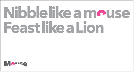
C-Lo, they have an alternate application where a few key "o"s in a sentence (whether it's "mouse" or "power" or "on") are replaced with the mouse of the ear. My bad in not explaining that part.
On Feb.15.2008 at 11:33 AM
Greg Formager’s comment is:
> I mean it's a mouse knocked out of a type block.
You mean as opposed to throwing every Photoshop filter or Adobe Illustrator gradient at a logo? Yeah, I guess you are right, it's just a mouse knocked out of a type block.
--
Great sarcastic reply.
Terry’s comment is:
Very Nice.
However, it seems to me that the 's' is begging to have a more significant role in this memorable mark. Reducing the length of the negative 'mouse' space a little would put it in perfect position to serve as the tail.
On Feb.15.2008 at 12:09 PM
JBII’s comment is:
I really like the concept. The mouse could have been executed better to make the word more legible. The Copyright as an "eye" is not needed. This is how I would have directed the white mouse shape...
On Feb.15.2008 at 12:14 PM
JBIII’s comment is:

JBIII’s comment is:
Sorry for breaking your grid Armin....my bad
On Feb.15.2008 at 12:22 PM
David Kulen’s comment is:
I love this, its refreshing to see a logo like this amongst all the gradient ridden logo's these days.
I too first saw a computer mouse in it, and then I saw the mouse, I actually think thats a strong point.
good post.
On Feb.15.2008 at 12:40 PM
Romario’s comment is:
Sure, great visual thinking and execution.
But, they sold this clean, bold solution to Microsoft!
That fact amazes me as well.
Tom’s comment is:
Right on, this is wonderful and I can't believe it's Microsoft either.
On Feb.15.2008 at 03:23 PM
Audrée Lapierre’s comment is:
good idea, poorly executed. It looks old and ulgy!
On Feb.15.2008 at 03:59 PM
Mark’s comment is:
It's sooooooooo cuuuuuuute!!!!
It gets a thumbs up from me, well done and cleverly executed.
Leaves the previous (and forgettable) logo in the dust.
On Feb.15.2008 at 04:37 PM
Gigi F.’s comment is:
I also saw the mighty mouse first...though I can't help but wonder if that is such a popular thing among designers because most of us work on Macs. I'm even willing to bet that if you mentioned this to the folks at Microsoft they would be appalled.
In any case, mighty mouse or not, it's a really great and simple solution.
On Feb.15.2008 at 04:40 PM
Peter McRae’s comment is:
I love this!
I saw the mouse as an abstract mouse, neither input device or animal. The fact that so many people saw something different in the mouse proves that point. Any more would have been overkill.
I didn't notice the O as an ear, nor the S as a tail until I read the comments. That's even more reason to like the design. It's a simple design, yet there are several layers of meaning.
Really strong!
On Feb.15.2008 at 10:26 PM
Anonymous’s comment is:
cubek’s comment is:
It's nice, yes. But perhaps everybody saying how amazingly clever it is...just isn't that clever? I mean it's a mouse knocked out of a type block.
Yeah, it is that simple and made such a strong statement.
Mr Posen’s comment is:
My only bitch is the placement of the copyright symbol - it is a little forced and precious for my taste.
Why?!!! No!!!... that's the best part :) haha
Romario’s comment is:
Sure, great visual thinking and execution.
But, they sold this clean, bold solution to Microsoft!
That fact amazes me as well.
You couldn't be more right. It was more than just a great logo, it must've taken a lot to sell this to square-minded people like Microsoft executives.
Audrée Lapierre’s comment is:
good idea, poorly executed. It looks old and ulgy!
Buddy, I think you're commenting in the wrong logo. Old?... I dont think that any of us see something 'old' about this. Ugly? that's subjective so I can't say anything about it. Poorly executed? I could go on and on on how this logo is cleverly executed... not only me but most colleagues here agree on it. Just how bad logo are ripped off here, the good ones deserve to be celebrated.
On Feb.16.2008 at 02:40 PM
Audrée Lapierre’s comment is:
I feel like the focus point is the copyright symbol, which really shouldn't be getting all the attention.
The mouse curve is way too flat. The gray and pink makes it old, I remember seeing lots of pink and gray in the 90s for computers. The "O" looks nothing like a ear, feels like they were trying too much to make things appear in the logo. Even the mouse curve is unattractive. I rarely have a big opinion on logos, but I really thought I would read a negative review on this one. Good if you like it, I don't. I like the idea, not how its rendered.
Asen Tsvyatkov’s comment is:
I see nothing wrong with the copyright symbol being utilized as the eye.
It works on a number of levels, especially when we talk about creativity, intellectual property and communicating ideas within defined parameters.
This is probably the only time when a trade mark signifier is used in a creative way without it being the corporate design equivalent of a red che guevarra t-shirt.
On Feb.16.2008 at 08:11 PM
Ryan’s comment is:
They took my idea!
http://rypsicle.deviantart.com/art/The-Rhino-38311907
Nah, just kidding. I like theirs better anyway. I'm still learning and mine is sorta amateurish.
On Feb.16.2008 at 09:04 PM
Sanjay Basavaraju’s comment is:
'Mouse' works because eventually you figure out all the layers.
I feel it is quite stupid for us to expect ear, eye, body, tail, etc to be in place. It is an abstraction of a mouse.
How about in high contrast (black)? Emphasis of 'o' in pink?
It teases one's mind! It works. As clever as Jerry.
On Feb.17.2008 at 02:40 PM
Lanny Heidbreder’s comment is:
My only problem is that that's an improper use of the © symbol. The copyright symbol goes on a, well, copyright notice that tells the creator and date of creation of a work. The proper mark for a logo, wordmark, or name is either TM or ®.
I know the ® isn't as optimal for an eyeball as the © is, but it's preferable to what's going to happen when Microsoft legal gets ahold of it:

Dan’s comment is:
In response to the comment below - are you serious?
The lion association has a double meaning - the old adage of the lion and the mouse, etc... look it up - and also The Cannes Awards has something to do with Mouse.
Feminine hygiene product - well, a mouse in like a tampon... with the white tail. He was also referring to the colours - very feminine, with the pink and soft grey.
This is a great logo, although I am confused by the ads. I don't get the lion/mouse association.
I am even more confused as I try to think of how the word "mouse" would cause Mr. Posen to think of a "feminine hygiene" product??
Ryan’s comment is:
Dan,
"The one uptick to these awards is that the first-prize winners in each category get automatically entered into the Cannes Cyber Lions competition — a big deal if there ever was one. Seeing that a coveted "Lion" award was the ultimate bait..."
That's from the original post. I guess the mouse/lion thing, in addition to the old adage refers to that.
On Feb.18.2008 at 08:58 PM
Lena’s comment is:
It's cute an all but it's also reduntand - it doesn't say anything but mouse.
On Feb.18.2008 at 09:06 PM
Anne Stewart’s comment is:
The best thing about the logo, I think, is the hide-y-ness, or sneakiness of the mouse. The little creature's got character. That you're not instantly sure what you're looking at is part of its charm.
On Feb.19.2008 at 03:55 PM
Mr Posen’s comment is:
Dan’s comment is:
"Feminine hygiene product - well, a mouse in like a tampon... with the white tail. He was also referring to the colours - very feminine, with the pink and soft grey."
Yep.
Actually I don't think the colors are necessarily feminine, just reminiscent of "feminine hygiene products".
....just saying. ;)
On Feb.19.2008 at 06:09 PM
David’s comment is:
Hiy-carumba.
People are odd yes?
To even attempt to make a negative comment, despite how constructive your mental little heads may think you're being, amazes me.
The old quote of 'best keep your mouth shut and have people THINK you're a fool than open it and let them KNOW for sure' would apply to a few people here.
The ID is sublime.
Some comments are ridiculous.
Mr Posen’s comment is:
Oh relax David, I was partially kidding, no need to get offended and start calling people names.
Like I stated earlier, I think overall the id looks great.
Sublime? not quite.
On Feb.19.2008 at 07:07 PM
Oliver Hutton’s comment is:
As one poster said, the impressive part is the fact that Microsoft actually bought it. As a logo itself, I don't think it's that great. Obviously a vast improvement considering the old logo, and the industry. I actually think JBill's solution is more clever because it uses the existing counter of the "O", and the "S" works much better as the tail. To me, the copyright symbol actually takes away from the strength because it is an extra added element that is with one more layer of information. It's almost if they discovered the similarity of the copyright mark to an eye, and then forced it into the solution because they fell in love with the idea.
The copyright symbol in the eye is funnily enough, not actually even copyrightable. Someone at our firm sent a logo with a similar idea though legal for a "dog company."It was actually rejected for the fact that using the "registered" mark for the eye wasn't something that could be owned. He wound up having to re-send the mark, and then just added the symbol for the eye after it was approved. Once the logo is released, I'll post it on the forum...whenever that will be...
On Feb.19.2008 at 09:14 PM
David’s comment is:
Don't take offence Posen, I was only partially serious.
On Feb.20.2008 at 12:28 PM
Paul Rand’s comment is:
I do like the new identity, however the color palette and shapes that are used are remindful of sex toy packaging for women or a feminine hygiene product...
On Feb.21.2008 at 02:12 AM
DesignRanger’s comment is:
There is beauty in simplicity. And I'll echo Armin's comment that it's nice to see success that doesn't feature filters, drop shadows, gradients or a swoosh. (Okay, I added a few). As I've been taught, and as I teach, great design keeps it simple. And this works on all levels. Great work.
On Feb.21.2008 at 10:26 AM
Tony Goff’s comment is:
I love it, didn't even see the mouse in the logo to begin with (that's the mouse mouse and not the computer mouse).
It works on so many levels and the fact that the previous logo was so bad makes it all the more impressive...that and the fact that its from Microsoft (least we not forget the dismal Silverlight logo).
On Feb.22.2008 at 09:40 AM
Mog’s comment is:
I love it.
It's pretty much perfect. Giving the mouse more of a face, a tail, or a block of cheese to smile at is just too much, IMO.
I actually wish this logo was for something more significant that "just" Microsoft's advertising awards. I want to see this logo all the time, dammit!
Maybe Microsoft could make an Apple-esque, design-oriented PC hardware sub-brand called "Mouse." Or that could be the name of their peripheral division. (Somewhat paradoxically, my favorite Microsoft products have long been their hardware.)
I know I'm just dreaming - there'd be trademark problems with the Japanese company "Mouse Computer," in any case (unless Microsoft bought them!) - but does anyone else feel that this logo isn't just too good for Microsoft, but too good for "merely" an advertising award?
I half want to go into advertising now, just so I can win the award. :-p
On Feb.22.2008 at 09:47 PM
Gm’s comment is:
Why is everyone talking about the 'big, pink ear'? Surely the ear is the COUNTER of the O!? This little white mouse has a little white ear.
On Feb.23.2008 at 03:58 AM
Ted Fabella’s comment is:
What a thoroughly impressive design, and one that reeks of classicism and modernism. With an overabundance of minimalist logos with little or no idea behind it, it's nice to see that conceptual thinking is alive and well. Paul Rand would be proud.
On Feb.23.2008 at 03:40 PM
andeth’s comment is:
love it,
whips all the faddish updates usually posted on here, all i will say though is that it reminds me a little of mobil's logo, not sure if that works for or against the design. also, i
heard talk over at jb's thought for the week that they are thinking of using the pink 'o' as a single element - i hope they don't as this might make it a bit too similar to the mobil identity program.
http://www.mobil.com
http://johnsonbanks.co.uk/thoughtfortheweek/index.php?thoughtid=292
Ally’s comment is:
I dint get the concept at first but on dwelling on it the details are just too interesting. Its a nice logo. But I agree that the pink is abit too feminine and might be killing the impact of the logo.
The play with the lion mouse is just ingenious.
On Mar.11.2008 at 01:40 AM
Tezza’s comment is:
They ripped of that design go and see their blog for the apology...WHAT A SHAME!!!!!!!!!! read excerpt below
t is with some regret that we have to announce that our recently designed ‘Mouse’ logo is too close to a design already registered by one of the major shampoo manufacturers. For legal reasons they can’t be named, but they have asked us to print their version of the mark and to issue a public apology, so on behalf of everyone at johnson banks we’re deeply sorry for any perceived similarity.
Their already registered version is shown above.
The Microsoft Mouse Advertising Awards will be reverting to a simple wordmark whilst we re-design the logo, which is unfortunate since it has been written up extensively on design blogs worldwide and in this month’s Creative Review.
Again, apologies to all concerned.
Also its not unfortunate as it was written and shown in blogs it's unfortunate that you hired someone in your studio that would rip of a design!!!!!!THATS UNFORTUNATE!!!!!!
On Apr.01.2008 at 02:03 PM
Louise’s comment is:
That is INCREDIBLE...they are dancing around the subject it's a blatant rip-off! Take full responsibility and admit you guys ripped it off!!!!!! its no way about the similarities its a DIRECT RIP-OFF
On Apr.01.2008 at 02:10 PM
Teddy’s comment is:
SHAME!!!!!!!!!
On Apr.01.2008 at 02:13 PM
Bruce’s comment is:
Shame they didnt even change the colours that's why its so reminiscent to female product as it was a shampoo for females!!!!
On Apr.01.2008 at 02:16 PM
Mike’s comment is:
And on April 1st, too. Who'da thunk it.
On Apr.01.2008 at 04:36 PM
Alfonso’s comment is:
Exactly. This is so obviously an April Fools prank.
On Apr.01.2008 at 07:23 PM
Newbomb’s comment is:
This will be a great April Fool's Day Hoax. Bravo!
On Apr.01.2008 at 08:57 PM
Bone’s comment is:
Regarding the "litigation"...
April Fools everyone.
1- The mouse is winking.
2- They show the "original" product logo but they can't name the trademark holder?
3- The weak apology.
Is the lameness of the joke or the fact you fell for it the most shameful part?
You would think we creative types would be better at creating April Fools jokes.
- Bone
On Apr.01.2008 at 09:34 PM
Michael Johnson’s comment is:
Yes sorry everyone, April Fool ;-)
But otherwise, thanks for everyone's nice comments.
Michael Johnson
johnson banks
ps you know, I see the 'tail' at the bottom of the 'e' not within the 's'. But actually, now you say that, I can see what you mean...
On Apr.02.2008 at 04:22 AM
Brett’s comment is:
Very clever. Good design.
On Feb.27.2009 at 12:01 PM
Charlotte’s comment is:
I love this!
It's so playful and the knock out mouse is genius. I had never heard of the award before but there will be no forgetting it now. I think as it is for me, it will be unforgettable for most.
Anxiously awaiting the creative ways this will be executed!
On Feb.27.2009 at 02:27 PM
Comments in Brand New, V1.0 have been closed.


