

NOTE: This is an archived version of the first incarnation of Brand New. All posts have been closed to comments. Please visit underconsideration.com/brandnew for the latest version. If you would like to see this specific post, simply delete _v1 from the URL.
![]()
When it comes to telecommunications companies the modus operandi is apparently clear: The bigger, the better. And what could be bigger (and better?) than a new joint spin-off company by, already-big corporations, Finland-based Nokia and Germany-based Siemens, two of the most influential technology companies in the world. The result is Nokia Siemens Network (NSN). Like most telecommunication giants (Alcatel-Lucent, Ericcson and Cisco), NSN’s scope is broad, ambitious and ambiguous so creating an identity around it becomes increasingly complex. Moving Brands, a London-based branding agency — and a newcomer to the highly public branding game — scooped the project from a handful of the major players and proceeded to create and, most amazingly, launch a new identity in the span of two months, premiering at the 3GSM World Congress in Barcelona this past February.
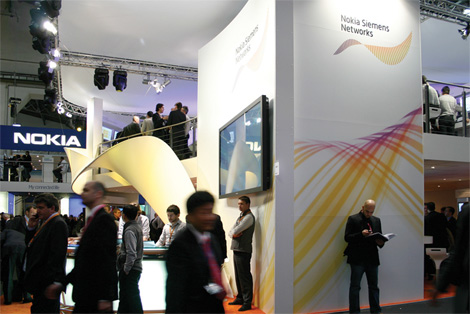
Booth at 3GSM World Congress in Barcelona
Incredulous that such a distinct identity could be approved by two incredibly large (and I’m surely incredibly complex) corporations I had the opportunity to inquire with Moving Brands about this fast-forward process. “As you might have guessed it,” says Peter Faulkner of Moving Brands, “it wasn’t an easy process; however the tight time schedules did have the effect of forcing quick and weighty decisions from key stakeholders (Nokia board, Siemens board, Nokia Siemens Networks board, etc.)” And on the possibility of what this identity could have easily been (and what Tony Spaeth pointedly illustrates) Peter adds, “One of the biggest [decisions] was to use a new font rather than continue with Nokia and Siemens brand marks attached to ‘Networks.’ We were fortunate in working with a client who had access to the key decision makers and who was able to accelerate the process.” The resulting identity — perhaps unorthodox, and undoubtedly European — is an implicitly dynamic wave, with a purple to yellow gradient (avoiding what would have been a too-cold gradient from Nokia’s blue to Siemens’ light teal) and a confident, modern sans serif. “The wave symbol,” adds Peter, “which was one of the earlier concepts got an immediately positive response from all sections of the organisation which also assisted the process; there were, naturally, many iterations of the final form you see.” Regarding the timing, “The logo was in approved design direction in less than two months. By the time two months came up we had produced visual concepts for all key applications (events, livery, signage, press, advertising, etc.) based on the Corporate Identity system we had developed.”

Fleet Livery
After the rush launch, Moving Brands can now look forward to a probable date of April 1st for the official launch of NSN and the rollout of the implemented identity. Plenty of work is still necessary, but the biggest hurdle has been cleared, allowing the brand to evolve, and from the application of the identity in the booth, livery and web site, it looks poised to deliver on the dynamic promise established by the static-by-nature wave mark. Unlike other marks for giant conglomerates (nielsen to name one) Nokia Siemens Network is a heroic case study of what can be achieved with a committed leadership group on the client end, a motivated and energetic branding agency, and the desire to create an identity that breaks out of the expected. The bigger, the less expected, the better.


Jump to Most Recent Comment
Inkblot Robot’s comment is:
It's nice to see a time crunch actually work out in favor of the designers!
On Mar.25.2007 at 10:48 PM
Mark.S.’s comment is:
From the examples shown the identity really shines when applied to environment, livery and web. It's going to be interesting to see it perform in print, the possibilities could be endless. The choice of typeface will be beneficial as well.
There is, however, still a little uncertainty for me regarding the two elements. If it's their respective scale, or the negative space they generate, or what?
A competent outcome, nevertheless, and one that continues to grow on me.
Christian Palino’s comment is:
The naming has its obvious limitations and suffers from the common ailment of two corporations deciding to merge but unwilling to compromise and become something new through their marriage.
From the introduction to this new brand merger and the various literature online, it is clear that Moving Brands was able to avoid what has become the classic model of creating the merger brand – the merger mash-up – for the logomark. This is positive.
The typography has a stately technology feel, good legibility and seems a respectable choice that will lend itself well to a variety of applications.
The lock-up seems rather inefficient, using a left-aligned typographic solution with an assymetrical mark that has an all-too-stable baseline and continues to break the left edge of the block of type and then carry on past the ragged right edge of the type block. Time will tell through applications how well the lock-up works.
As for the logomark, the wave concept is fine though a bit tired, especially in the field of "technology." However, that being said, the mark's formal properties and execution is terrible.
The overall shape is awkward, looking as if cut by Matisse from a piece of paper, and interrupts any rhythm and sense of movement that could be created from a sleeker shape with more continuous and gentle curves.
The use of the vertical lines to create a sense of dimension could have been enough with a better drawn shape to bring the form to life (I think of the latest Sprint logomark whose mark is much more dynamic in its rendering) but instead lay dormant like unused muscles, trapped inside an unshapely body with a bad sunbooth tan.
Speaking of the bad sunbooth tan – here we are again with the use of a gradient. This is a terrific example of how the gradient is applied lately to logomarks in the hopes of slapping on something sticker-like to give the mark something that simply is not there. In this case it seems that the gradient is being used to try and reinforce, or create, a sense of movement in the wave form – and it fails miserably. In some of the applications, for instance the environment image above, I would agree that the gradient can be used successfully as a tool on graphic elements that are more decorative. However, relying on the gradient to give the mark something that its formal properties are sorely lacking, simply does not work here.
…there were, naturally, many iterations of the final form you see.
I think they clearly needed a few more iterations.
In the end, though we can celebrate getting a new logo made and approved by two giant corporations in as many months, the hasty process is evident in the final solution.
On Mar.26.2007 at 04:11 AM
Frank’s comment is:
Agree with everything Christian said - i'd like to add that i think the logo (icon&typography) is really unbalanced; the icon is much too big in relation to the type.Also i think they should have chosen a different font as somehow the symbol looks totally seperated from the type.
In my point of view this is just another example of "let's go 2.0" - gradients, a wave and absence of meaning.
I predict a rebranding in no longer than 2 years.
On Mar.26.2007 at 07:54 AM
Blake’s comment is:
Quite swooshy, I must say.
On Mar.26.2007 at 08:18 AM
DesignMaven’s comment is:
The Visual Aesthetic is NOT what I'd Expect from two MEGA Brands.
Two Months of Ideation and Creative Studies on a Major, Major Identity Project isn't enough time to approve Doodles or Squiggles.
Guess What???!!!
They Got Approved!!!!!
As my Mentor and Good Friend Maestro Tony Spaeth noted the Identity IS NOT a Symbol.
My assessment, there is No Semiotic Category for this Aesthetic.
To further Piggyback on Maestro's Astute Observations, the Missed Opportunity was Merging both Names, Nokia Siemens in their OWN Respective Logotypes.
That was my First Impression Reading Identityworks a couple weeks ago before Reading the Editorial Identity Analysis.
Siemens has got to be one of my all time Favorite Logotypes.
Admittedly, I'm a SUCKER for Application. The Trade Fair Exhibit is quite Engaging, the Motif over the Gentleman's head and Shoulder.
The Livery is quite Eye Catching, referencing the Motif at the back of the van, in spite of it being very, very swooshy, noted by another Commenter
The Wave in and of itself is a Meaningless Squiggle Masquerading as a Soft Shell Fish, perhaps a new species of Jelly Fish.
DM
The Hostile Takeover of Corporate Identity
On Mar.26.2007 at 11:49 AM
felix’s comment is:

mine is really no better (that took all of 30 seconds) but you have to start with a solid form, which this isn't. the dimentionals aren't dynamic or even engaging. It's caught somewhere between a DNA strand and a purple unicorn's ear and horn. Not a fan.
Urgh. I need a hostile moniker ala DM. Here goes nuthin, ahem:
The global warming of Brand Identity. (SFX: tear drops)
On Mar.26.2007 at 08:51 PM
Calvin Ross Carl’s comment is:
This will be a "bridge" identity. In the sense that it will not last long, and it will only last until they decide to absorb the seperate names into one (probably just Nokia). The logo is okay. A little clunky and looks like it could still use some refining. There is nothing memorable about the font. It's just okay, and that's it.
On Mar.26.2007 at 11:43 PM
Andrew’s comment is:
It looks like a slug or an earthworm eating a potato chip.
On Mar.27.2007 at 10:15 AM
Exigent’s comment is:
I personally think it is garbage.
On Mar.27.2007 at 03:36 PM
Paul Riehle’s comment is:
As pointed before, first thing I saw was the lack of attention to the line quality. Personally I think the wave over the guys head would have been a more aesthetically pleasing identity. Oh well.
On Mar.27.2007 at 06:44 PM
fatknuckle’s comment is:
Ohhhhhhh let's name the zones, the zones, the zones, let's name the zones of the open sea!
On Mar.28.2007 at 12:36 AM
Von Glitschka’s comment is:
I think Andrew might be on to something in regards to the worm and potato chip inspiration?

Patrick Senecal’s comment is:
I find the type a bit too chunky and the shape definitely flowless. Looks like fast-food type corporate design. Sorry, doesn't do it for me at all.
On Mar.28.2007 at 11:45 AM
Simon’s comment is:
I agree with Christian and Felix.
"avoid what has become ...the merger mash-up – for the logomark. This is positive." A mash-up would have spelled disaster for this mark. At the same time, they needed more iterations and maybe some better lines like Felix suggested. I suspect they may use this logo in a more robust way going foward e.g. shape changes, different looks for differing canvasas etc.
Von Glitschka your hilarious. hehe
On Mar.30.2007 at 11:11 AM
Mary’s comment is:
I agree with the worm/chip comment (too funny!) and with the comments about the line quality.
I like the application of the logo idea to the vans and the environmental graphics they've come up with. However, I don't like the idea of having all of their materials so closely tied to their logo. When they want to redesign their materials, will their logo then be out of place?
On Mar.30.2007 at 05:10 PM
Indra Subedi ’s comment is:
We are interested in the branded new Siemens nokia mobiles.we like to purchase in bulk.So are you interested to become our Manufacturer Siemen Group?
On Apr.24.2008 at 08:09 AM
Indra Subedi ’s comment is:
We are interested in the branded new Siemens nokia mobiles.we like to purchase in bulk.So are you interested to become our Manufacturer Siemen Group?
On Apr.24.2008 at 08:09 AM
Indra Subedi ’s comment is:
We are interested in the branded new Siemens nokia mobiles.we like to purchase in bulk.So are you interested to become our Manufacturer Siemen Group?
On Apr.24.2008 at 08:09 AM
Indra Subedi ’s comment is:
We are interested in the branded new Siemens nokia mobiles.we like to purchase in bulk.So are you interested to become our Manufacturer Siemen Group?
On Apr.24.2008 at 08:09 AM
Indra Subedi ’s comment is:
We are interested in the branded new Siemens nokia mobiles.we like to purchase in bulk.So are you interested to become our Manufacturer Siemen Group?
On Apr.24.2008 at 08:11 AM
Indra Subedi ’s comment is:
We are interested in the branded new Siemens nokia mobiles.we like to purchase in bulk.So are you interested to become our Manufacturer Siemen Group?
On Apr.24.2008 at 08:11 AM
Comments in Brand New, V1.0 have been closed.


