

NOTE: This is an archived version of the first incarnation of Brand New. All posts have been closed to comments. Please visit underconsideration.com/brandnew for the latest version. If you would like to see this specific post, simply delete _v1 from the URL.
![]()
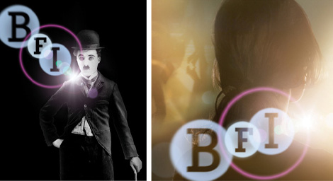
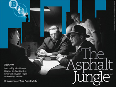
Established in 1933, the British Film Institute was created to “promote greater understanding, appreciation and access to film and television culture.” The BFI also serves as a repository for film, film stills and film posters; it runs the National Film Theatre and London Film Festival, as well as the BFI IMAX Cinema; and it also releases films in cinema and on DVDs, publishes books and runs educational programs. In other words, the BFI knows film. And was in need of an identity that established it as a leading organization in the crowded film industry. Stepping away from film clichés London-based johnson banks designed a cinematic identity around the idea of lens flares, creating a sense of movement and layering and, perhaps romantically on my part, a portrayal of those magical moments in film where you are momentarily brightened by a line of dialog, a great chase or a real display of emotion. Johnson banks’ solution might seem complex and highly illustrative, specifically compared to the old logo — which I particularly like — but considering that this identity will live mostly on screen and in 4-color posters it is a refreshing departure from traditional identity design and quite appropriate for the client and audience.
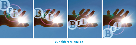
The identity features four different “angles” — although an unlimited number of configurations does not seem impossible — to provide flexibility and variation to the institute. And when used appropriately — the logo does not look as good in some sections of the web site — the logo looks quite fantastic in its applications, even as a one color mark.
The only thing missing from this identity is — what else? — a tune. Yes, a tune. Or “Aural Identity”. Until January 19, the institute is running a competition to create a tune that accompanies the beautiful logo animation at the start of every BFI film on DVD or cinemas. Start whistling.


Jump to Most Recent Comment
Vernon’s comment is:
I don't like it at all. If it was only used in animation for the start of films I could imagine it, I just don't like it for print work. But like you say, it is a departure from traditional identity design. On a sidenote, the animation for the films is very nice.
On Dec.20.2006 at 09:19 AM
HDSGNWRKS’s comment is:
This is not a very good logo, but rather a "fun with photoshop" idea. How does this logo look in B/W? True, it will be on screen more than paper, but I believe photoshop bluring, gradients and lens flare do not work for logos.
On Dec.20.2006 at 09:34 AM
felix’s comment is:
Its fucking great.
The purpose of an identity is to communicate, which this does in spades, and own, or separate itself within it's market. This does that as well. Also, it's memorable. Very memorable. And functional. Well done.
My only concern, or beef, is it's use on the website. It isn't positioned, or strengthened sitting next to the the curious little boy. They can't sustain that "God peeking through sunlight" idea in every scene. The most powerful, and important, application is the animation.
von glitchka's interview with bill gardner
last month was pretty interesting. the whole logos are black and white mantra from 1987 is dead.
Alex’s comment is:
This is just awful. I seriously don't believe that logos must be in B&W, or that they shouldn't use gradients or photographic elements either..
But this seriously looks like someone gave my mum an hour long lesson in photoshop and asked her to make something that looked "jazzy". It's shocking!
Everyone is entitiled to their opinion, but if you like this you're just plain wrong. ;-)
(Sorry Felix - I really do like your work!)
On Dec.20.2006 at 10:13 AM
Anonymous’s comment is:
The mark aint beautiful, but gosh dang it, the philosophy is right on. Black-and-white be damned -- this identity doesn't even have edges! Gone are the days when a good identity hand better be able to be embroidered on a golf shirt.
Ballsy choice, and a good one, by the client. It'll be interesting to see how long, if ever, it takes for these "new rules" of identity design to really take hold -- conventional wisdom dies very, very slowly.
On Dec.20.2006 at 10:29 AM
Von K’s comment is:
I realize the connotation lens flares have in the design community means most people will initially reject this logo, but I have to say it suits the brand very well.
My fist reaction was "ugh--I get the lens flare, but does it have to be so literal?" On second thought, though, literal works here very well.
I'm sure logos like this (not black & white, hard-edged) are becoming more common, and some will be better than others. This one seems to have been thoughtfully created and I don't doubt there's a b&w version somewhere for faxes/stamps/embroidery/whatever. As long as they have versions that work across whatever media they need, it's fine. Just an evolution of brand design driven by our shifting media landscape (haha!).
On Dec.20.2006 at 10:32 AM
Anoushka’s comment is:
I think this is one of the most beautiful pieces of branding I've seen for a long time. Frankly I feel some of the comments posted here are ignorant and are from people who obviously have no idea about good design.
On Dec.20.2006 at 10:54 AM
Peter Marquardt’s comment is:
I agree with Veron. While the animation is nice, I find it horrible for print or even as a still on screen. My very first thought when I saw both logos was "What? That was a perfectly good mark! What have they done?!"
On Dec.20.2006 at 10:58 AM
Andrew’s comment is:
To be honest, when I first saw this I thought it was a joke. This new mark is the epitome of a terrible photoshop (and film) cliche. Those moments of brilliance they're trying to capture are done with good acting and writing, not something as bland as a lens flare (unless it's a student film).
And from a technical viewpoint, their color choice it terrible. It's not nearly as versatile as it should be for what they're doing. In half of the example pictures they show, the "ring" overpowers the photo and transforms real, authentic powerful cinema into what is best described as "a photoshop experiment"
In short. this logo transforms what would otherwise be iconic, powerful images into rolling-my-eyes moments.
On Dec.20.2006 at 11:44 AM
Feldhouse’s comment is:
Felix is right on point. It's conceptually brilliant and has a lot of potential for what its purpose is.
The one suggestion I would have is to make their website flash or at least the header so they could keep it animated at all times (subtly). This would alleviate the problem of "print" on the web. Their letterhead, etc. would just be slightly less interesting, but wouldn't lose any brand equity. This is a gutsy move and one in the right direction since we live in a multi-media world anyway.
On Dec.20.2006 at 01:01 PM
felix’s comment is:
thats an excellent suggestion. film isn't about print, anyway. Of the 3, I would say film is more internet than print.
On Dec.20.2006 at 01:07 PM
maria’s comment is:
Bubbles as concept? and the flare to top it?
eew! Besides the design preference...what about functionality?!
This is a typical example of an idea that only works in motion: not as still, not in print. VERY LIMITED.
On Dec.20.2006 at 02:04 PM
Mark’s comment is:
Absolutely beautiful,clever,and unique.
Good use of the lens flare, it's about time somebody used it for once, it was an effect waiting for inspiration.
Black & White doesn't really matter anymore it's a film company so print isn't going to be their foremost usage.
The only beef I have with it is the blocky letters which doesn't convey the smoothness of the logo.
The previous logo I could care less about,simple and generic is OUT exciting and groundbreaking is IN.
On Dec.20.2006 at 02:04 PM
5000!’s comment is:
Man, sometimes listening to other designers armchair quarterbacking makes me want to tear my hair out. This is a great example of the idea that our job as designers is to create an identity, not just design a logo. And, if it's not obvious, an identity is not just a mark, a color palette and some typefaces. Kudos to BFI and johnson banks for being so forward-thinking.
On Dec.20.2006 at 02:15 PM
fatknuckle’s comment is:
5000! - I think you mean backward thinking. There were a whole host of these marks back when Knoll first ihit the scene back in the 80's (or was it 90's, anyway I digress.)
If the flare was not part of the identity, rather used as an accent to juice it in certain applications then hey Im all for it. But if you look at the mark sans the "dazzler" it's pretty mediocre and soft. Australia's mark works the flare well, this one doesn't.
Goes back to the speak up discussion on designing marks with motion graphics in mind.
and Mark, simple never goes out of style.
On Dec.20.2006 at 02:49 PM
Mark’s comment is:
The reason why it doesn't look as great on their website is because they took out many of the elements that made it look more like a lens flare.
(compare the after image at the top of the page to the logo on the website)
you can see that they (BFI's webpage designers) simplified it down to the "bare bones" per say ruining whats left of the lens flare effect ;P
It also looks like they took out the transparency of the letters also, on their website.
On Dec.20.2006 at 03:24 PM
HDSGNWRKS’s comment is:
So this is not a good logo if everytime they use it, they need to modify it.... Oh and how well does this tranfer to embroidery, there will be a time they will need that.
On Dec.20.2006 at 04:32 PM
Kevin’s comment is:
![]()
I definitely prefer it in mono, as it loses much of the generic photoshop feel to it, as well as making it more dynamic by shifting the big purple ring out of the center. The choice of a slab still bothers me a bit, but not so much as the color as well as the whole "aligning planets" feel. Many points for not going the "Web 2.0" route of adding gradients/trite vector marks, but I feel it could have been pushed so much further.
On Dec.21.2006 at 11:14 AM
Timmay’s comment is:
It seems to me that the only argument for supporting this identity is that it's "going to be used more in film than print." Isn't the whole idea of creating an identity making it versatile across all forms of media? I know this is becoming more and more difficult due to all the new media that is out there, but if you're not up to the task, then you should not be designing. I mean at some point there will be a need to print this and it's going to look horrible.
On Dec.22.2006 at 09:23 AM
HDSGNWRKS’s comment is:
WELL SAID TIMMAY!!!... I thought BFI was a garbage company (j/k)
On Dec.22.2006 at 11:41 AM
Anonymous’s comment is:
Conceptual-shmeptual. What an absolutely horrible abortion of a logo.
On Dec.23.2006 at 04:50 PM
Nick Z.’s comment is:
A lens flare by any other name ... is still a lens flare.
While the use of the lens flare makes this logo unique in the world of branding, I don't think it's uniqe in the world in general. Photoshop/Ilustrator tricks are everywhere. And I don't just mean in the design and illustration annuals. Dig deep into the internet and poorly designed collateral and you'll find PS filters by the boat load. And more often than not they are used terribly, absolutely terribly. So I question the decision to make it the heart of an identity.
I could understand the use of a lens flare as an application of a logo. But the use of it exclusively as the defining element of a mark is pushing a bit too far. I'm all for pushing the boundaries, I just don't think this is well thought out.
Of course the second half of branding is how the mark is used, which we're not seeing a whole lot of here because it's so new. If they are going to make this work they are going to have to work the lens flare to within an inch of its life. They are going to have to OWN lens flare, to the point that when someone sees a lens flare they immediately think "BFI." At that point it stops being a Photoshop filter and becomes a part of a brand. It's going to be a lot of work and it's going to have to be done flawlessly to get it to that point. The tough part will be not letting people get sick of it before it gets to that point. I'd love to see how this develops.
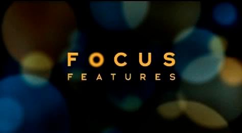
I'm reminded a bit of the Focus Features brand. They too use a lens flare effect, but only as a visual element not as part of the logo. The Focus and BFI logos are similar in that they both use Photoshop techniques; BFI the lens flare, and Focus the blur filter. The use of the blur in the Focus logo is a bit more subtle and its use apart from the mark is always limited to "O"s. This affords it flexibility with restraints. The BFI mark is long on restraints and low on flexiblility.
On a side note, I've used/applied brands that utilize photographic elements, and they are a bitch (in my opinion), even if they are done well. Like I said, I'm all for pushing boundaries, but it has to be done perfectly.
On Dec.27.2006 at 06:53 PM
Darrel’s comment is:
A lot of folks are pointing out that it's for a film company, and therefore an appropriate 'concept'.
Now, maybe I am wrong--and someone please correct me if I am--but I thought most of the time, a lens flare is something the filmaker DOESN'T want to see on film and is more often than not considered a mistake. In addition to that, I typically see the lens flare more associated with 'cheesy high school senior portraits' photography than filmaking.
What bothers me the most about this logo isn't the cheesy effect, but the fact that the old logo was great to begin with.
On Dec.28.2006 at 05:08 PM
jenn.suz.hoy’s comment is:
How many effective applications of this nightmare can we possibly expect to see? Not only that, but the flare draws away all emphasis from the mark itself (since I don't chose to accept that flare as a part of the actual logo).
I'll stick to my initial reaction: Seriously? THAT'S a logo?!
On Dec.29.2006 at 08:30 AM
Mark’s comment is:
Looking at this logo again,and I'm realizing that it's an inaccurate represtation of a lens flare.
the "ring" is WAYYY too big, and the three big circles are WAYYY too close to each other.
If you want to see waht a REAL lensflare looks like go here:http://static.flickr.com/31/93514294_1ead116f0d.jpg
or here:http://mirror-us-ga1.gallery.hd.org/_exhibits/places-and-sights/_more2002/_more09/US-CA-San-Diego-desert-hexagonal-and-star-lens-flare-from-sun-MB.jpg
or here:http://www.borisfx.com/images/larger/v3/lens%20flare%20adv.gif
or here:
http://moblog.co.uk/blogs/925/moblog_c973e45a51721.jpg
or here:
http://cheshire.iinet.net.au/simon/pics4simon/image002.jpg
http://tn3-2.deviantart.com/300W/fs7.deviantart.com/i/2005/171/0/a/lens_Flare_by_DopyGit.jpg
heres a better effect of a len's flare:
http://morepunkinstuff.tripod.com/filters/Axion/images/LensFlare.jpg
notice that REAL lensflares do not look like the hack-job shown above.
the "ring" is to much of a distraction to me and really spoils the effect of a genuine lens flare.
Also the brightness on the logo itself is really too dark to give an effect of a lensflare.
But the TYPEFACE! the BIG CLUNKY typeface is what really really ruins it for me.
On Jan.02.2007 at 01:32 PM
Keivn M. Scarbrough’s comment is:
I don't like it.
Not because of the use of "a" lens flare, but because of the particular use of "this" lens flare.
This is an example of great idea, poor execution. If you look at a real flare, there are no dark spots. There are variations in tone, but there isn't a spot dark enough to equate the letter forms. Why are they black? Readability? Wouldn't a very dark blue achieve the same? Possibly a dark green?
It looks very unbalanced to me. As does the 3 sizes of type. Is it BRITISH(!) film INSTitute?
Furthermore, the final logo, for a print version: Possibly create it in illustrator, layer by layer, to balance the color and tone. Cut out elements for the B&W version to ensure legibility.
On Jan.08.2007 at 07:14 AM
Mitch’s comment is:
One word: Photoschlok
The use of a standard filter for a logo is apalling. It shows a clear lack of conceptual thinking in terms of the graphics and the film industry in general.
I would be ashamed to put my name on this work.
On Jan.11.2007 at 08:59 AM
Scott Stowell’s comment is:
This new version is not a logo. It's a treatment. And why not apply this treatment to the old logo where appropriate, and at other times let the old logo be itself?
I'm all for something appropriate and new, but not at the expense of losing all the character of an existing mark. The old logo had lovely lettering; the new one is totally dependent on Photoshop.
On Jan.16.2007 at 11:24 AM
_’s comment is:
i like the idea of pushing identity design, and though the original logo was a bit pharmaceutical, i just don't buy this at all. say what you will, but to me it looks like a designer who relied upon the software too much. i think a concept is a great, novel idea, but the execution is so weak it overshadows a great concept. the spatial and scale relationship of the letterforms is bothersome at best, and the idea that one letter is sharp while the others have a blur is annoying. it feels very off-centered and cumbersome when placed and dare i say amateurish and tacky – the flare coming from an elbow? why? i think that since tate was able to produce an interesting solution that pushed boundaries, people are too quick to jump on the photoshop bandwagon. however, the tate logo actually seems to work and reproduce.
On Jan.16.2007 at 12:22 PM
Michael’s comment is:
I've seen this logo used a number of times now and it literally disappears when used in conjunction with any sort of complex imagery. I think it was a really bad idea, trying to cotton onto a trend for photoshop based design. The mono version in so much better. The designers could have learnt a lesson of two from North's recent work of the style manual for The Open University, after they got stuck with a similar photoshoped disaster.
On Jan.18.2007 at 05:37 PM
Mark’s comment is:
 " />
" />
this is probably a better representation of a lensflare ,but even this ends up looking bad.
On Jan.19.2007 at 09:42 AM
Mark’s comment is:
http://img254.imageshack.us/my.php?image=bfiotherconceptte8.png
this is probably a better representation of a lensflare ,but even this ends up looking bad.
What they did to Open university is horrible!
compare the photoshopped version to the flat color version in it's earliest incarnation.

sometimes photoshopping things takes away from the stark contrast that colors and shapes have themselves,sad isn't it?
some people just don't get it.
On Jan.19.2007 at 09:59 AM
Jim’s comment is:
This blog seems to be the topic of conversation elsewhere:
http://www.serifpublishing.com/?p=335
On Jan.21.2007 at 04:43 AM
Michael’s comment is:
I should clarify. There was a recently article in Grafik magazine about North's work for The Open University. Pretty much, another marketing led design agency had re-designed their original logo and overlaid it with various photoshop effects, essentially rendering it unusable by the client. North's task was to create a comprehensive manual to beat the identity back into shape. They also created a cleaner, vector based version of the new logo.
It's in Grafik 143. Really interesting article.
On Jan.21.2007 at 06:41 AM
Dan’s comment is:
Johnson Banks responds with: Is blogging bad for your health?
On Jan.22.2007 at 06:19 PM
FlaneurX’s comment is:
A little while ago, Johnson Banks were accused of plagiarism for their work on another identity, so perhaps the lens flare is not as original as they claim. The new identity is also widely hated within the organisation itself.
On Jan.26.2007 at 05:37 AM
shutdown’s comment is:
Why is everyone complaining about the fact that it's a simple filter from photoshop?
Who cares?
The logo works. I don't need to find the logo 'beautiful' to admit that it works, obviously the clients like it enough for it to be chosen.
On Jan.30.2007 at 10:57 AM
Seth Aldridge’s comment is:
They took what was a really nice, clean logo and made it look silly?
On Feb.04.2007 at 01:07 PM
Armin’s comment is:
More work on BFI... I don't know what all you haters are talking about. I'd buy a BFI mug without thinking about it twice.
On Mar.14.2007 at 08:16 AM
Michael’s comment is:
The logo doesn't work when you've got to have it shining out of the top of people heads most of the time. It looks so wrong. And the cover of Sight & Sound is a lot weaker for having to incorporate the new logo (the typeface doesn't help matters either) too.
On Mar.20.2007 at 05:36 AM
jul’s comment is:
lensflare,blablabla etc - i agree, but:
why did they have to change the typography?
it was a well known brand and had a much smoother and dynamic feel.
altogether this looks like a draft made by a design student who knows a few basic steps in photoshop and not much about typography rather than a completed and thought-trough logo.
excuse if language sounds not right i am not native.
On May.23.2007 at 07:16 PM
Mark’s comment is:
The more and more I look at it, it looks more suitable to be representing a movie projector.
Which makes more sense.
At first I though his identity was great but now,sigh I'm not so sure.
Visually when animated terrific,more suitable for symbol only used in animation,however like Disney does with it's 3D castle,Paramount does with it's CGI Mountain,Universal does with it's globe,20th Century Fox with it's stacked letters,and how Pixar uses it's animated lamp.
Case being most studios don't use effects as their main logos,they have a animated one used in film that is decked out with all the lastest effects,and a plain simple one used for things in print such as movie posters.
I think it would make sense to have the name spelled out at the bottom in full in the animation,and use that text for the print logo/a similar but more simplistic logo for print.
The ability to use a logo with effects in print,isn't the point.
The point is how good the logo looks and works in print in terms of legibility,recognizability,and appearance
No matter how much effort you put into putting effects into a print logo, it won't be any better if people can't read it, recognize it's design immediately,or arn't drawn to it/doesn't catches their eye.
I'd hate to think what this logo would look like on a black background,in black & white.
On May.24.2007 at 11:22 AM
Robbiefa’s comment is:
Lens Flare to the max!
On Dec.29.2007 at 07:38 PM
Mark’s comment is:
they're still using this logo
sigh.
On Dec.30.2007 at 09:54 AM
LadyN’s comment is:
Looks like someone discovered the glare filter and liiiiked iiiiittt! ;-)
On Jan.30.2008 at 03:44 PM
pu’s comment is:
anyone who uses lens flair should be shoot. thrice
On Feb.13.2009 at 01:19 AM
Comments in Brand New, V1.0 have been closed.


