

NOTE: This is an archived version of the first incarnation of Brand New. All posts have been closed to comments. Please visit underconsideration.com/brandnew for the latest version. If you would like to see this specific post, simply delete _v1 from the URL.
![]()
As its original name implied, Union Bank has a big presence in the state of California but as the organization has grown, expanding into neighboring states like Oregon and Washington, and with two international offices and six in other states of the U.S., it was time to drop the “of California.”
In a letter issued to customers last month, Union Bank President and CEO Masa Tanaka explained:
“With the change in our name, it was necessary to update our logo, and this gave us a wonderful opportunity to develop a look that underscored the values that we hold close.”
“The most important among these values is a singular dedication to serving your financial needs, which we have very boldly illustrated by adopting a dominant U in our new look. We hope you will always consider it your personal invitation to let us provide your financial solutions.”
— Press Release
How a “dominant U” illustrates “a singular dedication to serving your financial needs” is beyond me, but I will side with Mr. Tanaka to say that the dominant U is quite nice. It has a lovely swooping feeling without looking weak or fleeting, and I absolutely appreciate that the design manages to convey dimension without resorting to shading and bubbly Photoshop effects. The typography is perfectly adequate although I suspect it will get a rise from Gotham haters.
Thanks to Glenn Sakamoto for first tip.


Jump to Most Recent Comment
Jonathan’s comment is:
Nice, classy makeover. Whoever made that U, knows whats up. The curves and dimension in that thing are spot on. Anyone know who did this? My only knock is that I do feel a little bit of a disconnect between the strong, bold U and the blue type. Besides that, what does the small SM mean? Never seen that before.
On Jul.10.2009 at 09:44 AM
Mane’s comment is:
It's definitely an improvement, and a logic update.
About the U and their explanation: I think the U illustrates their personal approach. U (or 'You') is the central person in their services! A nice find, in my opinion...
On Jul.10.2009 at 09:49 AM
Chris Austin’s comment is:

Aaron’s comment is:
A definite improvement over the old identity, and a wise decision to drop the "of California." Although aesthetically pleasing, I agree that it doesn't clearly communicate anything financial - if thats what they were going for. Though it does have a sense of strength and establishment to it. Maybe he meant that the U doubles as signifying the diverse needs of "YOU" the customer.
On Jul.10.2009 at 09:55 AM
Sand’s comment is:
Love it!
I understand "living" logos are all the rage and possibly the future of design, but the classic simple geometric 1-2 color logo will always be my favorite style. Partly because of the challenge designers face by restrictions.
tho I'm not sure how this relates to a bank (Ally) I like the shape and typography. If you squint your eyes it even has an extrude effect from the white negative space U. Make the left side of the U a shade darker and it's money!
On Jul.10.2009 at 09:56 AM
Aaron’s comment is:
The SM signifies service mark (more of a temporary solution to protect it legally), meaning they probably haven't had the time to get it trademarked yet. Which they should.
On Jul.10.2009 at 09:57 AM
Armin’s comment is:
> Besides that, what does the small SM mean?
Jonathan, it stands for Service Mark.
On Jul.10.2009 at 09:58 AM
Chris Austin’s comment is:

Danne’s comment is:
While I do like it, it seems like the expected solution, i.e. it looks like every other bank logo out there.
And yes, the U is a bit reminiscent of a tulip.
On Jul.10.2009 at 10:23 AM
Joshua’s comment is:
I really like the "U", but it doesn't seem to match the word mark very well.
Do you think the "U" doubling as a lowercase "b" was intentional?
On Jul.10.2009 at 10:28 AM
Anton’s comment is:
I think the "U" could be moved a tad closer to the text, but then it probably starts suffering from the visual repetition, as in UUnionBank... quite a challenge. Nice, clean, pleasing design, thanks for reviewing it and bringing to everyone's attention.
Regards,
Anton
Josh’s comment is:
Perhaps the "U" is a reference to "you". Then it might suggest that "you" are the dominant element in the brand. Perhaps a stretch, but not by too much.
Overall I think they've done a nice job updating it. It still has an aesthetic that's going to age, but there looks like there's just enough quirk in the "Bank" type to help it stand out from the hoards of simple, sans-serif, Helveticesque faces out there.
For some reason, it reminds me of another identity that escapes me at the moment.... I'll update if I can think of what it is.
On Jul.10.2009 at 10:54 AM
Andrew Sabatier’s comment is:
A very bankable corporate brand identity.
This is a simple symbol that says so much. It has a sense of abundance and restraint. It comes across as approachable and yet firmly disciplined. The U not only has the proportions of a lowercase b, it is heart-like in colour and form, and in three dimensions with that cleverly crafted edge.
The 'U', without the overt customer-centric cliche of the 'you' in contemporary brand thinking, is the real cake-taker. There is clearly an inherent and authentic focus on customers. No wonder business is thriving. With such a competent handling of the primary brand mark I am very impressed with so little.
Union Bank, U have an outstanding new brandmark.
A.
M.’s comment is:
I'm not as positive on this one. 1 - The old mark was very distinctive, including good font choice. It was also a logo and wordmark in one, which is memorable and flexible. The new wordmark is very generic (narrow/bold) and forgettable. The icon is mainly good, but also a bit obtuse and I disagree that it is not necessarily "weak" - it seems feminine in some fashion. That's not a value judgment - that might be a good thing for the brand - but it's tangible. 2 - Why every bank needs to rebrand to be as generic as possible, I'll never know. "California" was holding back the brand? A huge, influential, well-regarded placename? I wonder if Bank of America needs to rethink itself on the global market - or Deutche Bank, etc. If this is progress, then the Citis and GloboChems of the world must be perfection - completely generic, indistinct lumps of "brand". Give me Wells Fargo anytime.
On Jul.10.2009 at 11:02 AM
Kim Siever’s comment is:
Perhaps, Armin, the “U” refers to “you”, the customer. At least that’s what I get from Tanaka’s explanation.
On Jul.10.2009 at 11:10 AM
Soda & Candy’s comment is:
The new one is very generic; it makes me think of medical services rather than financial.
I just feel like we've seen a million of the abstract logo item / black weight anonymous sans serif word / light weight anonymous sans serif word
On Jul.10.2009 at 11:30 AM
JM’s comment is:
Unremarkable. Undistinguished.
My prediction is it will blend silently into the marketplace without causing even a ripple.
A logo for bankers, designed by bankers.
On Jul.10.2009 at 12:48 PM
randy’s comment is:
DULL.
It looks dated already.
On Jul.10.2009 at 12:50 PM
James’s comment is:
BOOOOOOORRIINNNG
I liked the original layout better. Now they will blend in with all the others. Awesome.
On Jul.10.2009 at 12:57 PM
Joey V’s comment is:
Well it's not that exciting, but neither is banking. I think it's very fitting and a huge step up from their previous look.
I think they should have tried to steer away from red, white and blue. It's hard to stand out when you're the same colors as your competition.
On Jul.10.2009 at 12:59 PM
Nisio’s comment is:
I agree with regard to the colours. The ol' red,white and blue is about as uninspired as it gets. Mind u I'm not American so the inherent patriotism wouldn't appeal to me - though my own national colours in a logo would make me cring too. Rambling statement over.
On Jul.10.2009 at 01:18 PM
CobaltSD’s comment is:
I don’t quite understand why they departed from the old identity that much. UBoC is not a damaged brand like so many others these days. And while I can see why they wanted to go away from the ‘California’ aspect, I think they should have kept other familiar traits in the logo at least for a while, just to show (potential) customers that this is a brand that has done everything right in the past and doesn’t require big changes.
The old logo doesn’t make much sense to me. But at least it is distinctive.
jayparry’s comment is:
Aw thats too bad I loved the Union Bank of California block logo. Solid identity and i did an annual report layout for them so its hard for me to be objective, but yes i agree the weakest part is the red and blue color combo. Maybe they did a 1-color option?
On Jul.10.2009 at 01:45 PM
Rico’s comment is:
I like the new logo although I don't think it's anything ground-breaking, but it's pleasant and a vast improvement. For some reason it kind of reminds me of the old B of A "seagull" logo, can't quite put my finger on it...
![]()
Chris Herron’s comment is:
An excellent symbol. It will likely stand the test of time. It is very difficult to create a mark that is this simple, yet own-able.
And the U/b hybrid is a nice touch. It gives the symbol a pleasing asymmetry.
Not that sure about the type, though. Font could be softer, maybe some rounded corners like the mark, and the two type weights seem unnecessary. Are they UnionBank or Union(Bank)?
On Jul.10.2009 at 02:05 PM
mP’s comment is:
Armin, Glen, do you know who did this?
On Jul.10.2009 at 02:16 PM
Mr. T’s comment is:
I like it. It looks like an adult diaper. Which is perfect because you'll need one when you check your home's value against your current mortgage.
On Jul.10.2009 at 02:17 PM
mP’s comment is:
Adult diaper!
Laughing out loud.
Citibank had the cats sphincter.
Unionbank have the Adult diaper.
all is as it should be.
On Jul.10.2009 at 02:23 PM
Jonathan’s comment is:
It really looks alot like this bank logo minus the oval and the text effects are reversed.
![]()
Mark’s comment is:
Well done, nice logo evolution.
The U in very unique and well executed,and the typeface is nicely done as well.
I like both logos both are done well. None of them have any problems.
It's nice to see a company avoid swooshes and gradients.
On Jul.10.2009 at 02:30 PM
Steven Hoober’s comment is:
This says all I need to about the smartness of going with the name "Union Bank" all by it's lonesome at all:
http://en.wikipedia.org/wiki/Union_Bank_%28disambiguation%29
UBOC had a nice ring to it, and the square word mark was lovely.
Even if forced to change the name, I have to believe I would start with several years of the square without the "of california." Why all these radical changes to good logos, for things that are meaningless to the bulk of the end users?
On Jul.10.2009 at 02:44 PM
Harris’s comment is:
It looks just like Commerce Bank's old logo, sideways.
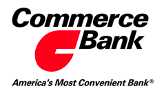
Regardless, I kind of like the mark, but it would be better above the word, which is ugly and not bank-like.
On Jul.10.2009 at 04:26 PM
Marcin’s comment is:
I really like it.
Different two parts of new symbol looks like they want to show two letters (U+b) in one mark ;)
On Jul.10.2009 at 04:33 PM
Chip’s comment is:
This needs more gradients, reflections, and maybe a bevel effect.
But seriously, I do think that the two pieces of the U should be separated just a hair more. I could see some issues with small usage and signage.
On Jul.10.2009 at 04:54 PM
John Mindiola III’s comment is:
The U as "you" is genius. However, I think I'm in the minority when I say that I can't stand the U. It feels so flimsy, and looks like it's trying to pictorialize something else as well (like a b, as someone mentioned earlier). And really, UnionBank? Why lose the space? And, why is there space in the official name, but not in the logo?
On Jul.10.2009 at 05:23 PM
ben’s comment is:
This looks a lot better on paper than in reality. Saw it the first time yesterday on a billboard and was pretty convinced it was a giant toilet trap/plumbing piece until I looked twice. The old design was so great! I so liked it.
On Jul.10.2009 at 08:01 PM
Keith’s comment is:
Well executed, sure, and thanks for staying away from the gradients, for God's sake. But it seems to me they caved on what used to be a very strong an unique brand identity--they just had to resort to some financial sector blue, just had to mash the two words together without a space, just had to go the HeavyLight route.
The old UBOC always made me smile because it was red, and solid, because their implementation was sharp, and because I loved that quirky alignment of words. This is just plain borrr-ing. (Funny, how I could think a big red box is more interesting than the lopsided tulip-thingy.)
All this ranting, from a Gotham lover.
And I'm not even going to harp on the adult diaper thing.
On Jul.10.2009 at 10:08 PM
SamCurt’s comment is:
I don't know if that's just me, but the U feels Japanese for me-- well, after all, Union Bank is now fully-owned by Mitsubishi-UFJ.
But on they other hand-- why don't they just call it MUFC Bank America?
On Jul.10.2009 at 10:19 PM
fsaputra’s comment is:
Logo design is never about looking pretty or different just for the sake of it... It's about communicating the company's voice and acting as the gateway entry into the brand.
If it works, it works...Period. Forget about being original, just be good.
The simplicity of the mark may seem a bit bland, but the overall design works well to convey the corporate feel of banking.
I do have to say it is a pretty safe solution.
On Jul.11.2009 at 12:53 AM
Loren Shumaker-Chupp’s comment is:
Nice mark, my only problem comes in the placement of it. I feel like the logotype does not integrate the mark itself well. It feels somewhat separated. Maybe if the right arm swooped into the top of the logotype?
On Jul.11.2009 at 03:22 AM
Norman Rabinovich’s comment is:
Well love it or hate it, it's progressed into accessibility. The question is, does it evoke a sense of trust? Are we to believe that this is really "our" bank? Or is it masking the intentions of a brand through a softer typeface application and a playful variation on a letterform summoning the lyrical inspiration from a Riccola commercial circa mid 90s.
It's success comes not in the form of the basic principle of branding....see what the other guy is doing and then do the opposite. But it takes all the brand research, market study, focus groups, and presents exactly what the people are expecting to see, a mark that is somewhat familiar, somewhat recognizable, and a mark for the everyman.
The question that lies at the heart of the matter, why would the same bank, need a new look?
"And when you see it, please know that we are the very same bank, with a brand new look -- a look that says that our focus is clearly on you," Mr. Tanaka said. "
GregT’s comment is:
A classy, distinctive logo has been lost. And, OK, I'm not a designer but hasn't the the old boldface word jammed up against a lighter font weight word been done to death in recent years?
On Jul.12.2009 at 12:25 AM
fsaputra’s comment is:
Just because it's been done to death, doesn't mean it can't be done again, can it?
No need to always reinvent the wheel when it comes to design. Too much unnecessary work and sometimes it doesn't even help communication the message.
On Jul.12.2009 at 12:36 AM
Stefan K.’s comment is:
I live in Portland, Ore. and the Union Bank building is one of my favorites downtown. Every time I walk past I admire the somewhat-dated typography and the longer-than-usual name, never mind the fact that we're not in California. I see this as a perhaps-inevitable but still unfortunate loss of character. Yeah, squares are old hat, but I love the way the old name is set and the "of California" lends the institution a note of prestige that UnionBank lacks. There's little to distinguish this from USBank, Bank of America, etc. Oh well!
On Jul.12.2009 at 08:29 PM
Icons’s comment is:
I like the new logo.
Nice Font. Nice Signature & Logo.
Good Colour Combination...
thelottery’s comment is:

Moeed’s comment is:
Pretty bland in my opinion. I'm sure there are quite a few logos that have a similar U. The colors are, well ... American yes, but bland and unoriginal as well.
I loved the logo of The Bank of New York before they changed it. It was daring, unique, and beautiful. This logo as a short lifespan.
On Jul.13.2009 at 10:50 AM
Jackie’s comment is:
The "u" is very similar to the Foodlands Ontario logo.
And I immediately thought of Ontario when I saw it.
http://www.foodland.gov.on.ca/library/english/images/logo-flo.gif
It reminds me of a plant not a bank.
On Jul.13.2009 at 12:47 PM
Comments in Brand New, V1.0 have been closed.


