

NOTE: This is an archived version of the first incarnation of Brand New. All posts have been closed to comments. Please visit underconsideration.com/brandnew for the latest version. If you would like to see this specific post, simply delete _v1 from the URL.
![]()
Swisscom is Switzerland’s largest telecommunications company, delivering services and products for mobile, fixed and IP-based voice and data communications. Since 1997 — when PTT’s (Post, Telegraphy and Telephony) telecom division went public as a limited company — Swisscom has sported its blue and red, boxy corporate logo… “[the previous logo] with its simple style, combines the human side of technology with the image of credibility and security offered by a traditional company.” The previous logo was traditional indeed, perhaps even downright stagnant. And as with so many large corporations of late, the old logo has gotten thrown out the window to live amongst the lost hits of Hanson and Toni Braxton (that’s right, Hot 100 number-one hits of 1997!), making room for the more contemporary and trendy image.
According to Swisscom:
Swisscom’s on the move. As the logo shows. The new brand is like the new organisation. A dynamic company that has grown above and beyond the segments it serves.
Making our logo more dynamic is vital, as the majority of our services are now available via a screen: from voice telephony to multimedia communications services, from the keyboard to the screen.
The Swisscom re-brand is part of an overall corporate restructuring. Gone are the previous group companies Swisscom Fixnet, Swisscom Mobile and Swisscom Solutions. Swisscom Ltd will instead house the divisions Residential Customers, Small & Medium-Sized Enterprises and Corporate Businesses. The new brand was developed by Moving Brands with assistance from Dalton Maag (well known for their typographic work with BMW and UBS).
The previous logo left a lot to be desired: Generic typography pinned against a very 90s corporate interpretation of a progressive and moving graphic. Given the competing baselines for the type and mark, stacked and aligned to opposite sides, the logo was difficult to align within a composition — whether in a print or digital workspace. Even the generic red, blue and inevitably white color selection steered the previous mark away from an ownable image.
The new logo is… well… certainly new! Let’s start with the positive. The wordmark is a vast improvement. It’s a pleasure to see new typography handled with care — right down to the kerning — and attention to whatever heritage and equity was there previously. I look forward to seeing the accompanying new type family (hoping that there is one). We could debate whether or not one “likes” the typography, however there is no argument in regards to the clear thought and superb execution at play.


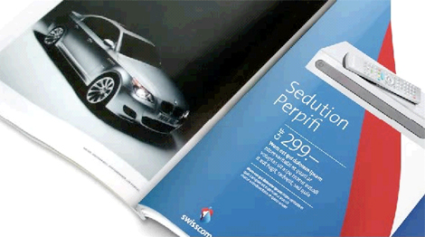
Some collateral samples.
In addition, the color choice and usage is a step forward. Now I know what you’re thinking: Gradients!? Indeed, I’m as offended by them as you are and ready to point out how quickly they will become dated. So leaving aside the gradients for a moment, the new color usage in the mark has a much more independent voice. The generic royal blue is replaced by a brighter shade in the mark and a much darker variant in the wordmark. The red is now paired with a controlled usage of white, playing a more nationalistic swiss note. Definitely an improvement in the color palette and well showcased in the brand videos [see link below for brand site].
![]()
And then the not-so-positive — the icon. I understand that “dynamic” is all the rage these days as a brand attribute — but it seems like they grabbed one of the animation frames from their brand video studies (albeit well handled, if not overly corporate, studies) and ran way past the goal post. If there were ever a mark bound to be called outdated quickly it is certainly this trendy use of vector drawing tools, flaccid bastardization of the timeless swiss cross and gradients. I like seeing it twist and twirl like a six-year-old girl in the Christmas pageant too, but clearly some over-zealous corporate parent saw the video and got just a little too excited about it.
Visit Swisscom’s new brand site, see a logo animation, check out a great timeline of the PTT/Swisscom brand, and don’t miss these Frequently Asked Questions about the new brand.


Jump to Most Recent Comment
Andrew J Klein’s comment is:
so...what's it supposed to be?
I don't see the swiss cross
I don't really see anything... which shouldn't be a problem if it's meant to be abstract, but the forms and shape seem to want to imply that there is meaning other than an abstract shape, but there really is not.
i'm not so crazy about the cut-off looking "i" or "m"
On Dec.19.2007 at 05:33 PM
Ty’s comment is:
Maybe the Swiss cross is the white shape in the centre of the icon? It would certainly be a stretch, but in a logo as abstract as this, perhaps that's the point?
On Dec.19.2007 at 05:53 PM
wear palettes’s comment is:
the cross is the first thing i saw, and i like it.
i'm not too convinced about the transparency (the gradients why not) and the pear shape.
nice typo and, overall, i think it's a nice step forward.
On Dec.19.2007 at 05:53 PM
Derrick’s comment is:
I really like this new logo. It's awesome. :)
On Dec.19.2007 at 06:00 PM
Christopher’s comment is:
Why assume that gradients will be dated? In my understanding it is an indifferent thing that is really dependent on how well or poorly it is used, like everything else in design.
That typeface is Thesis: The Sans with a bit of a trim, no?
Catalyst’s comment is:
The icon is very vaginal. And not in a good way.
[I can't believe that's my first comment ever on this site.]
On Dec.19.2007 at 06:09 PM
Darrin Crescenzi’s comment is:
I enjoy abstract marks for corporate identity, but I only find them effective when the indicated movement or indexical association says something tangible about the entity being described. This mark is interesting, but I don't think it's terribly effective. It seems that most commenters are seeing a distorted Swiss cross in the mark, which I'd wager is merely a result of needing to see something, because the cross is a bit of a stretch. Say, for argument's sake, that it is the Swiss cross... what are we communicating by distorting it so?
I guess I would love to hear the rationale behind the form here, but honestly if I can't feel it, then it isn't doing its job.
The typography is nice, though I really wish the curves on the "i" and "m" were more organic and less mathematical, to reflect the nature of the associated mark. And the two different blues really, really bother me, albeit for completely personal reasons.
On Dec.19.2007 at 07:56 PM
Audrée Lapierre’s comment is:
I keep trying to find what it is. But I can't. And I don't think it can be an easily recognizable icon... its too complicated.
On Dec.19.2007 at 08:18 PM
Sao_Bento’s comment is:
Looks great. I know it won't fax well, and I'm not crazy about it as the background in the magazine ad, but it's a huge step forward.
On Dec.19.2007 at 09:05 PM
Joachim’s comment is:
I don't know what the shape is, but I love it. It's a really nice looking abstract sort of thing and after studying it for a while, I see a stylized cut apple and leaves. It would look even better if they replaced the gradients with solid colours. It's a really nice mark, though that 'm' at the end looks wonky.
On Dec.19.2007 at 09:25 PM
wookiepants’s comment is:
Woo Hoo! Gradients! Transparencies! Amorphous Blobs! Type with rounded edges! Ludicrous Branding speak! Woo Hoo!
I think that about covers it.
On Dec.19.2007 at 09:31 PM
Alfonso’s comment is:
I don't think the cross is a stretch at all. And I think that by distorting it the message being sent is one that contrasts with the overall crispness and rigidity commonly associated with swiss... well, swiss-anything. The rest of the "blobby" icon seems a bit over-the-top, though. But not necessarily offensive. Certainly not offensive in light of its predecessor.
I really enjoy the typography. The curved corners on the 'i' and the 'm' are a very nice touch, although I do find that if it were a tad less pronounced on the 'm' the letter would be better served (its leftmost stem looks a bit weak). The tight kerning is a great improvement.
About the gradients, I'm pretty satisfied with them in this case. I think they were applied sensibly. Same goes for the transparency, although it could do with a little less transparency on the red area, where the blue behind it seems to darken it way more than necessary.
The sample collateral looks much nicer than the logo alone would suggest, in my opinion. I enjoy the play on the shapes inspired by the logotype, without strictly adhering to the shapes defined by the icon. This is something that plays well when compared to the logo animation. The animation suggests different perspectives of the icon, and the identity seems to borrow from that to present a dynamic –albeit still safe and predictable– public image.
Overall, I think this is a great improvement.
On Dec.19.2007 at 10:05 PM
Jeff’s comment is:
It looks like a t-bone wrapped in wax paper.
I really like the look of the collateral, though.
On Dec.19.2007 at 10:21 PM
K. West’s comment is:
I don't know if it works for a logo or it's trendy or blah blah, but as a piece of art it's very beautiful.
I really like the type--especially the 'i".
On Dec.19.2007 at 10:54 PM
Paul Walker’s comment is:
It looks like what I hink the Adobe CS3 icons should have looked like.
Well executed - though a little generic - but certiainly an improvement. Though looking at the timeline, the 1982-1997 logos are sooo much better than either of the ones shown here
On Dec.20.2007 at 02:20 AM
Adrian’s comment is:
As an art director who recently moved back to Switzerland, I'm not at all sad to see the boring, conservative (almost stoic) old logo go. Swisscom has always had the tendency to arrogantly dominate the market, without growing close to the customers.
The new logo however is an abomination in my eyes. This wannabe-dynamic web2.0 feel is long gone, it's like KPN (the dutch equivalent of Swisscom) with their new weird blobs as a logo. I definately applaud the new use of color and that they're actively trying to change, but I don't see how this is going to help. The old logo had the bars (which apparently stood for dial tones or signal), the new one has absolutely no relation to the telecommunication branch. Unless signalling with flags is considered to belong to that branch as well ;)
On Dec.20.2007 at 02:31 AM
Von Glitschka’s comment is:

Inspiring recipe?
On Dec.20.2007 at 05:17 AM
Tephlon’s comment is:
That '82 logo wouldn't look out of place now.
I'm not exactly thrilled with the gradients and all, but I like the look of it.
I love the treatment of the letters, especially the i.
On Dec.20.2007 at 05:29 AM
diogo’s comment is:
I just think it is really ugly...
On Dec.20.2007 at 06:21 AM
diogo’s comment is:
I just think this is really ugly...
On Dec.20.2007 at 06:23 AM
Maaike’s comment is:
I think Von Glitschka's comment says it all :-)
On Dec.20.2007 at 06:34 AM
Plamen’s comment is:
Von Glitschka - LOL!
'though the smurfs are Belgian ;-)
On Dec.20.2007 at 07:16 AM
Blake’s comment is:
If the logo was for a Heart Transplant hospital I'd call it genius. I just don't see "dynamic within the communications industry". I feel like taking my heart rate for some reason...
On Dec.20.2007 at 08:54 AM
Tom’s comment is:
It sure is pretty, but the logo doesn't "say" anything to me about the business.
The collateral looks great (through corporate eyes) and I come to the conclusion the logo was created with nice gradient shapes and colors that would translate nicely to backgrounds for brochures and catalogs.
This could be a huge conspiracy with designers today... to overuse gradients, transparencies and dynamic shapes so much that every brand will need to be redesigned by 2010...creating a new golden age of design. It could happen, you just wait and see...
On Dec.20.2007 at 09:50 AM
Andrew J Klein’s comment is:
lol Von Glitschka,
Slow this time of year at the agency ? :)
On Dec.20.2007 at 09:51 AM
C-Lo’s comment is:
I see the swiss cross and all that, but I would expect this logo to be on the cover of a math text book. Rememberable for it being a kinda mush of a lot of things and different from most logos, forgettable because the logo is so off kilter that it distracts from the namesake, and you only remember the swirls. For a "generic" logo it works, but not much else.
On Dec.20.2007 at 09:59 AM
Igor’s comment is:
I think giving a modern treatment to the original logo would have been quite striking.
![]()
Matt’s comment is:
I'm really not enjoying the logo as many have already mentioned, but I think the colors are really lovely and the packaging and print materials are also pretty great. I'm looking forward to how they'll attempt to bring this new identity to their website.
On Dec.20.2007 at 12:03 PM
TheUprock!’s comment is:
@Von: You never cease to make me laugh in almost every thread.
This new logo is shite. I also don't like the manips on the type. If you're going to "update" or "improve" characters in a type family, then at least make an effort to try to convey something with those intents. Terriblé.
On Dec.20.2007 at 12:09 PM
David Sanchez’s comment is:
SWISSCOM….
BRAVO!
FLUIDIC, AMAZING, UNIQUE, INSPIRING, MOTION, REDEFINES, VIVID
A job well done by MovingBrands.
The comments are brutal, but been on the business of corporate communications to many industry verticals, you learn to recognize the winners when viewed in numbers, this is one.
The new corporate philosophy has a new personality; it unifies the company, facelift to their vision.
What a beautiful symbol “Wind Ornament”, yet complex, and it ROCKS when animated, evokes freedom, airiness, joy, emotional, it has national colors, kaleidoscopic view of what’s is to be a native Swiss Company, is just not red and white, crosses, that was an overcrowded monograph which is overly saturated.
Excellent rebranding.
Very Euro.
Again BRAVO!
On Dec.20.2007 at 01:51 PM
JasonP ’s comment is:
Finally, thank you Mr. Sanchez I had begun to get a bit depressed after reading some of these blogs. The logo above all else expresses viability and freedom. Swisscom did not westernize like many European companies have so kudos for that!
Moreover, it is a great piece of art plain and simple.
T-Bone’s comment is:
I kinda like it, however the part at the top where the red arc doesn't line up bugs me.
Overall it looks like it's been frozen in a completely random frame of the animation.
Collateral is awesome though.
On Dec.20.2007 at 03:14 PM
craig shully’s comment is:
Very cool - but I admit - my initial reaction was the same as Catalyst's earlier posting - vaginal.
Seeing it adapted to the website though, so calm and clean I do like it.
On Dec.20.2007 at 03:15 PM
natobasso’s comment is:
This logo turns into a complete blob when you make it black and white. Crap!
On Dec.20.2007 at 03:35 PM
jnl’s comment is:
I'm very puzzled by this logo. At first look, it reminded me of a mussel. I'm still not sure what it is.
It is clear to me that the animation came first...and then they tried to figure out what the logo would look like.
I'm a fan of gradients and transparencies, but also a fan of clearly communicating a image...
On Dec.20.2007 at 04:11 PM
andrew miller’s comment is:
Swisscom did not westernize like many European companies have so kudos for that!
I'm not sure what you mean by "westernize" but I can only assume it means using a mark that has meaning. And by that definition, you're right. They didn't. And its a shame.
The mark competes with the typography (which is really nice, btw). The viewer spends too much time trying to figure out what it is and will never remember it.
It feels awkward at the top of the mark where the blue crosses over to the other side.
Seems like an "AT&T" kind of approach. A highly transparent and swoopy/wonky mark that they can scale 1000% to use in the background of advertisements.


Illustrative Designer’s comment is:
Too many meaningless pieces. It needs to be simplified. I see the Swiss flag/cross but that's it. 7/10
Von, what happened to the Illustrative Designer Podcast?
No time for podcasts but plenty of time to create silly, yet apreciated animated gifs?
The podcasts rocked. I hope you start them back up soon. Could you give us an update?
On Dec.20.2007 at 04:58 PM
Von Glitschka’s comment is:
The "Illustrative Designer" podcast will have a new episode sooner then later. I got buried in work, updated my laptop and the interview software no longer worked for intel and then within the last two months I've switched cold turkey from FreeHand (17yrs) to Illustrator so that has been painful but I am now over the hump.
Unfortunately I am a one man show so I can only do it when I can do it. BTW, those animated gifs take all of but like 15 minutes or so. A podcast once recorded takes about 3-6 hrs to edit out all the "uh's" and "err's" or awkward pauses etc. so it's bearable to listen too.
But all that said they'll be new ones coming. One I am excited about is with a designer named Ross MacDonald who did all the props for National Treasure, great guy and lots of fun stories.
On Dec.20.2007 at 05:16 PM
christopher’s comment is:
Perhaps Jean Arp's work was an influence on the design. He was a resident of Zurich and is one of the more famous modern artists from Switzerland. Check this out.

And this:

K. West’s comment is:
What's wrong with vaginas?
On Dec.20.2007 at 11:47 PM
Matheus’s comment is:
woah another Microsoft Silverlight children
sometime designers get so inpired, but so new-thinking that they just forget everything they learned and go random to create pure nonsense logotypes.
On Dec.20.2007 at 11:49 PM
Danny Tanner’s comment is:
I understand Moving Brands Philosophy,
and agree with their vision, however feel they
overlooked every part of the branding except
for the "moving" part.
As a static mark, this doesn't work. It doesn't
appear to be light and lively or a wind thing.
Rather it appears heavy and sharp, and leaves
the viewer wondering what it is, having
so many shapes within it and taking up so much
real estate as a symbol.
Where the swiss cross is knocked out on
white backgrounds when used on a white
background or in animation works OK (the
animation is beautiful), however it works
poorly on the sample apps, where the mark
appears over a colored background. This
makes the mark feel even heavier and
more strange.
While I understand this identity will often be
used in a rich media environment, that's not
the only place it lives. One of the apps shown
is a mobile phone box, and I'd bet this logo
looks horrendous 1-cm tall in one color
on a phone casing.
There is a time and a place for identities like
this, times where organizations are far more
screen based than print, signage, phone booth,
mobile phone, based... notice none of the
application examples show how this will be
handled on actual 3D elements such as
signage and phone booths (major touchpoints),
only in print and on screen.
It seems they tried to pull the trick of having
a living brand, which I feel is commendable,
however having a crazy logo that just gets
cropped into neeto supergraphics is the wrong
way to go about it. They could have kept the
supergraphics, the animations, all of it, and
had a simple wordmark as the icon.
and finally
HELLO...the name of the company is SWISScom,
you don't have to show me picture of the swiss flag,
stop beating me over the head, I get it already.
diogo’s comment is:
I think christopher may have a point on the Jean Arp approach. But Arp understood the importance of simplifying forms when working with 2D.
I'm sorry, i really dislike this logo...
im from switzerland’s comment is:
and i life with this products all day long.
the old one is as boring as the new one.
they always do the same fancy shit all over and over again. there is no difference! trendy in the 90' or trendy in 2007. there is no sence of timeless graphicdesign in switzerland any more, so they accept evrything. there is no swiss graphic design tradition, this tradition is long death.
Mark’s comment is:
When I first saw this I said, what the heck is that!?
I think it's supposed to be an s with some abstract-y c and half of a swiss cross thrown in.
bad just bad...
On Dec.21.2007 at 11:00 AM
Glenn ’s comment is:
It's attractive in an odd and appealing way. More like a work of art and less like a logo. It is surprising and thus, memorable. I like it!
On Dec.21.2007 at 11:11 AM
Patrick Senecal’s comment is:
I love the way the branding is applied on the various items. It almost looks like the logo was made after the applications.
On Dec.21.2007 at 12:25 PM
Anonymous’s comment is:
Von is the king of animated GIFs around here (I think a Treble Clef should have made an appearance, though ;)
Boring new logo that will look ridiculous when paired with other logos for sponsored events and such, but it works well for that box design. I never would have noticed the melted swiss flag.
On Dec.21.2007 at 01:17 PM
Andrew’s comment is:
First off,
Christopher: Thanks for doing some simple research on Jean Arp while the rest of us bellyached. Very interesting. It's starting to make sense. Swisscom at least knew what they were getting by collaborating with him. Thanks.
Danny Tanner: Informative comments. Very well presented and apreciated. Thanks.
Von: Hallelujah! Hey, we know you're busy. We all understand. But you gave us a few hits and now we're addicted. I'd pay good money for your superior quality podcasts. Thanks.
On Dec.21.2007 at 04:25 PM
BWJ’s comment is:
I really like the word mark. It is set very well and the details on the "i" and "m" add a nice bit of personality.
The symbol, however much I appreciate it for not being expected or traditional, leaves me baffled. The form is very odd, I do see it more as an art piece, a futurist meets Picasso kind of piece, but I'm just so tired of gradients and transparencies, especially in identities. This mark should be as long lasting as possible to build and maintain equity, but this will be outdated much sooner than it's worth.
On Dec.21.2007 at 06:34 PM
Rico’s comment is:
Jesus god! WTF?
On Dec.26.2007 at 03:53 PM
Giuseppe’s comment is:
Well, I simply don't understand the mark, that should have some meaning that probably I don't catch. I don't like it. Nothing to say about tipography. Good job!
On Dec.27.2007 at 04:51 AM
adam’s comment is:
isnt that the new photoshop or wacom logoo or something? haha
i think the graphic is of an apple being washed in water?
On Dec.27.2007 at 05:04 PM
Blue Buddha’s comment is:
I really like this new logo. Both the color and the shape are very attractive to me and they did a great job branding this across different media (packaging, product, advertising). They took a somewhat complicated shape and simplified it down for the collateral.
To me, it looks like a living breathing organism, something like a flame, that was caught on camera. It seems as though they can play with this logo to their advantage for further uses.
On Dec.27.2007 at 11:17 PM
sam’s comment is:
i agree with tom
they could even downplay the usage of their new logo, keep it small in the corner
and all the applications would still be identity-apparent when they cover everything with logo-derived flourishes of red/blue/white gradient/transparent twisted/rounded etc... which is kind of a trendy cop-out
Tim’s comment is:
i like the type, i don't like the icon. even after seeing this for a number of times: I still see an apple and a pear in the icons shapes. to me it looks more like an icon for a cheese, milk or any other food-related stuff.
On Jan.01.2008 at 04:08 PM
Char Alfonzo’s comment is:
What do we know what works nowadays?
We have extremely abstract logos working. I think the extremely geometrical oh-my-god-Paul-Rand logos are effective but how are we gonna be ever move forward if we don't push the envelope?
I love this logo, it's edgy [not trendy] and it makes you stop and look closely. It's engaging.
We need more interesting logos rather than safe.
Mr Posen’s comment is:

Fabio’s comment is:
The ideia is great but not for Swisscom... actually I'm kind of lost... does the logo represent something?
On Jan.12.2008 at 12:20 AM
Randy Hill’s comment is:
The icon reminds me of the little twirly blob inside of some of the old glass marbles. That's all I see. Egads.
On Jan.16.2008 at 03:03 PM
Mark’s comment is:
This logo is quite unusual but on reflection it isn't that bad, in fact, it's quite clever, there are worse looking logos out there.
On Jan.17.2008 at 10:28 AM
Armin’s comment is:
Great inside look at this project by Creative Review.
On Feb.29.2008 at 08:03 AM
Tyler Bolton’s comment is:
prediligent inductionally adherency totanus methanometer forfoughten stercoreous nonlegato
http://www.beckervision.com >South County Eye Care
http://www.etsy.com/shop.php?user_id=82394
Menk’s comment is:
what a mess.
On Dec.12.2008 at 11:45 PM
Josh’s comment is:
Von = Funniest comment ever.
I see where they are going with it, but I'd hate to see what it would look like in black and white. Did they even consider that?
On Dec.14.2008 at 03:40 AM
Simon Robertson’s comment is:
Moving Brands have some more production pics up, including the single colour versions of the logo.
i like the single colours ones better...
http://www.movingbrands.com/?category_name=swisscom-work
On Jul.07.2009 at 03:34 AM
Comments in Brand New, V1.0 have been closed.


