

NOTE: This is an archived version of the first incarnation of Brand New. All posts have been closed to comments. Please visit underconsideration.com/brandnew for the latest version. If you would like to see this specific post, simply delete _v1 from the URL.
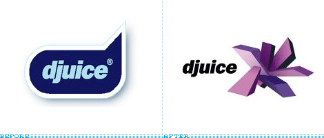
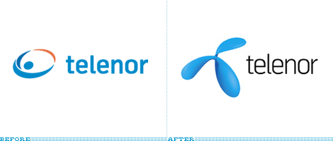
djuice is one of the worlds leading mobile content providers for young people. Wolff Olins, who also helped rebrand djuice’s parent company Telenor earlier this year, created the new identity.
Ok, I am clearly not the audience here as I’ve never downloaded anything on to my phone. Until last year, I still used a StarTac and still would be if it didn’t break. So it’s probably not important that I’m not exactly sure what the new logo is. I do know, however that whatever it is, it’s extreme. So extreme, maybe I should have spelled it x-treme. Don’t let it get too close to your eye, it may stick you.
The Press Release:
A close-up of “the thing.”

Also in 2006, Wolff Olins rebrands parent company, Telenor.


Jump to Most Recent Comment
Sonny’s comment is:
I'm not so sure either. The 3D rough blocks may not very appropriate with the existing brand "Djuice". I think it should've had a softer, more natural look, i.e. leaf, green, orange (as fruit and color). But then such ideas are too common these days. Well, at lease the new identity has its distinct look.
On Nov.06.2006 at 09:12 PM
grace2_89’s comment is:
How reproduceable is the djuice mark? I'd love to see what their company polo shirts look like... It's a neat concept (phone content coming in from all directions) but goodness, those gradients and shadows would just disappear when small.
On Nov.06.2006 at 11:27 PM
Kyle Hildebrant’s comment is:
I would think there would be a lot of opportunity for this mark to fail in low-resolution mobile screen applications. That would seem to be a big criterion when designing a mark for a mobile content provider--unless the content is really never branded by the company itself.
On Nov.06.2006 at 11:45 PM
Joseph Szala’s comment is:
Yikes. Without reading a brief or anything, it's hard to say this is a winner. Based on basic design principles, it's pretty bad.
I did some work for mobile content a couple years back and they usually do not understand the importance of true design. They just want something pretty.
I wouldn't mind seeing how both logos play out in black and white or just two color.
Seems like a bomb to me.
On Nov.07.2006 at 08:55 AM
Paul R’s comment is:
sure seems that Telencor likes things that explode. Both logos seem to have the same aesthetic. Drjuice must have got his PH.D. in geology.
On Nov.07.2006 at 11:06 AM
Paul R’s comment is:
oopps, look at me. I read it as drjuice. Nevemind the phd comment =p
On Nov.07.2006 at 11:07 AM
felix sockwell’s comment is:
I actually don't mind this mark. Trendy product = trendy badge.
Exectution could use some help.
On Nov.07.2006 at 11:13 AM
Joseph Szala’s comment is:
Is following a trend really the best idea in an initiative that's supposed to be long term? After all, the cutting edge is the first thing to get dull.
On Nov.07.2006 at 12:01 PM
Michael Nott’s comment is:
The measure of all logos...
"Can it be stitched on a Polo shirt?"
R Berger’s comment is:
Can you hear me now?
no.
On Nov.07.2006 at 01:27 PM
Lester’s comment is:
I actually think both the Before and the After suck. They're just going from one shitty logo to another.
I sort of like the Telenor redesign, though, even if it is trendy.
On Nov.07.2006 at 02:37 PM
David’s comment is:
I don't mind the djuice mark, it has some graffiti type quality to it that should relate well to the target audience, although it think it's a tad too complex.
On Nov.07.2006 at 04:41 PM
Joe Moran’s comment is:
I put it in photoshop, inverted it, then changed it to bitmap (50% Threshold).
It turns into a blob of weird spikey stuff.
A logo should be able to print in one color, and be reversed. (And faxed.)
VR/
On Nov.07.2006 at 08:49 PM
Ryan’s comment is:
As a logo it's a failure, but as an illustration it's intriguing.
I'm not sure I see the point in this current trend of 3d-ing logos. I'm comfortable with simple gradations here and there, but this logo (and many others) completely spit in the face of the symbolic logic that used to be a staple of identity design. Instead they go for a shiny, pretty, 3d effect that will reproduce horribly.
BOOM! Splat. Flush.
On Nov.08.2006 at 01:51 AM
Armin’s comment is:
Animated – which I assume is why this logo ended up looking like this – it must be a pretty cool mark. If they can pull off some sort of Matrix-ey, whoah-inducing animation that is. But not to excuse it... As a "thing" it's quite dastardly.
The typography is not half bad though. The new redrawn one is a nice piece of typography on its own.
On Nov.08.2006 at 08:42 AM
louis Lygo’s comment is:
Why when designing a brand do we need the requirements of what it would look like on a polo shirt, surekly the target audience ie. "youth would not be seen dead in a polo shirt. Maybe we should look at the requiremnts more in a virtual enviroment. ingame sponsorship etc. Extreme how is it extreme? crikey where do you guiys hang out?
On Nov.08.2006 at 10:39 AM
kyle’s comment is:
The symbol looks like a poor execution/knockoff of Daim's graffiti.
more samples from Google images
Joe Moran’s comment is:
I was laughed out of an interview for suggesting a logo should maintain its integrity regardless of technological capabilites.
Computer screen vs. print. 1994.
The laughing boys went out of business a year later.
VR.
On Nov.08.2006 at 10:59 PM
Craig’s comment is:
man, reading through all the different posts here I wonder whether there's anything out there that's actually apreciated by you all. It feels like you are simply just dissin somebody elses work under the comfort of anonymity. It would be great if you guys at Brand New would build a community where you'd have to post your own work BEFORE you get to comment on other peoples work. Wonder who would be laughing then...
But if you do want to continue bashing the identity, consider the following:
1) The target audience in question couldn't care less whether a logo can be stiched on a polo shirt or not, because it would definitely not wear one. And since when is the measure of all logos stitching? There are dozens and dozens of applications that are all difficult...
2) A fax? What's a fax and who uses one? Instead of looking at possibilities you are looking at limitations - why would you start small? Oh and if you can't make this work in one color, you might want to go to art school again.
3) Low Resolution screens are a thing of the past, almost every phone nowadays has at last a 1.2 mega pixel camera and pretty amazing resolution and if you've seen any of the animations that are out there for mobile phones, you'd know what's possible.
So before you bash the next identity, look at the brand and what it wants to communicate first and foremost, then look at the environment this is used in, get to understand the TA, look at the competition and consider where it will be implemented.
My 5 cents: I congratulate the guys over at WO for once again challenging the status quo and coming up with a solution that is fresh and unique and definitely differentiating in a sea of sameness. I just hope that they implement it in a way that is truly capitivating and compelling, otherwise it will get dull pretty quickly.
On Nov.09.2006 at 12:35 AM
Armin’s comment is:
> man, reading through all the different posts here I wonder whether there's anything out there that's actually apreciated by you all.
Craig... See the Chicago 2016 Olympic Bid post.
> under the comfort of anonymity.
Other than one "Anonymous" post, everybody's name is right there – and it's usually real. If you rollover the names you can link to their web site (where most people show their work) or their e-mail (you can e-mail them and ask to see their work). You can then decide to laugh or not.
On Nov.09.2006 at 12:03 PM
Matt’s comment is:
Just to start… a logo is not a brand unless it is burned into the side of a cow.
The logo has both ups and downs for me.
Ups: Radical, fits the audience well.
Downs: Reproduction nightmare unless it is on a tv screen or website.
I can appreciate the logo for what it is and applaude the designer for not conforming (for what ever thats worth). Thanks for reading.
On Nov.09.2006 at 12:35 PM
David’s comment is:
I don't see the need to see anyone's work before they post a comment. What is important is that it is constructive criticism and not a rude bashing without reasoning.
Any random person can comment here - people from all walks of life and that's valuable. They are entitled to leave a comment or opinion just as much as people that have a "design background". These people may not not have done any work themselves, so your point is moot.
Furthermore, if I would to post a logo mark, I would rather have people commenting on what can be improved rather than blowing smoke up my ass - as long as it's constructive.
On Nov.12.2006 at 12:35 AM
C. D. Sutton’s comment is:
The graffiti look and feel may appeal to the target, but yeah the one colour and two colour versions of the djuice logo will be a design/execution challenge.
On Nov.12.2006 at 08:22 PM
catalyst’s comment is:
What's the idea here? Electronic sea urchin?
On Nov.13.2006 at 04:44 PM
Tikuz’s comment is:
Looks like the blocks are overdone abit?
On Nov.17.2006 at 02:55 AM
jenn.suz.hoy’s comment is:
Something with that much prominence and size should never be a random something tacked on to the end of the company name.
On Nov.20.2006 at 11:21 AM
yi’s comment is:
Tastes like a late 90's flash based website.
On Nov.20.2006 at 04:26 PM
Xavez’s comment is:
@yi: that's probably the best way to describe it.
On the other hand, it refers to the parentcompany logo quite well. Although I'm not sure what that wobbly thing is either :).
Mark’s comment is:
the "wobbly thing" to me tooks like a stylized letter T.
was the Djuice logo some random illustration tacked on or is there some meaning behind it?
On Dec.19.2006 at 07:12 PM
Sten67814’s comment is:
I just don't have much to say these days, but so it goes. Today was a total loss. I guess it doesn't bother me.
On Dec.30.2006 at 12:52 AM
Dave C.’s comment is:
although a little too tightly kerned, I much prefer the old logo. The new telenor logo is an improvement, but still not sure what that blobby thing is.
On Jan.20.2007 at 02:39 AM
10905’s comment is:
I like it. It has a urban-grafitty feel to it. Nowadays most logo's look familiar and this one stands out. Look at www.daim.org. This guy makes digital grafitty illustrations which have the same feel!
On Feb.01.2007 at 09:32 AM
Joseph’s comment is:
I think the new djuice logo looks a bit Peter Saville/Mark Farrow circa 1992. But that may just be the Helvetica talking.
On Apr.03.2007 at 09:24 PM
Exigent’s comment is:
It's crap. Can't reproduce well on ALL mediums, and is way too trendy. I will give it one year before they realize just how much of a turd they have and change it out with something that doesn't reak of dotcom iconography failure.
On Apr.04.2007 at 12:26 PM
Kalsnes’s comment is:
Used to work for Telenor, as a customer service clerk / sales representative. I was there for two years, and got a good impression of the company..
They wanna be big, they wanna be great, they wanna rule the world (and then some)(which company doesn't?)..
Telenor used to be government owned known as "Televerket", with a logo quite similar to the initial Telenor piece. Now, - as a private company -they want to break away from the old dull government bureaucracy identity, and be very "hip" and "fresh".
The Djuice-logo has been marketed heavily in Norway in "utterly cool ways", such as grafiti-sprayed on a dog + +. Right now Djuice is marketed via humorous short story spots of a "would be east european village" in clear "Borat"-style.
The logo it self is not very much focused on (animation and such), but the commercials are.
Maybe this speaks for the fact that the logo itself has "failed", but the brand excists via heavy and "extreme" marketing?
When it comes to the "Telenor"-logo, it's been given mad critisicm up here. No one knows what it is supposed to illustrate, yet many has suggested a boat propeller. Keen people in the boat industry has said that the propeller in that case is not set in the right direction, making the boat go backwards in forward motion. Specialists have said that this is bad PR for the company, set to dominate international telecom.
In Norway it has worked, because the company gets a lot of attention due to its past as government run. Up here, everyone recognizes the brands and typographies. Telenor has now established them selves in international markets, and I will follow the development of ther branding with interest.
At this point the symbol and typography is carried out through all marketing, but the names change e.g Telenor -> Sonofon -> Digital City, depending on the country they're in, and which service they provide.
Telenor in Norway pretty much controls Phone lines, Cell phone signal distribution, Broad band internet, Digital television. I do not know if their intention is to be a leader of all these internationally.
On Sep.23.2007 at 11:06 AM
Comments in Brand New, V1.0 have been closed.


