ADV @ UNDERCONSIDERATION Peek here for details
BROWSE
Client
Self Promotion
Quantity Produced
Brochure: 500
Business Cards: 2,000
Production Cost
Brochure: $500
Business Cards: $1,000
Production Time
Brochure: 3 Weeks
Business Cards: 2.5 Weeks
Dimensions (Width × Height × Depth)
Brochure: 6.14 in. × 2.61 in.
(Size of a Dollar Bill)
Business Card: 3.5 in. × 2 in.
Page Count
Brochure: 8 pages
Paper Stock
Brochure: Uncoated Recycled, 40 lb. Cover
Business Cards: Coated, 100 lb. Cover
Number of Colors
Brochure: 2 Spot, Black and UV Transparent
Business Cards: 4-color (for Rich Black) and UV Transparent
Varnishes
Brochure: UV
Business Card: Matte
Binding
Brochure: Saddle stitched
Typography
Fangohr Grotesk (a customized version of Akzidenz Grotesk Medium)
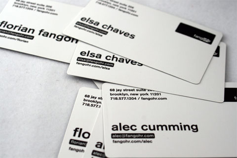
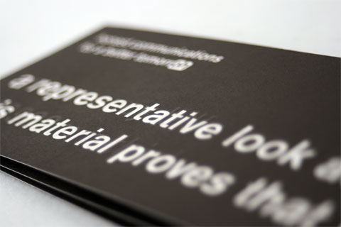
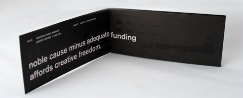
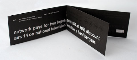
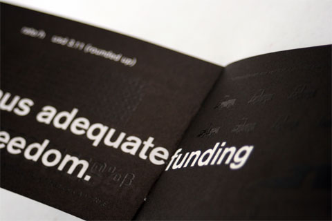
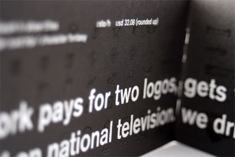
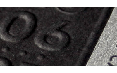
Few things are so simple and so attractive, at least to these blogger’s eyes, than a transparent varnish on a black background. Specially, as a side note, when it is used so smartly in applications like this. But I digress to the varnish-on-black at hand, the business cards and petite brochure from Brooklyn-based Fangohr. The business cards feature the items on each of the cardee’s desks from the obvious (keyboard) to the nerdy (the title treatment of Wolfgang Weingart’s My Way to Typography on Florian’s card). Meanwhile the business card is varnished with graphs and infographics that help Fangohr with their state of affairs: “this material,” reads the cover “proves that we need your business.” A nice touch is that the business cards are printed on coated stock with matte varnish and the brochure on uncoated stock with UV varnish, playing nicely with the opposing finishes.
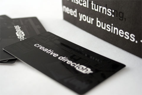

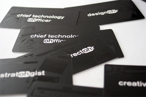
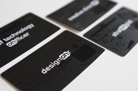
The printer was capable of printing as small as 0.18 pt stroke on the UV spot, which allowed for a lot of detail in the illustrations- so we were able to really show everything that lives on our desks. [This image by Fangohr]
Fangohr Business Cards and Brochure
Production Method
Offset
Design
Fangohr
Brochure: Carlos Ancalmo, Florian Fangohr
Business Card: Elsa Chaves, Jakyoung Min, Florian Fangohr
Desk illustrations: Jakyoung Min, Elsa Chaves, Florian Fangohr
Printing
Card Land, Taiwan
This post was published in the original layout of FPO so all images are smaller. Project descriptions as well as production lessons are quoted in the main content area.
Post Author
Armin

Armin Vit
Editor of FPO and co-founder of UnderConsideration LLC.
More: Online / On Twitter
Date Published
June 23, 2009
Filed Under
Offset
Self promotion
Tagged with
spot gloss varnish
UV
varnish


About
FPO (For Print Only), is a division of UnderConsideration, celebrating the reality that print is not dead by showcasing the most compelling printed projects.
FPO uses Fonts.com to render Siseriff and Avenir Next.
FPO is run with Six Apart’s MovableType
All comments, ideas and thoughts on FPO are property of their authors; reproduction without the author’s or FPO’s permission is strictly prohibited
Twitter @ucllc
Sign-up for Mailing List
Mailing list managed by MailChimp
Thanks to our advertisers
About UnderConsideration
UnderConsideration is a graphic design firm generating its own projects, initiatives, and content while taking on limited client work. Run by Bryony Gomez-Palacio and Armin Vit in Bloomington, IN. More…
blogs we publish
Brand New / Displaying opinions and focusing solely on corporate and brand identity work.
Art of the Menu / Cataloguing the underrated creativity of menus from around the world.
Quipsologies / Chronicling the most curious, creative, and notable projects, stories, and events of the graphic design industry on a daily basis.
products we sell
Flaunt: Designing effective, compelling and memorable portfolios of creative work.
Brand New Conference videos / Individual, downloadable videos of every presentation since 2010.
Prints / A variety of posters, the majority from our AIforGA series.
Other / Various one-off products.
events we organize
Brand New Conference / A two-day event on corporate and brand identity with some of today's most active and influential practitioners from around the world.
Brand Nieuwe Conference / Ditto but in Amsterdam.
Austin Initiative for Graphic Awesomeness / A speaker series in Austin, TX, featuring some of the graphic design industry's most awesome people.
also
Favorite Things we've Made / In our capacity as graphic designers.
Projects we've Concluded / Long- and short-lived efforts.
UCllc News / Updates on what's going at the corporate level of UnderConsideration.

Related entries
E.A.S.E. Stationery Set
End of Work iPad and Notebook Cases
Cranky Bucks Promotion
Pizza Box Promo Mailer
Bryan Patrick Todd Mailer