ADV @ UNDERCONSIDERATION Peek here for details
BROWSE
Dimensions (Width × Height × Depth)
12 in × 18 in
Page Count
–
Paper Stock
Starwhite Natural, 80 lb Cover
Number of Colors
Offset: 1 Spot
Letterpress: 2 Spot
Varnishes
–
Binding
–
Typography
Futura
(Distorted) Helvetica press-type
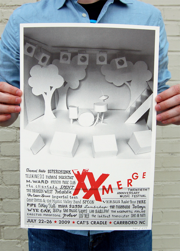
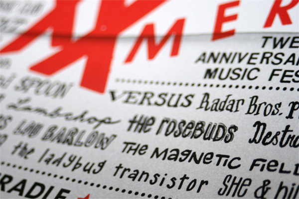
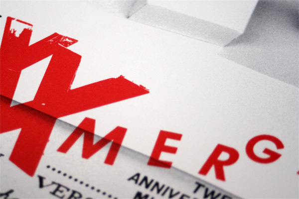
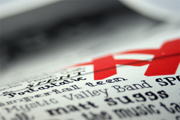
To celebrate their 20th anniversary, Merge Records — who released Arcade Fire’s debut record Funeral — held a four-night, thirty-three-band festival, XX Merge, in their hometown of North Carolina this past July. To commemorate the occasion, their art department — who keep a wonderful process blog — created this special edition offset and letterpress poster. The poster features a hand-made paper set replica of the Cat’s Cradle, the venue where the festival was held, and is sprinkled with fun lettering of all the bands’ names. The festival logo (XX Merge) is letterpressed in red, adding a visual and tactile punch to the already cool poster. Merge Records’ art director Maggie Fost shares more on the paper set she built:
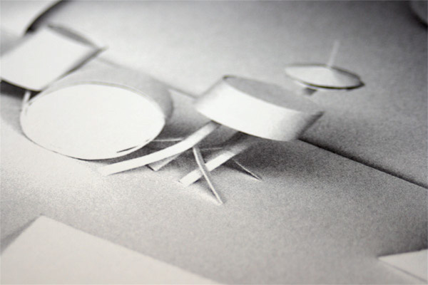
It’s a model of the Cat’s Cradle, a legendary rock club in Carrboro, North Carolina where much Merge history has taken place and where the whole festival took place. I went to the club in the middle of the day and took photos of the stage so that my model would be representative. It worked! It was very gratifying that when fans saw the poster, they immediately knew it was the Cradle. I added the trees to give it a sense of fantasy and to suggest North Carolina in the summer. The model is literally made of posterboard and scotch tape.
The trees ended up being realized life-size for the stage by Dave Doernberg, who made them out of foamboard in New York and shipped them down, spraypainting them glossy red outside the club hours before the first band took the stage.

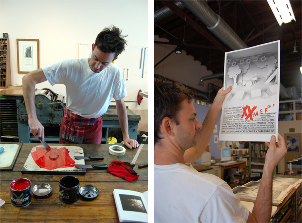
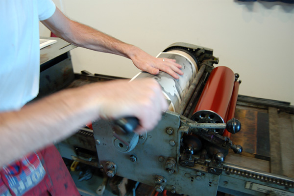
Dave Wofford of Horse & Buggy Press in action.
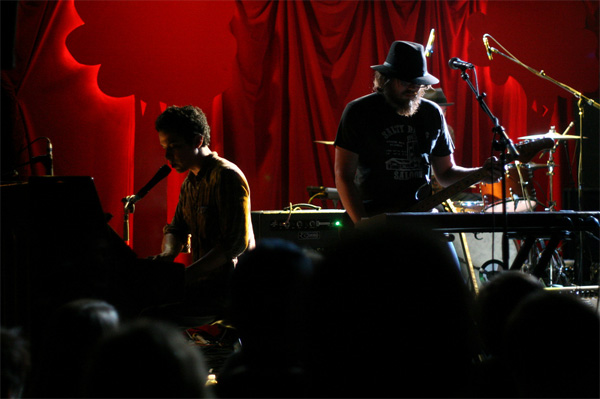
The poster-inspired set at Cat’s Cradle.
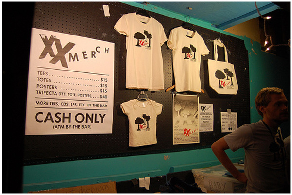
Festival merchandise.
XX Merge Festival Poster
Production Method
Design
Maggie Fost, Merge Records Art Director
Printing
Offset: HarperPrints
Letterpress: Horse and Buggy Press
This post was published in the original layout of FPO so all images are smaller. Project descriptions as well as production lessons are quoted in the main content area.
Post Author
Armin

Armin Vit
Editor of FPO and co-founder of UnderConsideration LLC.
More: Online / On Twitter
Date Published
January 7, 2010
Filed Under
Posters
Tagged with
letterpress
offset
poster


About
FPO (For Print Only), is a division of UnderConsideration, celebrating the reality that print is not dead by showcasing the most compelling printed projects.
FPO uses Fonts.com to render Siseriff and Avenir Next.
FPO is run with Six Apart’s MovableType
All comments, ideas and thoughts on FPO are property of their authors; reproduction without the author’s or FPO’s permission is strictly prohibited
Twitter @ucllc
Sign-up for Mailing List
Mailing list managed by MailChimp
Thanks to our advertisers
About UnderConsideration
UnderConsideration is a graphic design firm generating its own projects, initiatives, and content while taking on limited client work. Run by Bryony Gomez-Palacio and Armin Vit in Bloomington, IN. More…
blogs we publish
Brand New / Displaying opinions and focusing solely on corporate and brand identity work.
Art of the Menu / Cataloguing the underrated creativity of menus from around the world.
Quipsologies / Chronicling the most curious, creative, and notable projects, stories, and events of the graphic design industry on a daily basis.
products we sell
Flaunt: Designing effective, compelling and memorable portfolios of creative work.
Brand New Conference videos / Individual, downloadable videos of every presentation since 2010.
Prints / A variety of posters, the majority from our AIforGA series.
Other / Various one-off products.
events we organize
Brand New Conference / A two-day event on corporate and brand identity with some of today's most active and influential practitioners from around the world.
Brand Nieuwe Conference / Ditto but in Amsterdam.
Austin Initiative for Graphic Awesomeness / A speaker series in Austin, TX, featuring some of the graphic design industry's most awesome people.
also
Favorite Things we've Made / In our capacity as graphic designers.
Projects we've Concluded / Long- and short-lived efforts.
UCllc News / Updates on what's going at the corporate level of UnderConsideration.

Related entries
36 Days of Type Poster
Ministry of Environment in Colombia Poster
National Parks Map
eBoy Poster
“Love Your Mother” Print