ADV @ UNDERCONSIDERATION Peek here for details
BROWSE
Dimensions (Width × Height × Depth)
12 in × 18 in
Page Count
–
Paper Stock
Crane Lettra 110 lb. 100% Cotton Paper in Ecru color
Number of Colors
2 spot inks, Black and PMS 227
Varnishes
–
Binding
–
Typography
Cochin LT Std
Stuyvesant ICG
ITC New Baskerville Italic (all from Adobe Type Library)
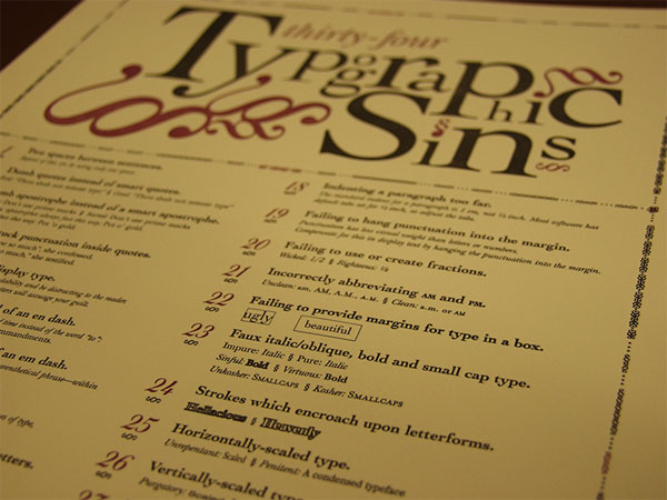
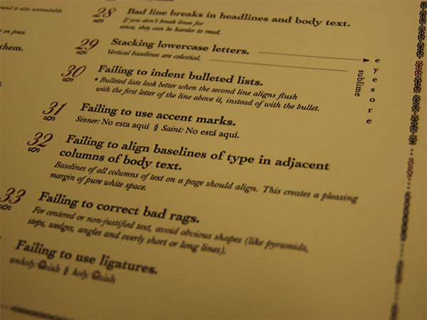
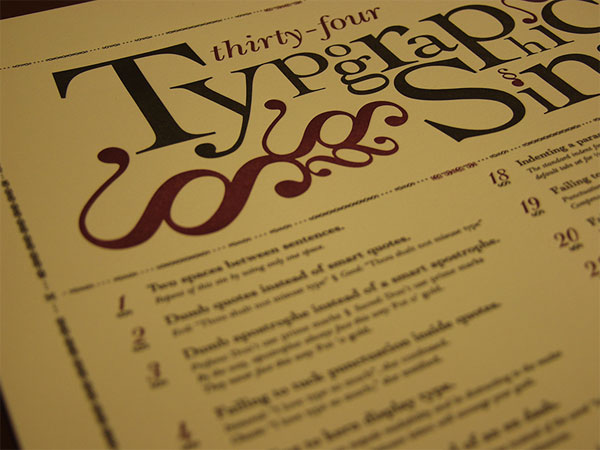
Jim Godfrey is a typography teacher. Jim Godfrey is often irritated by the typographic sins of students who join his class semester after semester. Jim Godfrey decided to do something about it and, after consulting with his colleague Patrick Wilkey, a list of 34 unprofessional ways to set type was drafted. It took three years from beginning to the final letterpressed poster run of 38—not enough paper to account for print ready made this first impression a short one. A second one will likely happen when all existing copies are sold.
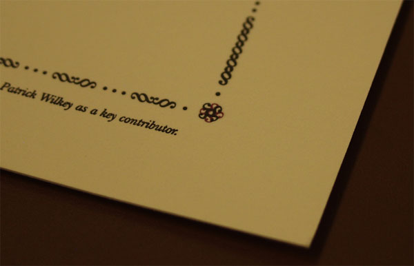
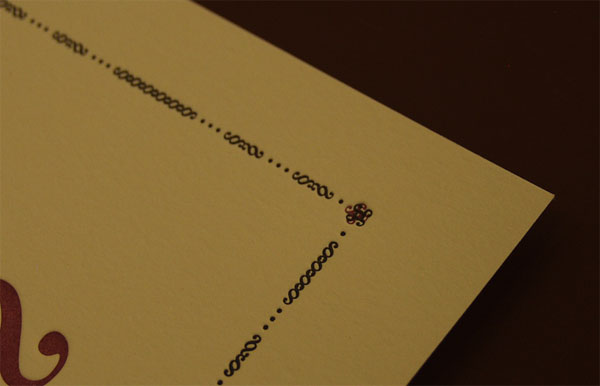
Because the poster is 12 × 18 inches, we ran into some registration issues on the press. The poster contains a rosette in each corner that was intended to be reproduced in two colors and needed precise registration. However, because the paper was so long, each sheet tended to stretch or pull a little bit giving each rosette a slightly unique position (a variance of 1/32-1/16 of an inch, roughly). Because of this variation we were unable to get the rosette to register consistently. To solve the problem, we trimmed the rosette from the plate of the second color, so that the rosette printed only in black. Because the rosette is small, printing it in one color did not compromise the design aesthetic.
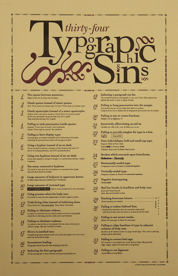

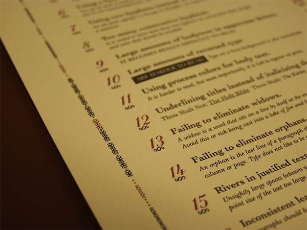
Typographic Sins Poster
Production Method
Design
Design and copywriting: Jim Godfrey
Editing: Patrick Wilkey
Printing
Rowley Press
This post was published in the original layout of FPO so all images are smaller. Project descriptions as well as production lessons are quoted in the main content area.
Post Author
Bryony

Bryony Gomez-Palacio
Editor of FPO and co-founder of UnderConsideration LLC.
More: Online / On Twitter
Date Published
August 6, 2010
Filed Under
Posters
Tagged with
color paper
crane
letterpress
poster


About
FPO (For Print Only), is a division of UnderConsideration, celebrating the reality that print is not dead by showcasing the most compelling printed projects.
FPO uses Fonts.com to render Siseriff and Avenir Next.
FPO is run with Six Apart’s MovableType
All comments, ideas and thoughts on FPO are property of their authors; reproduction without the author’s or FPO’s permission is strictly prohibited
Twitter @ucllc
Sign-up for Mailing List
Mailing list managed by MailChimp
Thanks to our advertisers
About UnderConsideration
UnderConsideration is a graphic design firm generating its own projects, initiatives, and content while taking on limited client work. Run by Bryony Gomez-Palacio and Armin Vit in Bloomington, IN. More…
blogs we publish
Brand New / Displaying opinions and focusing solely on corporate and brand identity work.
Art of the Menu / Cataloguing the underrated creativity of menus from around the world.
Quipsologies / Chronicling the most curious, creative, and notable projects, stories, and events of the graphic design industry on a daily basis.
products we sell
Flaunt: Designing effective, compelling and memorable portfolios of creative work.
Brand New Conference videos / Individual, downloadable videos of every presentation since 2010.
Prints / A variety of posters, the majority from our AIforGA series.
Other / Various one-off products.
events we organize
Brand New Conference / A two-day event on corporate and brand identity with some of today's most active and influential practitioners from around the world.
Brand Nieuwe Conference / Ditto but in Amsterdam.
Austin Initiative for Graphic Awesomeness / A speaker series in Austin, TX, featuring some of the graphic design industry's most awesome people.
also
Favorite Things we've Made / In our capacity as graphic designers.
Projects we've Concluded / Long- and short-lived efforts.
UCllc News / Updates on what's going at the corporate level of UnderConsideration.

Related entries
36 Days of Type Poster
Ministry of Environment in Colombia Poster
National Parks Map
eBoy Poster
“Love Your Mother” Print