ADV @ UNDERCONSIDERATION Peek here for details
BROWSE
Dimensions (Width × Height × Depth)
210 mm × 210 mm × 7 mm (8.26 in × 8.26 in ×.27 in)
Page Count
76
Paper Stock
Cover: Uncoated 300gsm
Body: Uncoated 140gsm
Number of Colors
CMYK
Varnishes
–
Binding
Perfect binding
Typography
FF Unit Slab and FF Unit (FontFont)
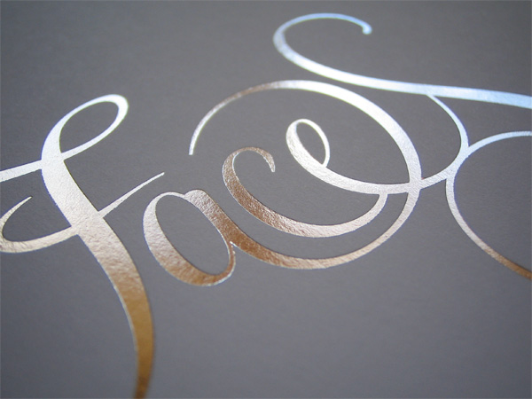
Logo created from a customised version of Feel Script by Alejandro Paul (Sudtipos) and FS Clerkenwell by Jason Smith and Phil Garnham (FontSmith)
PDF version:£3 (US$4.75)
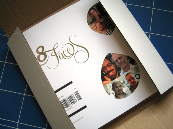
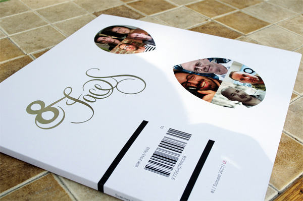
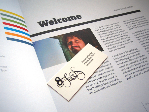
8 Faces is a print magazine for devotees of typography and the aim of the magazine is to bring type to the masses. Noting that current publications on the subject are often unnecessarily highbrow and carry an extremely high price tag, Elliot Jay Stocks decided to develop a magazine for the people who love type, but you don’t have to be a real type nerd to enjoy it. The main goal? to encourage learning and passion for typography at all levels.
The magazine started life as a little side-project; a personal indulgence. Because I work predominantly on the web, I felt frustrated that so many of my projects were ephemeral and short-lived. I wanted to do more print work, and something on a large scale. Something that would be beautiful, and smell great, and be so special that I — and all readers — would want to keep it forever. Plus, I felt that the other typography magazines on the market were priced way too high and were totally inaccessible for the casual type fan. Typography seems to be — especially in the web design community — a very big subject right now, and I was confident that there was a space for a small, lovingly crafted, reasonably-priced-yet-very-high-quality magazine.
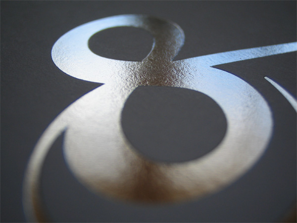
Printed on heavy uncoated stock, with a foil-blocked cover, and lovingly pressed at just 1,000 limited editions, each issue is a true collector’s item. Unlike most magazines, advertising is kept to an absolute minimum and each copy is individually numbered, so 8 Faces is more at home on a bookshelf than in a magazine rack.
Elliot’s love for the project as well as his dedication to see it to fruition was surely tested many times along the way.
The biggest hurdle was that I’d thought a lot about the magazine’s editorial and design, but I’d totally underestimated how long it would take to handle all of the ‘unseen’ stuff: things like getting advertisers on board, chasing up the ad creative, liaisoning with the printers, helping out customers with post-sale support, etc. As a result, the magazine took up a lot more of my time than I’d previously thought and the whole thing was, at times, pretty stressful. It was completely worth it, though. I’m over the moon with the end product and so were our customers: we sold out all 1,000 physical copies in under 2 hours!

This post was published in the original layout of FPO so all images are smaller. Project descriptions as well as production lessons are quoted in the main content area.
Post Author
Bryony

Bryony Gomez-Palacio
Editor of FPO and co-founder of UnderConsideration LLC.
More: Online / On Twitter
Date Published
September 30, 2010
Filed Under
Magazines
Tagged with
CMYK
digital
foil block
limited print run
magazine
numbered copies
perfect bound
uncoated


About
FPO (For Print Only), is a division of UnderConsideration, celebrating the reality that print is not dead by showcasing the most compelling printed projects.
FPO uses Fonts.com to render Siseriff and Avenir Next.
FPO is run with Six Apart’s MovableType
All comments, ideas and thoughts on FPO are property of their authors; reproduction without the author’s or FPO’s permission is strictly prohibited
Twitter @ucllc
Sign-up for Mailing List
Mailing list managed by MailChimp
Thanks to our advertisers
About UnderConsideration
UnderConsideration is a graphic design firm generating its own projects, initiatives, and content while taking on limited client work. Run by Bryony Gomez-Palacio and Armin Vit in Bloomington, IN. More…
blogs we publish
Brand New / Displaying opinions and focusing solely on corporate and brand identity work.
Art of the Menu / Cataloguing the underrated creativity of menus from around the world.
Quipsologies / Chronicling the most curious, creative, and notable projects, stories, and events of the graphic design industry on a daily basis.
products we sell
Flaunt: Designing effective, compelling and memorable portfolios of creative work.
Brand New Conference videos / Individual, downloadable videos of every presentation since 2010.
Prints / A variety of posters, the majority from our AIforGA series.
Other / Various one-off products.
events we organize
Brand New Conference / A two-day event on corporate and brand identity with some of today's most active and influential practitioners from around the world.
Brand Nieuwe Conference / Ditto but in Amsterdam.
Austin Initiative for Graphic Awesomeness / A speaker series in Austin, TX, featuring some of the graphic design industry's most awesome people.
also
Favorite Things we've Made / In our capacity as graphic designers.
Projects we've Concluded / Long- and short-lived efforts.
UCllc News / Updates on what's going at the corporate level of UnderConsideration.

Related entries
Elbow Grease Magazine
Best of Local Magazine
nomad Magazine
ARCMTL + LA SERRES - Objets flottants Arts vivants Edition
Unfiltered Magazine