ADV @ UNDERCONSIDERATION Peek here for details
BROWSE
Client
–
Quantity Produced
–
Production Cost
–
Production Time
–
Dimensions (Width × Height × Depth)
–
Page Count
–
Paper Stock
–
Number of Colors
–
Varnishes
–
Binding
–
Typography
–

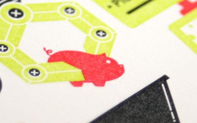
FAME Open House Party Materials

|
DESIGNED BY
|
PRINT METHOD
Letterpress by Studio OnFire
|

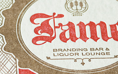
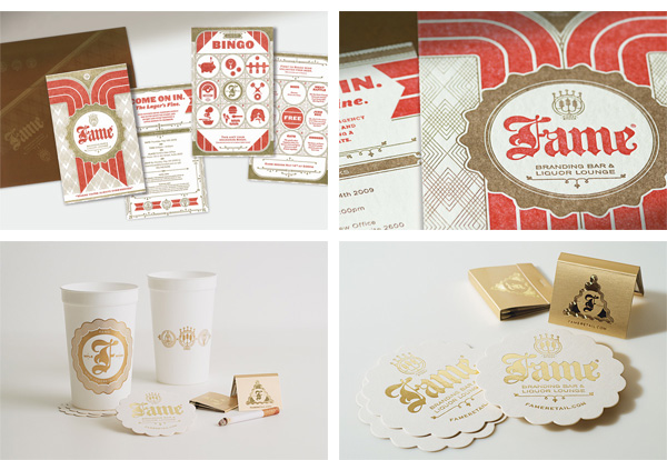
By Fame for Fame. Totally pimp invitation and party materials with a lettepress finish to appeal to potential Open House crashers.
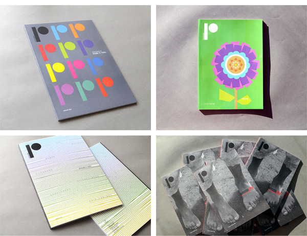
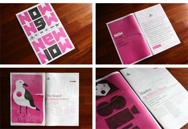
The Incredible Journey that is Consciousness Booklet
|
DESIGNED BY
|
PRINT METHOD
Offset
|

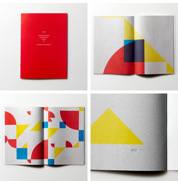
What does it mean? What is it for? Who cares and who cares? It’s on newsprint. It’s got primary colors. It’s awesome.
Measure Postcards
|
DESIGNED BY
|
PRINT METHOD
|
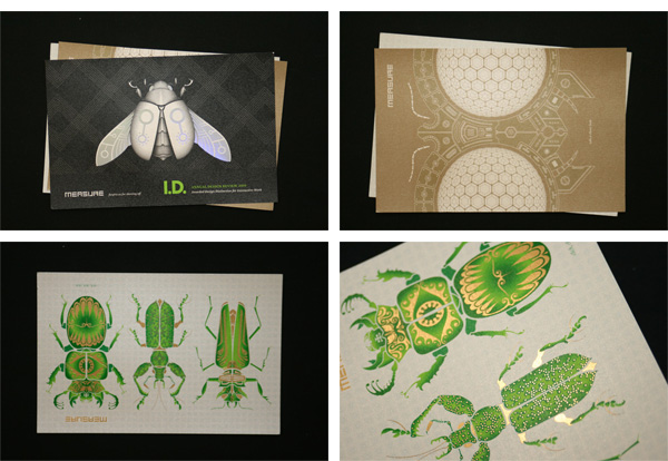
What better way to self-promote a design firm than foil stamped super insects? It’s a rhetoric question. Surely there are better ways, but this one works fantastically.
Parliament of Owls Holiday Cards
|
DESIGNED BY
|
PRINT METHOD
Letterpress by Cranky Pressman
|
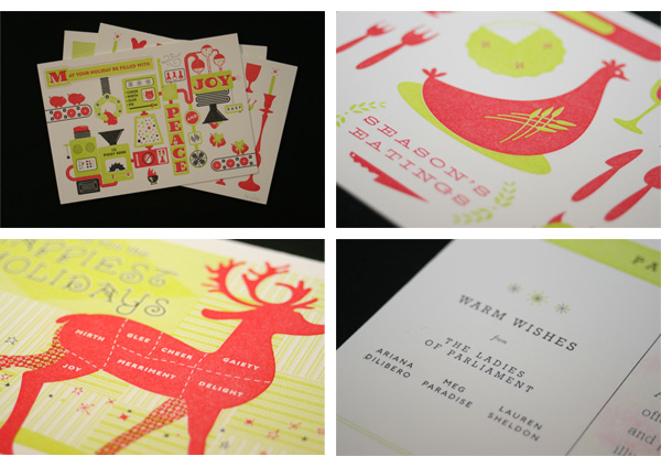
The three founding designers of the newly minted Parliament of Owls brought some macabre holiday cheer with these lettepress postcards.
The Pilgrim Journal
|
DESIGNED BY
|
PRINT METHOD
Offset by Karis Graphics
|
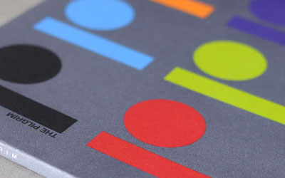
Here is a safe bet: This is the most handsome newsletter for a church in New Jersey. Solidly designed and printed in offset. No bells and whistles. Just straight-up goodness.
Marian’s Valentine’s Day Cards
|
DESIGNED BY
|
PRINT METHOD
Laser-cutting by Arkwel Industries
|
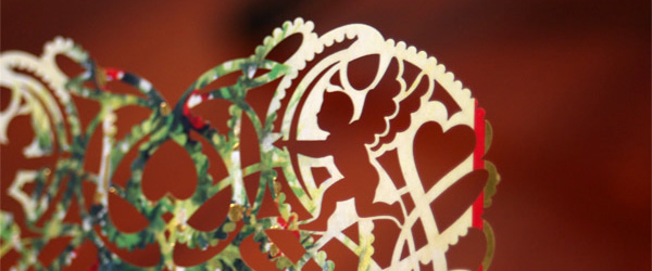
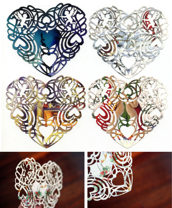
Not just a lovely execution but a great concept as well: Marian collected 2009 holiday cards and then laser cut them to repurpose for Valentine’s Day, making each card unique.
NAACP 2008 Annual Report
|
DESIGNED BY
|
PRINT METHOD
Offset by Recycle Paper Printing
|
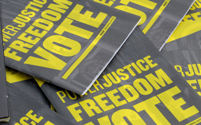
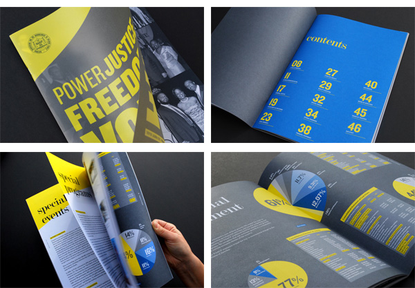
A lovely translucent cover gives way to a bold, simple interior full of good typography and big charts.
Miner & Miner Business Cards
|
DESIGNED BY
|
PRINT METHOD
Offset, Deboss, and Foil Stamp brokered by Springfield Graphics
|
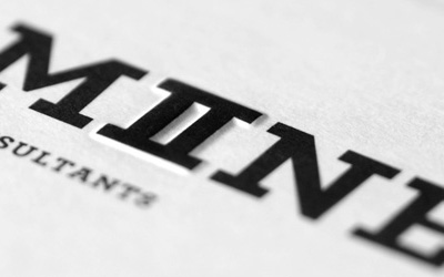
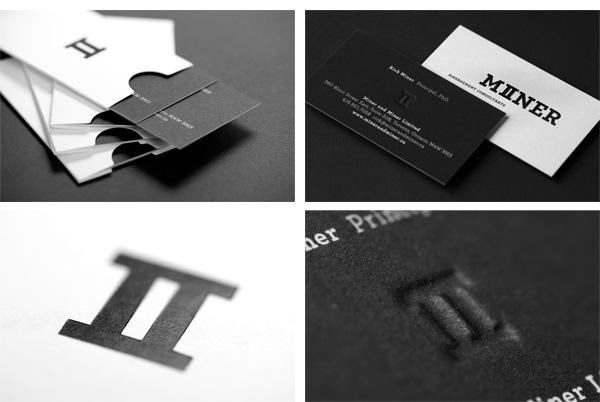
For Miner & Miner, Matter created a very clever logo that shows there are II Miners. Then the business cards are beautifully executed with foil stamp, deboss and not one but two hits of black.
Jen and Kevin Save the Date
|
DESIGNED BY
|
PRINT METHOD
|
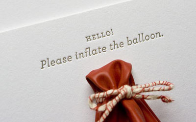
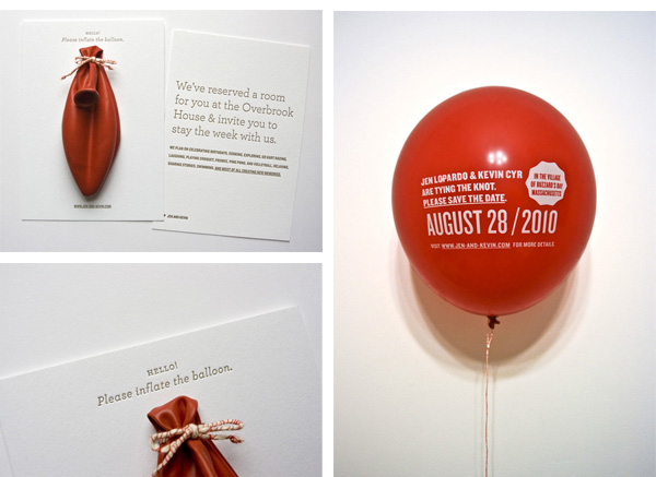
The combination of traditional lettepress and childhood memory balloon makes this one of our most popular posts of all time. And, for some reason, we get one or two requests for quote every month or so for doing silkscreen balloons. So for the record: we don’t silkscreen balloons, we just blog about people who do.
Mohawk Solutions Promo Book
|
DESIGNED BY
|
PRINT METHOD
Offset and Foil Stamp by The Hennegan Company
|
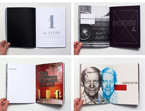
Great images, great copy, great design, great paper, great printing. Can it get any greater? How about metallic overprints? Great.
2009 – 10 Kitchen Dog Theater Brochure and Posters
|
DESIGNED BY
|
PRINT METHOD
Web offset by Dallas Offset
Silkscreen by SullivanPerkins |
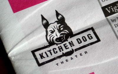
A great set of materials, including posters and a newsprint brochure, all printed in eye-popping magenta and black. Clever illustrations too.
Alyssa and Josh’s Wedding Invitation
|
DESIGNED BY
|
PRINT METHOD
Digital and Linocut Block Print by Classic Litho
|
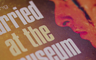
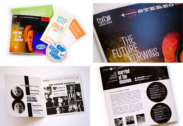
The couple (and designers) reproduced the aesthetic of early album covers with great fidelity even with digital printing.
This post was published in the original layout of FPO so all images are smaller. Project descriptions as well as production lessons are quoted in the main content area.
Post Author
Armin

Armin Vit
Editor of FPO and co-founder of UnderConsideration LLC.
More: Online / On Twitter
Date Published
December 22, 2010
Filed Under
End of Year List
Tagged with
Best of FPO


About
FPO (For Print Only), is a division of UnderConsideration, celebrating the reality that print is not dead by showcasing the most compelling printed projects.
FPO uses Fonts.com to render Siseriff and Avenir Next.
FPO is run with Six Apart’s MovableType
All comments, ideas and thoughts on FPO are property of their authors; reproduction without the author’s or FPO’s permission is strictly prohibited
Twitter @ucllc
Sign-up for Mailing List
Mailing list managed by MailChimp
Thanks to our advertisers
About UnderConsideration
UnderConsideration is a graphic design firm generating its own projects, initiatives, and content while taking on limited client work. Run by Bryony Gomez-Palacio and Armin Vit in Bloomington, IN. More…
blogs we publish
Brand New / Displaying opinions and focusing solely on corporate and brand identity work.
Art of the Menu / Cataloguing the underrated creativity of menus from around the world.
Quipsologies / Chronicling the most curious, creative, and notable projects, stories, and events of the graphic design industry on a daily basis.
products we sell
Flaunt: Designing effective, compelling and memorable portfolios of creative work.
Brand New Conference videos / Individual, downloadable videos of every presentation since 2010.
Prints / A variety of posters, the majority from our AIforGA series.
Other / Various one-off products.
events we organize
Brand New Conference / A two-day event on corporate and brand identity with some of today's most active and influential practitioners from around the world.
Brand Nieuwe Conference / Ditto but in Amsterdam.
Austin Initiative for Graphic Awesomeness / A speaker series in Austin, TX, featuring some of the graphic design industry's most awesome people.
also
Favorite Things we've Made / In our capacity as graphic designers.
Projects we've Concluded / Long- and short-lived efforts.
UCllc News / Updates on what's going at the corporate level of UnderConsideration.

Related entries
The Best of 2011 on FPO, Part 3: Posters
The Best of 2011 on FPO, Part 2: Jul - Dec
The Best of 2011 on FPO, Part 1: Jan - Jun